“Finding the perfect paint color for your home can feel like searching for a needle in a haystack. There are thousands of options, and each one looks different depending on lighting, room size, and furnishings. You want something that feels right but won’t look dated in a few years.
I promise that SW 6212 Quietude by Sherwin Williams might be the answer you’re looking for. This soft blue-green shade brings calm to any space without overwhelming it.
In this blog post, I’ll show you how Quietude works in various rooms, what colors pair well with it, and tips for using this versatile shade in your home. I’ll also share some real-life examples so you can see how it looks in actual spaces.
The Green Grace of Quietude Sherwin Williams – SW 6212
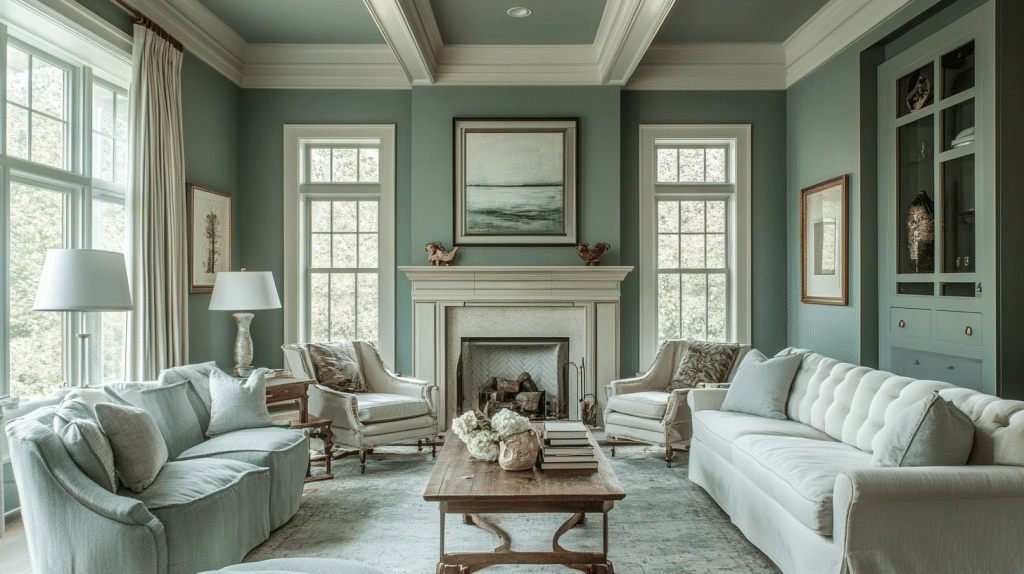
Quietude (SW 6212) offers a gentle mix of blue and green tones that fits perfectly in many homes. This soft, muted shade sits comfortably between a pastel and a medium tone. When you first look at it, you might notice how it shifts between blue and green depending on your lighting.
I’ve used this color in my guest bathroom, and visitors often ask about it. The wall color changes throughout the day, looking more blue in morning light and showing its green side in the afternoon. This shifting quality makes Quietude special among paint colors.
The color works well in bedrooms, bathrooms, and living spaces where you want a feeling of peace. It pairs nicely with white trim, natural wood tones, and gray or beige furniture. For a complete look, try adding some small touches of warm colors like coral or light yellow as accents.
Here’s a quick breakdown of Quietude’s key details:
| Feature | Details |
|---|---|
| Color Family | Blue-Green |
| LRV (Light Reflectance Value) | 62 |
| RGB Values | R:188, G:204, B:200 |
| Best Rooms | Bedrooms, Bathrooms, Offices |
| Pairs Well With | White (SW 7005 Pure White), Beige (SW 7036 Accessible Beige) |
| Mood | Calm, Soothing, Fresh |
Applying the Quietude Sherwin Williams
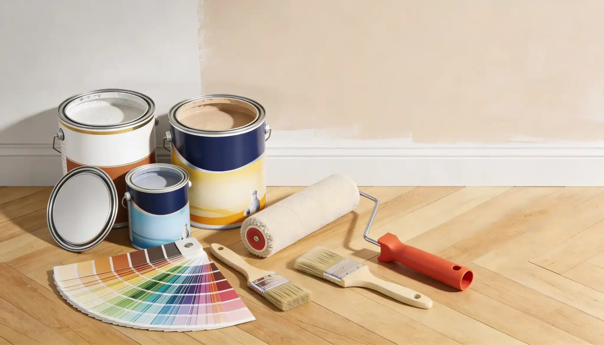
Quietude brings a soft blue-green look to any space. I found this paint simple to apply with standard tools. A good quality roller works best for walls, while a 2-inch brush helps with trim and corners. Two coats give the fullest color effect, but some lighter walls might need just one coat if you use primer first.
The paint dries in about 1-2 hours, but I like to wait 4 hours between coats for the best results. The final look settles after about a week when the paint has fully cured.
Now, let’s look at how Quietude works in different rooms of your home.
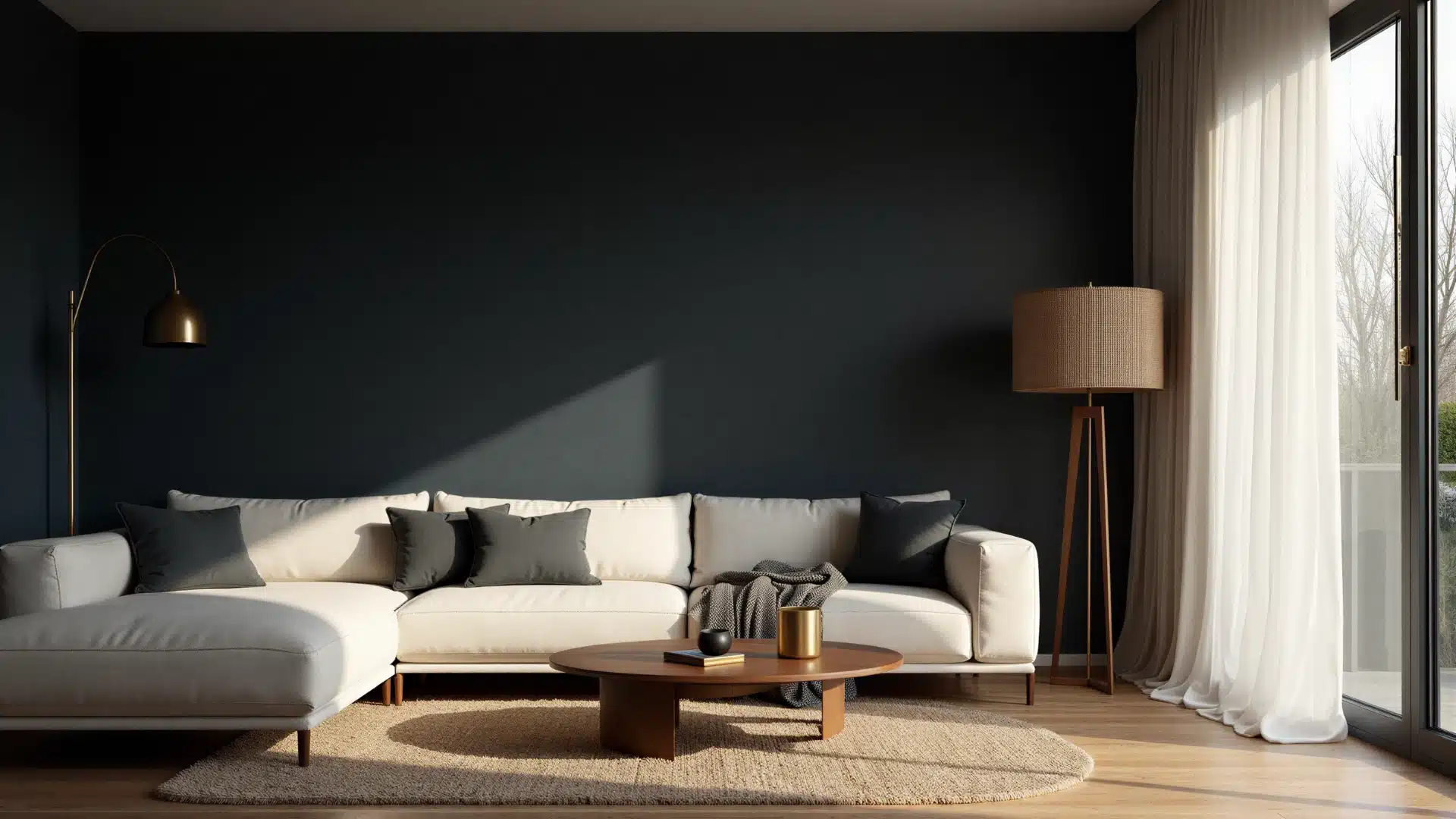
Living Room
In living rooms, Quietude creates a cool, fresh look that pairs well with white or cream furniture. I painted my living room with this color, and it made the space feel bigger and more open.
The walls reflect more light than darker colors would, helping brighten the entire room.
This color works well with medium to light wood tones for floors. My oak hardwood floors created a nice contrast with the walls. For rugs, I found that neutral tones like beige or light gray complement the walls without competing.
Bathroom
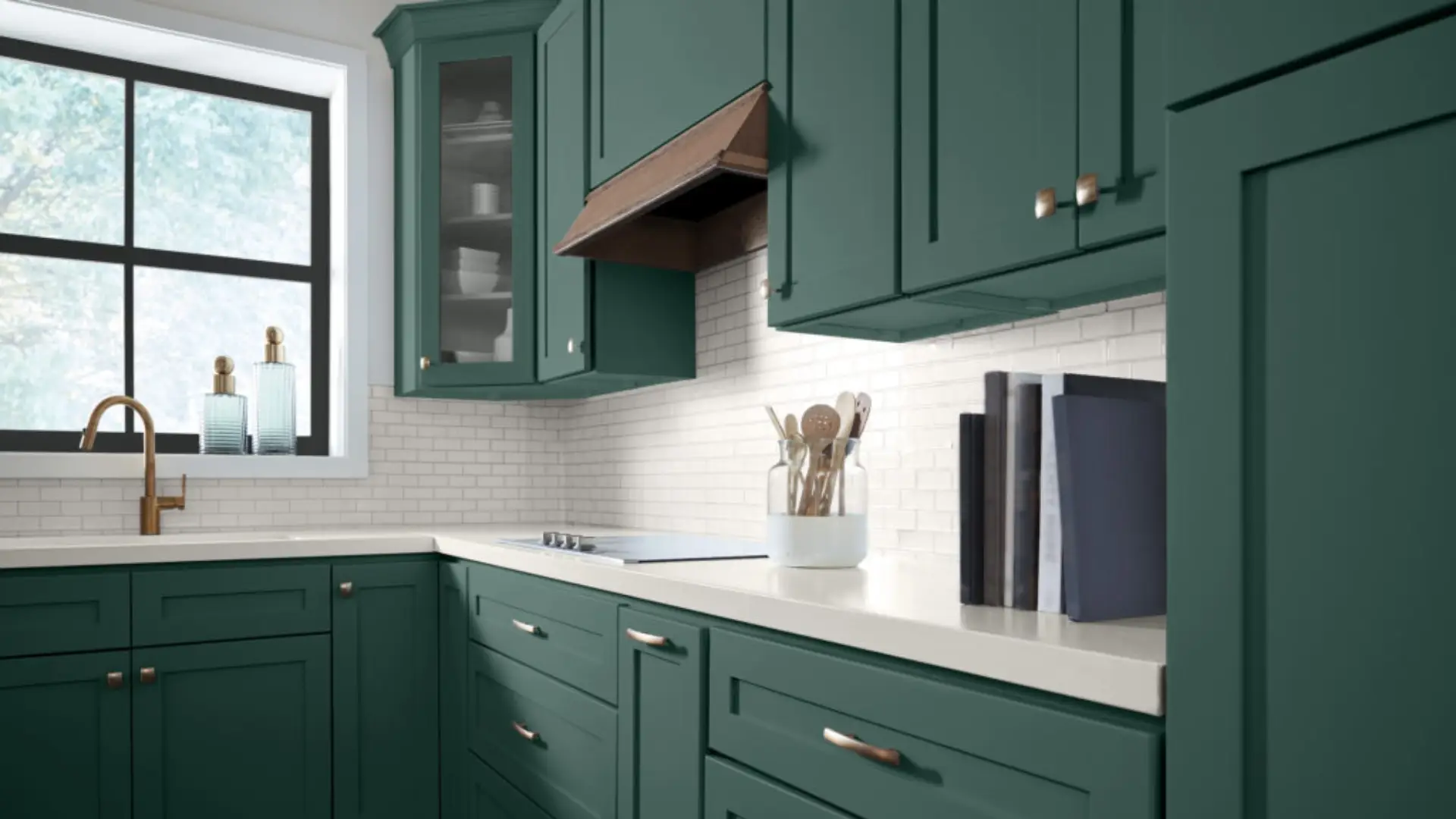
The bathroom might be the perfect spot for Quietude. The blue-green tones match well with white fixtures and chrome or brushed nickel hardware. This color helps make small bathrooms feel less cramped.
For bathroom floors, I found that white tile with light gray grout looks clean and fresh with these walls.
If you have wood cabinets, both dark and light woods work well – my dark walnut vanity created a striking contrast.
For shower curtains and towels, whites and creams are safe choices, but don’t be afraid of patterns that include the wall color. I used white towels with a small blue pattern that picked up the wall shade.
Bedroom
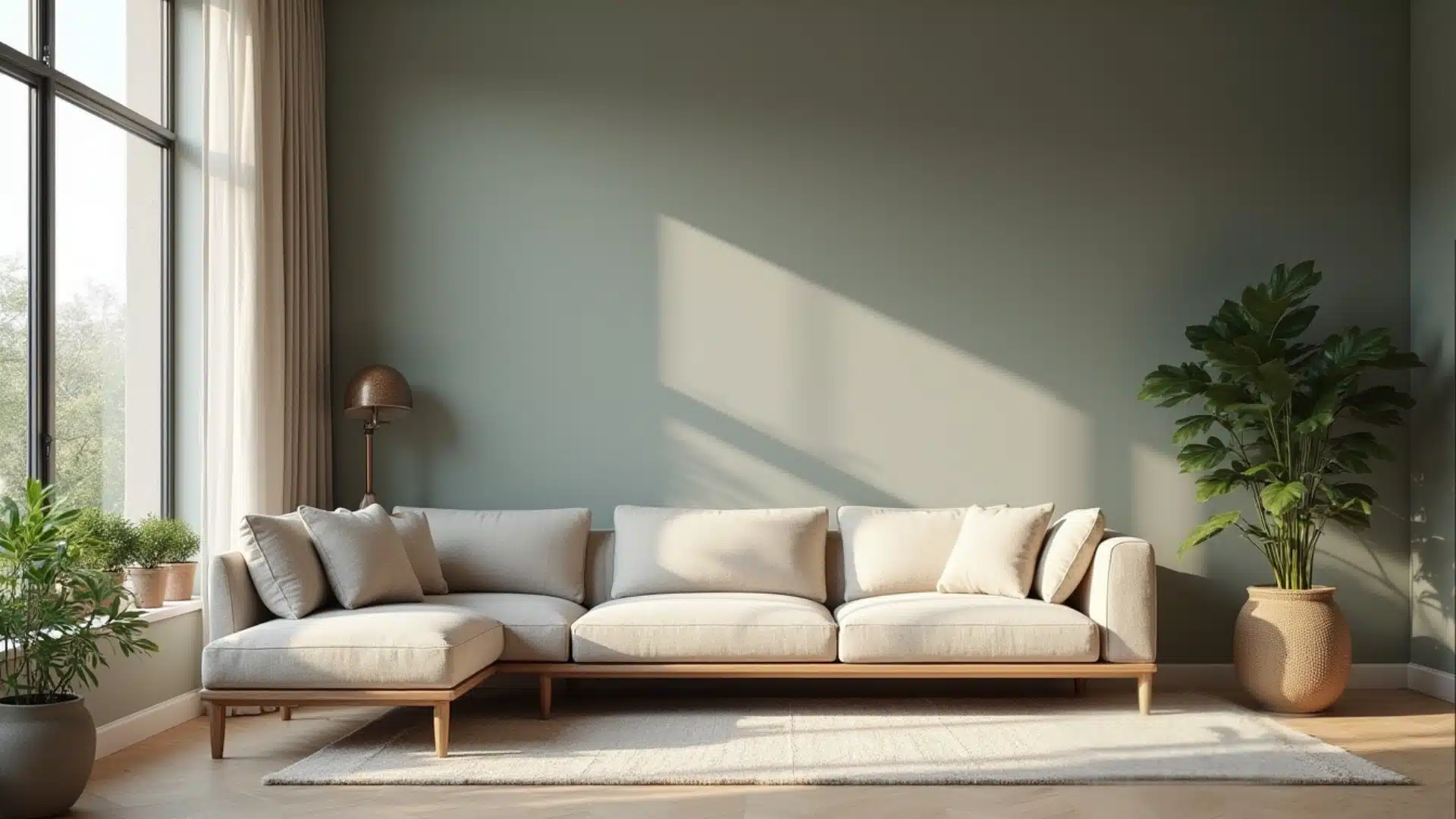
Quietude offers a truly relaxing background for bedrooms. The soft color helps create a peaceful sleeping space. This shade works wonderfully in both large master bedrooms and smaller guest rooms.
Furniture choices can go several ways with this color. I found that both white painted pieces and natural wood tones complement the walls. My bedroom has a mix of white nightstands and a natural oak dresser, creating a casual but put-together look.
For window treatments, I installed simple Roman shades in a light, neutral fabric.
These allow me to control the light in the room while maintaining a calm feeling. For art, black-and-white photos in simple frames stand out nicely against these walls, adding interest without disrupting the peaceful mood.
Quietude Against Other Competitors
When I was choosing paint for my home, I wanted to be sure Quietude was the right choice. I compared it with similar blue-green paints from other brands to see how it stacked up. What I found was that while many colors look alike on small swatches, they show their true nature when painted on walls.
Quietude has a special blend of blue and green that shifts based on lighting. This quality sets it apart from some competitors that lean heavily toward either blue or green. The color has a softness that many similar shades lack.
Here’s how Quietude compares to other popular blue-green paints:
| Paint Name | Brand | Undertones | LRV | Best For | Price Range |
|---|---|---|---|---|---|
| Quietude (SW 6212) | Sherwin Williams | Blue-green, slight gray | 62 | Bedrooms, bathrooms | $$$ |
| Sea Salt (SW 6204) | Sherwin Williams | Green-gray, more green | 63 | Kitchens, living rooms | $$$ |
| Wythe Blue | Benjamin Moore | Blue-green, historic feel | 59 | Colonial homes, studies | $$$$ |
| Rainwashed | Sherwin Williams | Blue-green, more blue | 69 | Sunrooms, nurseries | $$$ |
| Silver Marlin | Benjamin Moore | Blue-gray, less green | 58 | Modern spaces | $$$$ |
| Watery | Sherwin Williams | Bright blue-green | 57 | Coastal homes | $$$ |
I tested several of these colors in my home before making my choice. Quietude felt more balanced than Sea Salt, which turned quite green in my space. Wythe Blue, while beautiful, felt a bit too formal for my casual home style.
The coverage of Quietude was good, needing just two coats in most areas. Some of the competitor paints, especially the lighter ones like Rainwashed, needed a third coat for even color.
One thing to note is that Quietude tends to look more green in spaces with lots of natural light and more blue in rooms with mainly artificial lighting. This shifting quality can be either a plus or minus depending on your needs.
Painting It Up
Looking back at our study of Quietude Sherwin Williams, this gentle blue-green creates peaceful spaces in your home. Its soft tone works in various settings, from living rooms to bathrooms and bedrooms.
So what? Quietude Sherwin Williams isn’t just a color – it’s a mood setter. When your walls affect how you feel in a space, picking the right shade matters more than you might think.
What next? First, try a sample of Quietude Sherwin Williams on your wall. Watch how it changes from morning to evening light before committing. Take photos at different times of day to see its full range.
Ready to refresh your space? Grab a brush and see how this calming color can change the feel of your home. Share your before-and-after photos in the comments below!”


2 Responses
I have dark stained vanities in my bathroom and I want to paint my shiplap walls sw quitude. I don’t see an example of my vanities here. Do you have any? I have one window over my stand alone tub. Thanks
We are looking for a rug to put in our bedroom, painted Quietude walls and Alabaster trim. I LOVE the rug in your photo accompanying this article. Are you able to share where you purchased this, please?