Ever walked into a room and felt instantly zen? Or maybe you’ve scrolled through Pinterest and wondered why certain colors make you want to curl up with a good book?
I’ve got some news for you. Colors aren’t just pretty to look at; they’re actually mood magicians working behind the scenes.
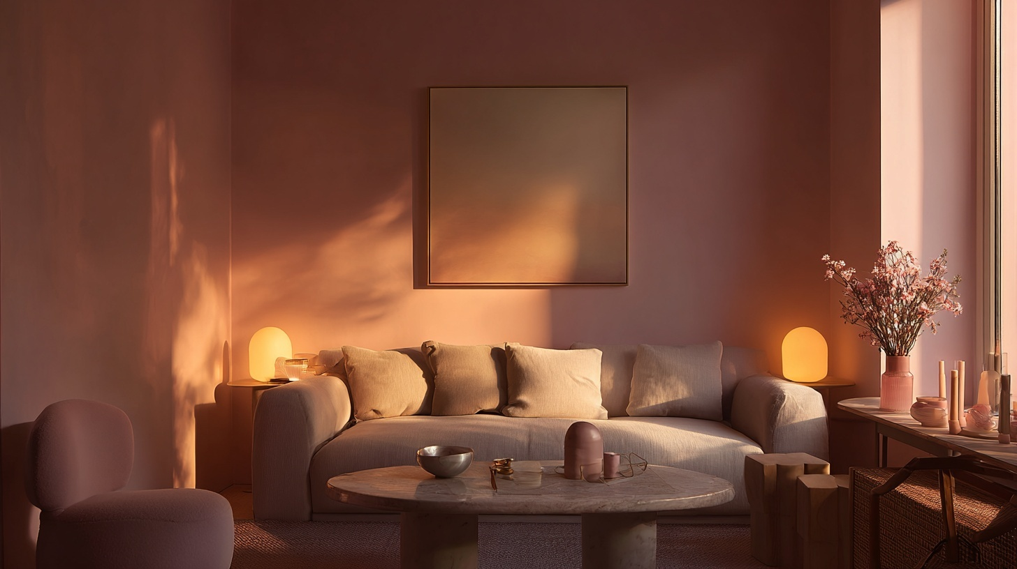
Turns out, there’s real science behind why some shades like Farrow & Ball Elephant’s Breath and Quietude from Sherwin-Williams make us feel like we’re floating on a cloud, while others have us reaching for our third cup of coffee.
The Psychology Behind Calm Color Shades
You know that feeling when you walk into a spa and instantly feel your shoulders drop? That’s not magic, it’s psychology at work.
Our brains are hardwired to respond to colors in specific ways, and scientists have been studying this connection for decades.
Here’s what happens when your eyes meet calming colors:
- Your nervous system gets the memo: Cool colors like blues and greens literally slow down your heart rate. It’s like your body’s built-in chill pill.
- Cortisol levels take a nosedive: That’s your stress hormone waving goodbye. When you’re surrounded by soft, muted tones, your body thinks “vacation mode activated.”
- Your brain starts making happy chemicals: Serotonin production kicks into high gear, which is why you feel so content in that sage green bedroom.
This isn’t just new-age nonsense. Hospitals have been utilizing this science for years, selecting specific shades for their walls to aid in patient recovery.
Even prisons figured it out; they use certain pink lights to calm aggressive behavior. If it works for stressed patients and rowdy inmates, imagine what it can do for your living room!
Most Calming Color Shades Backed by Design Science
Time for the main event! These colors have passed the science test with flying colors (pun totally intended). I’ve organized them from “instant zen” to “gentle hug,” so you can pick your perfect calm companion.
Soft Blues: The Universal Peace Maker
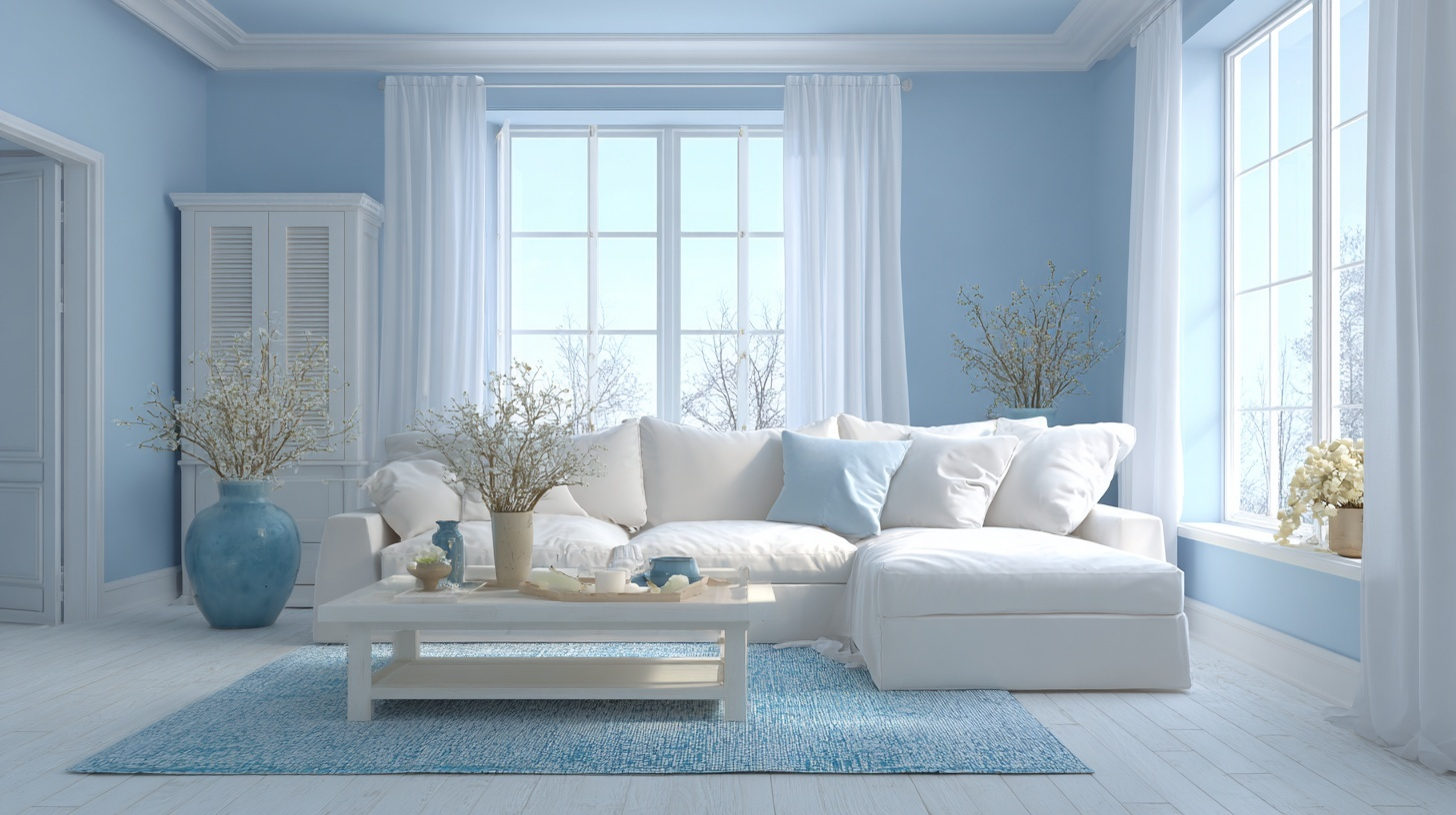
Picture staring at a clear summer sky or gentle ocean waves. That’s the magic of soft blue working on your brain. This color tricks your mind into thinking you’re in nature’s most peaceful settings.
Researchers found that people surrounded by powder blue experienced a 15% drop in anxiety levels within just 20 minutes.
Top Paint Picks:
- Benjamin Moore Palladian Blue (HC-144): Like morning mist over a lake
- Sherwin-Williams Misty (SW 6232):Soft as a cloud, calming as meditation
- Farrow & Ball Borrowed Light (No. 235): Whisper-quiet blue with gray undertones
Sage Green: Nature’s Stress Buster
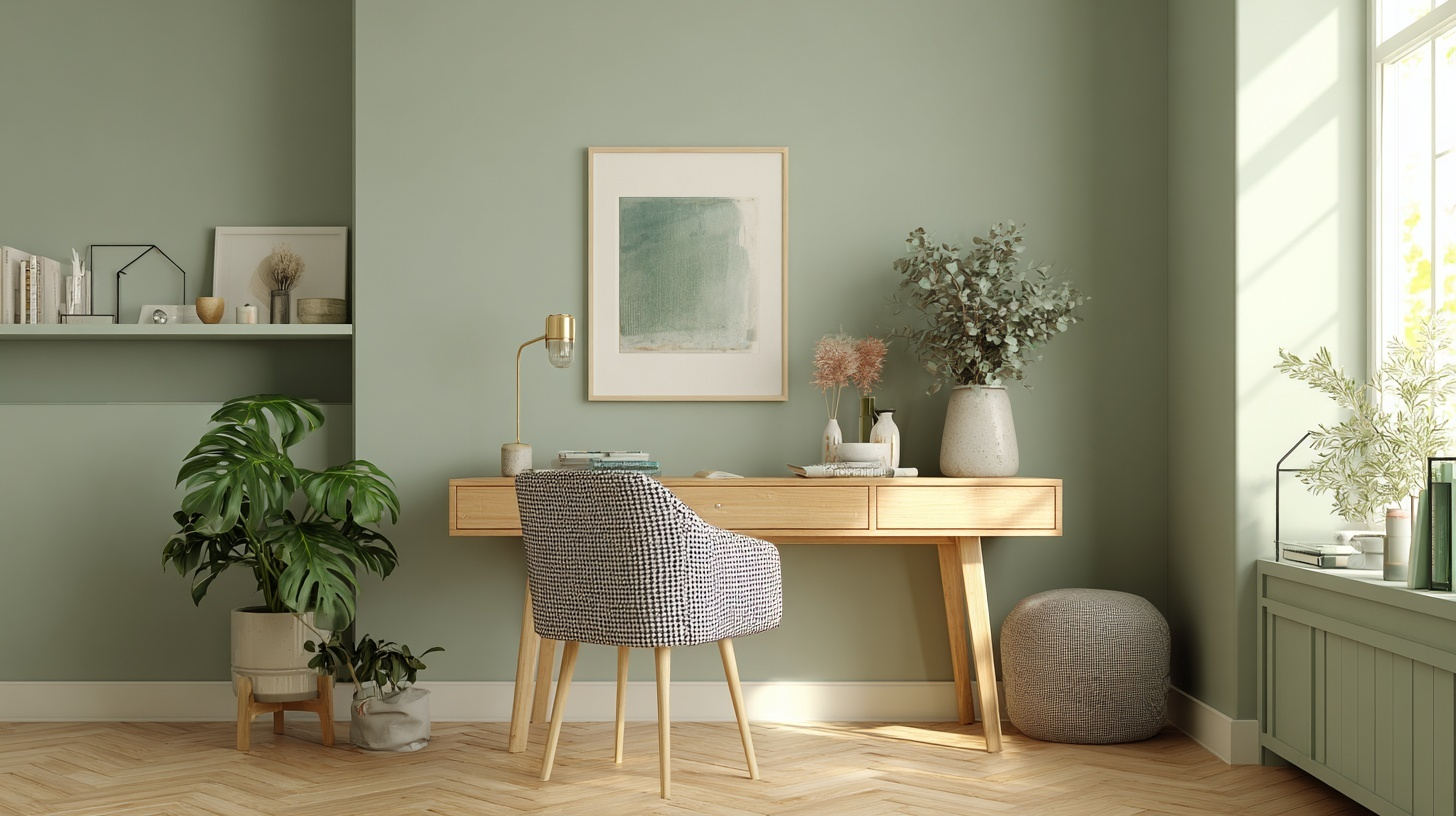
This muted green shade mimics the color of fresh herbs and morning mist on leaves. Studies show that people working in sage green environments have lower cortisol levels and report feeling more focused.
I used SW color of the year Quietude in my brother’s home office, and he loved it.
Top Paint Picks:
- Benjamin Moore Saybrook Sage: Earthy sage with gray undertones
- Sherwin-Williams Clary Sage (SW 6178): Perfectly balanced green-gray blend
- Clare Current Mood: Modern sage that feels fresh and timeless
Warm Grays: The Soother
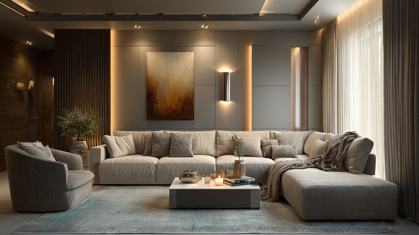
The right warm gray is like a gentle hug for your visual system.
This color provides emotional stability without overwhelming your senses. Psychologists refer to it as the “neutral mediator” because it doesn’t demand attention, yet still feels intentional.
Top Paint Picks:
- Benjamin Moore Revere Pewter (HC-172): The gold standard of warm grays
- Sherwin-Williams Agreeable Gray (SW 7029):Lives up to its friendly name
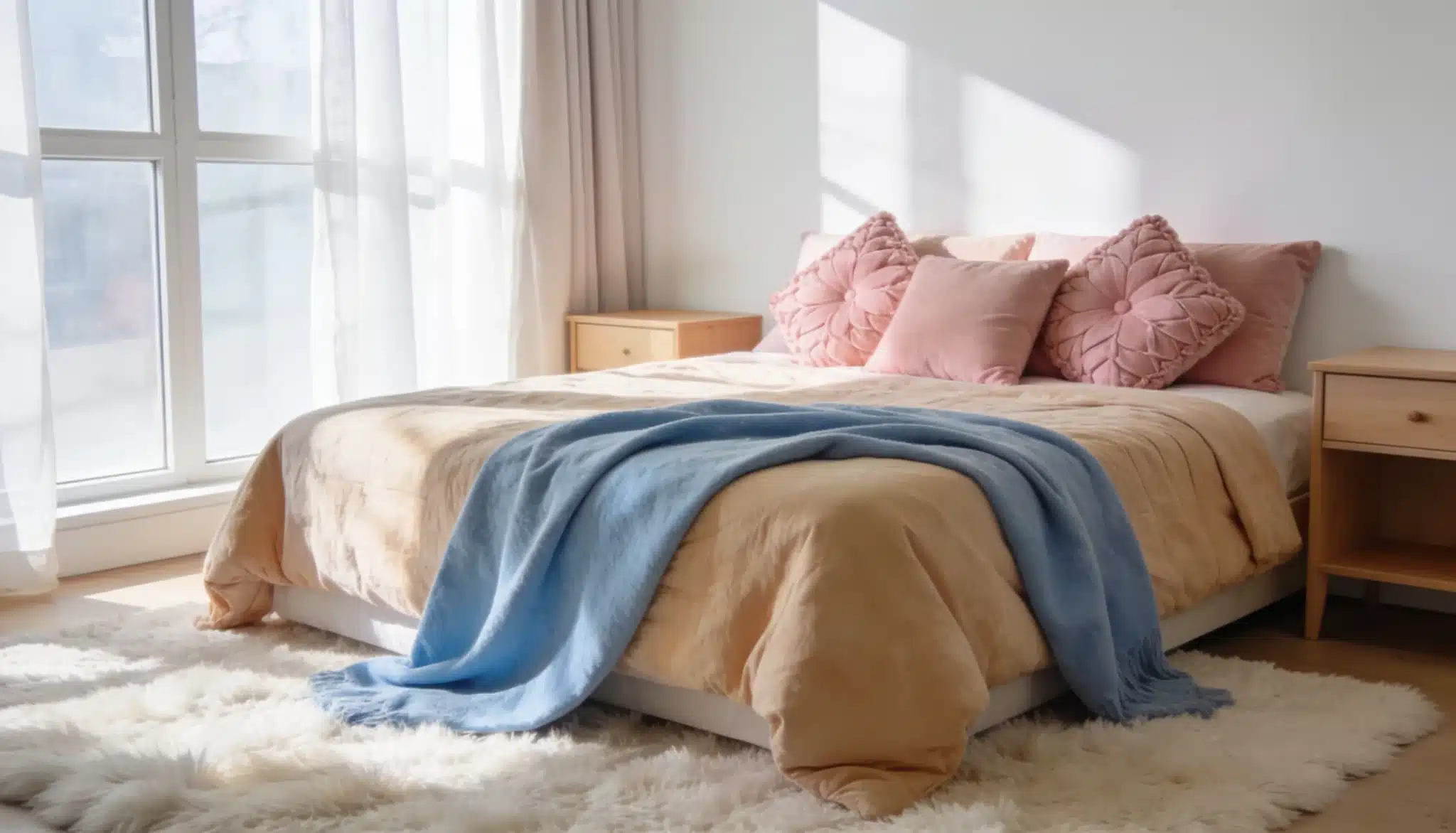
- Farrow & Ball Elephant’s Breath (No. 229): Gray with purple undertones
Lavender: The Sleep Whisperer
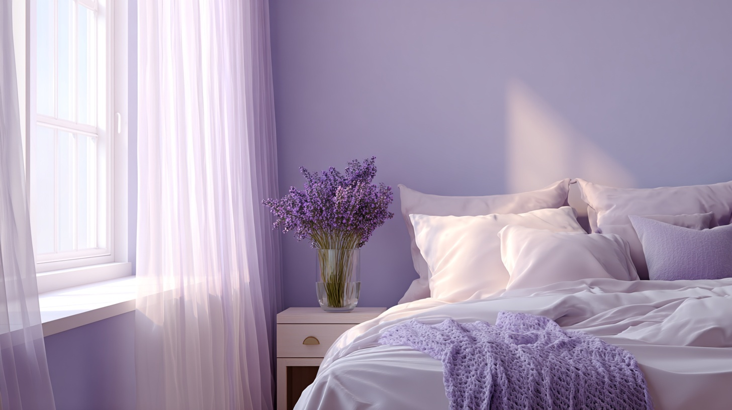
There’s a reason lavender essential oil is in every spa and sleep product. Light lavender walls can improve sleep quality by up to 23% according to recent studies.
This soft purple creates a cocoon-like feeling that tells your nervous system it’s time to wind down and let go of the day’s stress.
Top Paint Picks:
- Benjamin Moore Lavender Ice (2069-60): Barely-there purple perfection
- Sherwin-Williams Potentially Purple (SW 6821): Soft lavender with gray balance
- Clare Cosmic Vibes: Modern take on classic lavender dreams
Cream: The Cozy Comforter
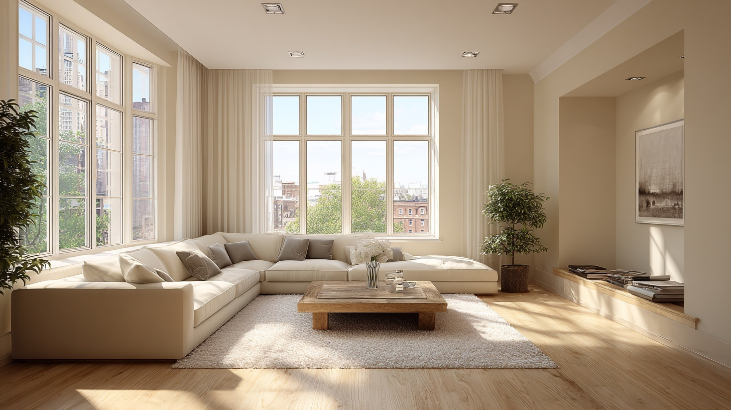
While pure white can feel sterile and cold, cream wraps you in comfort like your favorite worn-in sweater.
This shade reflects light beautifully while maintaining a cozy, lived-in feel. Interior designers love it because it makes spaces feel larger without the harsh brightness that can cause eye strain.
Top Paint Picks:
- Benjamin Moore Cloud White (OC-130):Creamy without being yellow
- Sherwin-Williams Creamy (SW 7012): Warm and welcoming neutral
- Farrow & Ball Pointing (No. 2003): Rich cream with depth and character
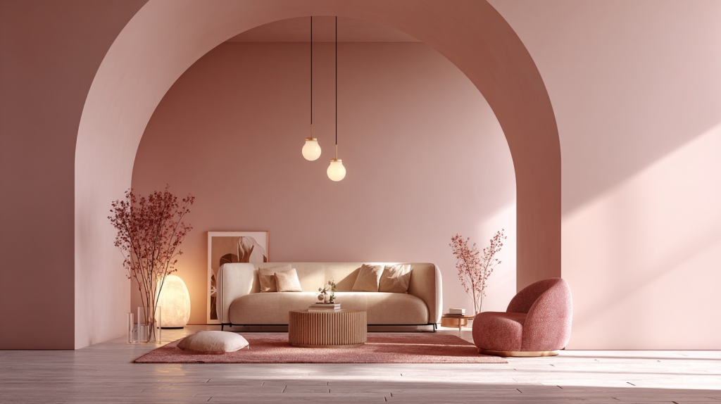
Dusty Pink: The Gentle Giant
Research shows that dusty pink can reduce aggressive behavior within minutes of exposure, which is why some detention centers use it!
But in your home, dusty pink creates a nurturing, womb-like environment that feels safe and protective.
Top Paint Picks:
- Benjamin Moore First Light (2102-70): Subtle pink with gray undertones
- Sherwin-Williams Rose Quartz (SW 0034): Soft blush that feels grown-up
- Clare Subrosa: Modern dusty rose for the design-conscious
Colors to Avoid When Seeking Calm
Now for the troublemakers. These colors might look pretty on Instagram, but they’re basically energy drinks for your eyeballs.
If you want peace and quiet, these shades need to sit this one out.
- Bright Red: This color literally raises your blood pressure. Your brain thinks “emergency!” every time it sees fire-engine red.
- Electric Orange: Orange screams, “Pay attention to me!” which is the opposite of calm. It’s like having a toddler tugging at your sleeve all day.
- Neon Yellow: Studies link bright yellow to increased anxiety and even arguments. It also overstimulates your nervous system
- Hot Pink: While dusty pink soothes, hot pink agitates. It’s too intense for spaces where you want to unwind.
- Pure Black: Black absorbs light and energy, making spaces feel heavy and oppressive.
Conclusion
Who knew picking paint could be so scientific?
The best part is that you don’t need a complete makeover to feel the benefits. Start small with some sage green throw pillows or a powder blue accent wall.
Remember that the most calming color is the one that makes you smile when you walk into the room.