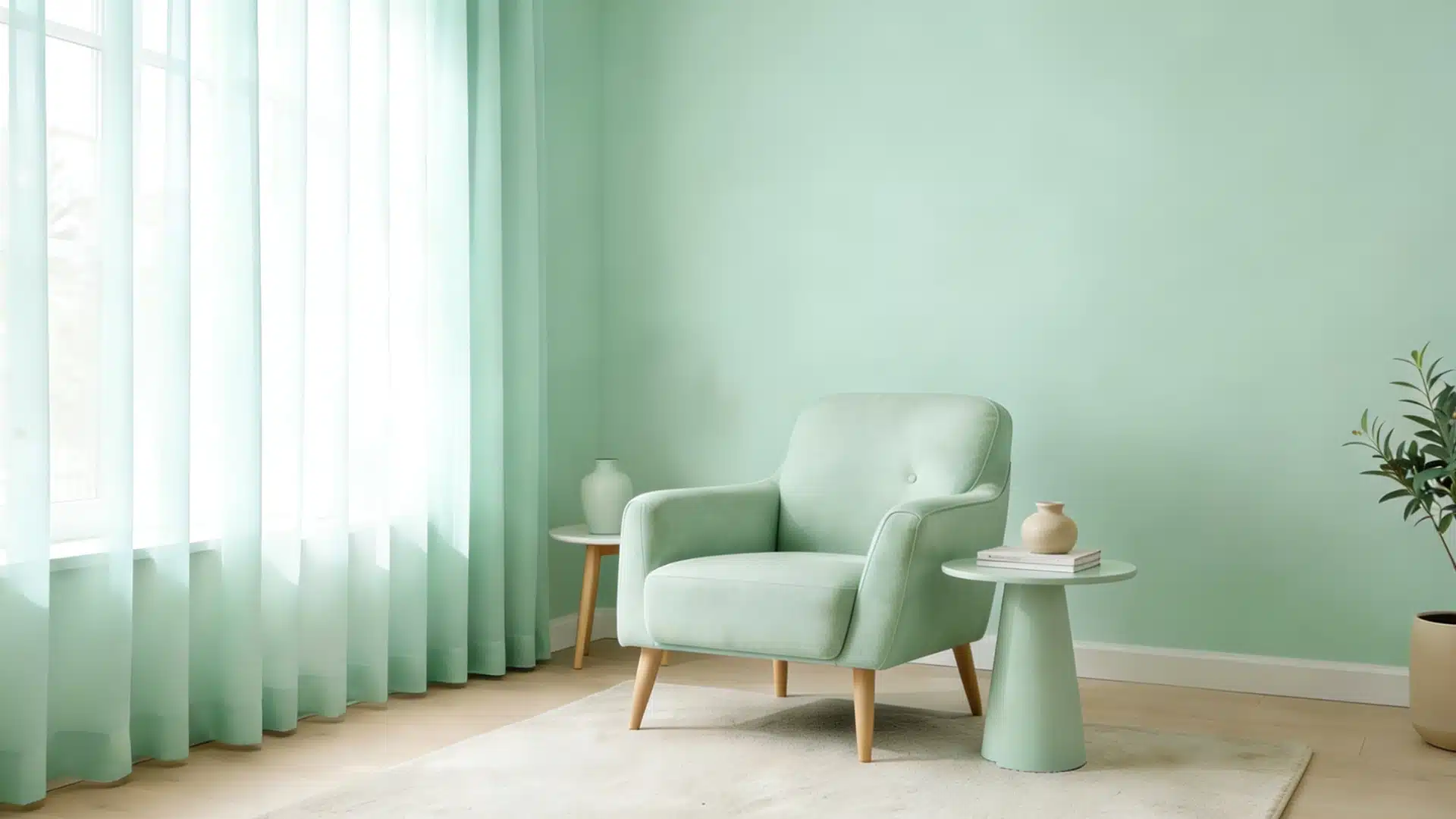
Choosing colors for a room is tricky. Too much color feels messy. Too little looks boring.
Triadic color schemes fix this.
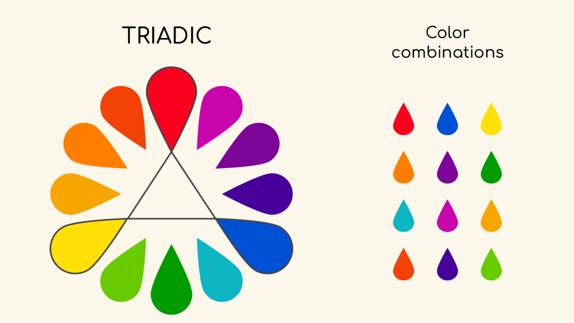
A triadic palette uses three colors spaced evenly around the color wheel. Think red, yellow, and blue. This simple method creates bold, balanced looks every time.
This blog shows you what are triadic colors and how triadic schemes work.
You’ll learn easy rules, see real examples, and turn any room from plain to eye-catching.
About Triadic Color Scheme
A triadic color scheme uses three colors spaced evenly around the color wheel.
Picture a triangle on the wheel, the three points are your colors. Red, yellow, and blue form the most common triadic set. Orange, green, and purple create another. Any three colors positioned 120 degrees apart will work.
The equal spacing creates natural balance. Each color stands out, but they’re connected by their position on the wheel.
This gives you bold combinations that look harmonious.
Pick one color as your main shade. Use the other two as accents. This prevents the scheme from feeling chaotic.
Triadic schemes deliver vibrant, energetic results. The three colors won’t clash because of their geometric relationship. You get a strong contrast without conflict.
Designers love triadic palettes for their variety and simplicity. They create lively spaces that feel balanced and intentional, not random.
Triadic Color Examples and Combinations
Here are practical examples showing how different triadic schemes work in real spaces.
Primary Triadic: Red, Yellow, Blue
This classic combination forms the foundation of color theory. It’s bold and energetic, perfect for playful spaces like kids’ rooms or creative studios.
Use navy blue as your dominant shade, mustard yellow for furniture, and red as small pops in pillows or artwork.
Secondary Triadic: Orange, Green, Purple
This set feels more sophisticated than the primaries. Think burnt orange walls, sage green upholstery, and plum accents in throws or vases.
It works beautifully in living rooms and dining areas where you want warmth with depth.
Tertiary Triadic: Red-Orange, Yellow-Green, Blue-Violet
These muted versions create refined, complex palettes.
Try terracotta (red-orange) as your base, chartreuse (yellow-green) in plants or textiles, and lavender (blue-violet) in decorative pieces. This combination suits bedrooms and reading nooks.
Warm Triadic: Red-Orange, Yellow-Orange, Yellow
Stay on the warm side of the wheel for cozy, inviting spaces. Coral, apricot, and golden yellow create sunny kitchens and breakfast nooks.
This palette feels cheerful without being overwhelming.
Cool Triadic: Blue-Green, Blue-Violet, Green
Cool tones bring calm and serenity. Teal, periwinkle, and mint green work perfectly in bathrooms and bedrooms.
Use teal as your 60%, periwinkle at 30%, and mint as 10% accents.
Pastel Triadic: Soft Pink, Light Yellow, Pale Blue
Soften any triadic scheme by choosing lighter tints.
Baby pink, butter yellow, and sky blue create gentle nurseries or cottage-style spaces. These combinations feel fresh and airy.
Bold Triadic: Magenta, Lime Green, Cyan
For maximum impact, choose saturated versions. Hot pink, bright lime, and electric blue create modern, energetic spaces.
Use this in home offices or creative studios where you want stimulation.
Each combination follows the same principle: three colors, equal spacing, and geometric harmony. Pick your intensity level and apply the 60-30-10 rule for balance.
Color Psychology in Triadic Schemes
Triadic schemes use three contrasting hues that bring energy, balance, and visual interest to a space.
Each color carries its own emotional weight, creating a dynamic yet harmonious atmosphere.
A red, yellow, and blue triad feels playful and bold, perfect for living rooms or studios. Orange, green, and purple evoke warmth and vitality, ideal for eclectic interiors.
Choose one hue to set the mood, then let the others support it.
- Warm colors (reds, oranges, yellows) boost energy and optimism
- Cool colors (blues, greens, purples) promote calm and relaxation
- Muted triads create sophistication
- Saturated triads spark excitement
Understanding how each color influences emotion helps you craft rooms that look balanced and feel right for their purpose.
How to Use a Triadic Color Scheme in Room Design
Learn simple steps to apply a triadic color scheme room design, using three balanced colors to create a vibrant and harmonious space.
1. Start with the 60-30-10 Rule
Choose your dominant color for 60% of the room, typically walls or large furniture. Pick a secondary color for 30%, sofas, curtains, or rugs.
Use your accent color for the remaining 10%, pillows, artwork, or decorative pieces.
2. Select Your Dominant Color Wisely
Your main color sets the room’s mood. Want a calm bedroom? Make blue your 60%.
Need an energetic kitchen? Go with yellow as dominant. The other two colors add interest without overwhelming the space.
3. Apply Colors by Surface Area
- Walls: Use your dominant color here for maximum impact
- Furniture: Split between dominant and secondary colors
- Textiles: Great place for your secondary color, curtains, rugs, upholstery
- Accents: Save your third color for small items, throw pillows, vases, artwork, lampshades
4. Balance Warm and Cool Tones
If two of your triadic colors are warm, use the cool one as your dominant shade to prevent overstimulation. If two are cool, a warm dominant color adds energy and coziness.
5. Vary Your Intensities
Don’t use all three colors at full saturation. Choose one saturated shade for impact, one medium tone for support, and one muted version for balance. This creates depth and prevents the room from feeling cartoonish.
6. Test Before Committing
Paint sample boards and move them around the room at different times of day. Natural light changes how colors appear. What looks perfect at noon might feel different at sunset.
7. Layer Gradually
Start with your dominant color on the walls. Add secondary color through major furniture pieces. Finish with accent color in easily changeable items. This approach lets you adjust without major renovations.
8. Consider Adjacent Rooms
If your living room uses red, yellow, and blue, choose one of those colors to repeat in the hallway or dining room. This creates flow throughout your home.
9. Use Neutrals as Buffers
White, gray, or beige between your triadic colors gives the eye a place to rest. Paint trim white or add a neutral rug to break up bold combinations.
Triadic vs. Other Color Schemes
| Color Scheme | Number of Colors | Color Wheel Position | Visual Effect | Best For |
|---|---|---|---|---|
| Triadic | 3 colors | Evenly spaced (120° apart) | Bold, vibrant, balanced | Dynamic spaces, playrooms, creative studios |
| Monochromatic | 1 color (multiple shades) | Single position | Calm, cohesive, subtle | Minimalist rooms, bedrooms, spa-like bathrooms |
| Complementary | 2 colors | Opposite sides (180° apart) | High contrast, dramatic | Accent walls, focal points, modern spaces |
| Analogous | 3-5 colors | Adjacent positions | Harmonious, serene, flowing | Traditional rooms, nature-inspired spaces |
| Split-Complementary | 3 colors | One base + two adjacent to its complement | Balanced contrast, softer than complementary | Versatile for most rooms, living spaces |
| Tetradic (Double Complementary) | 4 colors | Two complementary pairs | Rich, complex, busy | Large spaces, eclectic designs, maximalist styles |
The Bottom Line
Triadic color schemes make design simple. Three evenly spaced colors create balanced, vibrant rooms every time.
Adjust intensity for mood, bright for energy, muted for sophistication, and pastels for calm.
Grab a color wheel, pick your three colors, and transform your space.