Here’s something that might surprise you: people who sleep in blue bedrooms get an average of 7 hours and 52 minutes of sleep each night, while those with purple bedrooms manage just 5 hours and 56 minutes.
That’s nearly two hours more sleep, simply from choosing the right colour! This remarkable difference shows that what colour helps you sleep isn’t just about personal taste—there’s real science behind it.
The colours you choose for your bedroom can dramatically impact your rest quality and overall wellbeing. Research shows there’s a significant link between a calm mood and preference for blue, with studies finding that blue is strongly associated with feelings of being “relaxed,” “safe,” “satisfied,” and “secure”.
On the flip side, viewing the colour red may promote aggression and increase your blood pressure and pulse rate.
Your bedroom should be your own personal sanctuary. A space where you can escape from the outside world and truly recharge. The colours you choose for this important room can make a remarkable difference to both your sleep quality and your mood when you wake up.
Some colours have wonderfully calming effects, whilst others can be energising or even disruptive to your sleep patterns.
Ready to discover which colours will help you sleep better? This guide explores the science behind how different colours affect your sleep, which bedroom colours promote rest, and practical ways to bring sleep-friendly hues into your personal space.
How colour affects your sleep
The connection between colour and sleep quality runs much deeper than simple aesthetic preference. Colours create powerful psychological reactions that directly impact how quickly you fall asleep and how restfully you sleep throughout the night.
The basics of colour psychology
Colours convey important information about our surroundings and trigger emotional responses that guide our actions. These responses are both instinctual and learned through cultural norms. Research has consistently shown that different hues activate specific neurons in our brains, creating distinct associations.
Blue tends to evoke feelings of harmony, openness and trustworthiness, with scientific studies confirming its calming effect on the brain. No wonder blue is the favourite colour of approximately 40% of people according to polls. Green connects us with nature and rebirth, whilst red often triggers associations with fear, anger and excitement.
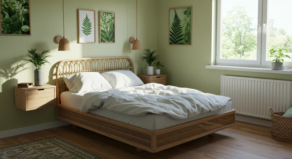
Image credit Bedstar: Small bedroom decor, nature inspired green, white linen bedding, nature inspired artwork, rattan wooden bed, floating wooden bedside cabinets.
How emotions influence sleep quality
Your emotional state before bedtime significantly affects your sleep quality. Studies show that poor mood can negatively impact how well you rest. Feel tense or overly focused before bed? Falling asleep becomes much more difficult.
The colour of your bedroom plays a key role in this process by influencing your pre-sleep emotions. Psychologists have found that energy levels and mood are both affected by the colours surrounding us. Colours with long wavelengths, such as red and yellow, tend to be more stimulating, potentially disrupting your ability to wind down when you need it most.
Why your bedroom environment matters
Your bedroom environment fundamentally shapes your sleep experience. Recent research published in Sleep Health found that sleep efficiency is directly related to environmental factors including air quality, temperature levels, and noise.
Colour remains a crucial element of this environment. Scientists have discovered that specialised ganglion cells in our eyes are particularly sensitive to short-wavelength light (around 490 nanometres), signalling to our internal clock that it’s daytime. This means the colour of light in your bedroom can actually reset your circadian rhythms.
Creating an ideal sleep sanctuary requires balancing colour psychology with personal preference. The most relaxing colours differ for each person since we all have unique colour associations, though generally, softer and more muted hues promote feelings of calm and safety.
Best bedroom colours for sleep
Choosing the right bedroom colour can be the key to better sleep quality. Research has identified several hues that promote relaxation and help create the perfect sleep environment.
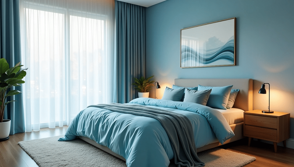
Blue: calm and restful
Blue reigns supreme as the champion of sleep-inducing colours. A 2013 Travelodge study revealed that people with blue bedrooms enjoyed an impressive 7 hours and 52 minutes of sleep on average. Even more remarkable, 55% of those with blue bedrooms reported waking up happy.
The science behind blue’s effectiveness lies in specialised ganglion cells in our retinas. These cells are particularly sensitive to blue, relaying signals to our brains that trigger a calming response, reducing blood pressure and slowing heart rate. For optimal results, select shades with grey or icy undertones that evoke peaceful oceanic scenes.
Embrace shades of soft green
Green connects us to nature, bringing feelings of renewal, harmony and tranquillity. Colour theorists associate green with fertility and balance, making it an excellent choice for creating a restorative sleep environment. Surrounding yourself with green can lower rates of anxiety and depression—essential factors for quality sleep.
When selecting green for your bedroom, opt for muted shades like forest or sage with earthy undertones rather than stimulating lime or chartreuse varieties.
White and off-white: clean and peaceful
White creates an uncluttered, peaceful sleeping space that allows your mind to breathe. Technically not a colour but a combination of all colours across the visible light spectrum, white may help with sleep because it stimulates the brain less than colourful rooms.
People often associate white with positive words such as ‘peace,’ ‘secure,’ ‘safe,’ and ‘relaxed,’ creating the perfect psychological foundation for rest.
Set the scene with soft neutrals
Beige brings gentle warmth to your bedroom, creating an atmosphere that feels safe and comforting. Its soft, neutral tone evokes sandy shores and sunlit fields—elements known for their calming influence. Taupe and cream offer similar benefits, wrapping your space in understated elegance.
Pastel pink: gentle and romantic
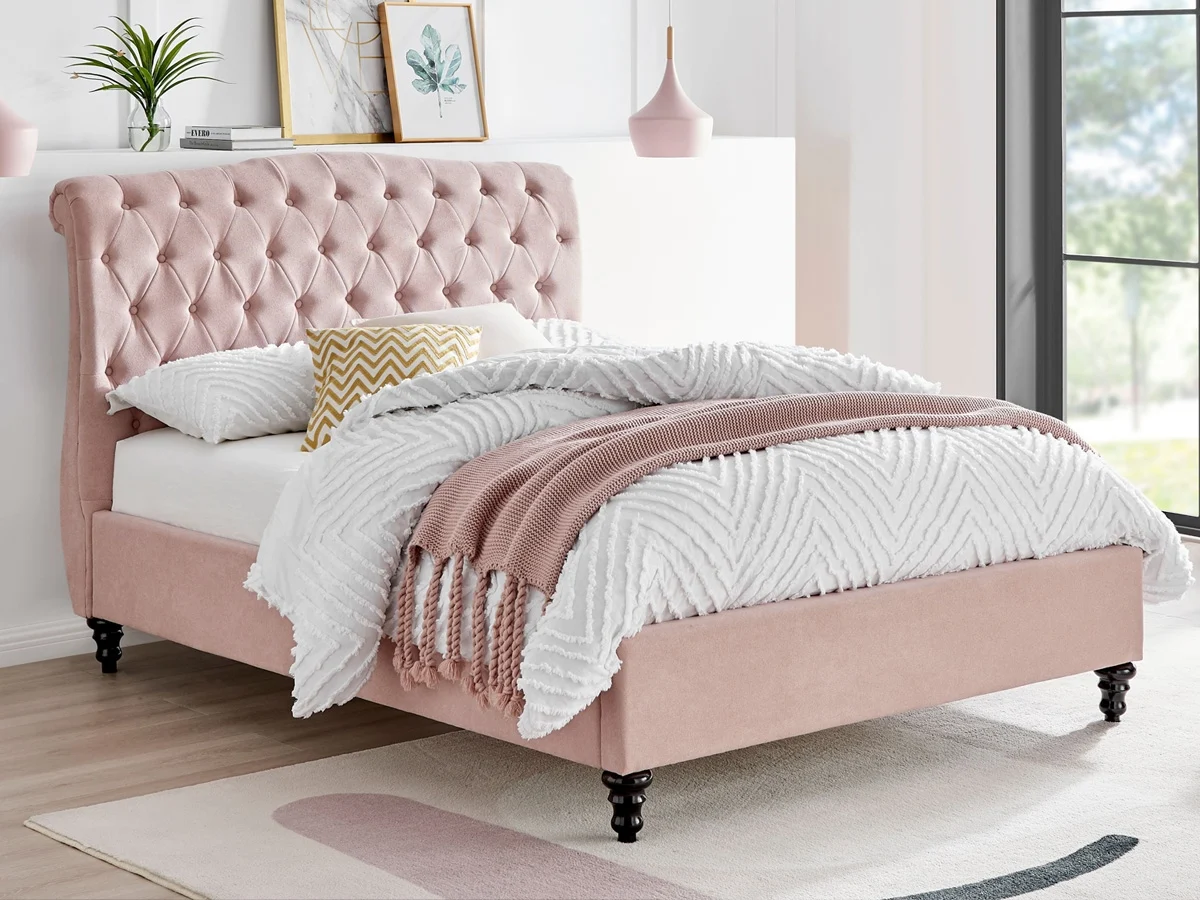
Image credit Bedstar: Rosa 4FT 6 Double Fabric Bed Frame – Blush. Priced £349
Soft pink offers surprising effectiveness for sleep, especially in muted forms. Modern dusky and pastel pinks now create restful adult bedrooms, evoking feelings of comfort, warmth, and tenderness. Don’t dismiss pink as purely feminine—the right shade can work beautifully in any bedroom.
Colours that may disrupt your sleep
Now, what about the colours that could be sabotaging your sleep? Some hues can actively work against your rest, so understanding which colours to steer clear of is just as important when designing your ideal sleep sanctuary.
Red: far too stimulating for rest
Red might just be the worst possible choice for your bedroom walls. This vibrant hue carries the longest wavelength of any colour on the visible light spectrum, triggering alertness rather than relaxation. Exposure to red can increase your blood pressure, raise your pulse rate, and even promote feelings of aggression. Research shows it activates your brain—exactly what you don’t want when you’re trying to wind down.
Black: emotionally heavy and intense
You might think black would help with sleep since it creates darkness, but black walls often trigger negative emotional responses. People strongly associate black with depression, sadness, anger and fear. Black also absorbs all wavelengths of visible light, making spaces feel smaller and more enclosed. This confined effect can trigger feelings of anxiety—hardly what you want in your sleep sanctuary.
Bright orange and yellow: overly energising
Much like red, bright orange and yellow bring similar sleep-disrupting effects. These colours stimulate mental activity and keep you alert, potentially triggering feelings of restlessness when you should be winding down. Their warm tones prove far too overstimulating for bedroom use.
Dark brown: feels oppressive
Dark brown creates a gloomy, heavy atmosphere that works against quality sleep. Studies note it can increase subconscious feelings of sadness and cause restlessness instead of peaceful sleep. This shade feels oppressive, especially in smaller spaces, hindering the creation of a sleep environment that feels airy.
Purple: linked to mental stimulation
Remember that statistic about purple bedrooms getting just 5 hours and 56 minutes of sleep on average? Bright purple is particularly problematic for sleep because these hues have reddish undertones that increase energy levels and keep you alert. Purple is associated with creativity and imagination, which might stimulate brain activity when you’re trying to quiet your mind.
How to use sleep-friendly colours in your bedroom
Ready to put this colour science into practice? Creating a sleep sanctuary goes beyond simply choosing the right wall colour. You’ll need to think about bedding, décor, and lighting choices that work together harmoniously.
Choosing the right wall paint
Start with muted, cooler tones like soft blues or greens as your primary wall colours. These hues naturally lower heart rate and blood pressure, creating the perfect foundation for rest . Feeling overwhelmed by the thought of repainting your entire bedroom? Consider a feature wall behind your bed in a calming shade instead.
Colour drenching—painting walls, ceiling and trim in the same colour—creates a cocooning effect that many find deeply relaxing . This technique works particularly well with soft, restful shades.
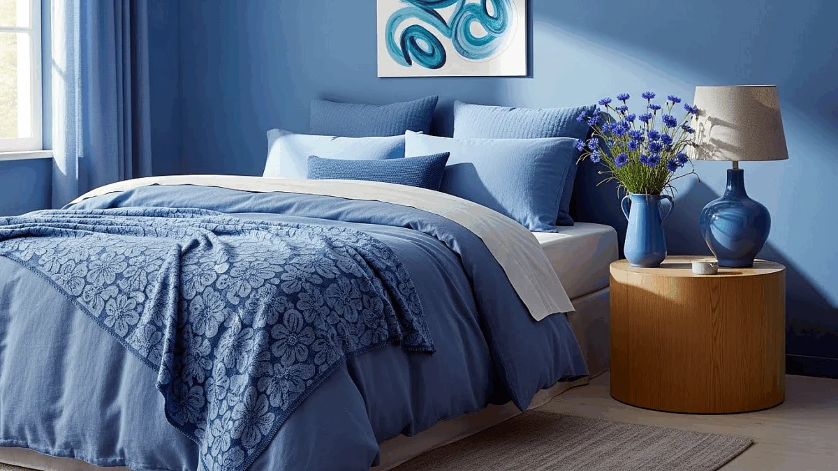
Image credit Bedstar: Colour drenching cornflower, bedroom décor.
Bedding and soft furnishings
Your bed serves as the centrepiece of your sleep sanctuary. Opt for high-thread-count cotton or breathable linen in calming colours to enhance comfort . Layer textures thoughtfully with throws or cushions in slightly darker or lighter shades of your chosen palette .
Why not try a pale blue duvet paired with dove-grey cushions and a sage green throw? This creates a tranquil, sophisticated look that supports quality sleep whilst adding visual interest.
Accent colours and décor tips
Keep your bedroom clutter-free and organised, as disarray can subtly increase stress levels . Add relaxing elements like artwork in soothing colours or indoor plants to purify air and bring natural touches into your space .
Takeaway Tip: Choose accent pieces that complement your main colour scheme rather than compete with it. Minimalism works particularly well in sleep spaces.
Lighting and its colour temperature
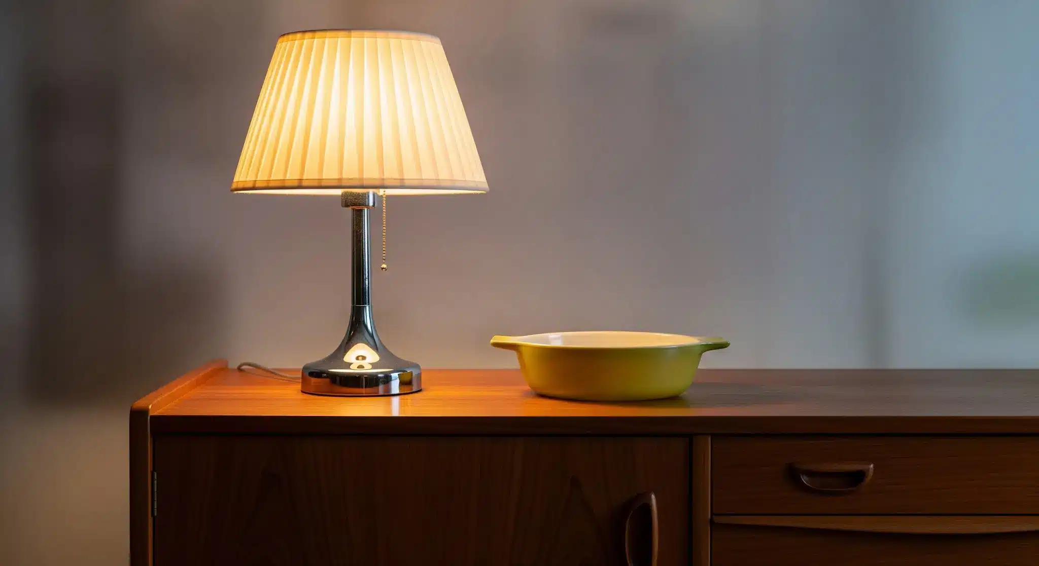
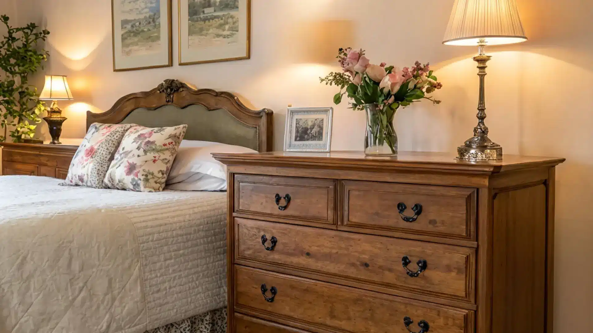
Warm light tones (2000K-3000K) promote melatonin production, making them ideal for bedroom lighting . Cool blue light, on the other hand, suppresses this sleep hormone and disrupts your circadian rhythm . Install dimmer switches or use lamps with adjustable settings to control light intensity as bedtime approaches .
For enhanced sleep, consider amber or red-tinted bulbs in bedside lamps for evening use .
Combining colours for balance
Balance is key when working with multiple colours. If you’re incorporating darker tones like navy or forest green, use them sparingly—perhaps on a single wall or through furnishings . Lighter blues work beautifully for larger areas like walls and flooring, whilst more vibrant hues can add personality through artwork or soft furnishings .
The most relaxing bedroom embraces your personal preferences whilst respecting colour psychology principles. Don’t forget, you can always test your chosen colours with samples before committing to the full room.
Conclusion
Your bedroom colour choice goes far beyond simply looking good. The colours surrounding you actively influence your sleep quality, affecting everything from how quickly you drift off to how refreshed you feel when you wake up. The science confirms what sleep experts have suspected for years—certain colours genuinely promote better rest through their psychological effects on your brain.
Blue stands out as the undisputed champion for sleep, followed closely by gentle greens, whites, and soft neutrals. These colours work with your body’s natural systems rather than against them, helping to lower blood pressure, reduce heart rate, and create the perfect conditions for rest.
Meanwhile, vibrant hues like red, bright orange, and purple actively disrupt sleep patterns by stimulating your brain when it should be winding down.
Why not consider your bedroom colour scheme an essential part of your sleep routine? Whether you choose to transform your entire space or simply add sleep-friendly elements through bedding and accessories, these changes can significantly impact your rest quality.
After all, a well-designed sleep sanctuary addresses all environmental factors—from temperature and noise to lighting and colour—creating optimal conditions for restorative sleep.
Better sleep might be as simple as a fresh coat of paint or new bedding in the right shade. By applying these science-backed principles to your bedroom design, you’re taking a meaningful step towards improving not just your nights but also your days.
Sweet dreams await—all thanks to choosing the perfect palette for rest.
Key Takeaways
Understanding the science behind bedroom colours can dramatically improve your sleep quality and overall wellbeing.
• Blue bedrooms deliver the best sleep results, with users averaging 7 hours 52 minutes nightly compared to just 5 hours 56 minutes in purple rooms.
• Cool, muted tones like soft blues, greens, and neutrals naturally lower heart rate and blood pressure, creating optimal conditions for rest.
• Avoid stimulating colours like red, bright orange, and purple in bedrooms as they increase alertness and can disrupt your natural sleep patterns.
• Warm lighting (2000K-3000K) promotes melatonin production, whilst cool blue light suppresses this crucial sleep hormone and disrupts circadian rhythms.
• Your bedroom colour scheme functions as essential sleep hygiene—combining the right wall colours, bedding, and lighting creates a restorative sanctuary.
The most effective sleep environment balances colour psychology with personal preference, prioritising calming hues that signal to your brain it’s time to rest and recharge.