Colour does a lot more in our homes than we often realise. It is not only about how a room looks but how it feels to live in every single day. The colours around us can shape our mood, our energy, and even how we behave, without us really noticing. A bedroom that helps you sleep better, a kitchen that feels warm and welcoming, a living room that makes people want to stay and talk. Much of that feeling starts with colour.
This guide has been shaped by practical insight from Wood Veneer Hub wall panelling specialists with real experience of how colour, texture and surface finishes influence the mood of a space.
As awareness around wellbeing and mental health has grown, the way we think about interior design has changed, too. Our homes are no longer just places we come back to at the end of the day. They are places where we work, relax, socialise and reset. Interior colour design plays a quiet but important role in making those spaces feel comfortable, supportive and easy to be in.
Rather than being a final decorative choice, colour often sets the emotional tone of a room from the very beginning. When it is chosen with care, it can help create spaces that feel calmer warmer, and more in tune with the people who live there.
How Colour Affects the Mind
Colour psychology looks at how different colours influence how we feel and behave. We react to colour almost instantly, often before we have time to think about it. That is why some rooms feel calm the moment you walk in, while others feel lively or energising straight away.
At home, colour becomes part of the background of everyday life. Soft muted shades often feel safe and comforting. Brighter colours can lift the mood, bring personality or encourage conversation. These reactions are not accidental. They are shaped by how our brains work, along with personal memories and experiences.
People tend to choose calmer colours for spaces meant for rest and focus, while warmer or bolder tones feel right in rooms where people gather and spend time together. We may not always think about these choices consciously, but instinctively we often design spaces around how we want to feel in them.
Warm and Cool Tones and How They Feel
A simple way to think about colour in the home is by looking at warm and cool tones.
Warm colours like reds oranges and soft yellows usually feel inviting and full of energy. They can make large rooms feel cosier and more welcoming. When used carefully they work well in living rooms dining spaces and other areas where people come together to relax and talk.
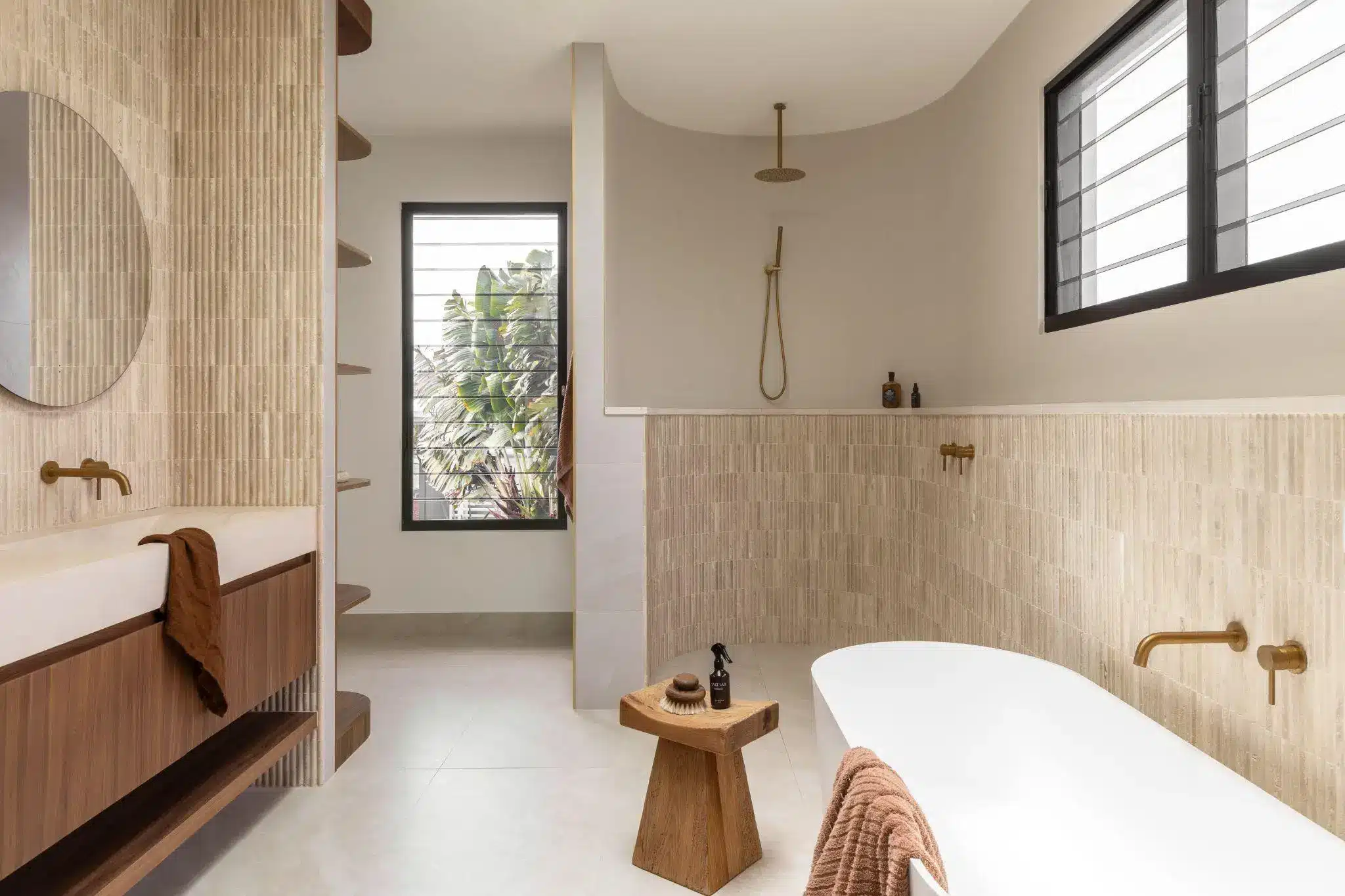
Cool colours such as blues greens and soft purples tend to have a calming effect. They are often linked with balance rest and clarity which is why they are so popular in bedrooms bathrooms and home offices. Their connection to nature like water plants and sky helps explain why they feel so soothing in everyday spaces.
There is no right or wrong choice. What matters most is how the colour suits the room and the people using it.
Colour and Mental Wellbeing at Home
As our homes have taken on more roles colour has become an important part of making them feel supportive and easy to live in. The right colour palette can help reduce visual clutter ease stress and make a space feel more balanced especially when one room needs to do several jobs.
Calmer colours are often used to create a sense of escape in busy homes. Gentle blues greens and warm neutrals can help the mind slow down and relax. Brighter colours when used in small amounts can bring energy and positivity to spaces that might otherwise feel dull.
Colour can also affect how well we focus. In home offices or study areas softer cool shades tend to work well. They feel steady and calm without being distracting. Adding colour through smaller features such as shelving a wall panel or soft furnishings can make a difference without overwhelming the room.
Choosing Colour Based on How Each Room Is Used
Every room in the house has a different purpose and colour can help support that in a natural way.
Bedrooms benefit from colours that feel gentle and calming. Soft blues warm greys and earthy tones help create a space that feels restful. The aim here is comfort not making a bold statement.
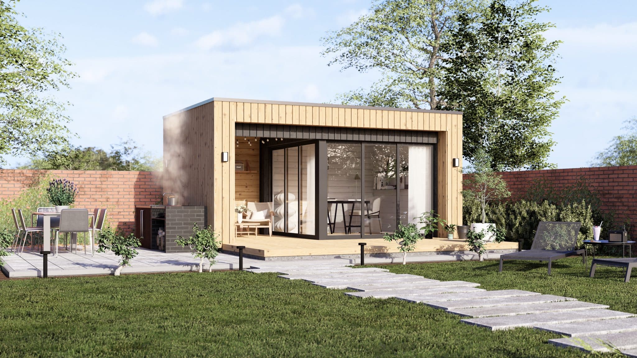
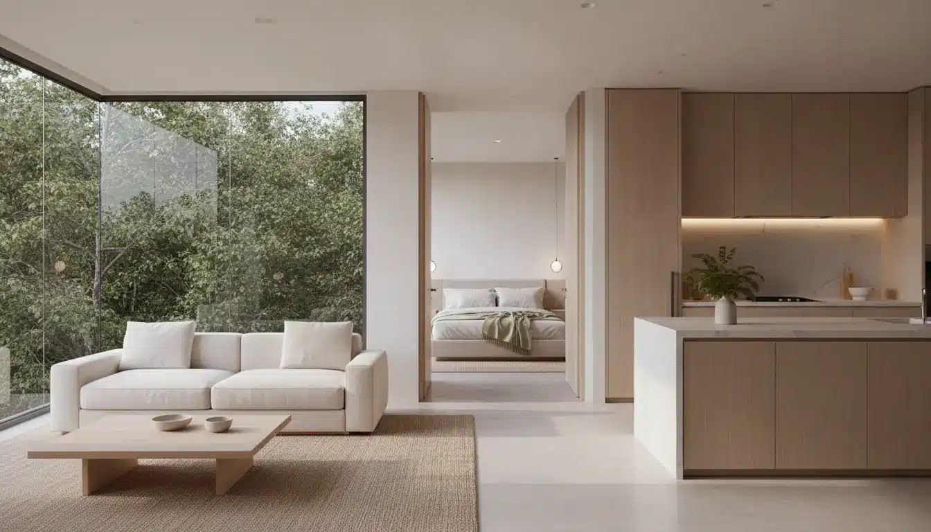
Living rooms are often the heart of the home. This is where warmth really matters. Soft warm tones and rich neutrals can help the space feel relaxed and sociable while texture and accents add interest.
Kitchens and dining areas can handle a little more energy. Subtle warm colours can make these rooms feel lively and welcoming. Even small touches of colour through tiles cabinetry or accessories can change the mood of the space.
Home offices work best when colour supports focus without drawing too much attention. Calm neutral shades with cool undertones often feel practical and comfortable at the same time.
These are not strict rules. They are simply helpful starting points. Personal preference will always matter most.
How Light and Space Change Colour
Colour never exists on its own. Light room size and surface finish all affect how it looks and feels. A colour that feels warm and inviting in a bright room can feel heavy or dull in a darker space.
Natural light changes throughout the day which means colours can look different in the morning compared to the evening. Artificial lighting also plays a part. Warmer lights tend to bring out cosy tones while cooler lights can make colours feel sharper and cleaner.
The size of a room matters too. Darker colours can make large spaces feel more intimate while lighter colours help small rooms feel more open. This is why testing colours in the room itself is so important. Seeing how they react to light and shadow often reveals their true character.
Colour Is Personal
While colour psychology is useful our response to colour is very personal. Culture memories and life experiences all shape how we feel about certain shades. A colour that feels calming to one person might feel boring or uncomfortable to someone else.
This is where good interior design becomes more human. The best colour choices are not about copying trends but about understanding who a space is for and how they want to feel when they are in it.
Listening to your own response to colour often leads to spaces that feel more natural and satisfying over time.
Colour Trends and Wellbeing
Recent colour trends reflect a growing focus on comfort and emotional wellbeing at home. Some people are drawn to bold joyful colours that lift the mood and add character. Others prefer softer nature inspired shades that feel calm and grounding.
What links these approaches is intention. Colour is being chosen less for show and more for how it supports daily life. Wellbeing is no longer an extra in interior design. It has become part of the conversation.
Designing with Colour in A Thoughtful Way
You do not need to make big changes to use colour well. Often, small choices have the biggest impact.
Start by thinking about how you want a room to feel rather than how it should look. Test colours properly and spend time with them. Balance stronger shades with calmer ones so the space does not feel overwhelming. Most importantly, trust how the colour makes you feel. If it feels right, it usually is.
Using elements like a wall panel is a simple way to introduce colour and texture in a controlled and flexible way.
A Quiet Influence on Everyday Life
Interior colour design shapes how we experience our homes, often without us realising it. When chosen carefully, colour can support wellbeing, bring people together and make spaces feel more comfortable and human.
Instead of chasing trends, thoughtful use of colour encourages us to pay attention to how our homes make us feel. In doing so, colour becomes more than decoration. It becomes part of living well.