There is a specific kind of frustration that handmade sellers know well. You pour real skill into every product, wrap it beautifully, and still watch customers scroll right past it online or walk by at a craft fair without a second glance. The product is not the problem. The visual identity around it might be.
Your label and logo are doing a quiet job every single day, and most makers underestimate how much weight those two things carry. When a shopper picks up a jar of hand-poured candles or clicks on a listing for hand-stitched goods, their brain makes a snap judgment in under six seconds. A dated font or a logo that reads blurry at small sizes can undercut everything behind it before anyone reads a word.
A few targeted changes, guided by exceptional creative solutions, can shift how buyers perceive your work.
Packaging Shapes the Purchase Decision Before Your Product Gets a Chance
72% of consumers say packaging design has a huge role in their purchasing decisions. For handmade businesses, that number matters even more because your labeling is not just a protective layer. It is the first physical expression of your brand that a customer touches.
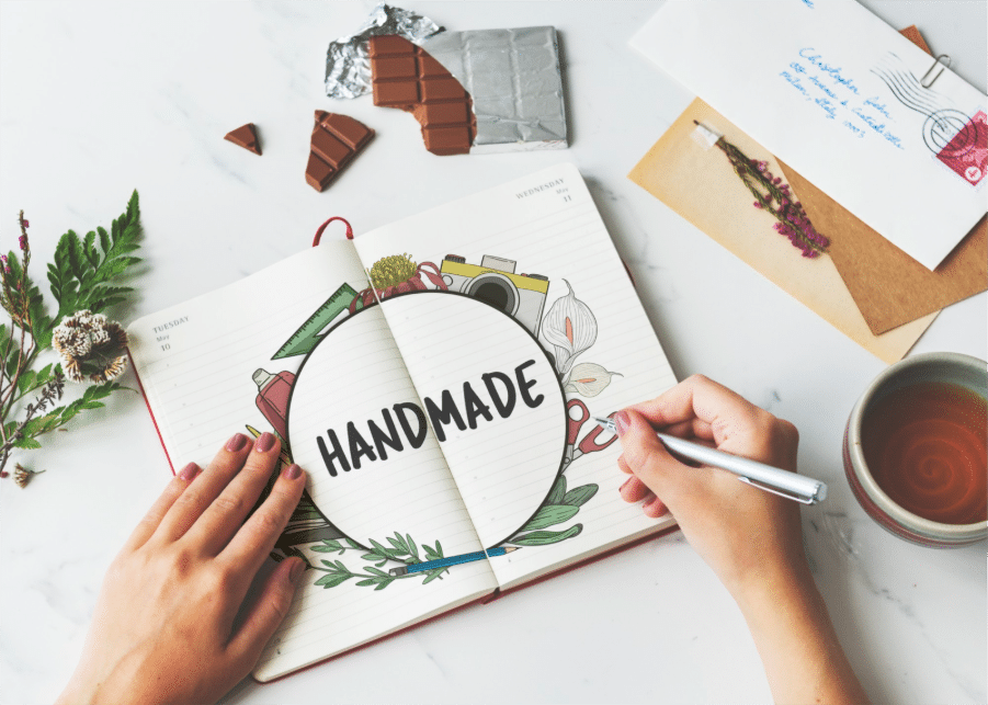
The handmade market has an advantage that mass-produced brands cannot replicate: authenticity. But it only lands when the visual design around your product actually communicates it.
Start With Your Logo at the Smallest Size It Will Ever Appear
One of the most common mistakes handmade sellers make is designing a logo that looks fine on a laptop screen but falls apart on a 1.5-inch round sticker. If your logo has thin lines, script text smaller than 12pt, or more than three colors, it will lose detail at small print sizes, and those sizes are often where customers first encounter it.
Scale your logo down to sticker size and see what survives. If any text becomes unreadable or the image turns muddy, those are the exact elements to simplify.
Bold, single-weight fonts hold up far better in small formats than elegant scripts, and that one swap can lift how professional your brand looks.
Fonts Communicate a Personality Before Anyone Reads a Word
Font choice communicates a personality before a single word gets read. A serif font says heritage and craft, while a clean sans-serif says modern and minimal. The trap most handmade sellers fall into is using a decorative script for everything (the product name, the tagline, the ingredient list) until the label becomes visually exhausting and hard to read.
The fix is simple: one display font for your brand name and one readable body font for all supporting text. That contrast does the design work for you, and your label becomes far easier to scan at a glance.
Color Consistency Is a Business Decision
62% to 90% of a buyer’s snap judgment about a product is based on color alone, which means your palette is doing more persuasive work than your product description ever will.
Yet most handmade sellers choose colors they personally love rather than colors that speak to their buyer, and they shift them with each new batch because they are working by eye rather than from fixed values.
Pick two to three core brand colors and note their exact hex codes for digital use and CMYK values for print. Every label, hang tag, and product photo uses those exact values going forward.
What a Real Refresh Looks Like

A maker running a small herbal skincare line described the shift after updating her labels with cleaner typography and a consistent two-color palette. Her products had sold steadily at local markets for two years, but online sales were flat.
After the refresh, her photos started getting saved at a much higher rate, and her average order value climbed because buyers were purchasing multiple items from the same line rather than just one. She had not changed a single formula. Just the face of the thing.
That is what most people miss. A visual refresh does not tell customers the product has got better. It tells them the brand is trustworthy and worth paying attention to.
The One Thing Worth Spending Money On
If you are going to invest anything here, put it toward a vector file of your logo. A vector file scales to any size without losing quality, so your logo looks equally sharp on a half-inch sticker and a trade show banner.
Most files from low-cost design marketplaces are raster images that blur when enlarged. A designer can redraw your existing logo in vector format for a modest fee, and it becomes the foundation everything else builds on.
The products you make deserve packaging that reflects them honestly. Small changes to your label and logo are not about chasing trends. They are about making sure the first thing a buyer sees actually matches the care that went into everything they are about to open.