Picking the right paint color can feel like looking for a needle in a haystack. You want something that fits your home, matches your style, and stands the test of time. I know this struggle all too well.
I’m here to help you decide if Benjamin Moore Collingwood OC-28 is the right choice for your walls. In this review, I’ll share my hands-on experience with this popular warm gray, including where it shines and where it falls short.
This article will walk you through Collingwood’s undertones, light values, ideal pairings, and real-life applications. By the end, you’ll know if this neutral shade deserves a spot in your home.
Collingwood: A Modern Neutral for Any Space
Collingwood OC-28 is a warm gray that sits comfortably in the neutral family without leaning too far in any direction. It’s not quite gray, not quite beige, it’s somewhere wonderfully in between.
Collingwood is one of Benjamin Moore’s best selling colors, and for good reason. With an LRV – 61.52, it sits in that sweet spot; not too light to lack substance, not too dark to close in a space. It offers a soft, understated look that works as a fantastic whole-home color option.
I’ve noticed more and more designers turning to Collingwood when they need a color that bridges the gap between cool and warm.
Perfect Spaces for Collingwood
Looking for a paint color that brings warmth, versatility, and timeless style to every room? Benjamin Moore’s Collingwood is a soft, warm gray that effortlessly adapts to living rooms, bedrooms, kitchens, and more.
With just the right balance of depth and brightness, it creates cozy, elegant spaces without feeling cold or overwhelming.
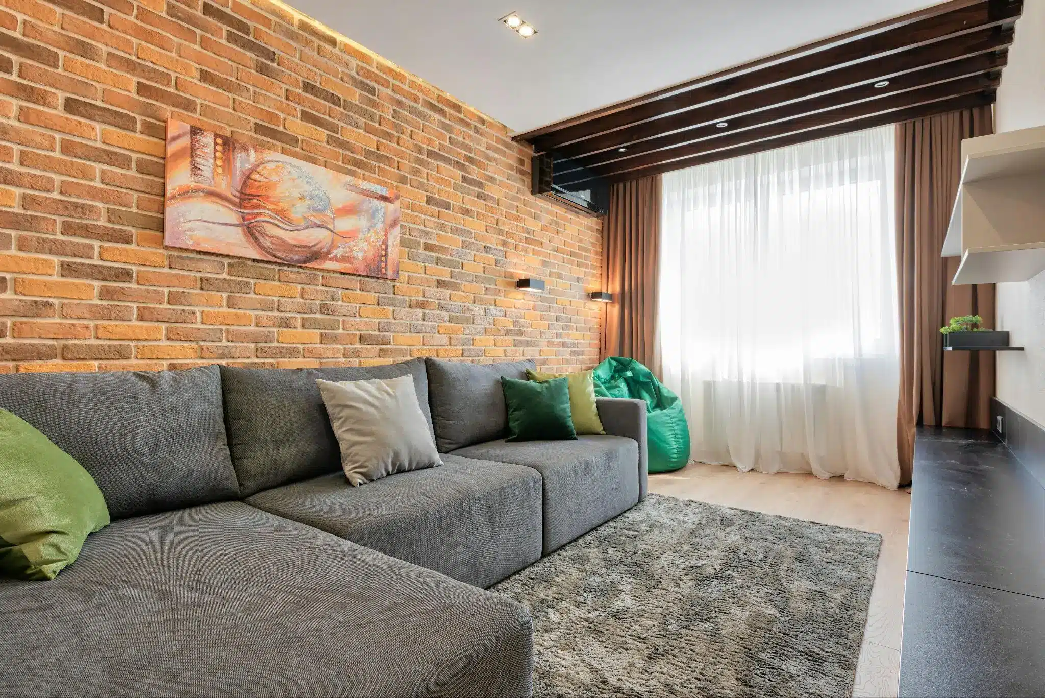
Living Rooms: Cozy Without Being Too Dark
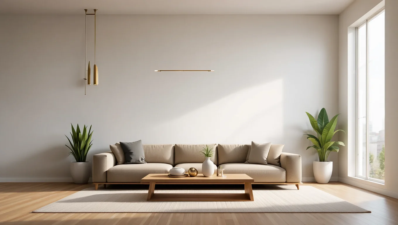
In living rooms, I’ve seen Collingwood create the perfect balance of warmth and brightness. It provides a soft background that makes furniture pop without competing for attention.
When paired with natural textures like wood and linen, this paint color helps create a lived-in, comfortable space that never feels stuffy or formal.
The subtle undertones give just enough depth to make the room feel cozy in the evening but stay bright during daylight hours.
Bedrooms: Serene and Subtle
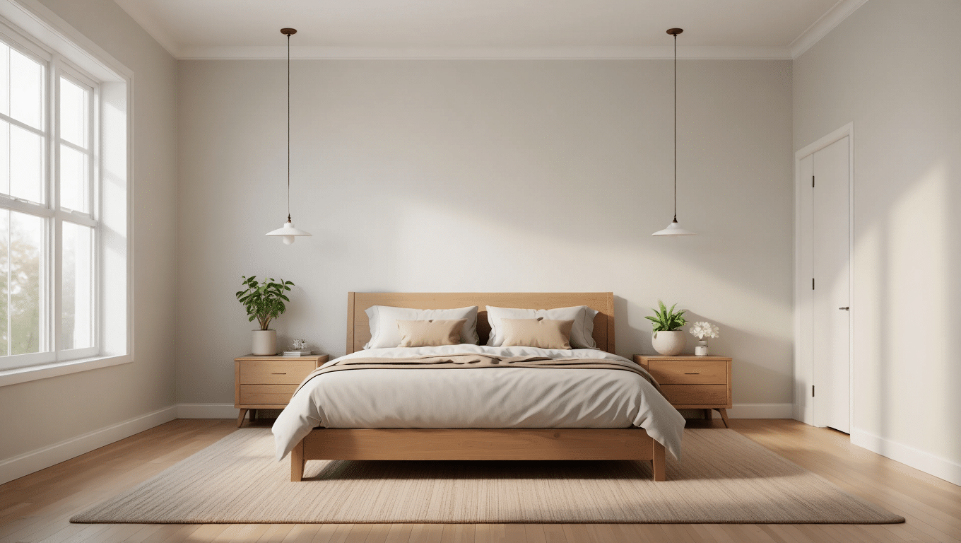
For bedrooms, Collingwood offers a sense of calm that helps turn your space into a true retreat.
I love how it never feels too cool or sterile, a common problem with many grays. Instead, it provides a gentle hue that recedes into the background, letting your bedding and personal items become the focus.
It works wonderfully with crisp white linens or deeper, richer bedding colors for a more dramatic look.
Kitchens & Cabinetry: Soft Contrast
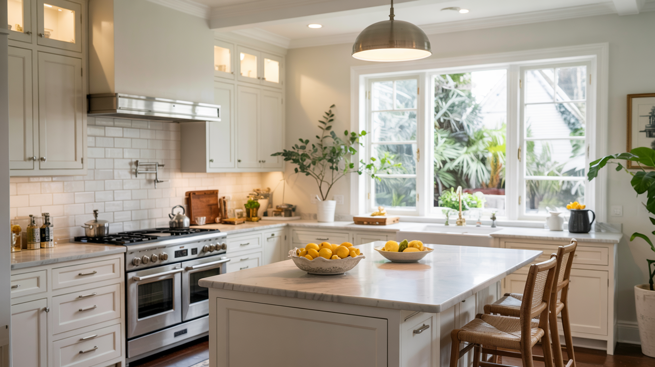
In kitchens, Collingwood provides just the right amount of contrast when used with white countertops or appliances. On cabinetry, it offers a fresh take on the painted cabinet trend without the boldness of darker colors.
I’ve found it pairs beautifully with marble countertops, stainless steel fixtures, and both brushed nickel and brass hardware.
It’s light enough to keep the kitchen feeling clean and bright, but has enough depth to hide the inevitable kitchen splatters better than a true white.
Bathrooms: Spa-like Feel

Bathrooms painted in Collingwood can take on a lovely spa-like quality, especially with the right lighting. The warm undertones help counter the cool surfaces often found in bathrooms like tile and porcelain.
I’ve noticed it works well in both small powder rooms, where it helps make the space feel larger, and in master bathrooms where it creates a sense of luxury and calm. Pair it with plush white towels for a hotel-inspired look.
Home Offices: Keeping It Professional
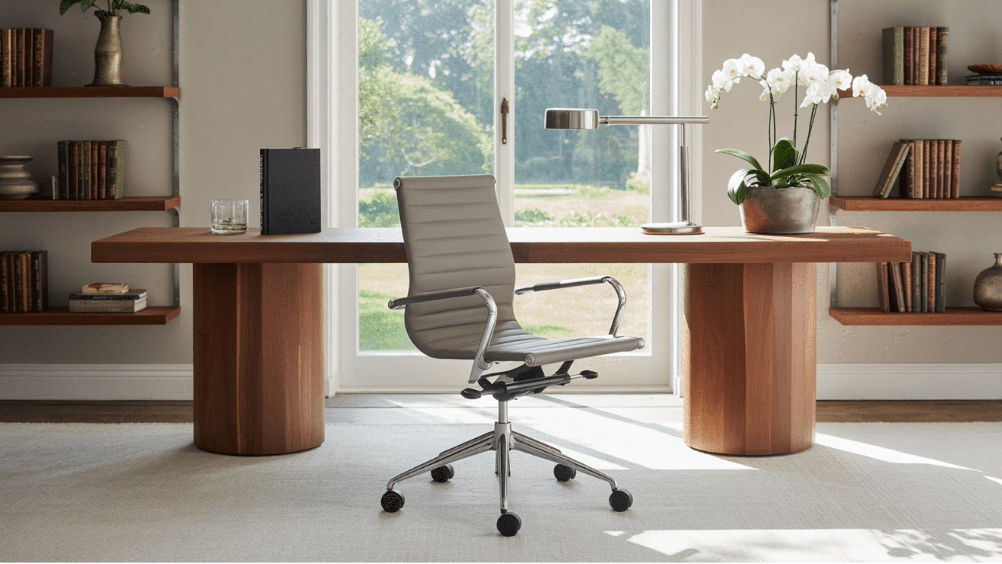
For home offices, Collingwood strikes the perfect balance between professionalism and comfort.
Unlike stark whites or true grays that can feel too institutional, Collingwood provides a warm, focused environment without feeling boring or flat.
It’s neutral enough to serve as a backdrop for video calls without distraction, yet warm enough to create a space you’ll want to spend time in. I’ve found it works particularly well with wood desks and leather office chairs.
Collingwood vs. Other Neutrals
| Color | LRV | Undertones | How It Differs from Collingwood |
|---|---|---|---|
| Edgecomb Gray (HC-173) | 63.88 | Beige with yellow-green | Warmer and cozier feel, slightly lighter, more yellow-green undertones compared to Collingwood’s violet ones. |
| Classic Gray (OC-23) | 74.78 | Soft, subtle, warm gray | Much lighter and airier, more neutral with less violet than Collingwood |
| Balboa Mist (OC-27) | 67.37 | Purple-pink | Lighter than Collingwood, more purple-pink, can look more feminine in certain lighting |
| Revere Pewter (HC-172) | 55.51 | Greige with green | Darker and more grounded, stronger green undertones give it an earthier vibe |
| Pale Oak (OC-20) | 69.89 | Beige | Warmer and sunnier in appearance, significantly lighter and beige-leaning |
Collingwood OC-28: Lighting & Paint Tips
- In north-facing rooms, Collingwood leans cooler, with violet undertones becoming more noticeable and the overall tone appearing slightly darker. South-facing spaces bring out their warmth, enhancing the soft beige undertones and making the color feel welcoming and balanced throughout the day.
- In east-facing rooms, it feels warmer in the morning and more neutral by afternoon. West-facing rooms create the opposite effect; cooler during the day and warmer in the evening light.
- Under warm artificial lighting (2700–3000K), Collingwood looks cozier and more greige, ideal for relaxed spaces. Cooler lighting (3500–4100K) shifts the color toward a crisper gray with stronger violet undertones; better suited for functional areas like kitchens. Avoid bulbs over 5000K, which can make it look flat or bluish. For balance, use daylight bulbs (3000–3500K).
- To test it properly, use large sample boards (12″x12″) with two coats, placed against white poster board. View them in different lighting conditions throughout the day to see how Collingwood behaves in your space.
- For finishes, choose matte in living spaces to hide wall imperfections, eggshell in kitchens and baths for cleanability, and satin on trim and doors. Avoid semi-gloss on large areas, as it can exaggerate violet undertones.
- Pair Collingwood with warm whites like White Dove, and accent it with greiges, muted greens, navy, or terracotta. Steer clear of stark whites, cool blues, or true beiges, which can throw off the balance of the color.
Conclusion: Is Collingwood Right for Your Space?
Collingwood OC-28 strikes that rare balance between gray and beige, making it one of the most flexible neutrals in Benjamin Moore’s lineup. Its subtle depth adds character without overwhelming your space, allowing your furniture and decor to take center stage.
It shines in well-lit areas, especially south-facing rooms, where it takes on a warm, inviting glow.
It’s perfect if you want a neutral that feels fresh but not cold. However, in rooms with minimal natural light, you might find that its gray side becomes too dominant. And if you’re seeking a true warm beige or a clean bright white, this middle ground neutral might feel too murky for your taste.
No paint review can substitute for seeing Collingwood in your own home, so grab a sample, paint it on a few walls, and live with it for a few days.
Trust what you see in your own light, with your own furnishings. The “perfect gray” is the one that makes you smile when you walk into the room and Collingwood might just be that color for you.