Choosing the right colors for your home can feel confusing; almost overwhelming, right?. You want something fresh and inviting. But with so many options out there, where do you even start?
I’m here to help you brighten your home with Benjamin Moore Color Palette.
This blog will show you simple ways to pick colors that truly work.
You’ll learn which shades create the mood you want and how to match them like a pro.
Why Choose Benjamin Moore for Your Home
Benjamin Moore has been around since 1883. That’s over 140 years of paint-making experience. They know what works.
Their colors last longer than most brands I’ve tried. The paint covers walls evenly in just one or two coats. This saves you time and money.
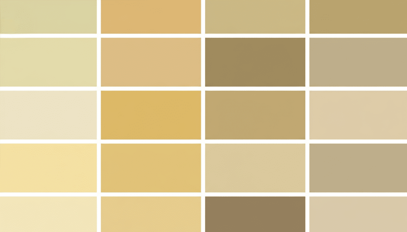
You’ll find over 3,500 shades to pick from. From soft neutrals to bold blues, there’s something for every room. Each color is carefully tested for quality.
The formulas resist fading, too. Your walls will look fresh for years. Plus, their paints have low VOCs, which means cleaner air inside your home.
I love how their customer service helps you make a choice. They offer free color consultations at most stores. It takes the guesswork out of decorating.
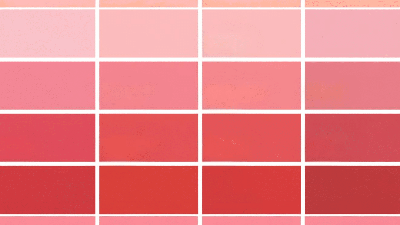
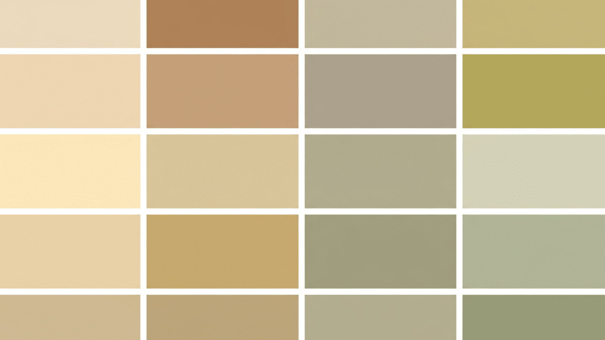
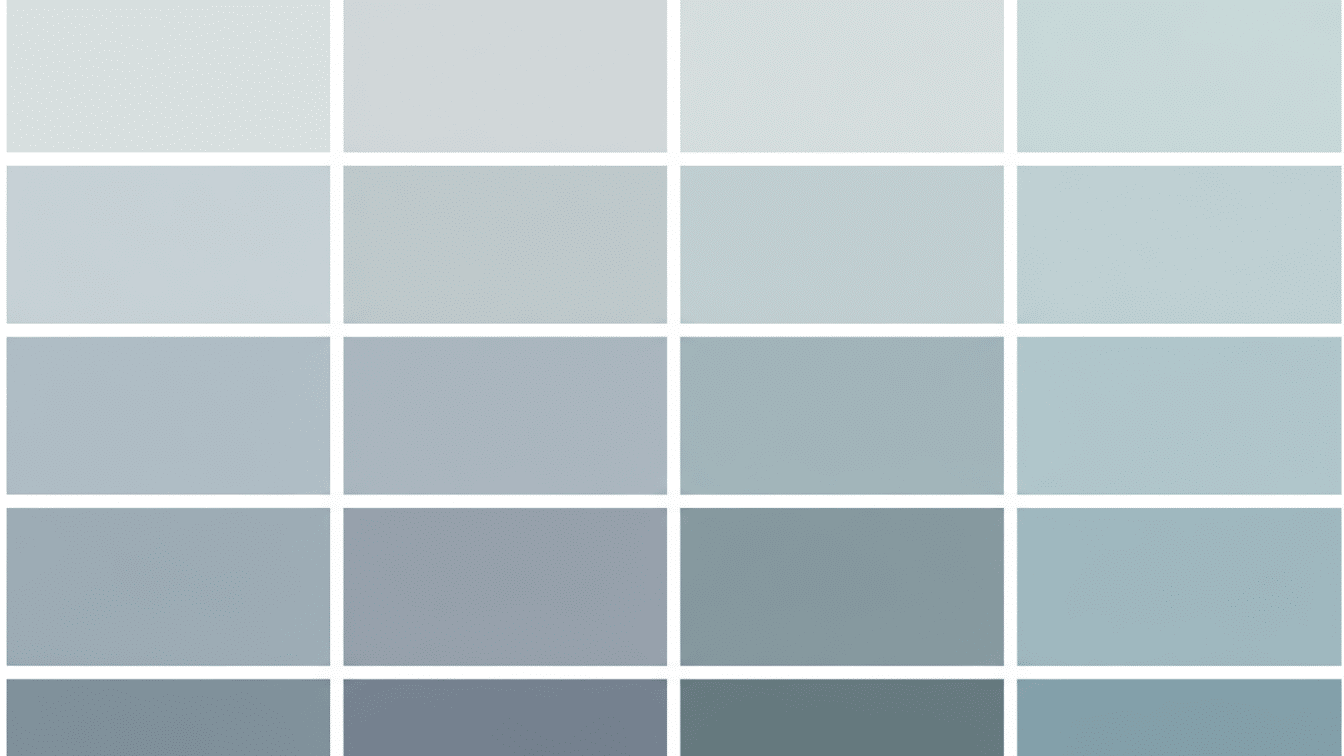
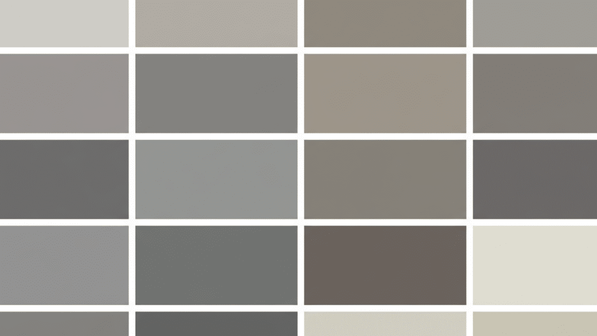
Benjamin Moore’s Most Iconic Color Collections
The Benjamin Moore color palette features stunning collections designed to match every style and preference.
These expertly curated groups make choosing the perfect color effortless and inspiring.
Disclaimer: The information provided below is an estimate. Check out Benjamin Moore’s official website for accurate information.
1. Historical Collection
This collection brings history into your living space. The shades are inspired by colors used in American homes from the 1700s to the 1900s.
Key Details:
- LRV Range: Varies from 3 to 85
- Color Families: Earthy tones, muted greens, soft grays, deep reds
- Total Colors: Around 190 shades
- Best For: Traditional homes, period restorations
2. Color Preview Collection
These colors work together effortlessly. Each palette is pre-coordinated, so you won’t make costly mistakes when matching rooms.
Key Details:
- LRV Range: 5 to 89
- Color Families: Neutrals, blues, greens, soft tones
- Total Colors: Around 1200 coordinated shades
- Best For: Quick decorating decisions
3. Affinity Collection
The Affinity line features calm, eternal colors. These shades create peaceful spaces that never go out of style.
Key Details:
- LRV Range: 12 to 84
- Color Families: Refined neutrals, soft pastels, refined tones
- Total Colors: Around 140 shades
- Best For: Modern and classic interiors
4. Classics Collection
This is Benjamin Moore’s bestseller collection. It includes their most-requested colors from the past 50 years.
Key Details:
- LRV Range: 8 to 88
- Color Families: Blues, greens, grays, beiges
- Total Colors: Around 1680 popular shades
- Best For: Any room in your house
5. Color Stories Collection
Each color tells its own story here. The collection helps you express different feelings through paint choices.
Key Details:
- LRV Range: 4 to 91
- Color Families: Full spectrum coverage
- Total Colors: Around 240 curated shades
- Best For: Creating mood-based rooms
6. Off-White Collection
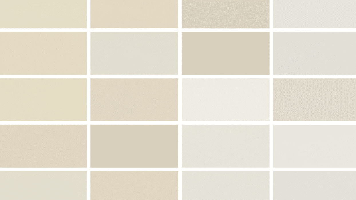
Don’t think all whites are the same. This collection shows subtle differences that make or break a room’s mood.
Key Details:
- LRV Range: 75 to 92
- Color Families: Creams, ivories, soft whites
- Total Colors: Around 150 variations
- Best For: Brightening small or dark spaces
7. Williamsburg Collection
These colors are based on research from Colonial Williamsburg. Historians and paint experts worked together to recreate genuine 18th-century hues.
Key Details:
- LRV Range: 6 to 87
- Color Families: Colonial blues, greens, ochres, brick reds
- Total Colors: Around 140 original shades
- Best For: Colonial and traditional architecture
Matching the Benjamin Moore Color Palette to Your Style
Your home should reflect who you are. The right color palette makes every room feel like it’s yours.
Let me show you how to match Benjamin Moore colors with different decorating styles.
1. Traditional Style
Go for classic neutrals and rich tones. Colors like Revere Pewter (HC-172) and Manchester Tan (HC-81) work beautifully here.
Add deeper shades, such as Hale Navy (HC-154), for accent walls. These colors have stood the test of time for good reason.
2. Modern Style
Clean lines need clean colors. Stick with crisp whites like Chantilly Lace (OC-65) and cool grays such as Stonington Gray (HC-170).
You can add black accents with Onyx (2133-10) for contrast. Keep your palette uncluttered and straightforward.
3. Farmhouse Style
Think soft and neutral here. White Dove (OC-17) and Swiss Coffee (OC-45) create that perfect farmhouse feel. Pair them with Wythe Blue (HC-143) or Chelsea Gray (HC-168) for cabinets.
These colors feel cozy without trying too hard.
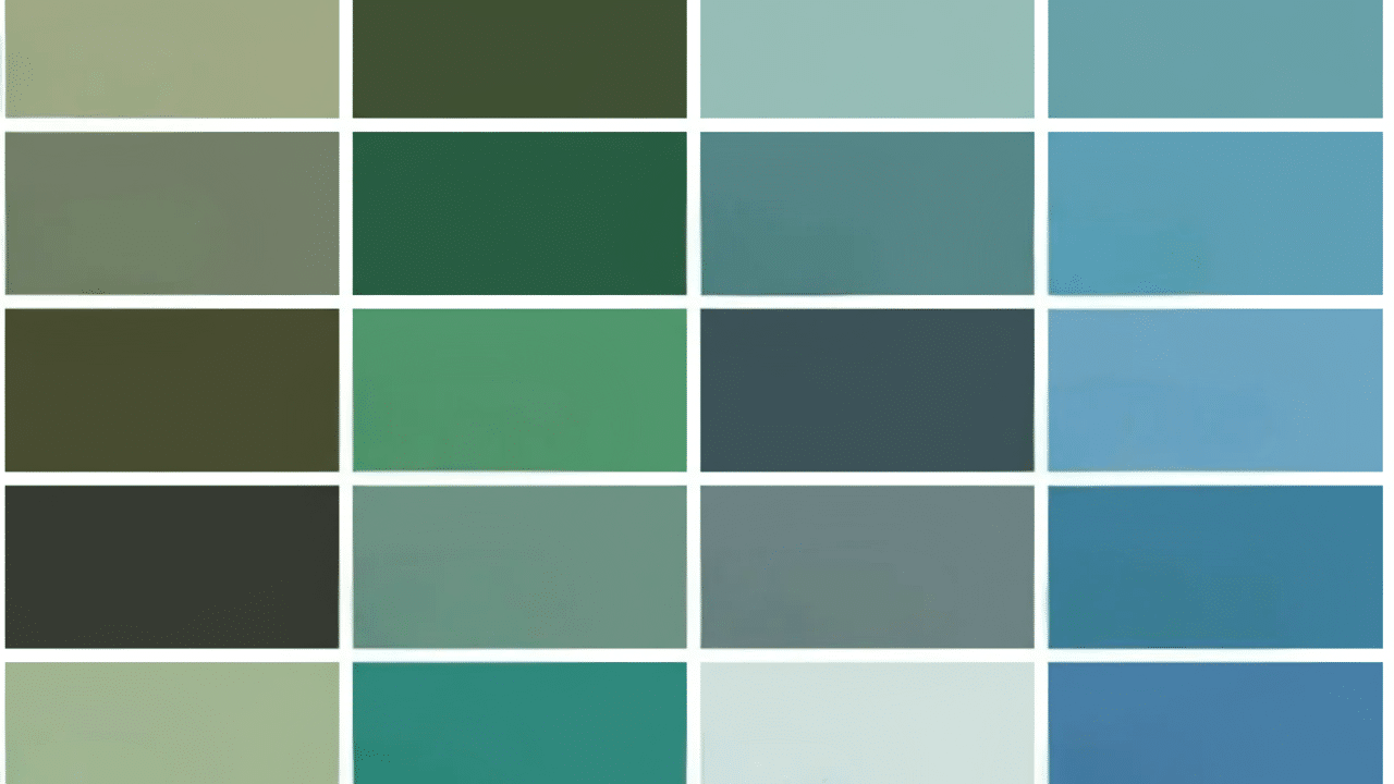
4. Coastal Style
Beach-inspired colors bring calm to any space.
Try Palladian Blue (HC-144) and Sea Salt (2055-70) for walls. Gray Owl (OC-52) works great as a neutral base. These shades remind you of the ocean and the sky.
5. Industrial Style
Bold, edgy colors suit this look. Wrought Iron (2124-10) and Kendall Charcoal (HC-166) set a strong foundation.
Balance them with Cement Gray (2112-60) for softer areas. The result feels urban and confident.
6. Scandinavian Style
Light and airy is the goal here. Simply White (OC-117) keeps rooms bright and open. Add Balboa Mist (OC-27) for subtle variation. Touch of Gray (OC-65) works for furniture and trim.
Less is definitely more with this approach.
7. Bohemian Style
Mix and match colors freely here.
Start with a neutral like Accessible Beige (AC-26) as your base. Then add pops of Teal Ocean (2049-30) or Calypso Orange (2015-30). This style celebrates personality and creativity.
8. Transitional Style
Bridge old and new with balanced colors. Pale Oak (OC-20) and Revere Pewter (HC-172) are perfect starters.
They’re not too formal or too casual. Add touches of Hale Navy (HC-154) when you need depth.
9. Mid-Century Modern Style
Retro colors define this era. Try Salamander (2050-10) for that vintage green look.
Pair it with Classic Gray (OC-23) to keep things grounded. Orange Parrot (2169-20) adds genuine ’60s flair to accent pieces.
Ready to Start? Practical Tips for Your Project
You’ve picked your colors. Now it’s time to make them work in your space.
Here are some practical tips that will save you time and frustration.
- Test your colors on the actual walls first. Buy sample pots and paint large swatches.
- Look at your samples in different lighting. Morning light shows colors differently from evening light.
- Paint samples on multiple walls in the same room. Colors change based on which direction the wall faces.
- Let your samples dry completely before deciding. Wet paint always looks darker than the final result.
- Consider your existing furniture and flooring. Your new paint needs to work with what you already own.
- Buy quality brushes and rollers. Cheap tools leave streaks and make the job harder.
- Prep your walls properly. Clean surfaces and fill holes before you open any paint cans.
Wrapping it Up
You now have all the tools to brighten your home with Benjamin Moore Color Palette. From iconic collections to style-specific choices, the options are clear.
Start small if you’re nervous. Pick one room and test your colors there first. See how they make you feel.
Ready to grab those paint samples? Head to your nearest Benjamin Moore store this weekend.
What room will you paint first?