So you’ve fallen head over heels for Sherwin-Williams’ Accessible Beige, but your heart belongs to Benjamin Moore? The struggle is real, my friend.
Here’s the thing about paint matching: it’s part science, part art, and part pure luck.
You want that perfect greige that makes your living room look like a cozy café, not a doctor’s office waiting room.
Trust me, I’ve been down this rabbit hole more times than I care to admit. Let me save you from endless paint swatches and help you find Benjamin Moore’s best match for that beloved Accessible Beige magic.
Ready to solve this colorful mystery together?
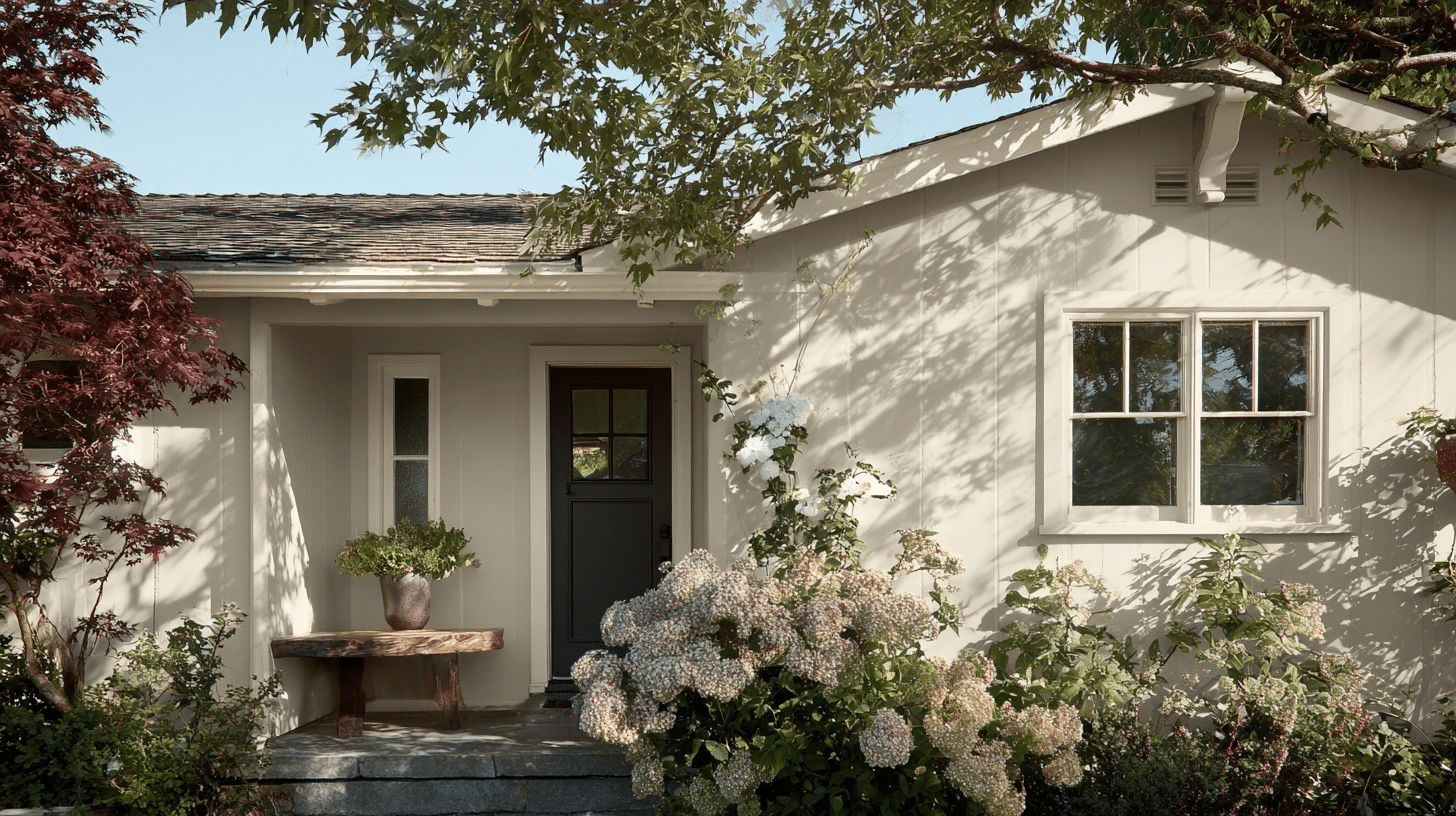
What Makes SW Accessible Beige Stand Out From Other Beige?
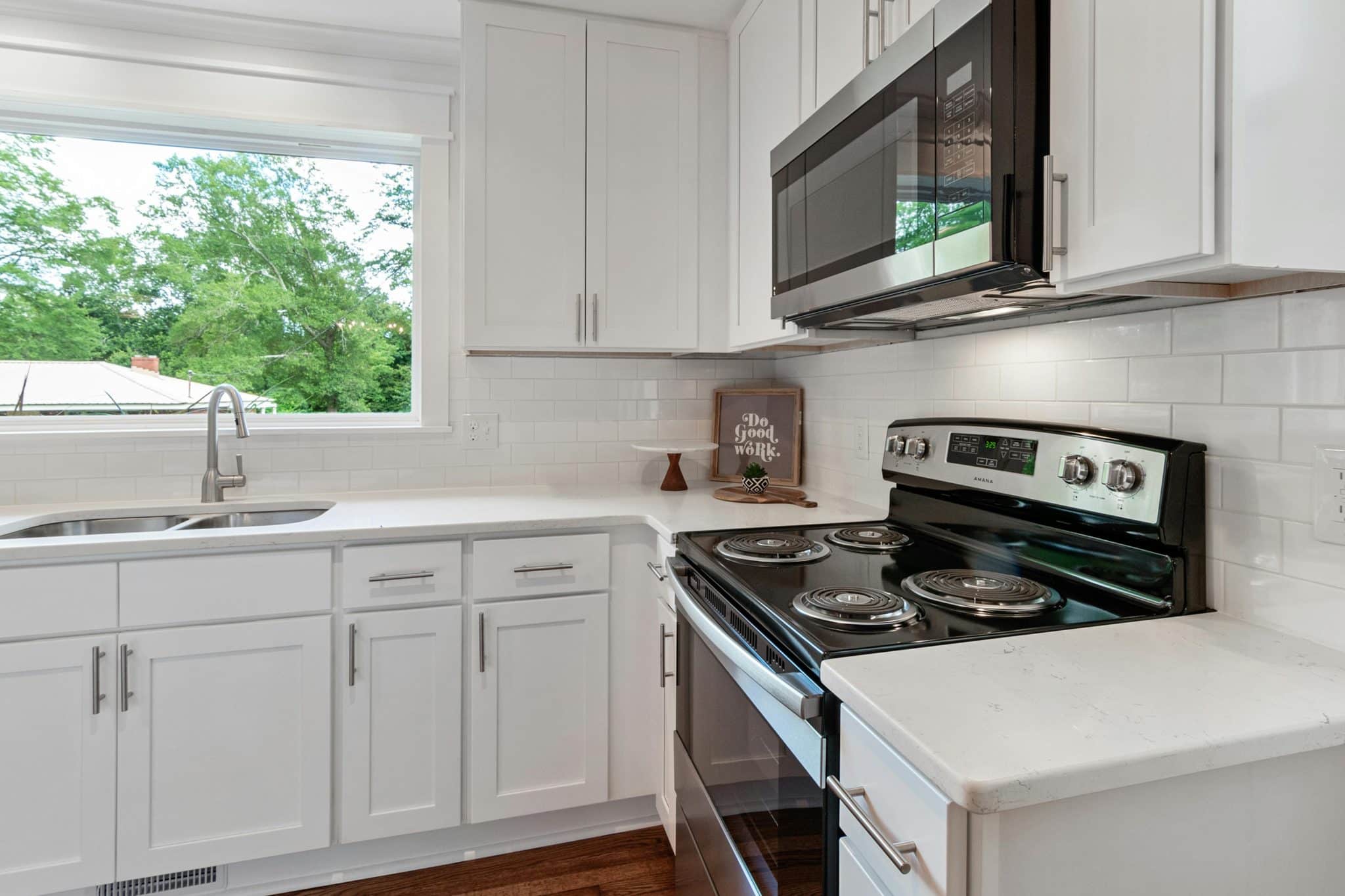
Allow me to tell you why this color has everyone obsessed! SW 7036 Accessible Beige in Exterior and interior both isn’t your grandma’s boring beige; it’s got personality.
The Magic Formula:
- Perfect greige balance: Not too gray, not too beige, just right
- Chameleon qualities: Changes beautifully with different lighting
- Neutral superhero: Plays nice with every color you throw at it
- Timeless appeal: Won’t look dated in five years
Here’s what makes it special: most beiges lean either pink or yellow. Accessible Beige, unlike Edgecomb Gray, stays perfectly neutral. Morning light makes it feel crisp and clean. Evening light brings out its cozy warmth.
I’ve seen this color work in everything from farmhouse kitchens to modern offices. It’s like the little black dress of paint colors: always appropriate, never boring.
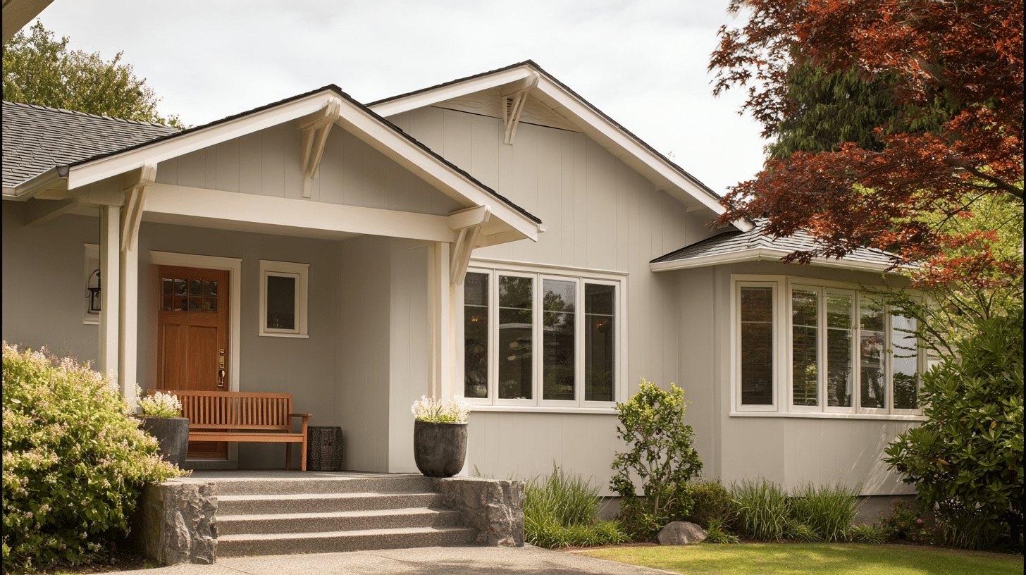
Best Benjamin Moore Match for Accessible Beige Guide
Finding your Benjamin Moore soulmate for Accessible Beige? I’ve tested them all, so you don’t have to! These matches will give you that same classy vibe.
The Winner: Benjamin Moore Revere Pewter (HC-172)
This is your best bet, hands down. Here’s why they’re practically twins:
- Same greige DNA: Both have that perfect gray-beige blend
- Similar undertones: Cool enough to feel fresh, warm enough to feel cozy
- Light Reflectance Value: Nearly identical brightness levels
- Versatility factor: Works in any room, any lighting
I’ve put these two side by side, and to be honest, you’d need a magnifying glass to spot the difference.
The Runner-Up: Benjamin Moore Balboa Mist (OC-27)
Your second-best option when Revere Pewter isn’t quite right:
- Slightly softer: A touch more beige than gray
- Warmer feel: Perfect for north-facing rooms
- Easy coordination: Pairs beautifully with whites and deeper tones
- Reliable choice: Never disappoints in any space
The Wild Card: Benjamin Moore Classic Gray (OC-23)
For when you want something close but with its own twist:
- Cooler undertones: Leans more gray than beige
- Modern vibe: Great for contemporary spaces
- Crisp finish: Feels fresh and clean
- Bold choice: Similar family, different personality
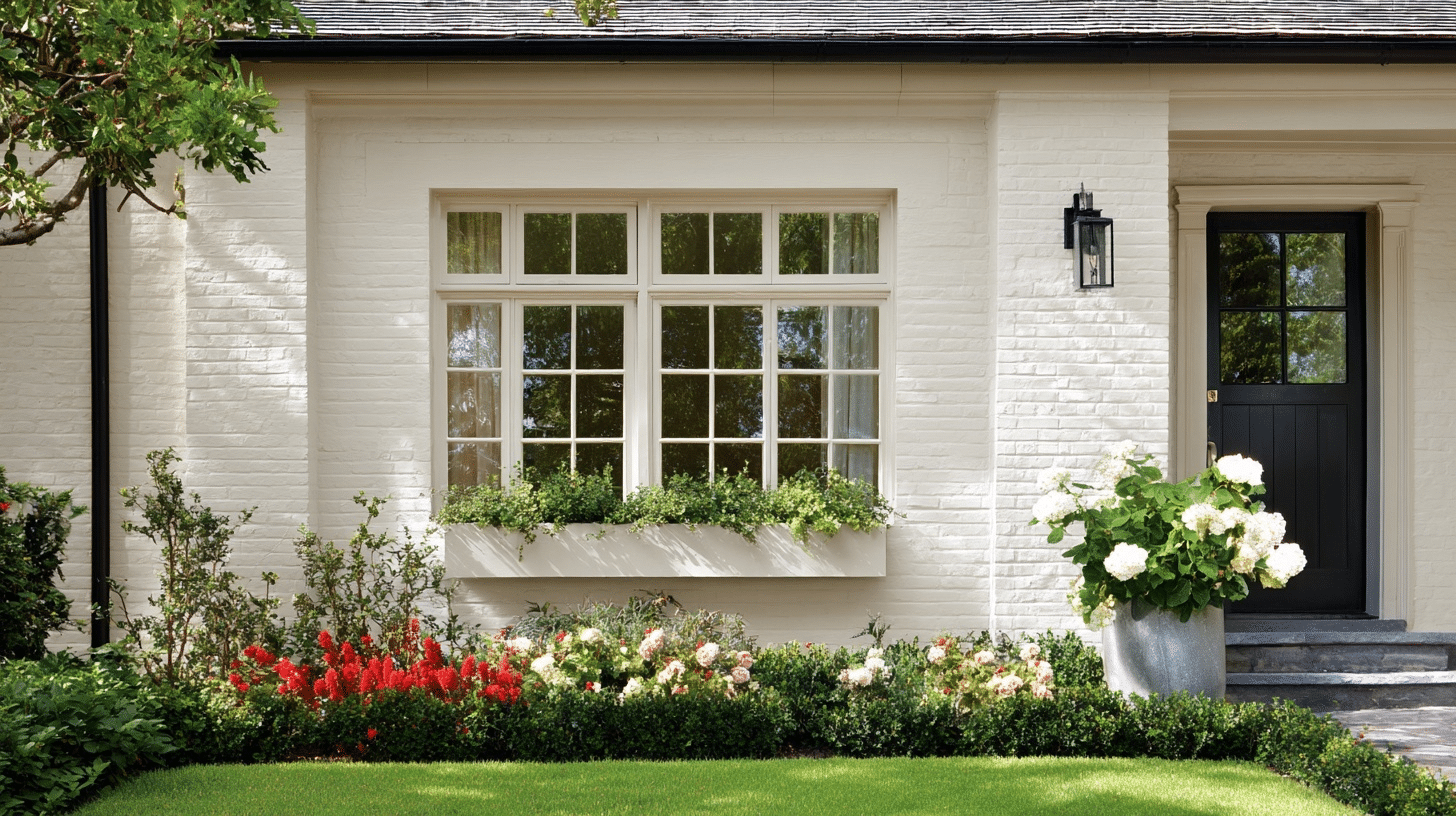
Colors that Coordinate with Accessible Beige
Want to build the perfect color palette? Here are my tried-and-true combinations that work every single time with Accessible Beige.
| Color Family | Specific Colors | Why It Works |
|---|---|---|
| Whites | Pure White, Alabaster, Ivory | Creates clean contrast without being harsh |
| Grays | Agreeable Gray, Repose Gray | Perfect monochromatic flow |
| Blues | Naval, Distance, Rainwashed | Adds cool sophistication |
| Greens | Retreat, Clary Sage, Evergreen Fog | Brings natural, calming vibes |
| Warm Accents | Tricorn Black, Urbane Bronze | Grounds the space beautifully |
Pro tip: Start with one accent color and build from there. I love pairing Accessible Beige walls with crisp white trim and navy blue accents. It’s like wearing a perfectly tailored outfit; everything just clicks.
The beauty of working with such a balanced neutral? You really can’t go wrong. Farmhouse charm or modern minimalist, this color plays well with all.
There You Have It
Your complete handbook to finding Benjamin Moore’s best match for Accessible Beige!
Revere Pewter takes the crown, but honestly, you’ve got solid backup options too.
Remember, paint colors are like relationships; what works in one home might not work in another. Lighting, existing furniture, and your personal style all play a part. My advice is to get those sample sizes and test them on your walls.
So go ahead, pick your favorite, and start painting.