Getting dressed shouldn’t feel like solving a puzzle, but here we are!
You know that feeling when you put on a color that makes you look like you need a vacation? Or maybe three cups of coffee?
Yeah, I’ve been there too. If you have warm skin tones or brown skin, certain colors can make you appear washed out or just… off.
I’m not here to tell you to throw out half your wardrobe. Instead, let’s chat about which colors might not be your best friends and why.
Trust me, once you know what to skip, getting dressed becomes so much easier. Plus, you’ll stop wondering why that gorgeous shirt looked better on the hanger than on you!
Why Is It Essential to Dress According to Your Skin Tone
Think of your skin tone as your natural filter. When you wear colors that complement it, you literally glow. But when you pick the wrong shades, they can make you look tired or sickly.
It’s not about following strict rules; it’s about understanding what works with your natural coloring.
Your skin tone affects how colors reflect light back to your face. Warm undertones have golden, peachy, or yellow hints. When you wear colors that clash with these undertones, they can cancel out your natural radiance.
Instead of looking bright, you might appear dull or washed out. Getting this right means you’ll always look put-together, even on lazy days.
Colors Warm Skin Tones Should Avoid: A Simple Guide
Here’s the tea: some colors just don’t play nice with warm undertones. But knowing which ones to skip makes shopping so much easier! These shades tend to fight against your natural glow instead of working with it.
Icy Blue
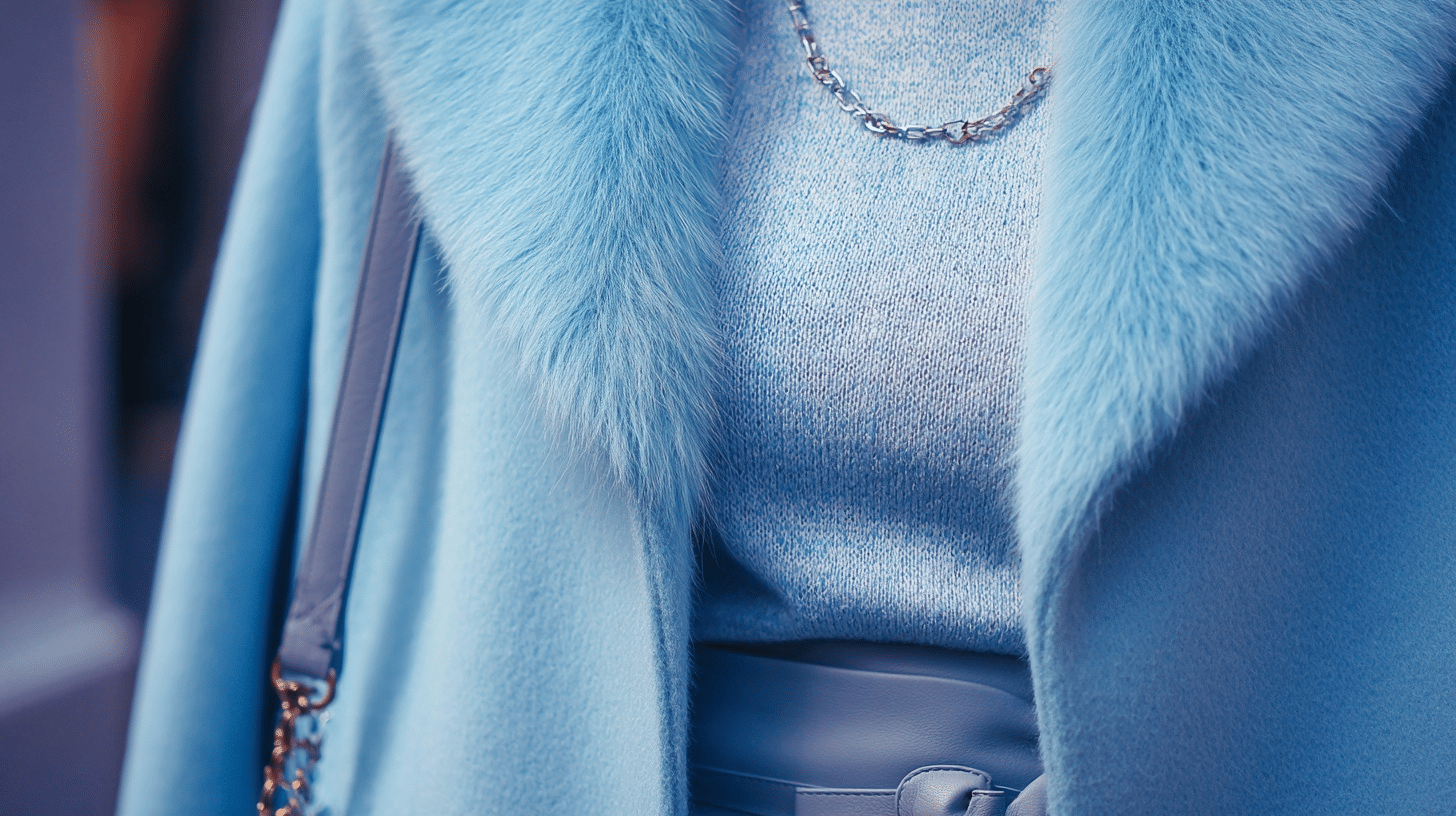
This cool, sharp blue has serious winter vibes. It creates a harsh contrast against warm skin because it lacks any golden or peachy undertones. Think frozen lake rather than tropical ocean. Icy blue can make warm-toned people look pale and tired.
Emerald Green
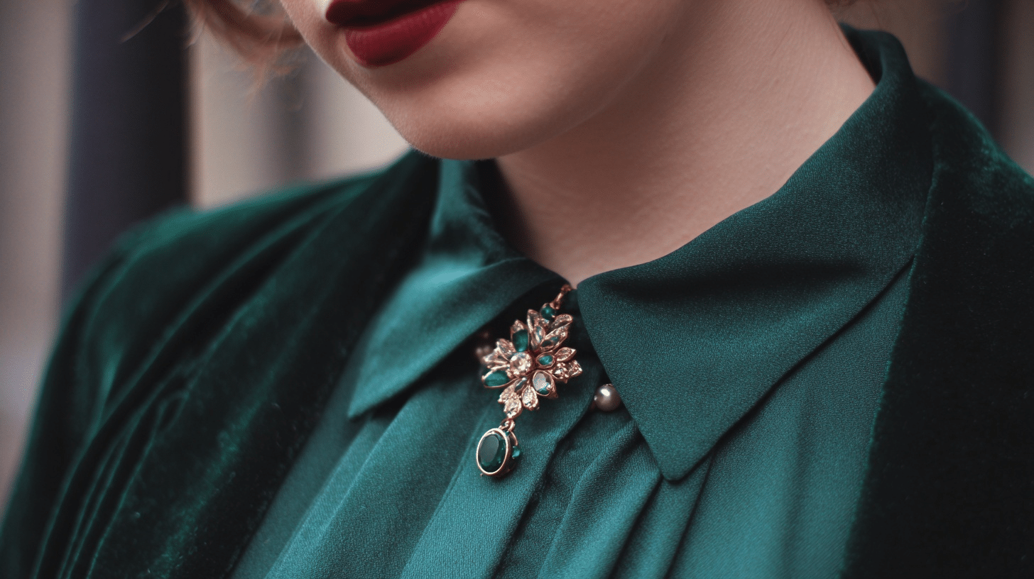
While gorgeous on its own, emerald green is too cool and jewel-toned for warm skin. It has blue undertones that clash with your golden base. This shade can make you appear sallow or bring out any redness in your complexion.
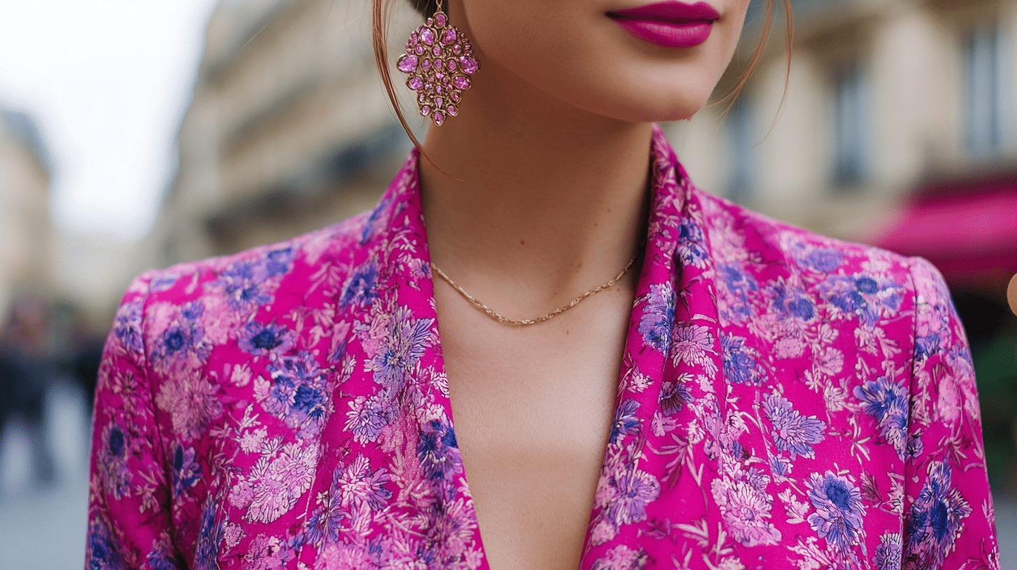
Hot Pink
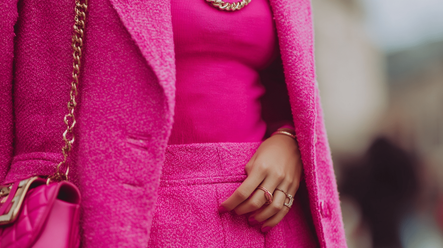
This electric, cool-toned pink is like neon candy: pretty but not flattering on warm skin. Hot pink has blue undertones that compete with your natural warmth. It can make you look washed out or create an unflattering contrast.
Navy Blue

Traditional navy has cool blue undertones that don’t mesh well with warm skin. While it’s a wardrobe staple, it can make warm-toned people look tired or create an unflattering backdrop for their natural coloring.
Burgundy
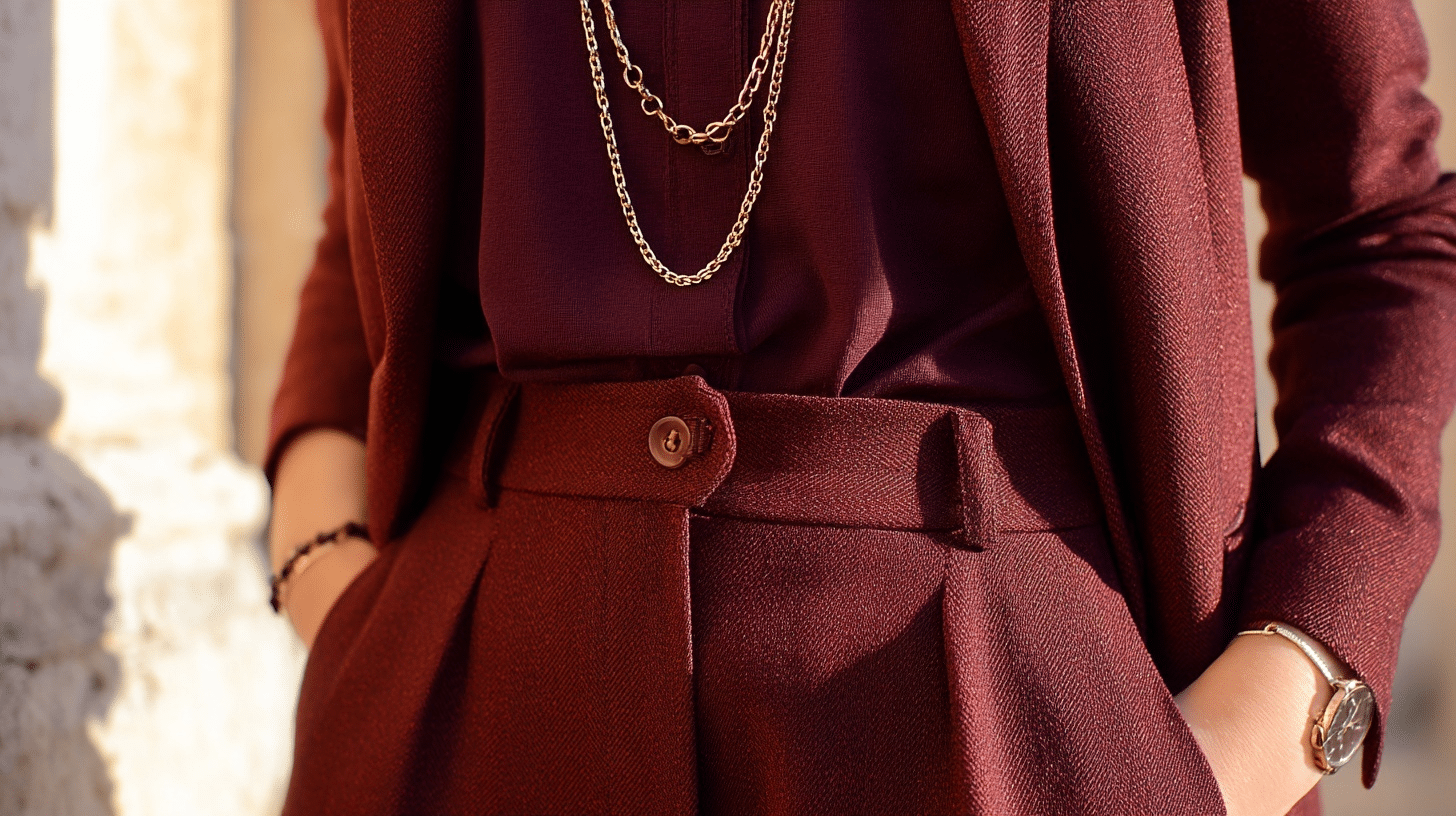
This deep wine color leans cool with its blue-red base. Burgundy can clash with golden undertones and make warm skin look dull. It’s particularly tricky because it seems like it should work but often doesn’t.
Silver Gray

Cool gray shades lack the warmth that complements golden undertones. Silver gray can make warm skin appear ashy or lifeless. These shades don’t provide the contrast needed to make your natural coloring pop.
Lavender
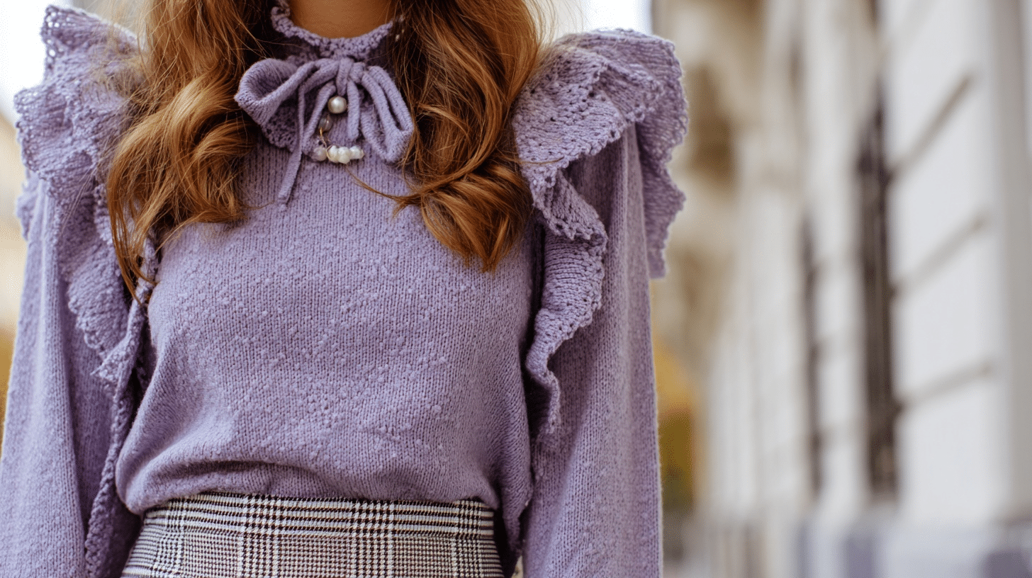
This soft purple has cool undertones that fight against warm skin. Lavender can make you look pale or bring out any yellow tones in an unflattering way. It’s too cool and delicate for warm undertones.
However, purple and lavender on warm skin tones may work if you opt for warmer shades and incorporate the right accessories.
Mint Green
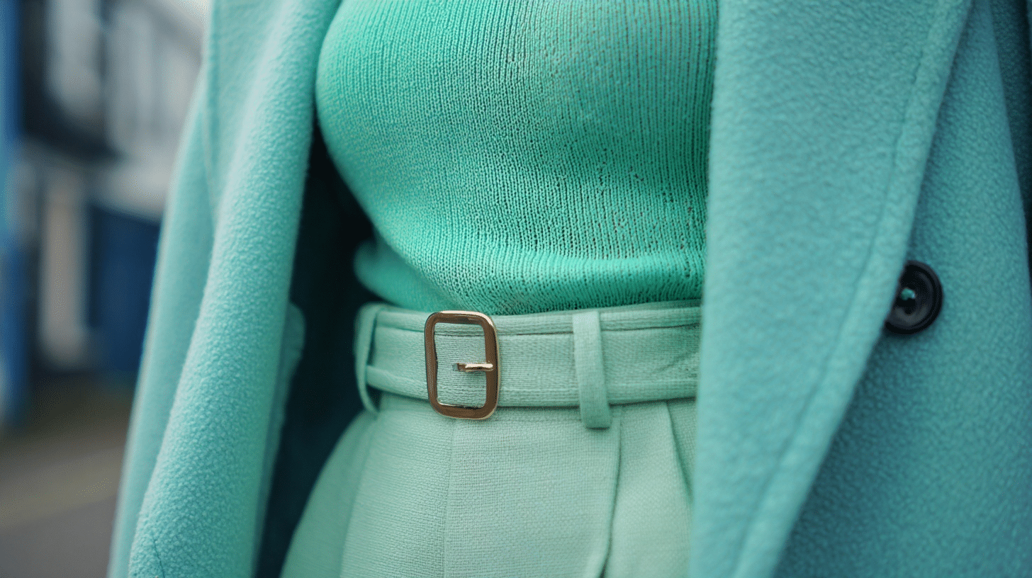
Fresh and cool, mint green has blue undertones that don’t work with warm coloring. This shade can make warm skin appear sickly or tired. The coolness of mint competes with your natural golden glow.
Royal Purple
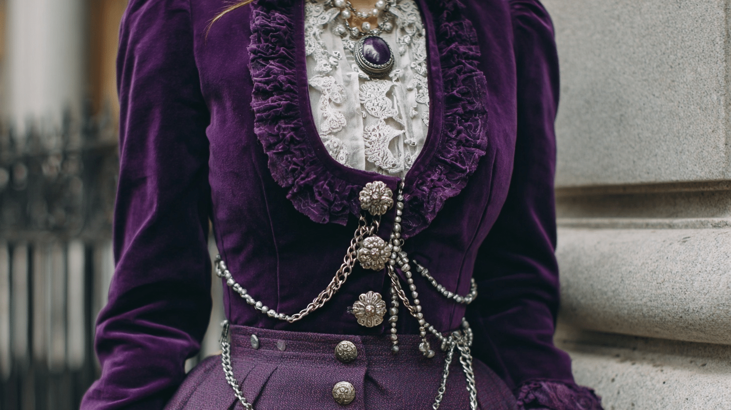
Deep royal purple is stunning but too cool for warm undertones. It has blue bases that create an unflattering contrast against golden skin. This shade can make you look washed out despite its richness.
Fuchsia
Similar to hot pink, fuchsia has cool blue undertones that clash with warm skin. This bright shade can overpower your natural coloring and create an unbalanced look. It fights against your golden base instead of complementing it.
Colors to Opt for Instead
Here are your golden-hour alternatives that’ll make you glow:
- Coral and peach tones: they echo your natural warmth and create harmony
- Warm yellows and golds: these add to your golden undertones beautifully
- Rust and burnt orange shades: perfect for adding richness without competing
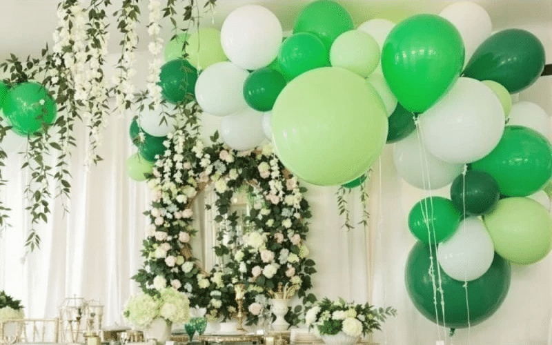
- Olive and forest greens: earthy tones that complement rather than clash. They are one of the best colors to get a suit in for brown skin
- Cream and warm whites: softer alternatives that won’t wash you out
Conclusion
Getting your colors right isn’t about perfection; it’s about understanding what makes you shine. Sure, you might love that icy blue top, but if it makes you look like you need a nap, maybe save it for someone else.
Once you know your color friends, shopping becomes way more fun. You’ll spend less time second-guessing purchases and more time feeling confident in what you wear.
Remember, these are guidelines, not laws. If you absolutely love a color that’s supposedly “wrong” for you, wear it anyway!
Consider pairing it with a warm-toned accessory or using it in small doses. Fashion should be fun, not stressful.