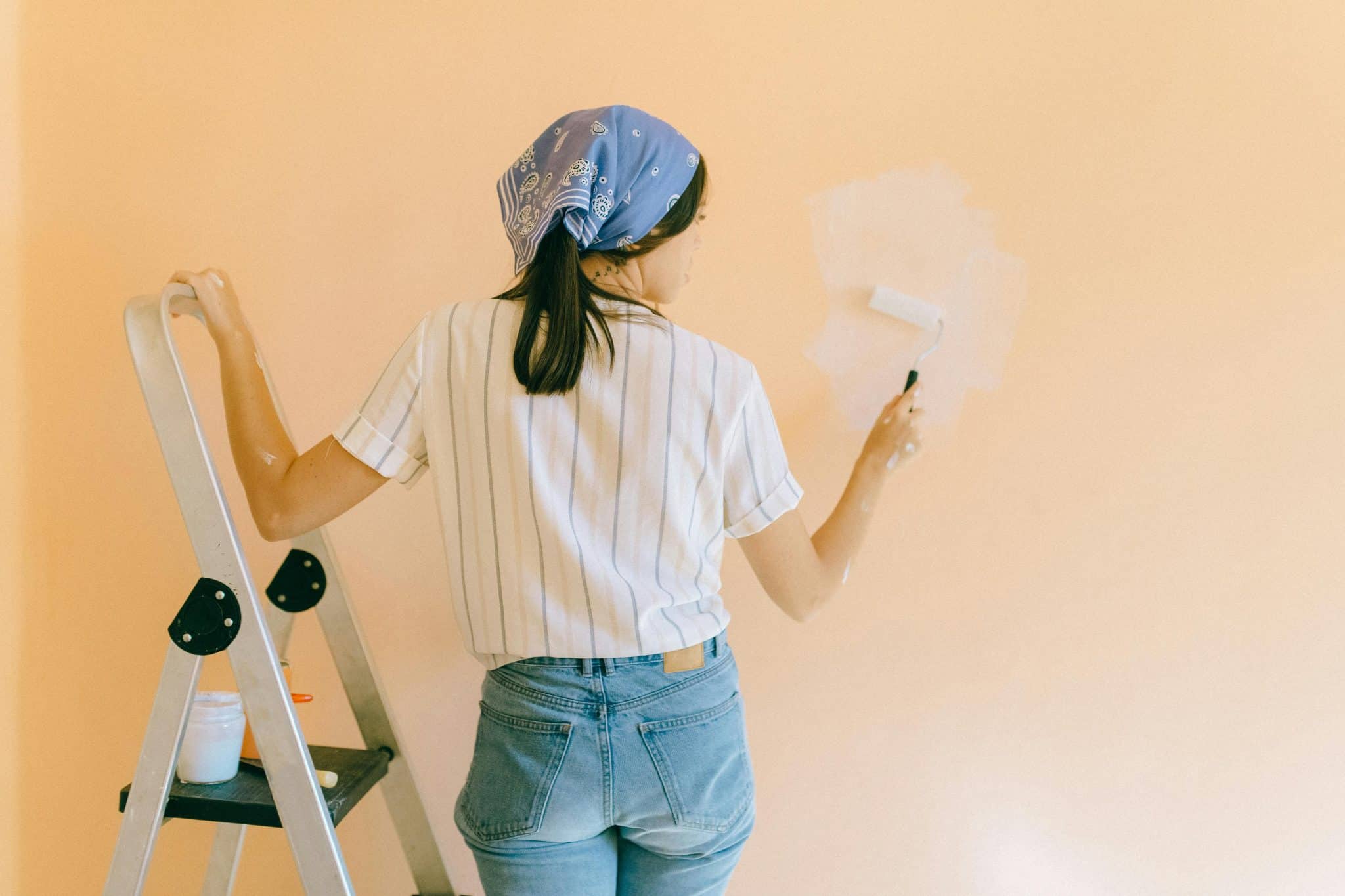
I know how frustrating it can be when your home feels warm and cramped, even with good lighting and space. Cool tones might be exactly what you need to transform your living space into a calm, refreshing retreat.
I’m going to show you simple ways to add cool colors like blues, greens, and purples to your decor. These colors can make any room feel more spacious and peaceful.
In this blog, you’ll learn how to choose the right tones for each room. I’ll share styling tips for using cool colors in paint, furniture, and accessories.
Understanding Cool Tones in Interior Design
Understanding cool tones in interior design means recognizing colors like blues, greens, and purples that evoke calmness and serenity. These colors, rooted in nature, water, sky, and foliage, carry blue undertones, which classify them as cool.
Using tones in a space can create a peaceful, refreshing atmosphere, ideal for bedrooms, bathrooms, or any area meant for relaxation. Cool colors also visually expand a room, making smaller spaces feel larger and airier.
When designing, balancing tones with warm accents can prevent a room from feeling cold or uninviting. Overall, tones bring tranquility and spaciousness, making them a versatile choice for creating soothing interiors.
Cool Tone Paint Colors and Ideas for your Home
I’ve tested dozens of cool-toned paints in real homes. These five consistently deliver results that make homeowners smile. Each brings its personality while maintaining that signature cool, calm tone.
Behr Blueprint
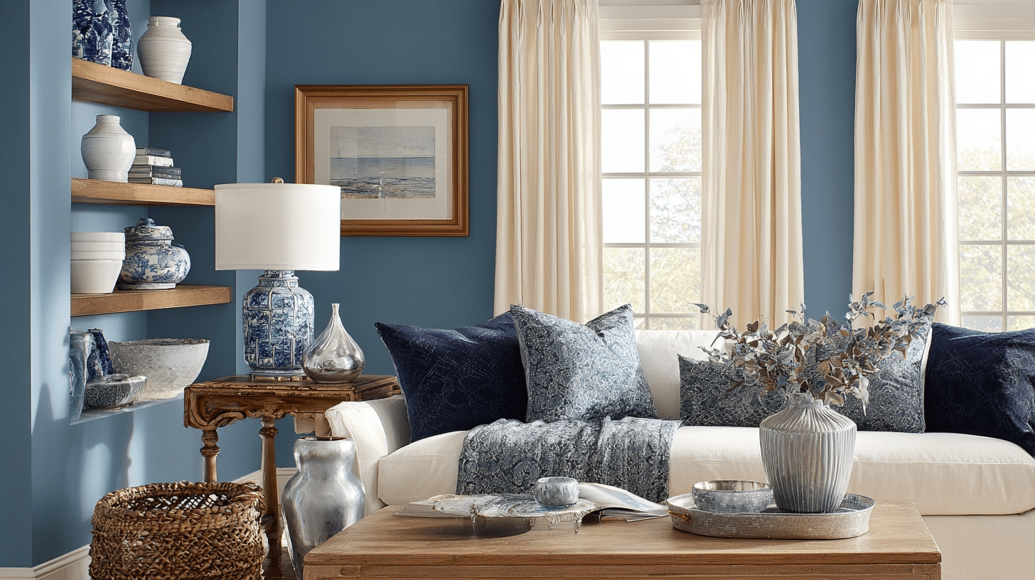
This medium blue hits the sweet spot between peaceful and powerful. I love how it changes throughout the day – soft and dreamy in morning light, confident and grounding by evening.
Perfect pairings: Crisp white trim, warm brass fixtures, natural oak furniture
Decor elements to intensify this tone:
- Textiles: Cream linen curtains, navy velvet throw pillows
- Ceramics: White or cream pottery, blue and white patterned vases
- Glass décor: Clear glass table lamps, mercury glass accents
- Natural wood accents: Light oak coffee tables, bamboo picture frames
Benjamin Moore Palladian Blue
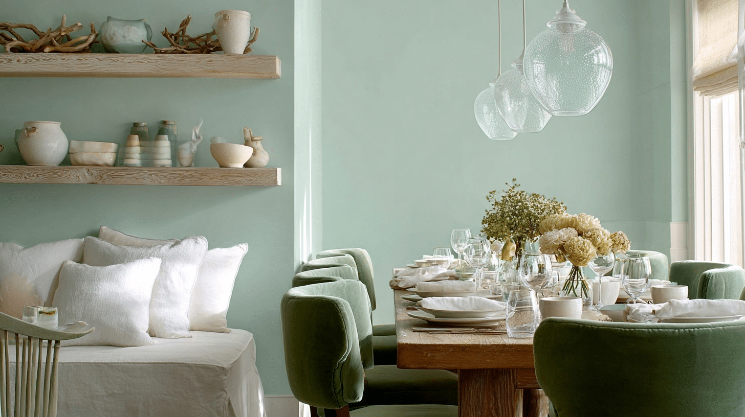
Don’t let the name fool you, this reads more green than blue. It’s like bringing morning mist indoors. I use this when clients want color without commitment.
Perfect pairings: Soft whites, brushed nickel hardware, marble countertops
Decor elements to intensify this tone:
- Textiles: White linen bedding, sage green velvet chairs
- Ceramics: Terracotta pots, white ceramic vases
- Glass décor: Frosted glass pendant lights, clear glass bowls
- Natural wood accents: Bleached driftwood art, pine floating shelves
Sherwin-Williams Silver Strand
This chameleon color shifts between gray and blue depending on your lighting. It’s my go-to for open floor plans because it flows beautifully from room to room.
Perfect pairings: Pure white ceilings, black iron fixtures, walnut wood tones
Decor elements to intensify this tone:
- Textiles: Charcoal linen sofas, white cotton throws
- Ceramics: Matte black pottery, speckled gray planters
- Glass décor: Smoke-tinted glass hurricanes, crystal table lamps
- Natural wood accents: Dark walnut dining tables, reclaimed wood shelving
Benjamin Moore Hale Navy
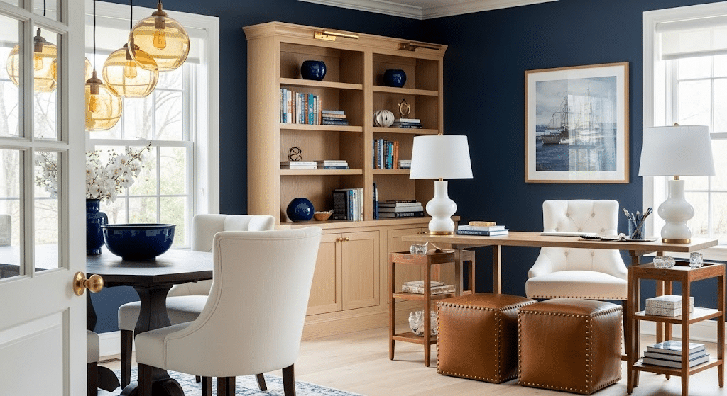
This rich navy creates instant refinement. I recommend it for dining rooms or home offices where you want drama without darkness.
Perfect pairings: Cream or ivory trim, gold hardware, light wood floors
Decor elements to intensify this tone:
- Textiles: Cream velvet dining chairs, brass-studded leather ottomans
- Ceramics: White ceramic table lamps, navy blue decorative bowls
- Glass décor: Amber glass pendant lights, clear crystal accessories
- Natural wood accents: Honey oak bookshelves, teak side tables
Farrow & Ball Calluna
This tranquil lilac feels grown-up and calming. I use it in bedrooms and powder rooms where you want something special but not overwhelming.
Perfect pairings: Soft gray trim, aged brass fixtures, white oak furniture
Decor elements to intensify this tone:
- Textiles: Dusty pink linen pillows, cream velvet headboards
- Ceramics: Soft pink pottery, white ceramic table lamps
- Glass décor: Rose gold glass vases, clear glass picture frames
- Natural wood accents: White-washed pine furniture, natural rattan baskets
Where and How to Use Cool Tones
I’ve learned that each room in your home serves a different purpose. That means these colors work differently in each space.
Let me walk you through my tried-and-true approach for every room.
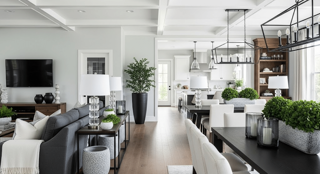
1. Living Room
I always start with serene grays as the foundation in living rooms. They’re foolproof and work with any furniture you already own. Paint your walls in a soft dove gray or charcoal. Then add seafoam green through throw pillows, artwork, or a cozy blanket draped over your sofa.
My favorite trick: Use one seafoam accent wall behind your TV or fireplace. It creates depth without overwhelming the space. I’ve seen this work in tiny apartments and large family rooms alike.
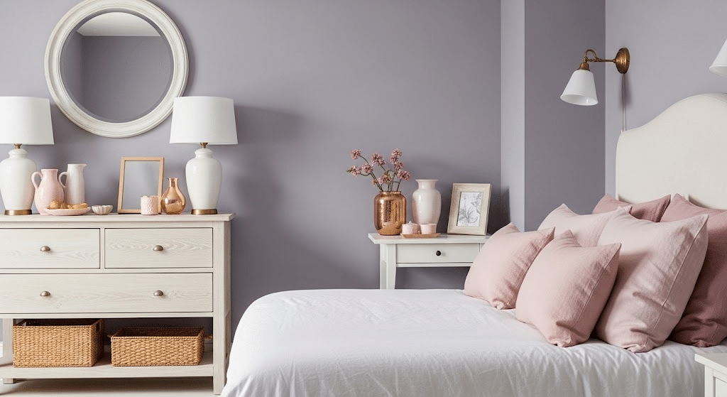
2. Bedroom
Your bedroom should feel like a retreat.
I swear by lavender and icy blues for better sleep. Science backs this up – blue triggers melatonin production in your brain. Paint your bedroom walls in a soft periwinkle or pale lavender. Keep bedding in crisp whites or pale blues.
I avoid dark navy in bedrooms because it can feel too heavy. Light, airy blues work much better for rest.
3. Kitchen
Kitchens get messy. These colors help them feel cleaner and more spacious. I love soft mint green cabinets paired with white countertops. If painting cabinets feels too bold, try dove gray instead. Mint backsplash tiles work beautifully, too.
They reflect light and make your kitchen feel twice as big. I’ve used this trick in galley kitchens with great results.
4. Bathroom
Upgrade your bathroom into a spa with teals and aquas. These colors naturally pair with water and create that luxury resort feeling. Paint walls in a soft teal or add aqua tiles around your shower.
I recommend keeping fixtures white or chrome. They complement cool tones perfectly and keep the space feeling fresh and modern.
Style Layering Tips for Cool Tones
Cool tones bring calm and beauty to home decor, but layering them thoughtfully can upgrade your space even more. Here are some style layering tips to make cool tones work beautifully in your interiors:
- Start with a neutral base like whites, grays, or soft taupes to create a versatile foundation for layering cool tones without overwhelming the space.
- Mix light and dark shades of cool colors to add depth and contrast, preventing the room from feeling flat or washed out.
- Incorporate varied textures such as smooth fabrics, rough wood, or metallic finishes to add tactile interest and richness to the design.
- Use complementary or analogous colors within the cool palette to create harmony or dynamic contrast, like pairing blues with soft greens or purples.
- Add warm accents sparingly through textiles or accessories to balance the coolness and keep the space inviting.
- Layer lighting sources, natural, overhead, and lamps, to intensify the colors’ vibrancy and the room’s atmosphere.
- Bring in natural elements like plants and wooden furniture to soften cool tones and add organic warmth
The Bottom Line
Cool tones have stood the test of time because they adapt to any style, from modern minimalism to cozy farmhouse. I love how versatile they are.
Start small if you’re hesitant. Try cool-toned throw pillows or a single accent wall first. You can always add more once you see how the colors feel in your space.
Match your cool-toned colors to each room’s purpose and lighting. Bright blues work in sunny kitchens, while deeper teals shine in dim bathrooms. Pay attention to how colors change throughout the day.
Your home should feel like a peaceful retreat; tones make that happen naturally.