A front porch does not need a major renovation to look more finished. In a lot of homes, the difference comes down to color choices and a few permanent details that feel intentional from the street.
Bronze is one of the easiest finishes to work with because it adds warmth without looking flashy. It can feel classic, slightly historic, or quietly upscale depending on the porch color around it. The trick is not to treat bronze as a separate decorative layer. It works best when it feels tied to the paint, the trim, and the overall mood of the entry.
Why Bronze Works on a Front Porch
Bronze has more softness than black and more depth than bright gold. That makes it easier to pair with the kinds of paint colors people actually use on porches: warm whites, greiges, muted greens, weathered blues, and darker earthy neutrals.
It also reads well outdoors. Sunlight, shade, and changing weather can flatten some finishes or make them feel harsher than they did in the store. Bronze usually holds up better visually because it already sits in that middle ground between warm and grounded. It adds contrast, but it does not shout.
That is especially helpful on porches where several materials meet in a small space. Painted floors, brick, stone, railings, trim, and a front door can all compete if the palette is not kept under control. Bronze helps bridge those surfaces because it looks comfortable next to both dark and light tones.
Front Porch Color Ideas With Bronze Accents
The best place to start is with the tone of the house itself. A porch should feel connected to the siding, masonry, and roof, not styled as a separate zone. Once that foundation is clear, bronze can work as the warmer thread that pulls the entry together.
A soft beige or warm greige porch is usually the safest option when you want the house to feel inviting and calm. Colors in this range are easier to pair with brick, natural wood, concrete, or stone, and they also give bronze enough contrast to stand out. A shade like Accessible Beige works well when the goal is to keep the porch light but not washed out. The warmth in the paint helps bronze feel intentional rather than added at the last minute.
If you want a little more depth, a grayer greige can push the entry in a more tailored direction. Something like Revere Pewter gives the porch enough body to feel substantial while still leaving room for warmer metal details. This kind of color tends to work especially well on U.S. homes with stone steps, brick foundations, or black shutters because it stays flexible across a lot of common exterior materials.
Muted green is another strong match. Sage, olive-gray, and softer historic greens all work nicely with bronze because they share the same quiet warmth. They feel natural together, especially when the porch has wood furniture, planters, or older architectural details. A green porch color can also make bronze look richer without forcing the whole entry into a dark palette.
For a moodier look, deeper browns and charcoal-bronze tones can be very effective. A dark color like Urbane Bronze exteriors can work well when the porch gets decent daylight and has lighter trim or stone nearby to keep it balanced. In the right setting, that kind of depth can make even a simple front door and light fixture look more custom.
Start With Fixed Exterior Surfaces
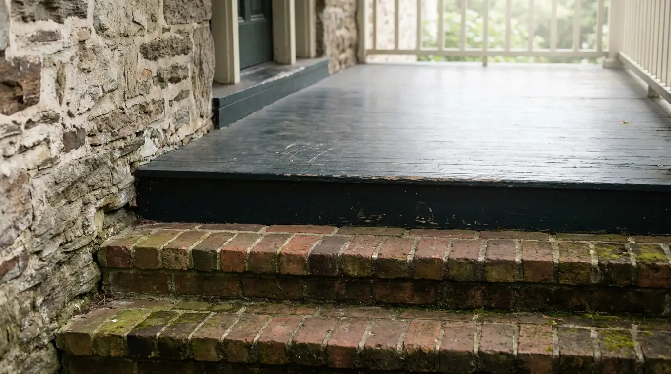
One reason porch color plans fall apart is that people choose paint in isolation. They focus on the door or floor color first and forget to account for the parts that are already fixed, like brick, stone, roofing, or stair treads.
It helps to think of the porch as one small exterior composition. The floor, ceiling, trim, door, and hardware all need to sit comfortably with the materials that are not changing. That is why a lot of porch paint ideas work best when they start with the undertones already present in the house rather than chasing a color trend first.
If the masonry leans warm, bronze will usually feel natural. If the masonry leans cooler, you may need a paint color with enough softness to keep the finish from feeling too orange. Either way, it is easier to get the result right when the porch color is chosen as part of the full entry, not as a standalone swatch decision.
Use Bronze in Permanent Details
Bronze looks best when it shows up in places where the eye already expects a finish change.
Light fixtures are the obvious choice, but they are not the only one. Door handles, kick plates, mailbox details, planters, rail caps, and house numbers can all carry the finish. The most convincing porches usually repeat the metal in two or three places, then stop.
Bronze can also carry through house numbers or custom cut letters in bronze when the goal is to make the entry feel more architectural than decorative.
The important part is restraint. Bronze works because it feels grounded. Once it starts appearing on every accessory, it loses that effect.
Keep Front Porch Styling in Proportion
Even a good porch color can look off if the styling around it is too large, too busy, or too scattered. A front entry is a relatively tight visual area, so scale matters more than people think.
That is true of seasonal decor as well. Wreath size and placement matter because a piece that is too small can make the door look unfinished, while one that is too large can crowd the trim and fight the hardware.
That balance matters even more when bronze is part of the look. Because the finish already adds visual weight, the surrounding pieces do not need to do as much.
What Makes Bronze Porch Colors Work
The strongest porch updates usually come from choices that support each other. A warm neutral or muted green sets the tone. Bronze adds depth. A few permanent details repeat that finish in a way that feels settled instead of styled for a season.
That is what makes front porch color ideas with bronze accents work so well. They do not rely on one dramatic feature. They make the whole entry feel more intentional, which is often what turns an ordinary porch into one that looks custom.