An elevator changes how people move through a building, but it does not have to announce itself. With the right planning, the cab, doors, and lobby can read like part of the architecture instead of a separate machine.
In busy public areas, that quiet integration can make circulation feel more natural. The goal is simple: make the ride feel like stepping into another well-finished room.
Treat The Elevator As A Built-In Element
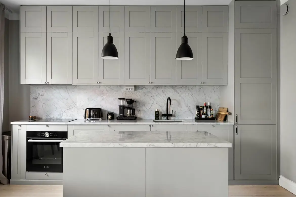
Great integration starts with the surfaces around the elevator, not the elevator itself. When surrounding walls, ceilings, and flooring line up cleanly at the door frame, the opening feels intentional. Designers often treat the elevator like a built-in cabinet that just happens to move.
Inside the cab, wall panels, reveals, and trims can echo nearby millwork so the cabin reads like a continuation of the hallway.
Landing doors and frames deserve the same attention as any other opening, with reveals sized to match adjacent details. When the door face picks up the same finish as an adjacent wall panel, the elevator starts to disappear in plain sight.
Start With The Building’s Design Language
The most seamless elevators follow the same design rules as the rest of the space. For teams coordinating Commercial elevator services across Michigan, Wisconsin, or whatever is local during a remodel, early site notes help keep door lines, trim profiles, and panel seams consistent. A quick field mock-up can show where shadows fall and which joints will be most visible.
Older buildings often lean on symmetry and heavier trim, and new buildings lean on thin profiles and flat planes. Either approach can work when the elevator details match the pattern. When the lobby reads like one composition, the elevator becomes part of the backdrop.
Use Materials That Feel Intentional, Not Industrial
Material choice carries most of the visual weight. Wood veneers can warm up a modern corridor, and stone can give a quiet sense of permanence in a public lobby.
Better Homes & Gardens has pointed to bold marble veining as a current interior trend, which fits well when stone shows up as an accent rather than a full surround.
A simple palette keeps the elevator from looking like a patchwork of parts. These details tend to read clean in both new builds and refreshes:
- Door finish matches a nearby wall panel or millwork tone.
- One metal repeats across pulls, trims, and signage.
- The same flooring continues at the threshold with a crisp transition strip.
- Strong patterns stay on one focal surface, such as a feature wall in the lobby.
- Graphics stay minimal, so the architecture does most of the work.
Practicality still matters. Fingerprints, scratches, and cleaning routines shape what works in busy buildings. Many teams pick a hero material for the lobby and a more forgiving finish for the cab, so the space stays polished with routine care.
Minimize Visual Noise With Clean Hardware
Controls, indicators, and signage can crowd the eye if every piece looks unrelated.
A coordinated fixture set, with consistent fonts and finishes, makes the cab feel designed rather than assembled. Slim profiles and flush mounting reduce the sense of clutter, even in small cars.
Hardware placement shapes the experience. When handrails align with panel joints, and lighting runs parallel to the long wall, the interior feels balanced.
A single finish family can tie the cabinet to nearby door hardware in the corridor. Clean detailing can still meet accessibility needs, with clear contrast and readable labels, without turning the cab into a billboard.
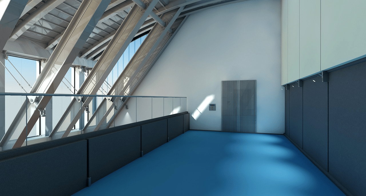
Lighting And Acoustics Make It Feel Like A Room
Lighting is often the difference between “utility” and “interior.” Soft, even light across wall panels reduces harsh reflections and hides small wear.
Downlights can work, but indirect light at the ceiling edge can feel more like a finished room, even in a commercial setting. A softer ceiling texture can help keep glare under control.
Sound and airflow shape comfort in the same way. A cab with tighter joints, thoughtful ventilation, and a bit of acoustic backing feels calmer from the first step in. When the cab lighting and hallway lighting share a similar tone, the transition feels natural.
Modernization Without Losing The Building’s Rhythm
Many properties want a visual update without long outages.
Engineered Group has noted that architectural finishes can help avoid common interior damage issues and allow many modernization projects to wrap up in a day or two, which supports refreshes in occupied buildings.
A good update plan focuses on touchpoints people notice most: door faces, cab wall panels, ceiling light, and control stations.
When those pieces match the building’s broader material story, the elevator stops feeling like an inserted object. Modernization can still respect original character, keeping the elevator in step with the interior as it evolves.
A well-blended elevator is less about hiding a machine and more about completing a space. Consistent lines, a limited palette, and calm lighting can make the cab feel like part of the building’s design, not a break from it.
When the details stay cohesive, the elevator becomes another interior room that happens to move.