Most bathrooms still follow a quiet rulebook no one talks about. Walls stay straight, fixtures line up neatly, and every surface feels contained within invisible boundaries. Nothing feels wrong, though nothing feels memorable either. The space works, but it rarely leaves an impression. That boxed-in look has less to do with size and more to do with repetition: the same lines, the same placements, the same visual stops.
Recent design thinking has started to question that pattern. Instead of treating the bathroom as a fixed grid, it is now being approached as a space that can guide movement and hold attention. Subtle changes in layout, form, and material are transforming how the room is experienced.
Working With the Right Expertise
A boxy bathroom rarely fixes itself through surface updates. New tiles or fixtures can refresh the look, though the underlying structure often stays unchanged. The layout continues to follow the same rigid logic, which means the space still feels predictable. Breaking away from that requires a different kind of thinking, one that looks at how the room is organized before deciding how it should look.
An experienced bathroom remodeling company often approaches the space with this mindset. Instead of treating each element separately, they read the room as a whole. A vanity may shift slightly off-center, a wall surface may carry a different material to interrupt flatness, or a shower boundary may be softened to reduce segmentation.
Layered Wall Surfaces
Flat walls are one of the biggest reasons bathrooms feel boxed in. A single material stretched across every surface creates a visual stop. The eye has nowhere to travel, so it settles quickly, and the space feels smaller than it is.
Introducing variation across walls changes that entirely. A narrow vertical strip of textured tile behind a sink, a stone panel that breaks into an otherwise smooth wall, or even a subtle shift in finish can redirect attention. The room begins to unfold in sections rather than presenting itself all at once. Light reacts differently across each surface, creating moments that feel intentional without needing bold contrast.
Curved Design Elements
Bathrooms tend to rely heavily on straight edges. Cabinets, mirrors, tiles, and even lighting often follow rigid lines that reinforce the room’s structure. However, that repetition creates a visual flow that feels mechanical.
Curves interrupt that pattern in a way that feels natural rather than forced. A rounded mirror changes how the wall is read. A vanity with softened edges reduces the sense of bulk. Even a slightly curved partition can shift how the eye moves through the space.
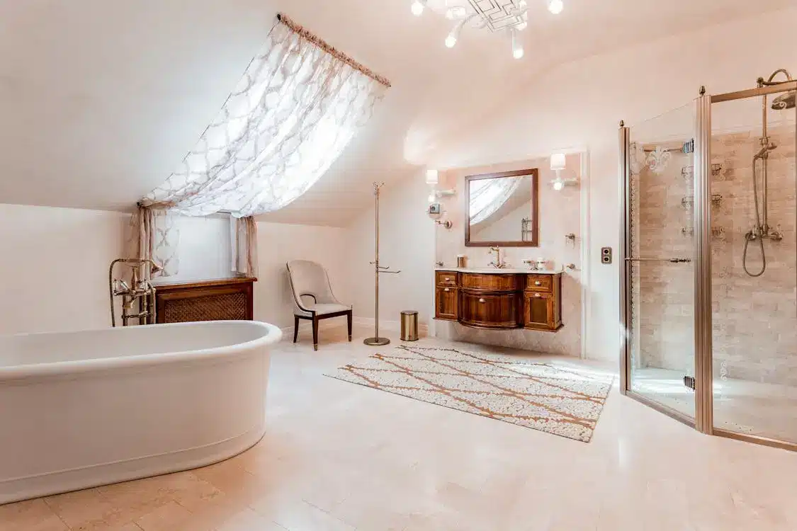
Integrated Shower Design
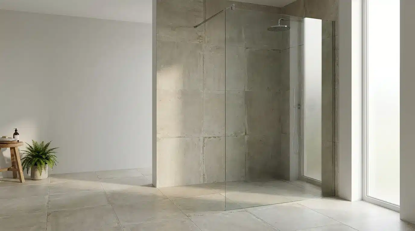
The traditional shower often feels like a separate unit placed within the bathroom. Framed, enclosed, and clearly defined, it creates a strong visual boundary that divides the space. This separation reinforces the boxy feel, even in larger bathrooms.
A more integrated approach removes that hard division. Using the same material across the shower floor and the rest of the bathroom creates continuity. Minimal glass panels define the area without closing it off completely. In some layouts, the shower becomes an extension of the room rather than a contained section. The eye moves through it without interruption, which changes how the entire space is perceived.
Vertical Focus
Most bathrooms are built with a strong horizontal emphasis. Tiles run side to side, vanities stretch across walls, and storage sits low. This orientation keeps the space visually grounded, which can make it feel compressed.
Drawing attention upward shifts that perception. Vertical tile arrangements, tall storage elements, or even a narrow feature wall that reaches toward the ceiling can change how height is experienced. The room begins to feel taller without any structural change. It is a subtle adjustment, though it alters the balance of the space.
Playing With Tile Patterns
Tile is often treated as a background decision, something chosen once and applied uniformly across the room. That approach tends to flatten the space, especially when the pattern follows a predictable grid. The eye moves across it quickly and then stops, reinforcing the sense of enclosure.
Changing how the tile is arranged introduces a different experience. A herringbone pattern behind a vanity, a diagonal layout across the floor, or a vertical stack that shifts direction mid-wall can guide movement across the room. The space begins to feel active rather than static. Even using the same tile in varied orientations can create subtle shifts that keep the eye engaged.
Using Partial Dividers
Full walls tend to break a bathroom into strict sections. Each area becomes clearly defined, though the overall space feels smaller and more contained. That structure reinforces the boxed-in effect, even in layouts with generous square footage.
Partial dividers offer a different solution. A half wall, a slim partition, or even a vertical panel can separate areas without closing them off entirely. For example, a low divider between a vanity and shower can provide definition while still allowing light and sightlines to pass through.
Framing Mirrors With Intention
Mirrors often follow predictable shapes and placements. Rectangular mirrors aligned directly above vanities continue the same straight lines already present in the room. While functional, they rarely add anything new to the visual composition.
A mirror can do more than reflect. Its shape and framing can shift how the wall is perceived. An arched mirror introduces height and softness. A rounded frame breaks the repetition of corners. Even a slightly oversized mirror placed off-center can change the balance of the space.
Repositioning Key Elements
Symmetry often defines traditional bathroom layouts. Sinks are centered, mirrors align perfectly, and fixtures follow a predictable order. While this creates balance, it can make the space feel overly structured and repetitive.
Adjusting the placement of key elements introduces a more natural flow. A vanity placed slightly off-center, a mirror positioned to one side, or lighting that does not follow a strict pair can shift the visual weight of the room. The layout begins to feel more relaxed, less bound by rigid rules.
Creating Focal Points
A room without a focal point often feels flat. The eye moves across it without stopping, which makes the space feel uniform and unremarkable. In bathrooms, this can reinforce the sense of repetition created by straight lines and consistent materials.
Introducing a focal point changes that dynamic. A textured wall behind a vanity, a statement light fixture, or a distinct material used in one area can draw attention. The focus shifts to that element, allowing the rest of the room to support it rather than compete.
The boxed-in look that defines many bathrooms comes from repetition and predictability. Straight lines, uniform materials, and strict layouts all contribute to that feeling. Changing it does not require a complete overhaul. It comes from a series of deliberate choices that introduce variation, soften structure, and guide how the space is experienced. Each adjustment, whether through layout, material, or form, allows the room to open up visually.