Choosing the right paint color sounds simple until you stand in front of a wall of swatches. What looked perfect online suddenly feels too dark, too bright, or completely different under your home’s lighting. Many homeowners feel stuck between playing it safe with beige or risking a bold shade they might regret later.
Paint is one of the most powerful tools in home design. It shapes mood, influences how large or small a room feels, and ties together furniture and décor. The good news is that you do not need to be a designer to make confident choices. With a clear strategy and an understanding of how color works in different spaces, you can select shades that feel intentional and timeless.
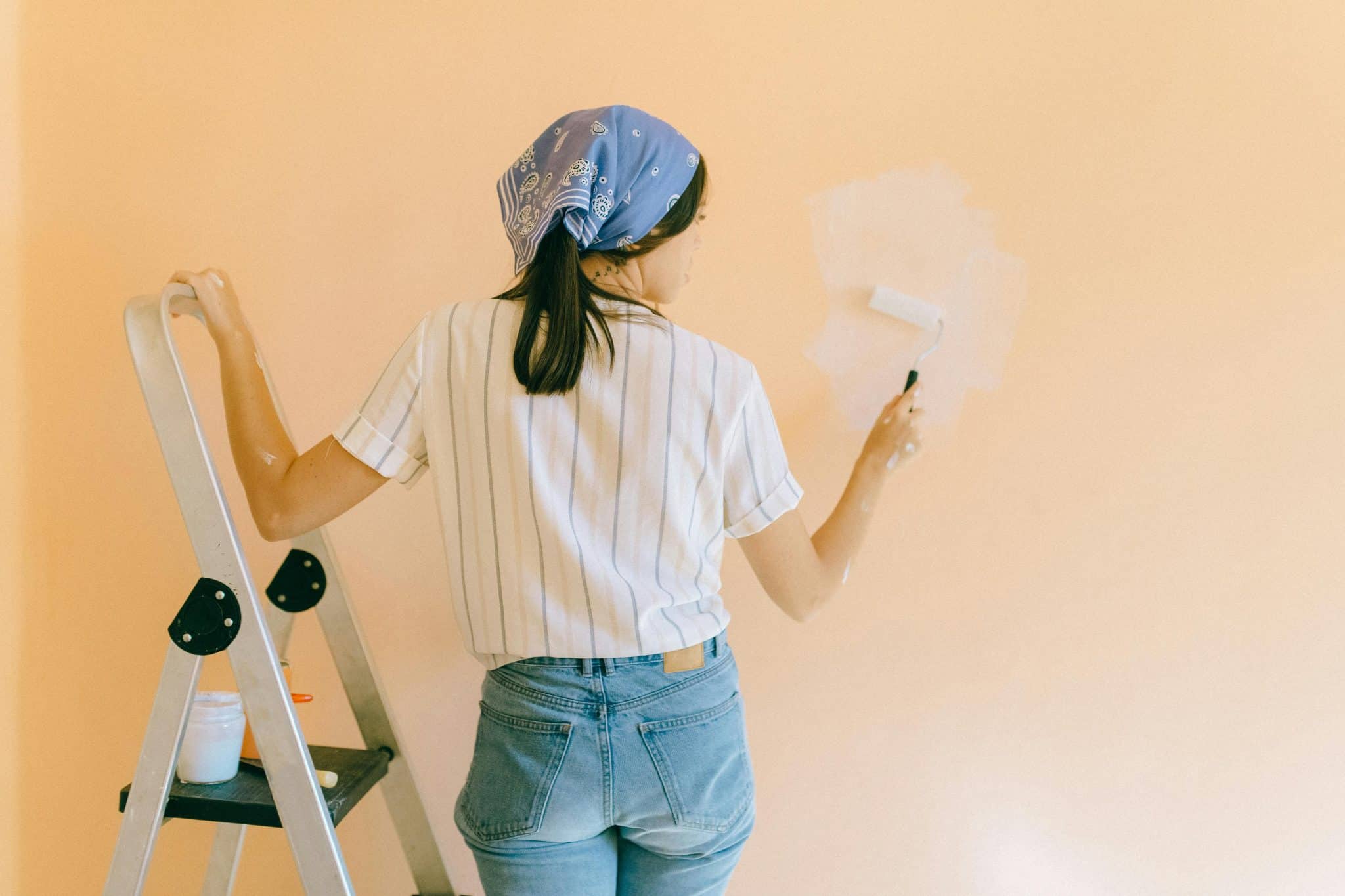
Below is a practical guide to help you choose the perfect paint color for every room in your home.
Start With the Purpose of the Room
Before picking up color samples, ask yourself one simple question: How do I want this room to feel?
Each room serves a different purpose. A bedroom should promote rest. A living room should feel welcoming. A kitchen often needs energy and warmth. Paint color should support the function of the space, not fight against it.
If you feel stressed in your bedroom, bright or overly saturated colors may be part of the problem. If your living room feels dull and lifeless, muted tones might need a bit more warmth or contrast.
Defining the mood first prevents random decisions later.
Understand How Light Affects Color
Lighting changes everything. A color that looks soft and warm in a store may appear cool or dull at home.
Natural light varies by direction:
- North-facing rooms often feel cooler and slightly shadowed.
- South-facing rooms receive warmer, brighter light.
- East-facing rooms feel warm in the morning.
- West-facing rooms glow warmly in the afternoon.
Artificial lighting also plays a role. Warm bulbs enhance warm tones. Cool LED lights can make beige appear gray or blue.
Always test paint samples on multiple walls and observe them throughout the day. This small step prevents expensive repainting.
Choosing Colors for the Living Room
The living room is usually the heart of the home. It’s where you host guests, relax in the evening, and spend time with family.
For a welcoming atmosphere, warm neutrals like soft taupe, creamy white, or light greige work well. They provide flexibility for furniture and décor changes over time.
If you want something more expressive, muted blues or sage greens add personality without overwhelming the space. These shades feel modern but still timeless.
Avoid extremely dark tones unless you have plenty of natural light. Deep colors can look stunning but may make smaller living rooms feel confined.
Selecting Bedroom Colors for Better Rest
Bedrooms benefit from calming tones. Soft blues, dusty greens, pale lavender, and warm whites create a peaceful environment.
If your bedroom feels restless or cluttered, high-energy colors like bright red or intense orange may be contributing to the issue. Cooler tones lower visual stimulation and help the space feel serene.
For those who prefer darker walls, charcoal or deep navy can create a cozy, cocoon-like atmosphere. Just balance them with lighter bedding and soft lighting.
Kitchen Paint Colors That Inspire
The kitchen often serves as both a workspace and a social hub. Paint color can influence how energetic or relaxed the space feels.
Soft yellows, warm whites, and light greens create a fresh, inviting environment. These shades reflect light and pair well with wood cabinets or stone countertops.
If your kitchen feels outdated, a modern gray or muted blue can refresh it instantly. Even small changes to wall color can make older cabinets feel intentional rather than tired.
In homes designed by experienced custom home builders in Columbus, color flow between kitchen and living areas is often carefully planned. You can apply the same idea by choosing a kitchen shade that complements adjacent rooms rather than clashes with them.
Dining Room: Set the Tone for Hosting
Dining rooms offer more freedom to experiment. Since they are used less frequently than bedrooms or kitchens, you can take a slightly bolder approach.
Deep greens, navy blues, or warm terracotta tones create an intimate setting for dinner parties. These colors feel sophisticated and encourage conversation.
If you prefer something lighter, soft beige with warm undertones keeps the space bright while still feeling elegant.
Bathroom Colors That Feel Clean and Calm
Bathrooms benefit from clean, airy colors. Light gray, pale blue, soft aqua, and crisp white are popular for a reason. They enhance brightness and make small bathrooms feel larger.
Avoid overly dark colors in compact bathrooms unless you are intentionally creating a dramatic powder room look. In that case, strong contrast with mirrors and lighting is essential.
Moisture-resistant paint finishes are also important in bathrooms. Satin or semi-gloss finishes are easier to clean and hold up better in humid conditions.
Creating a Cohesive Flow Throughout the Home
One of the biggest mistakes homeowners make is choosing each room’s color in isolation. When moving from room to room, abrupt changes can feel jarring.
Instead, create a simple color palette for the entire home. This does not mean every room must be identical. It means the tones should relate to one another.
For example:
- Use one main neutral throughout common areas.
- Introduce complementary accent colors in bedrooms.
- Repeat subtle undertones across spaces.
This approach creates visual harmony and makes your home feel thoughtfully designed.
How to Avoid Common Paint Mistakes
Choosing paint can be overwhelming. Here are a few mistakes to avoid.
Relying only on small swatches
Tiny paint chips do not show how a color will feel across an entire wall. Always test larger samples.
Ignoring undertones
Two beige colors may look similar but have different undertones. One might lean pink, another yellow. These undertones affect how they pair with flooring and furniture.
Skipping surface preparation
Even the perfect color will look bad on poorly prepared walls. Cleaning, sanding, and priming matter more than many realize.
This is where skilled painters can make a noticeable difference. Proper application ensures even coverage and a professional finish that elevates the final result.
Using Accent Walls Wisely
Accent walls can add interest without overwhelming a room. They work best when there is a natural focal point, such as behind a bed or fireplace.
Choose a shade that complements the surrounding walls rather than competing with them. In smaller spaces, too many contrasting colors can make the room feel fragmented.
If you’re unsure, subtle contrast often works better than dramatic shifts.
Matching Paint With Furniture and Flooring
Before committing to a color, consider permanent elements in the room.
- Wood floors have warm or cool undertones.
- Countertops may contain flecks of gray, beige, or brown.
- Large furniture pieces influence the overall color story.
Choose paint that complements these features instead of fighting against them. Bringing a flooring sample to the paint store can help you compare undertones accurately.
The Role of Finish in the Final Look
Finish affects both appearance and durability.
Matte finishes hide imperfections but can be harder to clean. Eggshell and satin finishes offer a subtle sheen and are easier to maintain. Semi-gloss works well for trim, doors, and high-traffic areas.
Choosing the right finish ensures your color looks polished and stands up to daily life.
When to Go Bold and When to Stay Neutral
Neutral tones provide flexibility and longevity. They are ideal if you frequently update décor or plan to sell your home in the near future.
Bold colors add personality and make a statement. They work well in rooms where you want to express creativity or create mood.
If you are hesitant, try bold color in smaller areas first. You can always expand later once you feel confident.
Final Thoughts
Choosing the perfect paint color for every room is not about following trends. It is about understanding how color affects mood, how light changes perception, and how each space functions in your daily life.
Start with purpose. Test samples. Pay attention to undertones. Consider flow between rooms. With a thoughtful approach, you can transform your home room by room without feeling overwhelmed.
Paint is one of the most affordable and impactful upgrades available. When chosen carefully, it turns ordinary walls into the foundation of a beautiful, cohesive living space that truly feels like home.