Choosing colors for your home can feel daunting. You stand in the paint aisle, staring at hundreds of swatches, and nothing feels right.
The colors you pick never look the same on your walls as they did on those tiny cards. I get it, I’ve been there too.
But being honest, finding your perfect interior design color palette doesn’t have to be this hard.
In this blog, I’ll show you practical ways to choose colors that work for your space.
You’ll learn how to pick shades that match your style, make your rooms feel bigger, and create a home you actually love coming back to.
The Secret Behind a Great Color Palette
A great color palette isn’t about following trends or copying magazine photos. It’s about balance.
Think of it like cooking. You need the right mix of ingredients. Too much of one thing, and the whole dish falls apart.
The secret? Use the 60-30-10 rule.
Pick one primary color for 60% of your room – walls, big furniture. Then choose a secondary color for 30% – curtains, chairs, rugs. Finally, add an accent color for the last 10% – pillows, art, small decorations.
This formula works because it creates a visually pleasing look. Your eyes know where to rest. The room feels complete, not chaotic.
And cherry on top, you can use this rule in any room, with any colors you love.
Choosing an Interior Design Color Palette that Reflects Your Style
Your home should tell your story. The colors you pick need to match who you are, not what someone else thinks looks good.
Start by asking yourself what makes you feel calm and happy. Do you love the ocean? Forest walks? City lights at night? Your answers will guide you toward the right shades.
Here are some style directions to consider:
- Modern minimalist – Stick with whites, grays, and one bold accent color
- Soft and cozy – Think beiges, soft browns, and cream tones
- Bright and cheerful – Use yellows, corals, and light blues
- Nature lover – Go for greens, earth tones, and natural wood colors
Color Combinations that Inspire Beautiful Spaces
The right color combinations can completely change how a room feels. Some pairings bring energy, others create peace.
I’ve put together few tried-and-tested combinations that work beautifully in real homes.
1. Navy Blue and White
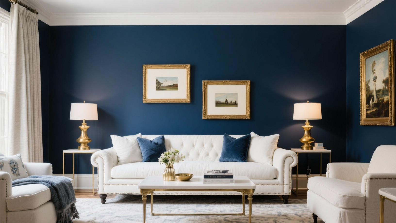
This classic pairing never goes out of style. Navy brings depth and complexity, while white keeps things fresh and clean. Use navy on an accent wall or for your sofa, then add white trim, curtains, and bedding.
Throw in brass or gold accessories for a touch of comfort. It works perfectly in bedrooms, living rooms, and even bathrooms.
2. Sage Green and Cream
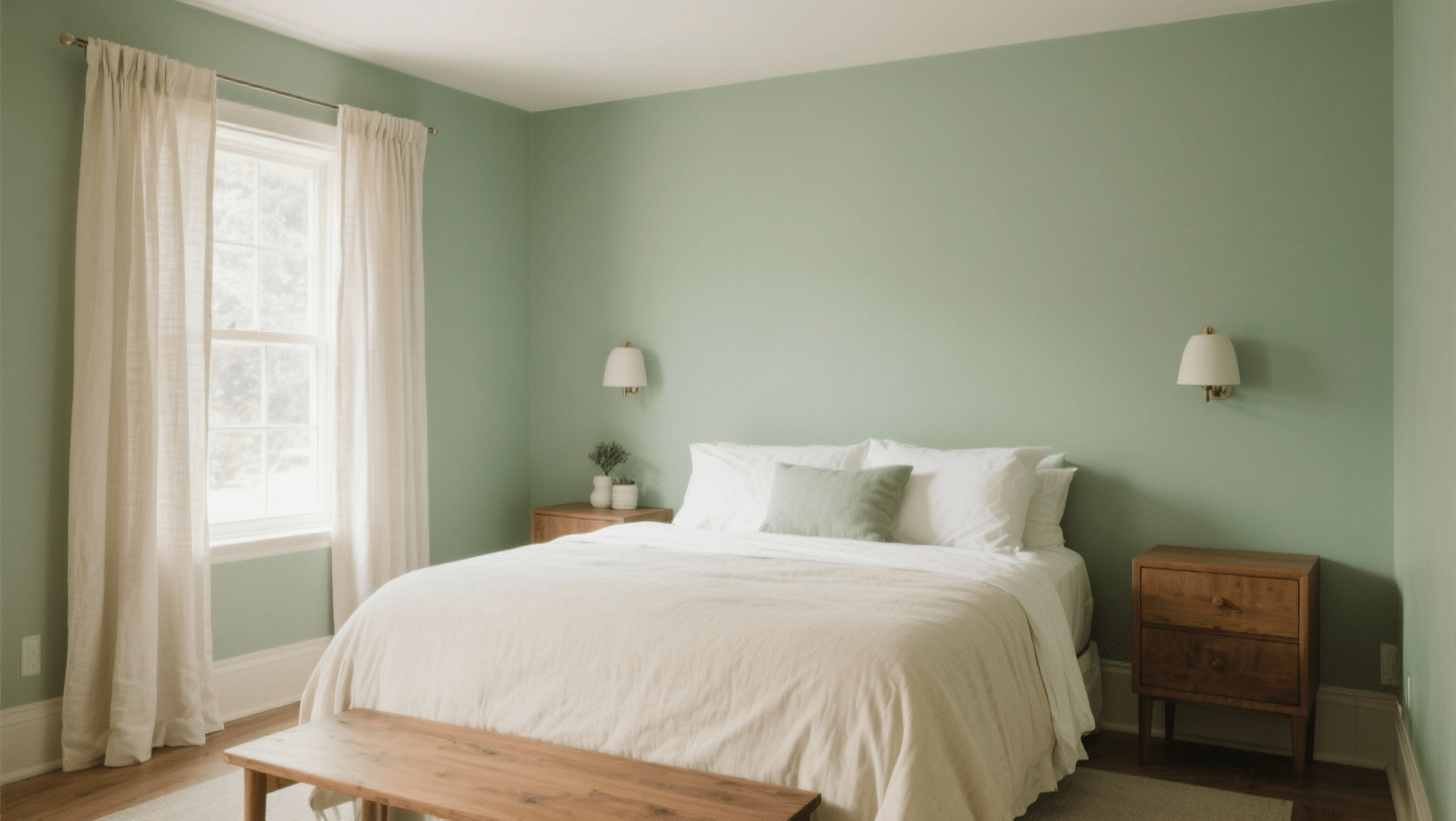
Soft and calming, this combination feels like bringing the outdoors inside.
Sage green works well on walls, while cream can cover your larger furniture pieces.
Add natural wood accents, woven baskets, and linen textures. This palette suits kitchens, bedrooms, and reading nooks beautifully.
3. Terracotta and Ivory
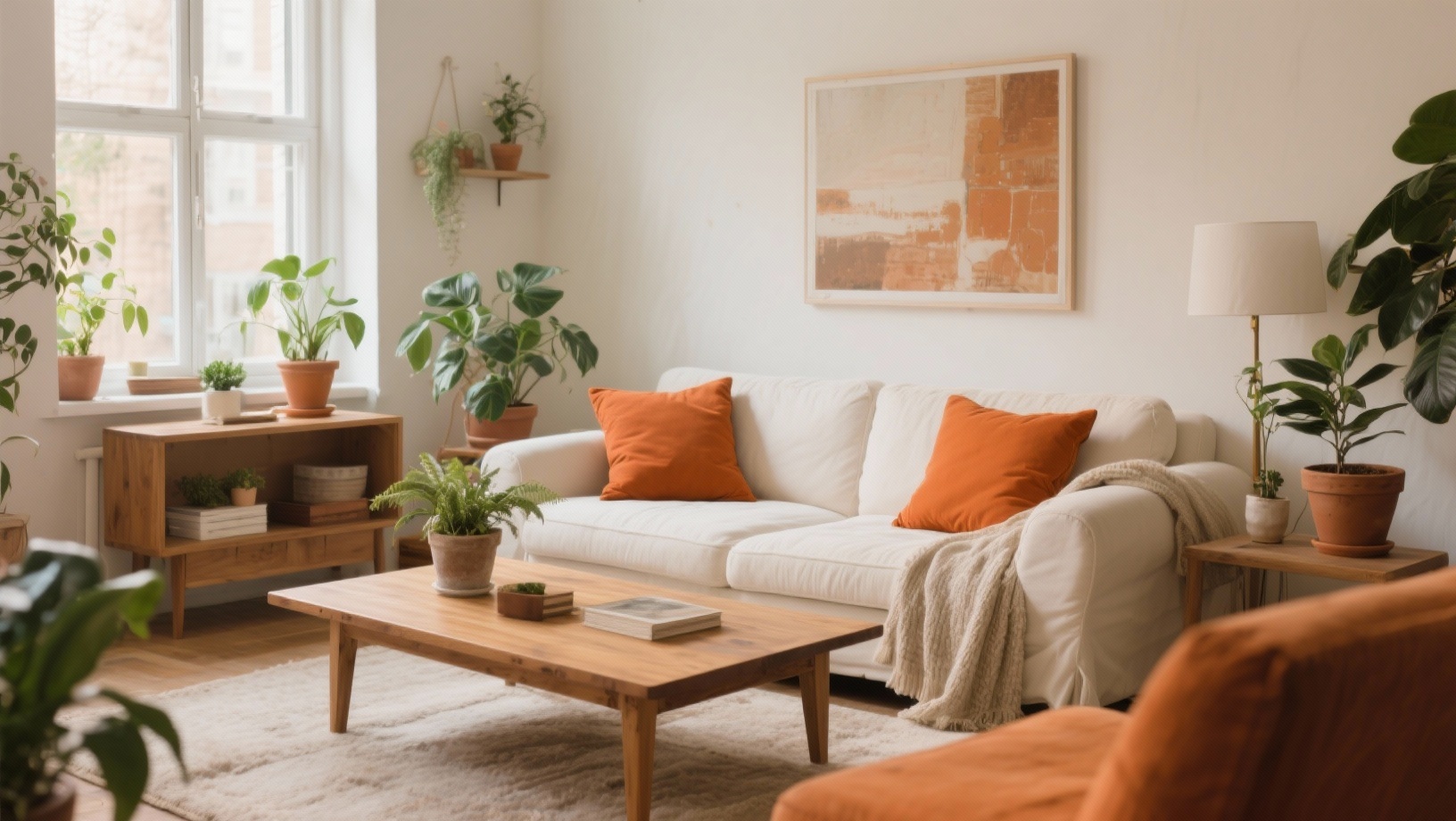
Soft and inviting, these earth tones create a cozy atmosphere. Terracotta can appear in throw pillows, pottery, or an accent wall.
Eep ivory as your base color for walls and main furniture. Include plants, wooden bowls, and ceramic vases to complete the look. This combination shines in living rooms and dining spaces.
4. Charcoal Gray and Blush Pink
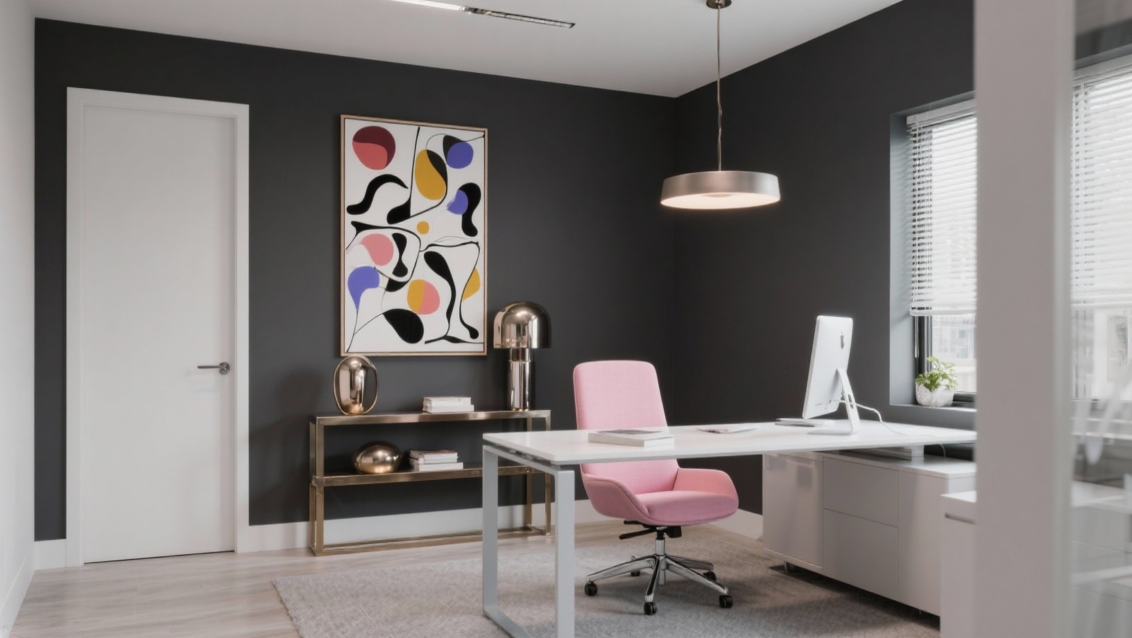
Modern yet soft, this pairing balances masculine and feminine tones.
Charcoal gray anchors the space through furniture or feature walls. Blush pink comes in through cushions, artwork, and smaller decor items.
Add metallic silver or chrome accessories for extra polish. Perfect for bedrooms and home offices.
5. Mustard Yellow and Gray
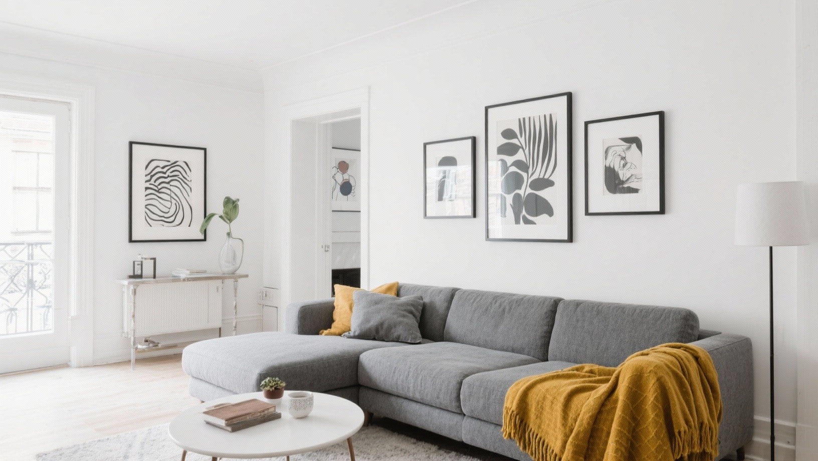
Cheerful without being over, this duo adds personality to any room. Use gray as your dominant color on walls and large pieces.
Mustard yellow pops through in chairs, throw blankets, and art. Include some white elements to keep things balanced. Great for living rooms and entryways.
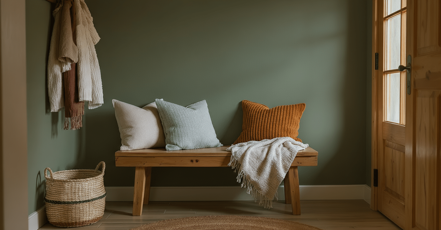
6. Forest Green and Tan
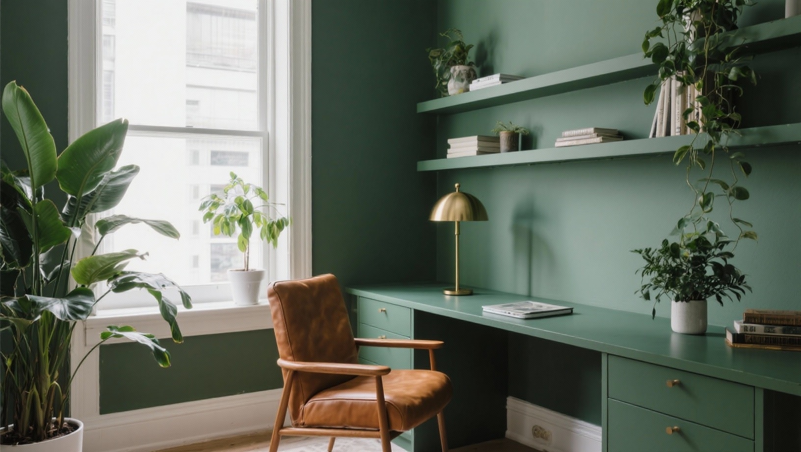
Rich and grounding, these colors create a sophisticated retreat. Forest green works as an accent wall or on velvet furniture. Tan covers your base – walls, rugs, and neutral pieces.
Bring in leather accessories, brass lighting, and plenty of greenery. Ideal for studies, bedrooms, and cozy corners.
7. Coral and Turquoise
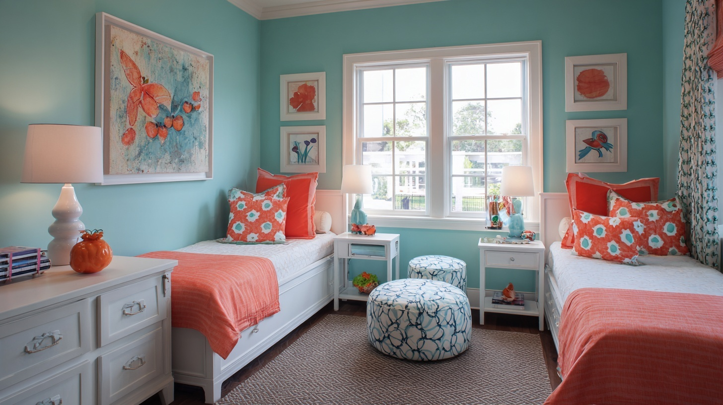
Bright and energetic, this tropical combination brings instant happiness. Use turquoise as your primary wall color or for larger furniture items.
Coral adds fun through pillows, lamps, and decorative pieces. Keep some white in the mix to prevent overstuffing. Works wonderfully in kids’ rooms and sunrooms.
8. Black and White with Wood Tones
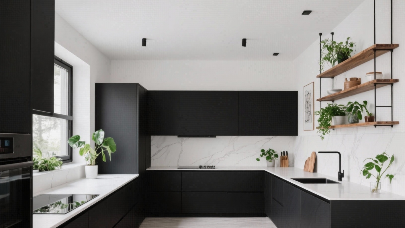
Clean and eternal, this trio never fails to impress.
Black and white create a strong contrast through furniture and decor. Natural wood adds an inviting feel and helps prevent the space from feeling cold.
Add green plants for a pop of life. This combination suits every room in your home.
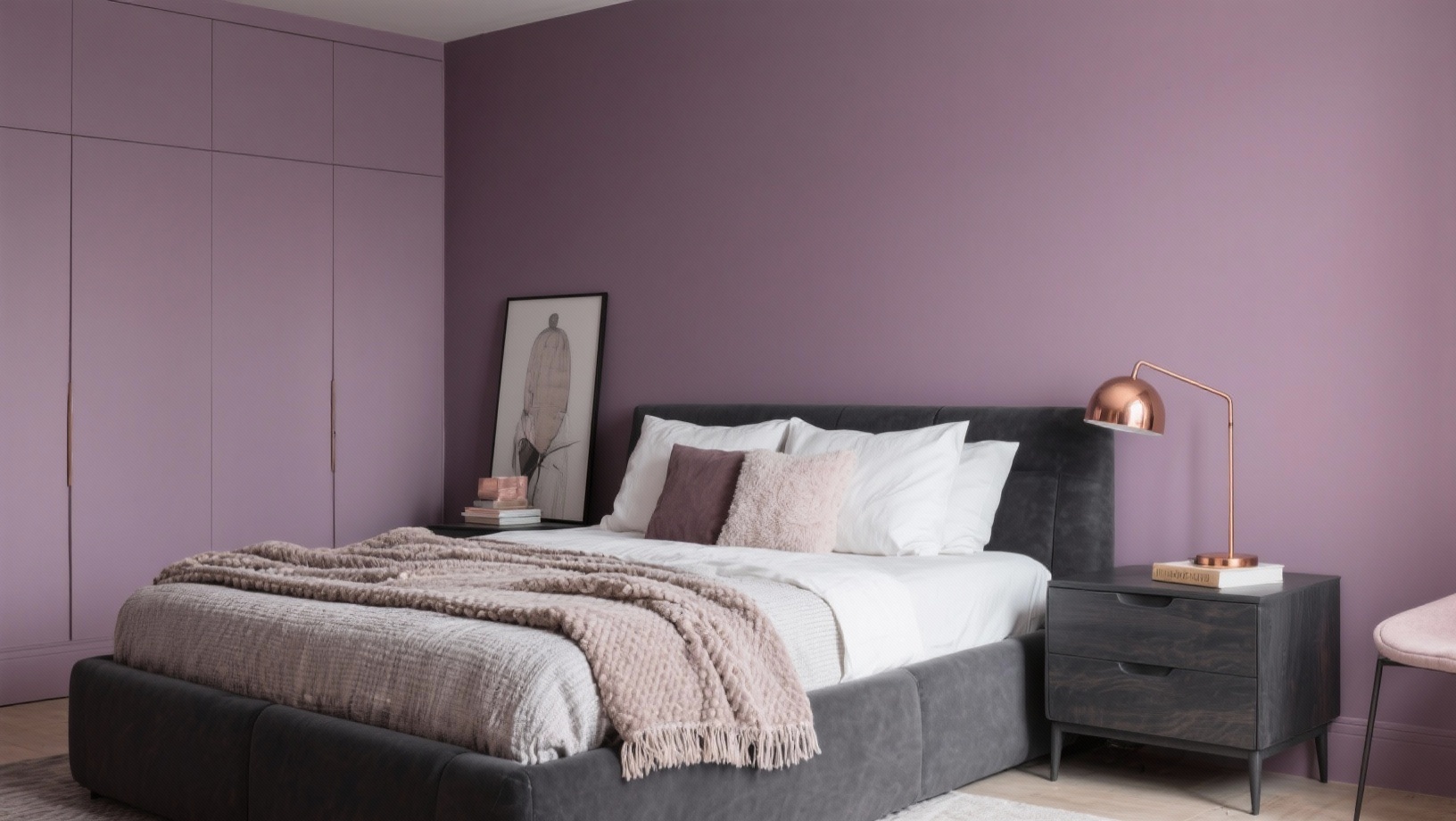
9. Lavender and Gray
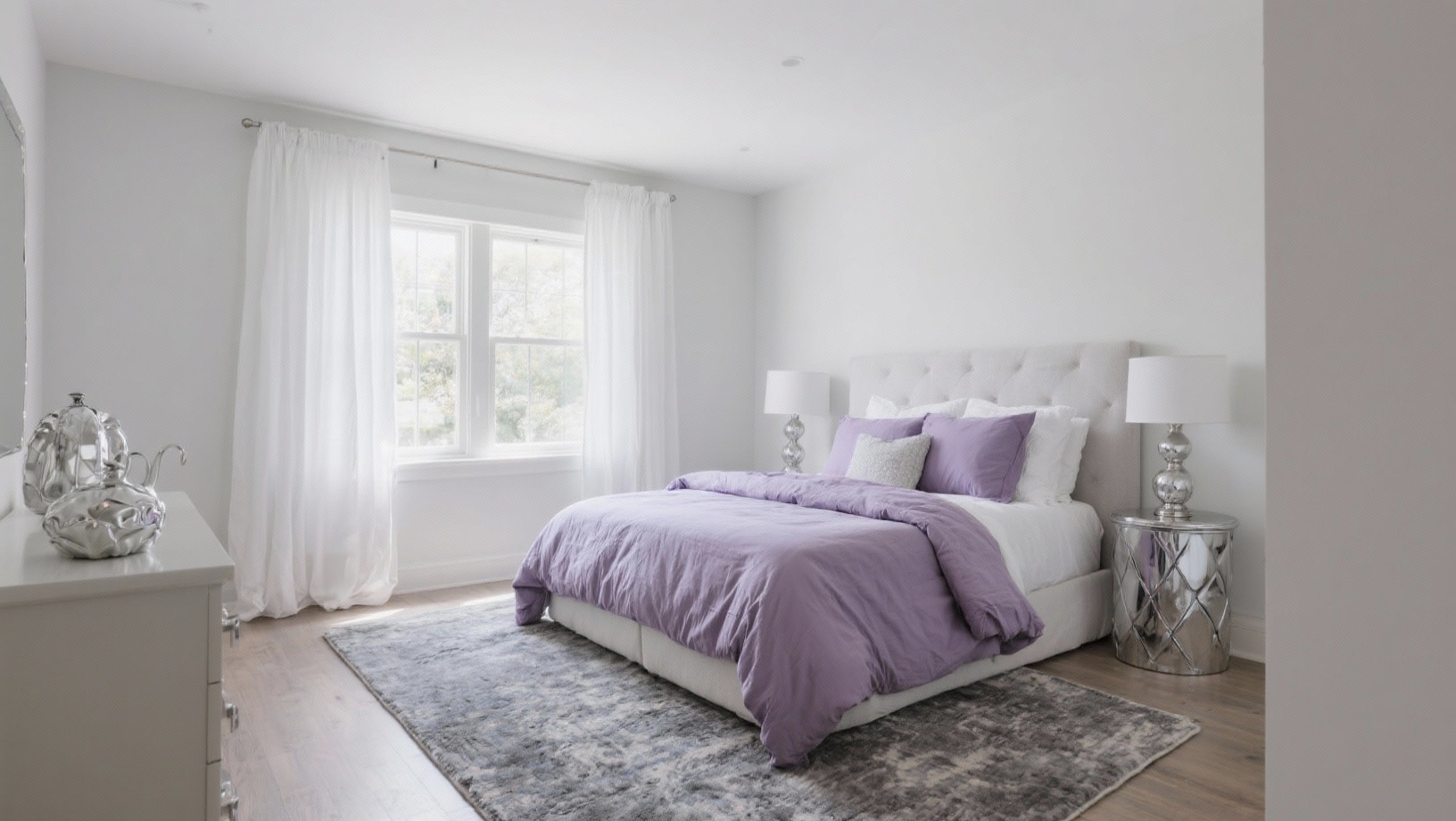
Soft and serene, these colors promote relaxation. Lavender can color your walls or appear in bedding and curtains. Gray grounds the space through furniture and rugs.
Include white accessories and silver frames for brightness. Perfect for bedrooms and meditation spaces.
10. Burnt Orange and Teal
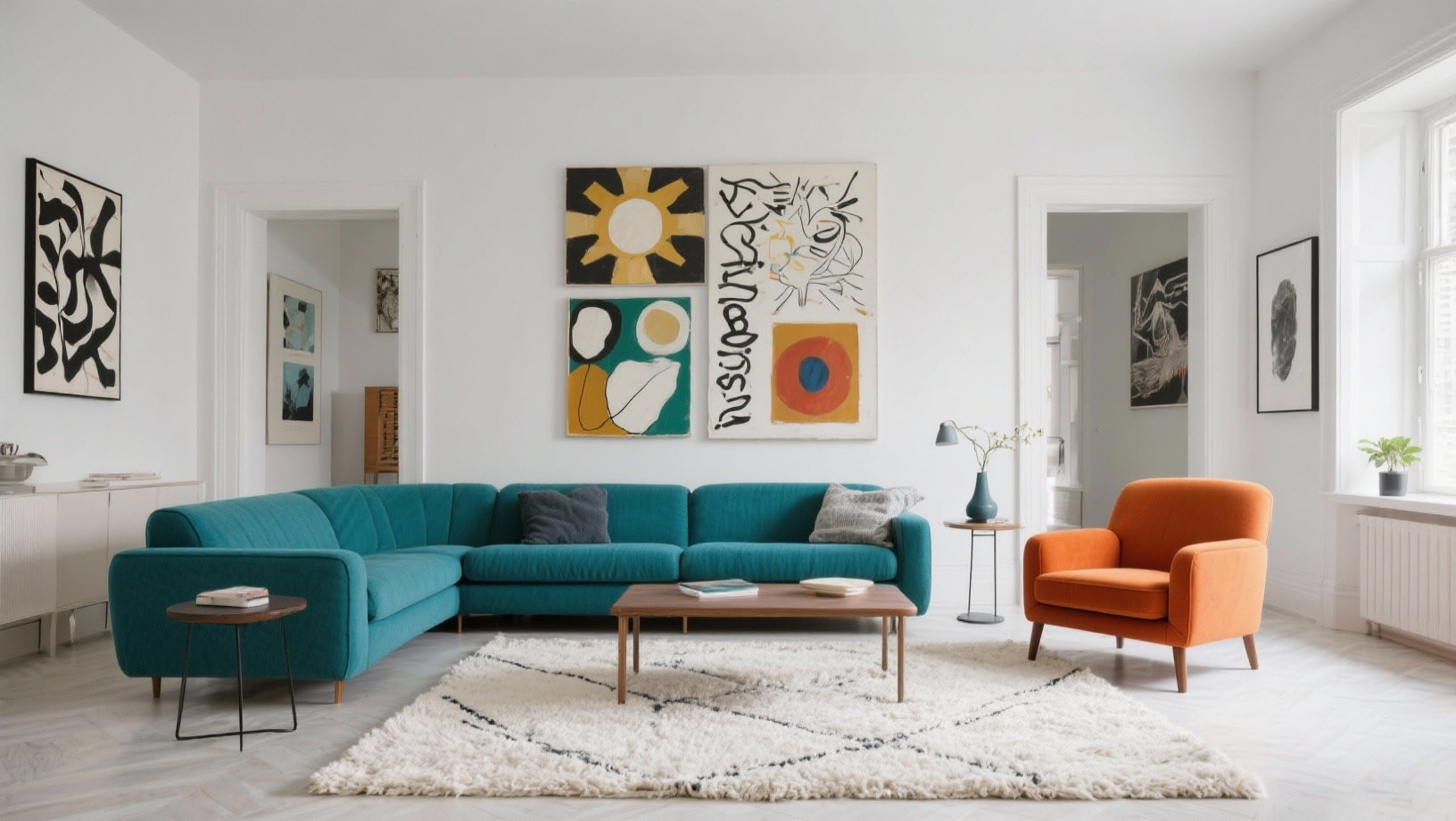
Bold and artistic, this pairing makes a statement. Teal works well as your dominant shade on walls or a large sofa.
Burnt orange provides contrast through accent chairs, artwork, and textiles. Add a touch of cream or beige to soften the intensity. Great for creative spaces and living rooms.
11. Soft Blue and Sand
Coastal and calming, these colors mimic the beach. Soft blue covers the walls or main furniture pieces. Sand tones appear in rugs, curtains, and natural fiber accessories.
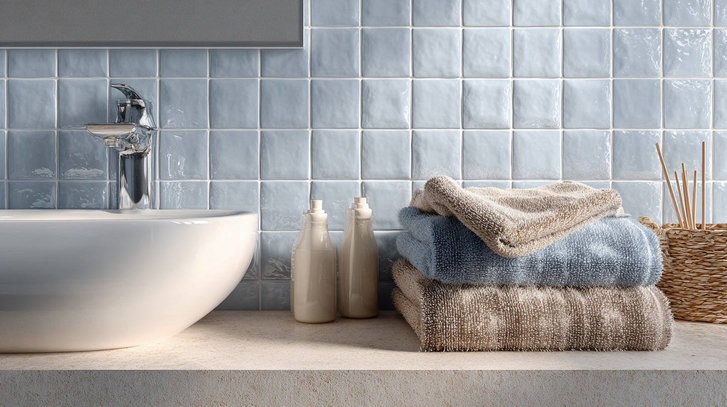
Include white elements, rope details, and driftwood decor. This palette belongs in bathrooms, bedrooms, and beach homes.
12. Burgundy and Cream
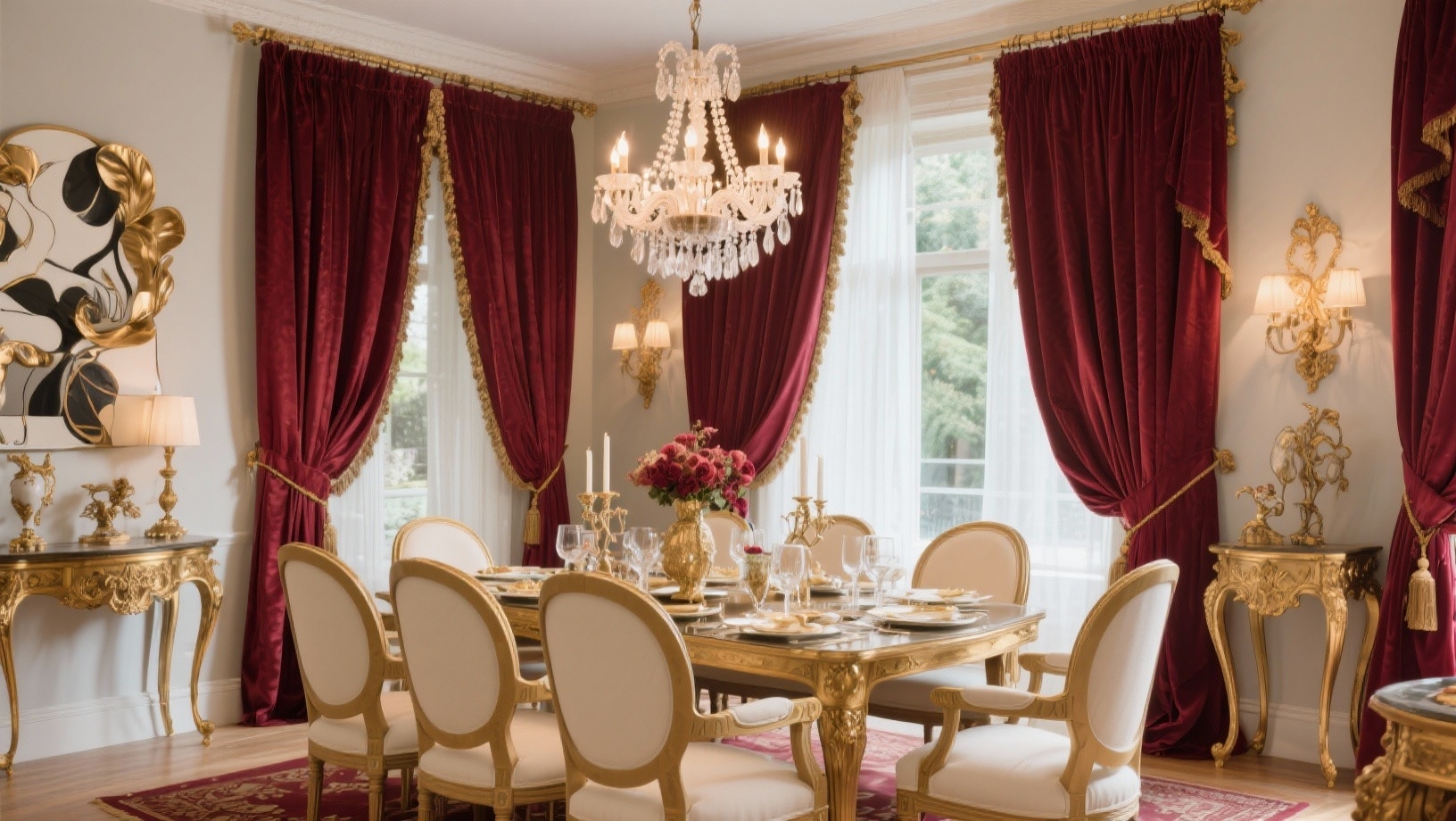
Elegant and cozy, this combination feels luxurious. Burgundy adds richness through an accent wall, curtains, or upholstered chairs.
Cream keeps the space light on the remaining walls and larger furniture.
Gold or brass accessories enhance the sophisticated feel. Works beautifully in dining rooms and master bedrooms.
13. Peach and Mint Green
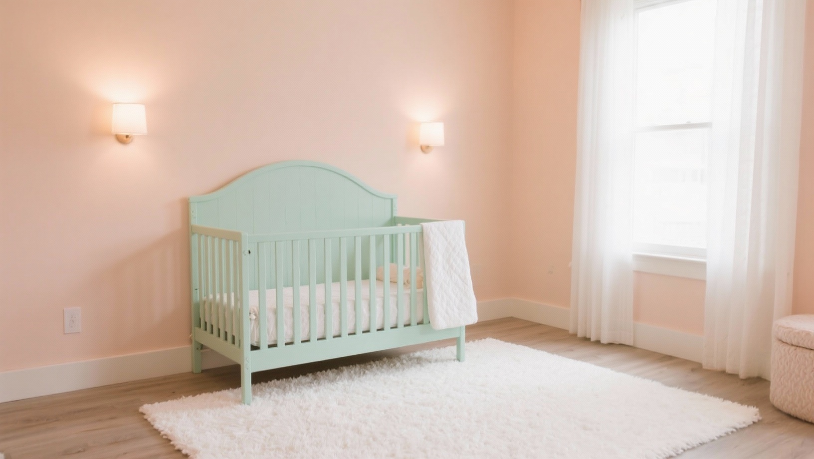
Fresh and playful, these pastels create a light atmosphere. Peach can color one wall or appear in textiles and art. Mint green comes through in smaller furniture pieces and decorative items.
Keep white as your base to maintain airiness. Perfect for nurseries, craft rooms, and powder rooms.
14. Chocolate Brown and Light Blue
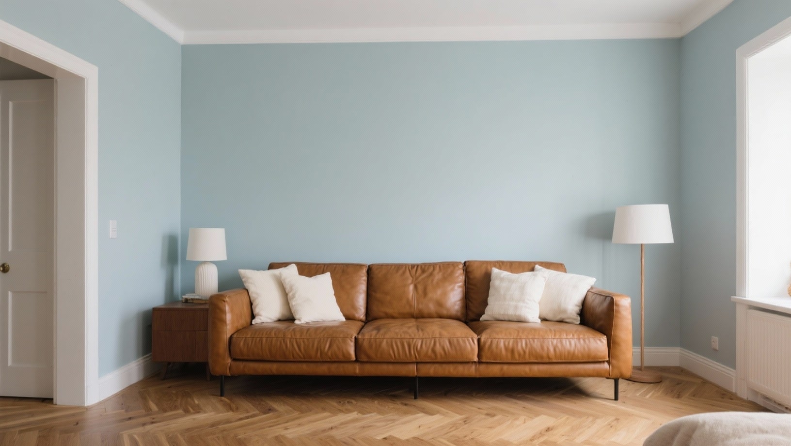
Comforting and balanced, these colors work together naturally. Chocolate brown anchors through leather furniture, wood pieces, or an accent wall.
Light blue softens the space via walls, bedding, or curtains. Add cream and white accessories for contrast. Ideal for family rooms and bedrooms.
15. Olive Green and Rust
Earthy and organic, this pairing feels grounded. Olive green works on walls or through larger upholstered pieces.
Rust adds comfort in throw pillows, blankets, and pottery. Include natural textures like jute, linen, and wood. This combination suits living rooms and entryways perfectly.
16. Mauve and Charcoal
Complex and modern, these tones create visual interest.
Mauve can appear on walls or in larger fabric pieces, such as sofas.
Charcoal provides contrast through accent furniture and decor. Add rose gold or copper accessories for a cozy touch. Great for bedrooms and sitting areas.
17. Soft White and Natural Wood
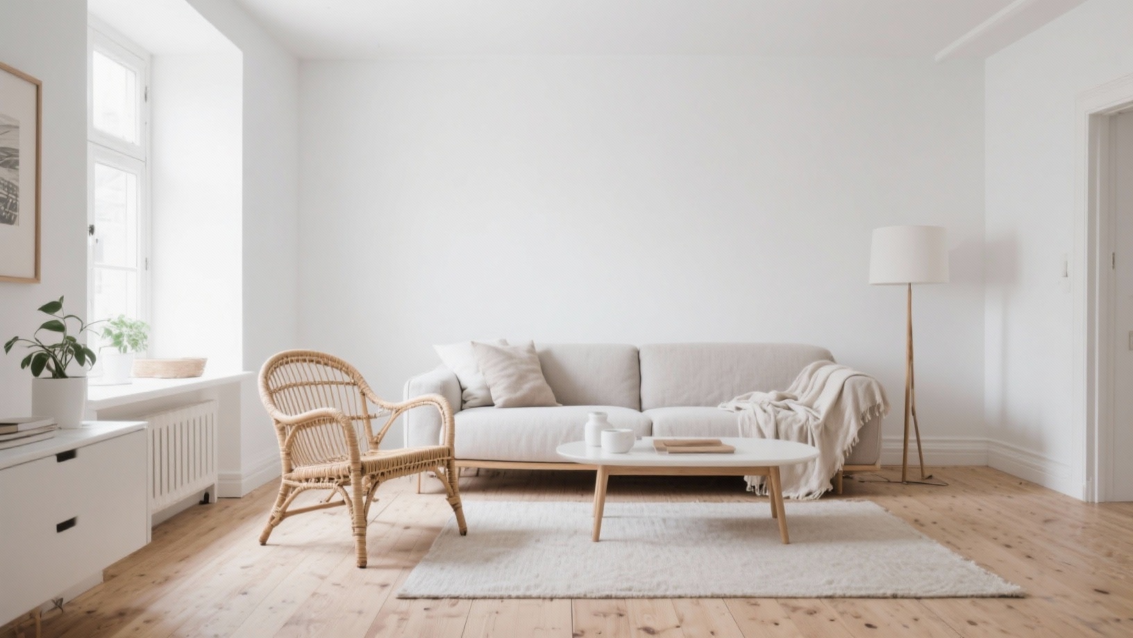
Simple and versatile, this combination lets your style shine through. Cozy white covers the walls, creating a blank canvas. Natural wood appears in floors, furniture, and decorative elements.
You can easily add any accent color you like through accessories. This works in literally every room and pairs with any decorating style.
Mistakes People Make When Picking Colors
Even with the best intentions, it’s easy to mess up your interior design color palette. I’ve seen these mistakes happen over and over.
- Picking colors under store lighting instead of testing them at home in natural light
- Choosing too many colors at once makes rooms feel chaotic and busy
- Ignoring the existing fixed elements like flooring, countertops, and built-in furniture
- Following trends blindly without considering if they match your personal taste
- Forgetting about undertones – earthy colors clash with cool ones
- Painting entire rooms before testing small sections first
- Not thinking about how colors flow from one room to another
- Selecting colors based on tiny paint chips that look different on large walls
Tools to Plan and Refine Your Palette
You don’t need to be a professional designer to plan colors well.
Several tools can help you visualize combinations before you commit. Here are my favorites that make the process easier and less stressful.
| Tool | What It Does | Best For |
|---|---|---|
| Paint Brand Apps | Shows colors on your actual room photos | Visualizing specific paint shades |
| Canva Color Wheel | Generates matching color schemes automatically | Finding complementary colors |
| Physical Paint Samples | Let’s you see real colors in your lighting | Testing before buying gallons |
| Mood Boards | Combines colors, textures, and furniture ideas | Planning entire room designs |
| Pinterest Boards | Collects inspiration and real room examples | Getting ideas and seeing what works |
Finishing it Up
Creating your interior design color palette doesn’t require special training or expensive consultants. You just need patience and a willingness to experiment.
Start with the 60-30-10 rule, test your colors in real lighting, and pick combinations that genuinely make you happy.
So grab some paint samples this weekend. Try a few combinations on your walls. See what speaks to you.
What color will you try first?