Paint does more than cover walls. It quietly shapes how a home feels. The right color can make a room feel warm, calm, open, or grounded. The wrong one can make even a beautiful space feel uncomfortable. That’s why choosing from the many interior wall paint ideas available today shouldn’t be rushed.
When paint works well, you don’t notice it right away. You just feel comfortable. That’s usually a sign the color, finish, and décor are working together.
Start With the Feeling, Not the Color Chart
Before perusing the samples, consider how you want the space to resemble. Not how it should appear online, but how it should feel while you’re in it.
Some rooms need to feel calm. Others need warmth. Social areas often feel better when they’re inviting rather than bold. This is where undertones become important. A warm undertone can soften a space and make it feel welcoming, especially in homes that don’t get much natural light.
Two paints may look almost the same on a sample card but feel completely different on the wall. That difference usually comes down to undertones.
Using Color Without Overdoing It
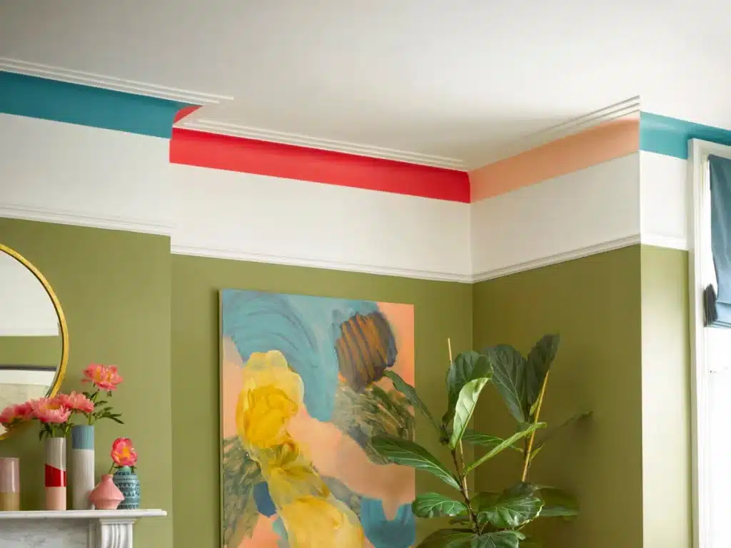
A room doesn’t have to rely on one color alone. Mixing soft neutrals with warmer or deeper tones often creates a more balanced and comfortable space. Accent walls or subtle color variations can add interest without making the room feel heavy.
Violet works well in this kind of setup. Not all violets are bold or dark. Light lavender shades bring calm to bedrooms or quiet areas, while muted violets with a warm undertone suit living rooms nicely. Deeper violets are best used in small doses, like on an accent wall or in a well-lit corner. The goal is simple: let violet add character without taking over the room.
Choosing the Right Paint Finish for Everyday Life
Paint finish affects how a wall looks and how it holds up over time. A flat wall finish creates a smooth, soft appearance. It reduces glare and helps hide small wall imperfections. This makes it a good option for bedrooms, offices, and low-traffic spaces.
Flat finishes aren’t always ideal for busy areas like hallways or kitchens, where walls get touched often. In those spaces, durability matters more than appearance.
Many people also ask practical questions before painting, such as: is acrylic paint water based?
Yes, acrylic paint is water based. That’s one reason it’s so popular for interiors. It dries quickly, has less odor, and is easier to clean up. It’s also easier to live with during the painting process.
How Interior Wall Paint and Décor Should Work Together
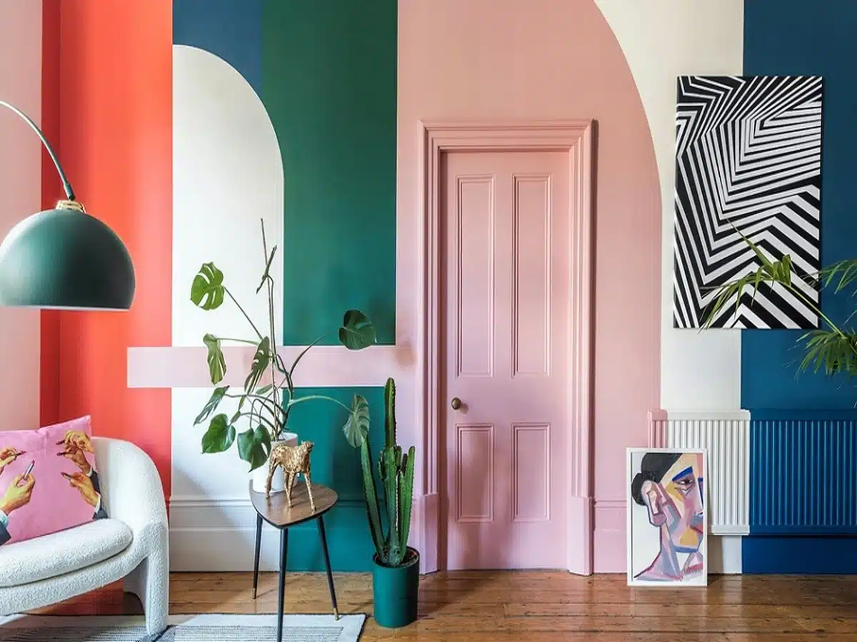
Paint and décor shouldn’t fight for attention. When walls are bold, décor should be simpler. When walls are neutral, décor can carry more personality.
For warm or neutral wall colors:
- Natural wood furniture works well
- Soft fabrics like linen or cotton add comfort
- Earthy tones keep the space grounded
For stronger wall colors, including violet shades:
- Keep furniture shapes clean and simple
- Limit decorative items to avoid clutter
- Repeat wall colors gently in cushions or artwork
Lighting plays a bigger role than many people expect. Warm lighting supports warm colors and prevents rooms from feeling flat in the evening.
Adding Personal Touches Without Overcrowding the Space
A room doesn’t need a lot of decoration to feel complete. Often, a few personal pieces make a bigger impact than filling every surface.
Artwork is a good example. Hand-finished or textured pieces feel more personal than mass-produced prints. Some people enjoy displaying Paint By Numbers artwork that matches their wall colors. These pieces add personality without feeling overly styled.
They also tell a story. A home feels more comfortable when it reflects time, care, and small creative choices.

Interior Wall Paint Ideas for Different Rooms
Each room serves a different purpose, so paint choices should change accordingly.
Living Rooms
Soft neutrals, warm beiges, or muted colors work well. These shades adapt easily to different lighting and décor styles.
Bedrooms
Calm colors and flat finishes help create a relaxed atmosphere. Lighter tones often feel less distracting at night.
Dining Areas
Richer shades can work well here, especially with warm lighting. They make the space feel cozy and intentional.
Home Offices
Focus may be maintained without seeming boring with well-balanced colors that don’t feel too brilliant or dark. Considering each area separately helps prevent the error of using the same hue throughout the entire house.
Why Paint Matters More Than People Realize
Furniture may be swapped out, you may rearrange the décor. Paint establishes the foundation, then everything else is easy to arrange when the colors of the walls seem perfect.
A room’s perceived size is also influenced by its paint. A room is opened up by light hues. Intimacy is created by deeper colors. Cooler tones seem farther away, but warm undertones offer coziness. Knowing this makes it easier for you to select interior wall paint ideas that complement your way of life.
A Thoughtful Approach Makes All the Difference
No single hue is ideal for every type of home. Slowing down, evaluating samples, and observing how a room feels throughout the day yield the greatest outcomes.
Good paint selections don’t aim to be impressive. They provide the house a sense of security, coziness, and ease of living. When décor and paint complement each other, the room feels completed without exerting too much effort.
A residence begins to feel like home at that point.