Do you feel stuck with walls that just don’t feel right? Many homeowners spend months picking colors only to end up with rooms that fall flat.
Benjamin Moore Sparrow AF-720, a mid-tone taupe with gray and brown notes, might be the answer.
This adaptable neutral can make small spaces feel bigger, add warmth to cold rooms, and bring a touch of style without being flashy.
In this post, I’ll show you real spaces that got total makeovers with just this one color. You’ll see how Sparrow works in living rooms, bedrooms, and even kitchens.
Why Benjamin Moore Sparrow is a Popular Choice?
I’ve seen many paint colors come and go, but Sparrow AF-720 has stayed on my top list for good reasons. This shade has won me over with its balance and depth that few other colors can match.
Overview of its Unique Tone
When I first used Sparrow AF-720, I was struck by its rich character. It’s not just one color but a mix that shifts with light:
- It has a base of taupe that feels warm and grounded
- Gray tones add a modern touch that keeps it from feeling too brown
- Subtle green hints peek through in certain lights, adding depth
What makes this color special is how it sits perfectly between warm and cool. It’s not too gray to feel cold, and not too brown to look dated. The green notes are so soft that they only add interest without taking over.
Versatility Across Different Lighting Conditions
With an LRV of 21.14, I’ve seen this color in many homes, and its flexibility always stands out.
- Morning light: The color wakes up with a soft, warm glow
- Midday: It holds its depth without washing out in bright light
- Evening: As light fades, it becomes richer and more cozy
- Artificial light: With warm bulbs, it feels extra cozy; with cooler LEDs, the gray tones step forward
Works in Multiple Room Types
I’ve put Sparrow to the test in almost every room type with great results:
- Living rooms: Creates a calm backdrop that makes furniture pop
- Bedrooms: Feels soothing without being too dark or heavy
- Kitchens: Pairs well with both white and wood cabinets
- Home offices: Help focus without being too stark or plain
- Bathrooms: Adds warmth to spaces that often feel cold and clinical
Before & After Transformations Using Benjamin Moore Sparrow
I’ve seen my fair share of paint jobs, but Sparrow by Benjamin Moore is one color that truly stands out for its ability to change a space.
Let me walk you through some stunning room makeovers where this rich taupe shade made all the difference.
Living Room Makeover
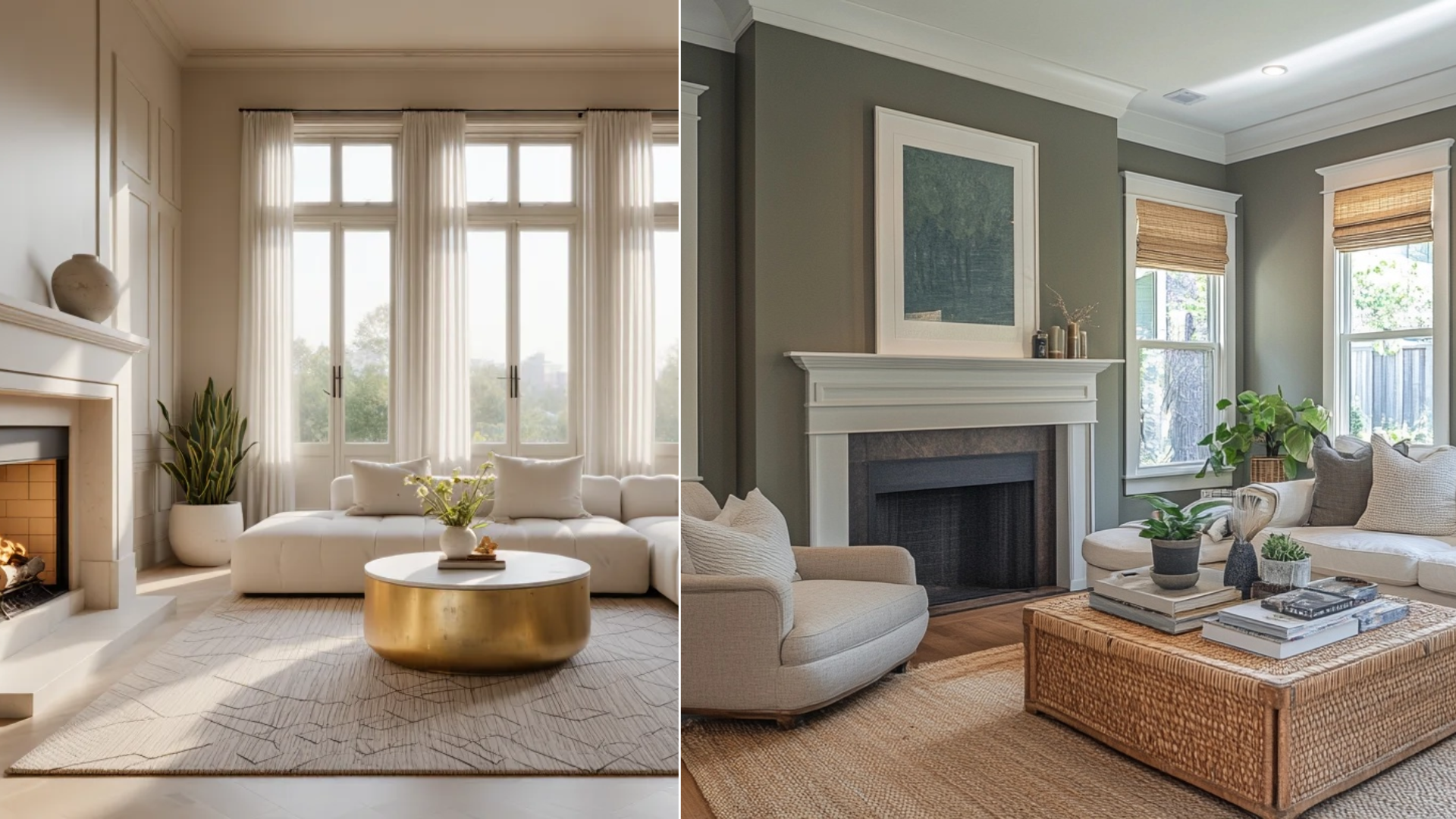
Before:
- Plain white walls that felt clinical rather than homey
- The space looked flat with no depth
- Even with furniture, the room felt empty and cold
- Natural light seemed harsh instead of welcome
My client needed a change that would make the space feel lived-in and cozy. After looking at many samples, the Sparrow AF-720 caught my eye.
After:
- The walls now have a rich taupe tone that shifts with the light
- The gray-brown mix creates a perfect backdrop for my furniture
- I paired it with soft beige textiles that blend well with the wall color
- My brass floor lamp and coffee table frame now pop against the walls
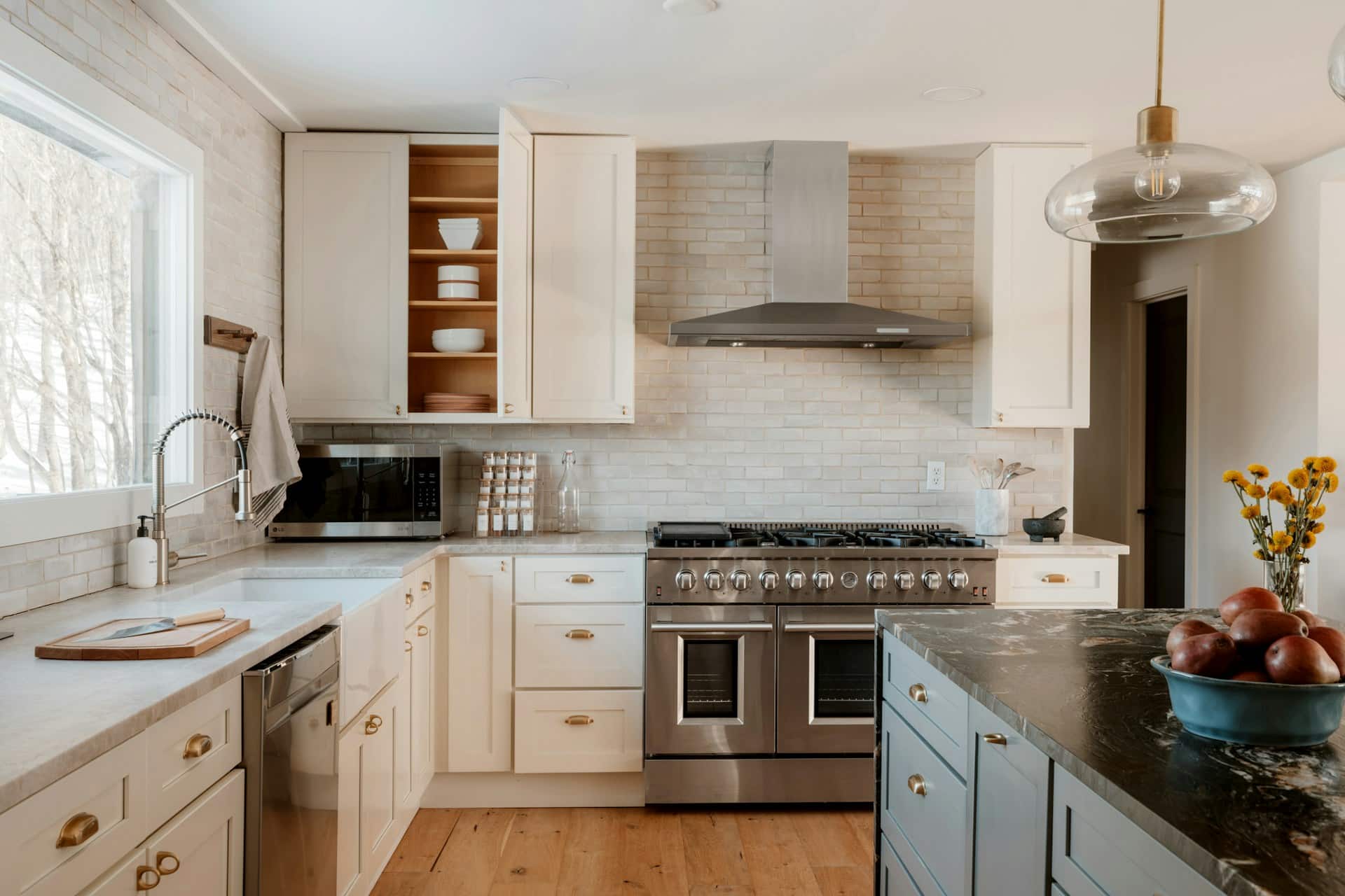
Kitchen Cabinets Update
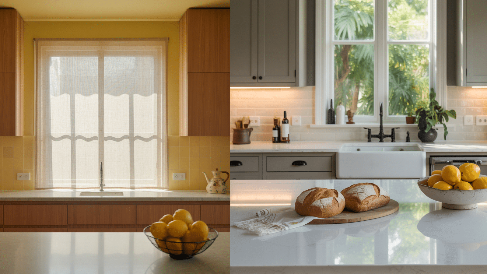
I’ve seen many kitchens go from drab to fab, but this transformation using Benjamin Moore Sparrow AF-720 is one of my favorites.
Before:
- The kitchen had oak cabinets that screamed 1990s
- Yellow-tinted walls made the space feel old and tired
- The room felt smaller than it actually was
- Poor lighting made everything look flat and uninspiring
After:
- The cabinets now wear a coat of Sparrow AF-720, giving them depth and character
- I added matte black hardware for a touch of contrast that pops against the taupe
- White quartz countertops bring light and space to the room
- Natural light now bounces off the surfaces, making the kitchen feel bigger
What I Did With the Bedroom
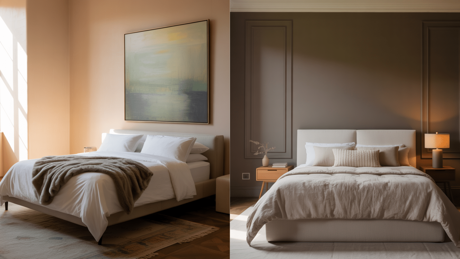
Before:
The walls of my sister’s bedroom were painted in a basic beige that:
- Felt too safe and bland
- Made the room look washed out in different lights
- Didn’t give me any warm feelings when I walked in
- Failed to set a mood for rest or calm
After:
- The rich taupe color created an immediate focal point
- I paired it with cream-colored bedding for contrast
- Navy blue throw pillows and a matching rug added depth
- Soft white trim brought out the warmth in the Sparrow shade
Office Remodel
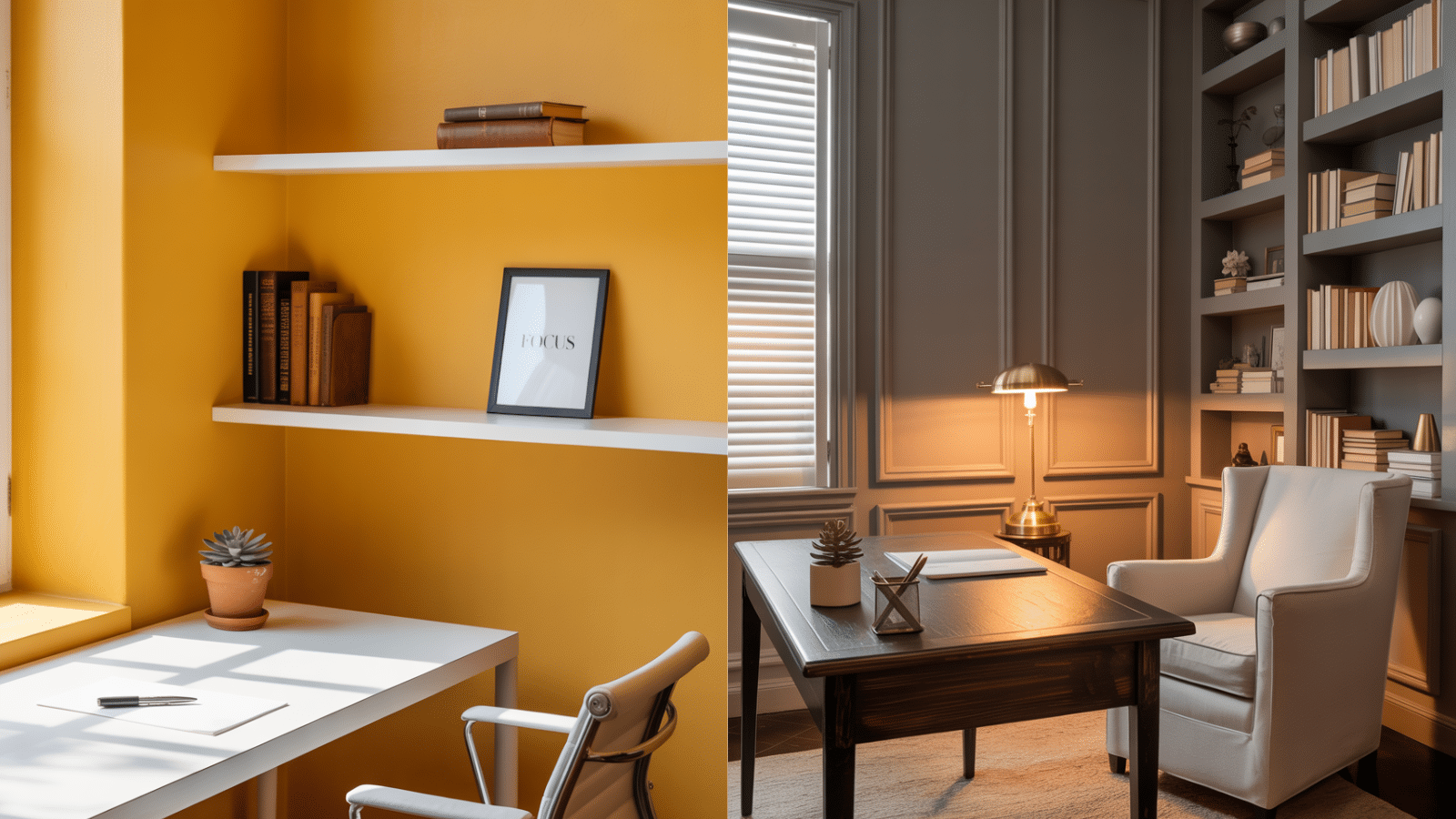
My client needed a fix for his home office. The bright yellow walls were fun at first, but they started to hurt his focus.
Before:
- My office walls were painted in an attention-grabbing yellow
- The color made the small space feel busy and distracting
- I found it hard to concentrate during video calls
- The brightness clashed with my wooden desk and bookcase
After:
- I painted all four walls with Benjamin Moore Sparrow AF-720
- Added open natural wood shelving that pairs well with the taupe
- Kept my decor simple with just a few plants and necessary items
- Used a neutral desk chair to maintain the calm vibe
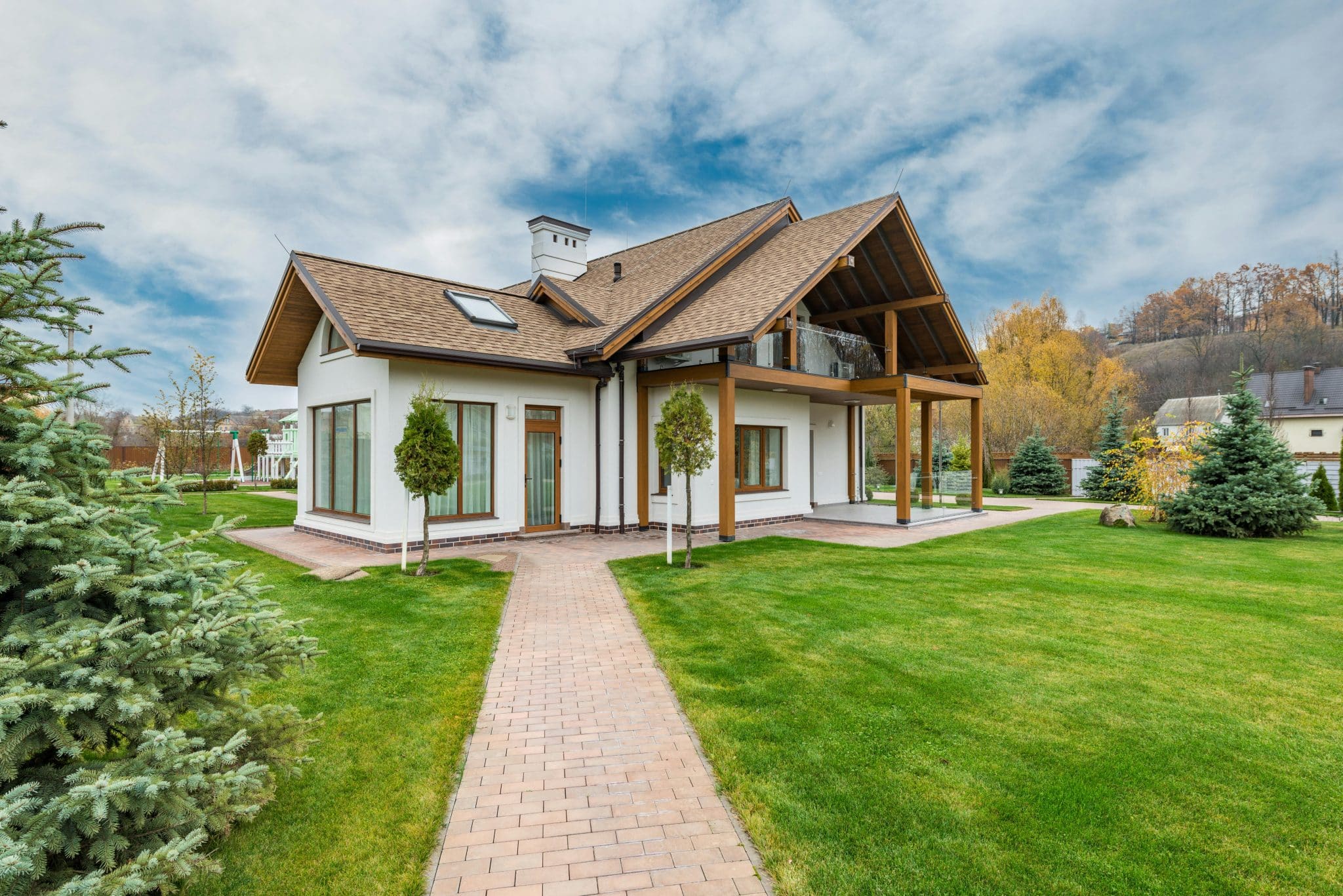
Home Exterior
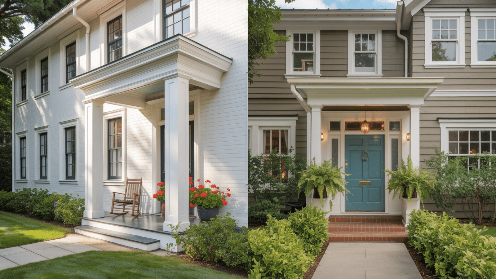
I’ve seen how even small changes can make a big impact in home design. One of my favorite tricks? Playing with trim colors against a beautiful wall shade like Benjamin Moore Sparrow AF-720.
Before:
- My trim was basic white that came with the house
- It faded into the background and didn’t add any style
- The walls and trim lacked contrast, making the room feel flat
- Nothing about the trim caught the eye or added interest
After: When I painted the walls with Sparrow AF-720, I decided to give the trim some attention too. I went with:
- A soft, bright white (Benjamin Moore White Wisp) for a clean, classic look
- The contrast immediately made both the walls and trim stand out
- In some rooms, I tried matte black trim for a more bold, modern statement
- The sharp lines between colors created visual interest that I never had before
How Sparrow AF-720 Compares to Similar Tones
I’ve found that many homeowners get stuck when picking between similar paint colors. To help you out, I made this simple table comparing the Sparrow AF-720 with other popular taupe and gray shades:
| Color Name | Main Tone | Undertones | Light Reflectance Value | Best For |
|---|---|---|---|---|
| Sparrow AF-720 | Taupe | Gray-brown | 21.14 | Living rooms, bedrooms, and home offices |
| Revere Pewter HC-172 | Light gray | Warm beige | 55.51 | Open floor plans, hallways |
| Edgecomb Gray HC-173 | Greige | Beige-gray | 63.54 | Bright spaces need warmth |
| Kendall Charcoal HC-166 | Dark gray | Blue-green | 12.96 | Accent walls, cabinetry |
| White Dove OC-17 | Off-white | Soft cream | 83.16 | Trim, doors, and ceilings |
When picking a paint color, always test a sample first. What looks great on my computer screen might feel different on my walls at home.
Final Thoughts
Benjamin Moore Sparrow AF-720 offers a modifying power that can breathe new life into any space.
Its dark gray tones, improved by earthy brown undertones, provide a sophisticated yet grounded atmosphere perfect for a variety of interior designs.
Whether used in a cozy living room or a stylish bedroom, this color strikes the right balance of trendy and warmth.
If you’re looking for a timeless shade to refresh your home, Benjamin Moore Sparrow promises to be a versatile, lasting choice that stands out while blending effortlessly into your existing décor.