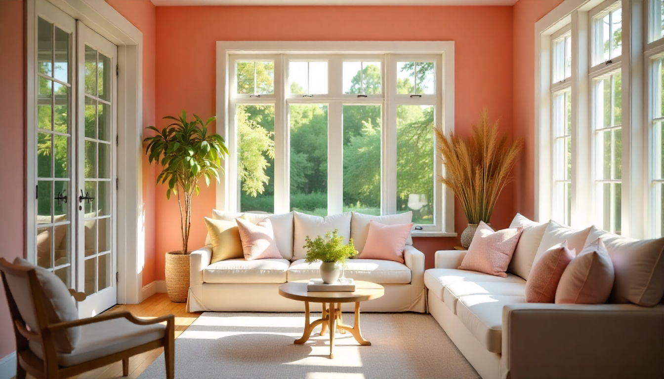
I get it. You want a space that feels peaceful and put-together.
But I know what the problem is: too many colors can make a room feel chaotic, and bold choices don’t always bring the calm and look that you’re after.
Well, no need to worry, I’m going to show you how a neutral color scheme can solve this. It creates balance without boring you to tears.
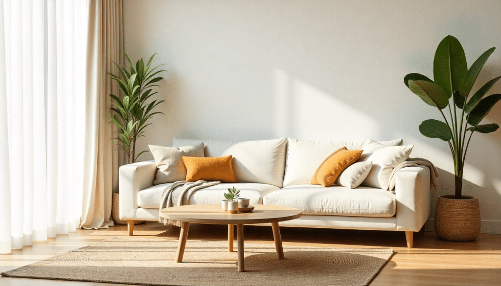
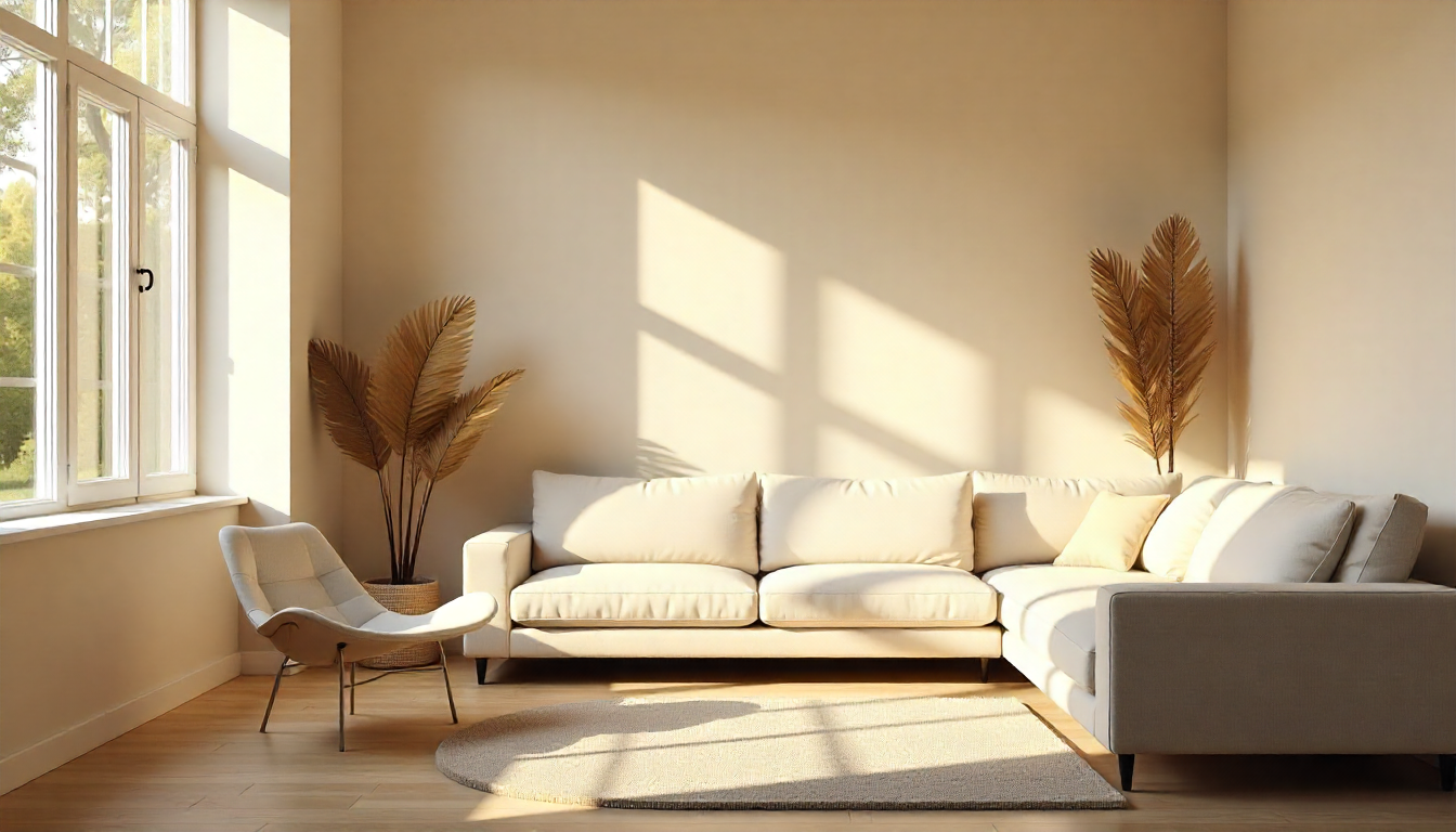
Think soft beiges, soft grays, and creamy whites that work together beautifully.
In this blog, I’ll show you the basics of neutral colors, why they work so well, and how to use them in your home. You’ll learn simple tips to create rooms that feel both relaxing and stylish.
What Makes a Neutral Color So Effective?
Neutral colors work because they don’t fight for attention. They let your eyes rest. And that matters more than you might think.
When you walk into a room filled with beiges, grays, and whites, your mind can relax. There’s no visual noise competing for focus.
These shades create a backdrop that feels naturally calming.
Plus, neutrals are incredibly flexible. They pair well with almost anything you add later: artwork, furniture, or even a pop of color here and there.
I’ve noticed something else, too. Neutral tones make spaces feel bigger and brighter.
Light bounces off them easily, opening up even small rooms. They also stand the test of time. Trends come and go, but neutral palettes always look current and modern.
Building Your Own Neutral Color Palette
Neutral color schemes are also central to professional design disciplines, where understanding texture, tone, and finish is just as important as choosing the right shade. Designers who work with materials, surfaces, and color harmony apply these same principles on a broader scale, shaping products and interiors that feel balanced and timeless. For those interested in this field, a cmf design job focuses on precisely this interplay of color, material, and finish, translating calm, cohesive palettes into functional and visually appealing design solutions.
Creating your own neutral palette isn’t hard. You just need a simple plan to mix the right shades without making things look flat or lifeless.
Step 1: Start with a Base Color
Pick one main neutral to anchor your space. This could be a soft beige, cozy gray, or creamy white. Your base color will cover the largest areas, such as walls, floors, and large furniture pieces.
Keep it light to make the room feel open and airy.
Step 2: Add a Mid-Tone Shade
Now bring in a second neutral that’s a bit darker or richer. Think taupe, greige, or medium gray. Use this for furniture, curtains, or accent walls. It adds depth without overcrowding your base color.
Step 3: Include a Dark Accent
Every palette needs contrast. Choose a deeper neutral, such as charcoal, chocolate brown, or slate gray. Apply it sparingly in pillows, picture frames, or a single piece of furniture. This stops your room from feeling washed out.
Step 4: Layer in Different Textures
Neutrals can look boring if everything’s the same texture. Mix things up. Pair a linen sofa with a wool rug. Add velvet cushions or a wooden coffee table. Texture creates visual interest when you’re working with similar colors.
Step 5: Test Your Palette Before Committing
Get paint samples and fabric swatches. Put them together in your actual space and see how they look in natural light.
Colors change throughout the day, so check them in both morning and evening light. This saves you from costly mistakes later.
Inspiring Ideas to Use Neutrals for Beautiful Decor
Neutrals offer limitless decorating options. I’ve gathered practical ideas you can start using right away, no matter your style.
1. Paint Walls in Soft Beige
Beige walls create a calm foundation for any room. They work with almost every furniture style you own. This shade reflects light beautifully, making spaces feel larger.
I recommend testing a few beige tones first because some lean pink while others look more yellow.
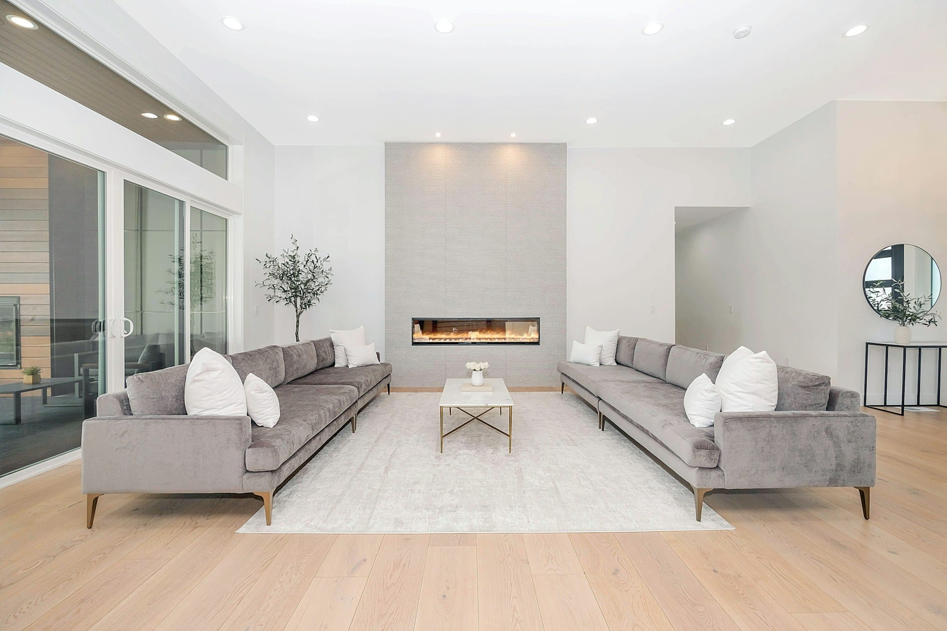
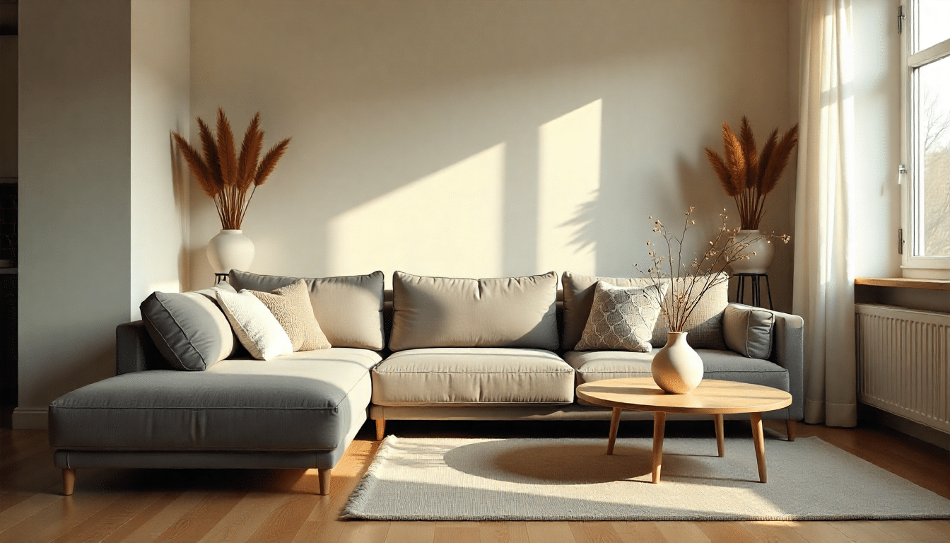
2. Choose Gray Sofas for Living Rooms
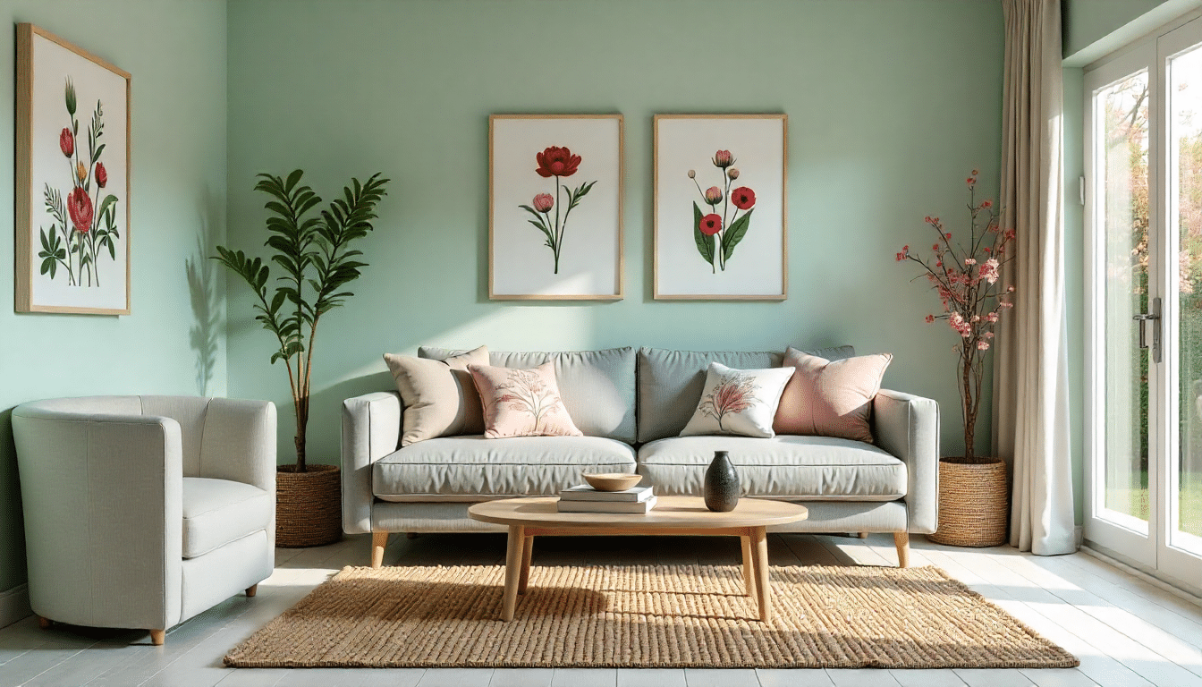
A gray sofa is incredibly adaptable. You can change throw pillows and blankets seasonally without buying new furniture.
Gray pairs well with both cool and cozy accents. It hides minor stains better than lighter options, too.
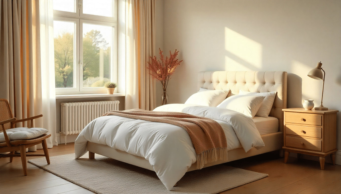
3. Layer White Bedding for a Hotel Look
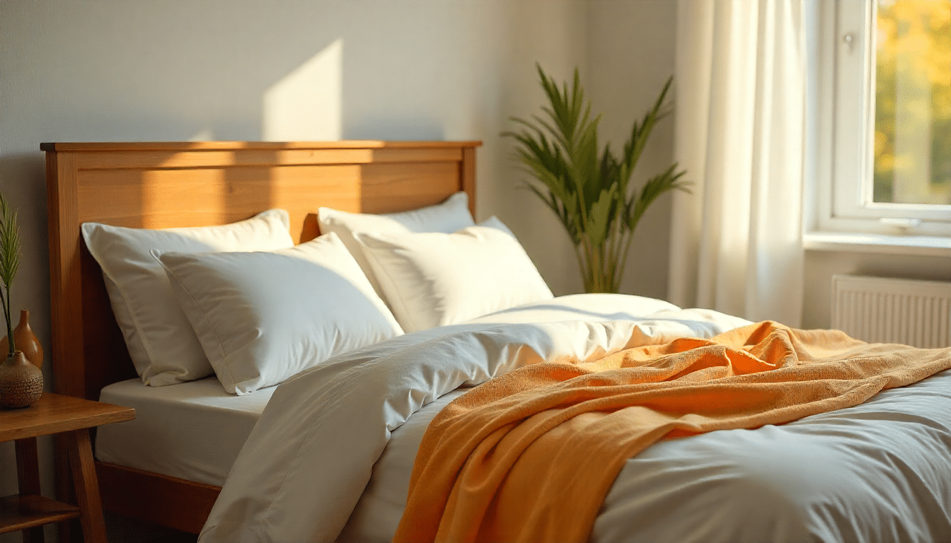
All-white bedding feels luxurious and clean. Layer different textures, such as cotton sheets, linen duvet covers, and quilted throws. White makes your bedroom feel peaceful and helps you sleep better.
Plus, you can bleach it when needed.
4. Use Taupe Curtains to Soften Windows
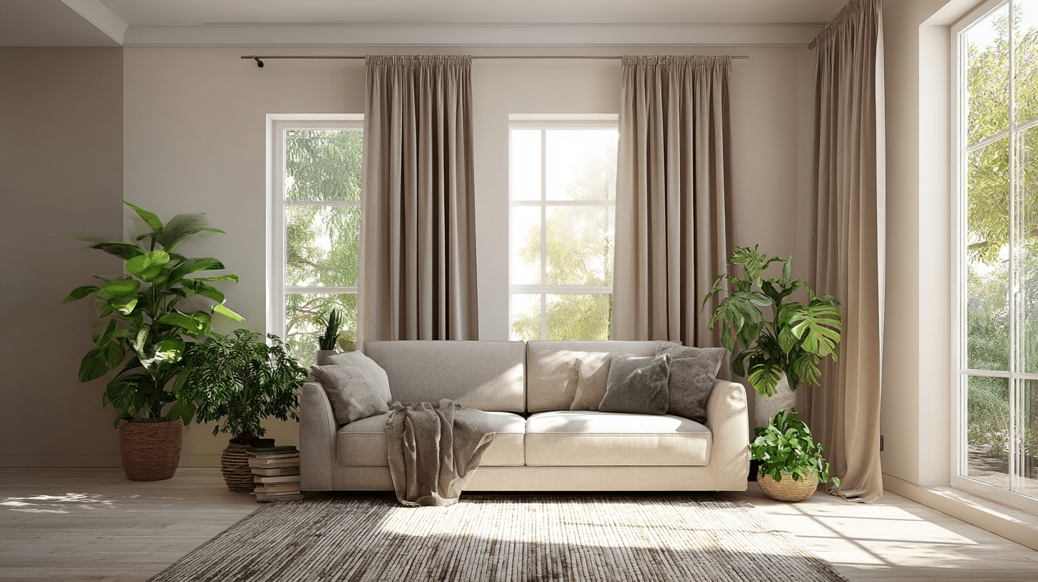
Taupe curtains that add privacy without blocking too much light are one of the best. They blend with walls while still framing your windows nicely. This color works in both bedrooms and living spaces.
Choose a slightly heavier fabric for better light control.
5. Install Cream-Colored Kitchen Cabinets
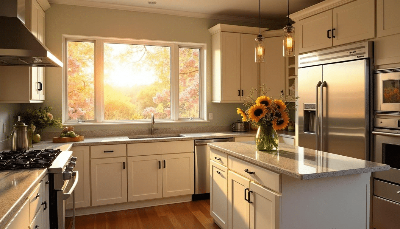
Cream cabinets make kitchens feel inviting and eternal. They’re easier to maintain than pure white because they don’t show fingerprints as easily.
This shade pairs beautifully with stainless steel appliances and wooden countertops. Your kitchen will look updated without following fleeting trends.
6. Add a Jute Rug for Natural Texture
Jute rugs bring an organic feel to your floors. The rough texture contrasts nicely with smooth furniture.
They’re durable enough for high-traffic areas and relatively affordable. I love how they ground a space without demanding attention.
7. Display Pottery in Neutral Tones
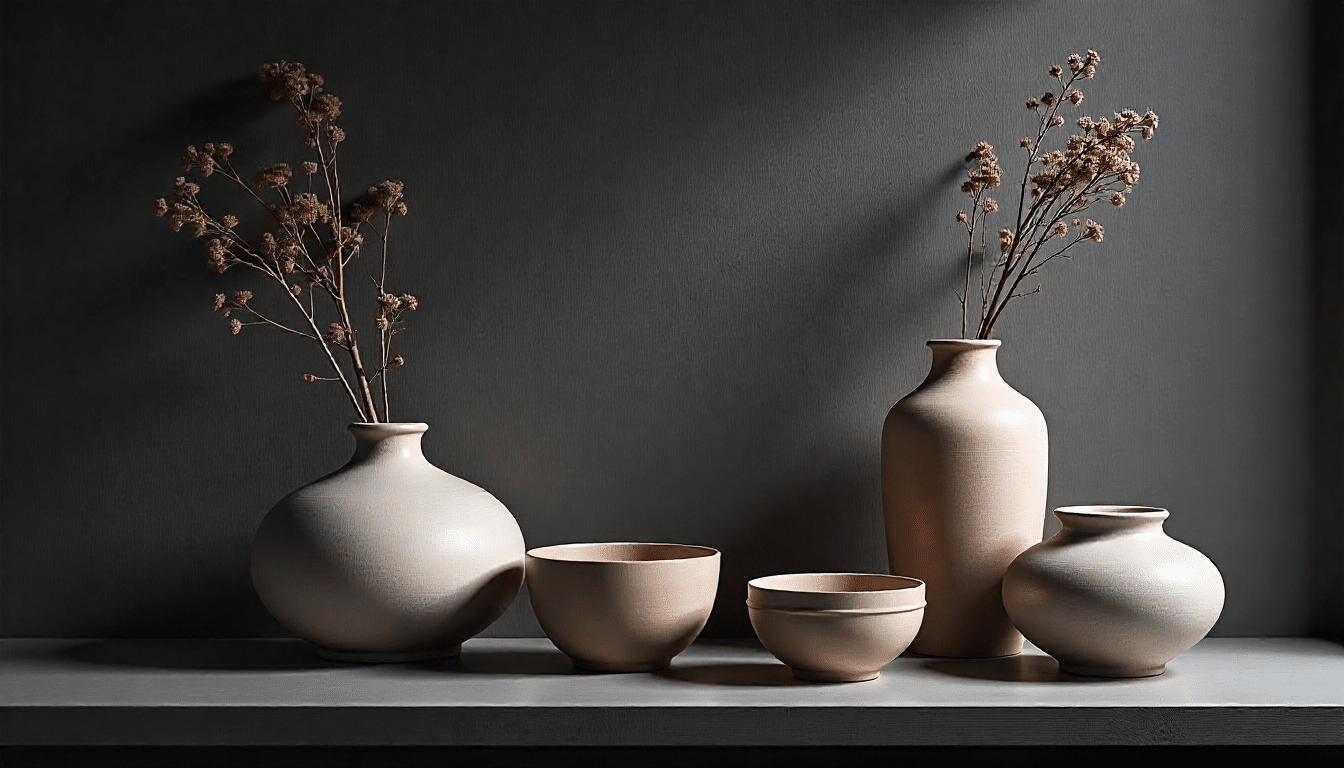
Ceramic vases and bowls in cream, tan, or gray add subtle interest to shelves. They create visual breaks without clashing with your existing decor. Group items by size for greater impact.
These pieces work year-round, unlike seasonal decorations.
8. Paint Trim in Soft White
White trim creates clean lines throughout your home. It makes rooms look more finished and polished. This choice works with light or medium-toned walls. Soft white is less stark than bright white and easier on the eyes.
9. Choose Stone Countertops in Gray
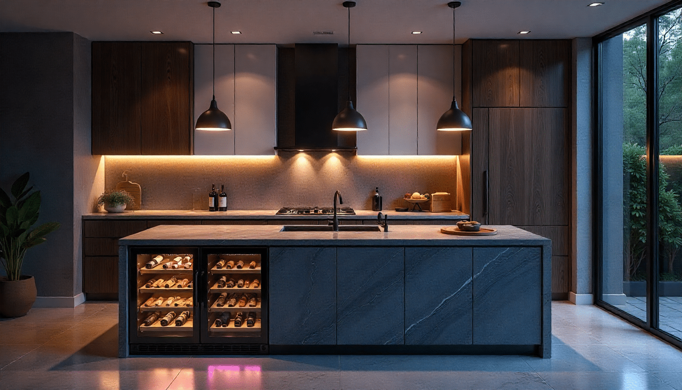
Gray stone countertops look modern and hide dirt well. They complement both light and dark cabinetry beautifully.
Stone is practical for kitchens and bathrooms because it’s durable. The natural veining adds interest without being too busy.
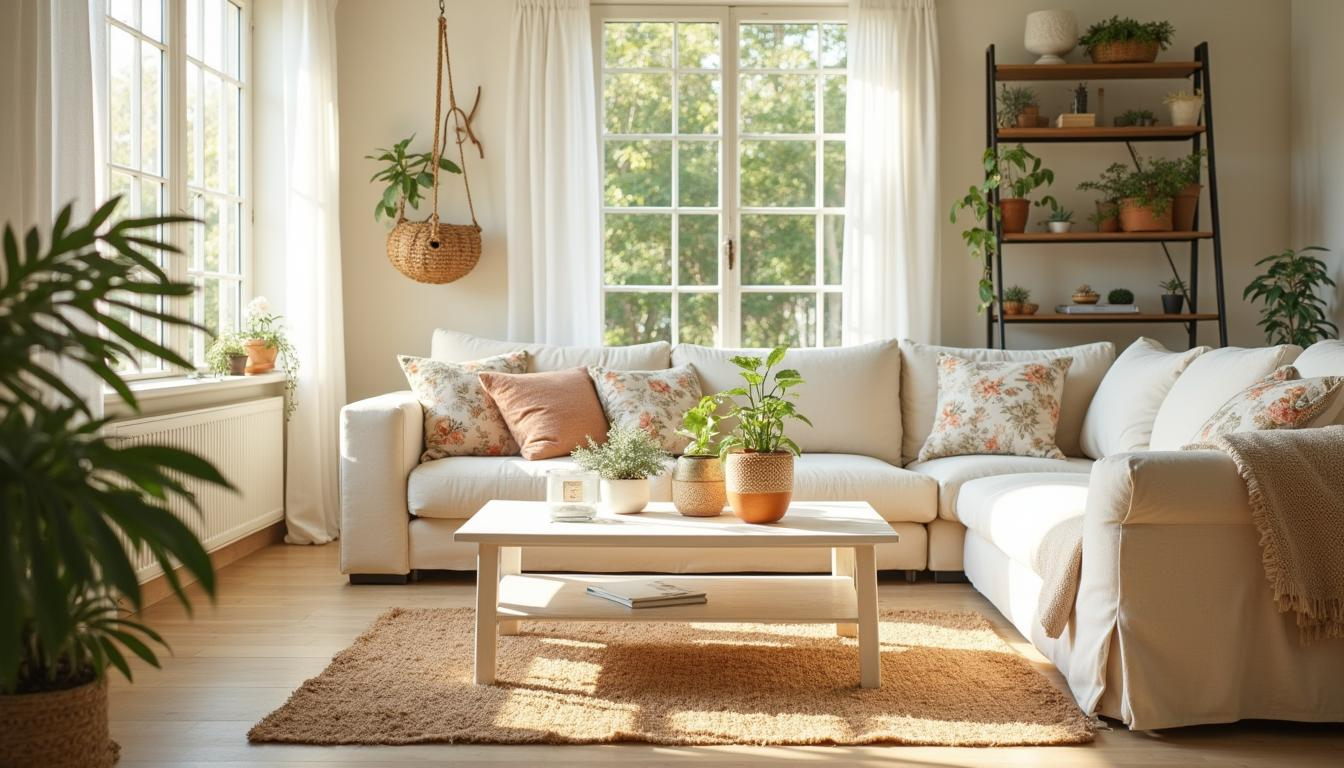
10. Hang Linen Curtains in Natural Tones
A neutral color scheme is incomplete without natural linen curtains that filter light softly while maintaining privacy. The slightly wrinkled texture gives rooms a relaxed, lived-in feel.
Linen breathes well and works in any season. These curtains look appropriate in every room of your house.
11. Install Hardwood Floors in Light Oak
Light oak floors brighten rooms naturally.
They show less dust than darker woods and make spaces feel open. This flooring choice increases home value and lasts for decades. You can refinish them multiple times as styles change.
Bringing Neutrals Into Your Space? Here are Some Tips that Would Totally Help
Ready to actually use neutrals in your home? These tips will help you apply what you’ve learned without second-guessing every choice.
- Start Small with Accessories: Don’t repaint your entire house right away. Begin with neutral throw pillows, blankets, or small decor items. This lets you test how the colors feel in your space before making bigger commitments.
- Mix Different Shades of the Same Color: Use light gray, medium gray, and charcoal together. Varying the tones prevents your room from looking flat or one-dimensional.
- Pay Attention to Undertones: Some beiges lean pink, others lean yellow. Some grays look blue in certain light. Test paint samples on your actual walls and observe them for a full day.
- Balance Light and Dark: If your walls are light, add darker furniture or accents. If you have dark floors, keep walls and ceilings lighter. This creates contrast and keeps things interesting.
- Replace One Item at a Time: Swap out colorful pieces gradually. Replace a bright rug with a neutral one first. Next month, change your curtains. This approach is easier on your budget and less jarring visually.
Final Thoughts
You now have everything you need to create calming spaces with neutrals. A neutral color scheme doesn’t mean boring rooms. It means giving yourself a flexible foundation that works with your life.
Start with one room. Pick your base color and build from there. Test samples before you commit. Layer textures to avoid a flat feel.
And one of the advantages is that you can change accents at any time without redoing everything.
Ready to try it? Grab some paint samples this weekend.