
Ever stared at your walls and felt nothing but… meh?
I found myself there last spring, desperate for a color that would breathe life into my living room without screaming for attention. Enter Saybrook Sage Benjamin Moore HC-114, the shade that’s been quietly revolutionizing homes across the country.
This isn’t just another green paint job. It’s the perfect balance between gracefulness and approachability, like that friend who somehow looks put-together without trying.
I’ve tested dozens of paint colors over the years, but something about this sage stopped me in my tracks.
Curious how this understated hero might convert your space? Or why do designers keep reaching for it when creating peaceful, grounded interiors? Let’s jump into everything you need to know about this remarkable shade.
The Saybrook Sage by Benjamin Moore
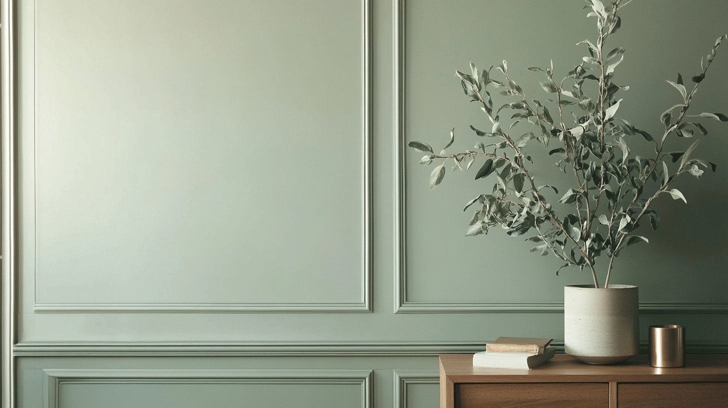
Saybrook Sage (HC-114) is one of those colors that’s hard to pin down, and that’s exactly its charm. It’s a muted, earthy green with subtle gray undertones that shifts throughout the day.
In morning light, it leans into its green heritage, while evening shadows bring out its cosmopolitan gray side. This chameleon-like quality makes it incredibly versatile for different spaces and design styles.
What makes Saybrook Sage special is its depth. Unlike some trendy greens that quickly feel dated, this color has staying power. It’s got this timeless quality that reminds me of vintage botanical prints or the weathered sage plants in my grandmother’s garden.
The color has enough personality to make a statement but knows when to step back and let your furniture shine.
| Feature | Details |
|---|---|
| Color Family | Green/Gray |
| LRV (Light Reflectance Value) | 38.88 |
| Undertones | Gray, slight blue |
| Best Rooms | Living room, bedroom, kitchen |
| Complementary Colors | Cream, terracotta, navy |
| Finish Recommendation | Eggshell or matte |
The LRV of 38.88 puts it squarely in the medium range, meaning it won’t make your room feel too dark or too bright. It’s that sweet spot that creates a cozy atmosphere without sucking all the light out of a space.
I’ve found it works beautifully in rooms that get decent natural light but can feel a bit heavy in already dark corners.
Where to Apply the Saybrook Sage Benjamin Moore
Saybrook Sage is one of those rare colors that seems to work almost everywhere. I’ve spent the last few months experimenting with this versatile shade in different spots around my home, and I’m constantly surprised by how it adapts to each space.
The beauty of this color lies in its balance; it has enough character to be interesting but enough restraint to be livable for years.
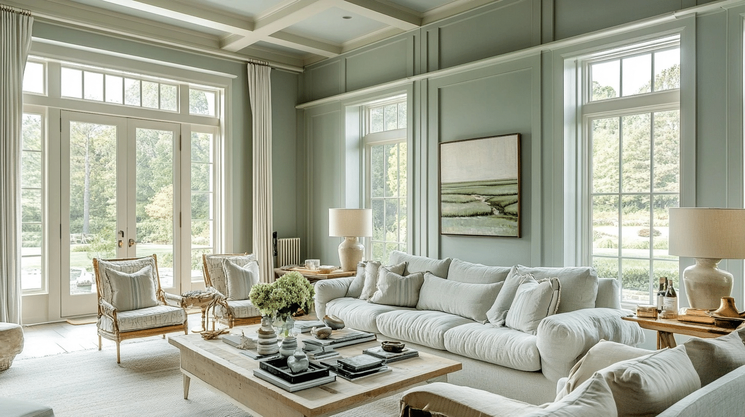
Living Room
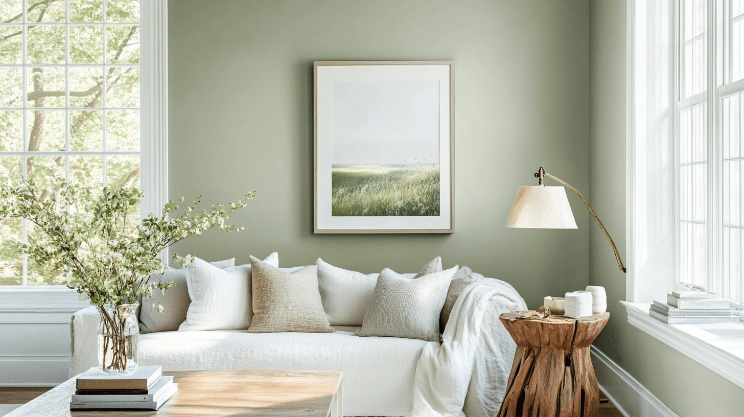
In the living room, Saybrook Sage creates this incredible cozy vibe without feeling dark or heavy. I painted all four walls and was amazed at how it made my white trim and ceiling pop without trying too hard.
The color shifts beautifully throughout the day, looking more green when the morning light hits it and settling into a cosmopolitan gray-green by evening.
It pairs beautifully with my tan leather sofa and natural wood coffee table, creating this earthy, grounded feeling that visitors always comment on.
Main Door
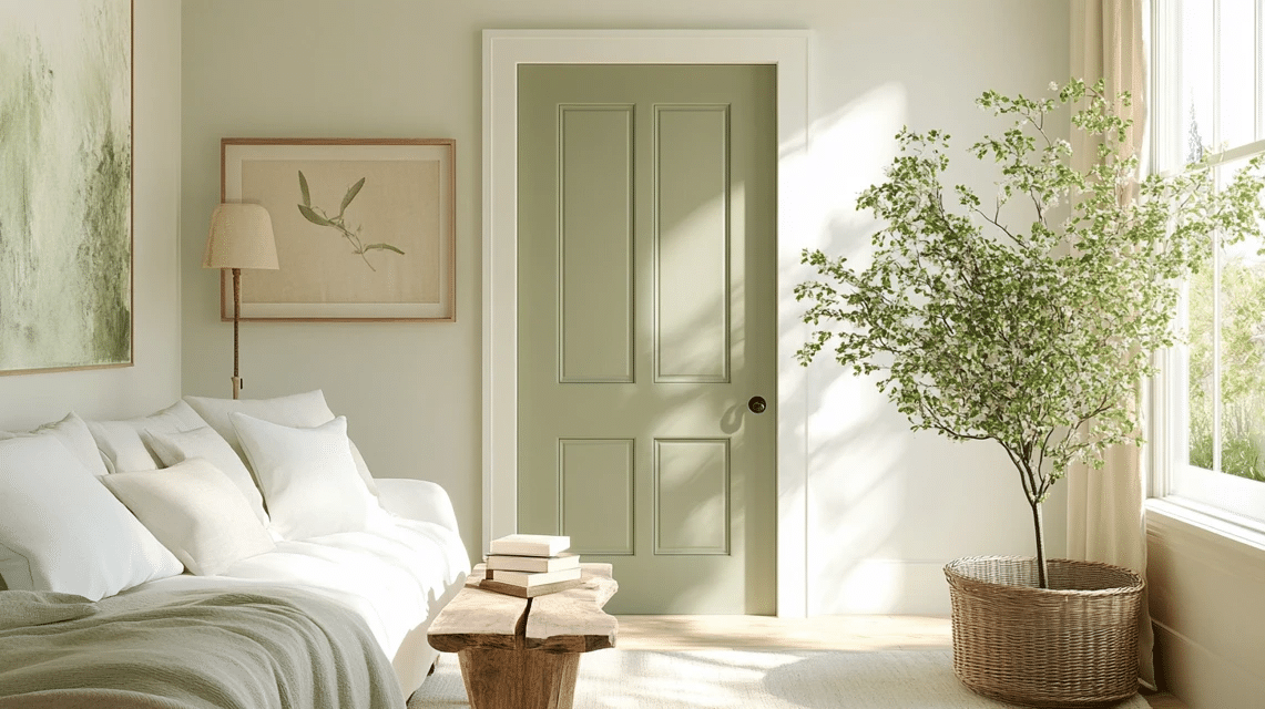
The main door was honestly a game-changer. I was hesitant about using Saybrook Sage here – worried it might be too subtle – but it turned out to be perfect. The color gives just enough personality to make a statement without screaming for attention.
It’s especially gorgeous when paired with brass hardware, which brings out the warm undertones.
Plus, it’s neutral enough to complement both the interior and exterior color schemes, creating a smooth transition between outdoors and in.
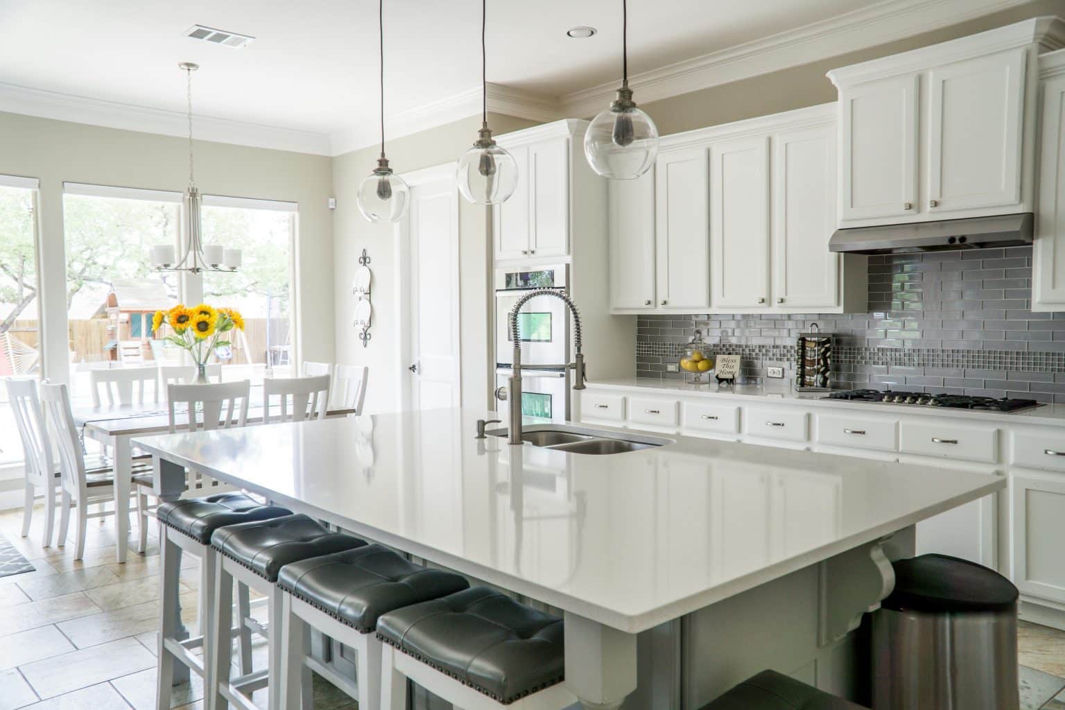
Kitchen Cabinets
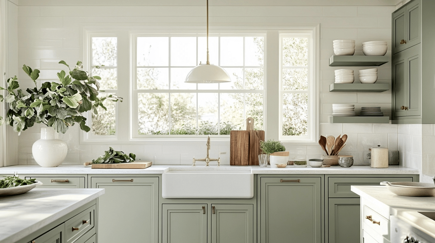
Don’t even get me started on how good this color looks on kitchen cabinets! I painted my lower cabinets Saybrook Sage while keeping the uppers white, and the combination is simply stunning.
The color has enough body to hide minor smudges and cooking splatters, which is practical for a busy kitchen. It also somehow makes my small kitchen feel larger and more cohesive.
The subtle gray undertones work beautifully with both my marble countertops and stainless appliances.
Bedroom Walls
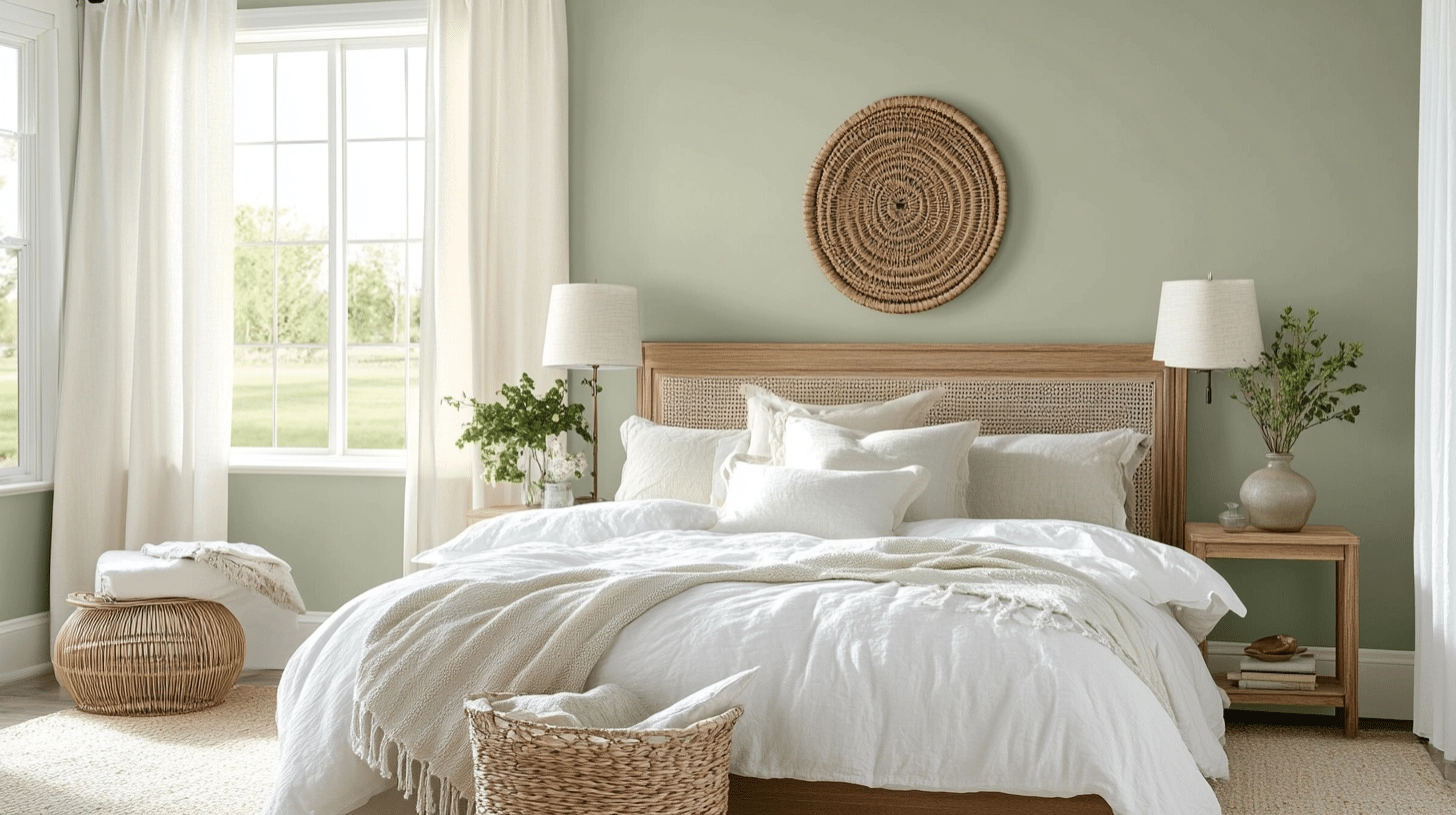
In the bedroom, this color absolutely converts the space. It creates a serene, restful atmosphere that honestly helps me sleep better. I’ve found it pairs wonderfully with crisp white bedding, creating a hotel-like vibe that feels both luxurious and deeply comfortable.
Unlike some greens that can feel energizing, Saybrook Sage has a calming quality that makes it perfect for a sleep space. It also provides a beautiful backdrop for artwork, making everything pop without competing for attention.
Home Office
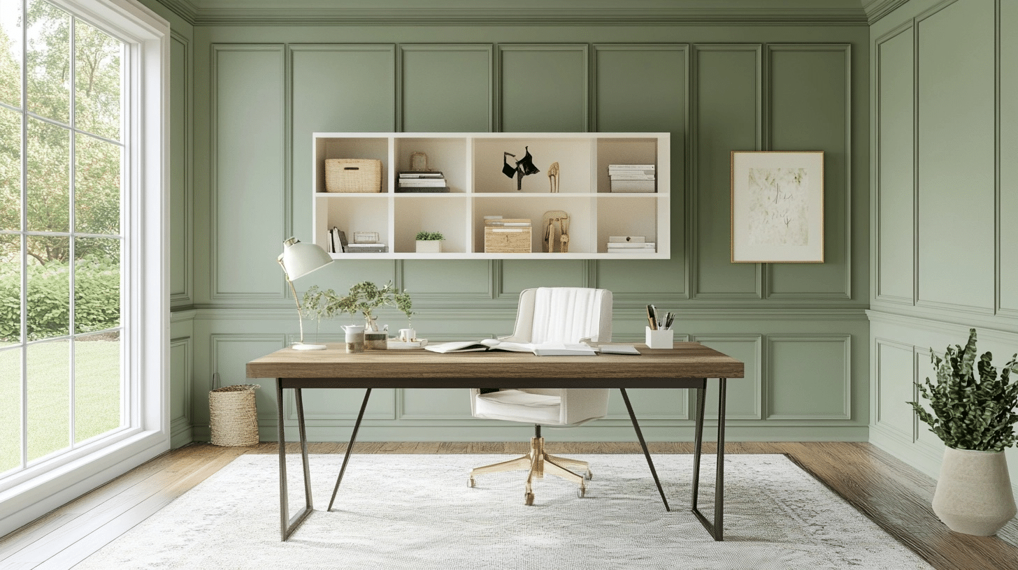
I last tried this color in my home office, and I wish I’d done it sooner. The Saybrook Sage creates a focused, productive environment without feeling sterile or boring like many office colors. It’s got this perfect balance that helps me concentrate without feeling confined.
The color looks particularly striking against my dark wood desk, and it provides a soothing backdrop for video calls.
I’ve noticed less eye strain after long workdays, which I attribute to this shade’s balanced, natural quality.
What Interior Designers Have to Say About Saybrook Sage?
Interior designers have shared various insights about Saybrook Sage, a popular paint color. Many professionals note its versatility as a neutral with character.
Jane Hampton, a Boston-based designer, calls it “a perfect backdrop that works with almost any accent color.”
Her assessment matches most color theory principles, as muted sage greens do pair well with numerous color families.
Mark Chen points out that “Saybrook Sage creates a calm feeling without being boring.”
Research on color psychology supports this claim, as green tones generally promote feelings of tranquility.
Designer Sara Wilson recommends it for “spaces that need to feel both fresh and timeless.”
This aligns with current trend analyses showing that soft green tones have staying power beyond typical color fads.
These expert opinions are consistent with color studies and current design trends, making their assessments reliable for those considering this paint color.
Saybrook Sage Vs Others
When I first started looking at sage green paint colors, I was overwhelmed by the options. There are dozens of similar-looking shades out there, and at first glance, they all seemed pretty much the same.
But after testing several samples, I realized that small differences in undertones and intensity make a huge impact on the finished look. Saybrook Sage stands out in this crowded field for some specific reasons.
What makes this color special is its balance. Many sage greens lean too gray (looking dirty in certain lights) or too green (feeling a bit too “theme-y” for everyday living).
Saybrook Sage hits this perfect middle ground that feels fresh yet grounded.
I’ve painted the same room in three different sage colors before settling on this one, and the difference was striking.
The table below compares Saybrook Sage Benjamin Moore with other popular sage-adjacent colors I considered:
| Paint Color | Brand | LRV | Undertones | Best For | Compared to Saybrook Sage |
|---|---|---|---|---|---|
| Saybrook Sage HC-114 | Benjamin Moore | 38.88 | Gray, slight blue | Versatile, whole-home | Our reference color |
| Clary Sage SW 6178 | Sherwin Williams | 41.65 | Yellow | Warm spaces, south-facing rooms | Warmer, slightly brighter |
| Sea Salt SW 6204 | Sherwin Williams | 63 | Blue, green | Bathrooms, coastal themes | Much lighter, more blue |
| Sage Green Light 2146-40 | Benjamin Moore | 48.58 | Yellow, brown | Traditional spaces | Brighter, more yellow-green |
| Dried Thyme PPG1145-5 | PPG | 33.7 | Brown | Accent walls, masculine spaces | Darker, more earthy |
After living with Saybrook Sage for six months now, I’m convinced it’s the most livable of the bunch. Where Sea Salt felt a bit too pastel and beachy, and Dried Thyme read too dark in my space, Saybrook Sage has this timeless quality that works in both traditional and modern settings. It feels mature without being stuffy and fresh without being trendy – a balance that’s surprisingly hard to find.
The slight blue undertones in Saybrook Sage make it feel cleaner than options like Clary Sage, which can sometimes look a bit muddy as the light changes. And its medium LRV makes it more versatile than lighter options that can wash out or darker ones that might feel heavy in smaller spaces.
Painting It Up
After three months of living with Saybrook Sage Benjamin Moore in various spaces, I’ve come to appreciate its subtle intelligence. This isn’t a color that shouts for attention; it quietly converts your home into something more refined. The true test? Every friend who visits asks about my walls.
If you’re on the fence, grab a sample and watch it through different times of day.
You’ll notice how it shifts from soft green to cosmopolitan gray, never landing in that dreaded “mint” territory that dates so many spaces.
Your walls are the largest design commitment you’ll make. In a world of fleeting trends, Saybrook Sage offers something rare: a color you’ll still love five years from now.
Sometimes, the best choices are the ones you barely notice until you can’t imagine living without them.


6 Responses
What color white is the trim and ceiling in the living room? It looks gorgeous, I’m trying to decide which white to pair it with!
Hi Marissa, thanks so much! We used White Wisp by Benjamin Moore for both trim and ceiling. It has just enough warmth to complement the sage without competing. The cream undertones make Saybrook Sage pop. For something crisper, Soft Chamois works beautifully too, but White Wisp makes everything look more kept together.
I’m considering Saybrook Sage, BM Aganthus or SW Softened Green for all kitchen walls (around cabinets, kitchen table & sitting area that has a bay window and fireplace with a white mantle). My cabinets are BM Chantilly Lace. The floor is Brazilian Cherry & black walnut color. Which color do you recommend that’s not too dark but rich and comfortable that will also pair well with Chantilly Lace, the floors & SW Pure White?
Hi Valerie. All three are beautiful choices, but I’d lean towards Aganthus Green. Saybrook Sage might be a bit cooler against the cherry floors, and Softened Green could go slightly dark in that space. Aganthus would perfectly compliment those wood tones and feel fresh. I’d also recommend getting large samples of each and observing them throughout the day.
Hello Colin,
You inspired me to paint my kitchen in Saybrook Sage and one wall leading to the hallway in White wisp, which I will use for the hallway. When I enter my house, from the hallway I see my sage kitchen (love it!) and the living room. I live in the Northeast surrounded by lots of trees and gardens.I am trying to find the right color for the living room that took ‘agree’ with the sage. Despite large windows the room is rather dark during the day because it faces West. What colors should I consider? Thank you so much for your help!
Hi Ewa, So glad to hear the Saybrook Sage worked out beautifully in your kitchen!
For your west-facing living room, I’d suggest trying Benjamin Moore Edgecomb Gray or Accessible Beige. I believe they would coordinate perfectly with your sage kitchen. And since you’re surrounded by greenery, these colors would bring the outdoors in naturally.
Would love to hear what you choose!