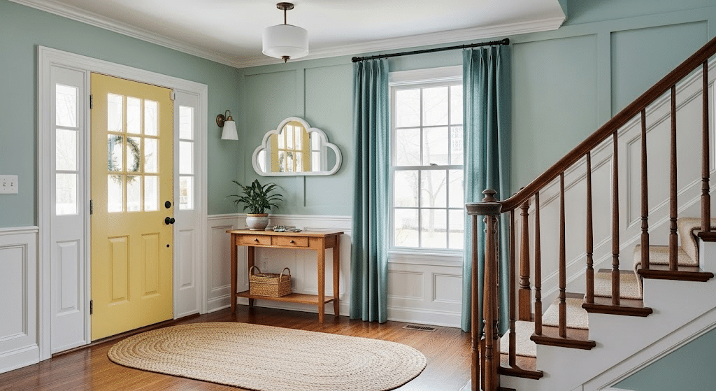
You know the feeling. You walk into a room painted in Sherwin-Williams Home Quietude and think, “I need this exact shade!” But then reality hits; finding the perfect match feels like hunting for a needle in a haystack.
Don’t worry, I’ve been there too. After countless trips to different stores and way too many paint swatches scattered across my coffee table, I figured out the secret to matching this gorgeous greige beauty.
Touching up walls or planning a whole room makeover, I’ll show you exactly where to find Quietude’s perfect twins. No more guessing games or “close enough” compromises!
Ready to become a color-matching pro?
Why is Sherwin-Williams HGTV Home Quietude So Popular?
This color has practically taken over Pinterest boards and home makeover shows, plus, Quietude was also SW Color of the Year. But what makes it so special?
Quietude hits that sweet spot between gray and beige that we’ve all been searching for. It’s not too cool, not too warm, just perfectly balanced.
Plus, its also one of the most calming color shades backed by design science.
The color shifts throughout the day, looking soft and airy in morning light, then cozy and grounded by evening. It’s like having multiple paint colors in one can!
Here’s why people can’t stop talking about it:
- Goes with both modern and traditional furniture
- Makes small rooms feel bigger
- Hides imperfections better than stark whites
- Creates that expensive, designer look without the price tag
Color Match Options for Quietude
Can’t find Quietude at your local store? No problem! These color matches will give you the same gorgeous look without the hunt.
Benjamin Moore Classic Gray (OC-23)
This is probably your closest match. Classic Gray has that same warm undertone that makes Quietude so appealing. It’s slightly lighter, but once it’s on your walls, you’ll barely notice the difference.
Perfect for living rooms and bedrooms where you want that calm, collected vibe.
Behr Mineral (N520-2)
Behr’s Mineral is another fantastic alternative. It leans just a touch more toward the beige side, which actually works beautifully in spaces with lots of natural wood.
I used this in a client’s kitchen, and it paired perfectly with white cabinets and brass hardware.
Valspar Woodrow Wilson Putty (6001-2C)
Don’t let the fancy name fool you – this is a solid match for Quietude. It’s got that same greige quality but with slightly more gray undertones.
Great for bathrooms or anywhere you want a spa-like feel.
Clare Current Mood
This online paint brand nailed it with Current Mood; it’s like Quietude’s trendy younger sibling. The undertones are spot-on, maybe just a hair more contemporary feeling.
I love how it photographs, too, which is perfect if you’re one of those people who post room pics on social media. Plus, Clare ships right to your door!
Farrow & Ball Elephant’s Breath (No. 229)
Okay, I know the name sounds weird, but hear me out! This British paint company created something magical here. Elephant’s Breath has that same refined greige quality as Quietude, but with a bit more depth.
It’s pricier than other options, but the finish is absolutely gorgeous, like butter on your walls.
Decor Tips
Once you’ve got your perfect Quietude match, here’s how to make it shine even brighter.
- Layer different textures: Think chunky knit throws, smooth ceramics, and rough wood pieces
- Add warm metals: Brass and copper fixtures make this color absolutely glow
- Include plenty of plants: Green foliage pops beautifully against greige walls
- Choose cream or off-white trim: Pure white can look harsh; softer whites complement better
- Mix in natural materials: Jute rugs, linen curtains, and stone accents feel right at home
And There You Have It
Your perfect Quietude match is closer than you think!
Finding the right color match doesn’t have to stress you out anymore.
Choose Benjamin Moore’s Classic Gray or try Behr’s Mineral; you’ll get that same calming, refined look that made you fall in love with Quietude in the first place.
The best paint color is the one that makes you happy every time you walk into the room. So grab those sample sizes, test them in your space, and trust your gut.
Happy painting!