Are you stuck with white ceilings and wondering what to do with your walls? I get it. The fear of choosing wrong stops many people from trying new colors in their homes.
The truth is, your walls and ceilings work together to set the mood in your room. And when matched well, they create a look that feels complete and thoughtful.
I’ve tested these combinations and seen how they improve different rooms while working with different clients.
From soft and subtle to bold and eye-catching, these options will help you create spaces you’ll love coming home to.
The Importance of Wall and Ceiling Color Combinations
Colors do more than just look pretty on our walls and ceilings. They affect how we feel in a room.
- When I choose warm colors like reds, oranges, and yellows, my rooms feel cozy and inviting. They bring a sense of comfort, perfect for living rooms where family gathers.
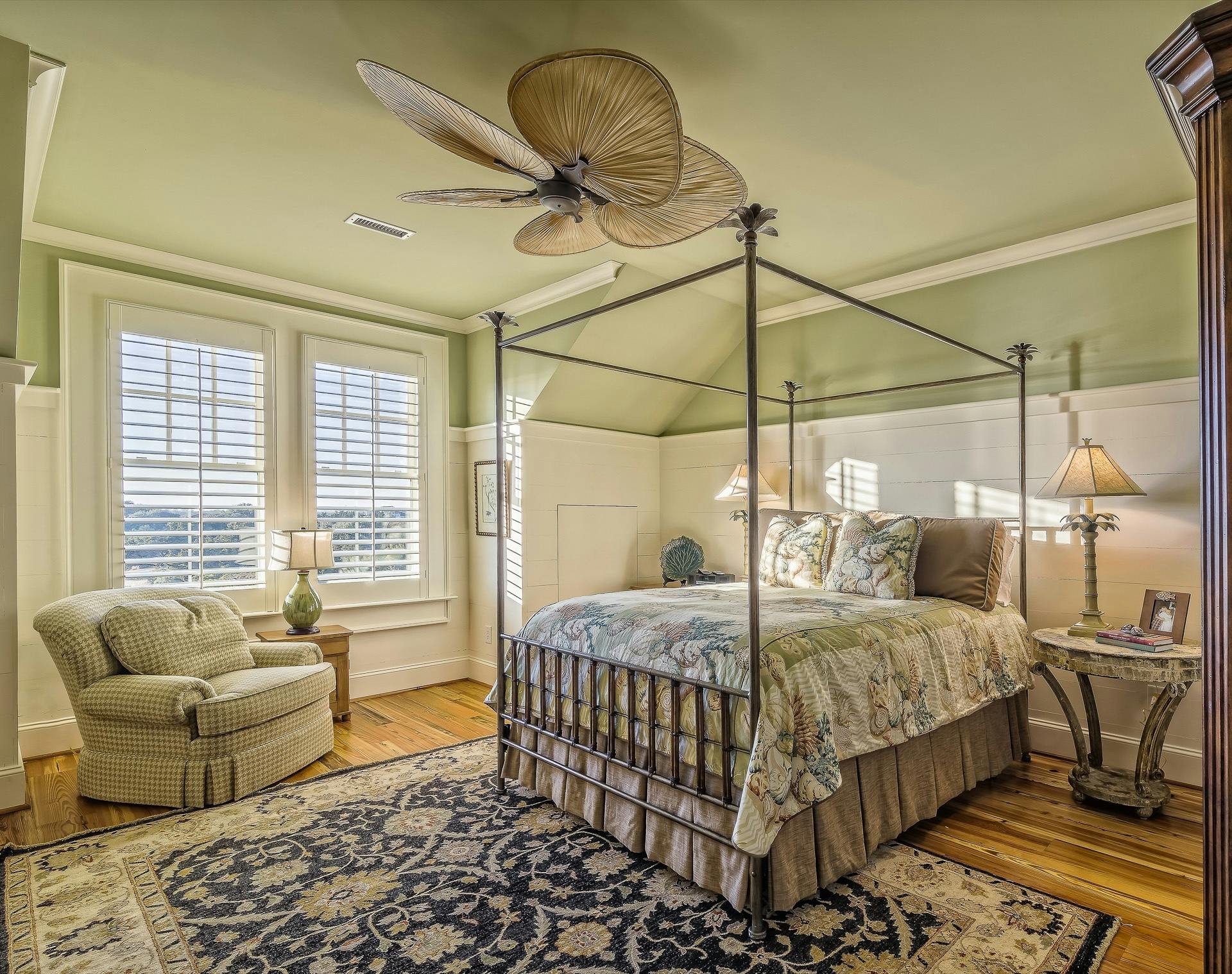
- Cool colors such as blues, greens, and purples make my spaces feel calm and fresh. I use these in bedrooms and bathrooms for a more peaceful feeling.
- Complementary colors (those opposite each other on the color wheel) create bold contrasts that catch the eye. Analogous colors (those next to each other) create a sense of unity and flow.
The right color choices can make small rooms feel bigger or large rooms feel more snug. White ceilings with colored walls make a room feel taller, while matching wall and ceiling colors can blur boundaries.
Wall and Ceiling Color Combinations that Just Work
Finding pairs of colors that complement each other can be tricky. After years of testing different options in homes of all sizes, I’ve found these combinations consistently create beautiful spaces.
Let me show you what works and why these pairings make such a big difference in how a room feels.
1. Soft Blue Ceiling + Creamy White Walls
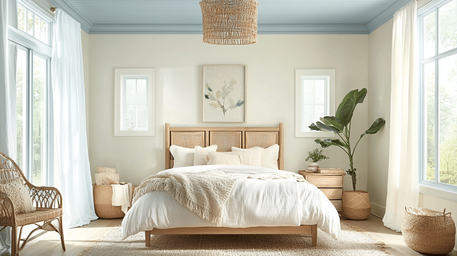
Why it works: This combo creates a calm, airy vibe. The soft blue ceiling mimics the sky, while creamy white walls keep the space bright and welcoming.
Furniture & Accents:
- Light wood or rattan furniture for a natural texture.
- White or pastel upholstery for a cohesive palette.
- Woven baskets and sheer curtains for a relaxed touch.
If you like this idea, you can opt for BLEACHED LINEN by Behr for that perfect cream.
2. Warm Beige Ceiling + Deep Brown Walls
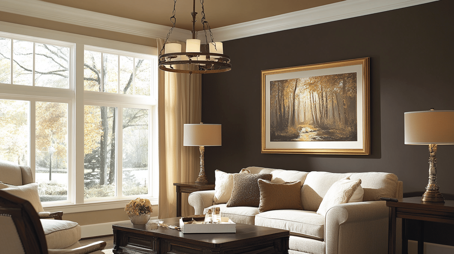
Why it works: The warm beige ceiling softens the space, while deep brown walls ground it with a cozy, rich feel, ideal for living rooms or dens.
Furniture & Accents:
- Dark wood furniture for timeless grace.
- Brass or gold finishes to add warmth.
- Cream or tan textiles for visual balance.
My go-to and most used dark brown shade is Benjamin Moore’s Mink.
3. Muted Green Ceiling + Soft Beige Walls
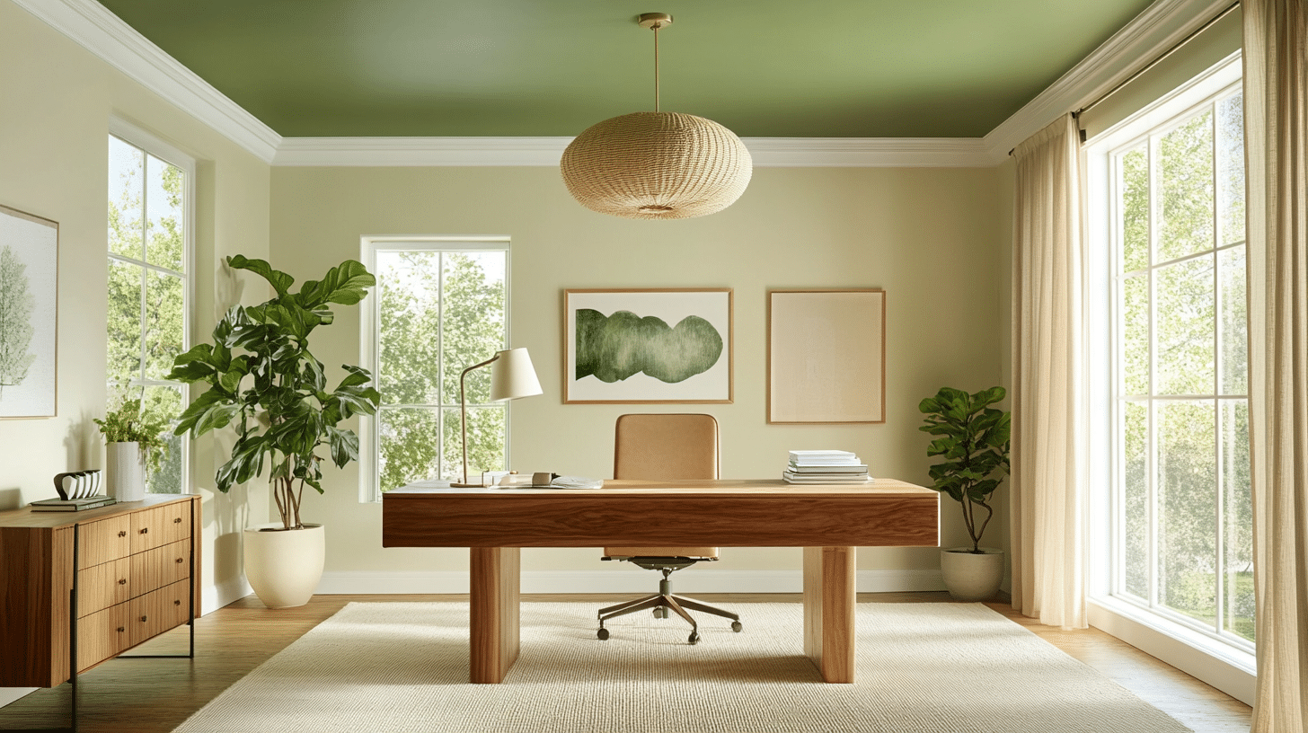
Why it works: Inspired by nature, this duo brings harmony indoors. The muted green ceiling feels refreshing, while soft beige walls offer warmth and versatility.
Furniture & Accents:
- Mid-century or sustainable wood furniture.
- Natural fiber rugs and indoor plants.
- Earth-toned ceramics and wood decor.
Confused? Here are my top muted green paint shade suggestions:
4. Charcoal Grey Ceiling + White Walls
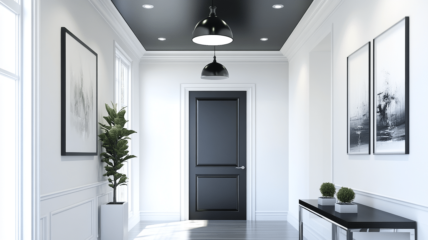
Why it works: A bold, modern contrast, the charcoal ceiling adds drama and depth, while crisp white walls prevent the space from feeling heavy.
Furniture & Accents:
- White or black leather seating.
- Chrome or glass furniture accents.
- Matte black lighting and abstract art.
5. Navy Blue Ceiling + Soft White Walls
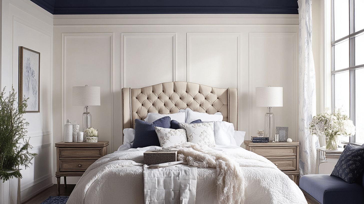
Why it works: Graceful and eye-catching, navy blue draws attention upward. Soft white walls provide a light, balanced backdrop.
Furniture & Accents:
- Navy or tan upholstered seating.
- Silver or mirrored décor for modern flair.
- Nautical or coastal-inspired accessories.
My top recommendation for this idea: COMPASS BLUE by Behr
6. Mustard Yellow Walls + Light Gray Ceiling
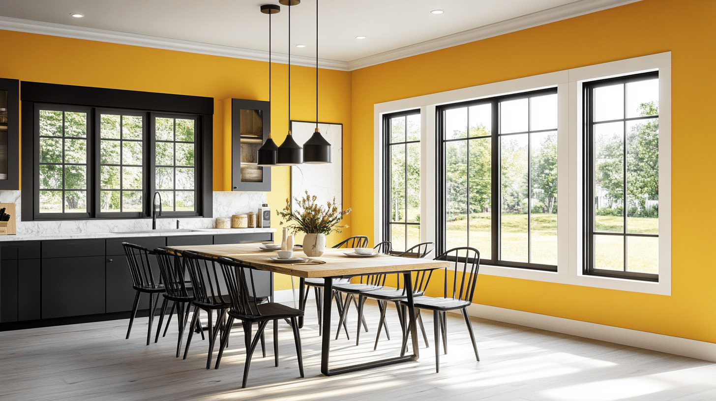
Why it works: Mustard yellow energizes the room, while a pale gray ceiling softens the brightness for a cheerful yet grounded effect.
Furniture & Accents:
- Gray or white seating to anchor the color.
- Black metal or wooden accents.
- Colorful pillows or art to tie the palette together.
7. Sage Green Walls + Pale Pink Ceiling
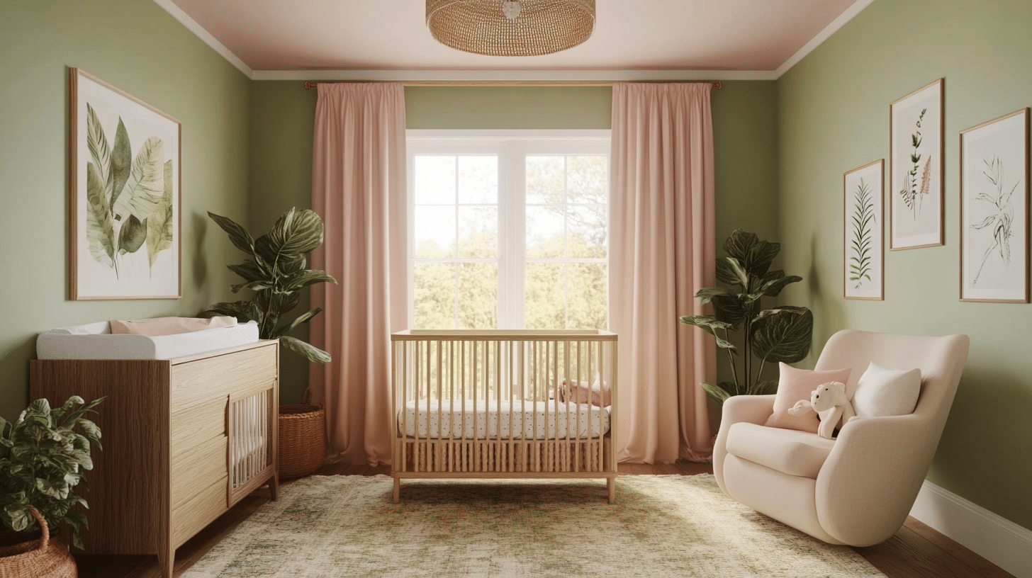
Why it works: Fresh, soft, and serene, this feminine pairing brings calm and warmth. Sage offers a peaceful base, while pale pink adds a gentle charm.
Furniture & Accents:
- Blush or white furniture pieces.
- Rose gold or brass fixtures.
- Botanical prints and soft, cozy textiles.
Check out my review on Saybrook Sage by Benjamin Moore for a clearer insight into the sage green paint shade.
Color-Combining Dos & Don’ts for Walls and Ceilings
Not all color matches are equal. Some create magic, while others fall flat. In my years of home painting, I’ve seen both stunning successes and cringeworthy mistakes.
Here are the key rules to follow and the common pitfalls to avoid when pairing wall and ceiling colors in your home:
| Do’s | Don’ts |
|---|---|
| Test paint samples in both natural and artificial light | Use dark ceilings in small or low-height rooms |
| Coordinate colors with furniture, flooring, and décor | Ignore undertones in wall and ceiling paint choices |
| Use lighter ceiling colors to create a sense of openness | Overlook accessories and accent colors |
| Match color temperature (warm with warm, cool with cool). | Pair clashing or overly intense colors that compete visually |
| Choose colors based on the room’s function and mood. | Disregard the ceiling texture, finish, or architectural details |
| Use ceiling colors to highlight or minimize architectural features. | Default to plain white ceilings without exploring alternatives |
| Add interest with trims, moldings, or accent walls. | Skip updating the ceiling color when repainting the walls. |
Smart Color Pairing Tips for Walls and Ceilings
Getting your walls and ceilings to work together is about more than just picking colors you like. These practical tips have helped me create rooms that feel balanced and well-designed. Use these simple strategies to make your color decisions with confidence:
- Check the lighting: Look at how sunlight enters the room during different times of day. A color that looks great in bright light might appear dull in a dim room.
- Match the room’s purpose: Soft blues and greens work well in bedrooms for better sleep. Warm yellows and soft reds can make living rooms more social. Clean whites and light colors help kitchens feel fresh.
- Blend with what you have: Consider the color of your floor, furniture, and other items in the room. The new paint should work with these items, not fight against them.
- Apply color basics: Complementary colors (opposites on the color wheel) create energy. Analogous colors create harmony. One color in different shades keeps things simple yet stylish.
- Try before you buy: Always put paint samples on both walls and the ceiling. Look at them throughout the day and evening to make sure you’re happy with how they look in all lighting.
How to Paint Walls and Ceilings for Best Results
Getting great results when painting walls and ceilings comes down to proper methods and tools. Follow these steps for the best outcome:
- Prepare the space properly: Empty the room as much as possible. Cover any remaining items with drop cloths. Wash all surfaces to remove dust and grease, then let them dry fully.
- Gather quality supplies: Invest in good brushes, rollers, painter’s tape, drop cloths, primer, and paint. Better tools mean better results and often save time and money in the long run.
- Use smart painting methods: Apply painter’s tape along edges for clean lines. Start with the ceiling, then move to the walls. Put on primer first, then use smooth, overlapping strokes for even coverage.
- Care for painted areas: Wipe painted surfaces with a soft, damp cloth when needed. Fix small marks quickly before they become bigger problems.
- Test before committing: Put sample colors on small wall and ceiling sections. Check how they look in morning, afternoon, and evening light before making your final choice.
Final Thoughts
So there you have it, top wall and ceiling color combinations that can make your rooms feel new again.
When picking colors, remember to consider your room’s purpose, lighting, and what makes you happy. Don’t rush, test samples, look at them at different times, and trust your feelings about what works.
What color combination catches your eye the most? Have you tried any of these at home?
Share your experience in the comments below, or let me know if you have questions about trying these colors in your space!