Home design is most powerful when it feels personal. While furniture and paint colors set the foundation, it is the details that tell a story. Photo prints have the unique ability to blend memory, emotion, and visual interest into a space. When styled thoughtfully, they become more than decoration. They become a design language that reflects who you are and how you live.
Styling with photo prints is not about filling wall space. It is about creating visual rhythm, balance, and meaning. Whether your home leans vintage, modern, rustic, or eclectic, photo prints can be adapted to complement and elevate your style.
Why Photo Prints Work So Well in Home Styling
Photo prints bring authenticity into a room. Unlike mass produced art, they carry personal significance, which naturally draws attention. Many designers choose professional grade papers such as those from Red River Paper to ensure photos display accurate color, texture, and longevity. Studies in environmental psychology suggest that personal imagery in living spaces can increase feelings of comfort, belonging, and emotional well being.
Photo prints also offer flexibility that many decor elements do not. They can be swapped seasonally, rearranged as collections grow, or resized to fit new spaces. This adaptability makes them ideal for evolving homes and changing tastes.
Choosing the Right Photos for Interior Spaces
Before thinking about frames or layouts, the images themselves deserve attention. Not every photograph works equally well as wall art.
Consider Mood and Tone
Images set emotional tone. Bright landscapes can energize a room, while soft portraits create calm.
Think about how each space is used:
- Living rooms benefit from warm and engaging imagery
- Bedrooms feel best with soft tones and intimate moments
- Hallways are ideal for storytelling sequences or travel memories
- Kitchens pair well with candid family photos or lifestyle imagery
Pay Attention to Color Harmony
Photo prints should work with your existing palette. This does not mean everything must match perfectly, but there should be cohesion.
Black and white photography often blends seamlessly into many styles. Color photography works best when one or two dominant tones connect with nearby textiles, furniture, or wall colors.
Frame Styles That Support the Space
Frames are the bridge between the photo and the room. The wrong frame can distract, while the right one enhances both the image and the space.
Matching Frame Style to Home Aesthetic
Different interiors call for different framing approaches.
- Natural wood frames complement farmhouse and rustic spaces
- Thin black or white frames suit modern and minimalist rooms
- Ornate or distressed frames work well in vintage inspired homes
- Mixed frames can enhance eclectic or collected styles
Consistency matters. Even when mixing frames, keeping one unifying element such as color, width, or material helps maintain visual balance.
Creating Impact with Layout and Placement
How photo prints are arranged often matters more than the prints themselves. Placement guides the eye and defines how a space feels.
Gallery Walls with Purpose
Gallery walls are popular for a reason. They allow multiple images to coexist while creating a focal point.
Successful gallery walls share a sense of structure. Before hanging, plan the layout on the floor or use paper templates on the wall.
Common gallery wall approaches include:
- Grid layouts for clean and structured spaces
- Organic layouts for relaxed and artistic homes
- Linear rows for hallways or staircases
- Centered clusters above furniture
Keeping consistent spacing between frames creates a polished look even when images vary.
Styling Photo Prints on Shelves and Surfaces
Not all photo prints belong on walls. Styling prints on shelves, mantels, and consoles adds depth and dimension.
Layering is key. Place a framed photo slightly behind a decorative object or stack frames at different heights. This approach creates a lived in feel rather than a staged one.
Vertical prints work well leaning against walls, while smaller horizontal prints add charm when paired with books or ceramics.
Scale and Proportion in Photo Styling
One of the most common mistakes in styling photo prints is choosing the wrong size. Prints that are too small can feel lost, while oversized prints can overwhelm a room.
A helpful guideline is to let art occupy about two thirds of the width of the furniture beneath it. For example, a large print or grouping above a sofa should visually anchor the seating area without extending beyond it.
Large statement prints work beautifully in dining rooms and bedrooms, while smaller groupings suit intimate spaces like reading nooks or entryways.
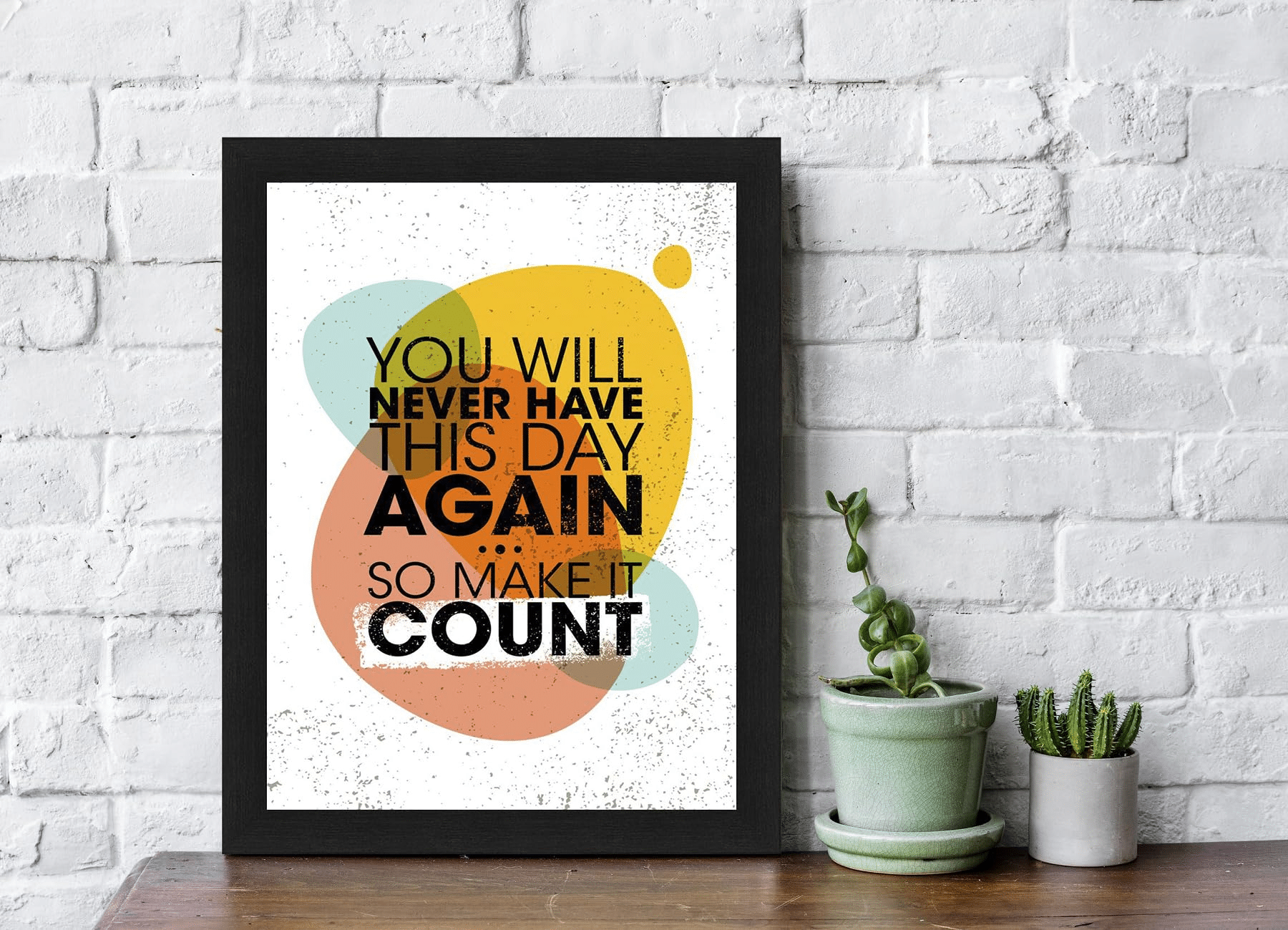
Mixing Photo Prints with Other Art
Photo prints do not need to stand alone. Mixing photography with other art forms creates richness and visual interest.
Consider pairing photo prints with:
- Illustrations or sketches
- Typographic art
- Botanical prints
- Textile wall hangings
The key is balance. When mixing mediums, allow one element to lead while others support it. This keeps the space cohesive rather than cluttered.
Seasonal and Rotational Styling
One of the most overlooked advantages of photo prints is how easy they are to rotate. Swapping images seasonally keeps a home feeling fresh without major changes.
Travel photos in summer, cozy family moments in winter, or nature imagery in spring can subtly shift the mood of a room. Keeping frames consistent allows for easy updates without rehanging hardware.
Emotional Storytelling Through Photo Styling
Photo prints tell stories in ways few decor elements can. A sequence of images down a hallway can document a family’s growth. A single portrait can honor a loved one. A collection of travel photos can reflect curiosity and adventure.
These stories matter. Homes feel warmer and more inviting when they reflect the people who live in them. Guests notice when a space feels intentional and personal.
Styling with Confidence and Intention
There are no strict rules when styling with photo prints. What matters most is intention. Thoughtful placement, cohesive framing, and meaningful imagery transform simple photographs into powerful design elements.
Start with a few pieces you love. Build slowly. Adjust as your space and story evolve. Photo prints allow design to grow alongside life, which is what makes them such a timeless and meaningful part of home styling.
When used with care, photo prints do not just decorate a home. They define it.