Looking for the perfect neutral shade that adds warmth without overwhelming your space?
Accessible Beige by Sherwin Williams has become a top choice for homeowners and designers alike. This versatile color works with almost any style, from modern to traditional, and creates a cozy feel in any room.
Most people struggle to find that “just right” neutral that isn’t too gray, too brown, or too bland. Accessible Beige solves this problem with its subtle warmth and ability to transform spaces into inviting areas that feel both relaxed and put together.
Ready to see how this popular shade can alter your home?
I’ll show you gorgeous color combinations, room examples, and tips for using this fantastic neutral in ways that will make your space look amazing.
What is Accessible Beige? Understanding the Color and LRV
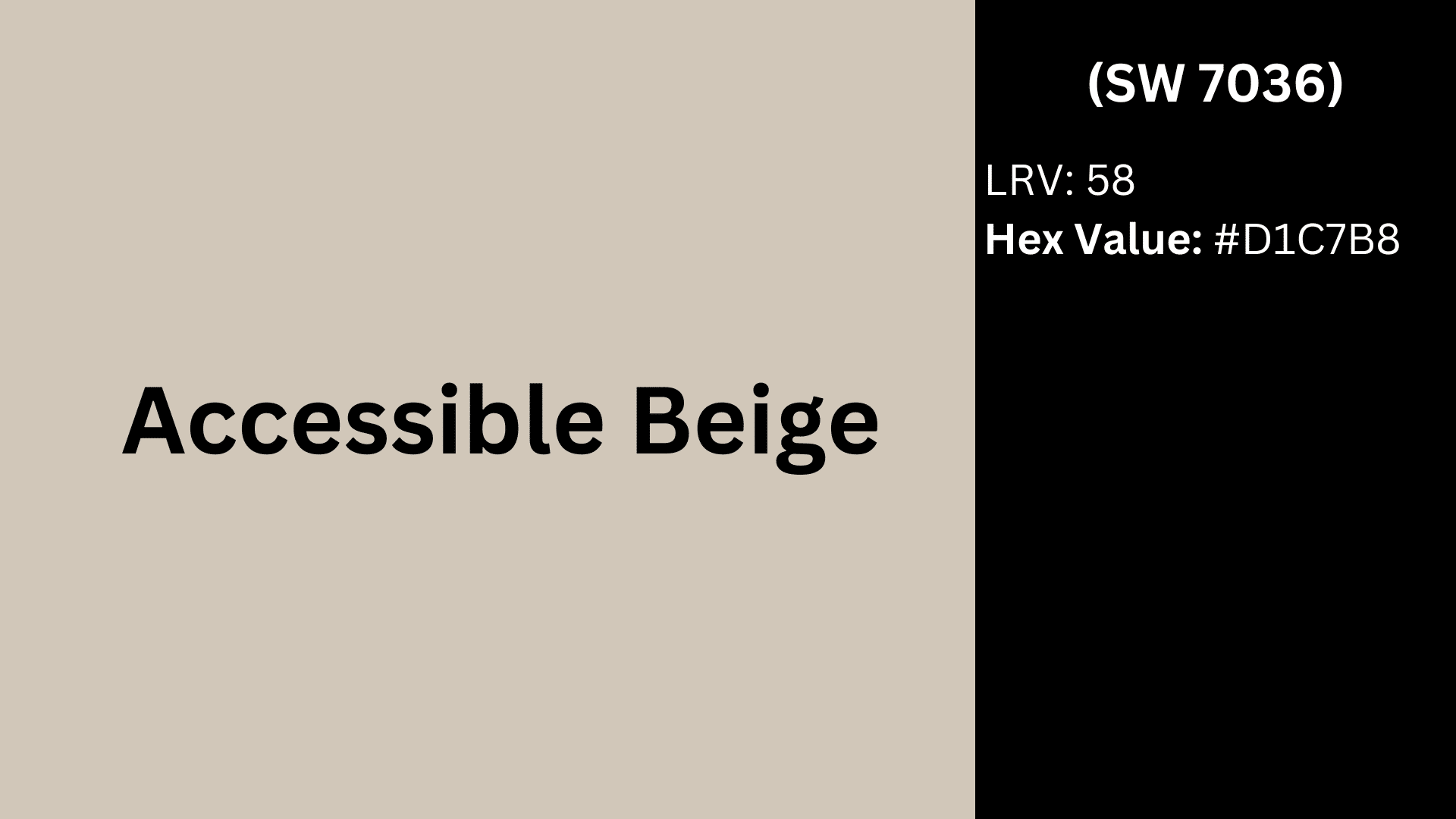
Accessible Beige (SW 7036) is a soft, warm neutral from Sherwin Williams that sits between gray and beige, often called a “greige” color. It features subtle brown undertones that give it more warmth than typical gray shades. The Hex Value of this shade is #D1C7B8.
The Light Reflectance Value (LRV) of Accessible Beige is 58, placing it in the medium range. This number tells us how much light the color reflects rather than absorbs. With an LRV of 58, this shade reflects a good amount of light while still providing enough depth to create visual interest.
In bright rooms with lots of natural sunlight, Accessible Beige appears lighter and warmer. In spaces with limited light, it may look slightly darker and show more of its gray undertones.
This adaptability makes it work well in various settings, from small rooms where you need more light reflection to larger spaces where you want a cozy feel without going too dark.
Why You Should Use Accessible Beige Color Palette in Your Home
Accessible Beige brings a flexible neutral option that works in nearly any home. Its subtle mix of warm and cool tones makes it a smart pick for various spaces and styles.
This color stands out because it:
- Creates a calm background that lets furniture and decor shine
- Changes subtly throughout the day as light shifts
- Complements both modern and classic design approaches
- Pairs well with wood tones and most accent colors
- Makes rooms feel larger and more open
Unlike pure beige or gray, this in-between shade avoids looking too yellow or too cold. It works in homes from craftsman to contemporary without feeling out of place.
The color stays relevant year after year, so you won’t need to repaint as trends change. For homeowners who want a reliable neutral that won’t box them into one specific style, Accessible Beige offers the perfect solution.
Benefits of Using the Accessible Beige Color Palette
Choosing the right neutral color can change your entire home. Accessible Beige has gained popularity not just for its pleasing appearance but for practical advantages that make it a wise investment for any homeowner.
Here’s why this color deserves your attention:
Timeless Appeal
Accessible Beige avoids trendy extremes that quickly date a space. Its balanced undertones prevent it from appearing too yellow (like outdated ’90s beige) or too gray (like recent cold minimalist trends).
This middle-ground approach means your walls will look fresh and current for many years, saving you time and money on frequent repainting.
Exceptional Versatility
This shade adapts to its surroundings with remarkable flexibility. In north-facing rooms, it warms up the cooler light.
In south-facing spaces, it maintains its neutral character without turning too yellow. This adaptability makes it ideal for open floor plans where light conditions vary throughout the day and from room to room.
Creates Natural Warmth
The subtle warmth in Accessible Beige makes spaces feel inviting without being obvious about it. Unlike stark whites or cool grays that can feel clinical, this color adds just enough warmth to make rooms feel lived-in and comfortable.
The effect is particularly noticeable in larger spaces that might otherwise feel empty or impersonal.
Complements Various Decor Styles
From farmhouse to contemporary, Accessible Beige plays well with numerous design approaches. It provides an ideal backdrop for both modern clean-lined furniture and traditional ornate pieces. This compatibility extends to different materials too it amplifies the richness of wood tones while balancing sleek metals and crisp whites.
Accessible Beige Color Palette for the Interiors
Accessible Beige creates a flexible foundation for interior spaces, allowing for countless styling options. This adaptable neutral works throughout the home, shifting subtly based on lighting, room function, and paired colors.
Let’s find out how this versatile shade performs in different spaces and how to use it effectively throughout your home.
Bedroom Retreat Colors
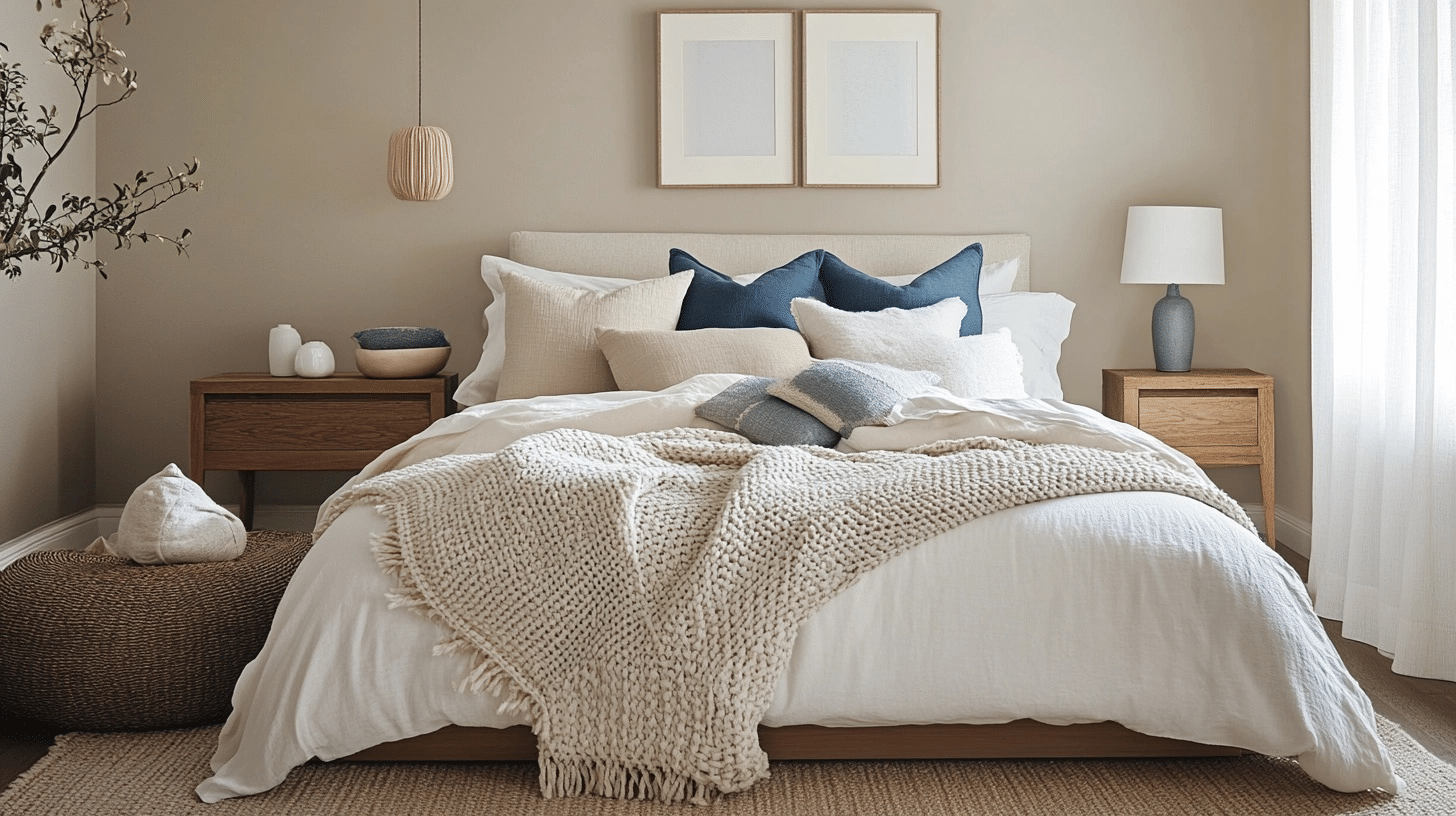
Bedrooms need colors that promote rest and relaxation, making Accessible Beige an excellent choice.
Creating a Restful Space
Accessible Beige on all four walls creates a cocooning effect that feels both cozy and spacious. For added interest, consider an accent wall in a darker coordinating color like SW Mega Greige or SW Useful Gray.
Bedding and Textile Suggestions
Layer bedding in whites, creams, and soft blues or greens to create a peaceful retreat. Add textural elements through:
- Knit throws in cream or soft gray
- Linen duvet covers in white or natural tones
- Velvet pillows in muted accent colors
- Textured cotton or wool rugs underfoot
Ceiling Treatment Options
- Paint the ceiling Accessible Beige for a cozy, enveloping feel
- Use ceiling color at 50% strength for subtle contrast
- Try SW Pure White for a clean look with gentle contrast
- Add simple crown molding painted white for architectural interest
Furniture Finish Selection
Furniture that pairs well with Accessible Beige bedroom walls:
- Medium-toned wood pieces for a natural, cohesive look
- Painted white furniture for a fresh farmhouse feel
- Black or dark wood for dramatic contrast
- Upholstered pieces in cream, taupe, or subtle patterns
Living Room Applications
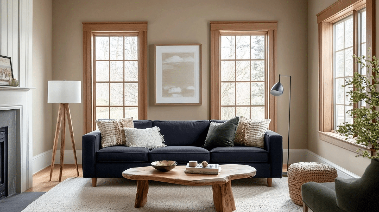
The living room often serves as the heart of the home, making color selection particularly important in this gathering space.
Wall and Trim Combinations
Accessible Beige walls paired with white trim (like SW Pure White or SW Extra White) create a clean, classic look.
For a more cohesive feel, try painting the trim in Accessible Beige at 75% strength. This slight contrast adds depth without stark transitions.
Furniture and Accessory Pairings
With Accessible Beige walls, furniture in navy blue, sage green, or warm terracotta creates beautiful contrast. Natural wood tones—from light oak to rich walnut—look especially striking against this neutral backdrop.
Accent Color Options
- Dusty blues and soft teals for a calming effect
- Warm terracotta or rust for a more energetic space
- Muted sage or olive green for a natural, organic feel
- Rich navy for a classic, timeless combination
Lighting Considerations
How your living room looks depends heavily on lighting. In north-facing rooms, Accessible Beige adds needed warmth. In bright, south-facing spaces, it stays neutral without going too yellow. Consider using warm light bulbs (2700-3000K) to enhance its cozy qualities.
Flooring Compatibility
Accessible Beige works with most flooring types:
- Medium to dark hardwoods bring warmth and contrast
- Light oak or blonde woods create an airy, Scandinavian feel
- Gray-toned luxury vinyl or laminate creates a modern look
- Natural stone or porcelain tile in cream or taupe tones blend seamlessly
Kitchen Color Schemes
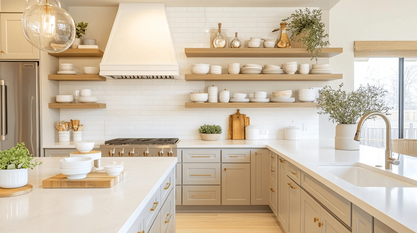
Kitchens benefit from the warmth Accessible Beige brings while maintaining a clean, fresh appearance.
Cabinet and Wall Pairings
Accessible Beige cabinets with white walls create a soft, timeless kitchen. Alternatively, white cabinets with Accessible Beige walls offer a similar feel with a different emphasis.
Countertop and Backsplash Coordination
This neutral shade works beautifully with marble or quartz countertops featuring beige, gray, or taupe veining. For backsplashes, consider subway tile in white or cream or natural stone with warm undertones.
Island Color Options
For two-tone kitchens, try these combinations:
- Accessible Beige perimeter cabinets with a darker island in SW Mega Greige
- White perimeter cabinets with an Accessible Beige island
- Accessible Beige throughout with the island in a muted blue or green
Hardware Selections
- Brushed brass or gold hardware adds warmth and a touch of luxury
- Matte black creates modern contrast
- Brushed nickel or chrome offers a classic, timeless look
- Bronze or copper hardware boosts the warm undertones
Open Shelving Styling
When using open shelving in an Accessible Beige kitchen:
- Display white dishes for clean contrast
- Include natural elements like wooden cutting boards
- Add green plants for a touch of color
- Mix in a few items in your accent color to tie the space together
Accessible Beige Color Palette for the Exterior
Accessible Beige offers exceptional versatility for exterior applications, creating a timeless and classy look for homes of various architectural styles.
Let’s find out how to effectively use this popular color on different exterior elements of your home.
Exterior Walls
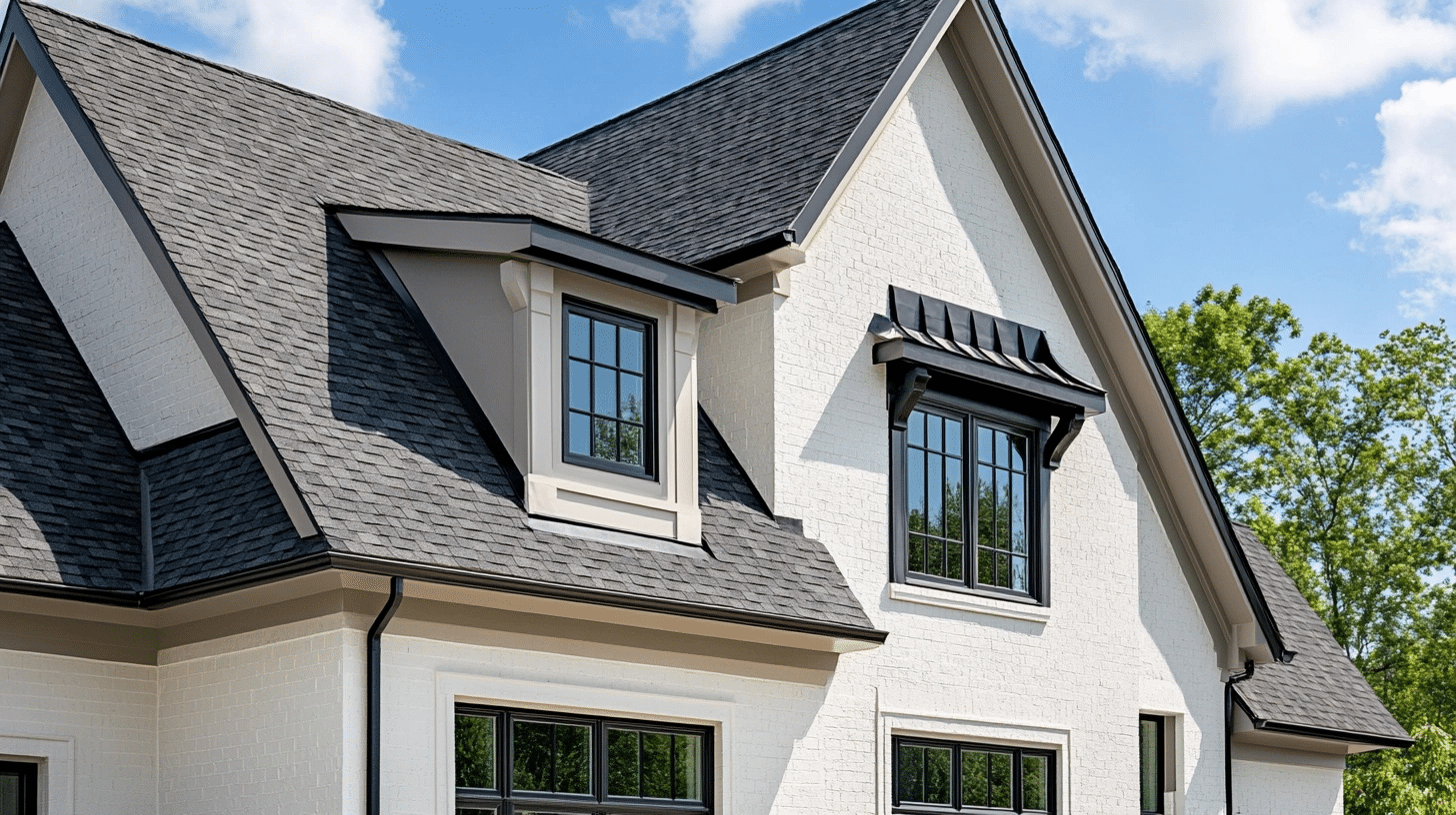
The main surface area of your home deserves a color that’s both appealing and practical. Accessible Beige excels on exterior walls by providing a soft, welcoming appearance without going too bold or too bland.
Trim and Accent Color Pairings
- White trim (like SW Pure White or SW Extra White) creates crisp, classic contrast.
- Dark brown or bronze accents add richness and definition
- Black trim for a modern farmhouse aesthetic.
- Navy blue accents for a coastal-inspired look
Roof Color Coordination
- Dark brown or black shingles create a pleasing contrast
- Gray roof tiles offer a classy, cohesive look
- Terra cotta or red tiles pair well with Mediterranean-style homes
- Weathered wood shingles complement the warmth of Accessible Beige
Lighting Effects
- Morning light brings out warmer tones in Accessible Beige
- Midday sun shows the color at its truest shade
- Evening light may emphasize gray undertones
- North-facing walls appear slightly cooler, and south-facing walls show more warmth throughout the day.
Siding and Material Considerations
- Works beautifully on stucco for a smooth, refined appearance with stone accents in beige, gray, or taupe
- Complements brick when used on trim or partial wall sections
- Amplifies wood siding with its natural warmth and provides softness to fiber cement or vinyl siding
Front Porch
Your front porch serves as a transition between outside and in, making it an important space for color consideration. Accessible Beige creates a welcoming entrance that feels both fresh and timeless.
Ceiling and Floor Options
- SW Ethereal White ceiling for a traditional “haint blue” effect
- Matching Accessible Beige ceiling for a cozy, enclosed feeling
- Natural wood tone floors in medium oak or cedar
- Gray-toned composite decking for modern contrast
- Brick or stone flooring in complementary earth tones
Door Color Selections
| Door Color | SW Code | Color Description | Style |
|---|---|---|---|
| Forestwood | SW 7730 | Dark green with gray undertones | Classic, traditional |
| Naval | SW 6244 | Deep navy blue | Timeless, versatile |
| Urbane Bronze | SW 7048 | Dark brown-gray with warm undertones | Subtle, classy |
| Tricorn Black | SW 6258 | True black | Bold, crisp |
| Rustic Red | SW 7593 | Warm, muted brick red | Traditional, inviting |
Furniture and Decor Coordination
- Natural wicker or rattan furniture boosts the warm undertones
- Black metal pieces create a modern contrast
- White rockers or Adirondack chairs for classic charm
- Cushions and pillows in:
- Muted blues and greens for a calm feel
- Terracotta or rust for warmth
- Navy for classic contrast
- Neutrals with interesting textures for subtle depth
Lighting Fixture Selection
Black lantern-style fixtures for traditional homes
- Brushed brass for warmth and charm.
- Copper fixtures that will patina over time.
- Iron fixtures with simple lines for craftsman styles.
- Clear glass fixtures to maximize light while adding style.
Plant and Landscaping Integration
Plants that complement the Accessible Beige exterior:
- Silvery-green plants like lavender or artemisia.
- Deep green evergreens for year-round contrast and grasses in tan and beige tones for natural harmony.
- Flowers in soft blues, purples, or corals. White flowering plants for clean, classic contrast.
Accessible Beige (SW 7036) Color Palette
Accessible Beige offers a balanced neutral that works in almost any setting. In the following segment, I have put similar colours to accessible beige to let you have a clear distinction.
Let me show you the most successful color combinations that make this versatile neutral truly shine in your home.
Other Similar Colors to Accessible Beige
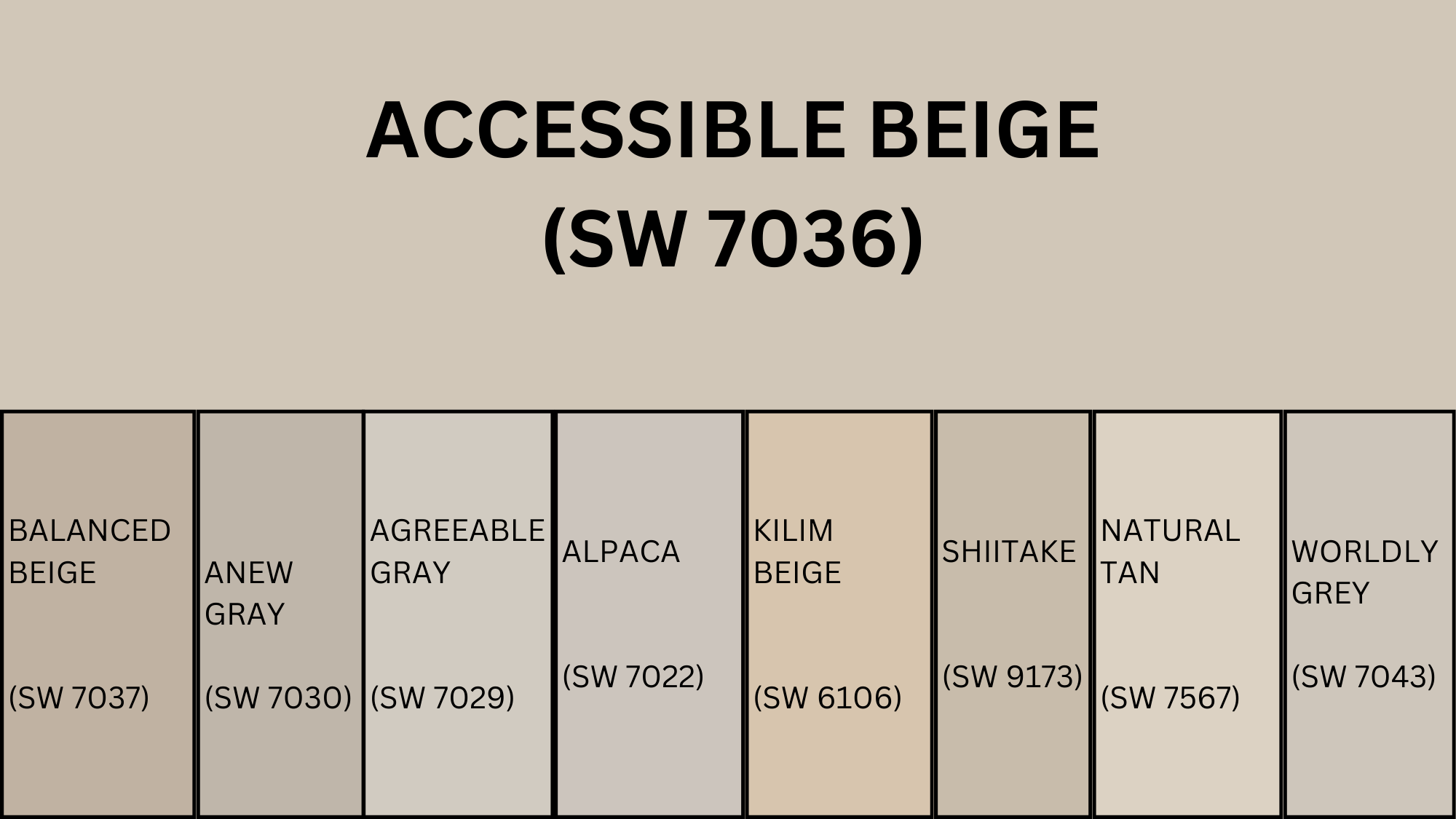
| Color Name | SW Code | Undertone | LRV | Tone Description | Best Pairings |
|---|---|---|---|---|---|
| Accessible Beige | SW 7036 | Warm beige with gray (greige) | 58 | Soft, warm neutral with slight gray undertones | Earth tones, soft whites, navy, sage, warm woods |
| Balanced Beige | SW 7037 | Deeper beige with gray | 46 | Richer, warmer than Accessible Beige | Creams, dark woods, rust, muted green, terracotta |
| Anew Gray | SW 7030 | Greige, slight purple tint | 47 | More gray-forward than Accessible Beige | White trim, charcoal, dusty blues, wood tones |
| Agreeable Gray | SW 7029 | Warm gray, subtle beige | 60 | Light, versatile greige | Crisp whites, navy, blush, natural wood, soft blues |
| Alpaca | SW 7022 | Warm greige, violet undertone | 57 | Charming and soft with subtle color shifts | Whites, silvers, taupe, soft lavender or blush |
| Kilim Beige | SW 6106 | Warm beige, peach undertone | 57 | Richer beige with more warmth than Accessible | Deep reds, warm greens, golds, warm wood tones |
| Shiitake | SW 9173 | Neutral beige with green | 51 | Organic and earthy, more muted feel | Warm whites, greens, wood tones, black metal accents |
| Natural Tan | SW 7567 | Soft tan, slight green | 65 | Lighter than Accessible Beige, more traditional | Soft whites, olive, sage, dark browns, muted terracotta |
| Worldly Gray | SW 7043 | Warm gray, hint of beige | 57 | Calm and grounded, similar to Accessible Beige | Whites, teals, charcoals, brushed metals, sage |
Best Color Combinations with Sherwin Williams Accessible Beige
I’ve found that Accessible Beige works as an amazing foundation for countless color schemes. Its balanced undertones make it incredibly versatile, allowing it to pair beautifully with both cool and warm accent colors.
After testing many combinations in my own projects and seeing them in clients’ homes, I can share the most successful pairings that consistently look fantastic with this popular neutral.
1. Accessible Beige + Pure White + Navy Blue
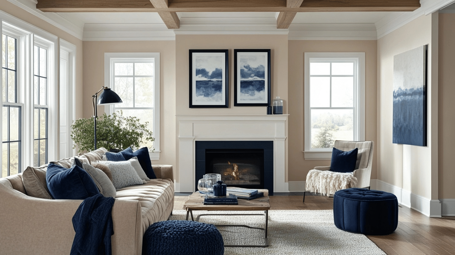
This classic combination creates a timeless, clean look. Pure White (SW 7005) on trim and ceilings provides crisp contrast, while navy accents like Naval (SW 6244) add depth.
I love this trio for living rooms and bedrooms, where the navy can appear on furniture, throw pillows, or even an accent wall for a touch of drama.
2. Accessible Beige + Sage Green + Creamy White
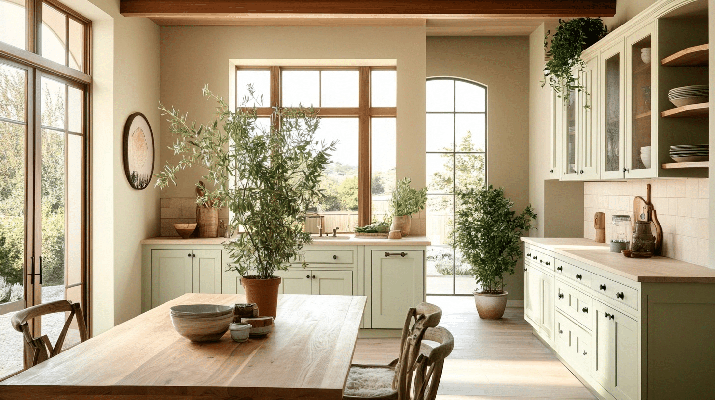
Sage green tones like Dried Thyme (SW 6186) bring a natural, calming quality to Accessible Beige walls. Add Creamy (SW 7012) for trim and ceilings to soften the contrast.
This combination works beautifully in kitchens and dining areas, creating a fresh but warm atmosphere that feels connected to nature.
3. Accessible Beige + Urbane Bronze + Alabaster
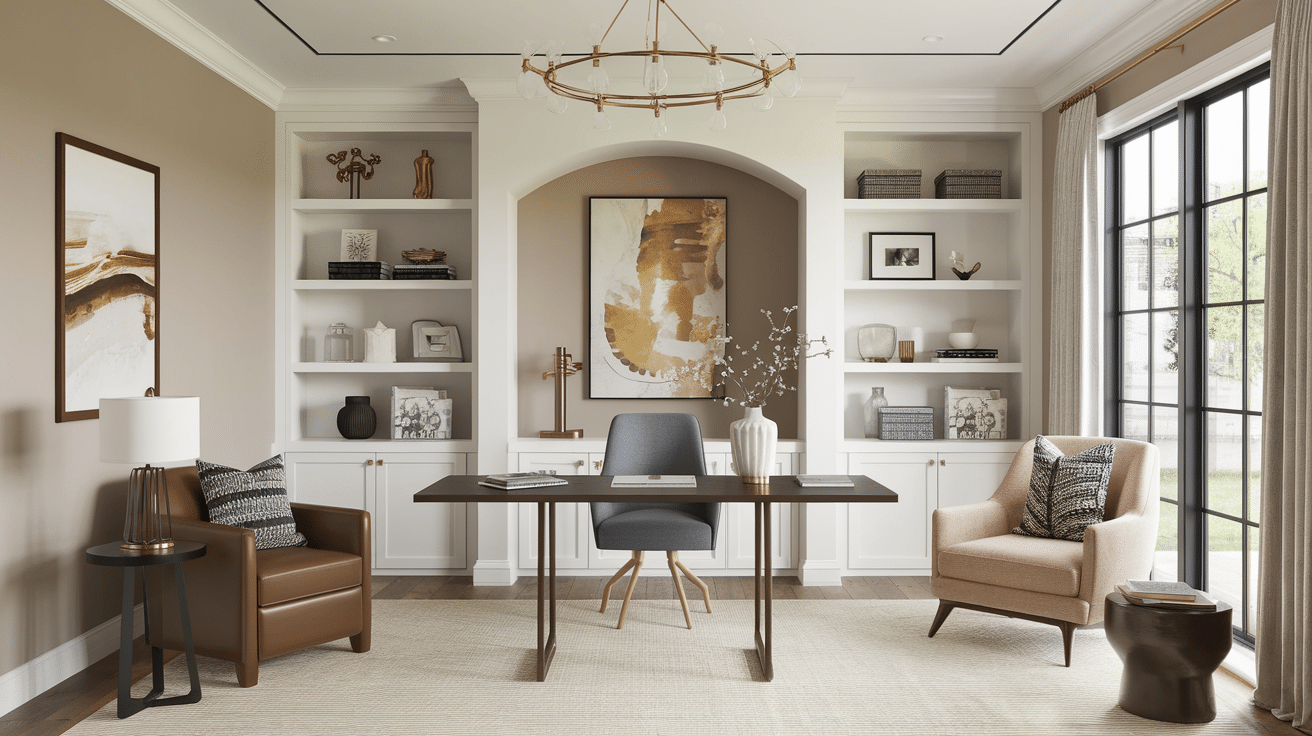
For a classy, modern look, I pair Accessible Beige with the rich Urbane Bronze (SW 7048) for accent pieces or a focal wall. Alabaster (SW 7008) on trim adds subtle contrast without starkness.
This charming trio works well in home offices, living rooms, and master bedrooms.
4. Accessible Beige + Coral Clay + Extra White
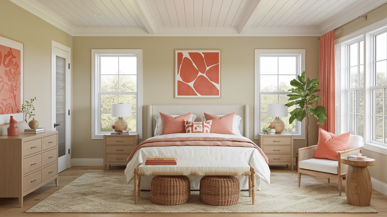
When I want to add warmth and energy to a space, I bring in Coral Clay (SW 9005) accents against Accessible Beige walls.
The Extra White (SW 7006) trim creates a clear definition. This combination feels fresh and uplifting in sunrooms, guest bedrooms, or any space that needs a cheerful yet sophisticated vibe.
5. Accessible Beige + Retreat + Dover White
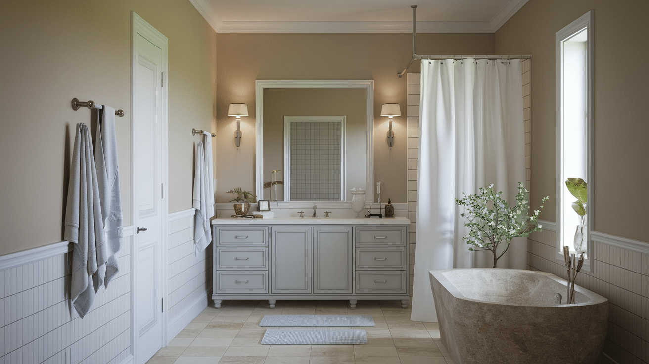
For a serene, spa-like feel, I combine Accessible Beige with the soft blue-gray Retreat (SW 6207) and warm Dover White (SW 6385) trim.
This calming palette creates harmony in bathrooms, bedrooms, and sitting areas where relaxation is the goal. The subtle contrast maintains interest without sacrificing tranquility.
Key Takeaways
Looking back at everything we’ve covered about Accessible Beige, it’s clear why this versatile shade has become such a favorite among homeowners and designers.
This balanced neutral creates the perfect backdrop for countless design styles while adapting beautifully to different lighting conditions.
From cozy living rooms to welcoming exteriors, Accessible Beige offers a timeless quality that won’t feel dated next year or even five years from now.
Ready to alter your space?
Start with a sample of Accessible Beige on your walls. Test it in different lighting throughout the day before committing. And remember, the perfect neutral isn’t about following trends; it’s about creating a home that feels right for you.