I used to think paint was just paint. Then I walked into my living room one gray morning and realized something felt off.
The walls looked fine, but the space felt cold and unwelcoming. That’s when I learned about warm paint colors and how they could change everything.
These rich, inviting shades don’t just cover walls; they change how a room feels.
They add comfort, energy, and life to spaces that once felt flat. In this post, I’ll show you exactly how warm colors turned my home from bland to beautiful.
You’ll learn which colors work best, how to choose the right ones, and simple ways to use them in your own space.
Top Warm Paint Color Picks from Trusted Brands
I spent weeks testing warm paint colors in my home.
Some looked great on the chip but fell flat on the wall. Others surprised me completely. After painting nearly every room and visiting countless paint stores, I found a few colors that actually deliver.
These picks come from brands I trust, and each one brings its own special warmth to a space.
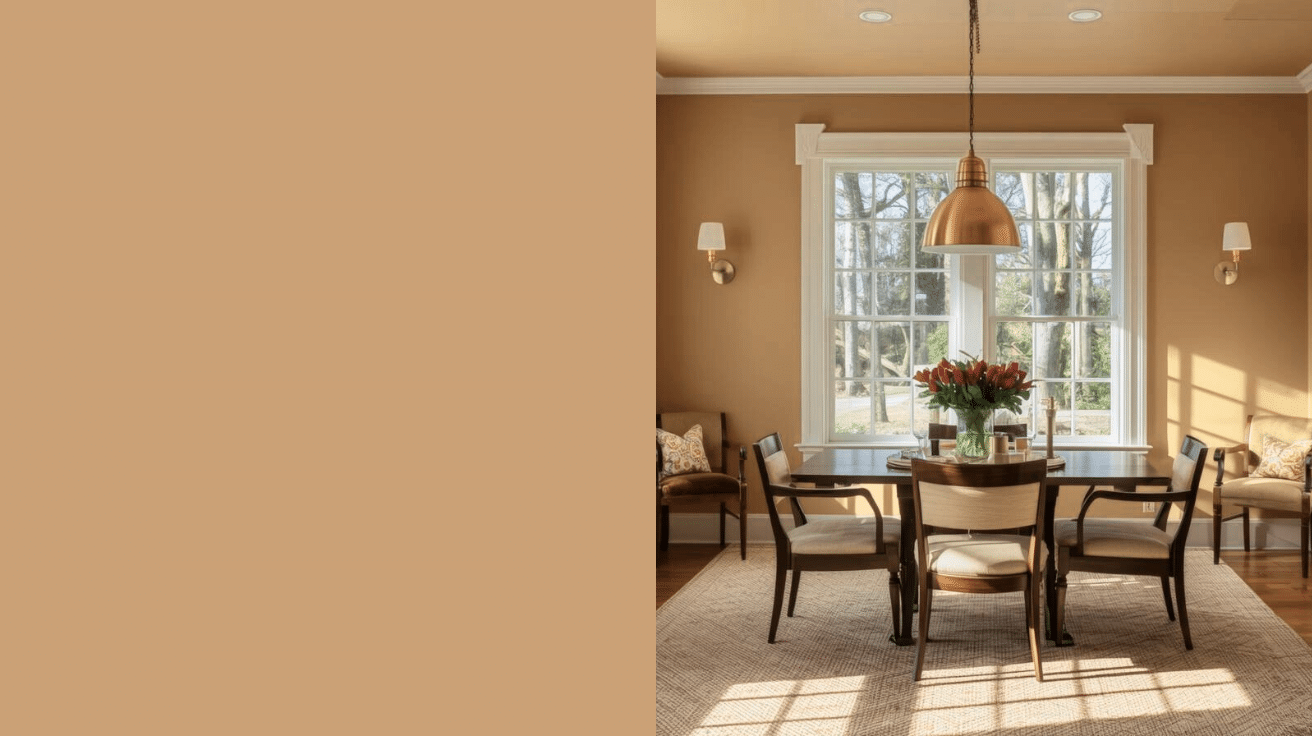
1. Benjamin Moore Warm Sienna
This rich terracotta shade reminded me of clay pots in a sunny garden.
I saw this at my sister’s house last summer, and it made her dining room feel instantly welcoming. The color shifts beautifully throughout the day as light changes.
- LRV: 16.81 – absorbs a good amount of light, creating intimacy
- Best rooms: Dining rooms, accent walls, cozy living spaces
- Pairs well with: Cream trim, natural wood, soft greens
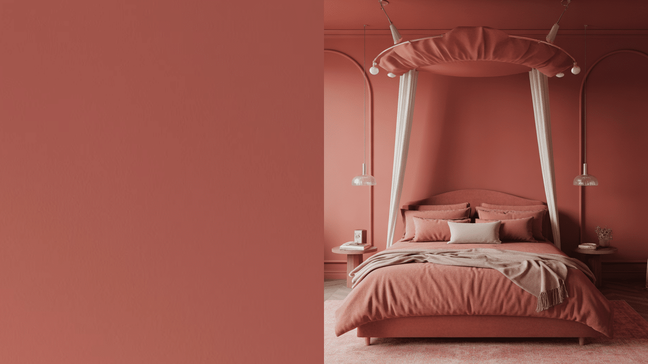
2. Sherwin-Williams Cavern Clay
This dusty rose-brown became my go-to for bedrooms. It’s warm without being too intense.
The subtle pink undertones make it feel soft and restful, perfect for spaces where you want to unwind.
- LRV: 44 – moderate reflectivity for balanced warmth
- Coordinating colors: Alabaster, Pure White, Naval
- Works in: Bedrooms, bathrooms, reading nooks
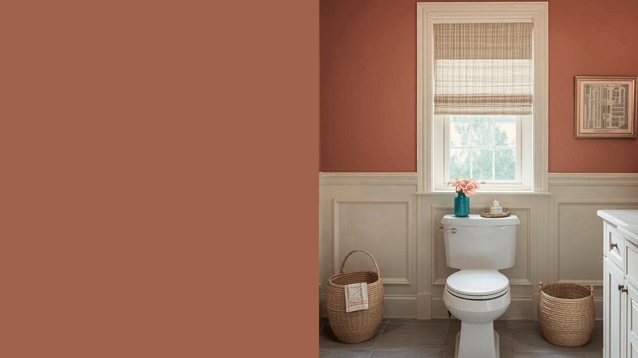
3. Benjamin Moore Audubon Russet
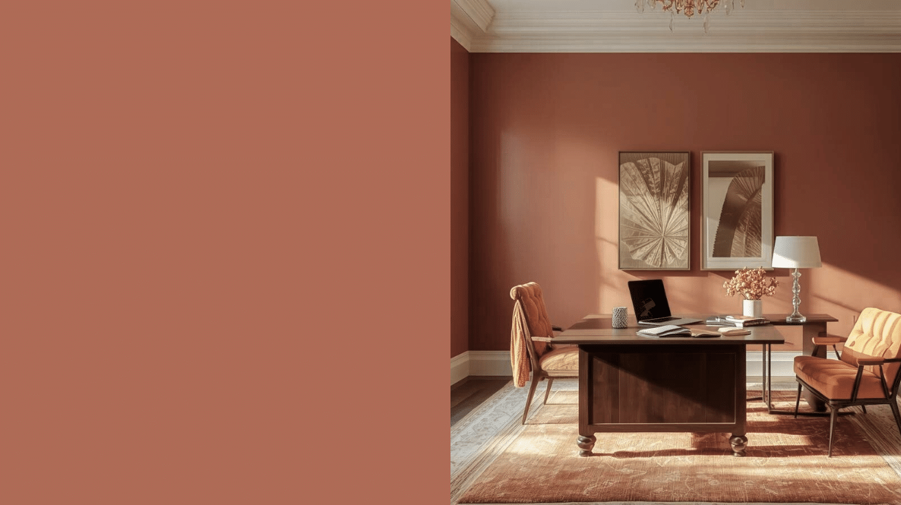
Deep and earthy, this color feels like fall all year round. I used it in my home office and suddenly found myself wanting to spend more time there. It’s serious but not stuffy.
- LRV: 20.95 – quite dark, best for rooms with good lighting
- Complements: Warm whites, burnt orange, deep greens
- Ideal for: Home offices, libraries, accent walls
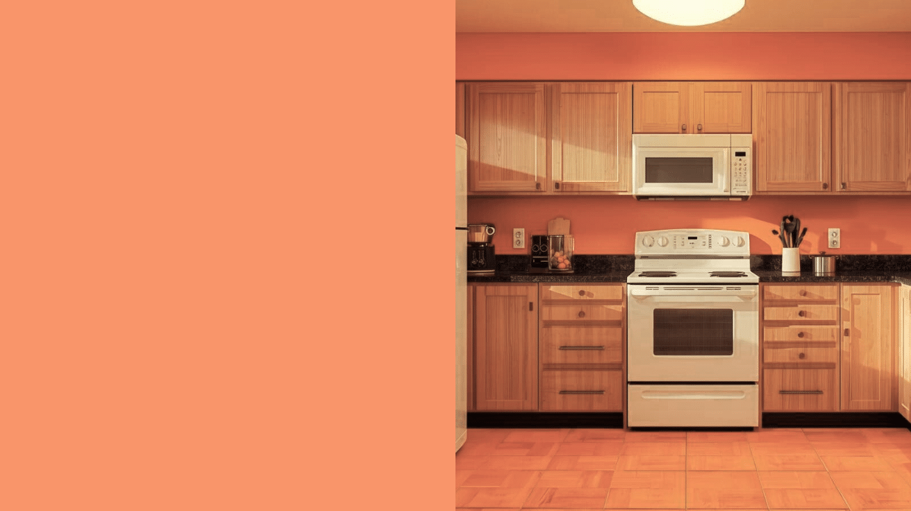
4. Behr Amber Autumn
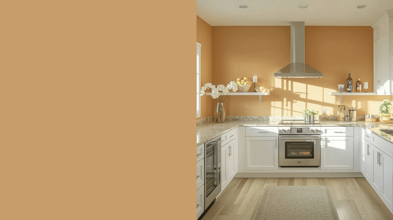
My neighbor painted her kitchen in this golden-orange hue.
Every time I visit, the room feels like a perpetual sunrise. It’s cheerful without being overwhelming, and it makes white cabinets pop.
- LRV: 37 – reflects moderate light while maintaining warmth
- Pairs with: White cabinetry, stainless steel, natural stone
- Best spaces: Kitchens, breakfast nooks, sunrooms
5. Sherwin-Williams Red Barn
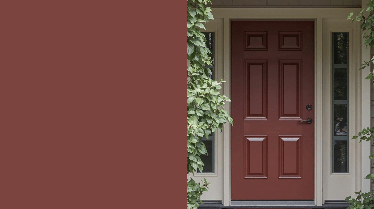
Don’t let the name scare you. This isn’t bright red, it’s a muted, historical red with brown undertones. I used it on my front door and got compliments from every delivery driver.
- LRV: 9 – very deep, makes a strong statement
- Coordinates with: Cream, sage green, charcoal gray
- Perfect for: Front doors, accent walls, traditional spaces
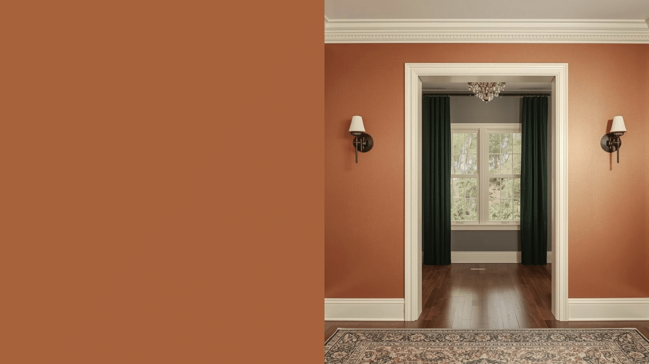
6. Benjamin Moore Burnt Sienna
This classic artist’s color translates beautifully to walls. It’s warm terracotta with orange-red notes. My cousin used it in her Mediterranean-style home, and it looked like it belonged there for decades.
- LRV: 17.37 – low light reflection creates drama
- Works with: Ivory trim, turquoise accents, natural textures
- Great in: Entryways, powder rooms, Mediterranean designs
7. Farrow & Ball Red Earth
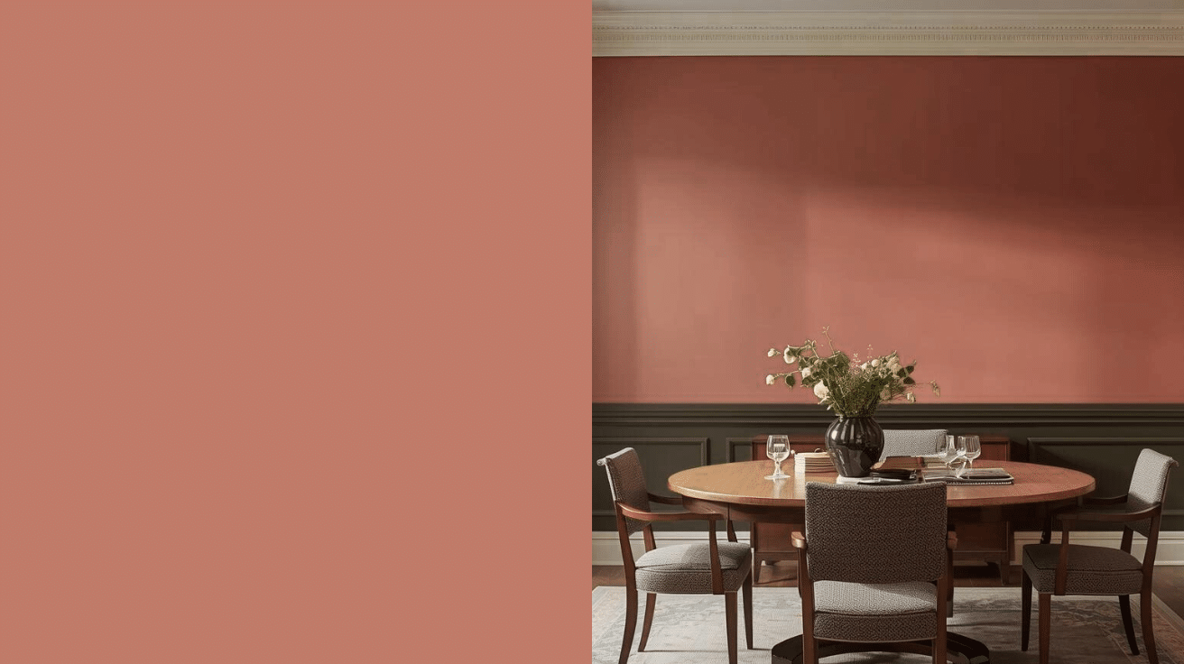
This premium paint costs more but delivers incredible depth.
The color is a dusty red that feels both modern and classic. It has a chalky quality that softens the intensity.
- LRV: 27 – very low, absorbs most light
- Pairs beautifully with: Strong White, Off-Black, Olive tones
- Use in: Feature walls, dining rooms, modern spaces
8. Sherwin-Williams Persimmon
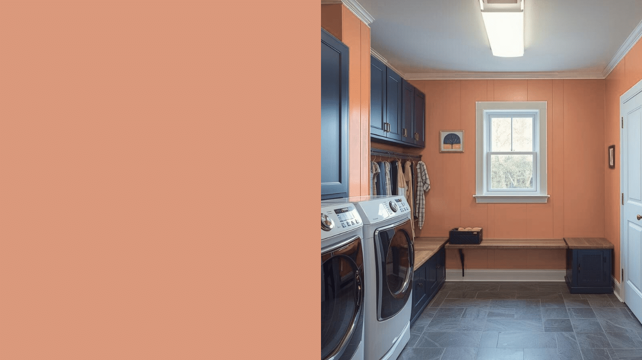
Bright and energizing, this orange-red wakes up any space. I tested it in my laundry room, and it actually made doing laundry less boring. It’s bold but not aggressive.
- LRV: 39 – moderate-low reflectivity
- Coordinating colors: White Dove, agreeable Gray, Navy
- Best for: Laundry rooms, mudrooms, playful spaces
9. Behr Pumpkin Butter
This creamy orange feels like comfort food for your walls.
It’s softer than actual pumpkin but warmer than peach. I saw this in a café once and couldn’t stop thinking about it.
- LRV: 39 – reflects decent light, stays approachable
- Complements: White trim, brown furniture, copper fixtures
- Works well in: Kitchens, casual dining areas, breakfast rooms
10. Benjamin Moore Sunset Boulevard
This vibrant shade needs the right space to shine. It’s true orange with warm yellow undertones.
My friend used it in her retro-style kitchen, and it looked like a magazine spread.
- LRV: 40.5 – good light reflection keeps it lively
- Pairs with: White appliances, natural wood, black accents
- Ideal spaces: Retro kitchens, creative studios, energetic rooms
11. Sherwin-Williams Copper Mountain
A refined burnt orange with metallic undertones. It looks different in every light, sometimes copper, rust. I used it in my powder room, and guests always ask about it.
- LRV: 17 – absorbs considerable light for depth
- Coordinates with: Bronze fixtures, cream, forest green
- Perfect in: Powder rooms, accent walls, cozy corners
Pro Tips for Your Warm Paint Project
Switching to warm paint colors is thrilling, but even I stumbled along the way, like that time a bold terracotta turned my tiny powder room into a sauna.
The key? Sidestep common traps with smart strategies to keep your space radiant without regret.
Here are some tips that are definitely going to help you:
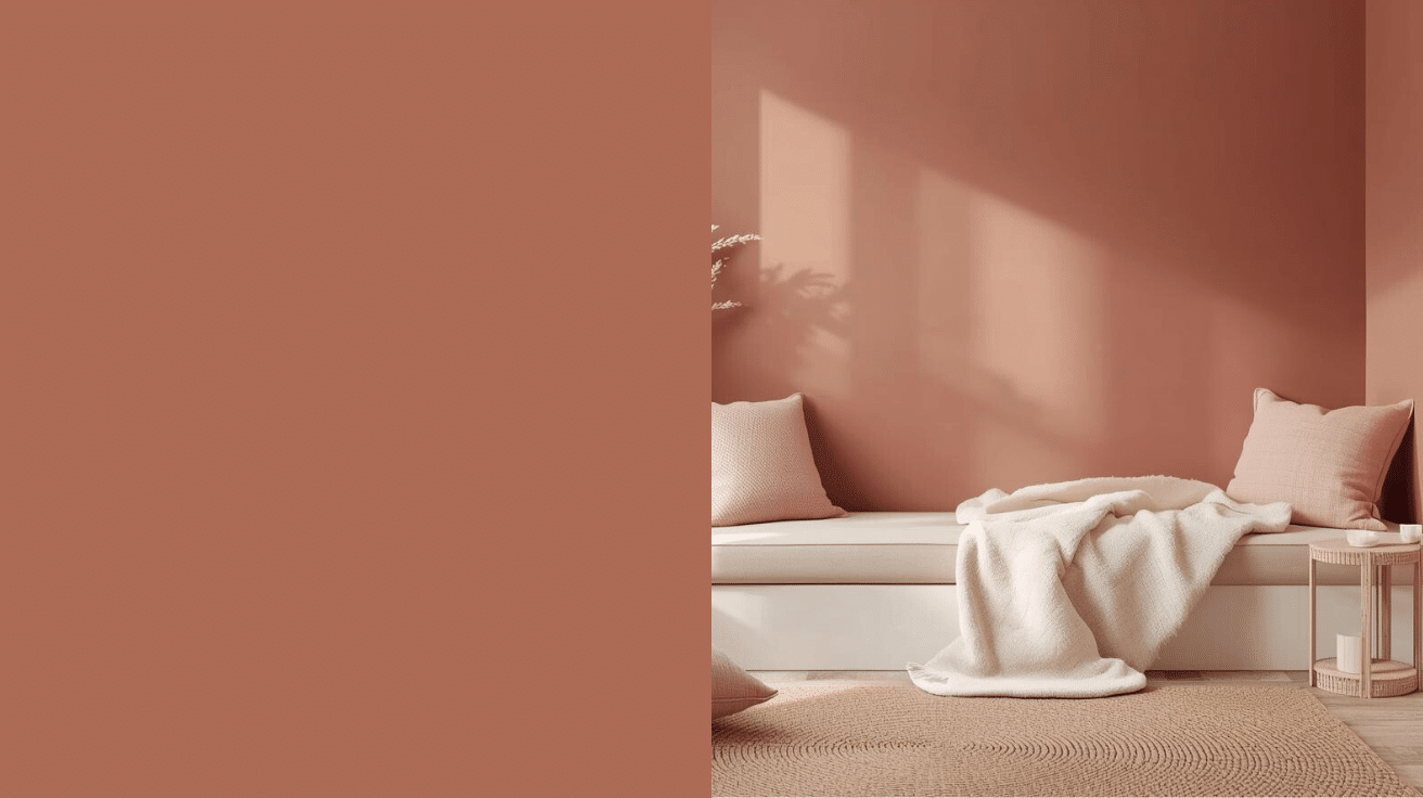
- Overdoing the Intensity: Deep warms can overwhelm small areas, making them feel cramped. Stick to muted tones like Benjamin Moore’s Revere Pewter for subtle depth.
- Ignoring Natural Light: Warms shift dramatically; cozy at dusk, glaring at noon. Test samples at different times of day to avoid surprises.
- Skipping Eco-Checks: Not all paints are created equal; some off-gas fumes. Opt for low-VOC options from Sherwin-Williams for healthier, fade-resistant results.
- Forgetting Trim Balance: All-warm walls can clash with cool floors. Pair with crisp white trim to let the hues breathe and pop
Summing it Up
Choosing warm paint colors changed how I experience my home every single day. These shades don’t just look good, they make you feel good.
Start with something small if you’re nervous. Test a few samples on your walls and live with them for a week.
Watch how the light changes them throughout the day. Once you find the right warm tone, commit to it.
Your space will thank you with comfort and life you didn’t know was missing. Grab some paint samples this weekend and see which warm colors speak to you.
Drop a comment below and tell me which color caught your eye; I’d love to hear about your painting plans!