The trendy window shade colours for 2026 focus on balance, using soft neutrals, nature-inspired tones, and subtle contrasts that work with windows instead of against them. Colour choice now goes beyond design. It shapes how light fills a room, how spacious it feels, and how comfortable the space stays all day.
As homes become warmer and calmer, window shades should support this change rather than stand out. The right colour softens harsh daylight, cuts glare, and visually links windows with walls, floors, and furniture. Often, the shade colour also affects how well natural light spreads through a room.
For homeowners, designers, and renovators, choosing the best window shades and the right colour scheme in 2026 means considering function, cohesion, and long-term appeal. Not just trends. You should aim to choose blinds or shades that improve both the window and the room, and that will still look good for years.
Top Window Shade Colour Trends for 2026
In 2026, window shade colours are shifting from bold contrasts to softer, more natural palettes. The focus is on calm, timeless colours that fit easily with modern windows and interiors. Instead of being just a decorative accent, shades are now seen as an extension of the window and nearby walls.
Warm neutrals are replacing cool greys and bright whites. These shades soften the look of a room, help spread light more evenly, and suit both light and dark window frames. Nature-inspired colours are also becoming more popular, showing a growing interest in sustainable and wellness-focused design.
Key colour directions shaping 2026 include:
- Soft whites and warm off-whites, which reflect daylight without creating glare
- Greige and taupe tones, offering flexibility across modern and transitional interiors
- Muted greens, such as sage or olive, that add depth without overwhelming the space
- Clay, sand, and stone hues, inspired by natural materials and textures
- Desaturated blues, used sparingly for balance and visual calm
These colours work well with modern window styles and let homeowners refresh their interiors without choosing bold or short-lived trends.
How to Choose Window Blinds or Shades Colour Scheme by Room Function
The function of each room should guide your window shade colour more than trends. Light, privacy, and daily use all affect which colours work best. A good shade colour puts comfort first, with design as a close second.
- For living rooms, aim for balance. These rooms get a lot of daylight and are used for many activities. Soft neutrals and light earth tones help manage glare and keep the space open and inviting.
- Bedrooms do well with calmer, deeper colours that help with rest and privacy. Slightly darker neutrals, muted greens, or warm greys cut down on light without making the room feel heavy. In bedrooms, blackout ability is more important than how bold the colour is.
- Kitchens and dining areas need good light control. Lighter shades are a smart choice because they reflect daylight and keep the space looking clean and bright. Warm off-whites or pale taupes also match well with cabinets and countertops.
- Home offices need to be visually comfortable. Colours that lower contrast and glare help reduce eye strain when using screens. Mid-tone neutrals or soft greige shades work better than bright white.
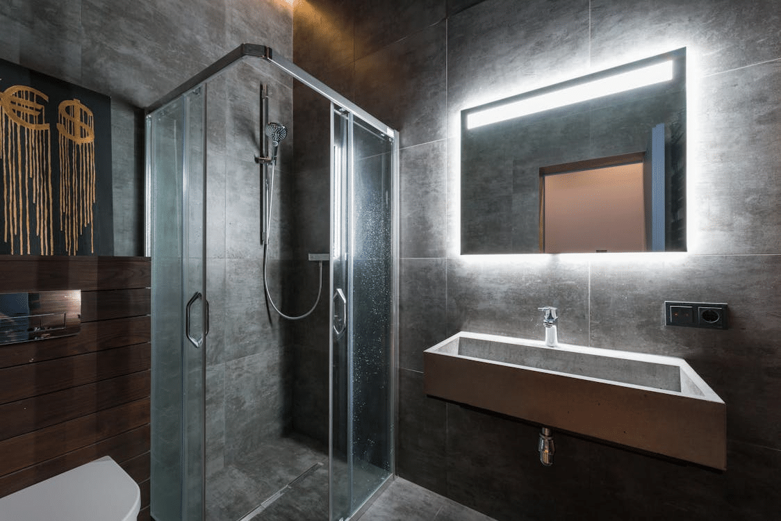
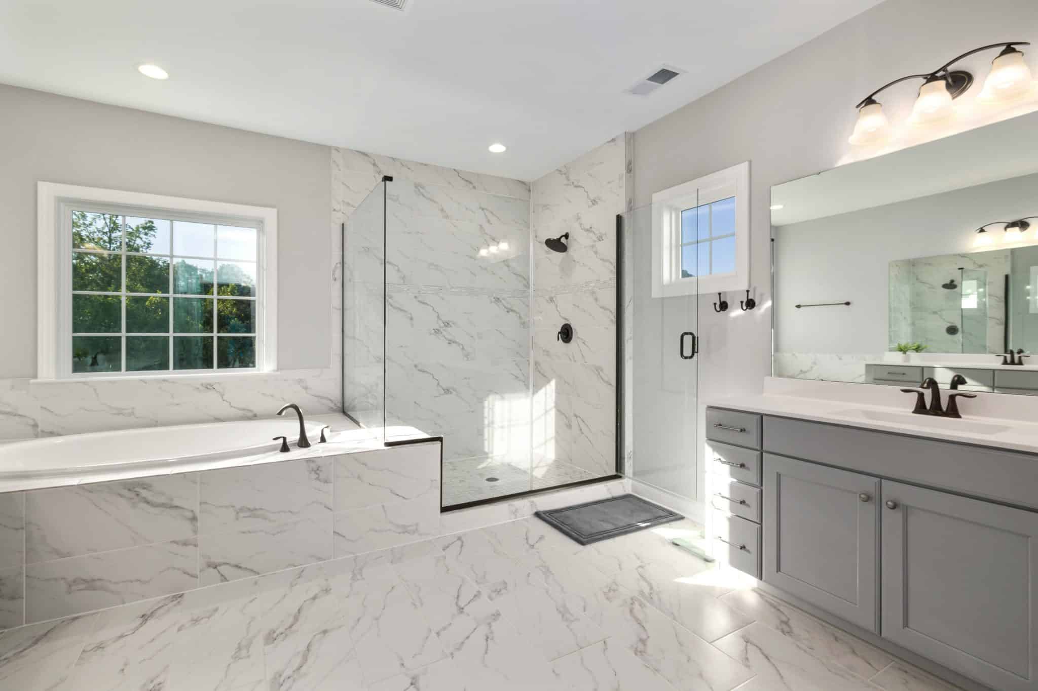
Bathrooms and utility rooms often have excessive condensation on windows, so they will do best with moisture-resistant materials in light, neutral colours. These shades boost natural light and still keep the space private.
Picking shade colours based on each room’s function creates a unified look and makes the home more practical every day.
Make Your Shades Colour Complement Windows and Frames
Window shade colour should complement the window, not clash with it. The frame’s colour, material, and shape all affect how the shade looks once it’s up. When these elements fit together, the window looks cleaner, more purposeful, and balanced.
- With light or white window frames, warm off-whites and soft neutrals help the shades blend in smoothly. This keeps the focus on natural light, not on sharp edges. Matching the colours too closely can look flat, so a little contrast usually works better than an exact match.
- Dark window frames look best with either some contrast or matching tones. Neutral shades like taupe, stone, or muted grey soften the frame but still show off its design. This works well in modern or minimalist spaces. Use very dark shades carefully, since they can make the window look smaller.
Shade colour can change how big a window looks. Lighter shades make windows seem taller and wider, while darker ones add focus and structure. Shades mounted outside the window and matched to the wall colour can make windows look bigger and more stylish.
When you choose shade colours carefully, they help tie windows to the rest of the room and improve the overall design.
Light, Heat, and Energy Performance: Colour Choices That Work Smarter
Window shade colour does more than change how a room looks. It also affects how light and heat move through space. Lighter shades reflect more daylight, spreading it deeper into the room. This cuts glare near the window and means you need less artificial light during the day, with modern, energy-efficient blinds and shades boosting your windows’ thermal performance by up to 40%.
Darker shades soak up more light and heat. This is helpful in rooms where you want less glare and more privacy, like bedrooms or media rooms. Still, it’s important to balance dark colours with the right fabric to prevent too much heat.
From a practical standpoint:
- Light colours improve daylight diffusion and keep rooms feeling open
- Mid-tone neutrals offer the best balance between glare control and brightness
- Darker shades reduce contrast and visual distraction when screens are present
During warmer months, reflective or light-coloured shades help keep out extra heat from the sun. In colder months, well-fitted shades of any colour help keep warmth inside by adding an extra layer. The best results come from matching the right colour with the right fabric and fit.
Top Interior Design Tips to Avoid Costly Colour Mistakes
A common mistake is picking shade colours without thinking about the whole room. Don’t choose shades just from a showroom sample. Lighting, wall colour, flooring, and window direction all affect how a shade will look at home.
Testing samples at different times of day is essential. Morning and evening light can shift colour, warmth and contrast. What appears neutral at noon may look too dark or too cool later in the day.
Here are a few practical design tips to help you avoid mistakes:
- Match shades to undertones, not just colour names
- Avoid pure white unless the surrounding finishes support it
- Do not match shades exactly to walls; a slight contrast works better
- Consider longevity over trends, especially for large windows
Window shades are a long-term part of your home. Choosing colours carefully means they’ll stay comfortable to look at and stylish for years, not just one design trend.
Choose Window Shade Colours That Will Last Beyond 2026
The best window shade colours for 2026 are all about restraint, comfort, and flexibility. Soft neutrals, muted earth tones, and balanced mid-tones fit well in any room, with any window style or layout. When you choose shades thoughtfully, they help natural light, make windows look better, and create a calm, unified space.
Instead of following bold trends, homeowners get the most from colours that match window frames, work with changing light, and fit each room’s use. Shade colour should look intentional but not stand out too much. This way, your design stays useful and stylish for years.
For homeowners planning a renovation or updating window coverings, check samples under real lighting and consider professional advice. Careful colour choices lead to more comfort, better looks, and fewer regrets in the long run.