I get this question almost daily from confused homeowners staring at paint swatches. What exactly is greige, and why does everyone keep talking about it?
Greige isn’t just another trendy color name. It’s actually the perfect solution for anyone who can’t decide between gray’s coolness and beige’s warmth.
Once I understood how to work with greige properly, my whole approach to decorating changed. You’ll save hours of second-guessing paint choices, and your rooms will feel more balanced than ever before.
Let me walk you through everything I’ve learned about greige, from what it actually looks like to the best color combinations that make any space feel just right.
Key Specifications of Greige Color
I think of greige as the perfect middle ground between gray and beige. It’s not quite gray, not quite beige, but something beautifully in between.
This color typically contains about 60-70% gray undertones mixed with 30-40% beige warmth.
The result? A neutral that feels both modern and cozy at the same time. What I love most about greige is how it shifts throughout the day – looking more gray in bright light and more beige in softer evening light.
Greige Color Specifications:
| Specification | Value |
|---|---|
| HEX Code | #8B8680 |
| RGB Values | R: 139, G: 134, B: 128 |
| Color Family | Neutral |
| Temperature | Warm Neutral |
| LRV | 25–35% |
| Undertones | Gray with beige/taupe hints |
This technical breakdown helps me match greige perfectly with other colors and lighting in any room.
Best Greige Color Across Brands for Your House
Greige works well across modern, rustic, and traditional styles, adapting to various lighting conditions and decor preferences.
If you’re painting a cozy bedroom, a stylish kitchen, or a formal living space, these greige shades deliver warmth and refinement in equal measure.
Below are seven standout greige paints from top brands, each with tips for where and how to use them best.
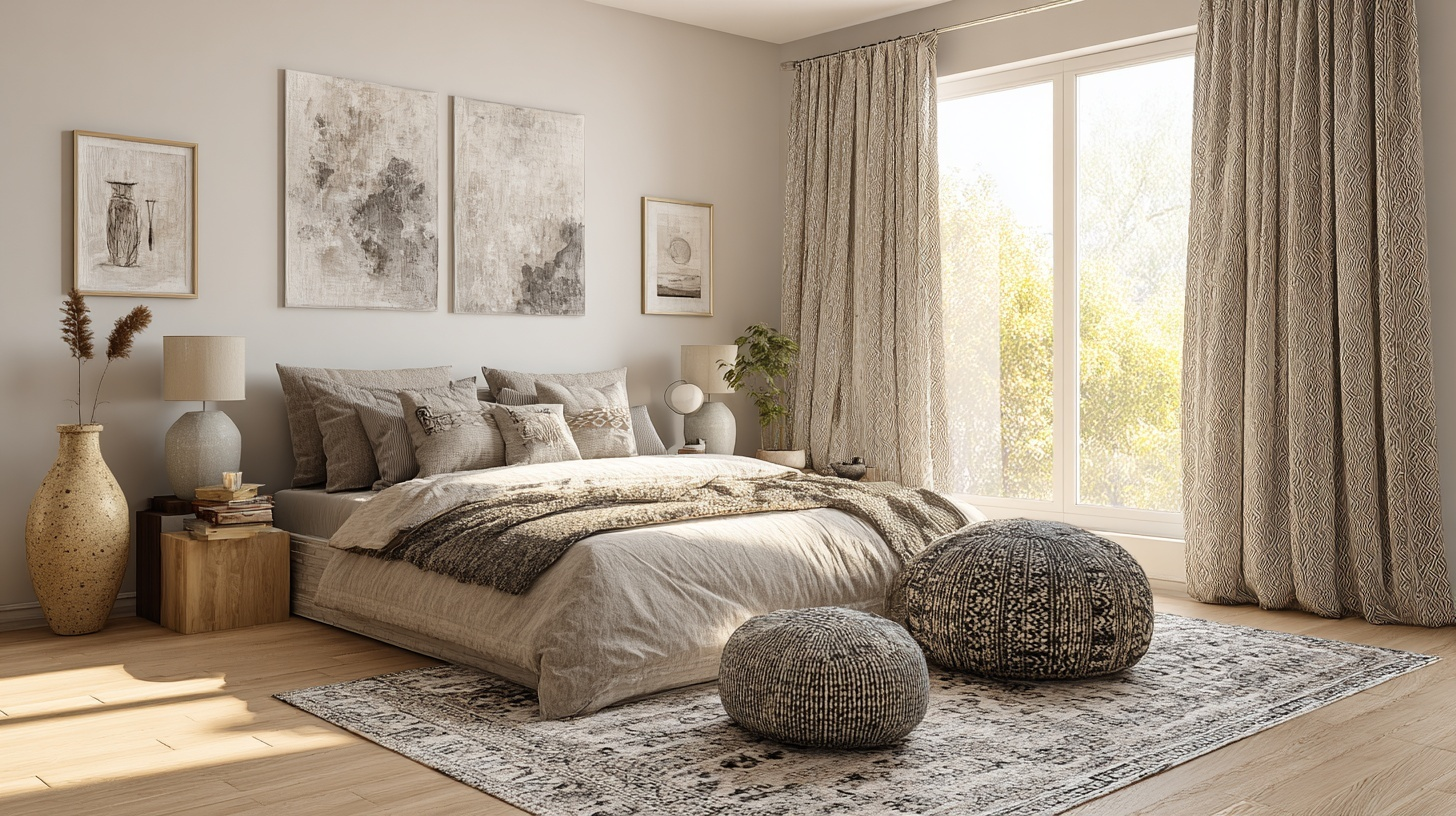
1. Benjamin Moore – Edgecomb Gray (HC-173)
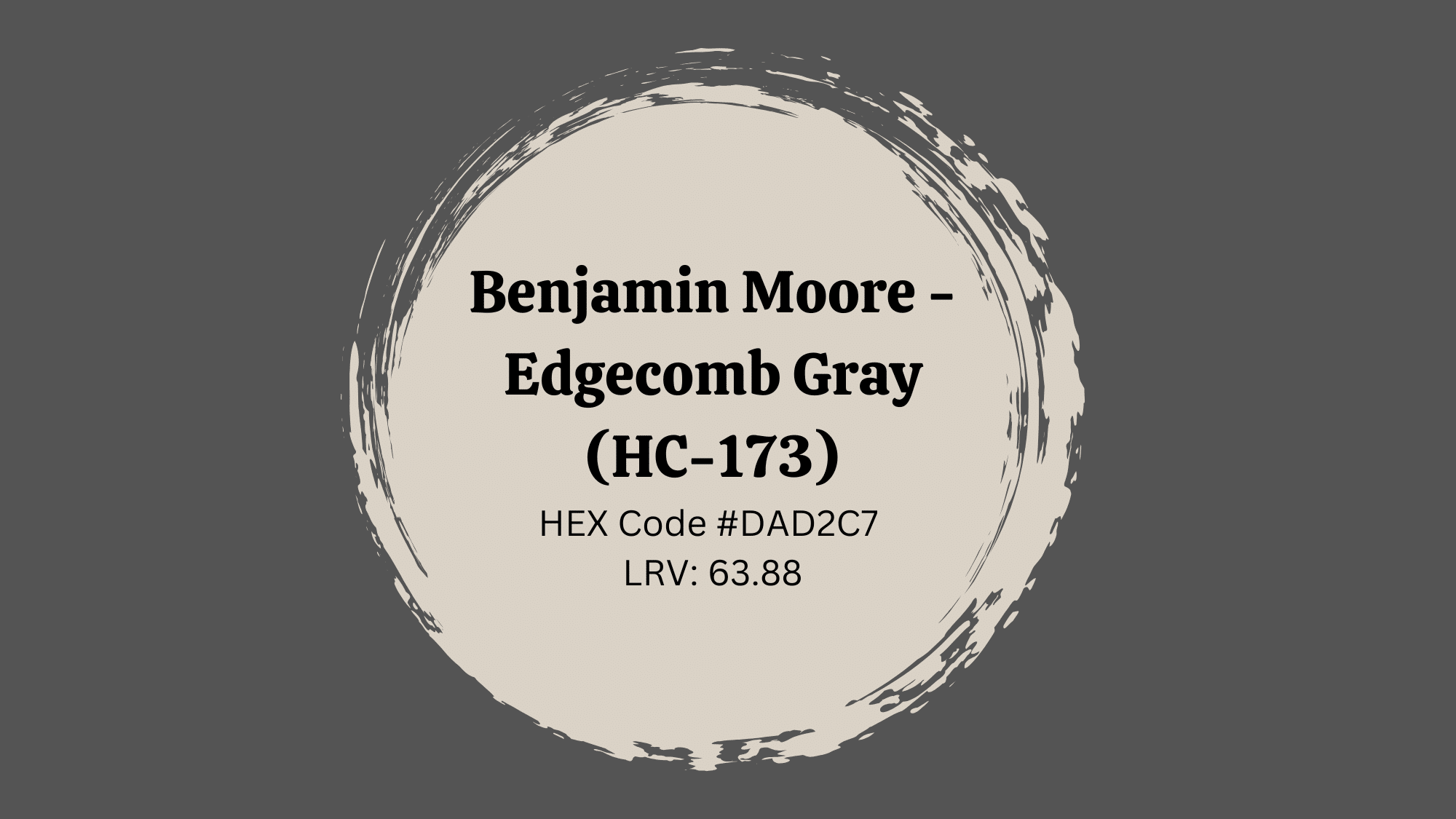
Edgecomb Gray is an ultra-soft greige that feels fresh and inviting, striking the perfect balance for any interior aesthetic.
To learn more about this shade of greige, visit our blog: Reviewing Edgecomb Gray Benjamin Moore (HC-173): A Stylish Neutral.
- Best Rooms Where to Use This Idea: Entryways, family rooms, breakfast nooks
- Lighting Suggestions: Excellent in rooms with mixed lighting
- Complementary Decor Elements: Black-framed mirrors, light wood floors, linen curtains
Similar Shades by Benjamin Moore:
| Color | LRV | Hex Code |
|---|---|---|
| Classic Gray | 74.78 | #EDEAE4 |
| Natural Cream | 64.78 | #DCD4C8 |
| Grant Beige | 55.81 | #C3B8A6 |
2. Sherwin-Williams – Accessible Beige (SW 7036)
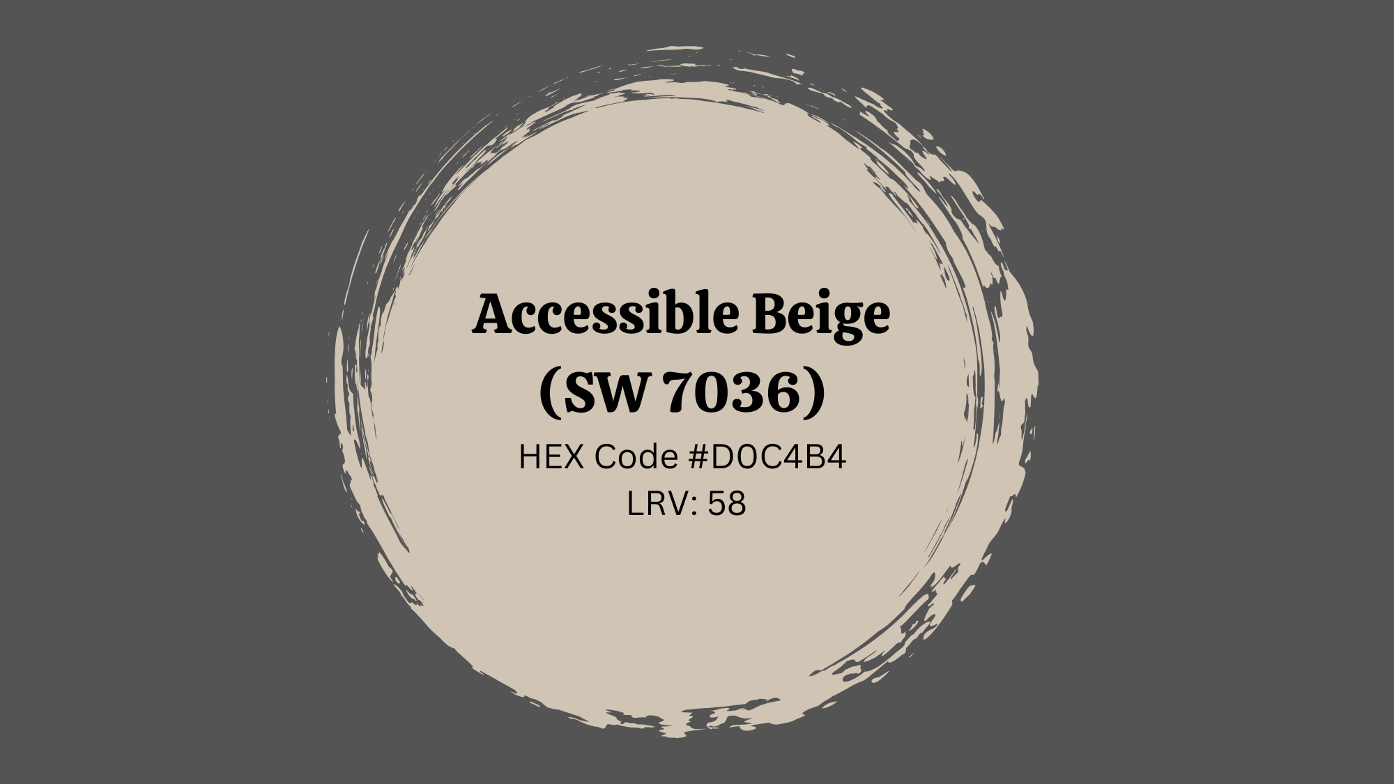
Accessible Beige skews slightly more beige than gray, creating a warm, welcoming feel that’s perfect for busy family homes.
To learn more about this shade of greige, visit our blog: SW 7036- Accessible Beige Color Palette by Sherwin Williams
- Best Rooms Where to Use This Idea: Family rooms, mudrooms, stairwells
- Lighting Suggestions: Ideal for areas with indirect sunlight
- Complementary Decor Elements: Woven textures, farmhouse decor, light neutral upholstery
Similar Shades by Sherwin-Williams:
| Color | LRV | Hex Code |
|---|---|---|
| Classic Gray | 74.78 | #EDEAE4 |
| Natural Cream | 64.78 | #DCD4C8 |
| Grant Beige | 55.81 | #C3B8A6 |
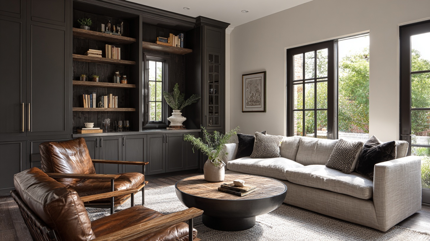
3. Benjamin Moore – Revere Pewter (HC-172)
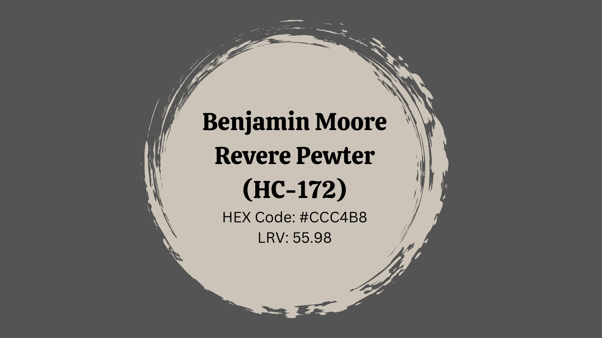
A beloved classic, Revere Pewter combines beige warmth with gray charm, offering a serene backdrop that complements both traditional and modern interiors.
- Best Rooms Where to Use This Idea: Living rooms, hallways, open concept spaces
- Lighting Suggestions: Great in both natural and artificial light
Complementary Decor Elements: Crisp white trims, warm wood accents, navy or blush soft furnishings.
Similar Shades by Benjamin Moore:
| Shade Name | LRV | HEX Code |
| Balboa Mist (OC-27) | 67.37 | #DAD5CD |
| Pale Oak (OC-20) | 69.89 | #EAE3DA |
4. Sherwin-Williams – Agreeable Gray (SW 7029)
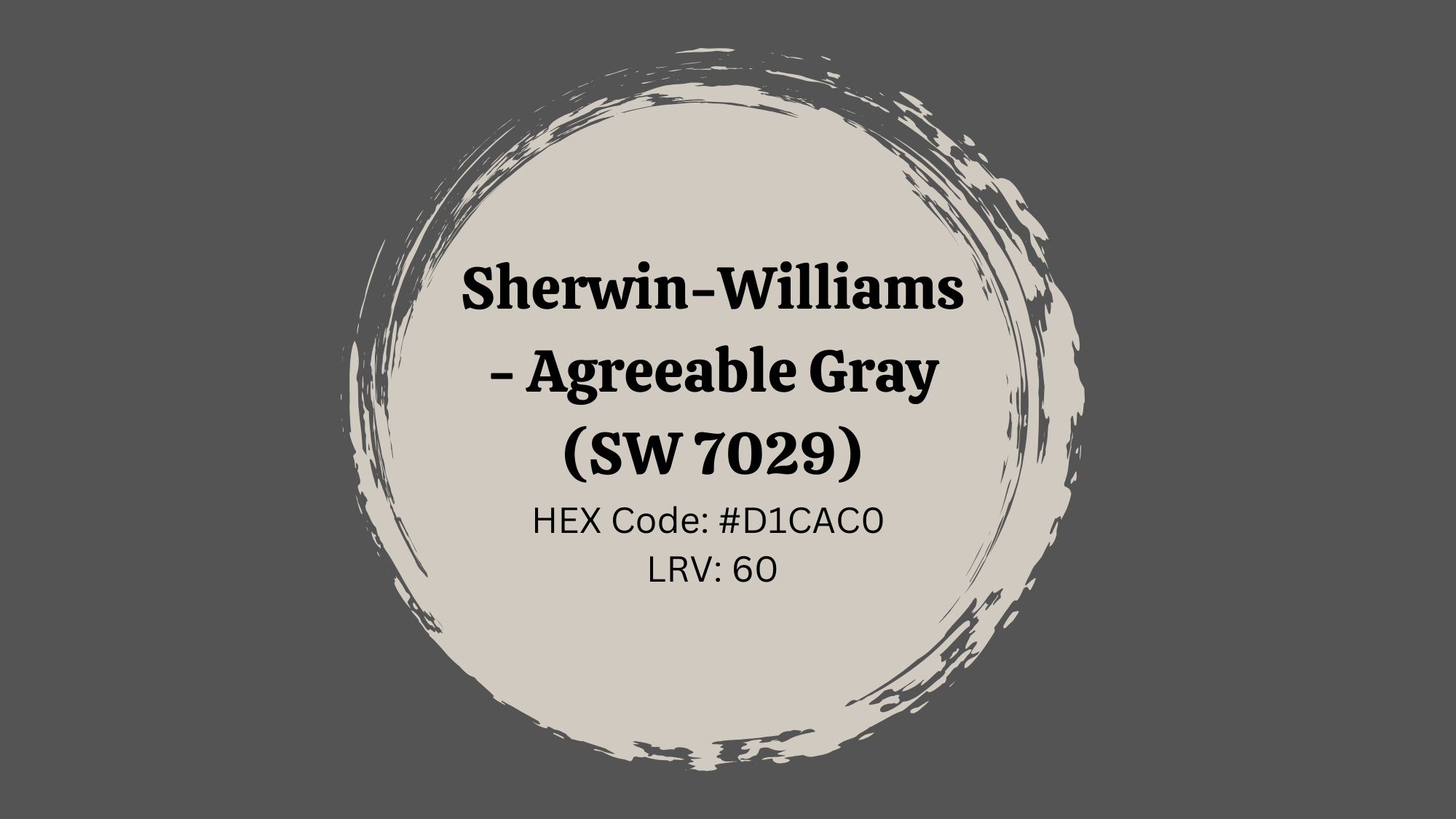
Agreeable Gray leans warm and inviting, making it one of Sherwin-Williams’ most popular and versatile greige paints for a cozy atmosphere.
- Best Rooms Where to Use This Idea: Bedrooms, kitchens, entryways
- Lighting Suggestions: Excellent for north-facing rooms
- Complementary Decor Elements: Matte black fixtures, taupe textiles, cool-toned decor
Similar Shades by Sherwin-Williams:
| Shade Name | LRV | HEX Code |
| Modern Gray (SW 7632) | 62 | #D6CEC3 |
| Drift of Mist (SW 9166) | 69 | #E3DFD7 |
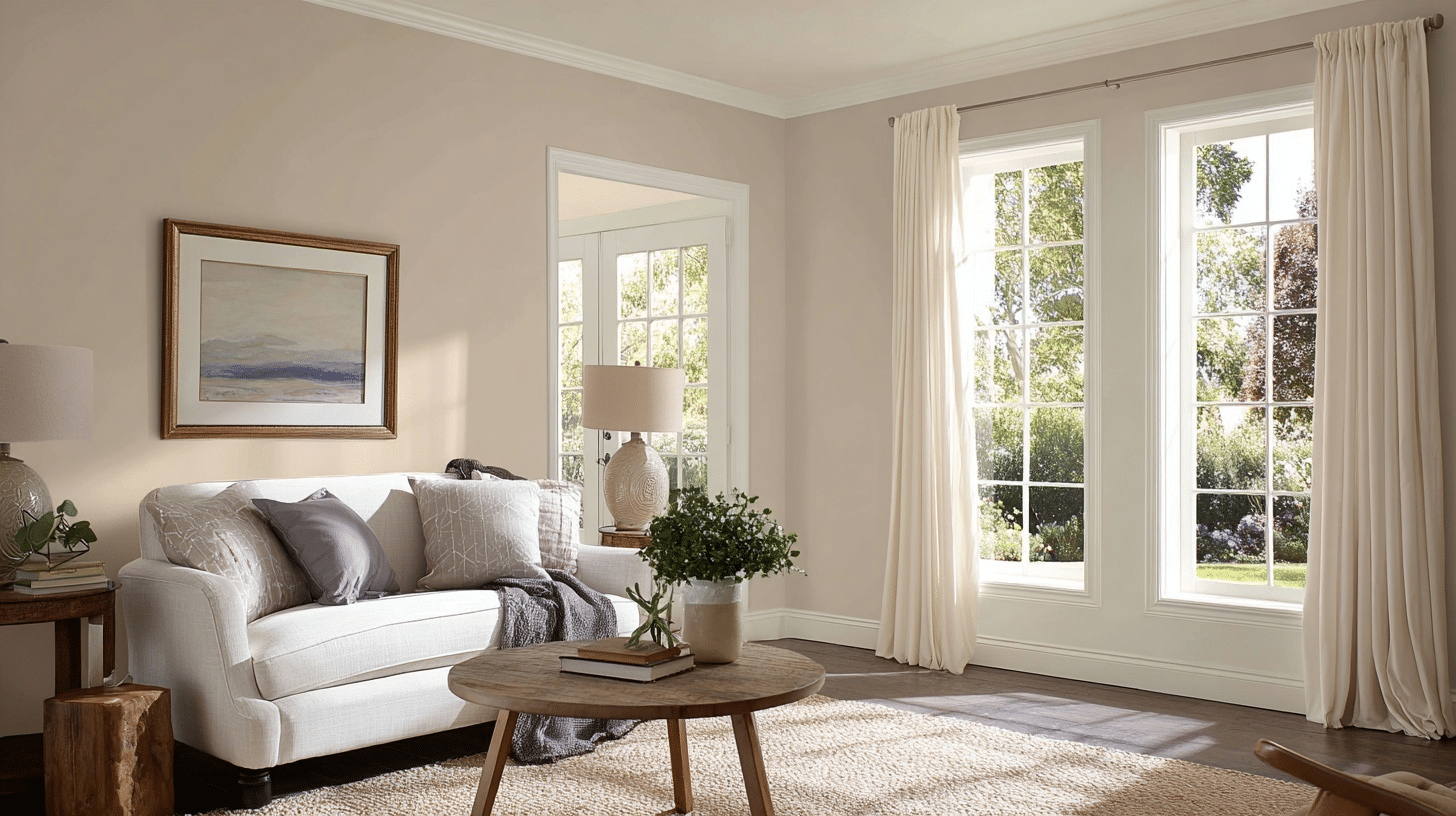
5. Behr – Greige (PPU24-11)
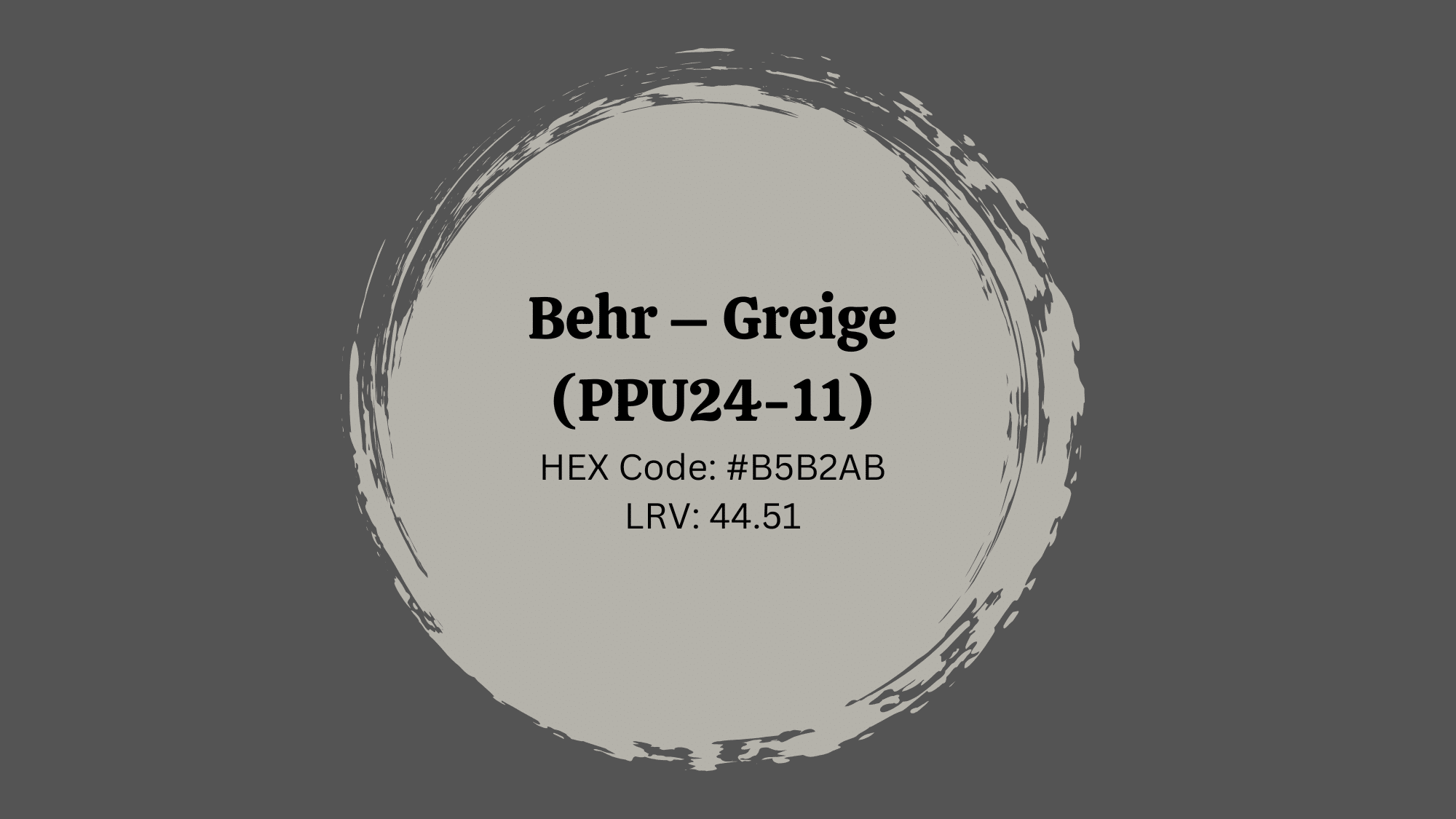
A subtle and modern neutral, Behr’s Greige brings an approachable calm to minimalist and transitional homes.
- Best Rooms Where to Use This Idea: Dining rooms, bathrooms, nurseries
- Lighting Suggestions: Thrives in daylight-rich spaces
- Complementary Decor Elements: Rattan, pale woods, soft gold hardware
Similar Shades by Behr:
| Color | LRV | Hex Code |
|---|---|---|
| Graceful Gray | 60 | #C6C2BA |
| Silver Drop | 69 | #D8D6CE |
| Perfect Taupe | 44 | #A89E94 |
6. Valspar – Smoked Oyster (6009-1)
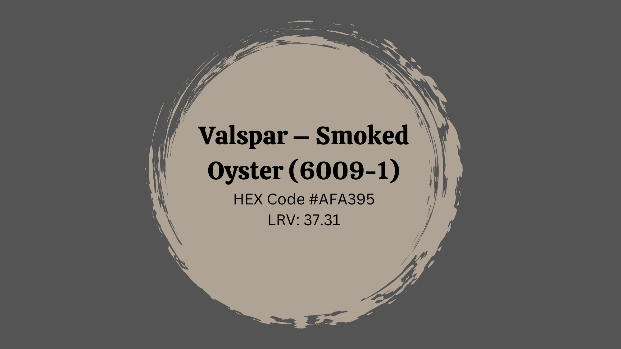
This rich, moody greige changes subtly with lighting, revealing taupe warmth or gray softness depending on the time of day.
- Best Rooms Where to Use This Idea: Home offices, powder rooms, formal dining
- Lighting Suggestions: Appears dramatic under warm artificial light
Complementary Decor Elements: Charcoal accents, brass light fixtures, olive green decor
Similar Shades by Valspar:
| Color | LRV | Hex Code |
|---|---|---|
| Boulevard Gray | 41 | #A09B94 |
| Woodlawn Colonial Gray | 55 | #BDB8B0 |
| Gravity | 63 | #D1CCC9 |
7.Farrow & Ball – Elephant’s Breath (No. 229)

Charming and layered, Elephant’s Breath adds a refined gray-beige hue that shifts with light for subtle drama.
- Best Rooms Where to Use This Idea: Studies, libraries, sitting rooms
- Lighting Suggestions: Test with both warm and cool light sources
- Complementary Decor Elements: Velvet upholstery, antique brass, crisp white ceilings
Similar Shades by Farrow & Ball:
| Color | LRV | Hex Code |
|---|---|---|
| Purbeck Stone | 35 | #CBC4BB |
| Skimming Stone | 61 | #DAD2C9 |
| Drop Cloth | 51 | #D0C6B8 |
Color Palettes with Greige Paint Color
I love how greige plays well with so many different colors. The beauty of this neutral is that it doesn’t compete for attention – instead, it makes other colors look better.
If you want a calming monochrome scheme or bold pops of color, greige provides the perfect foundation for any palette you have in mind.
1. Navy Blue
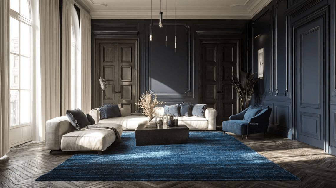
Revere Pewter’s soft warmth pairs beautifully with the depth of navy blue, balancing classic charm with a modern touch. This duo offers a timeless combination perfect for both contemporary and transitional spaces.
- Vibe It Gives: Refined and balanced sophistication
- Best Accents: Brushed nickel, glass decor, white trim
- Furniture Suggestions: Deep blue velvet sofas, oak coffee tables, neutral linen armchairs
2. Burnt Orange
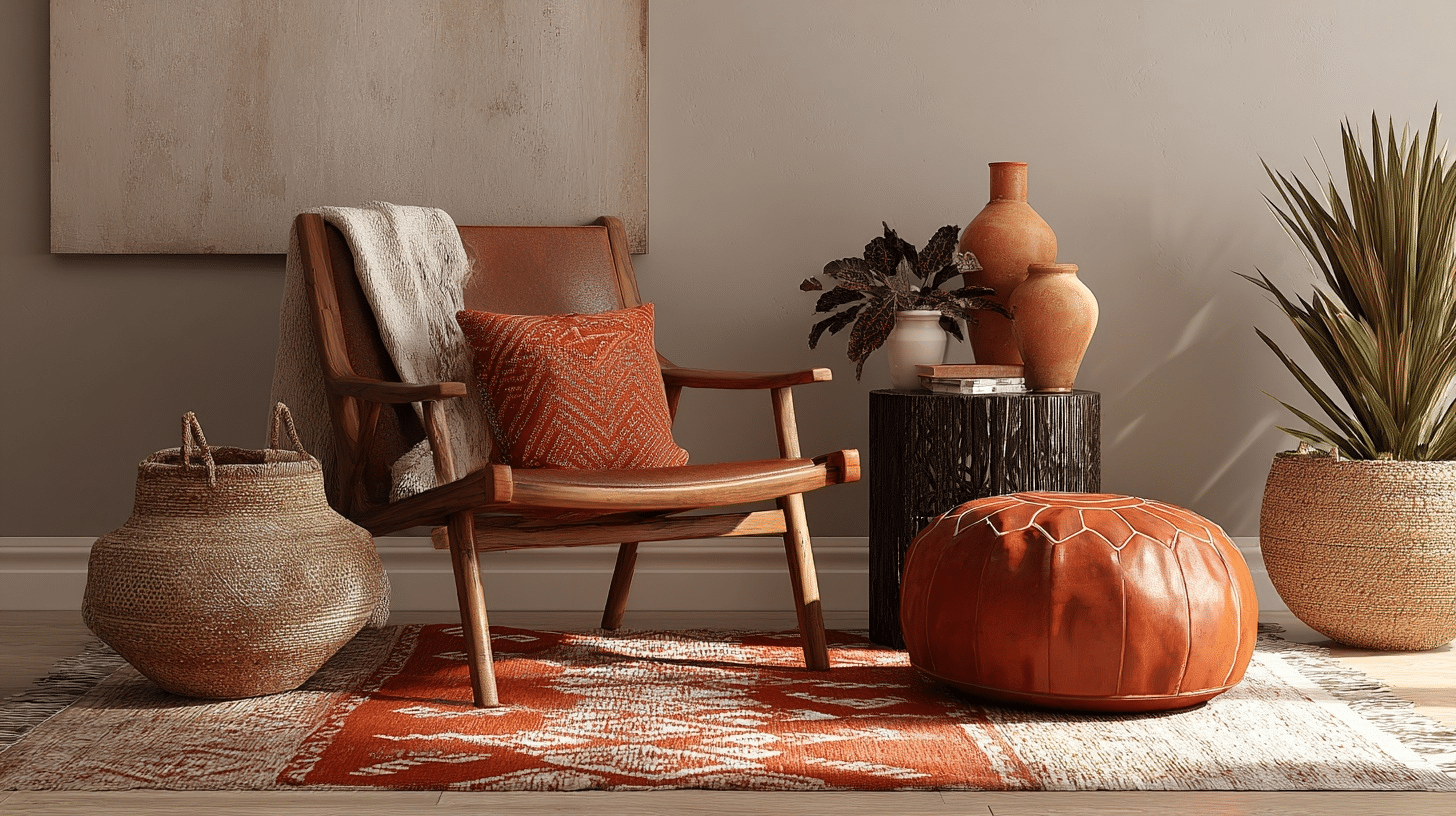
This pairing brings Agreeable Gray’s calm neutrality together with the warm vibrance of burnt orange.
It works especially well in eclectic or boho-inspired interiors, adding life without overwhelming the space.
- Vibe It Gives: Warm, earthy, and creative
- Best Accents: Woven baskets, terracotta pots, matte black hardware
- Furniture Suggestions: Mid-century modern wood pieces, leather poufs, rust-toned cushions
3. Sage Green
Behr’s Greige blends subtly with calming sage green to create a grounded, nature-inspired palette. This duo is ideal for those seeking a spa-like tranquility in bathrooms, bedrooms, or reading nooks.
- Vibe It Gives: Serene, natural, and refreshing
- Best Accents: Stone decor, rattan light fixtures, aged brass
- Furniture Suggestions: Whitewashed wood furniture, soft green throws, botanical prints
4. Blush Pink
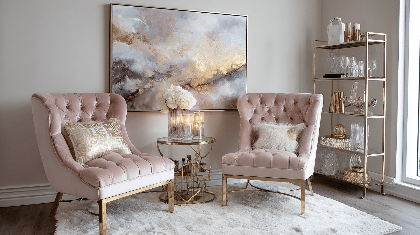
The richness of Smoked Oyster meets the soft femininity of blush pink in a contemporary and charming pairing. This combination thrives in rooms that aim to feel cozy yet stylish; perfect for a glam office or powder room.
- Vibe It Gives: Romantic with a modern edge
- Best Accents: Gold or rose gold finishes, marble, glass
- Furniture Suggestions: Tufted velvet chairs, mirrored side tables, abstract art
5. Deep Olive Green
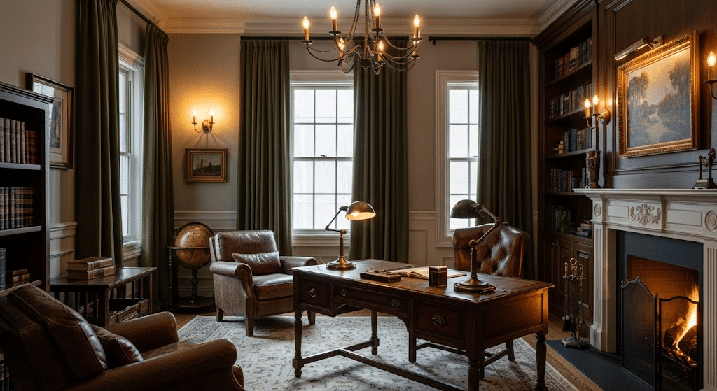
Elephant’s Breath, with its understated class, becomes bolder when partnered with a deep olive green. This nature-meets-luxury combo amplifies mood and depth, especially in intimate spaces like a study or den.
- Vibe It Gives: Moody, organic, and intellectual
- Best Accents: Aged bronze, dark leather, dark wood paneling
- Furniture Suggestions: Leather armchairs, antique desks, green linen drapes
6. Soft Lavender
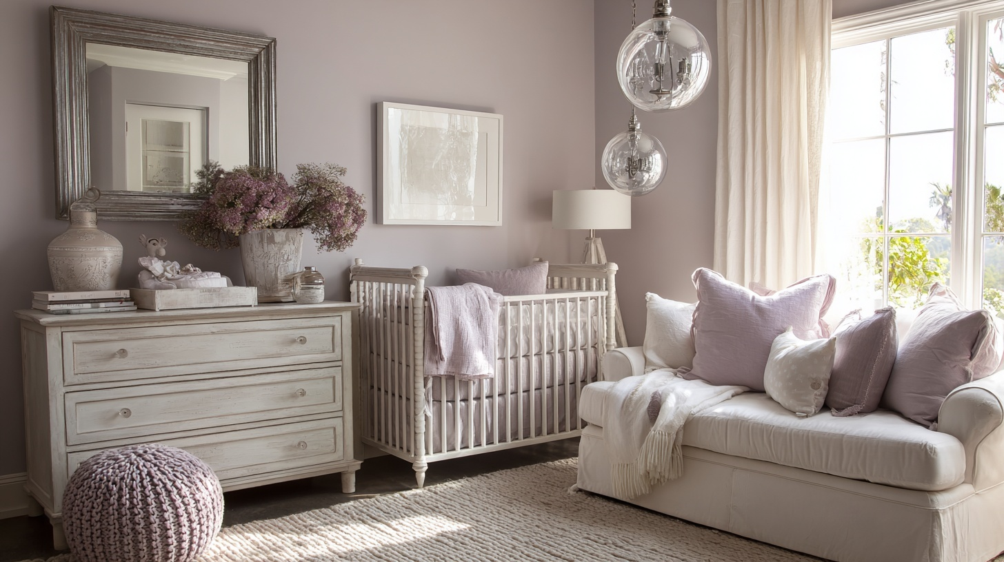
Edgecomb Gray’s subtle charm blends effortlessly with soft lavender to create a dreamy, almost dainty atmosphere. This pairing is lovely in nurseries, guest bedrooms, or any space meant to feel restful and nurturing.
- Vibe It Gives: Airy, romantic, and calming.
- Best Accents: White ceramics, silver accents, glass pendant lights
- Furniture Suggestions: White-washed or pale wood dressers, lavender cushions, linen bedding
How to add Greige Color in Your Home?
Greige is a flexible color that fits into many parts of your home. You can use it on your walls, furniture, decor, or even when picking a unique style. Here’s how to bring greige into your living spaces for a warm and fresh look.
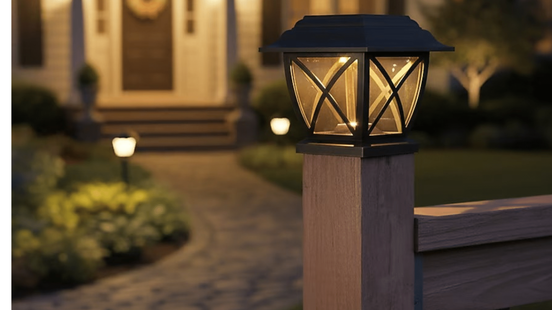
Greige as a Wall Color: Tips for Painting and Finishing
Start with paint samples to see how greige looks in different lights throughout the day. Choose shades with warm or cool undertones based on your room’s vibe.
For smaller spaces, soft, lighter greige helps open up the room. Use quality tools for a smooth finish, and try an eggshell or satin paint for walls;it’s easy to clean and keeps a gentle glow.
Finish with crisp white or deep trim for a balanced frame.
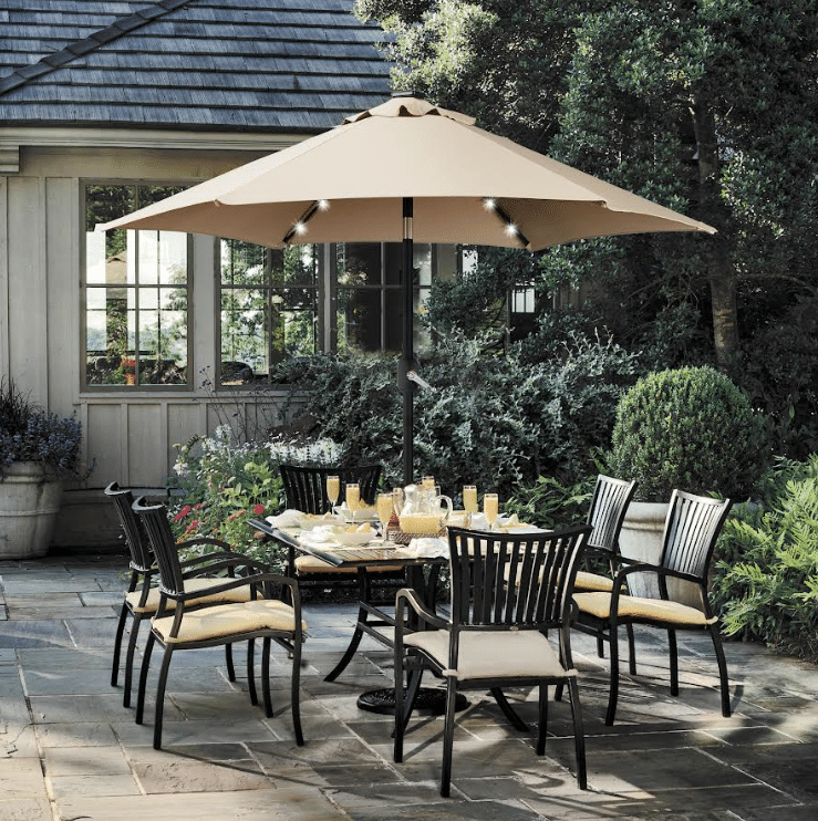
Greige in Furniture: Sofas, Cabinetry, Flooring
Greige sofas and chairs blend effortlessly into any style. For cabinetry, it adds a modern touch without feeling cold or dull. In flooring, greige helps hide everyday dust, making the room feel cleaner.
You can pair greige pieces with both dark and light woods, or mix textures like leather and soft fabric for more comfort and interest.
Using Greige in Decor: Textiles, Rugs, Accessories, Artwork
Pull the room together with greige curtains, throw pillows, or blankets. Choose area rugs with greige tones mixed with subtle patterns for a cozy base.
Accessories like vases, lamps, and picture frames in greige help everything feel connected. For wall art, simple pieces with greige backgrounds or hints tie the decor together without making things look too busy.
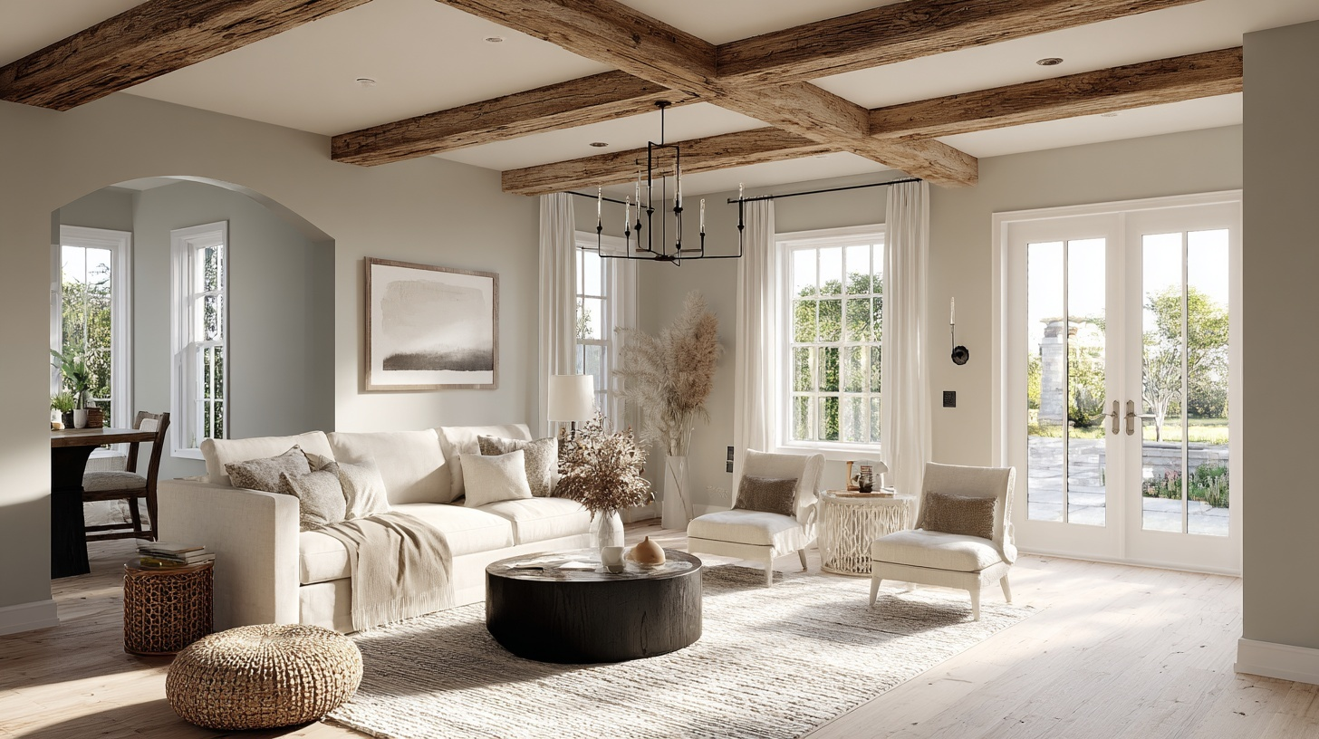
Greige for Different Interior Styles (Modern, Rustic, Scandinavian, Traditional)
In modern homes, pair greige walls with glossy finishes or black details.
For rustic rooms, add wood beams or stone decor to bring out greige’s earthy side. Scandinavian spaces benefit from pale greige, light woods, and plenty of sunlight.
In traditional settings, mix greige with charming fabrics and classic shapes so the look stays timeless but fresh.
With these steps, greige can help your home feel bright, airy, and inviting, no matter your style.
Common Mistakes to Avoid While Using Greige
I’ve seen so many homeowners fall in love with greige in the store, only to hate it once it’s on their walls. The truth is, greige can be tricky if you don’t know what to watch out for.
After years of helping people choose the right greige, I’ve noticed the same mistakes happening over and over again.
- Not testing samples in different lighting conditions – Greige looks completely different under morning light versus evening lamps. Always test your sample for at least 24 hours before committing.
- Ignoring existing undertones in your space – If your floors have warm honey tones, a cool greige will clash badly. Make sure your greige works with what you already have.
- Choosing the wrong paint finish – Using flat paint in high-traffic areas or glossy paint in bedrooms can make even the perfect greige look wrong.
- Not considering the room’s natural light – North-facing rooms make greige look more gray, while south-facing rooms bring out the beige. Pick accordingly.
- Pairing greige with competing neutrals – Mixing greige with stark white or cool gray creates an awkward contrast that makes both colors look off.
- Rushing the sample process – Those tiny paint chips lie. Always get sample pots and paint large swatches on different walls to see how the color truly behaves.
How to Transition from Gray or Beige to Greige
Making the switch to greige doesn’t have to be overwhelming or expensive.
I’ve helped many homeowners move from their existing gray or beige walls to greige, and the good news is you probably won’t need to replace everything. The key is taking it step by step and working with what you already have.
1. Start with one accent wall: Test the greige on a single wall first. This lets you see how it works with your current furniture and decor before committing to the whole room.
2. Keep your existing white trim and ceilings: Greige works beautifully with the white trim you already have. No need to repaint everything at once.
3. Gradually swap out accessories: Replace throw pillows, artwork, and small decor items that clash with your new greige. You don’t need to buy everything new right away.
4. Choose a greige that leans toward your current color: If you have cool gray now, pick a greige with gray undertones. Coming from beige? Choose a warmer greige to make the transition smoother.
5. Update lighting gradually: Swap out light bulbs for warmer tones if you’re coming from gray, or cooler tones if transitioning from beige. This small change makes a big difference.
6. Work room by room: Don’t try to change your whole house at once. Start with the room you use most and work your way through the house over time.
The Bottom Line
Greige colors really are the perfect compromise between gray’s modern feel and beige’s cozy warmth.
Grab sample pots of two or three greige colors that caught your attention. Paint large swatches on different walls and live with them for a few days.
Watch how they change throughout the day and how they work with your current furniture.
Trust me, once you find your perfect greige, you’ll wonder why you waited so long to make the switch. Your home will feel more balanced and pulled together than ever before.