Design is dialogue, fonts whisper, colors belt, and they form emotion together. What if, though, they switch voices? Typetype whispers gently while colors yell across the page. It’s a charming defiance of the norm, and more brands are testing out this voice swap to create curiosity and visual flow.
With Dreamina, exploring that balance becomes effortless. Its AI photo generator turns conceptual prompts into vivid imagery, helping designers see how calm typography and loud palettes interact. Whether you’re creating a digital poster, brand identity, or campaign artwork, Dreamina makes it easy to design visuals that speak in new emotional tones, bold, quiet, and beautifully contradictory.
Let’s break down this concept of whisper fonts and shouting colors.
When Fonts Decide to Whisper
Typography isn’t always about being bossy. Sometimes discretion seems bolder. Whisper fonts are fonts that converse with subtlety, light, airy, and refined. They invite the reader in rather than command attention.
Designers tend to employ:
Thin sans-serifs for a contemporary, soothing tone.
Light serif fonts to bring warmth and closeness.
Muted contrast to reduce visual shock.
The Art of Emotional Inversion
The convention has always been that text expresses logic and color expresses feeling. But when that sequence is turned around, when color speaks and typography listens, something strange occurs. It brings complexity and rhythm to a design.
This works because:
It shocks the viewer, breaking visual expectation.
It yields extremes, uniting excitement and calmness.
It follows contemporary storytelling, emotion driving ahead of meaning.
Brand Identity in Reverse
Consider a perfume commercial where gentle lowercase lettering sits upon a bold crimson background. Or a new technology company employing pale text hovering above the glow of electric green. Communication is understated: confidence doesn’t always require volume.
The stronger the restraint of the font, the bolder the color appears. Together, the two convey harmony through contrast, like speaking into a tempest and being heard nonetheless.
How Texture and Light Play Along
Motion in design is not just for animation; light and texture can render static images live. Depth created by gradient, glow, or blur makes color tangible while type stays calm.
Designers tend to try:
Transparency of overlay to create depth and balance.
Glow and grain for tension in film.
Soft gradations that simulate emotional flow.
Logos that Listen
Even in branding, this personality flip works nicely. Logos can no longer scream through typography. Instead, they can breathe feeling through color. The typography is still elegant and spare, while the palette bears identity and charge.
Here’s where an AI logo generator comes in handy. Designers can explore how bold color palettes complement soothing wordmarks, experimenting with gradients, lighting, or simple shapes. The output sounds alive and contemporary, like a brand that knows when to whisper and when to shout.
Dreamina’s Creative Symphony
Since theory now lives in your mind’s eye, let’s bring it to life. Dreamina assists you in turning this emotional flip into art with its simple three-step approach.
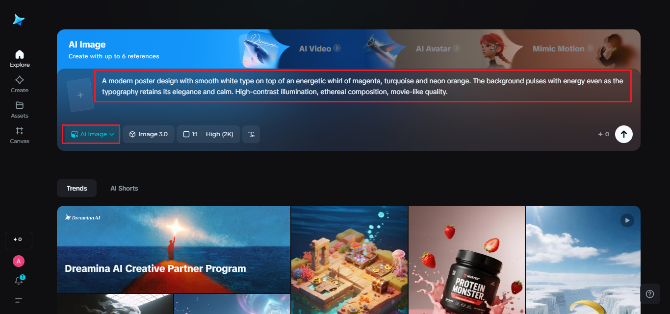
Step 1: Write a Text Prompt
Proceed to Dreamina and describe your concept with emotive, descriptive language. Think about contrast, energy, tone, color yelling while fonts don’t move.
Example prompt:
A modern poster design with smooth white type on top of an energetic whirl of magenta, turquoise and neon orange. The background pulses with energy even as the typography retains its elegance and calm. High-contrast illumination, ethereal composition, movie-like quality.
Your prompt should create a feeling. Dreamina understands feelings in description, so the more you tell it what you feel, the more perfect the outcome is.
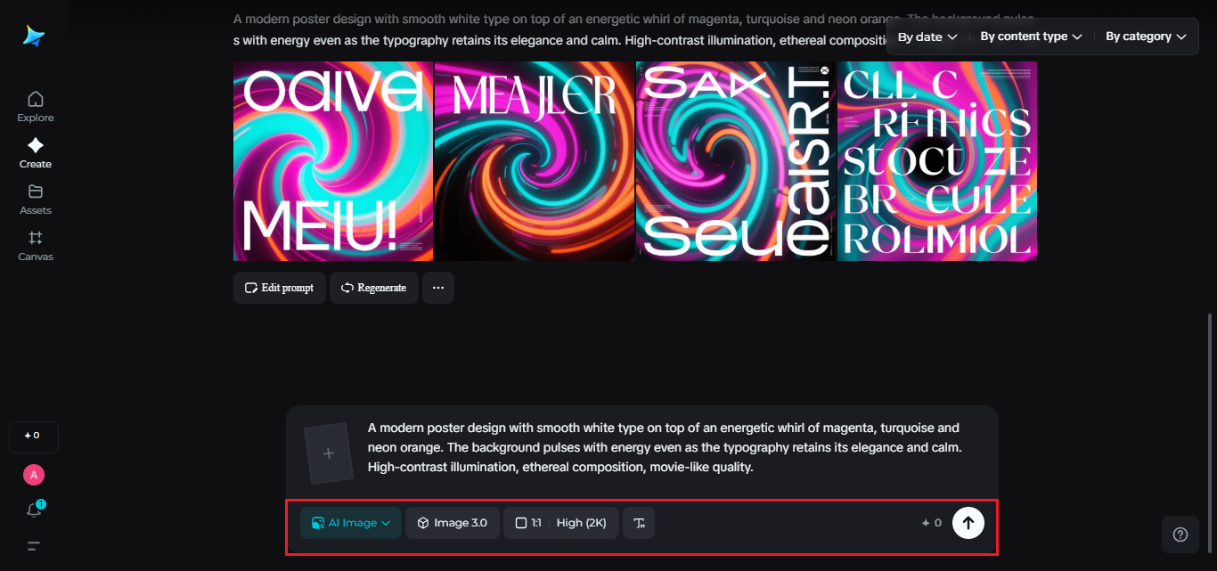
Step 2: Adjust Parameters and Generate
Next, establish your creative controls. Choose the model that fits your style, photo-realistic, abstract or artistic. Set the aspect ratio that sets your measurements, portrait or landscape for posters, square for branding. Set your size and resolution settings, 1k for drafts, 2k for finals.
Next, hit the Dreamina icon to create the visual, and in a second, your idea will turn into a visual masterpiece.
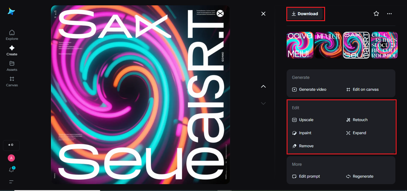
Step 3: Customize and Download
Now refine. Utilize Dreamina’s editing features, inpainting to redo parts, expansion to frame to preference, remove to minimize content, retouch for tone and light enhancement and so on.
When you feel good about the content, hit Download, and the finished image, which will take the emotional flip, still just a static design that pulsates with contrast and character, will be yours.
Editing as emotional tuning
Fine-tuning, after generation, breathes life into your design. The slightest nips and tucks can balance, perhaps a color yells too loudly, or a font recedes too quietly. The AI image editor assists you in correcting that balance by sharpening intensity, brightness, and flow without diminishing atmosphere.
Editing is not correction, it’s emotional tuning, where each tweak sharpens the rhythm of the mood.
Design as dialogue
When you view such a composition, you can almost hear it talking. The colors vibrate like instruments, the type whispers melody, and they become a visual duet.
Such designs trigger:
Energy through contrast and saturation.
Calmness due to restraint in typography.
Confidence in the interplay of restraint and assertiveness.
The Last Note
Allowing colors scream and fonts whisper is more than a trend; it’s an emotional test. It reminds us that design isn’t about hierarchy, design is about conversation. With Dreamina, you can make this conversation art, merging opposites until they harmonize with each other.
So, open Dreamina, write your vision, and see how silence and sound exist together in color and form. Your next creation may not only be seen, it’ll be heard in every shade.