Looking at Benjamin Moore’s White Dove and wondering if it’s as perfect as everyone claims?
You’ve probably heard it called the ultimate white paint, but those subtle undertones can make or break your room’s entire vibe.
The thing is, White Dove isn’t just another white. It has warm undertones that shift throughout the day, and picking the wrong pairings can leave you with a space that feels off. But when you get it right, it’s pure magic.
In this blog, I will discuss White Dove’s true undertones, the best color pairings, including Benjamin Moore Ashwood Moss and Black Beauty, with pros and cons.
By the end, you’ll know exactly how to use this popular white to create the warm, inviting space you’re after
Why is White Dove (OC-17) Benjamin Moore Popular?
White Dove (OC-17) has become Benjamin Moore’s most beloved white for good reason. This warm white strikes that perfect balance between clean and cozy, something most whites struggle with.
Unlike stark, cold whites that can feel sterile, White Dove carries subtle cream and gray undertones that shift beautifully throughout the day.
What sets it apart is how it behaves in different lighting conditions. Unlike some whites that can look gray or yellow depending on the room, White Dove stays consistent.
How to Recognize Undertones in White Dove Benjamin Moore?
Undertones in White Dove reveal themselves through different lighting conditions.
In north-facing rooms, you’ll notice its gray undertones more prominently. South-facing spaces bring out the creamy, warm notes.
Test it against pure white trim or paper, White Dove will show its subtle warmth and complexity compared to stark whites.
White Dove Benjamin Moore: Undertones and Pairings
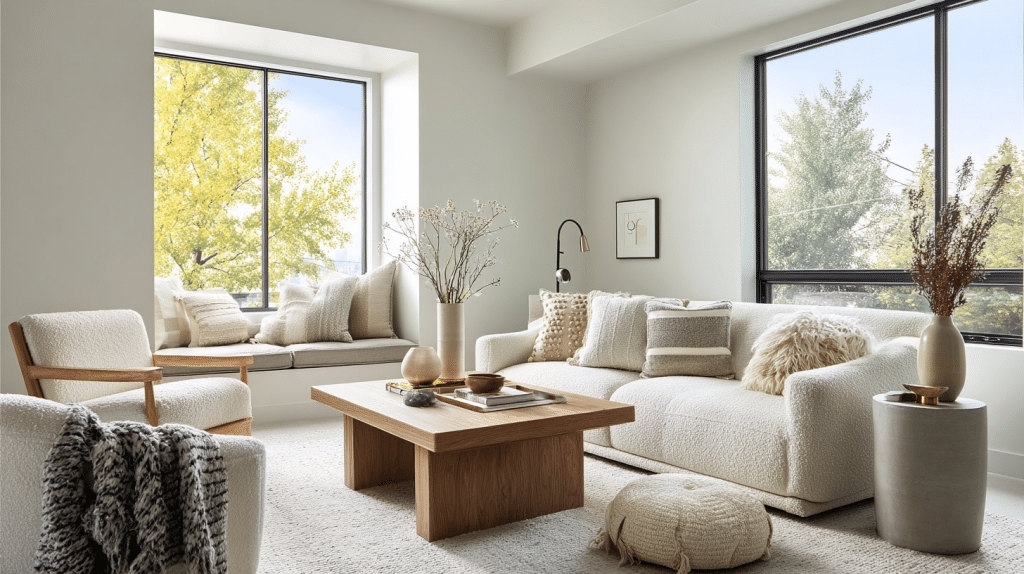
White Dove isn’t meant to stand alone; it shines brightest when paired with the right colors. The magic happens when you choose complementary shades that enhance its creamy undertones and make your home look beautiful.
Based on the latest Interior paint color trends, the following are some Benjamin Moore Pairings that create stunning, cohesive spaces.
White Dove + Ashwood Moss (1484)
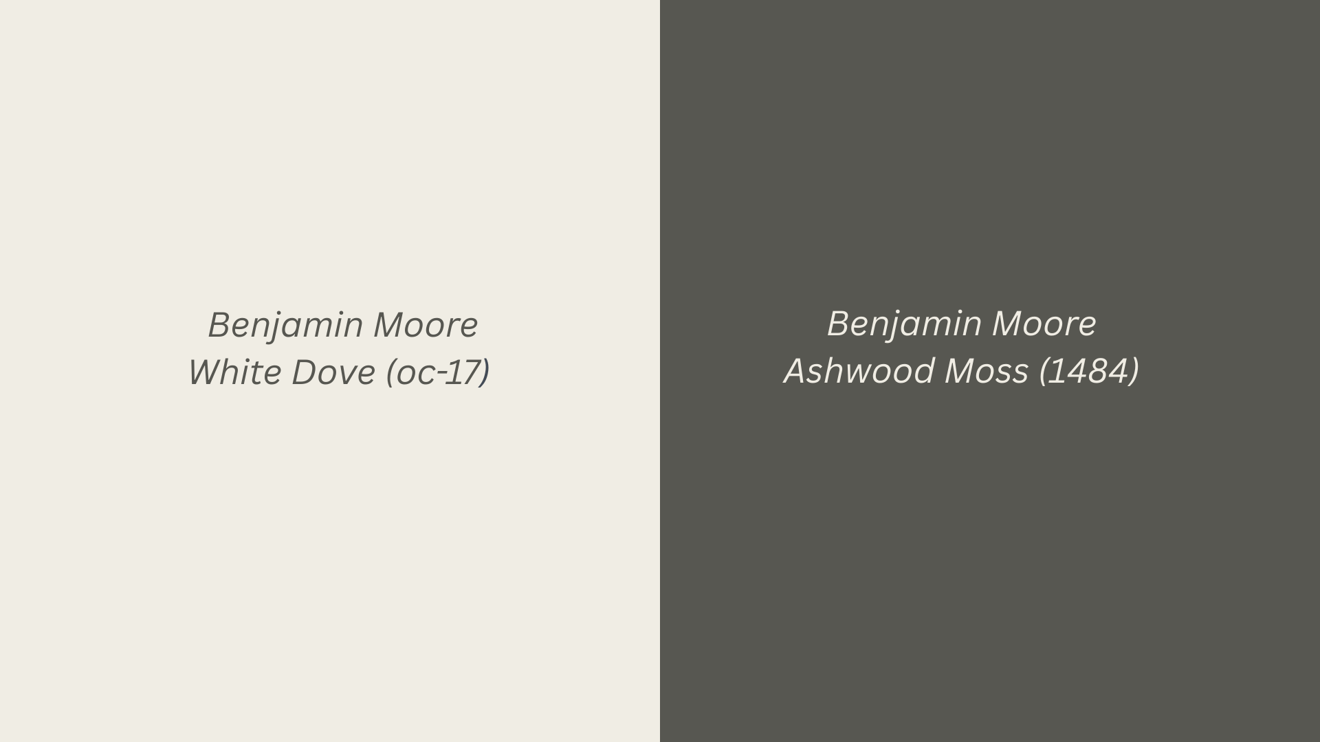
This pairing brings nature indoors with refined results. Ashwood Moss offers earthy depth while White Dove keeps things light and airy.
The combination works beautifully in bedrooms and living spaces where you want both tranquility and visual interest without overwhelming the room is the reason I love this combination.
White Dove + Hale Navy (HC-154)
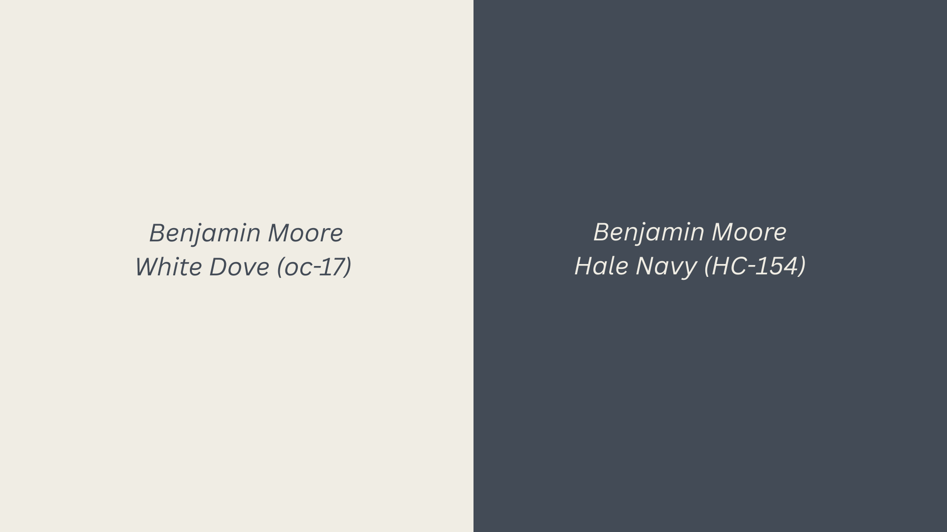
A timeless classic that never goes out of style. The rich navy creates a dramatic contrast against White Dove’s softness, perfect for accent walls or cabinetry.
This combination feels both coastal and traditional, working especially well in kitchens, bathrooms, and dining rooms where you want refined beauty.
White Dove + Forest Green (2047-10)
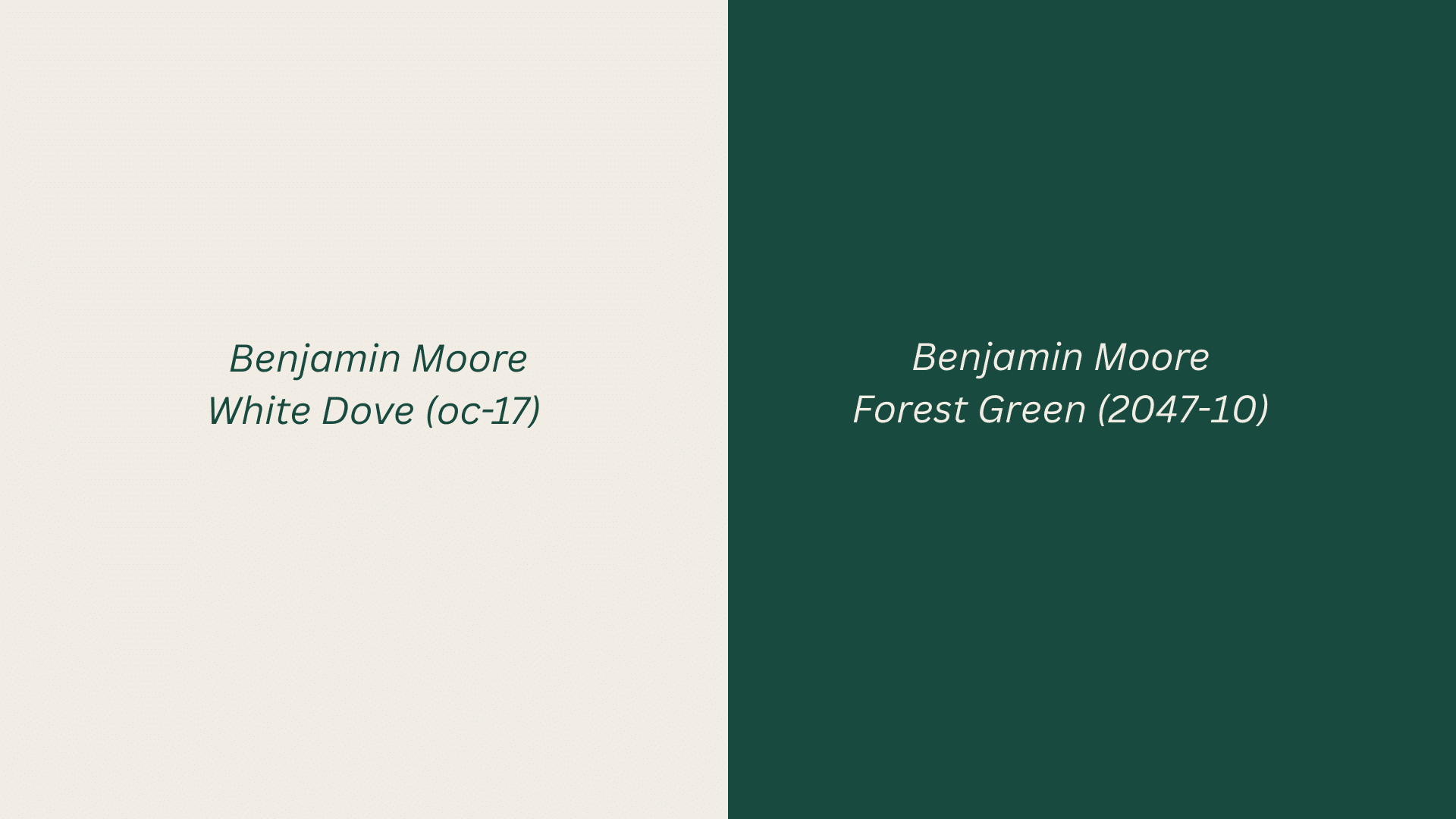
Rich Forest Green paired with White Dove creates a timeless, preppy aesthetic that never goes out of style. This combination works beautifully in dining rooms, studies, or powder rooms where you want classic beauty.
The deep green adds beauty, while White Dove keeps everything fresh
White Dove + Black Beauty (2128-10)
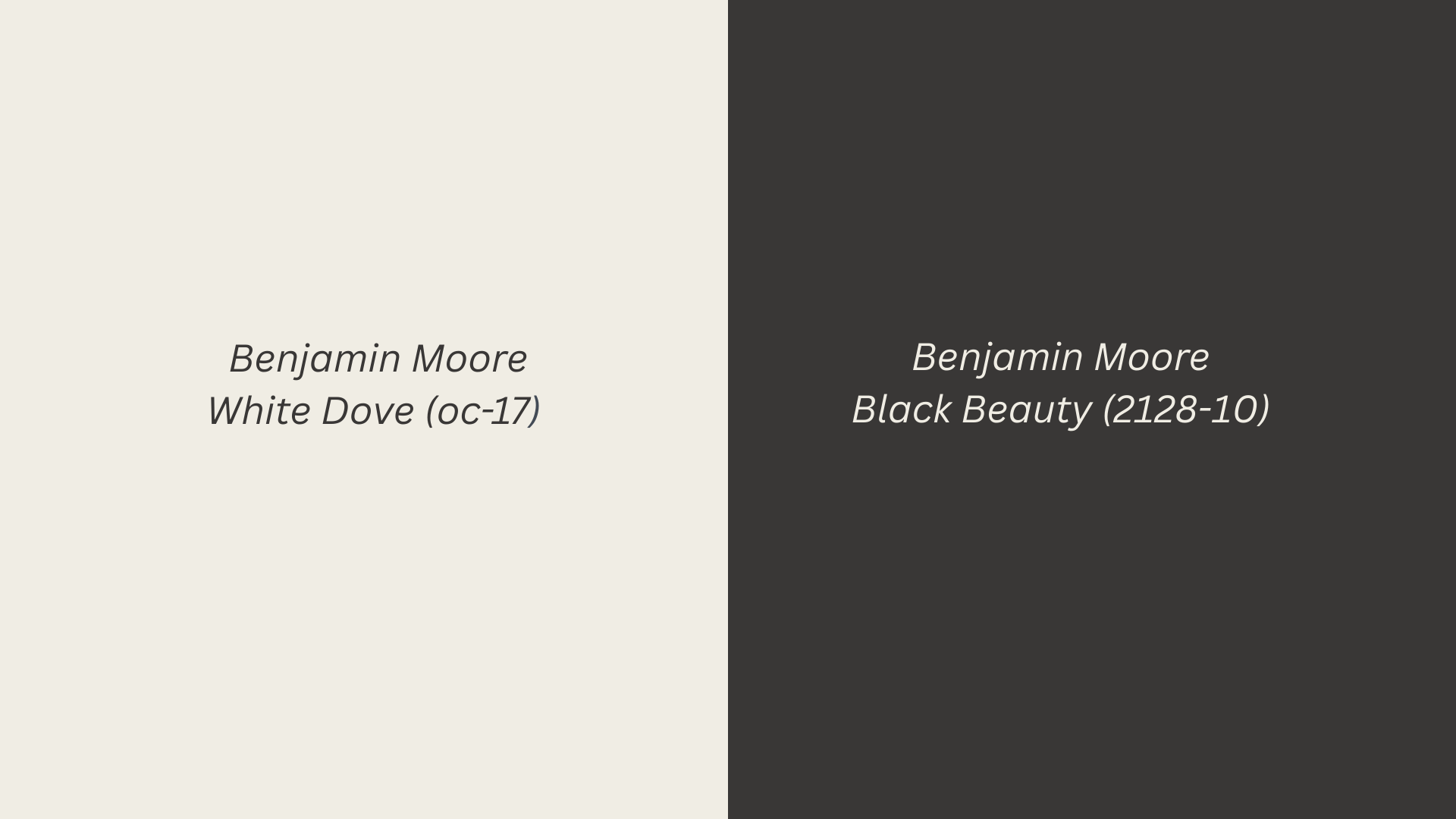
Bold and striking, this high-contrast pairing makes a serious design statement. Black Beauty provides dramatic anchor points while White Dove softens the overall look.
Perfect for modern spaces, powder rooms, or anywhere you want to create visual drama without sacrificing the calming effect of white.
White Dove + Sedona Clay (2174-30)
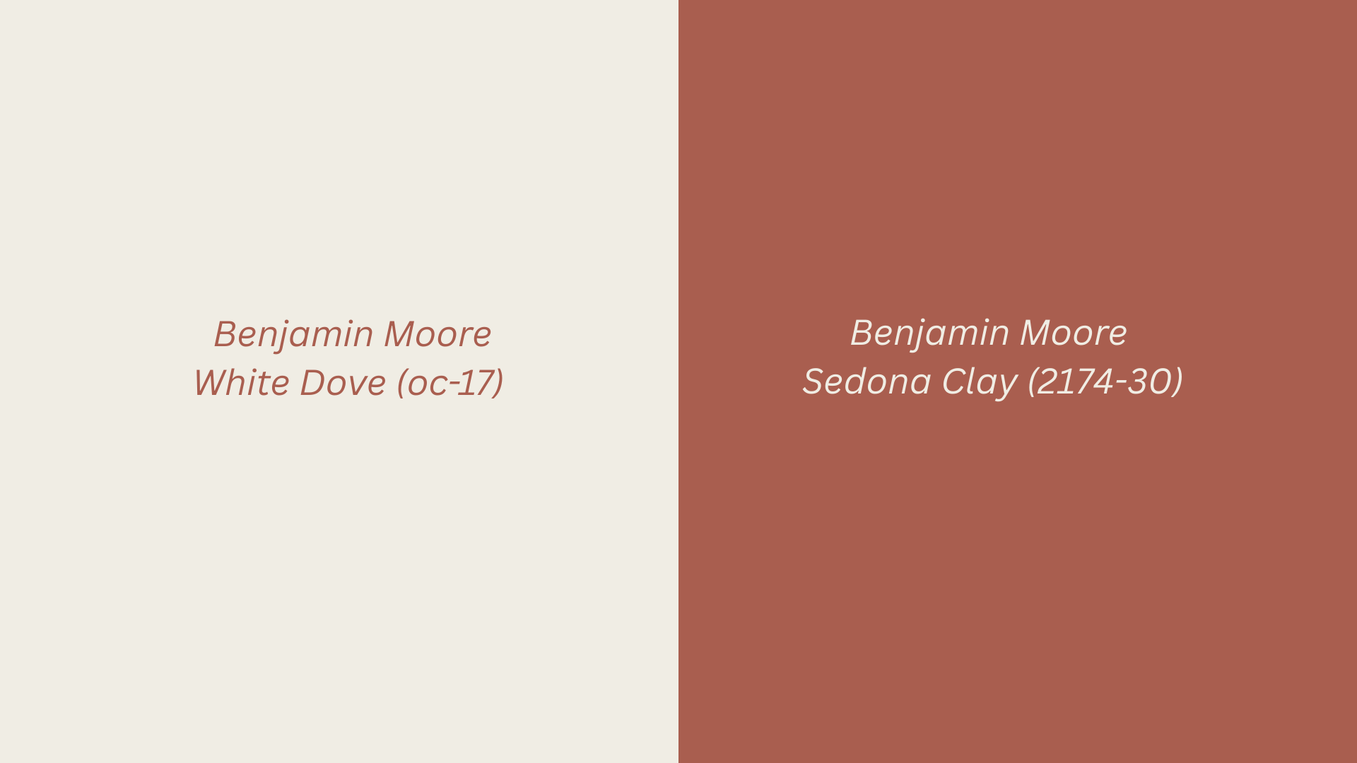
This warm terracotta brings earthy beauty when paired with White Dove’s creamy backdrop. Sedona Clay adds instant warmth and character to dining rooms, accent walls, or cozy reading corners.
I love this combination; it feels both modern and eternal, creating spaces that are inviting yet polished and perfectly balanced.
Pros and Cons of Working with White Dove
White Dove isn’t perfect for every situation, despite its popularity. Like any paint color, it has strengths and weaknesses you should consider before committing.
| Pros | Cons |
|---|---|
| Versatile enough for any room or design style | It can appear too stark in rooms with limited natural light |
| Warm undertones prevent that cold, clinical feeling | Shows dirt, fingerprints, and scuffs more easily than darker colors |
| Works in both traditional and modern design schemes | May look slightly yellow in certain artificial lighting conditions |
| Pairs well with both warm and cool accent colors | Higher price point compared to basic contractor whites |
| Consistent appearance across different lighting conditions | Requires quality primer and multiple coats for best coverage |
| Timeless choice that won’t look dated in a few years | Needs regular touch-ups in high-traffic areas like hallways |
| Excellent for resale value and broad buyer appeal | May clash with existing fixtures that have cool undertones |
The Bottom Line
White Dove has proven itself as more than just another trendy paint color.
Yes, it has drawbacks like any paint choice, but the pros significantly outweigh the cons for most homeowners. The key is understanding your specific space and lighting conditions before making the final decision.
Start with a sample pot and test White Dove in your room’s unique lighting. Your perfect neutral might just be waiting for you.


