
Finding the right white paint can feel like looking for a needle in a haystack.
Benjamin Moore White Wisp OC-54 might be your solution.
This soft, gentle white brings warmth without yellowing, and stays clear even in dim light. It’s one of my go-to whites for clients who want cozy spaces that still feel fresh.
In this review, I’ll show you White Wisp’s true colors in different lighting, help you understand its subtle undertones, and share the best rooms to use it. I
I’ll also compare it with similar whites so you can make the best choice for your home.
White Wisp OC-54: Color Characteristics
- Undertones- White Wisp features subtle cool undertones with hints of blue and green. These undertones are gentle and become more noticeable in different lighting. In north-facing rooms, the blue tone is more prominent, while south-facing rooms bring out the soft green hue.
- Warmth- While it’s a cool white, White Wisp doesn’t feel cold. It has a soft warmth that prevents it from appearing sterile, making it cozy and inviting without being too creamy or yellow.
- LRV- With a 74.51 LRV, it strikes a balance between light and airy without being blinding. It brightens spaces but maintains depth, adapting well to various room sizes and light conditions.
- Finish Flexibility- Benjamin Moore White Wisp OC-54 offers great finish flexibility. A matte or eggshell finish is perfect for living rooms and bedrooms, creating a soft, velvety look. For kitchens and bathrooms, satin or pearl provides durability with a subtle sheen. Semi-gloss or gloss finishes work well for trim and cabinetry, highlighting architectural details.
Benjamin Moore White Wisp OC-54 Vs. Popular Alternatives
| Paint Color | LRV | Temperature | Key Differences from White Wisp |
|---|---|---|---|
| White Wisp OC-54 | 74.51 | Cool | Light, airy, subtle cool tone – a soft gray with blue/green leanings |
| Gray Owl OC-52 | 65.77 | Cool | Darker, more neutral gray feels moodier in dim light |
| Classic Gray OC-23 | 74.78 | Warm | Similar brightness but warmer, creamier in tone |
| Moonshine OC-56 | 68.28 | Cool | Slightly darker and moodier – similar overall feel |
| Balboa Mist OC-27 | 67.37 | Warm | Warmer and more beige – softer but less crisp |
| Passive SW 7064 | 60.00 | Cool | Noticeably darker and more distinctly blue-toned |
Ideal Places to Use White Wisp
Benjamin Moore’s White Wisp OC-54 isn’t just a beautiful color.
It’s a game-changer for any room in your home. From bedrooms to kitchens, this soft hue creates a calming, inviting atmosphere that enhances every space.
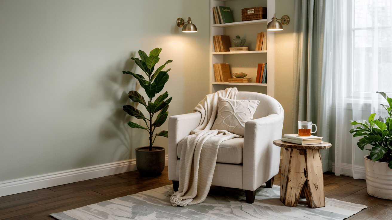
Bedrooms
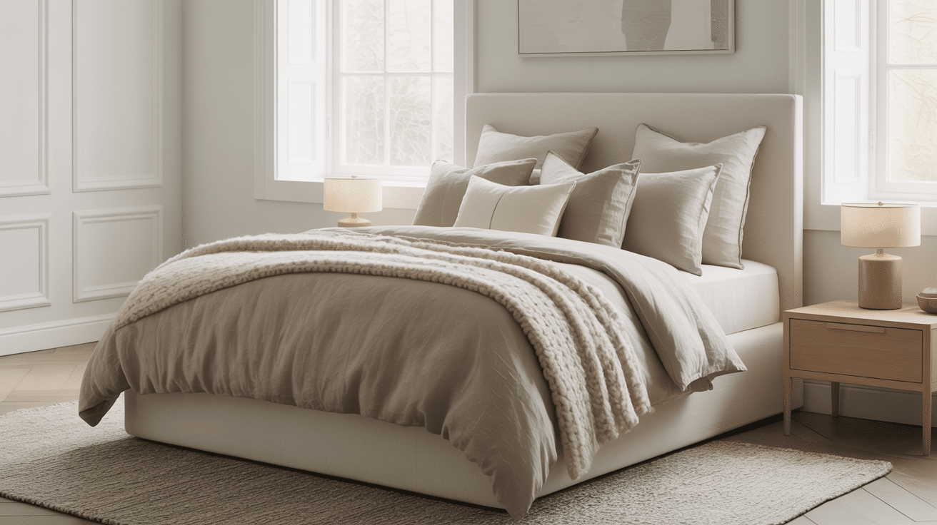
White Wisp creates a peaceful feeling in bedrooms that helps with rest and sleep.
I’ve used it in my clients’ tiny guest rooms and large master suites with equally good results. It makes dark corners brighter without harsh glare and provides a soft background that makes bedding colors pop.
My clients often tell me their bedrooms feel both bigger and cozier with this paint, which is exactly what most people want from a bedroom space.
Kitchens
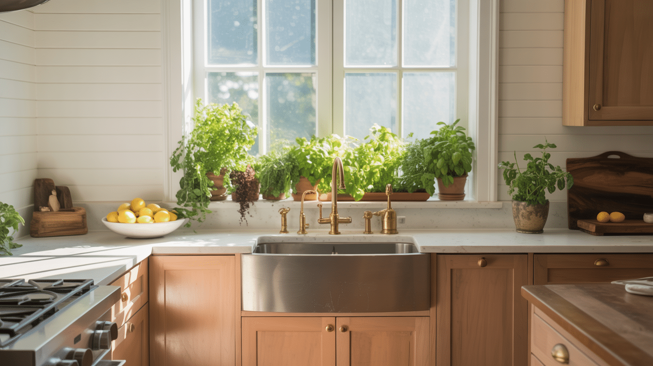
In kitchens, White Wisp offers the perfect balance between clean and comfortable. It works with white subway tile without looking too stark, and its subtle warmth makes wood tones and metal fixtures stand out beautifully.
I’ve noticed that kitchens with White Wisp walls tend to feel more welcoming and less utilitarian. It also does a nice job hiding small splatters and cooking marks between cleanings.
Hallways
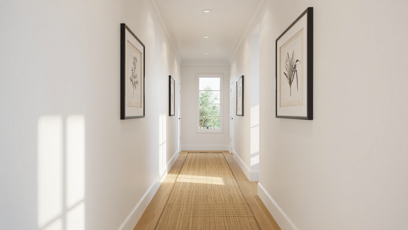
Hallways can be challenging often narrow, dark, and overlooked.
Benjamin Moore White Wisp brightens these transitional spaces without the flat, boring look of pure whites. It creates a gentle glow even in hallways with no windows, making these spaces feel intentional rather than forgotten.
Cabinets
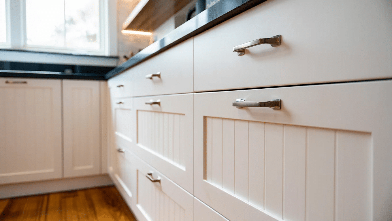
On cabinets, Benjamin Moore White Wisp shows its versatility. It reads as white but with enough depth to show off cabinet details like shaker panels or beadboard.
The slight warmth helps hide fingerprints and smudges that show easily on brighter whites. I find it works wonderfully in bathrooms where the slight warmth creates a spa-like feel against cool tiles and fixtures.
Dining Area
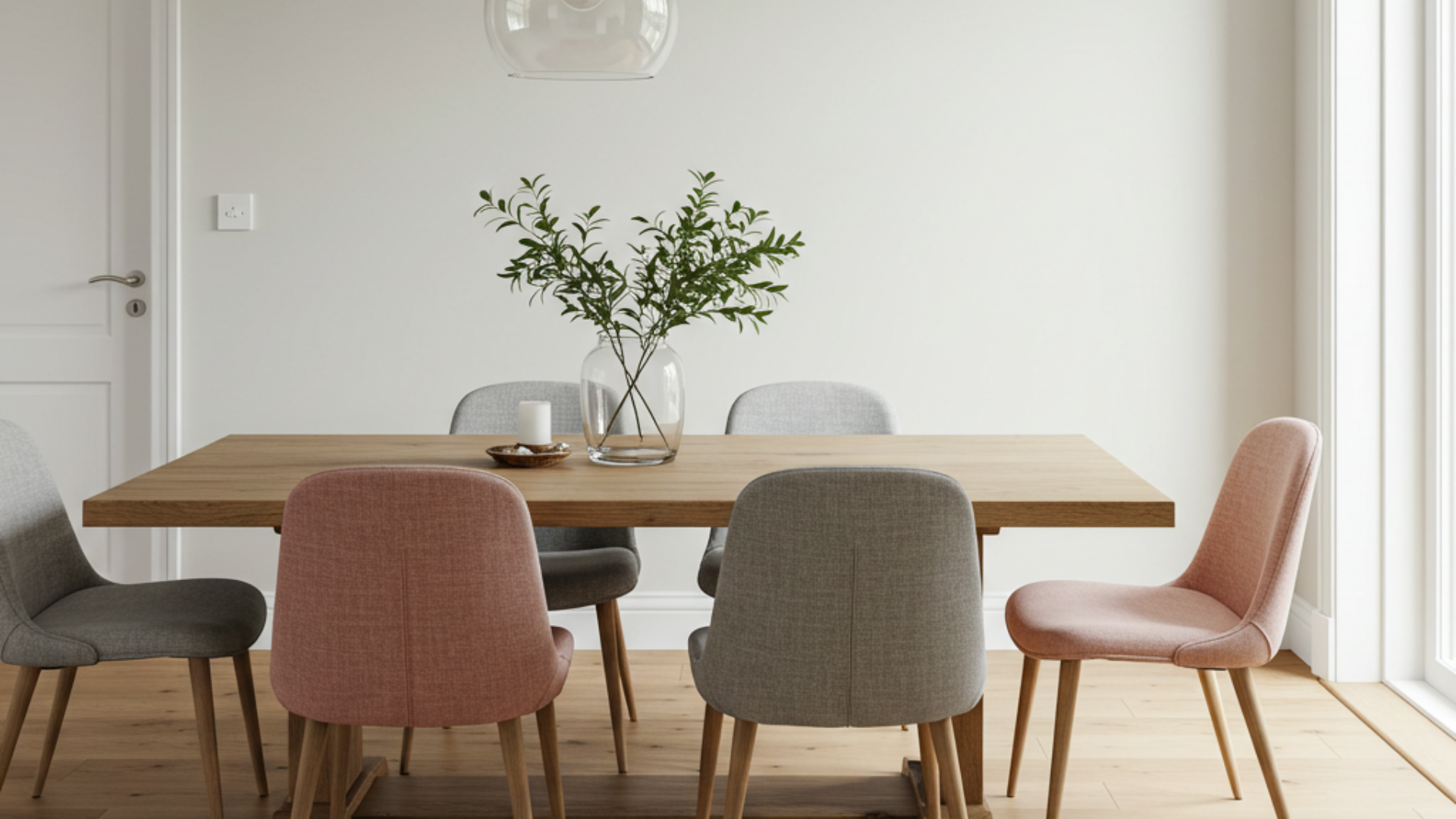
I’ve used White Wisp in many of my clients’ dining rooms with fantastic results.
It creates a clean backdrop that lets your furniture and decor stand out. In formal dining spaces, it provides a classy look without feeling cold. For casual eating areas, it feels welcoming and fresh.
I love how it makes artwork and light fixtures pop without competing for attention.
When paired with wood dining tables, it highlights the natural grain beautifully. It also works well with both colorful and neutral dining chairs, giving you flexibility with your style choices.
Exterior Style
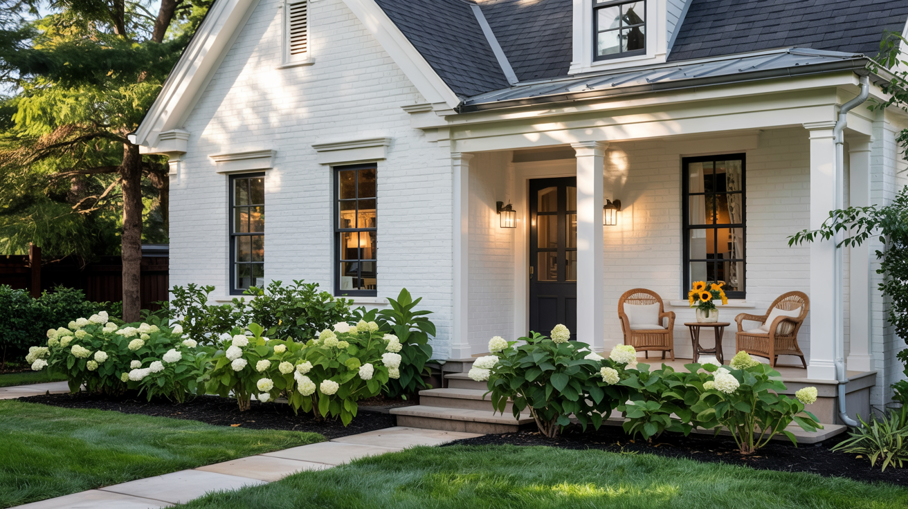
The exterior of this modern home, painted in Benjamin Moore White Wisp OC-54, exudes a timeless elegance.
The soft, cool white trim accentuates the house’s large windows, doors, and architectural features, offering a clean and fresh appearance. Set against a lush green landscape, the trim’s subtle blue and green undertones provide a sophisticated contrast, enhancing the overall aesthetic.
The gentle brightness of White Wisp amplifies the home’s curb appeal, seamlessly blending with nature while maintaining a modern, inviting atmosphere. This combination of design elements creates a space that is both refined and welcoming.
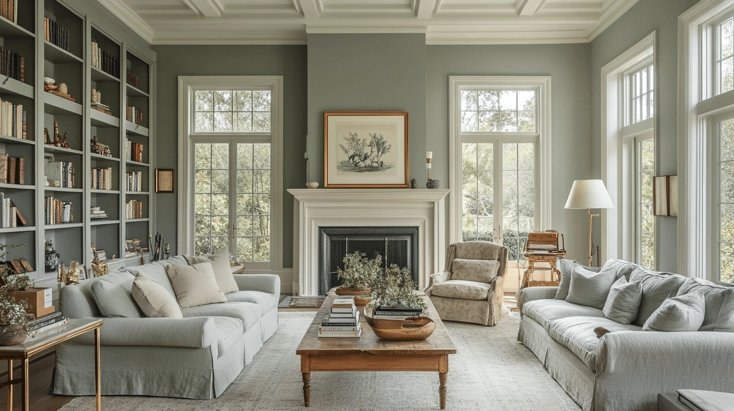
Perfect Pairings for Benjamin Moore White Wisp OC-54
Benjamin Moore’s White Wisp OC-54 offers subtle warmth and endless possibilities. From earthy tones like sage green and terracotta to the classy navy blue, discover how this soft hue enhances your space.
Pair it with natural textures, experiment with lighting, and learn how White Wisp works magic in both small and large rooms.
Complementary Colors
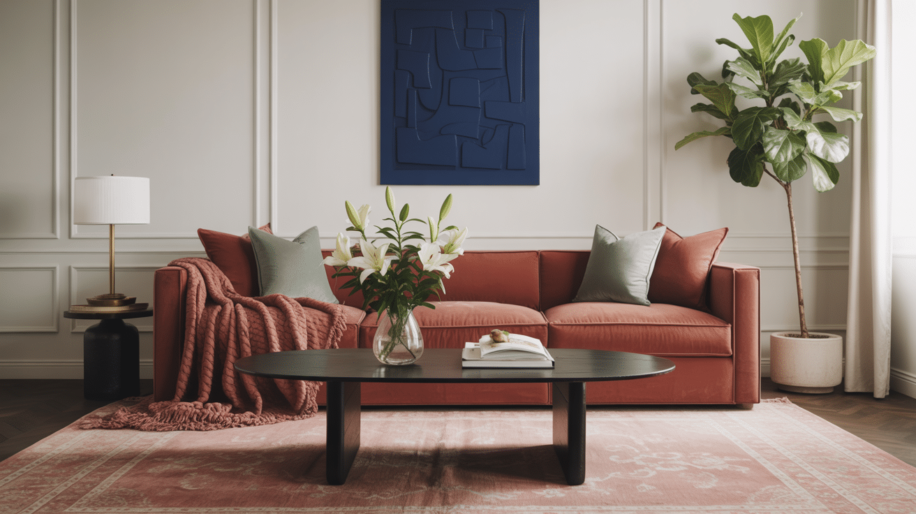
In my clients house I’ve found that White Wisp plays nicely with so many colors.
It looks stunning with soft, earthy tones like sage green, dusty blue, and warm terracotta. These colors bring out its subtle warmth without fighting it.
For a clean, classic look, I pair it with navy blue or charcoal gray accents. When clients want more personality, I suggest muted plum or dusty rose as accent colors. White Wisp’s gentle nature makes it flexible enough to work with both cool and warm color schemes.
Textures Match
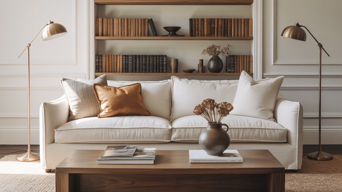
The magic happens when you mix White Wisp with varied textures.
I love how it looks against natural wood tones, especially medium oak or walnut. The contrast creates depth without harshness. Brushed brass or copper fixtures pop beautifully against this soft white.
For fabrics, I recommend linen, wool, or cotton in various weaves. These natural materials enhance White Wisp’s organic feel. Stone surfaces like marble or limestone also pair wonderfully, bringing out the paint’s subtle undertones.
Lighting Considerations
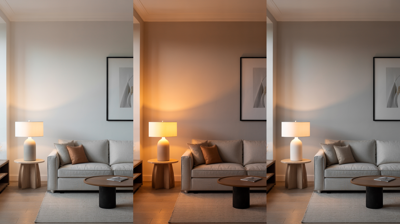
Light changes everything with White Wisp.
In north-facing rooms, it takes on a softer, more neutral appearance. South-facing spaces bring out their warmer side, but they never turn yellow like some whites do. I tell my clients to test it at different times of day. Morning light shows its true color while evening light brings out its coziness.
With artificial lighting, warm bulbs enhance its comfort, while cool LEDs make it appear crisper and more modern.
Shades Similar to Benjamin Moore’s White Wisp
After using White Wisp in dozens of projects, I’ve come to know its closest relatives in the paint world. If you’re considering White Wisp but want to explore options, here are some similar shades worth looking at:
| Paint Color | Undertone Difference | LRV | Visual Difference |
|---|---|---|---|
| White Dove (OC-17) | Creamier with more yellow | 85.38 | Warmer and slightly brighter; feels more traditional |
| Cloud White (OC-130) | More yellow undertones | 87.35 | Brighter and pairs well with warm-toned wood trim |
| Alabaster (SW 7008) | Slight yellow-pink in certain lighting | 82 | Soft like White Wisp but can read warmer in some spaces |
| Wind’s Breath (OC-24) | Slightly deeper with beige-gray undertones | 74.77 | Cozier and more grounded; appears darker, ideal for large spaces |
Conclusion
After working with White Wisp in dozens of homes, I can confidently say it’s one of the most versatile whites in Benjamin Moore’s collection.
This gentle off-white brings softness to any room without feeling bland. Its subtle warm undertones create comfort while maintaining a clean look that works in both modern and traditional spaces.
For my clients who want a timeless white that feels like home, this color has consistently delivered beautiful results.


3 Responses
I love this color and I have decided to paint my exterior of my home in white wisp. What is the name of the dark door color in the home picture that’s painted in bum white wisp?
thank you,
tammy
Hi Tammy, I can totally see what you’re referring to! Very keen of you to notice that dark color. It is Benjamin Moore’s Onyx (2133-10). The contrast with White Wisp is stunning! I actually covered several shades of dark colors that would pair beautifully with your White Wisp choice. You can check that out here: Unique shades of black
We are thinking about painting the exterior of our home this color too. How do you like it 9mo later and do you happen to have a picture? Thanks in advance