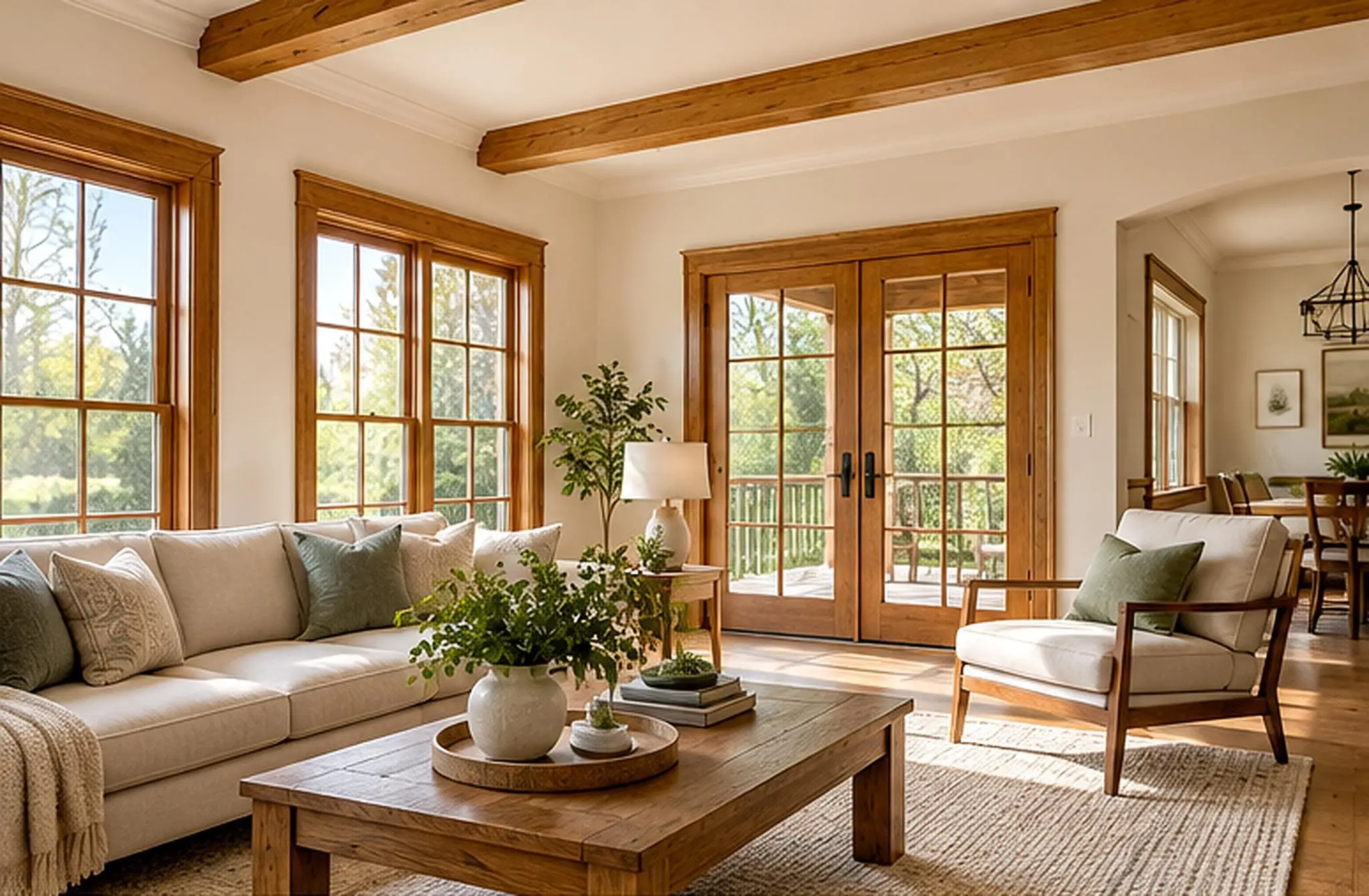
Does black feel like the easy choice until you start comparing samples? One looks blue, another looks brown, and the next parks itself somewhere between black and green. Suddenly, your “simple” decision needs a chair and a snack (preferably something crunchy).
I used to think black was black, with one shade doing much the same job as another. Decorating changed my mind; those little shifts in undertone can change a room from soft and restful to sharp and contemporary.
If you’re considering jet, charcoal, onyx, ebony, coal, graphite, raven, ink, sable, slate, or matte black, there’s more to compare than depth.
Let’s look at hex codes, room ideas, and actual paint-selection guidance before you buy. And yes, matte needs its own little clarification…
The Stunning Shades of Black Color That You Didn’t Know
Black isn’t just one color; it’s a spectrum of deep, intriguing shades, each with its own character and mood.
From neutral jet black to warm, brown-leaning sable, each tone changes how a room feels. The undertone is the hint of another color, like blue, green or brown, that shows through the black.
The following are striking shades of black to inspire your next design project:
| Shade Name | RGB Color Code | Hex Code | LRV (Approx.) | Undertone | Preview |
|---|---|---|---|---|---|
| Jet Black | (0, 0, 0) | #000000 | 0 | Neutral | 
|
| Charcoal Black | (54, 69, 79) | #36454F | 6–8 | Cool gray | 
|
| Onyx Black | (53, 56, 57) | #353839 | 5 | Cool blue-gray | 
|
| Ebony Black | (85, 93, 80) | #555D50 | 8–10 | Earthy green-gray | 
|
| Coal Black | (47, 53, 54) | #2F3536 | 4 | Blue-gray | 
|
| Graphite Black | (56, 60, 66) | #383C42 | 6 | Slate blue | 
|
| Raven Black | (45, 45, 50) | #2D2D32 | 3–5 | Violet-blue | 
|
| Ink Black | (25, 29, 34) | #191D22 | 1–2 | Deep blue | 
|
| Sable Black | (75, 54, 33) | #4B3621 | 4–6 | Warm brown | 
|
| Slate Black | (70, 80, 82) | #465052 | 10–12 | Gray-green | 
|
| Vantablack | (0, 0, 0) | #000000* | ~0.001 | No visible undertone | 
|
Design Ideas to Use Each Black Shade in Your Home
Black can look gorgeous on feature walls, kitchen cabinets, bathroom tiles, or a distinctive chair.
If you want it to work with your room, the trick is coordinating its undertone with the lighting and existing finishes (not just picking a gorgeous name).
So, how do those differences play out? Let’s take a look…
1. Raven Black Beauty
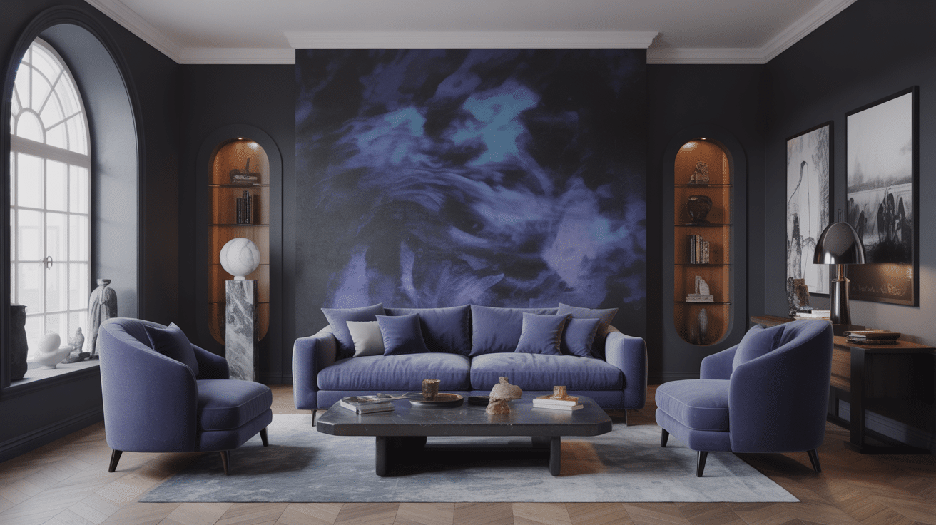
Picturean accent wall in Raven Blackthat blends beautifully with mid-tone blues and grays.
It’s serene but bold, and when you add minimalist furniture and a few art pieces, the whole room feels luxurious (maybe even a little fancier than you expected).
-
Why This Works: Raven Black adds depth while complementing the surrounding color palette, making the space feel modern and upscale.
-
Maintenance Tips: Keep the matte finishes clean by dusting regularly and using non-abrasive cleaners to preserve the rich texture.
-
Lighting Suggestions: Use soft, warm lighting to balance the dark tones.Consider LED floor lamps or pendant lights.
-
Customization Options: Introduce personal art pieces or vibrant throw pillows for a pop of color, or opt for different fabric textures to create contrast.
2. Graphite Black Workspace
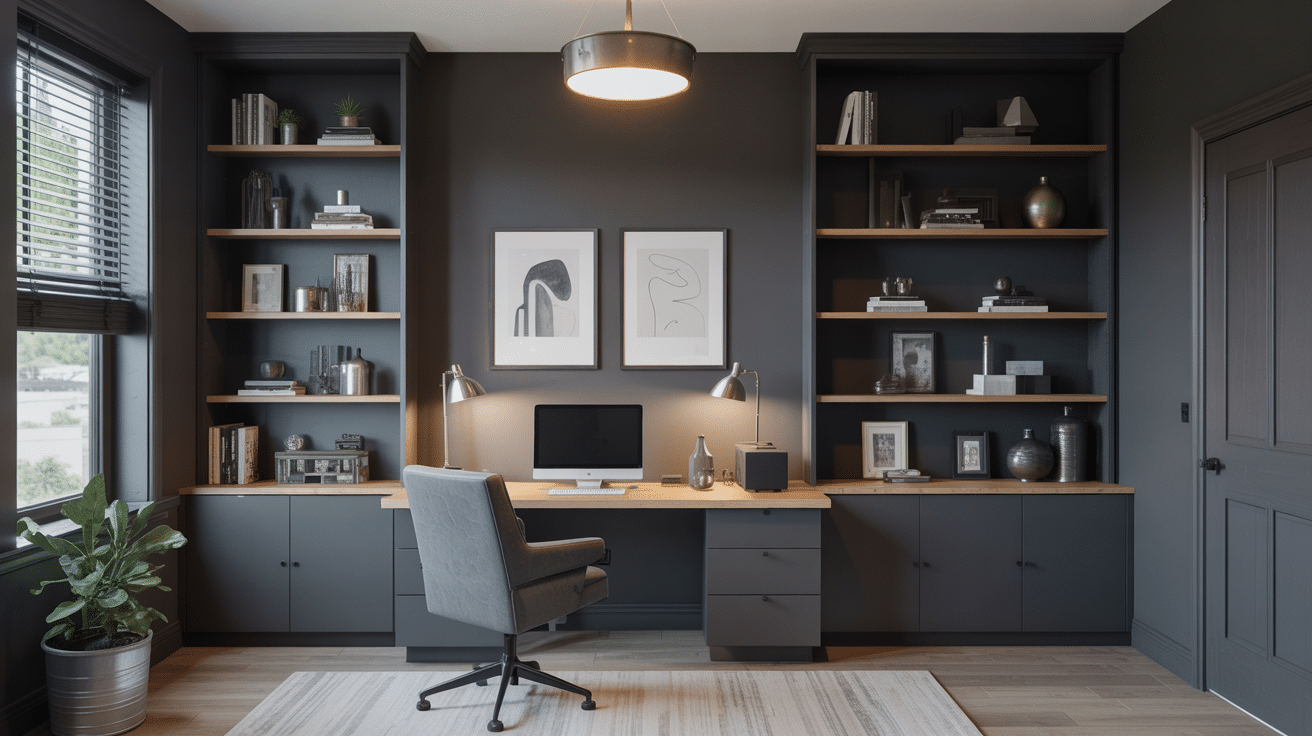
Graphite works beautifully on a dark-gray desk and shelving, especially with warm timber nearby. Its slate-blue influence creates a polished backdrop without demanding all your attention (I’d rather save mine for the work).
-
Why This Works: The wood supplies warmth and texture. A lower-sheen finish helps restrain glare. A good direction for a modern office. Calm, not corporate.
-
Maintenance Tips: Regularly wipe surfaces to prevent dust accumulation, especially on the black shelves. Avoid harsh chemicals that may damage finishes.
-
Lighting Suggestions:Layered lighting, such as desk lamps with adjustable brightness, can provide task lighting without creating shadows.
-
Customization Options: Switch up the décor with abstract artwork or modern sculptures to refresh the look. Use adjustable shelving for storage needs.
3. Coal Black Stairs
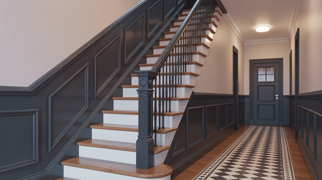
Coal Black railings against white steps? Timeless. When you add geometric wall paneling, you’ve got a contemporary feel with plenty of structure, and it probably won’t get overwhelming.
-
Why This Works: The striking contrast between the dark coal black and light stairs creates visual interest and draws attention to the architectural details.
-
Maintenance Tips: Use a microfiber cloth to clean the black railings and avoid harsh cleaners. Refinish periodically to maintain the deep color.
-
Lighting Suggestions: Place sconces along the wall or under-step LED lighting to highlight the staircase’s design and ensure visibility.
-
Customization Options: Experiment with different stair tread materials or incorporate a decorative rug for added warmth and color.
4. Ebony Black Retreat Bedroom
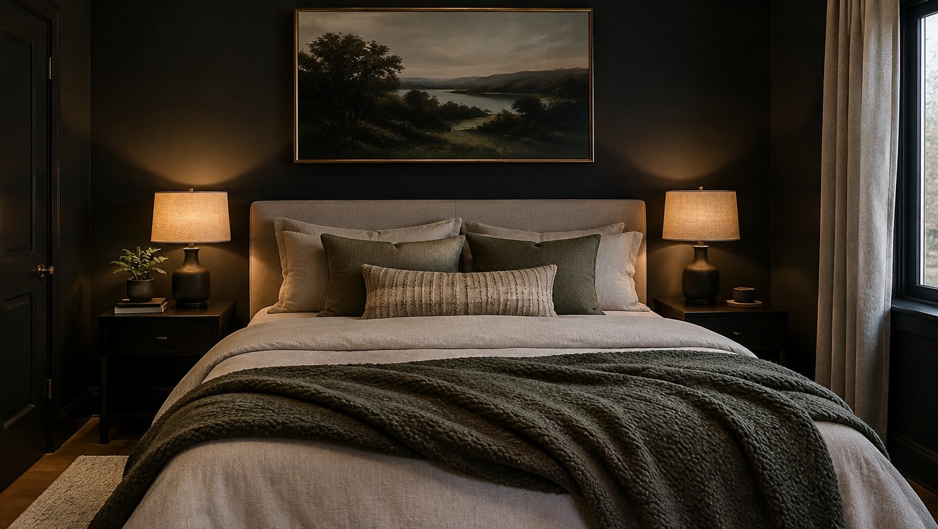
The deep Ebony Black tones used in this bedroom design create a sense of intimacy and relaxation, perfect for a restful sleep environment. The contrast between the dark walls and soft, neutral bedding invites a cozy yet refined aesthetic.
-
Why This Works:Ebony Black is one of those calm bedroom paint colors that evokes tranquility and creates a retreat-like space. It helps accentuate the soft furnishings in the room.
-
Maintenance Tips: Dust the walls and bedding regularly, especially around any dark elements, to maintain the sleek finish. A damp cloth is ideal for cleaning the walls.
-
Lighting Suggestions: Utilize soft ambient lighting, such as bedside lamps with dimmable features, to increase the serene mood.
-
Customization Options: Add textured throws or statement art pieces on the walls to complement the dark palette and add visual interest.
5. Charcoal Black Contemporary Kitchen
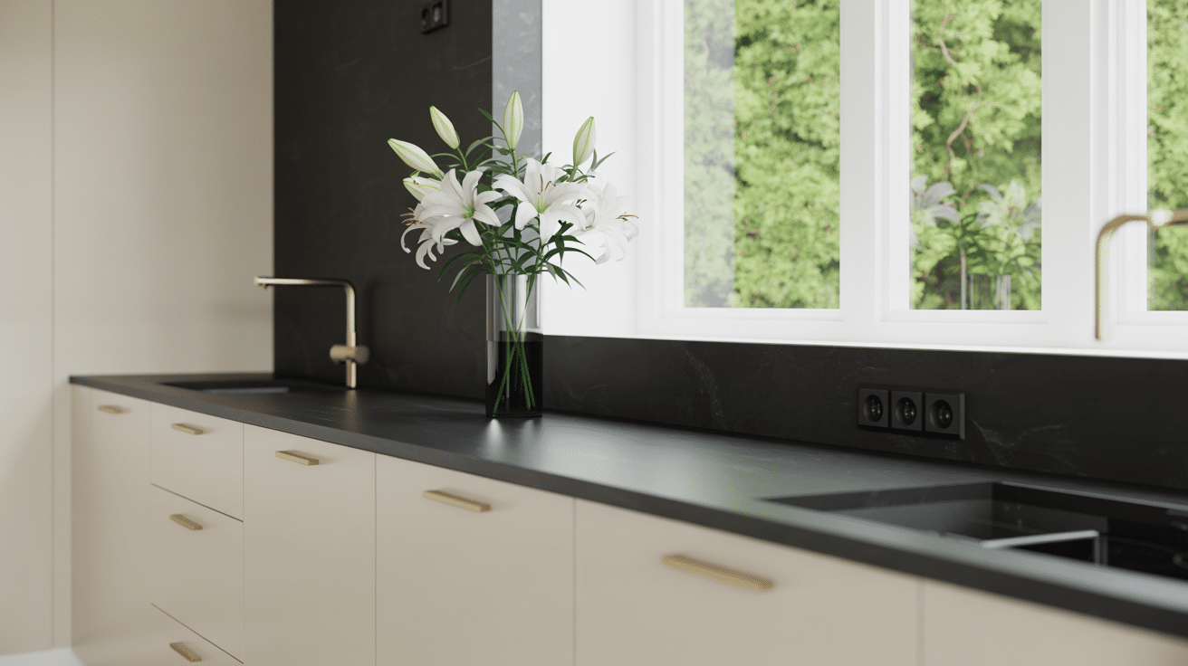
Charcoal Black accents in the kitchen combine a modern aesthetic with functionality. The matte finish on the cabinetry creates a classy backdrop for the clean lines of the countertops and the bright white walls.
-
Why This Works: Charcoal Black’s understated depth pairs perfectly with lighter tones, making it a versatile choice for both contemporary and classic kitchens.
-
Maintenance Tips: Wipe down surfaces with a gentle cleaner to prevent fingerprints and grease buildup. Be cautious of water spots on the black fixtures.
-
Lighting Suggestions:Focus on under-cabinet LED lights, which count as task lighting, or overhead recessed lighting to highlight the dark surfaces and add brightness.
-
Customization Options: Integrate open shelving for easy access to dishes and glassware, or experiment with different handle styles for added character.
6. Jet Black Serene Bedroom
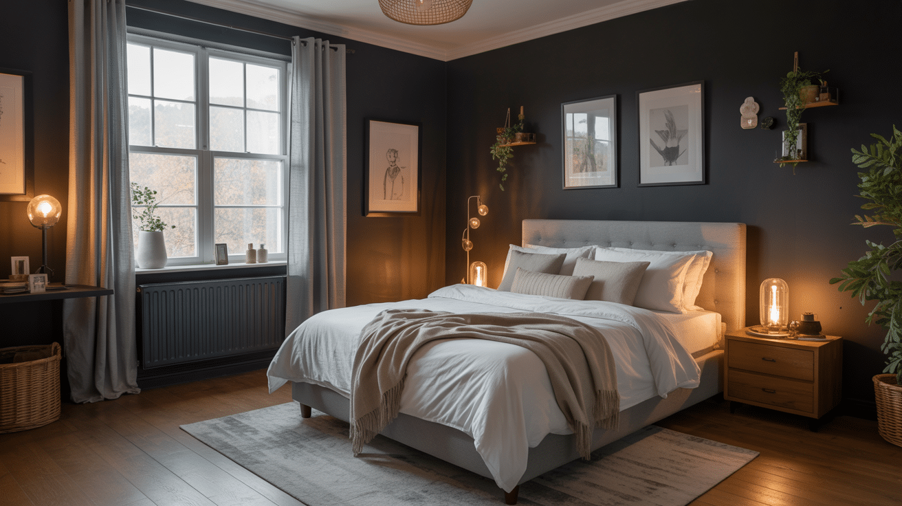
For this scheme, think jet-black drama with a midnight mood.
“Midnight Black” is a descriptive name here. Not a separate standardized shade from the reference table (I’m not sneaking another shade into the list).
-
Why This Works: Midnight Black creates a comforting space perfect for unwinding, with a bold statement that doesn’t overwhelm.
-
Maintenance Tips: Use a soft brush to remove dust from the walls. Regularly clean bedding to ensure it contrasts nicely with the dark tones.
-
Lighting Suggestions: Use soft overhead lights or side table lamps with warm bulbs to increase the room’s relaxed vibe.
-
Customization Options: Introduce additional textures with plush cushions, throws, or curtains to create a layered and inviting space
7. Onyx Black Luxe Lounge
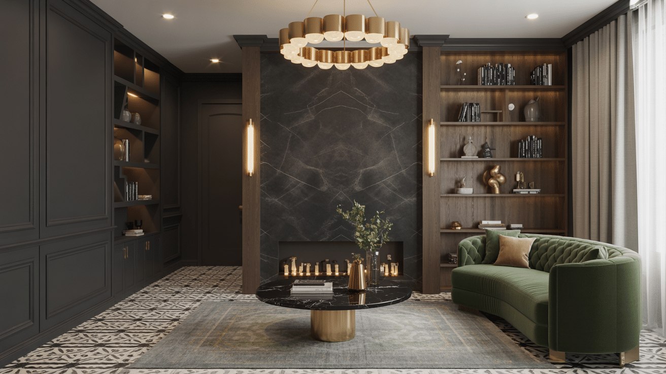
The deep Onyx Black tones in this lounge area provide a classy backdrop to the luxurious green velvet sofa and modern lighting fixtures. The balance of dark and light elements creates a chic, contemporary atmosphere perfect for relaxation or entertaining.
-
Why This Works: Onyx Black delivers a polished, bold statement without overwhelming the space, offering depth while maintaining beauty.
-
Maintenance Tips: Dust regularly to preserve the smooth finish of the dark walls and clean with non-abrasive cleaners to avoid scratches.
-
Lighting Suggestions: Use warm, ambient lighting like pendant lights and floor lamps to increase the room’s luxurious feel.
-
Customization Options: Swap in different accent furniture pieces, such as colorful cushions or artwork, to introduce new textures and colors.
8. Vanta Black Minimalist Living
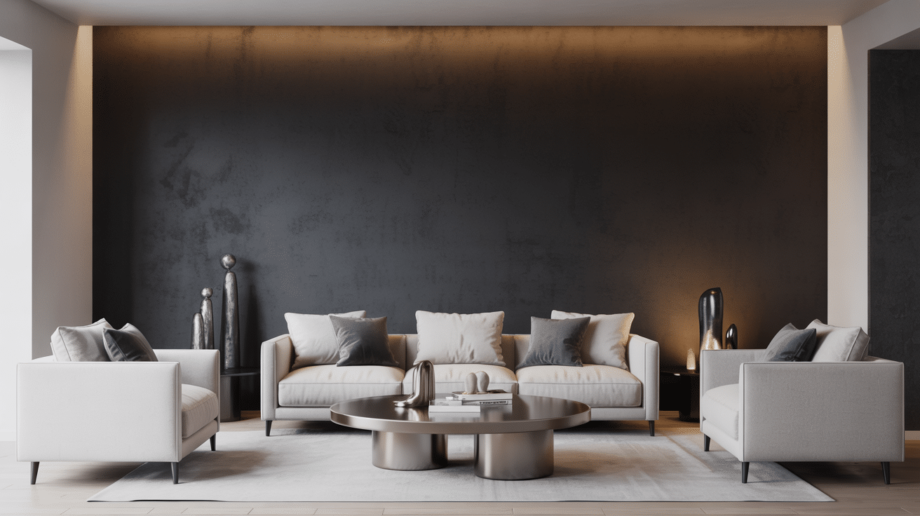
Very dark walls with streamlined furniture and beige or gray accents create an intriguing minimalist look. Pale furniture stands out against the darkness, giving even simple shapes more presence.
But actual Vantablack on living-room walls? That’s NOT my recommendation!
-
Why This Works: Vanta Black is the darkest of blacks, increasing the contrast with light furniture and adding an air of class to the room.
-
Maintenance Tips: Keep the matte finish free of smudges by using a microfiber cloth and gentle cleaners.
-
Lighting Suggestions: Recessed lighting or track lights will help illuminate the space without taking away from the sleek design.
-
Customization Options: Introduce organic materials like wood or plants to soften the bold black and create a balance between modernity and nature.
9. Slate Black Contemporary
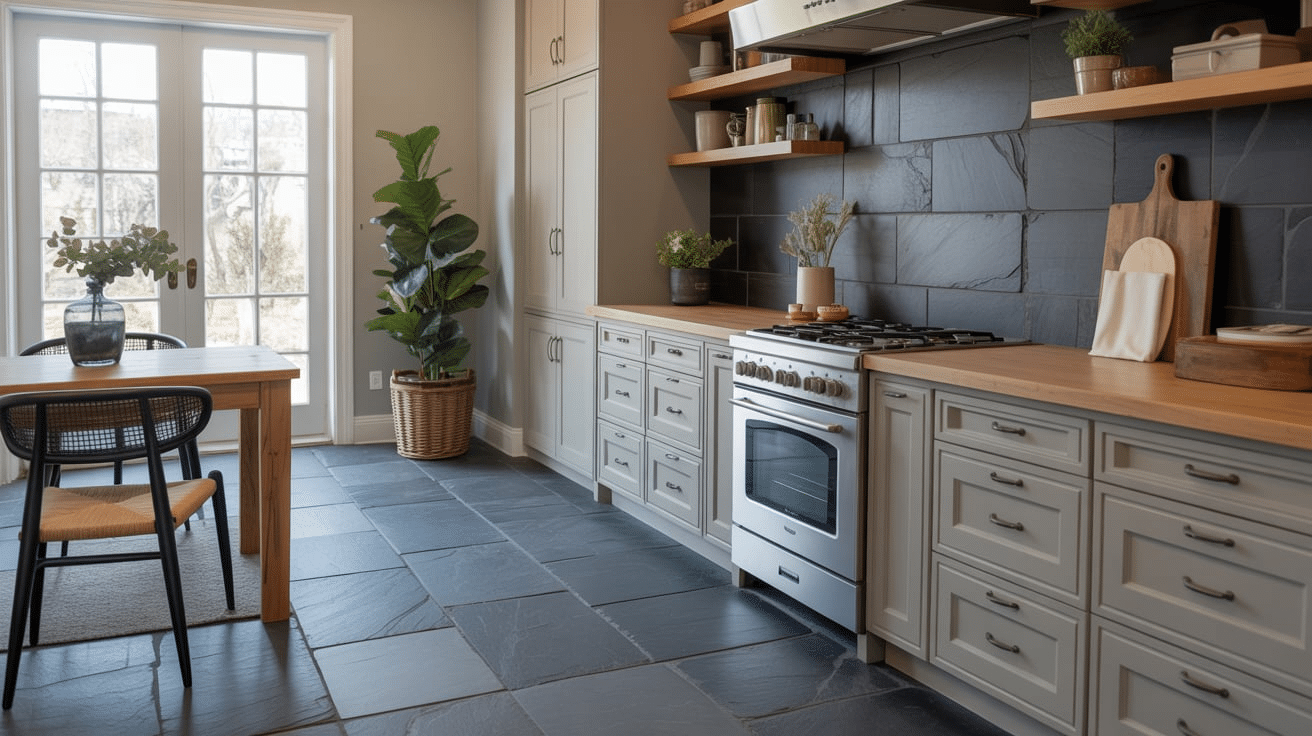
The Slate Black walls and decor in this living room bring a refined touch to the space, while the neutral furniture and decorative accents create a calm, inviting environment. The combination of textures adds visual interest and warmth to the room.
-
Why This Works: Slate Black brings class and depth without being overpowering, making it ideal for modern living areas.
-
Maintenance Tips: Clean the surfaces regularly with a damp cloth to avoid buildup, and make sure the walls stay smudge-free.
-
Lighting Suggestions: Soft lighting, such as table lamps and wall sconces, adds warmth to the dark walls and complements the chic vibe.
-
Customization Options: Experiment with different fabric textures or patterned rugs to add contrast and personality to the space.
10. Sable Black Timeless Comfort
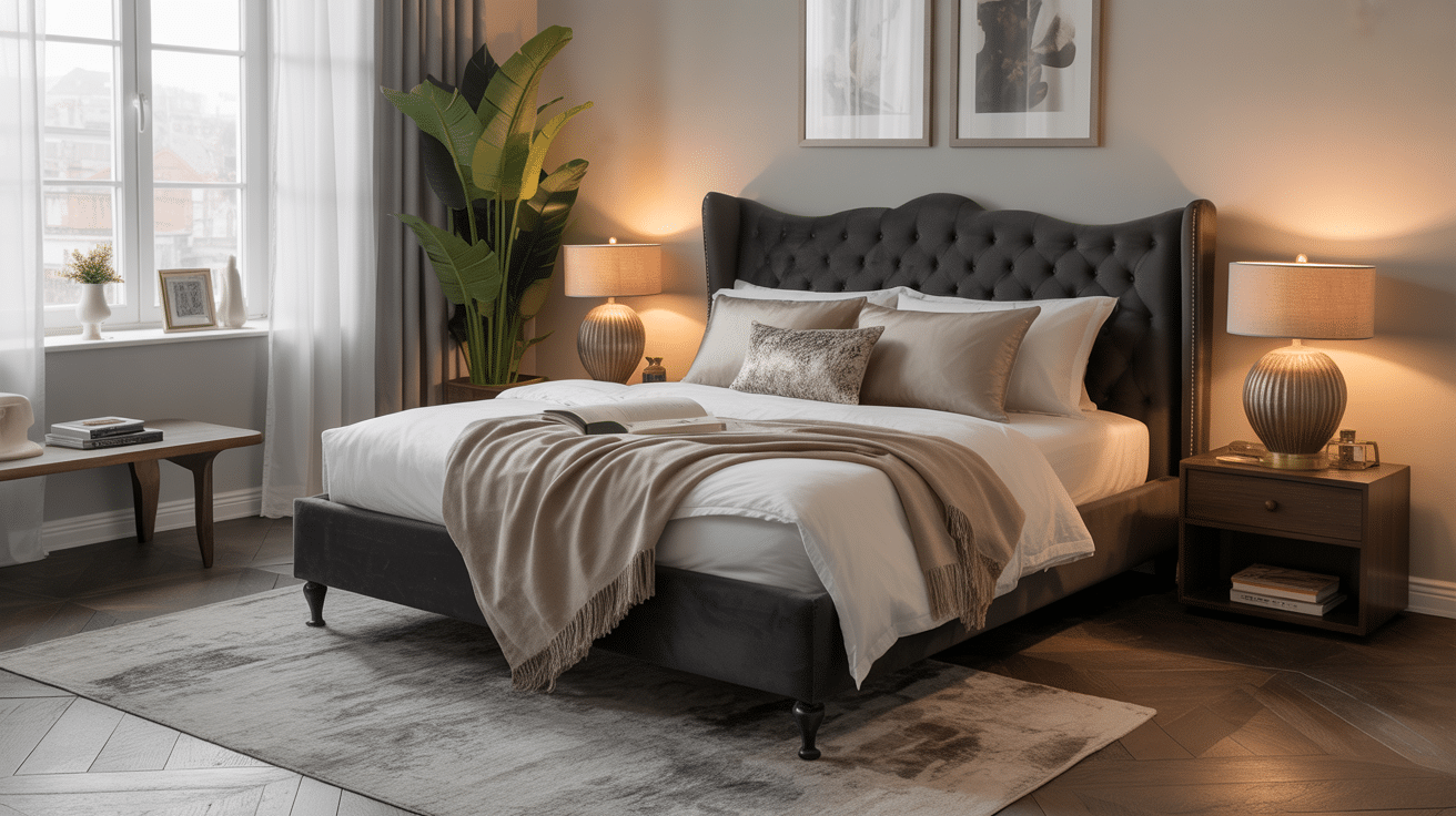
This bedroom, featuring Sable Black walls, exudes timeless comfort with its calming dark palette. The combination of the soft bedding, beautiful lighting, and cozy furnishings offers a peaceful retreat from the hustle and bustle of everyday life.
-
Why This Works: Sable Black creates a luxurious, restful space by adding richness and warmth to the bedroom’s design.
-
Maintenance Tips: Dust regularly to keep the deep, rich hue looking fresh, and clean with care to maintain the sleek, matte finish.
-
Lighting Suggestions: Use bedside lamps with soft, warm light to create an inviting glow that contrasts with the darker walls.
-
Customization Options: Introduce different textures with throw pillows, blankets, or even artwork to provide a personal touch to the classy space.
11. Ink Black Modern Chic Bathroom
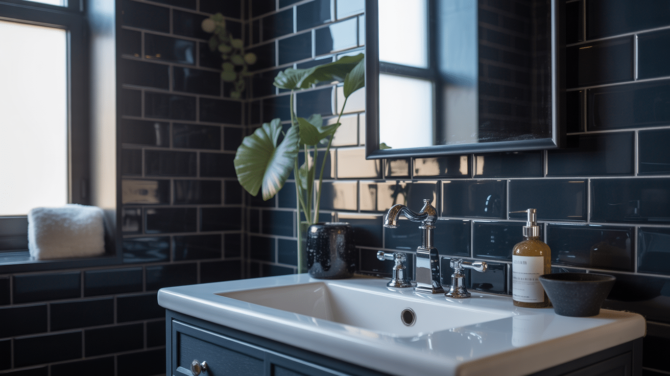
The deep Ink Black tiles in this bathroom add drama and beauty to the space. The sleek, minimalist design is complemented by subtle plant accents and contemporary fixtures, creating a balanced, visually appealing aesthetic.
-
Why This Works: Ink Black is perfect for a bathroom where boldness meets practicality. It creates a sleek look while being easy to clean.
-
Maintenance Tips: Wipe tiles down regularly to maintain the shiny finish and prevent water spots. Use non-abrasive cleaners to keep the black tiles pristine.
-
Lighting Suggestions: Install soft, focused lighting around mirrors or under-cabinet lighting to highlight the bold black tiles.
-
Customization Options: Experiment with different textures, such as a wooden shelf or metallic fixtures, to soften the black tones and add contrast.
How to Choose The Right Shade of Black for Your Room
The best black starts with your room. Not the name on the chip. Here’s my order before committing to walls or cabinetry…
1. Assess the daylight. If you have northern exposure, its cooler, blue-biased light can amplify cool blacks, while sable or ebony might feel cozier. Southern exposure tends to bring warmer, yellow light, which can make charcoal or ink feel less chilly. Actual conditions still vary throughout the day.
2. Check the artificial lighting. Warm lamps generally make black appear warmer, while cool-white lamps can pull out blue. Compare samples under the bulbs that will STAY in your room, not temporary ones you already dislike (give your samples a fair chance).
3. Look for the LRV. Light reflectance value describes how much light a surface reflects. The scale runs from 0 (pure black) to 100 (pure white). Check the chip’s reverse or product information; black paints sit near the lower end, where small numerical differences can become noticeable across large walls.
4. Choose the finish. Flat and matte finishes absorb more light and help disguise surface imperfections. If you want a surface that’s generally easier to wipe, satin and semi-gloss reflect more light and can be useful for your kitchen, bathroom, and trim. Product-specific durability matters, too.
5. Paint substantial samples. Test your chosen paint on two walls before buying the full amount. Check it in the morning, at midday, and at night, alongside the finishes it needs to work with!
Remember, matte describes sheen, not undertone. A matte black can still lean blue, green, brown, or neutral; lowering the shine doesn’t remove the color hiding underneath.
Things to Keep in Mind When Decorating with Black
Black can bring drama, style, and depth. But inviting rooms usually need a deliberate balance. That doesn’t mean every black wall needs a white sofa parked in front of it (I’m not handing out sofa assignments).
My approach: Give the darkness something useful to work with.
Do’s
-
Balance black with lighter colors and neutrals to prevent spaces from feeling too dark or closed in
-
Use black as an accent through lighting, hardware, picture frames, or textiles before committing to large furniture or walls
-
Pay attention to undertones in black (blue, green, brown, etc.) and keep them consistent throughout your space for a cohesive look
-
Add dimension and texture by mixing matte, glossy, and textured finishes, or by pairing black with metallics, glass, or natural materials.
-
Bring in plenty of natural light to counterbalance black’s visual weight and keep the space feeling open.
-
Use black to highlight architectural details, such as trim, doors, or built-ins, for added beauty.
Don’ts
-
Don’t overdo it; too much black can make a space feel heavy, gloomy, or claustrophobic. Use it sparingly and strategically.
-
Don’t mix too many different shades of black in the same room, as it can look inconsistent or faded
-
Don’t ignore your home’s architectural style; make sure black elements fit naturally with your overall design.
-
Don’t forget to incorporate a variety of textures and finishes to avoid a flat, lifeless look.
-
Don’t be afraid to use black, but avoid pairing it with very dark blues, which can muddy the effect and prevent black from standing out
Wrapping It Up
Black isn’t a single color anymore, is it? I’ve shown you elevendifferent shades of black that can make your home feel completely different.
From the warmth of charcoal to the drama of jet black, each shade has its personality.
You don’t need to repaint your entire house to see results. Start small with one room or even just an accent wall. Try lamp black in your bedroom for a cozy feel, or use onyx in your kitchen for something bold.
Pick one shade that caught your attention and test it out. Grab some paint samples and see how they look in your space throughout the day. Your home deserves more than basic black.