I get it, standing in the curtain aisle feels overwhelming. You’re staring at dozens of colors, wondering what color curtains I should get that won’t clash with everything else.
Most people don’t realize curtain color does way more than just “look pretty.” It changes how your room feels, affects the lighting, and can make or break your home’s vibe.
I’m going to show you exactly how to pick curtain colors that work with your space.
By the end, you’ll know which colors boost your mood and which ones to avoid completely.
Aligning Curtain Choices with Room Elements
Before I pick any curtain color, I always start with what’s already in the room. Think of it like getting dressed, you wouldn’t choose a shirt without looking at your pants first, right?
Here’s my go-to method for getting curtain colors that work:
| What I Look At | Why It Matters | Quick Tips |
|---|---|---|
| Wall Colors & Flooring | Take up most visual space | Light walls = bold curtains. Dark walls = light curtains |
| Large Furniture | Set the room’s mood | Match or complement the main furniture color |
| Lighting Type | Changes how colors look | North rooms = warm colors. Bright rooms = cool tones |
| Natural vs Artificial Light | The same curtain looks different all day | Test samples in morning and evening light |
| Room Purpose | Different spaces need different vibes | Bedrooms = calming. Living rooms = energizing |
Color Selection Frameworks That Work
I’ve tried every color combination you can think of, and some methods just work better than others. Here are some approaches I rely on when I can’t figure out what color curtains should i get.
1. Monochromatic
I stick to one color but use different shades of it. Think light blue walls with navy curtains, or cream furniture with chocolate brown drapes. It’s foolproof because everything automatically matches.
- Vibe: Clean, calm, and put-together without trying too hard
- Hues: Pick your room’s main color, then go 2-3 shades lighter or darker for curtains
- Texture: Silk with linen, or cotton with velvet
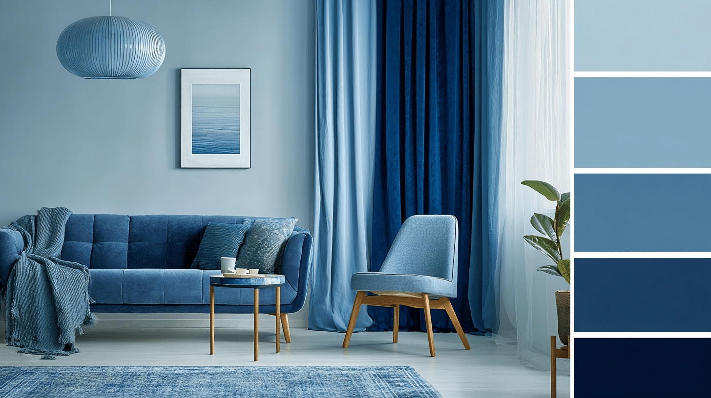
2. Complementary Color Opposites
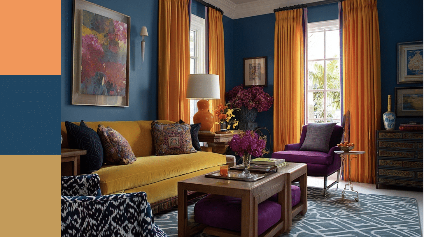
This is where I use colors that sit across from each other on the color wheel. Orange curtains in a blue room, or purple drapes with yellow accents. It sounds scary, but it creates real energy.
- Vibe: Lively, confident, and makes people notice the room
- Hues: Blue with orange, red with green, purple with yellow
- Texture: Cotton or basic weaves
3. Analogous Hues
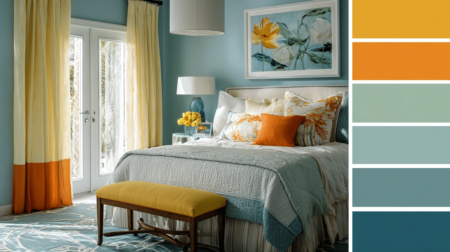
I choose colors that sit next to each other on the color wheel. Like blue-green curtains in a blue room, or yellow drapes with orange accents. It feels natural and easy on the eyes.
- Vibe: Peaceful, flows well, feels like nature
- Hues: Any three colors that touch on the color wheel (blue-green-purple or red-orange-yellow)
- Texture: Linen, cotton, or bamboo blends
4. Timeless Neutral Base
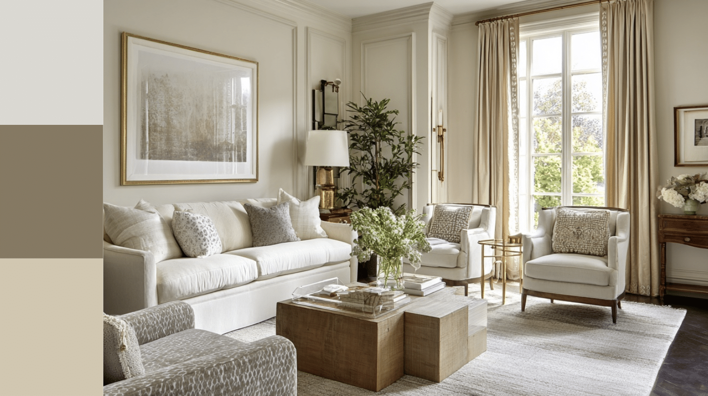
My go-to when I want something that’ll work for years. Whites, beiges, grays, and greiges never go out of style. I add interest through different textures instead of colors.
- Vibe: Classic, relaxing, works with any decor changes
- Hues: Cream, off-white, warm gray, cool gray, beige, greige
- Texture: Velvet, linen, textured weaves, subtle patterns, or layered fabrics
5. Accent Approach
When my room is mostly neutral, I let the curtains be the fun part. One bright color in an otherwise calm space. It’s like wearing a colorful scarf with a plain outfit.
- Vibe: Fresh, modern, personality without overwhelming
- Hues: Emerald green, deep teal, burnt orange, dusty pink, mustard yellow
- Texture: Velvet, silk, or heavy cotton
Essential Factors Before You Buy Curtains
Before you even start wondering what color curtains you should I get, there are some basics I always check first. These factors will save you from buying gorgeous curtains that don’t work in your space.
- Test Swatches in Real Lighting: I never buy curtains without testing samples first. That coral fabric looks different in morning sunlight versus evening lamplight. I tape samples to my window and check them throughout the day.
- Consider Fabric Weight and Texture: The same color looks completely different on velvet versus linen. Heavy fabrics make colors richer and deeper. Sheer materials make everything lighter and airier.
- Match or Contrast with Curtain Rods and Hardware: I learned this the hard way; my beautiful navy curtains looked terrible with my brass rods. Now I plan hardware and fabric together, not separately.
- Evaluate Maintenance and Color Fading: Dark colors hide dirt but show dust. Light colors stay fresh longer but need more washing. I pick based on how much cleaning I want to do.
Popular Curtain Colors by Room Type
I get asked all the time, What color curtains should I get for each room? While personal style matters most, I’ve noticed certain colors just work better in specific spaces.
The following are what I recommend based on how each room gets used.
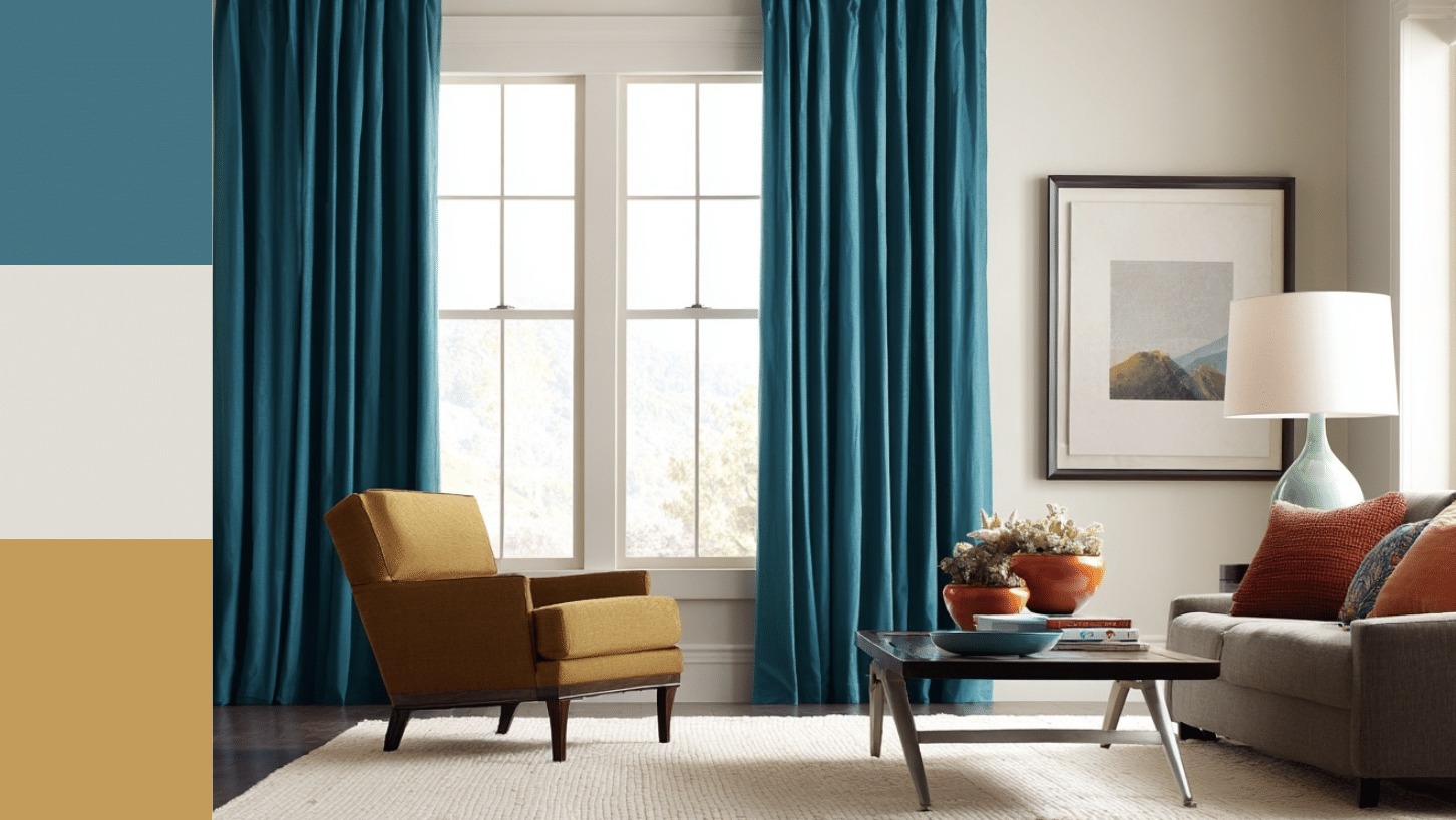
Living Room: Taupe
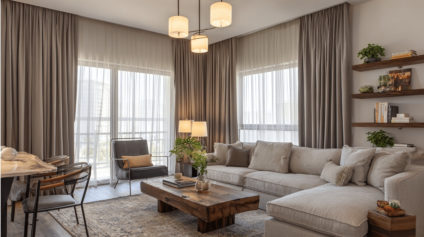
Living rooms need colors with depth since this is where you spend most of your time. I love navy because it feels rich without being too dark.
aupe works with almost any furniture, and forest green adds life without screaming for attention. These colors create a cozy backdrop for everything from movie nights to hosting friends.
Other Color Consideration: Navy and Forest Green
Bedroom: Dusty Rose
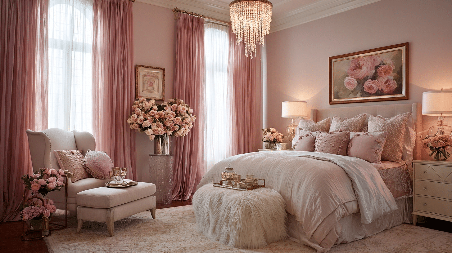
Sleep spaces call for colors that help you relax. I always go softer here – no bright or intense hues. Soft gray feels peaceful and works with any bedding. Pastel blue naturally calms your mind, while dusty rose adds warmth without being too stimulating. These colors help your brain shift into rest mode.
Other Color Consideration: Soft Gray, Pastel Blue,
Kitchen: Sage Green
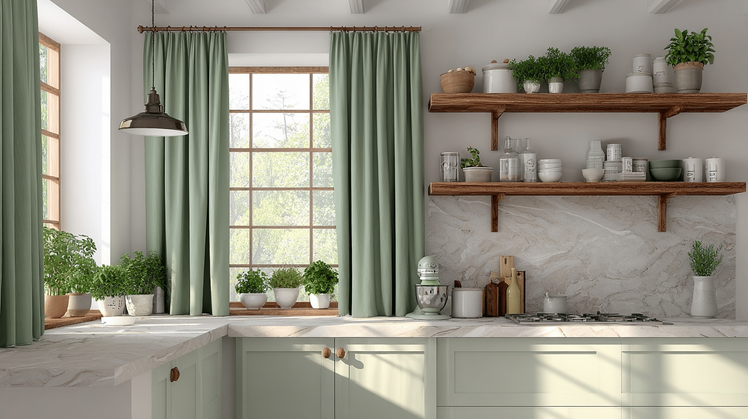
Kitchens need brightness since you’re doing detailed work like cooking and cleaning. White curtains bounce light around and make small spaces feel bigger. Sage green brings in a fresh, clean vibe that complements food prep. Linen (the color, not just the fabric) feels warm but still light and airy.
Other Color Consideration: White and Linen
Home Office: Slate
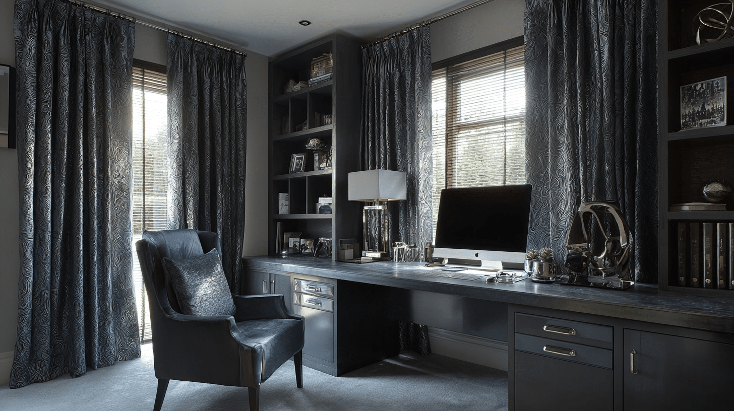
Workspaces benefit from colors that help you focus without being distracting. Terracotta adds warmth but stays grounded.
Slate gives you that professional feel while remaining calm. Olive creates a natural, earthy environment that helps reduce stress during long work sessions.
Other Color Consideration: Terracotta and Olive
The Bottom Line
Now you know the answer to, what color curtains should i get, isn’t just about pretty colors.
It’s about reading your room’s story first, then choosing curtains that make sense with what’s already there.
I’ve given you five solid approaches and practical filters to test your choices. Don’t let inspiration override function. Your curtains need to work with your lighting, match your lifestyle, and actually make you happy every day.
So grab those fabric samples, test them in your space, and trust your gut. Your windows are waiting for the perfect color match.