I know you’re probably staring at your walls right now, thinking they need a refresh, but feeling completely overwhelmed by all the color choices out there.
Trust me, I get it, picking the wrong paint color feels like such a commitment, and with trends changing faster than ever, it’s hard to know what’s worth trying.
I’m going to walk you through the standout color trends for 2025 and help you figure out which ones actually make sense for your home and lifestyle.
Color Palette: Interior Paint Color Trends for 2025
After testing countless combinations in real homes with trending colors like ashwood moss and thunderous, these five palettes keep proving themselves as the most livable and versatile options.
Palette 1: Harmony Palette
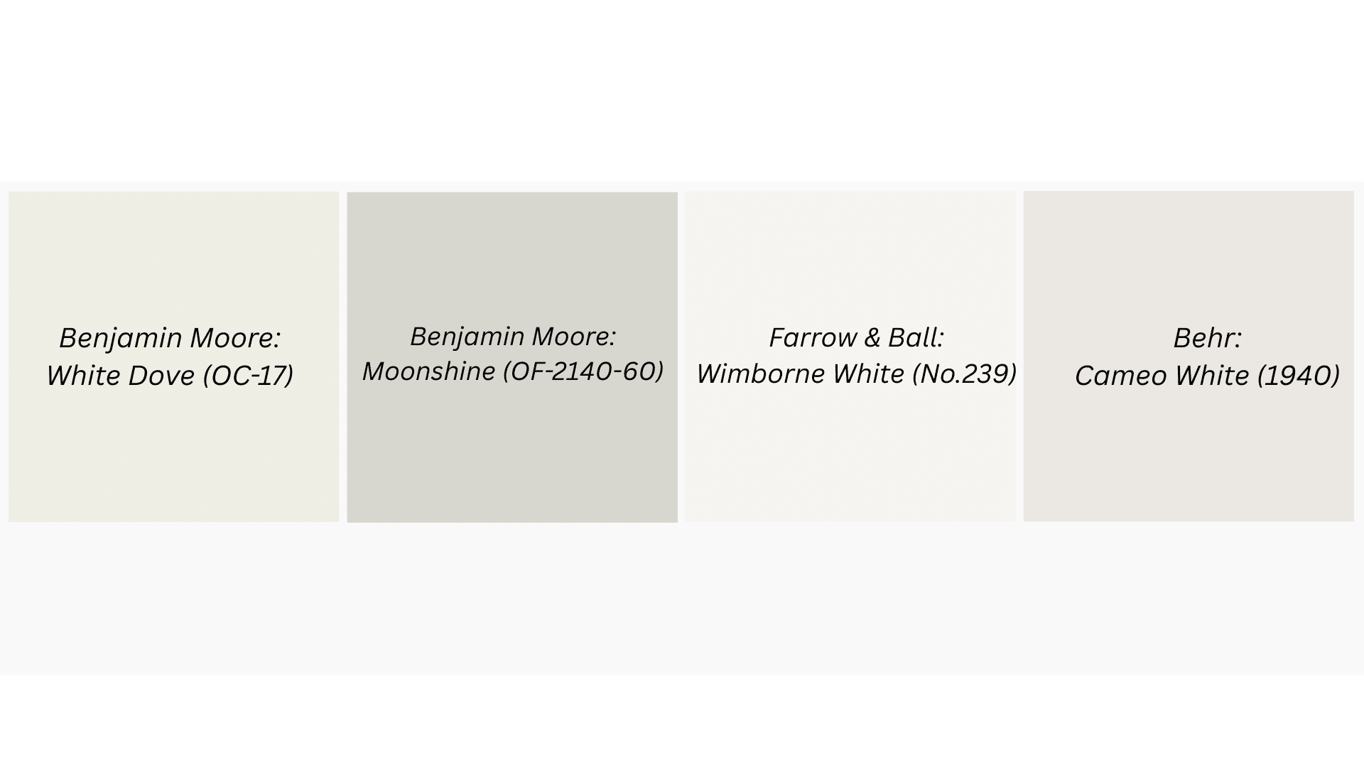
1. Benjamin Moore: White Dove (OC-17)
This isn’t your stark contractor white. White Dove has subtle warm undertones that prevent that cold, sterile feeling while still giving you that clean, timeless look.
You can check out my blog on White Dove Benjamin Moore to understand this classic yet underrated color better.
2. Benjamin Moore: Moonshine (OF-2140-60)
A soft, creamy white with just enough warmth to feel welcoming. It works beautifully in spaces where you want brightness without the harshness of pure white.
3. Farrow & Ball: Wimborne White (No.239)
This cream has gray undertones that shift throughout the day. It’s perfect for creating that effortless, lived-in elegance that feels both modern and classic.
A versatile off-white that bridges the gap between warm and cool. It’s forgiving with different lighting conditions and plays well with both modern and traditional furnishings.
Palette 2: Moody Blues
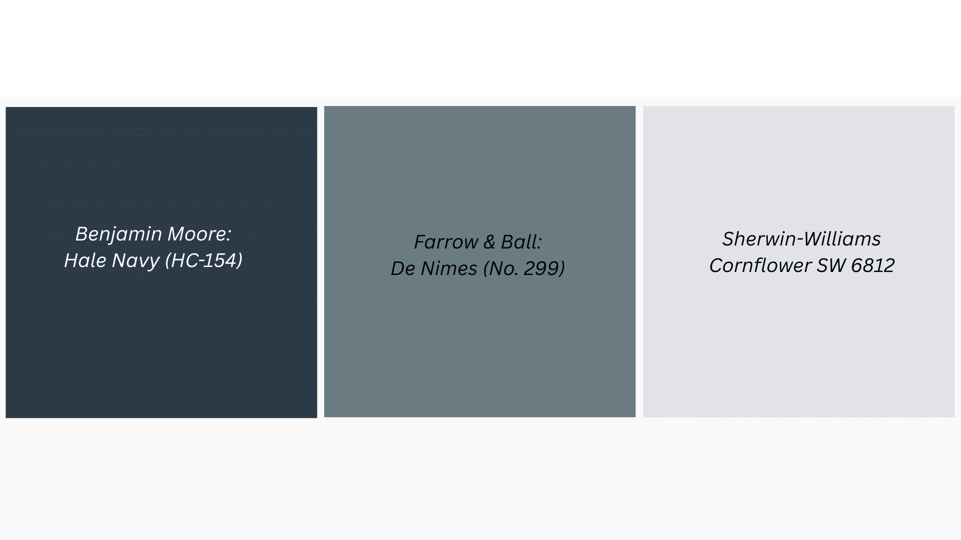
5. Benjamin Moore Hale Navy (HC-154)
A true navy that feels both nautical and urban. It’s the kind of color that makes white trim pop and creates a cocoon-like feeling in bedrooms.
6. Farrow & Ball: De Nimes (No. 299)
Think eternal denim vibes. This blue-gray has incredible depth and works beautifully in both traditional and contemporary spaces, especially with natural wood accents.
7. Sherwin-Williams Cornflower SW 6812
A lighter, more approachable blue that still has personality. It’s cheerful without being childish and creates a sense of calm that’s perfect for bedrooms or bathrooms.
Palette 3: Chocolate & Cream
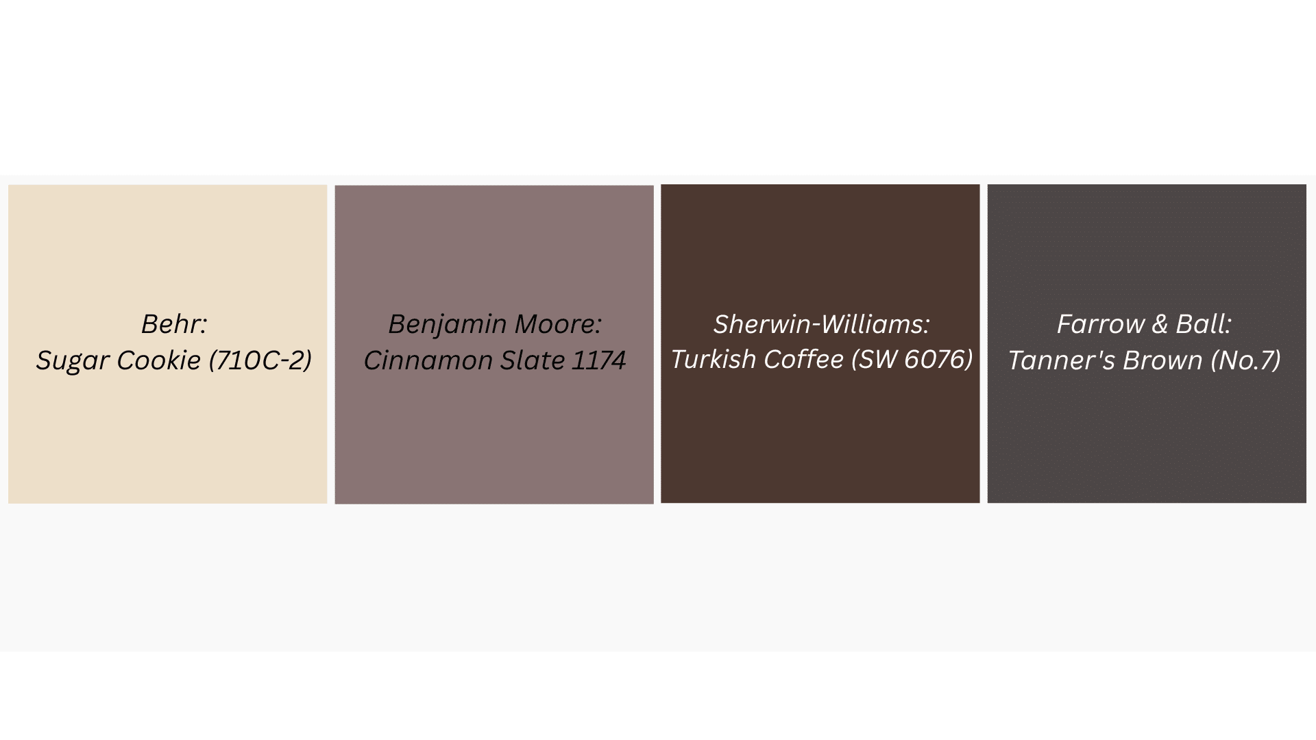
8. Sherwin-Williams Turkish Coffee (SW 6076)
Rich and enveloping, this deep brown creates instant warmth and classic. It’s perfect for creating cozy reading nooks or dramatic dining rooms that feel intimate.
9. Farrow & Ball: Tanner’s Brown (No.255)
A complex brown with red undertones that feels both earthy and refined. It pairs beautifully with cream and brass accents for a warm, luxurious feeling.
10. Behr: Sugar Cookie (710C-2)
This creamy, warm white has just enough beige to feel cozy without looking dated. It’s the perfect backdrop for layering textures and warm wood tones.
11. Benjamin Moore Cinnamon Slate (2113-40)
A brown that bridges warm and cool tones. It’s grounding without being heavy and creates a perfect backdrop for both modern and traditional furnishings.
Palette 4: Sage & Stone
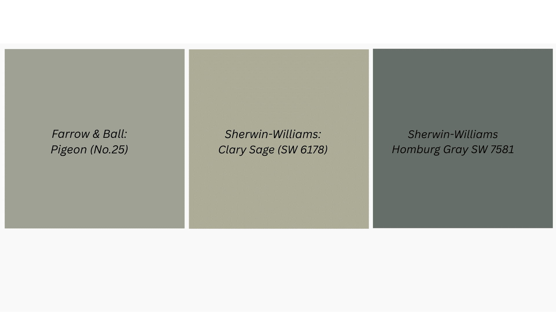
12. Farrow & Ball: Pigeon (No.25)
This complex gray-blue has surprising warmth and changes beautifully with different lighting. It’s moody but not heavy, creating spaces that feel both calm and sophisticated.
13. Sherwin-Williams: Clary Sage (SW 6178)
A muted green-gray that brings nature indoors without feeling too earthy. It’s incredibly soothing and works well with both warm wood tones and crisp whites.
14. Sherwin-Williams Homburg Gray SW 7622
A soft, mushroom-toned gray that’s anything but boring. It has enough warmth to feel cozy but stays neutral enough to work with bold accent colors.
Palette 5: Bold & Beautiful Palette
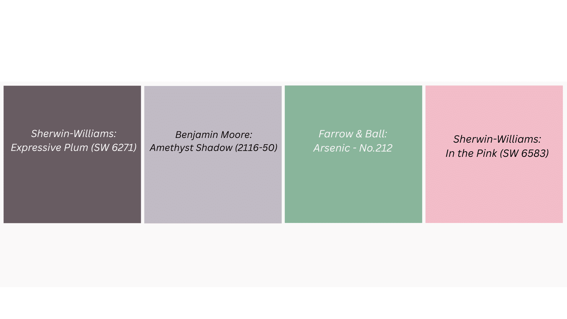
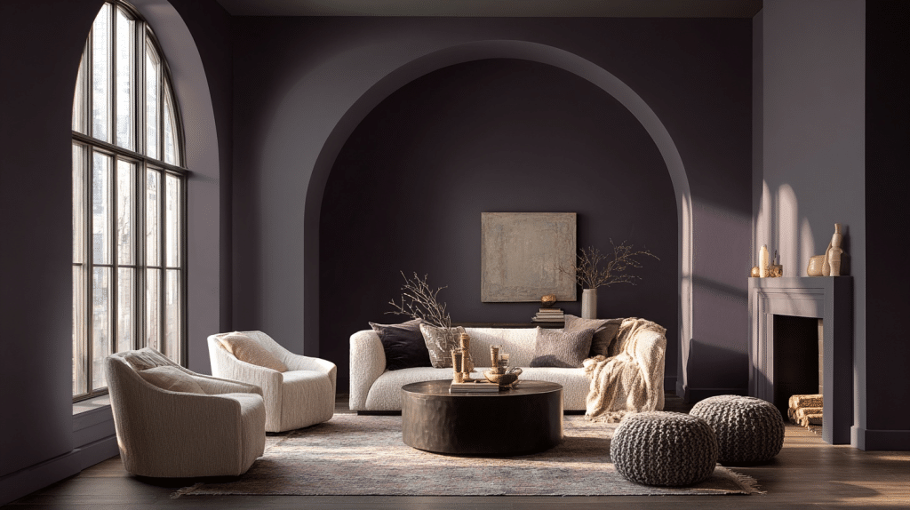
15. Sherwin-Williams: Expressive Plum (SW 6271)
This deep purple is dramatic but not overwhelming. It creates spaces that feel luxurious and cocoon-like, perfect for powder rooms or accent walls that make a statement.
16. Farrow & Ball: Arsenic – No.214
A green that’s both moody and fresh. It has incredible depth and creates spaces that feel both dramatic and calming, especially beautiful in dining rooms.
17. Benjamin Moore: Amethyst Shadow (1441)
A complex purple-gray that shifts between moody and serene depending on the light. It’s bold enough for impact but classic enough for everyday living.
18. Sherwin-Williams: In the Pink (SW 6583)
A dusty rose that’s anything but sweet. It’s earthy and eternal, creates warm, welcoming spaces that feel both modern and timeless without being overly feminine.
P.S. If you’re planning to sell your home, you can check out my blog on Top Paint Colors That Boost Home Value, which will help you gain maximum profit.
Things to Keep in Mind While Selecting Interior Paint Color
When it comes to choosing paint colors, there’s a lot more to consider than just what looks pretty on the color swatch. I’ve learned this the hard way, and I bet you have too.
- Test colors in different lighting conditions throughout the day before committing
- Consider your existing furniture and flooring; they’re not going anywhere anytime soon
- Start with one accent wall if you’re nervous about bold colors
- Remember that dark colors make rooms feel smaller, but also cozier
- Factor in the room’s natural light, north-facing rooms need warmer tones
- Think about the flow between connected spaces, so the colors complement each other
- Don’t forget about the ceiling – it’s the fifth wall and affects the whole room’s feel
The Bottom Line
Look, I know this whole paint selection process can feel overwhelming. Trust me, I’ve stood in the paint aisle, paralyzed by endless swatches more times than I care to admit.
These 2025 trends aren’t just about what’s fashionable; they’re about creating homes that actually feel good to live in. Start small, test thoroughly, and remember that paint is one of the most affordable ways to completely transform a space.
Now go grab those paint samples and start experimenting. Your walls are waiting


