Have you ever wondered why some rooms feel cozy while others feel fresh?
The answer lies in color temperature. I used to think all blues were calming and all reds were exciting. But I was wrong. Some blues can actually feel warm, and some reds can feel cool.
It’s confusing, right?
Here’s what changed everything for me: understanding warm vs cool colors isn’t about the color itself. It’s about the undertones.
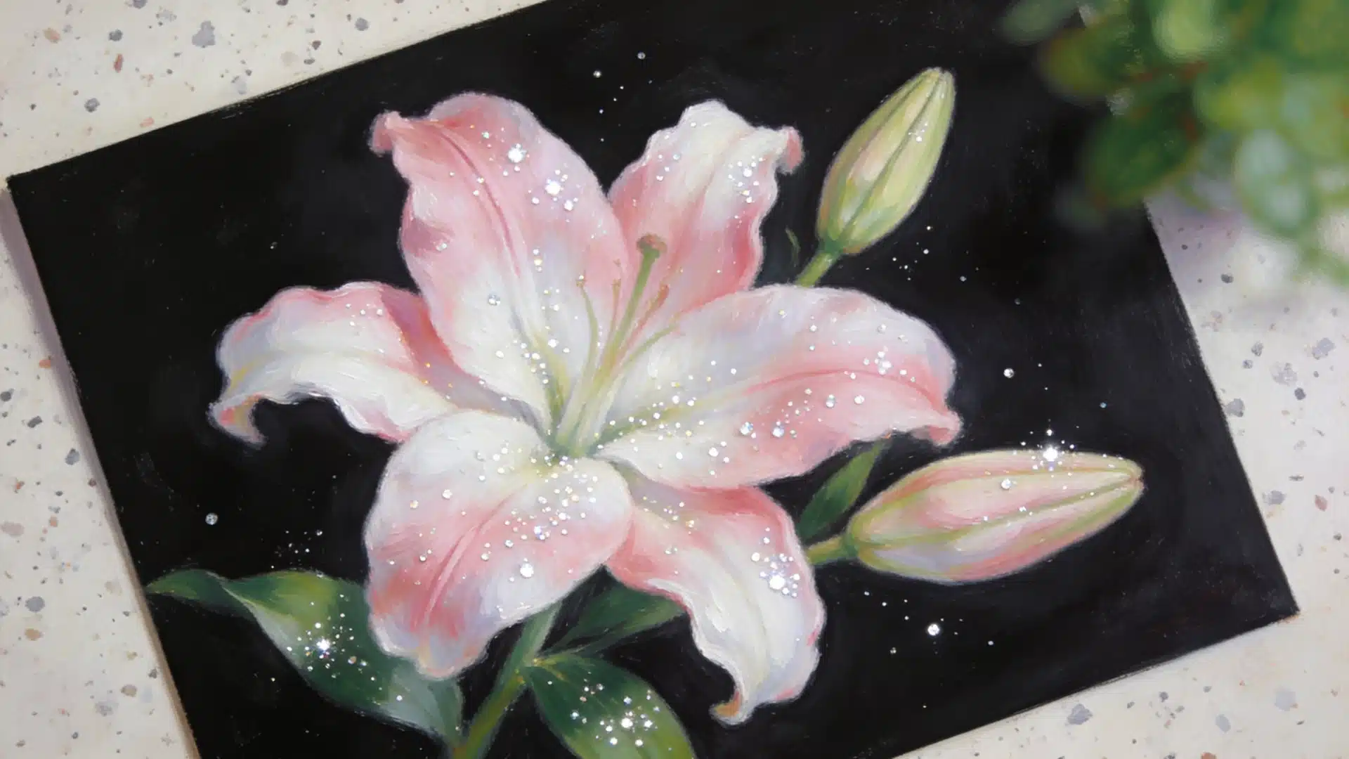
A red with orange undertones reads warm. But a red with blue undertones? That’s cool. This simple shift in thinking completely changed how I pick paint colors, choose clothes, and even arrange flowers.
Once you understand this concept, you’ll never look at colors the same way again.
Let’s Understand Color Theory First
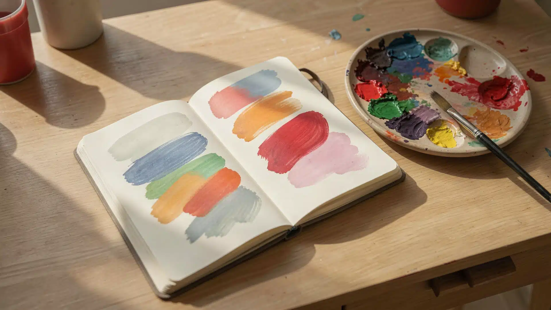
Color theory is the study of how colors work together and affect what we see and feel. It explains how colors mix, match, and contrast to create harmony or tension.
In design and art, color theory helps us choose the right balance of warm and cool tones.
By understanding the color wheel, complementary colors, and undertones, anyone can create spaces or visuals that look balanced, feel inviting, and express the right mood.
What are Warm Colors?
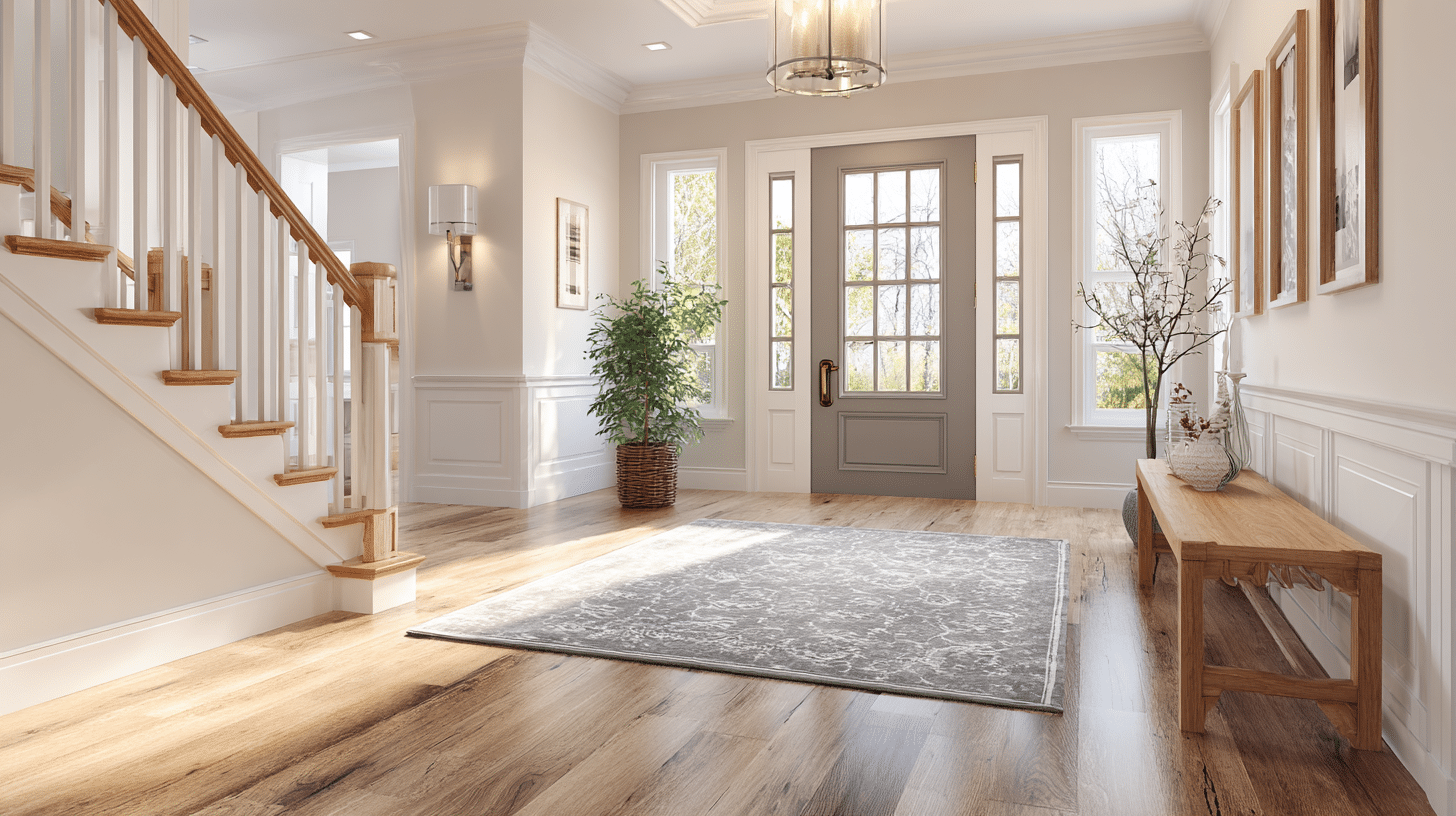
Warm colors are the ones that remind you of heat and sunlight. These colors make spaces feel cozy and inviting.
When I walk into a room with warm colors, I immediately feel more energetic. That’s because warm colors actually trick our brains into feeling physical warmth.
They can even make a room feel 2-3 degrees warmer than it really is.
The main warm colors include:
- Red
- Orange
- Yellow
- Red-orange and yellow-orange variations
- Browns with red or orange undertones
- Warm pinks and corals
I’ve noticed that restaurants often use warm colors because they stimulate appetite and conversation. These shades make us feel more social and energized.
On a color wheel, you’ll find warm colors grouped together on one side.
They sit between red and yellow-green, forming a natural family of heat-inspired shades.
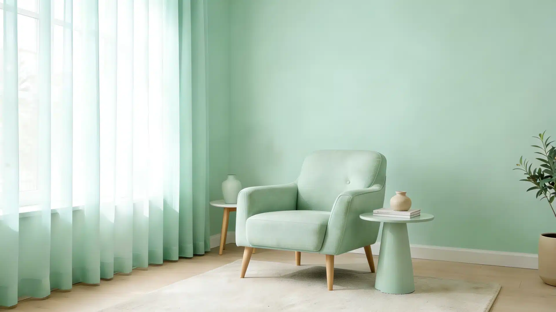
What are Cool Colors?
Cool colors are the opposite. They remind me of water, sky, and shade on a hot day.
These colors create a sense of calm and spaciousness in any room.
The main cool colors are:
- Blue
- Green
- Violet and purple shades
- Gray with blue or green undertones
- Cool pinks with blue undertones
- Turquoise and teal variations
There’s actual science behind why we call these colors “cool.” Blue and violet have shorter wavelengths than warm colors.
Our eyes process these wavelengths differently, and our brain associates them with coolness and distance.
I love using cool colors in bedrooms and bathrooms. They lower stress and help create a peaceful atmosphere. Studies show that cool colors can actually slow down your heart rate and blood pressure.
That’s why hospitals often use soft blues and greens.
Cool colors also make rooms appear larger. They seem to recede from our eyes, creating an illusion of more space. This makes them perfect for small rooms or areas where you want a calm, open feeling.
A Brief Comparison
The difference between warm and cool colors goes beyond just appearance.
Warm colors physically stimulate us, while cool colors have a calming effect. This is why color choice matters so much in our daily surroundings.
| Aspect | Warm Colors | Cool Colors |
|---|---|---|
| Emotions | Energy, excitement, passion, comfort | Calm, peace, relaxation, focus |
| Common Associations | Fire, sun, autumn, desert, spices | Water, sky, winter, ice, shadows |
| Typical Use in Design/Art | • Restaurants and kitchens • Call-to-action buttons • Foreground elements • Social spaces |
• Bedrooms and bathrooms • Professional websites • Background elements • Medical facilities |
| Space Perception | Makes rooms feel smaller and cozier | Makes rooms appear larger and airier |
| Best Complementary Colors | Pairs well with cool blues and greens | Pairs well with warm oranges and reds |
| Physical Effects | Increases appetite and heart rate | Lowers blood pressure and stress |
| Light Wavelength | Longer wavelengths | Shorter wavelengths |
Using Warm and Cool Colors in Interior Design
Choosing the Right Colors for Your Space
Earlier, I used to pick colors I liked without thinking about temperature. The result? Rooms that felt “off” somehow.
For wall colors, consider these guidelines:
- North-facing rooms get less sunlight – warm colors help balance the coolness
- South-facing rooms receive lots of light – cool colors prevent them from feeling too hot
- Small spaces benefit from cool colors to feel more open
- Large, empty spaces feel cozier with warm tones
Furniture selection tips:
- Warm wood tones (cherry, mahogany) add instant coziness
- Cool-toned furniture (gray, blue) creates a modern look
- Neutral furniture lets you play with accent colors
- Mix temperatures for visual interest
Creating Balance Between Warm and Cool
The secret to a well-designed room isn’t choosing one temperature. It’s knowing how to mix both.
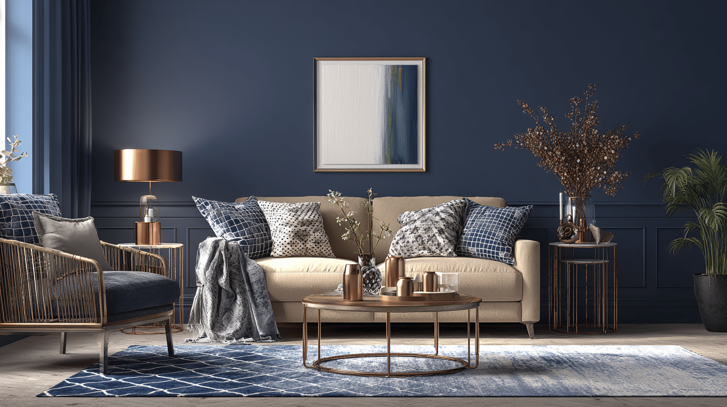
I follow the 80/20 rule. If 80% of my room is cool colors, I add 20% warm accents.
This prevents spaces from feeling too cold or too hot. For example, a mostly blue bedroom needs warm wood nightstands or gold picture frames.
Easy ways to balance temperatures:
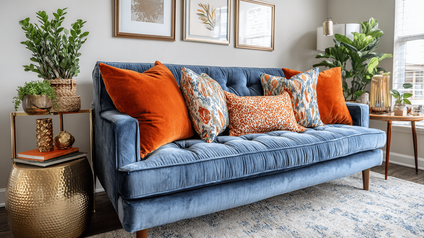
- Add warm throw pillows to a cool-toned sofa
- Place cool artwork on warm-colored walls
- Use metallic finishes (gold is warm, silver is cool)
- Bring in plants – green bridges warm and cool
Modern Design Trends with Mixed Palettes
Today’s designers aren’t afraid to mix temperatures. In fact, the best rooms often combine both.
One trend I’m seeing everywhere is pairing navy blue walls with beige or tan furniture. The cool blue creates sophistication while the warm beige adds comfort.
Another popular combination is sage green (cool) with terracotta accents (warm).
Current favorite combinations:
- Charcoal gray + mustard yellow
- Dusty blue + rust orange
- Forest green + blush pink
- Deep teal + copper accents
- Cool white walls + warm wood floors
Remember, rules are meant to be broken. If you love how two colors look together, use them.
Application in Art and Visual Design
Artists have used color temperature to control emotions for centuries.
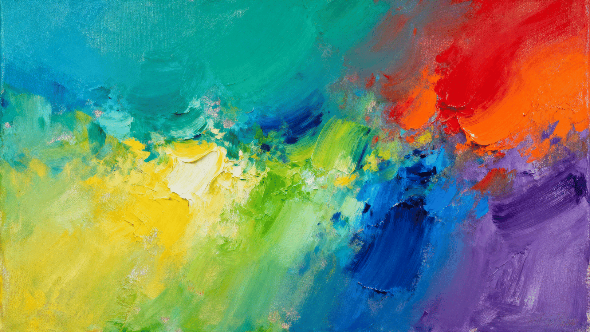
I’ve noticed that painters often place warm colors in foregrounds to grab attention. Cool colors push backgrounds away, creating depth and distance.
In graphic design, this principle drives every decision. Brands targeting energy and excitement use warm palettes.
Think about fast food logos – they’re mostly red and yellow. Meanwhile, banks and tech companies prefer cool blues to communicate trust and stability.
Digital designers use temperature strategically, too.
Call-to-action buttons are usually warm colors because they demand attention. Background elements stay cool to avoid overwhelming users.
Fashion designers play the same game. Warm colors make bold statements on runways. Cool tones create sophisticated, professional looks. The most successful designers know when to use each.
This push-and-pull between temperatures creates a visual hierarchy.
Warm colors jump forward while cool colors retreat.
Conclusion
Warm and cool colors do more than just decorate a space; they shape how we feel in it.
Once you understand how each color temperature works, you can design rooms, outfits, or art that truly fit your mood and style.
Mix them with confidence, use neutrals to connect both sides, and trust your eye.
The right balance between warmth and coolness can turn any space from ordinary to inviting, calm, and full of life.