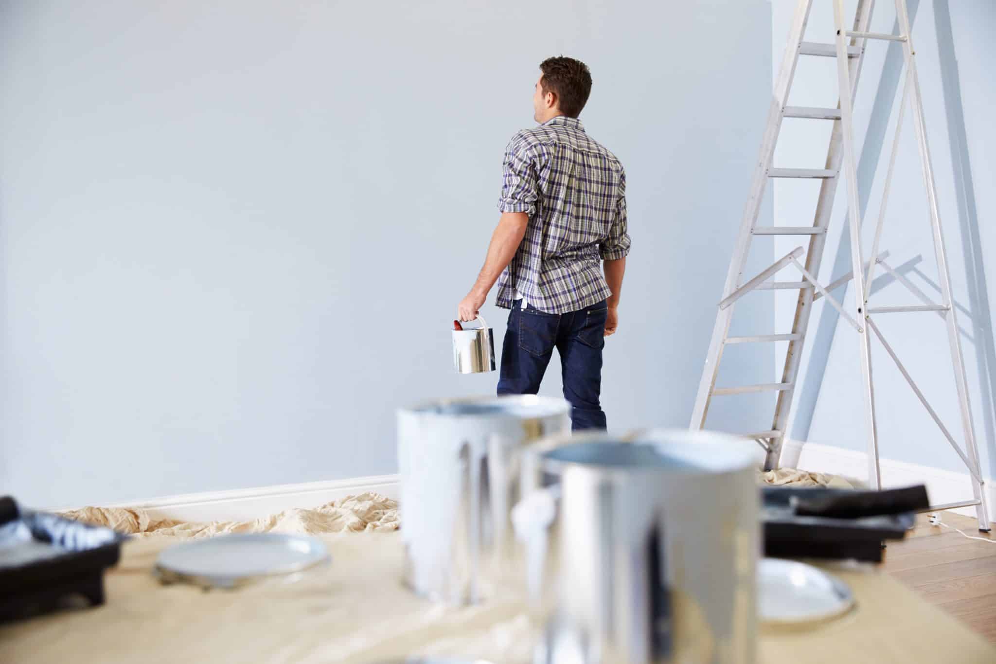
I get it, choosing the right paint color can feel like finding a needle in a haystack when you’re trying to create a space that looks put-together and stylish.
SW Alabaster is beautiful, and even prettier with pure white trim, but what colors work best with it? That’s the real question.
I’m going to show you the best SW Alabaster coordinating colors that bring out its rich feel and adaptability.
These combinations work in any room, and they’re easier to pull off than you might think.
In this blog, you’ll find practical color pairings that add depth and character to your space. No guesswork needed; just proven combinations that look expensive without the stress.
Why SW Alabaster Deserves a Spot in Your Palette
SW Alabaster isn’t just another white paint. It’s one of those colors that works in almost any room without feeling cold or sterile.
I’ve seen it change spaces because of its soft, cozy undertone.
It’s not stark white, and that matters. It creates a cozy backdrop while keeping things bright and open.
What I love most? It plays well with other colors. You can pair it with bold accent walls or keep things neutral. Either way, it looks expensive.
It also shifts throughout the day. Morning light makes it feel crisp. Evening light brings out its comfort. That flexibility is hard to find in paint.
If you want a color that looks good now and five years from now, this is it. It’s reliable, eternal, and surprisingly adaptable.
Top SW Alabaster Coordinating Colors You’ll Love
Finding the right alabaster color combinations can make or break your design.
These colors work beautifully with SW Alabaster and bring out its best qualities. I’ve tested these pairings myself, and they deliver every time.
| Color Name | Color Type | Why It Works |
|---|---|---|
| SW Tricorn Black | Deep Neutral | Creates striking contrast and adds drama without feeling harsh |
| SW Accessible Beige | Warm Neutral | Complements the warmth in Alabaster and feels naturally cohesive |
| SW Naval | Bold Blue | Adds depth and sophistication while keeping things grounded |
| SW Repose Gray | Soft Gray | Offers subtle contrast that’s calm and refined |
| SW Evergreen Fog | Muted Green | Brings in nature-inspired tones that feel fresh and modern |
Room by Room Ideas
Seeing how sw alabaster coordinating colors work in real spaces makes all the difference. Theory is one thing, but actual rooms show you what’s possible.
Let me walk you through specific ideas that you can copy or adapt for your own home.
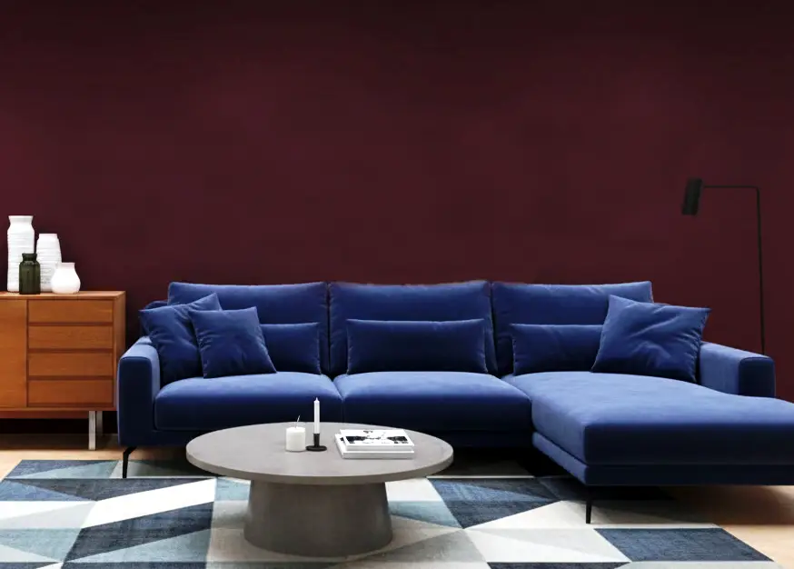
1. Living Room with Navy Accents
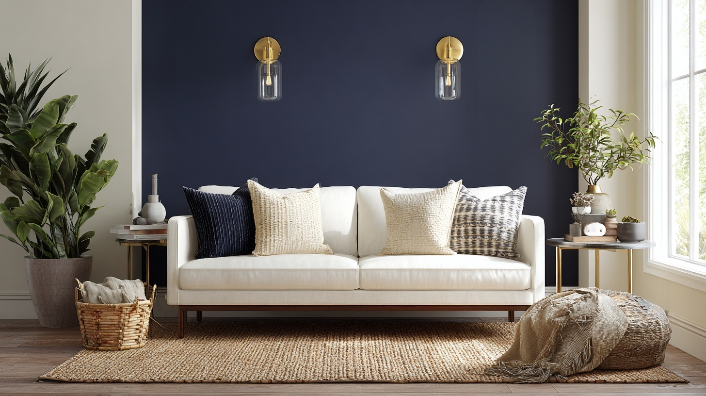
Paint your walls SW Alabaster and add a navy accent wall behind the sofa. I saw this at my sister’s house, and it looked incredible.
The contrast feels rich without being too bold. Add brass light fixtures and cream throw pillows to tie it together.
A jute rug anchors the seating area and adds natural texture, softening the overall look.
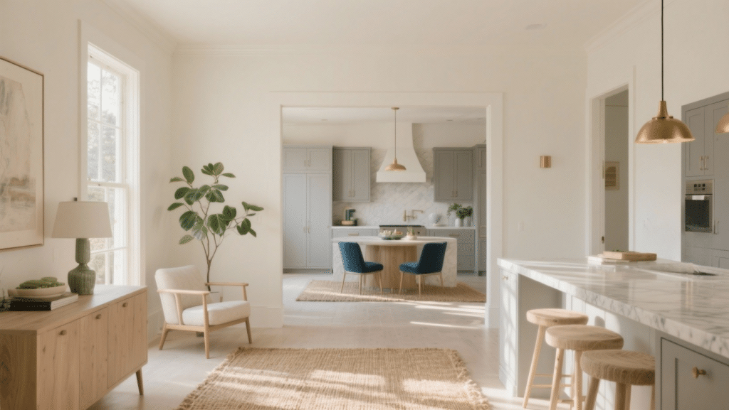
2. Kitchen with Accessible Beige Cabinets
Use Alabaster on the walls and SW Accessible Beige on lower cabinets. The comfort flows naturally between the two. White marble countertops and oil-rubbed bronze hardware complete the look.
It feels classic but not boring.
Keep the upper cabinets white, or opt for open shelving to maintain the light, airy feeling. This combination works in both small and large kitchens.
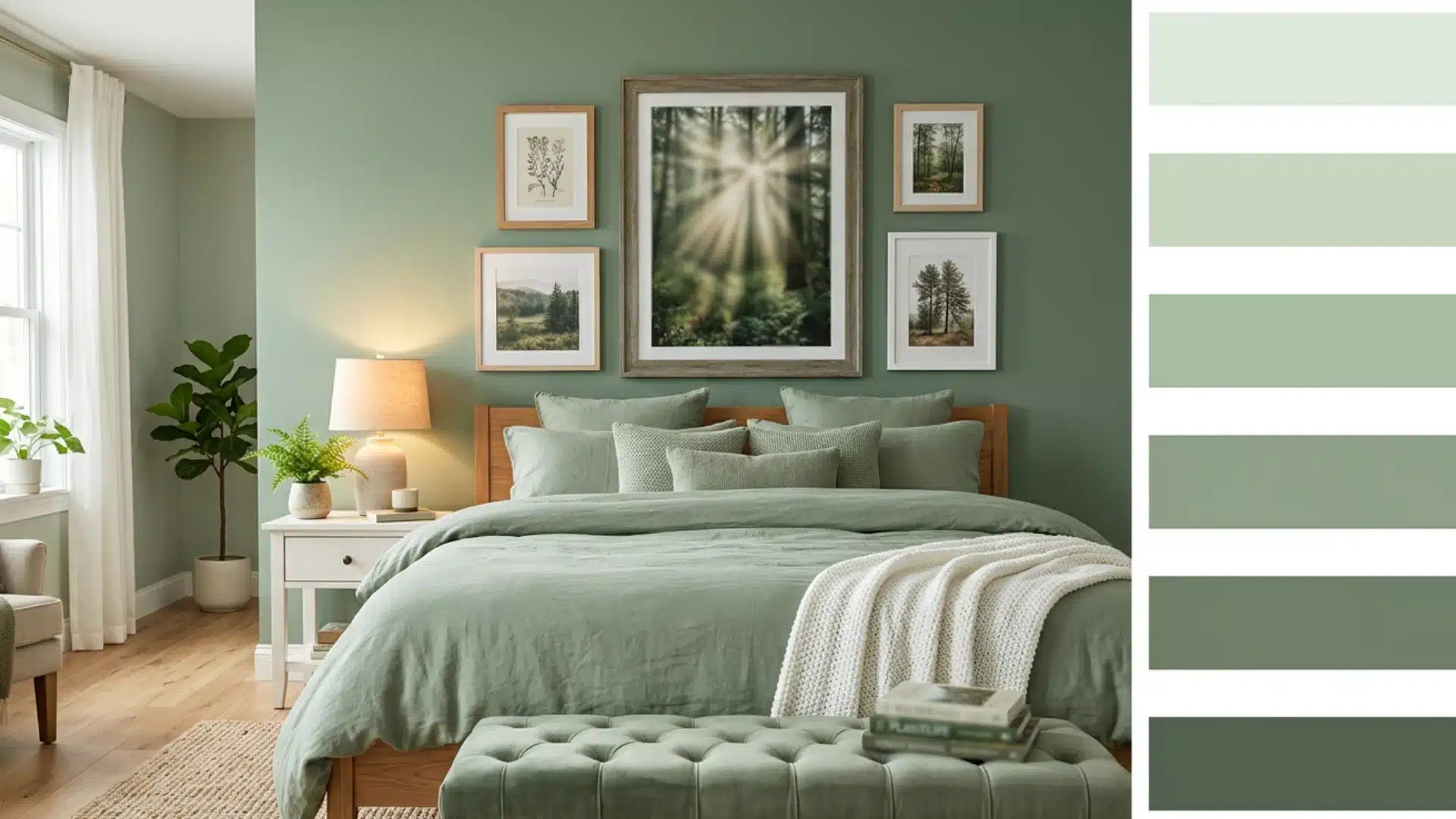
3. Bedroom with Repose Gray Accent Wall
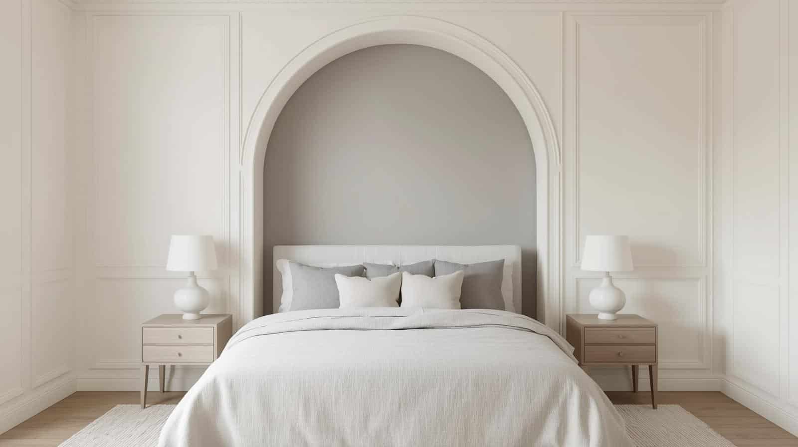
Keep three walls in Alabaster and paint one wall SW Repose Gray behind the bed. This creates a soft focal point without overwhelming the space.
Layer in linen bedding and light wood furniture for a calm retreat. Add white bedside lamps and a cozy throw blanket.
The gray adds just enough contrast to make the room feel designed and intentional.
4. Bathroom with Tricorn Black Fixtures
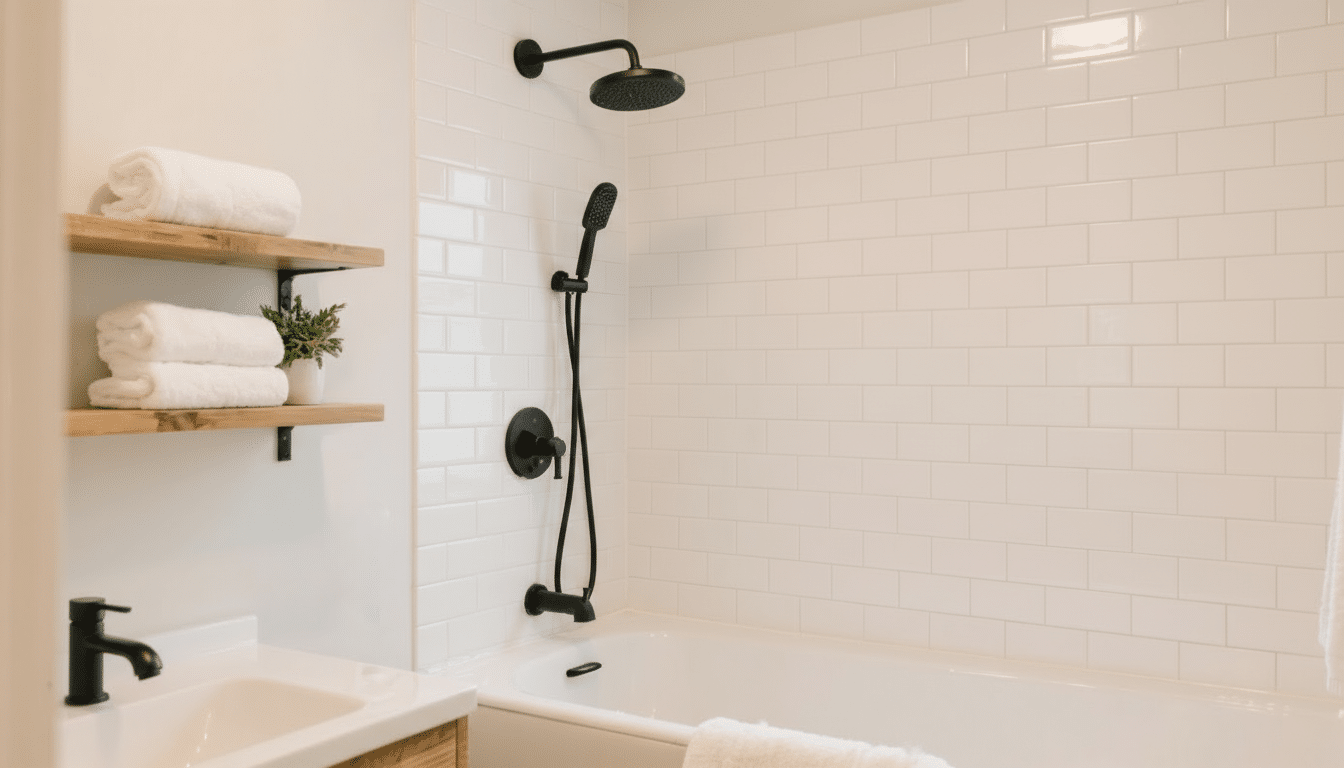
Alabaster walls paired with black faucets and shower fixtures look expensive.
Add white subway tiles and natural wood shelving. The black grounds the space and makes everything feel intentional.
I’ve noticed this combination photographs beautifully, too. Hang white towels and add a small plant for a spa-like touch that’s easy to maintain.
5. Home Office with Evergreen Fog Bookshelves
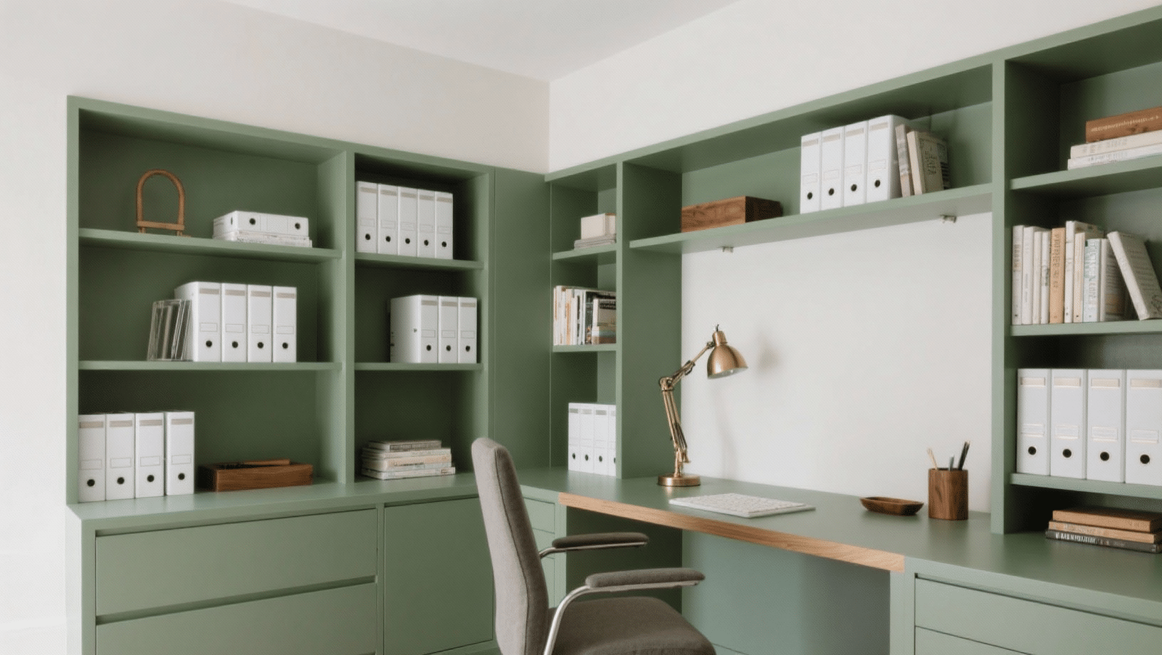
Paint built-in shelves SW Evergreen Fog and keep walls in Alabaster.
I tried this in my workspace, and it adds personality without distraction. Style the shelves with white binders and warm wood desk accessories.
The green is subtle enough to work all day without feeling tired of it. Add a brass or black desk lamp to complete the professional look.
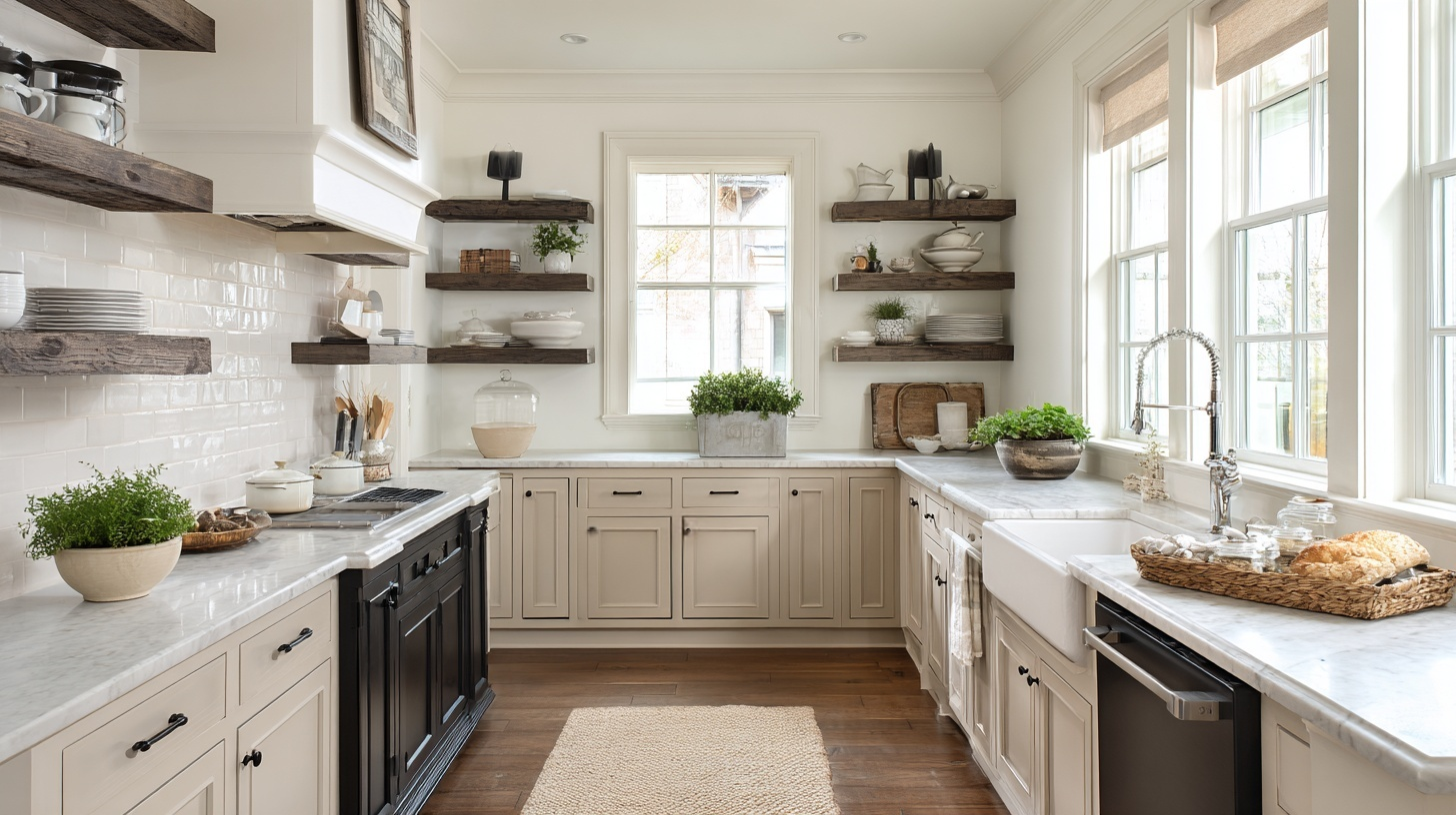
6. Dining Room with Warm Stone Wainscoting
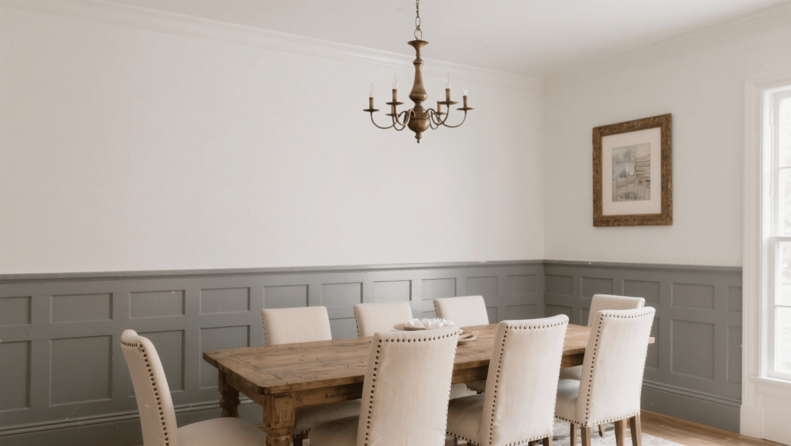
Install wainscoting painted in SW Warm Stone below Alabaster walls. This two-tone approach adds dimension and feels formal in a good way.
Bronze chandelier and upholstered dining chairs in cream complete the room. The separation creates visual interest and makes standard ceiling heights feel taller.
It’s a trick designers use that actually works in real homes, too.
7. Nursery with Soft Pink Accents
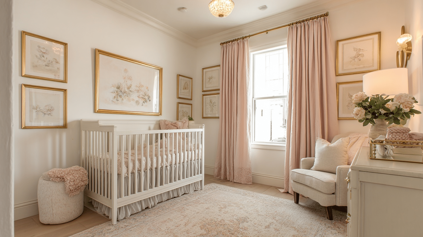
Keep walls Alabaster and bring in blush pink through bedding and curtains. Add a SW Ballet White ceiling for extra softness.
Gold picture frames and a cream area rug keep things light and sweet. This approach grows with your child better than painting walls pink.
You can swap out accessories later without repainting the entire room, which saves time and money.
8. Mudroom with Iron Ore Lockers
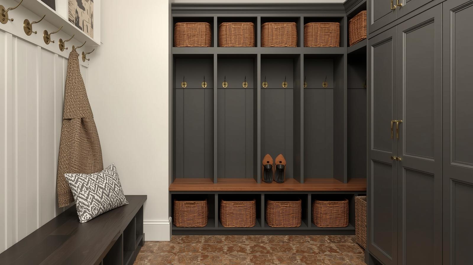
Paint storage lockers SW Iron Ore against Alabaster walls. The dark lockers hide dirt and look sharp.
Add brass hooks and a patterned tile floor for a function that doesn’t sacrifice style.
The contrast makes the space feel organized and purposeful. Baskets in natural materials soften the look while keeping shoes and bags out of sight.
9. Master Bath with Sea Salt Vanity
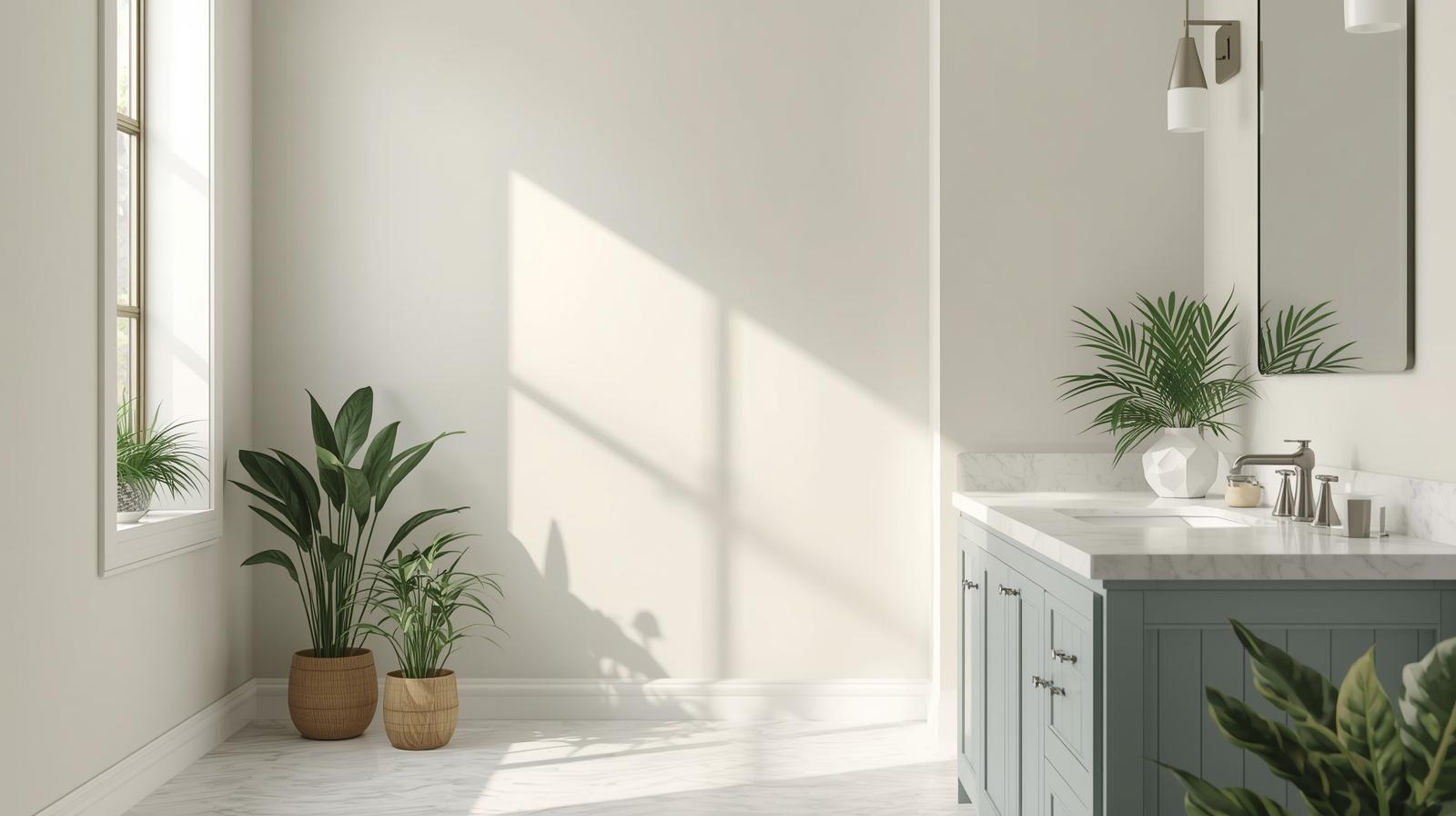
An SW Sea Salt vanity against Alabaster walls brings a spa-like feel. Pair it with white quartz countertops and brushed-nickel hardware. Plants and white towels keep the space fresh and clean.
The soft blue-green makes morning routines feel more relaxing.
Add a framed mirror and simple wall sconces for lighting that flatter without harsh shadows.
Know This Before Choosing a Coordinating Color
Getting your color pairings right takes more than just picking colors you like.
These tips help you avoid common mistakes and make professional choices. I use these guidelines every time I plan a room.
- Test in Different Lighting – Paint large swatches on multiple walls and watch them at different times of day. Morning light and evening light change how Alabaster looks with other colors.
- Use the 60-30-10 Rule – Make Alabaster your dominant color at 60%, your coordinating color 30%, and accent colors 10%. This keeps things balanced and not chaotic.
- Consider Undertones – Alabaster has warm undertones, so pair it with colors that complement warmth rather than fight it. Cool grays can look off if you’re not careful.
- Layer Textures – Mix materials like wood, metal, and fabric in your coordinating colors. This adds depth that flat color alone can’t achieve.
- Start Small in Bold Rooms – If you’re using dark coordinating colors like navy or black, test them on one wall first. You can always add more, but removing is harder.
Final Thoughts
You’ve got everything you need to make sw alabaster coordinating colors work in your home.
The pairings I’ve shared aren’t trendy; they’re tested combinations that look good year after year.
Start with one room. Pick a coordinating color from the list and try it out. You’ll see how quickly a space changes when colors work together instead of against each other.
Drop a comment below and let me know which color combination caught your eye. I’d love to hear how it turns out for you.