
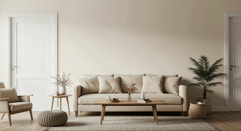
Every swatch in the paint aisle starts to look the same after ten minutes to me.
Everyone, even me, wants clean and fresh, still not cold wall colors for our spaces, and most of the “greige” cards on the wall don’t actually get you there.
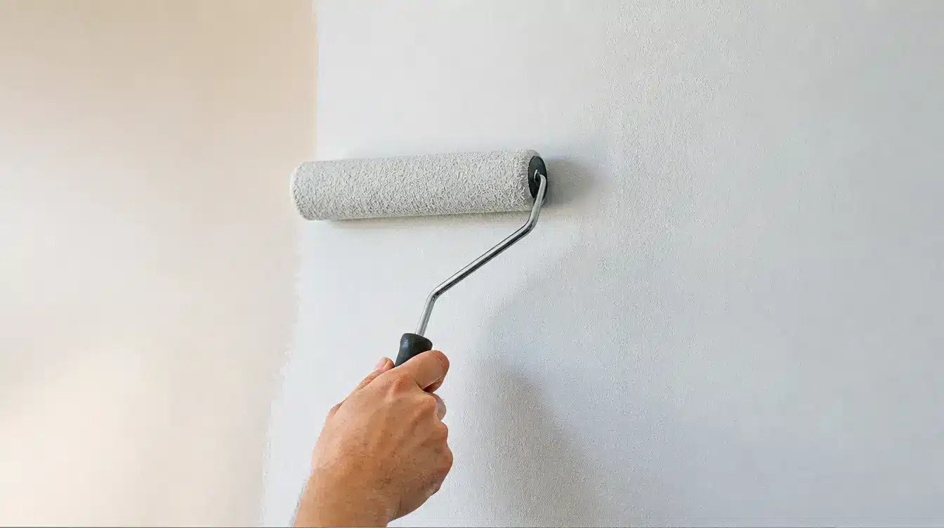
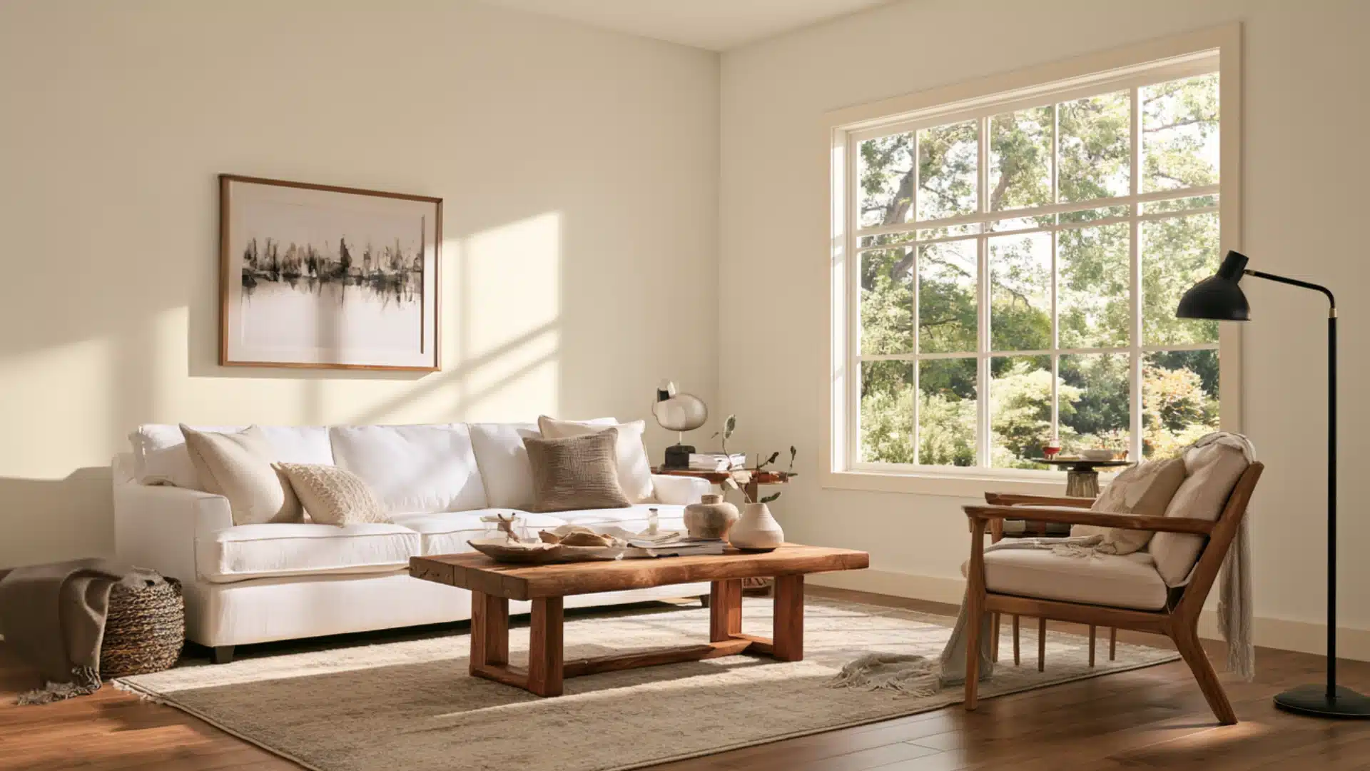
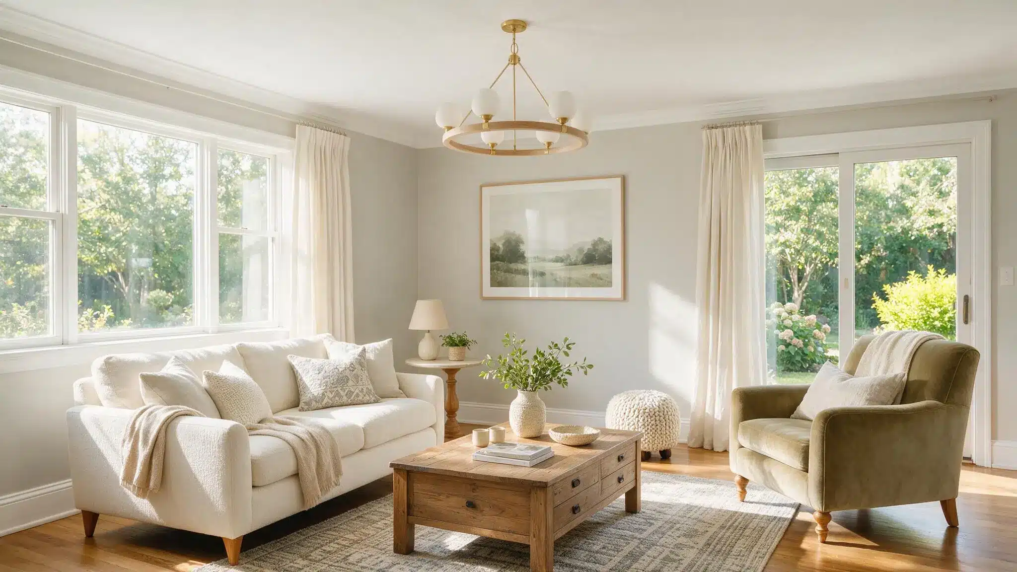
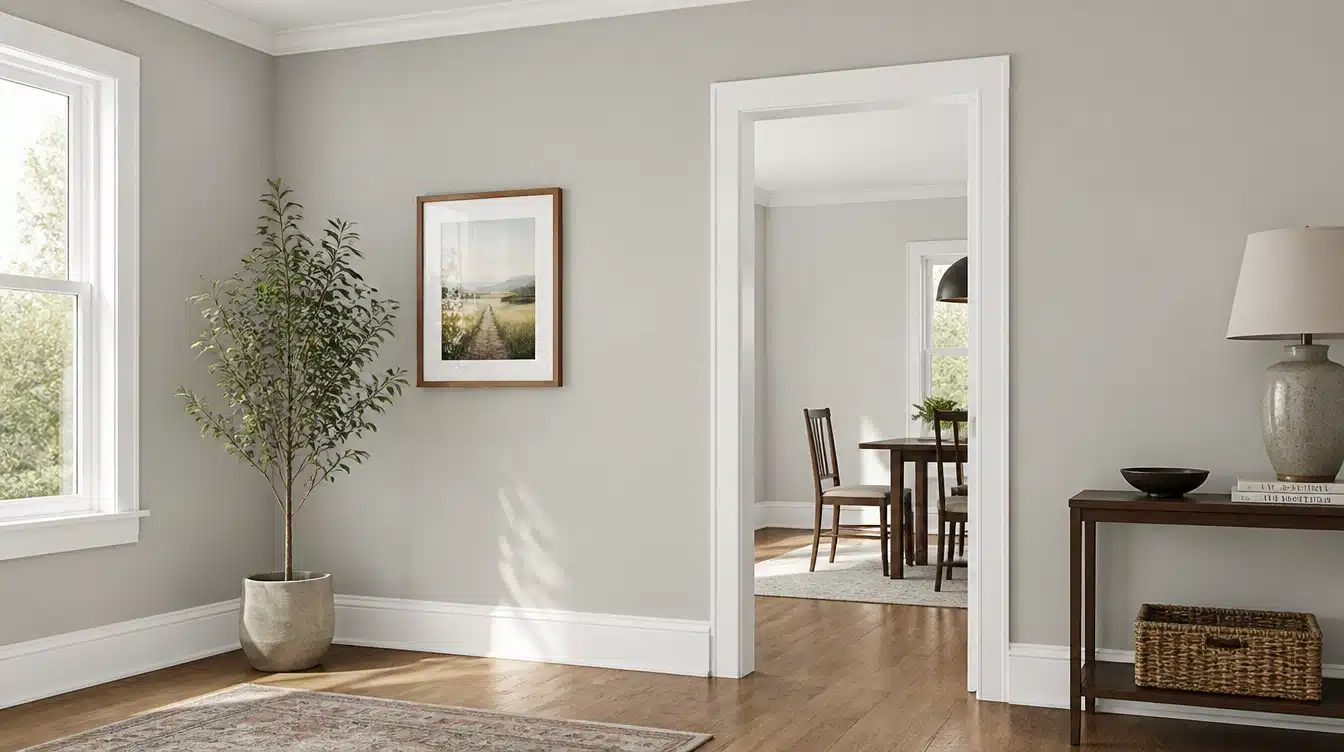
Sherwin-Williams Alabaster on the walls with Pure White on the trim is one combination that almost looks the same once it’s actually dry on a wall, and not just on a swatch.
Alabaster is a warm, creamy off-white with an LRV of 82.
And Pure White sits just above it at LRV 84 and looks cooler and cleaner by comparison.
The gap between them is small enough that the two don’t look alike, and large enough that the trim still looks like trim.
Keep reading to know everything.
Sherwin-Williams Alabaster (SW 7008) Color Description
Sherwin-Williams Alabaster sits right between white and cream. It’s not pure white, but it’s not yellow either. This color has just enough warmth to feel cozy without looking dated.
I’ve seen this color work in both modern and traditional homes.
And it works on both because it has these subtle undertones that shift slightly depending on your lighting.
In north-facing rooms, it feels cooler and crisper. In rooms with lots of natural light, you’ll notice its gentle warmth.
What makes Alabaster special is how it pairs with other colors. It’s neutral enough to work with bold accent colors, yet warm enough to feel inviting on its own.
| Property | Value |
|---|---|
| Color Family | Off-White/Neutral |
| LRV (Light Reflectance Value) | 82 |
| Hex Code | #EDEAE0 |
| RGB Values | R: 237, G: 234, B: 224 |
Sherwin-Williams Alabaster Undertones
Okay so Alabaster has a warm, creamy base with enough neutrality to keep it from appearing strongly yellow. It may look softer in warm sunlight and slightly muted in northern light.
The main undertones you’ll notice are:
- Greige undertones – A mix of gray and beige that keeps it from looking too warm
- Slight yellow hints – Very faint, but they add warmth without making it creamy
- Cool gray notes – These show up more in north-facing rooms or on cloudy days
- Neutral beige base – The foundation that makes it feel cozy and inviting
Sherwin-Williams Pure White (SW 7005) Color Description
Pure White SW 7005 stands as one of Sherwin-Williams’ most popular trim colors – keep reading and it will make more sense.
Sherwin Williams describes Pure White SW 7005 as a bright white with the slightest yellow undertone, which prevents it from looking too stark.
Unlike some whites that can appear dingy or off-color in certain lighting, Pure White maintains its clarity throughout the day.
The color works beautifully as trim, ceiling paint, or even on cabinets. It provides enough contrast against alabaster walls to define architectural features while maintaining a light and airy overall feel.
| Color Property | Value |
|---|---|
| Color Family | White |
| LRV (Light Reflectance Value) | 84 |
| Hex Code | #EDECE6 |
| RGB Values | R:237, G:236, B:230 |
Sherwin-Williams Pure White Undertones
Pure White lives up to its name better than most whites on the market. It doesn’t lean toward yellow, blue, or gray like many other white paints do.
However, no paint is completely neutral. Pure White has very subtle cool undertones that become more noticeable in certain lighting conditions.
Here’s what I’ve observed:
- Natural light: Appears crisp and clean with minimal color shift
- Artificial warm light: Shows slight blue undertones but stays mostly neutral
- Cool LED lighting: Maintains its true white appearance
- North-facing rooms: Can feel slightly cooler but not harsh
- Comparison to other whites: Less creamy than Alabaster, more neutral than Dover White
Why Two Whites This Close in LRV Don’t Wash Each Other Out
Fair question. Even I asked this first.
So we know that these both colors sit in the low-80s to mid-80s LRV range, close enough that side by side they can look almost identical.
Now what separates them on the wall is chroma, not just lightness.
Alabaster carries more pigment saturation from its warm undertone; Pure White carries less.
A chroma gap of roughly .2 or more is generally what keeps two near-white colors from reading as a mismatched paint job instead of an intentional pairing, and Alabaster and Pure White clear that gap.
That’s the actual reason behind why the combination works.
Rooms with Alabaster Walls with Pure White Trim
Nothing beats seeing real results in actual homes.
I’ve helped friends and family try this color combination in different rooms, and the before-and-after changes always impress me.
North-facing rooms strengthen cooler qualities, while south-facing rooms bring out warmer undertones. Existing flooring, furniture and bulbs also affect how both whites appear.
Let me share what happened when we used Alabaster walls with Pure White trim in four key spaces.
Bedroom
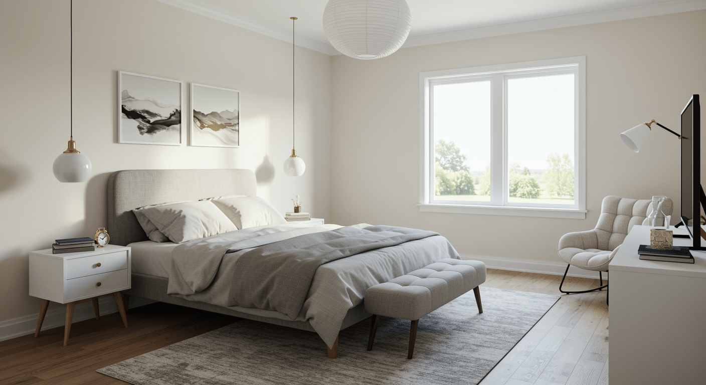
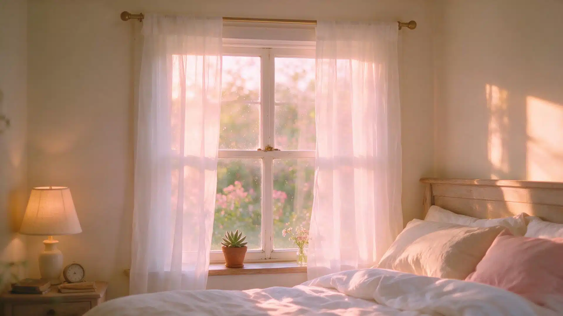
Last year, I helped my neighbor paint her master bedroom with this color combo, and the results were stunning.
In a bedroom, Alabaster can provide a softer wall color than a bright white. Pure White on the baseboards and window trim adds slight definition while keeping the room light.
The soft warmth of Alabaster makes the space feel cozy for sleeping while still looking fresh.
Kitchen
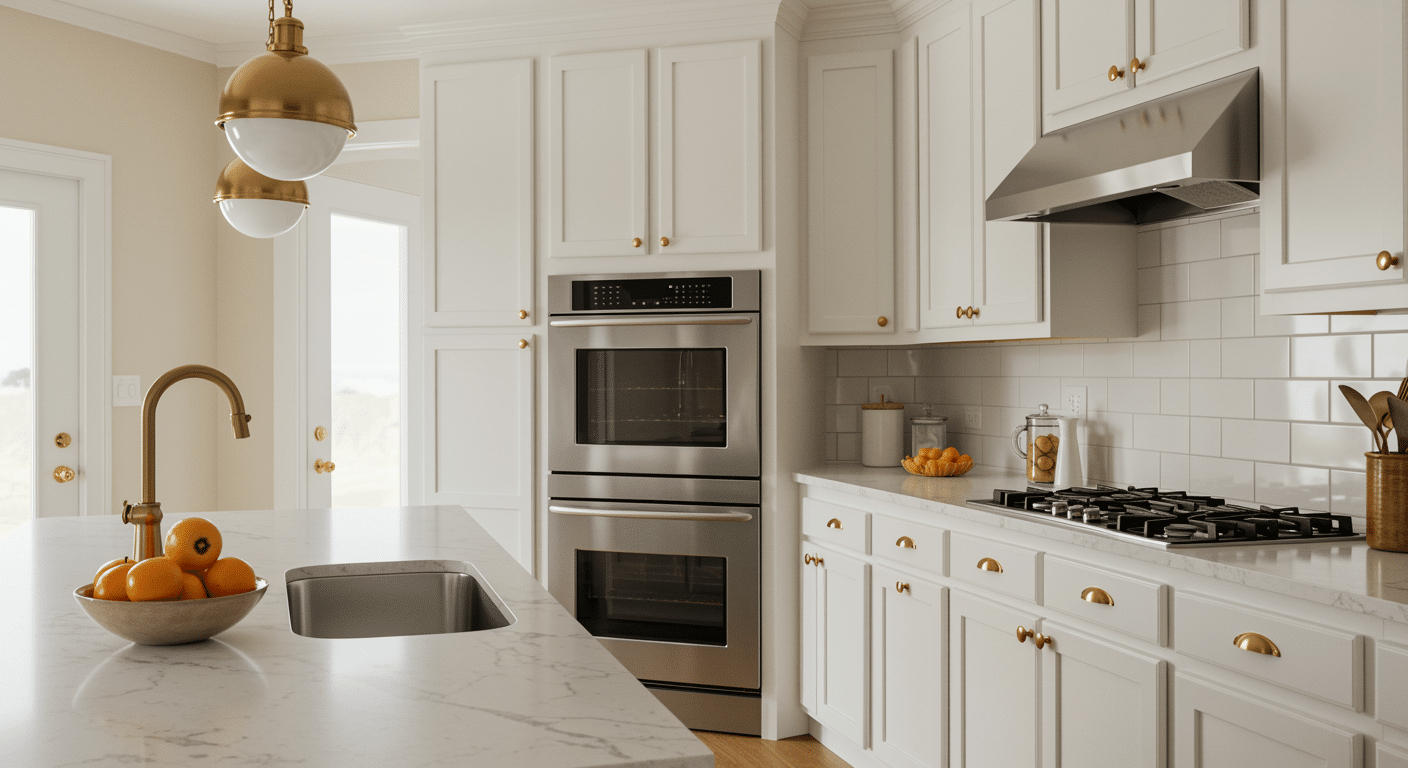
My sister’s kitchen was the tougher sell.
Small galley kitchens hide flaws in bad light, and hers had yellow walls from the previous owner that made everything look a decade older than it was.
Alabaster on the walls, Pure White on the cabinets, and it all looked so good.
She still complains about the layout. The color isn’t fixing tha but it’s not making it worse either.
Living Room
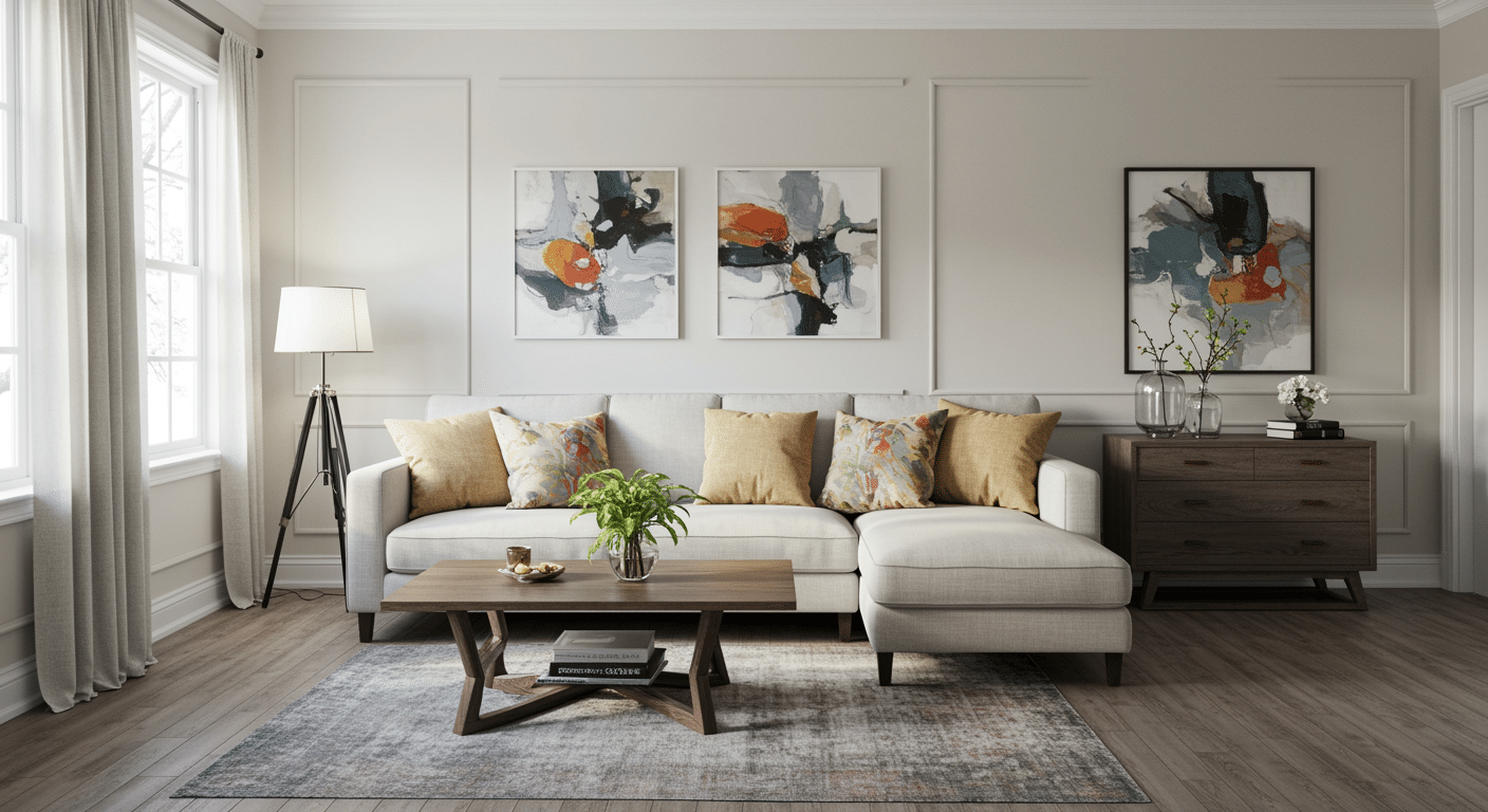
I did my own living room before I moved to a new place as well.
Mostly because I wasn’t sure Alabaster would hold up against the amount of color I have in throw pillows and art.
It did. If anything, the walls got quieter and the pillows got louder, which is the opposite of what usually happens when you paint a room.
Entryway
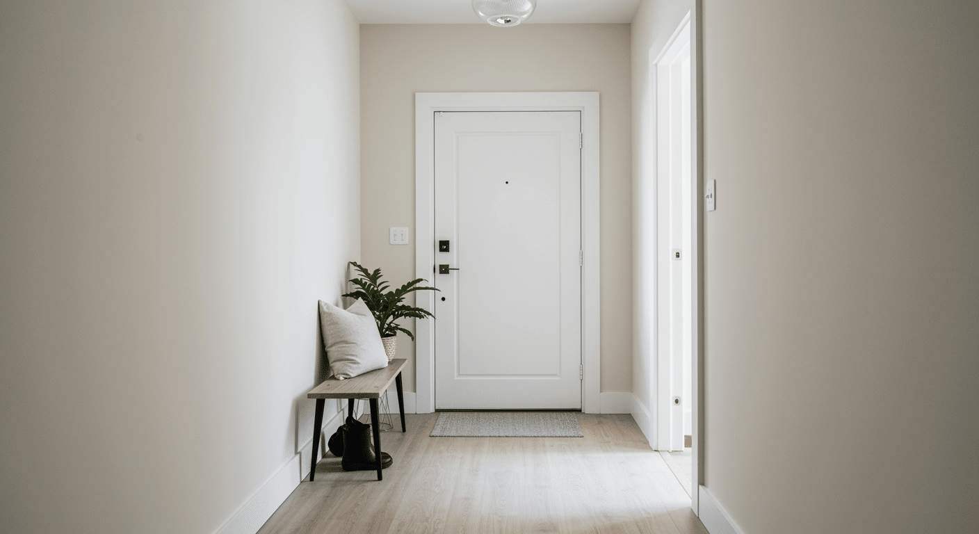
2024 fall, I painted my brother’s narrow entryway with Alabaster walls and Pure White trim, and it completely changed the feel of his home.
Before, the space felt dark and unwelcoming with its builder-grade beige paint. Now guests always compliment how bright and inviting his entrance looks.
The Pure White trim on his door frame and baseboards creates a crisp, finished look that makes the space feel more expensive.
Which Sheen to Use Where
Eggshell on the Alabaster walls. Semi-gloss on the Pure White trim and doors.
If you’re doing the ceiling too, keep it flat or matte.
That jump in sheen from wall to trim is what makes the baseboards and window casings stand out, instead of just looking like a slightly different white.
Satin on trim will get you some contrast, but not much.
And please skip high-gloss unless your trim is genuinely in good shape underneath, because gloss gets ruined quite quickly and you won’t be able to do anything about it. Every old nail hole, every ding from a vacuum cleaner, it’s all going to show.
Other White Trim Options if Pure White Isn’t Available
Pure White gets most of the attention, but it’s not the only trim color that works here. You can have more options as well.
SW Extra White runs cooler and a little assertive, and it actually makes Alabaster look creamier next to it, almost by contrast.
SW High Reflective White is the boldest suggestion here. Note that this color looks best in a room with real natural light behind it, or it can feel like too much white too fast.
And honestly, if your house already has a different white trim throughout and repainting every doorframe isn’t in the cards right now, just match Alabaster to what’s already there.
Chasing one specific pairing isn’t worth repainting a whole house of trim.
SW Alabaster Coordinating Colors
Finding the right colors to pair with Alabaster doesn’t have to feel overwhelming. I’ve tested dozens of combinations over the years aide from alabaster walls with pure white trim, and some work better than others.
The secret is understanding that Alabaster belongs to the yellow hue family with a 100-degree hue angle, which gives it subtle warmth.
This means that colors sharing similar undertones will create the most pleasing combinations.
Soft Neutral Companions
These gentle colors create calm, soothing spaces when paired with Alabaster. They’re perfect for main living areas where you want a relaxed feel.
1. Accessible Beige (SW 7036)
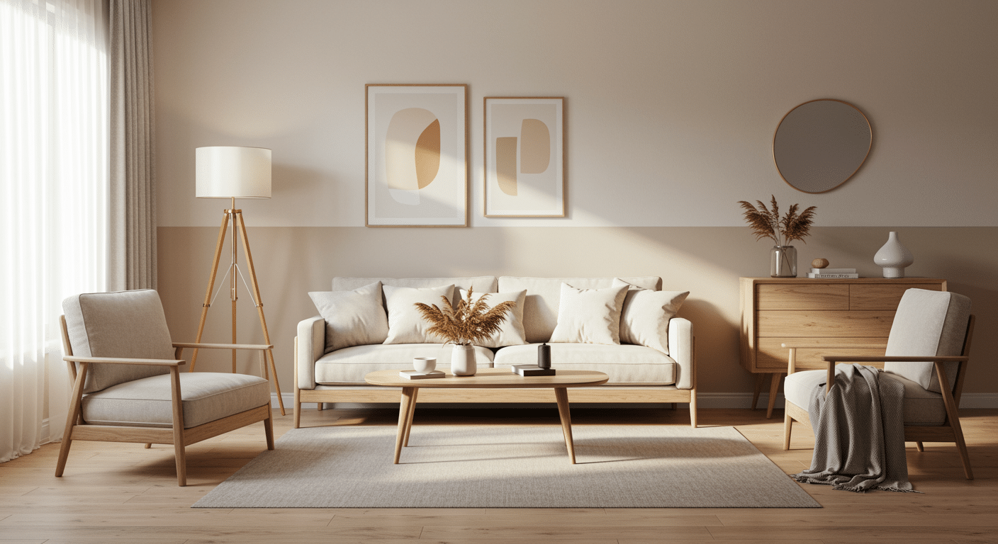
A warm, welcoming beige that leans slightly toward gray, creating a perfect balance between cozy and modern.
- Why It Works: This soft neutral creates a calming vibe when paired with Alabaster. The beige adds just enough warmth without competing with Alabaster’s gentle nature.
- Applications: Perfect for living rooms, dining rooms, or any space where you want a relaxed, inviting atmosphere.
- Design Tip: Use this combination with natural wood tones and cream-colored fabrics for a timeless, cozy look.
2. Worldly Gray (SW 7043)
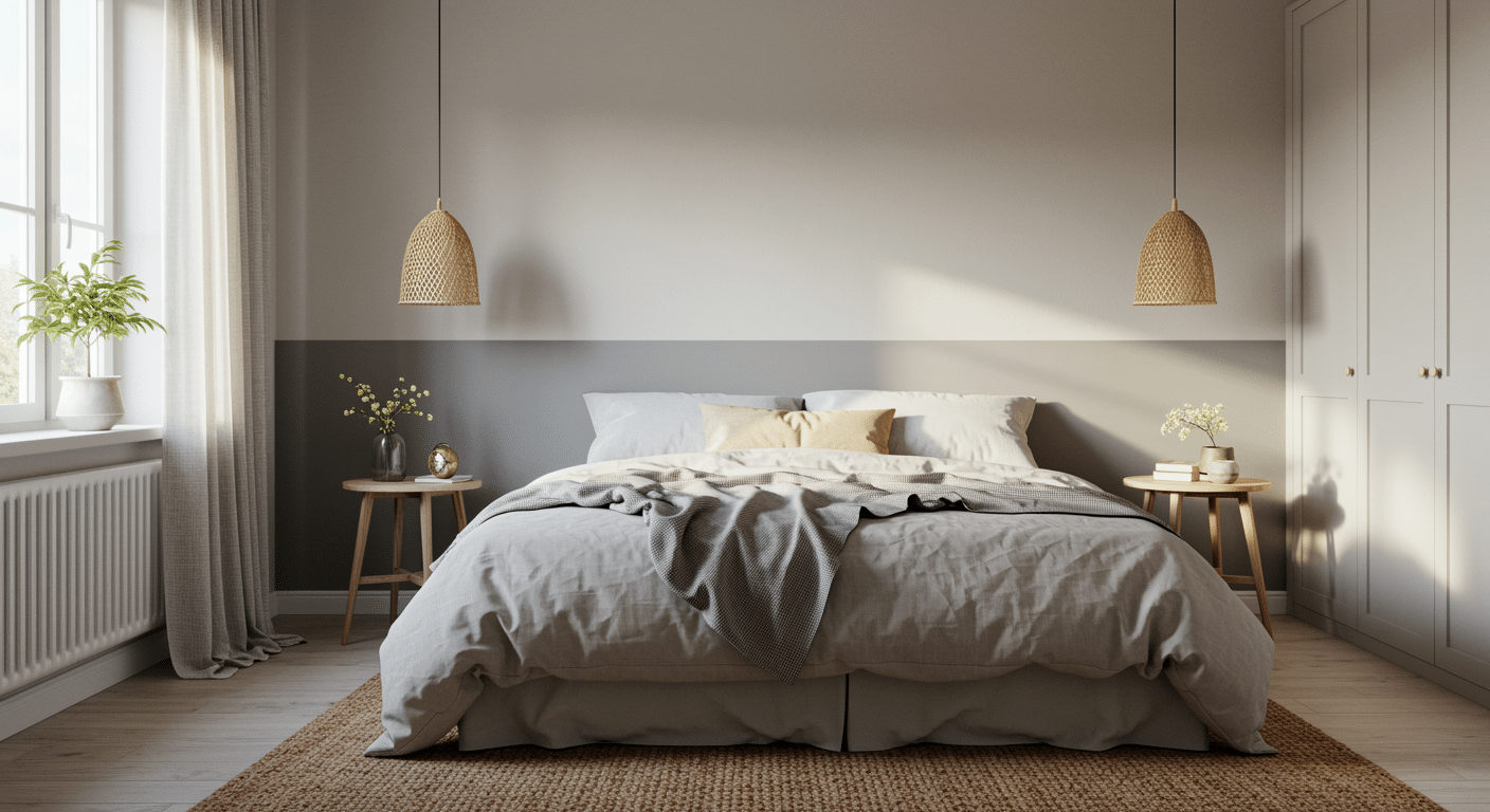
Worldly Gray is the one I’d pick if I didn’t know what direction a room faced. It doesn’t commit hard to warm or cool, which sounds indecisive but works in its favor here.
- Why It Works: Worldly Gray works as a soft neutral option that complements Alabaster beautifully. It bridges the gap between warm and cool, making it perfect for homes that get different types of light throughout the day.
- Applications: Ideal for bedrooms, home offices, or any room that needs to feel both calming and focused.
- Design Tip: Pair with white trim and natural textures like linen and jute for a modern farmhouse feel.
3. Agreeable Gray (SW 7029)
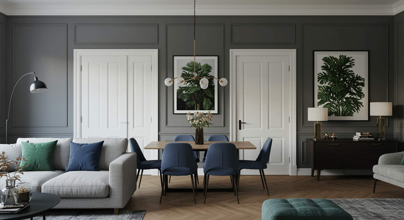
More gray than Accessible Beige, less gray than a true cool neutral. If your furniture already leans modern, this is the pairing that won’t fight it.
- Why It Works: Agreeable Gray pairs nicely with Alabaster as one of the cooler neutral colors. It’s slightly more gray than beige, which gives you a modern feel while still honoring Alabaster’s warm undertones.
- Applications: Works well in open floor plans where you want color flow between spaces.
- Design Tip: Add pops of navy or forest green through accessories to create depth and interest.
Bold Contrast Options
Sometimes you want to make a statement.
4. Urbane Bronze (SW 7048)
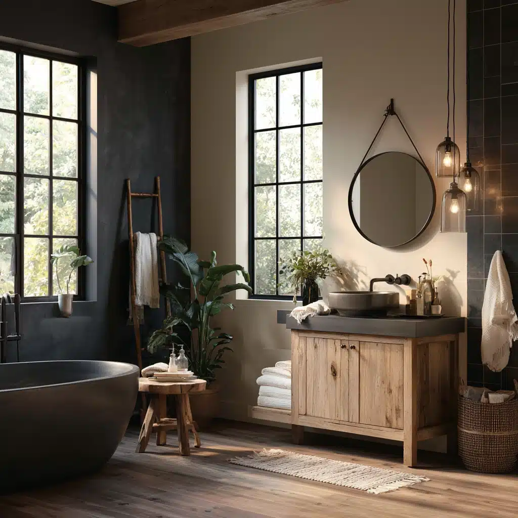
A rich, deep brown with gray undertones that feels sophisticated rather than heavy.
- Why It Works: Urbane Bronze provides a bold contrast with Alabaster for a cohesive and graceful design. You can create a balanced harmony with this contrasting dark color in a spa-like bathroom.
- Applications: Excellent for accent walls, exterior trim, or kitchen islands where you want to make a statement.
- Design Tip: Use brass or gold hardware to enhance the warm undertones in both colors.
Love this color? Read our full Urbane Bronze exterior review here.
5. Iron Ore (SW 7069)
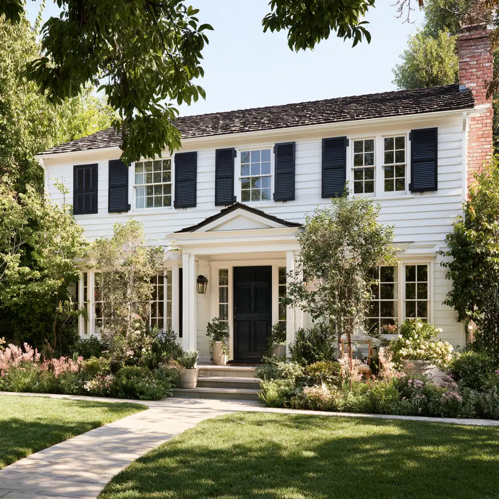
Almost black, but not quite, which is the whole appeal. On a front door it holds up better over time than true black because it hides fading.
- Why It Works: Iron Ore pairs beautifully with Alabaster, particularly for front doors with Alabaster walls. This deep charcoal creates a sophisticated look that never goes out of style.
- Applications: Perfect for front doors, shutters, or bathroom vanities where you want high contrast.
- Design Tip: Balance the drama with plenty of white trim and natural light to keep spaces feeling open.
Earthy Warm Tones
These colors bring natural warmth to your space and feel especially cozy in bedrooms and family rooms.
6. Spiced Cider (SW 7702)
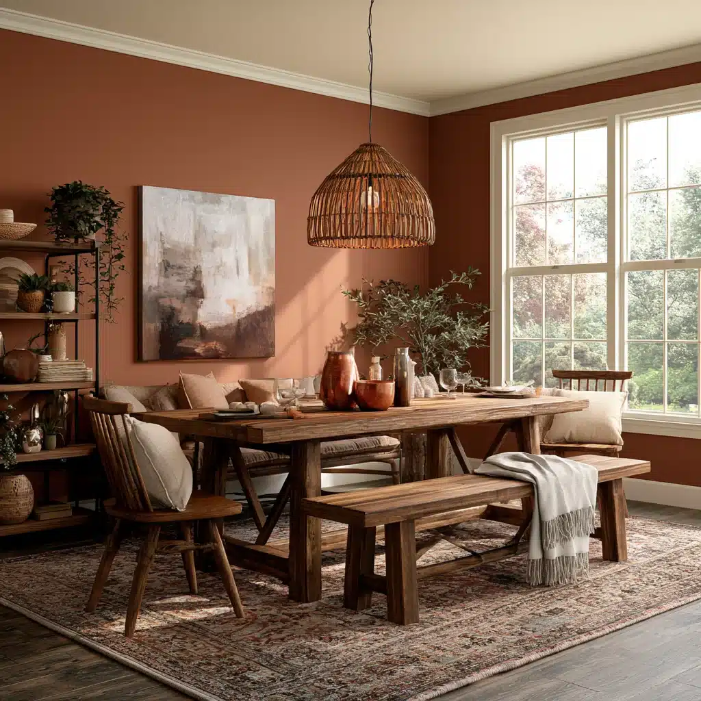
A rich, earthy color with orange undertones that brings warmth and depth to any space.
- Why It Works: Spiced Cider brings earthy tones that complement Alabaster’s warm undertones. It works well in warm, rich palettes paired with deep bronze tones.
- Applications: Great for dining rooms, libraries, or any space where you want to create intimacy.
- Design Tip: Pair with copper accents and rich fabrics like velvet or leather for a luxurious feel.
7. Clary Sage (SW 6178)
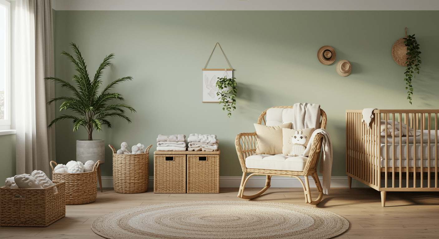
A muted green with gray undertones that brings the outdoors in without being overwhelming.
- Why It Works: Clary Sage creates an organic, natural vibe when paired with Alabaster. The soft green undertones feel calming and work especially well in bedrooms.
- Applications: Ideal for bedrooms, nurseries, or home offices where you want to feel connected to nature.
- Design Tip: Incorporate plants and natural materials like rattan or bamboo to enhance the earthy feel.
Does Alabaster with Pure White Trim Pairing Work Outdoors?
It can, but it obviously it looks different outside than it does in your interiors.
Alabaster in full sun, especially on a south-facing exterior, loses a lot of its warmth and starts looking brighter instead of the soft cream look you get indoors.
It holds onto more of that warmth on homes that get some shade from trees, or ones facing north.
Pure White trim doesn’t shift nearly as much outdoors, it stays close to how it looks inside. So no such changes there.
At the end, the whole combination ends up looking cooler on a house exterior.
Always Test the Actual Paint Before You Make the Final Decision
Both of these colors shift enough with light direction that a screen or a fan deck won’t tell you the full story.
Paint a large sample of each, at least a two-foot square, on the actual wall and trim you’re planning to paint, and look at both morning and evening.
Peel-and-stick sample sheets work best if you don’t want to open two cans just to test.
Finishing It Up
This pairing of Alabaster and Pure White works for one simple reason.
They are close enough in lightness that they never fight each other, but different enough in chroma that the trim still reads as trim.
Get the sheen right, eggshell on the walls, semi-gloss on the trim, and you’re most of the way there without needing to think about it again.
And it’s not a flashy combination. It’s just one that looks good in real light, in a real room.
People Also Ask
1. What Sheen Should I Use for Alabaster Walls?
Eggshell or satin hides wall imperfections better than flat, especially in hallways and kids’ rooms.
2. Does Alabaster Work with Stained Wood Floors or Cabinets?
Yes. Its slight warmth keeps it from clashing with honey oak or other warm wood tones.
3. Is Alabaster Too Similar to Just Using Plain White?
No. Pure white can look sterile in photos. Alabaster keeps a touch of softness the camera picks up.






3 Responses
This was such a helpful article, and really made me feel validated in my decision to paint my walls SW Alabaster and trim/ceilings SW Pure White next week. I am curious if you offer personalized advice? I’ll leave my email just in case. Thank you for your expertise!
What color was your bedroom before you changed it to alabaster? And do you have the color of your neighbors bedroom before painting it Alabaster?
I’m want to look up the previous colors to see how different they are from alabaster.
Thanks for your time.
Really helpful as I’m considering pairing Agreeable Gray or Accessible Beige trim/doors with Alabaster for our new house. I did notice that Agreeable Gray isn’t actually featured in the image where you talk about Agreeable Gray– it shows a much darker, truer gray. Same with the Spiced cider image. Also, that is a WILD AI bathroom image with the marble walls, the odd pendant lights and the toilet in the shower (!!!).