The four simple tricks for designer shelf styling include choosing a simple anchor theme, building a cohesive wall layout, styling the surface with complementary shapes, and adding one playful focal piece.
Mastering these foundational shelf styling ideas transforms a disconnected, underworked corner into a unified and intentional vignette.
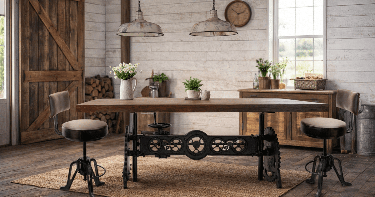
Look at that empty corner in your living space. You likely have a shelf holding a few random objects sitting beneath a blank or underworked wall.
Separately, neither the shelf nor the wall feels finished. The central insight to remember is that a shelf and its neighboring wall are not two separate projects.
They are one beautiful vignette waiting to be thoughtfully composed. By following a clear approach, you can turn that overlooked space into the most charming spot in the room.
These straightforward methods require nothing more than a bit of intentionality to achieve lasting results.
1. Choose an Interesting, Simple Theme
A loose theme acts as an invisible filter for every styling choice that follows. When visualizing your arrangement, utilizing a durable Americanflat gallery wall frame set cleanly resolves sizing puzzles alongside other standard frames.
This makes your decorating decisions easier rather than more restrictive. You might organize a family memory wall filled with layered photos, cherished mementos, and handwritten notes.
Alternatively, you could lean into vintage florals by combining soft botanical prints, aged ceramic tones, and an overall pressed-flower energy.
Handcrafted character items carry a whole emotional register on their own to support this theme.
Beautiful, whimsical Lori Mitchell figurines from Michelle’s aDOORable Creations serve as perfect whimsical accents alongside basic decor staples.
Each one brings a folk-art charm that perfectly mirrors the storybook personality of a curated display.
For a more dynamic space, a rotating seasonal motif provides a beautiful framework that refreshes naturally.
Do not worry about choosing a rigid or perfectly named theme. If you are unsure where to begin, pull two or three objects already sitting on your shelf.
Ask yourself whether they share a color palette, an era, or a specific mood.
The answer to that question becomes your natural theme. Think of this overarching concept not as a strict rulebook, but as a creative compass guiding your vignette.
This helps you build a cohesive display over time. Everything feels entirely intentional and beautifully unified.
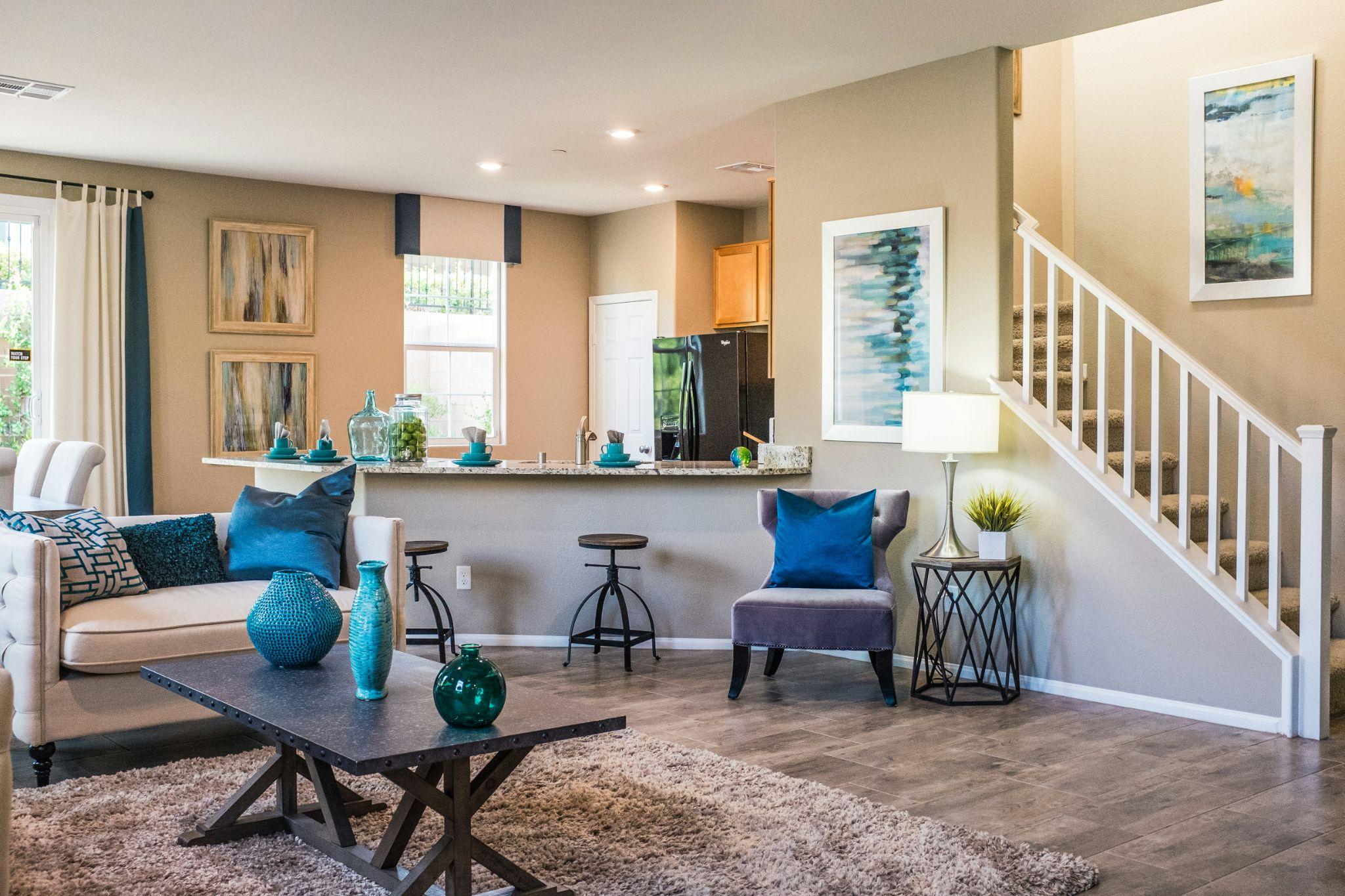
2. Build an Unbelievable Wall Layout
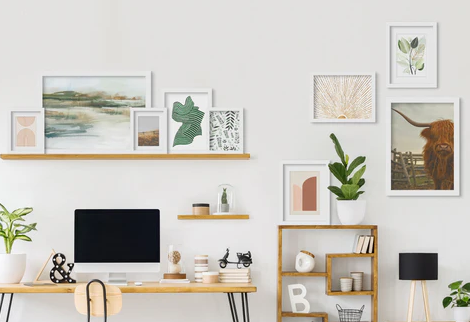
Always lay all your frames on the floor first to test the arrangement before a single nail goes into the wall. Mixing different frame sizes and orientations is highly encouraged.
The secret lies in making those choices feel coordinated rather than random. Anchor the composition by placing your largest or most visually heavy piece at the center.
Build outward using the smaller frames to create a balanced presentation. Keep your spacing consistent, as leaving two to three inches between frames reads as composed and highly intentional.
The repetition of similar frame styles naturally strengthens a design by tying together individual elements.
Whenever possible, echo the shelf height so the wall arrangement and the surface below feel like one unified statement.
This approach works beautifully for entryway wall decor. It seamlessly transforms a passing hallway into an inviting, lived-in gallery space.
You can easily adjust your framed pieces over time to keep the layout feeling fresh.
|
Important: Avoid the ‘floating frame’ look by keeping your layout tight. Spacing frames more than three inches apart loses the visual connection and makes the arrangement feel disconnected and chaotic. |
|---|
3. Style With Unusual Complementary Shapes
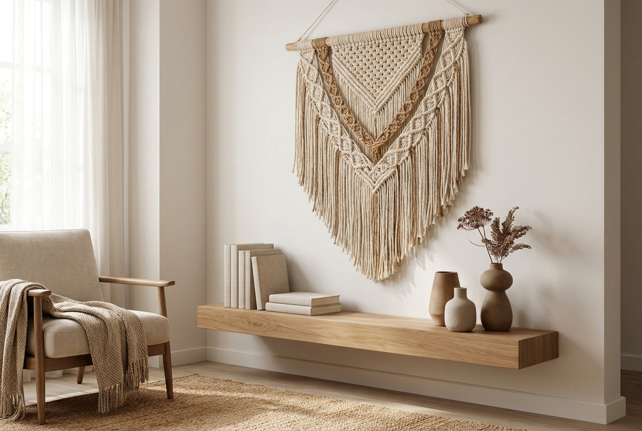
The surface beneath your newly arranged gallery wall needs to feel like part of the same visual conversation. To achieve this, consciously mix your object heights.
Taller items anchor the back or the far ends of the shelf, while shorter pieces step naturally forward. These staggered silhouettes give the eye somewhere to travel and explore.
Next, consciously repeat one color from the wall art. Lifting a specific tone from the framed prints directly onto the shelf creates an invisible thread that ties the wall and surface together.
Finally, remember to leave intentional empty areas between your items. The negative space in design is as important as the positive area, giving objects room to breathe.
For readers drawn to the warmth of a vintage-inspired home, the right accent piece does something no neutral filler object can ever manage.
Try grounding a character item beside a small stack of vintage books or a simple ceramic vessel to balance the texture.
Grouping these objects in odd numbers works wonderfully. Mixing materials like wood, ceramic, and paper keeps the eye moving pleasantly across the surface.
|
Pro Tip: Use the ‘Rule of Three’ when grouping shelf objects. Combining a tall item, a textured figurine, and a flat book creates instant visual interest and prevents a flat, stagnant display. |
|---|
4. Add One Unexpected Focal Piece
Every memorable styling moment features one standout piece that the eye lands on first. Everything else simply supports that anchor without competing for attention.
You can easily match this focal element to your own personalized aesthetic.
Consider incorporating a framed quote printed in an unexpected color or an oversized seasonal botanical illustration.
A textured macramé piece introduces tactile contrast, while a vintage-style clock brings genuine presence to the arrangement.
This focal piece serves as the emotional punctuation of the theme you chose at the very beginning.
It is the definitive statement that tells guests exactly what this specific corner is all about.
To maintain visual balance, if the wall carries most of the visual weight, keep the focal piece low and beautifully grounded on the shelf.
Conversely, if the shelf surface is the busier layer, let a single statement frame on the wall do the heavy lifting.
The best part is that this single focal piece can rotate seasonally while your underlying framework remains flawlessly intact.
Your Next Steps
Pick a thoughtful theme, build a beautifully coordinated gallery wall layout, and bring the shelf surface into the conversation.
Anchor it all with one focal piece that makes the corner feel yours entirely. Designer-looking results require neither a large budget nor a professional eye to execute properly.
They simply require a starting point and a few thoughtful choices made in sequence.
Remember that the wall and the shelf are always one unified project, not two separate tasks.
Try stepping into just one of these shelf styling ideas this weekend and let the room evolve naturally.
Authentic cozy cottage decor is always a joyful work in progress. That ongoing evolution is exactly what makes your home feel beautifully alive and personal.