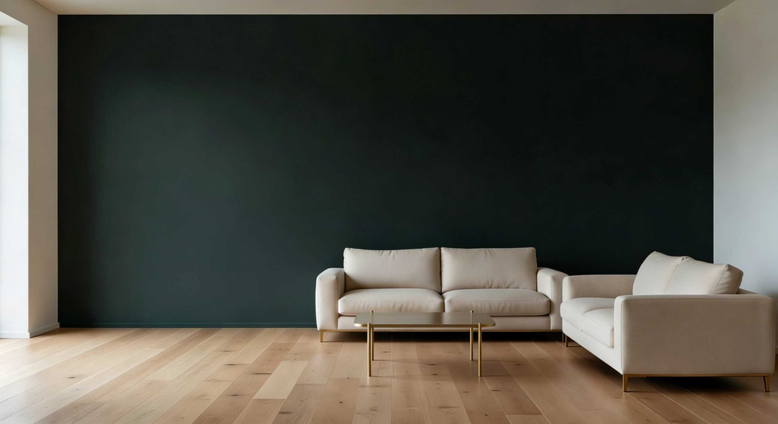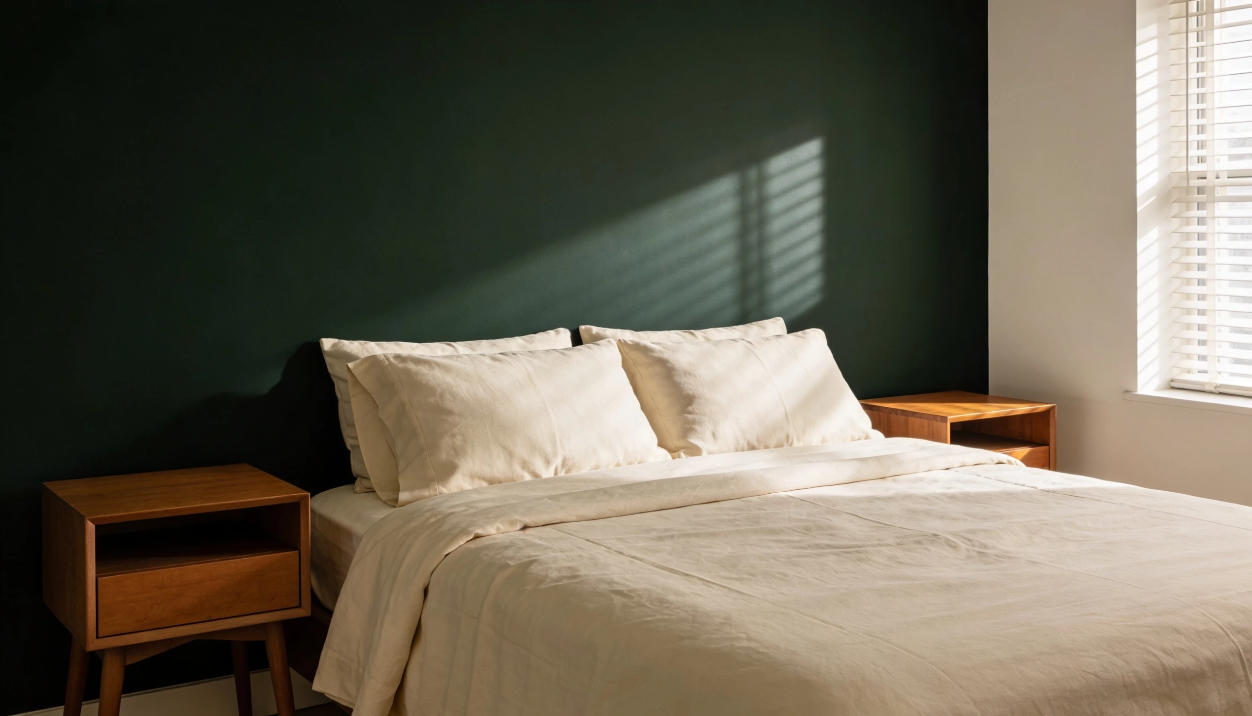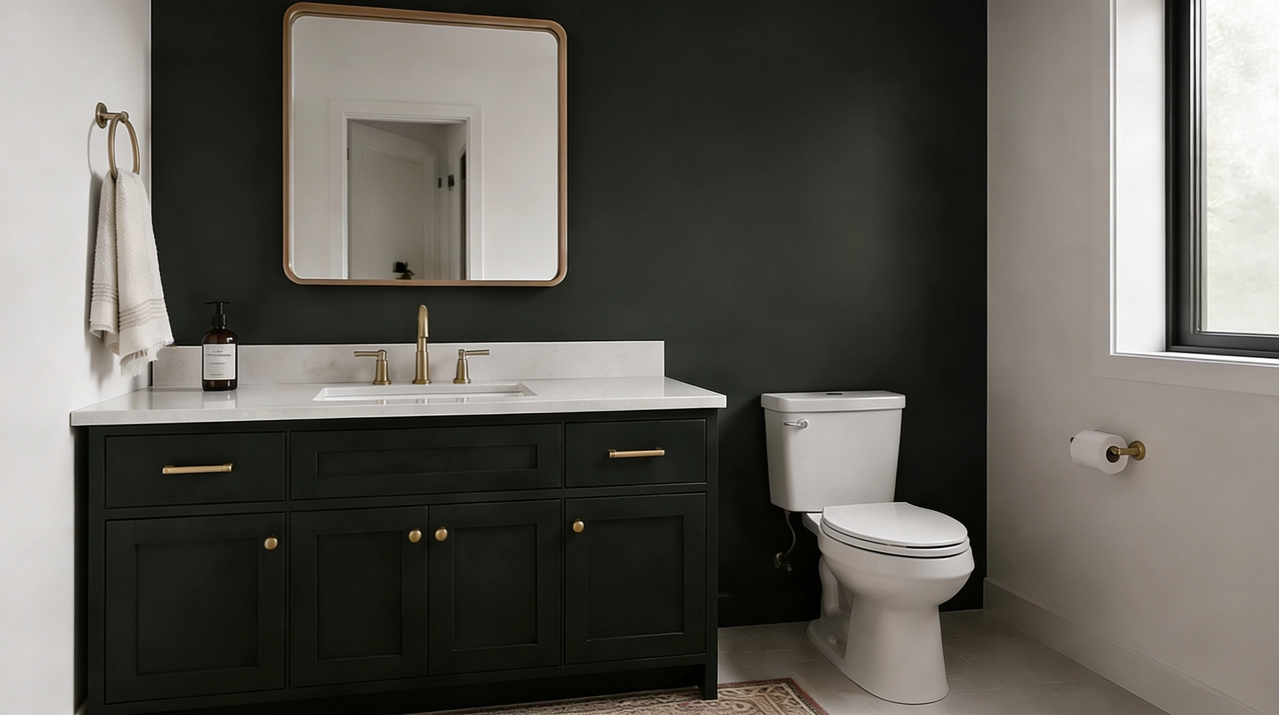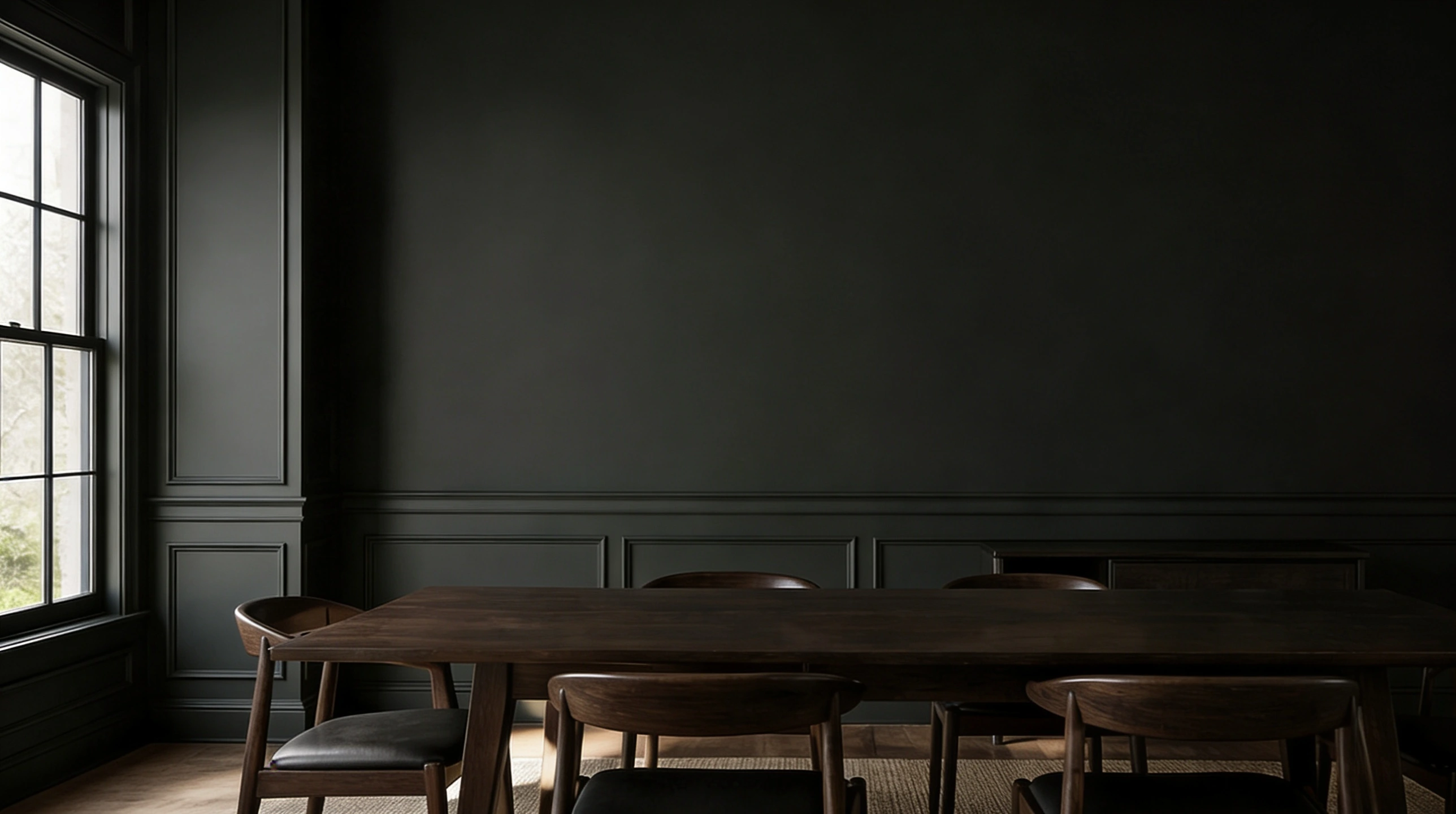
Picking a dark paint color sounds simple until someone stands in the paint aisle, second-guessing everything.
Sherwin-Williams Greenblack tends to end that conversation pretty quickly.
SW 6994 is a mix of deep green and near-black, giving it a character.
It belongs to the Blacks & Whites color family but has enough green to feel alive rather than flat. It feels very rich to look at, grounded, and definitely a little intense.
And once it goes on a wall or a cabinet, it is very hard to second-guess that choice.
Color Profile of Greenblack (SW 6994)
Color profiles matter more than most people realize.
And with a shade as layered as this, knowing what sits beneath the surface makes all the difference between a choice that works and one that misses the mark entirely.
1. Greenblack Undertones
It carries a deep forest-green undertone that gives it life and prevents it from being flat or lifeless. That green is subtle but present.
It adds a natural, organic quality that works in its favor across many spaces and surfaces.
2. What is the LRV of SW 6994?
LRV stands for Light Reflectance Value, and Greenblack has an LRV of 3, which puts it in the darkest end of the spectrum.
It absorbs almost all light that hits it.
That is what gives it such a commanding, immersive quality on walls and cabinets.
3. Is SW 6994 a Warm or Cool Paint Color?
Greenblack leans cool. The green in it has a blue-green quality rather than a yellow-green one.
Sharp and precise rather than heavy, which is why it works so well in modern and transitional spaces. It pairs naturally with:
- Slate blues for a cohesive, cool-toned look.
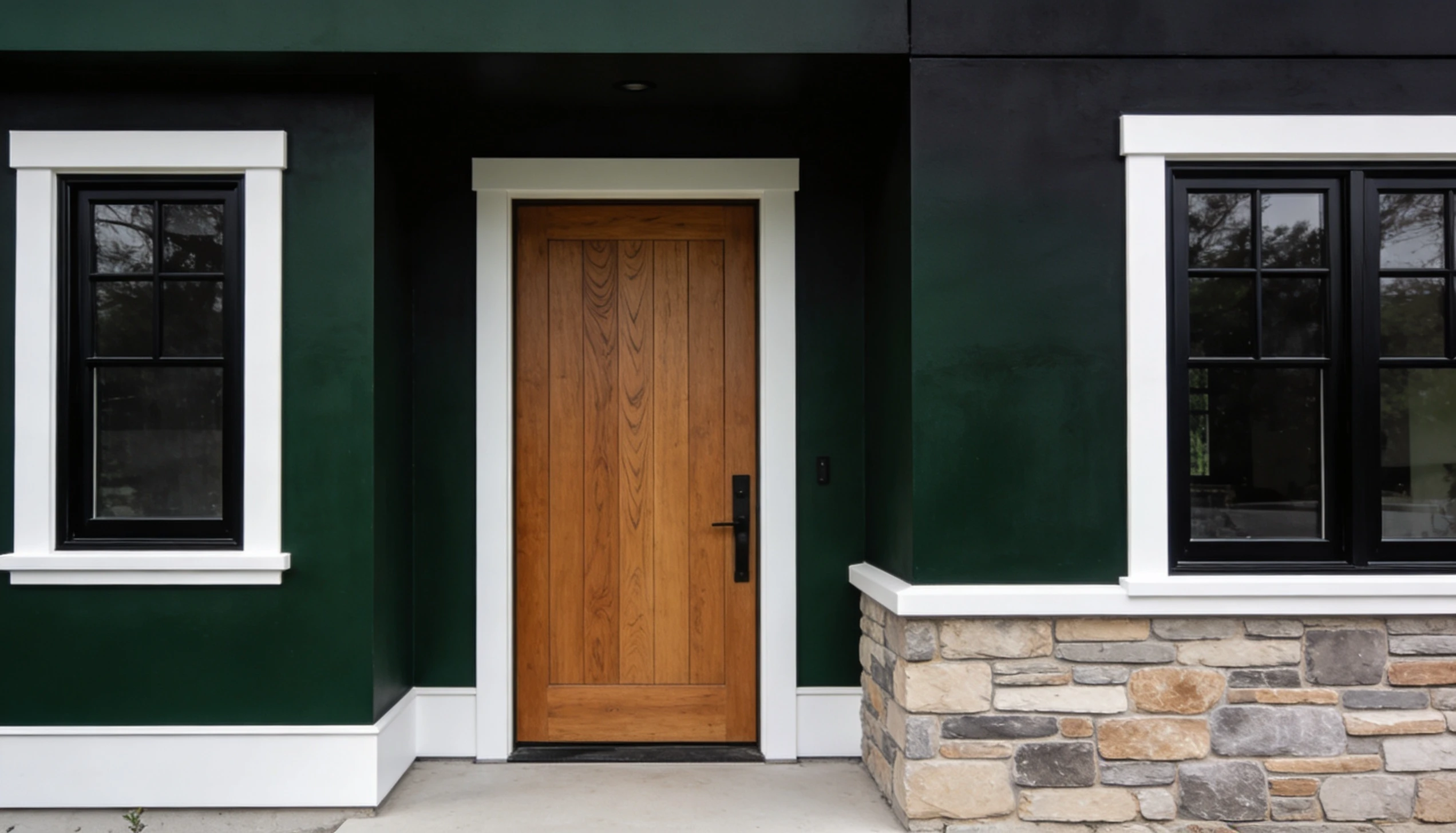
- Crisp whites for clean, high contrast.
- Soft grays for a calm, understated feel.
4. Why Greenblack Looks Different in Various Lightings?
This is one of the most talked-about qualities of SW 6994.
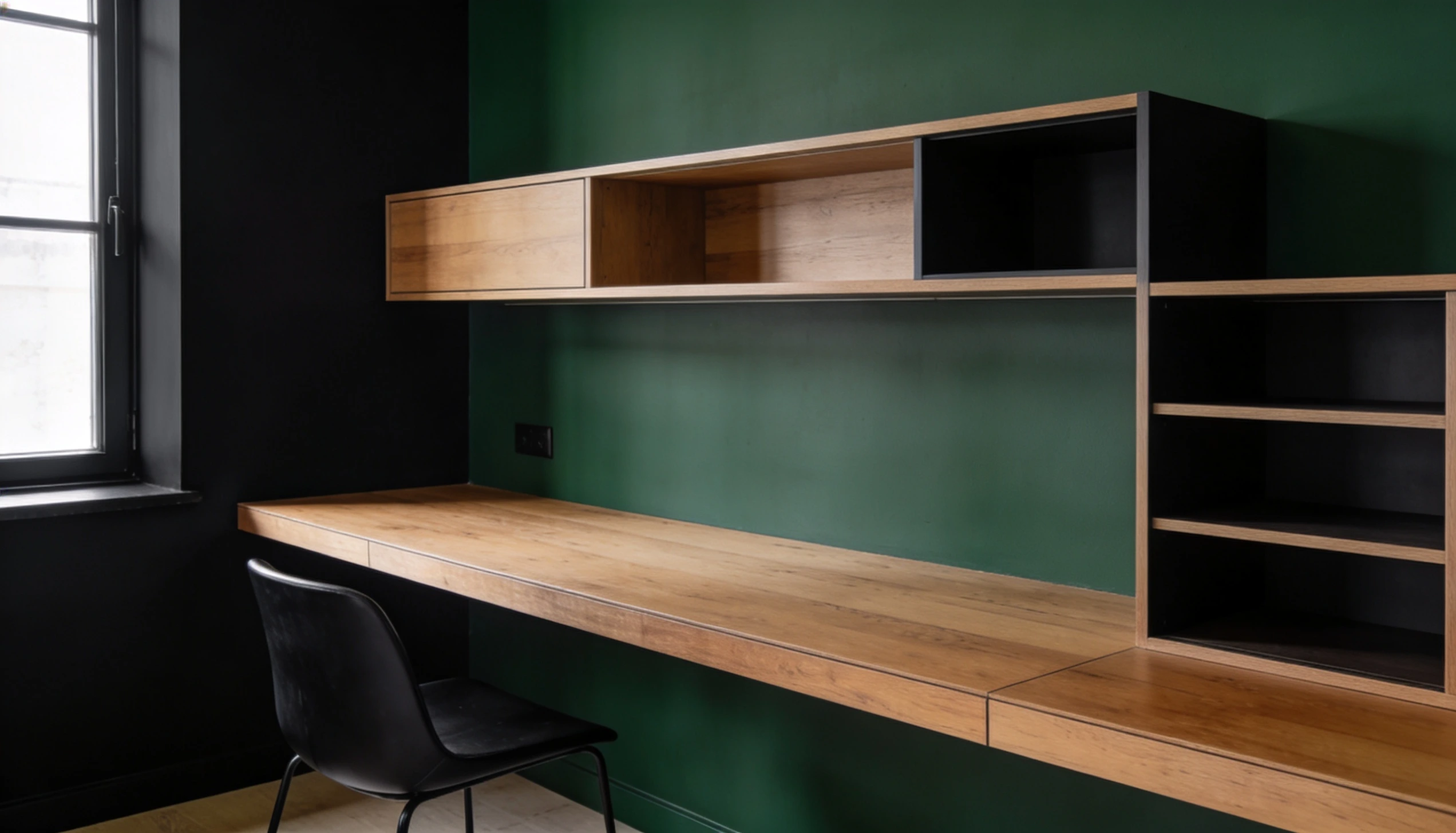
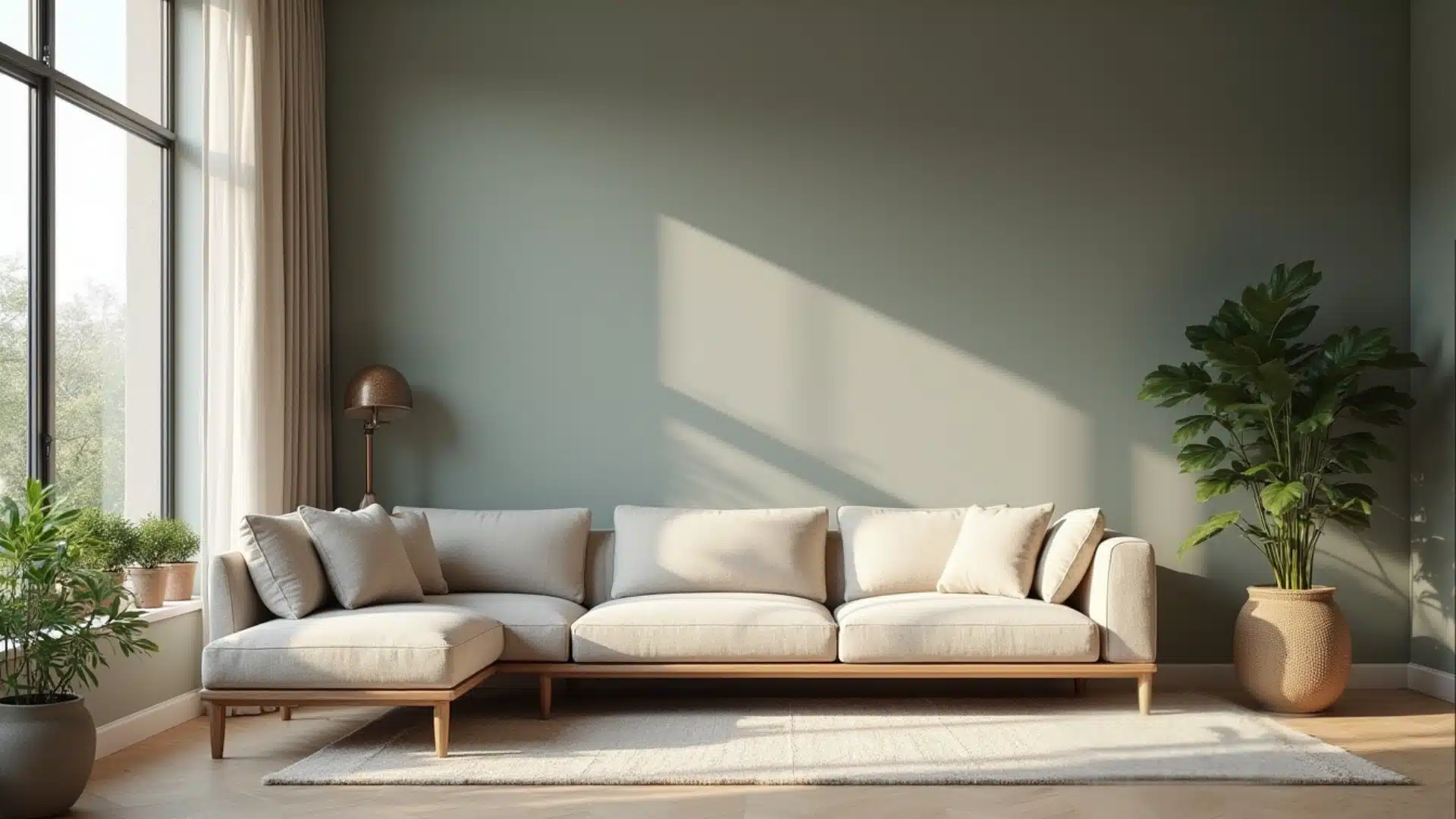
In bright natural light, the green comes forward, and the color feels almost like a deep botanical shade.
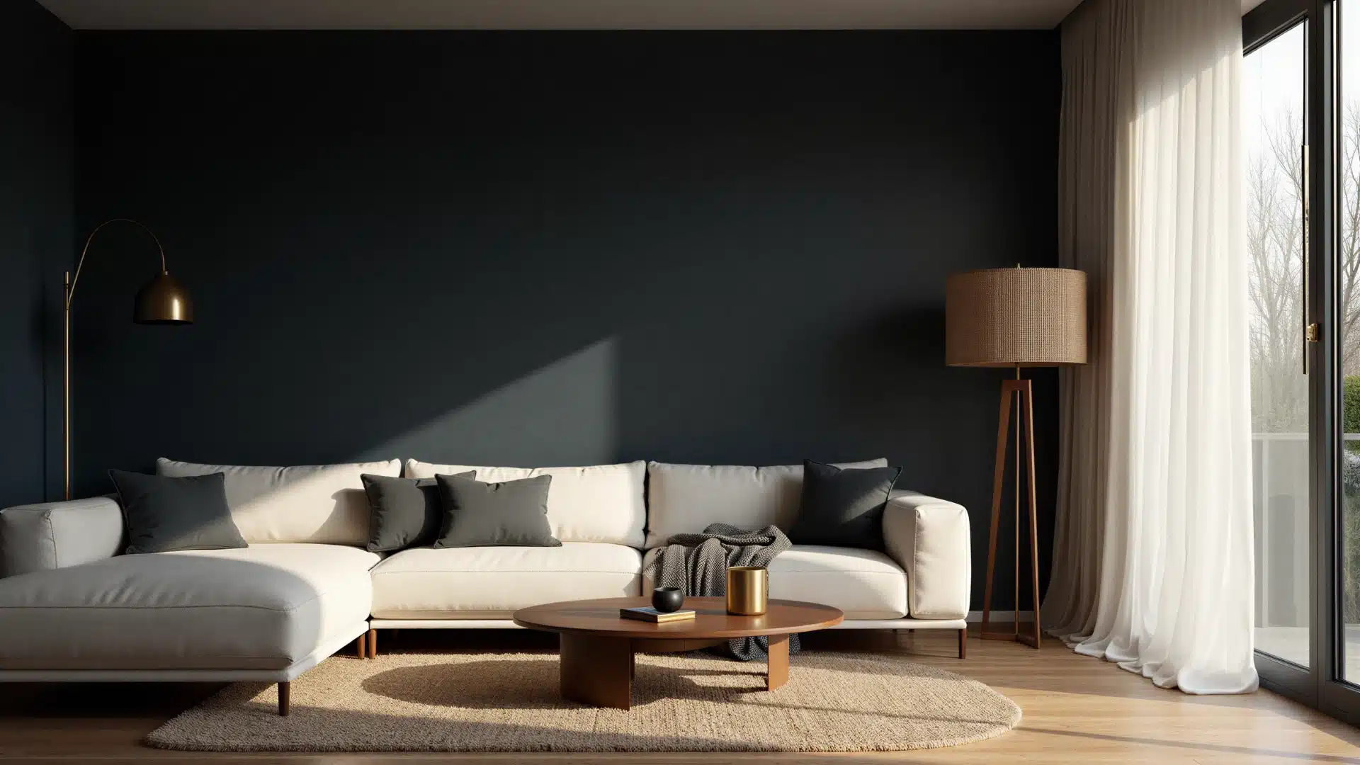
In dim or artificial light, it pulls toward black and takes on a more dramatic, moody quality. Neither version is wrong.
But it does mean the color behaves differently depending on the time of day and the light source in the room.
The Color Palettes of Greenblack (SW 6994)
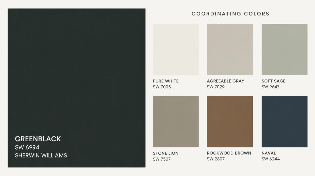
It goes well with both warm and cool tones, giving a lot of room to work with depending on the mood the space needs.
- Crisp whites and off-whites: High Reflective White and Alabaster create clean, high contrast pairings.
- Warm neutrals: Accessible Beige and Antique White soften the overall look without dulling it.
- Earthy greens: Sage and olive tones naturally pick up the green.
- Warm metals and wood tones: Brass fixtures and walnut surfaces add warmth and stop the palette from feeling too cold.
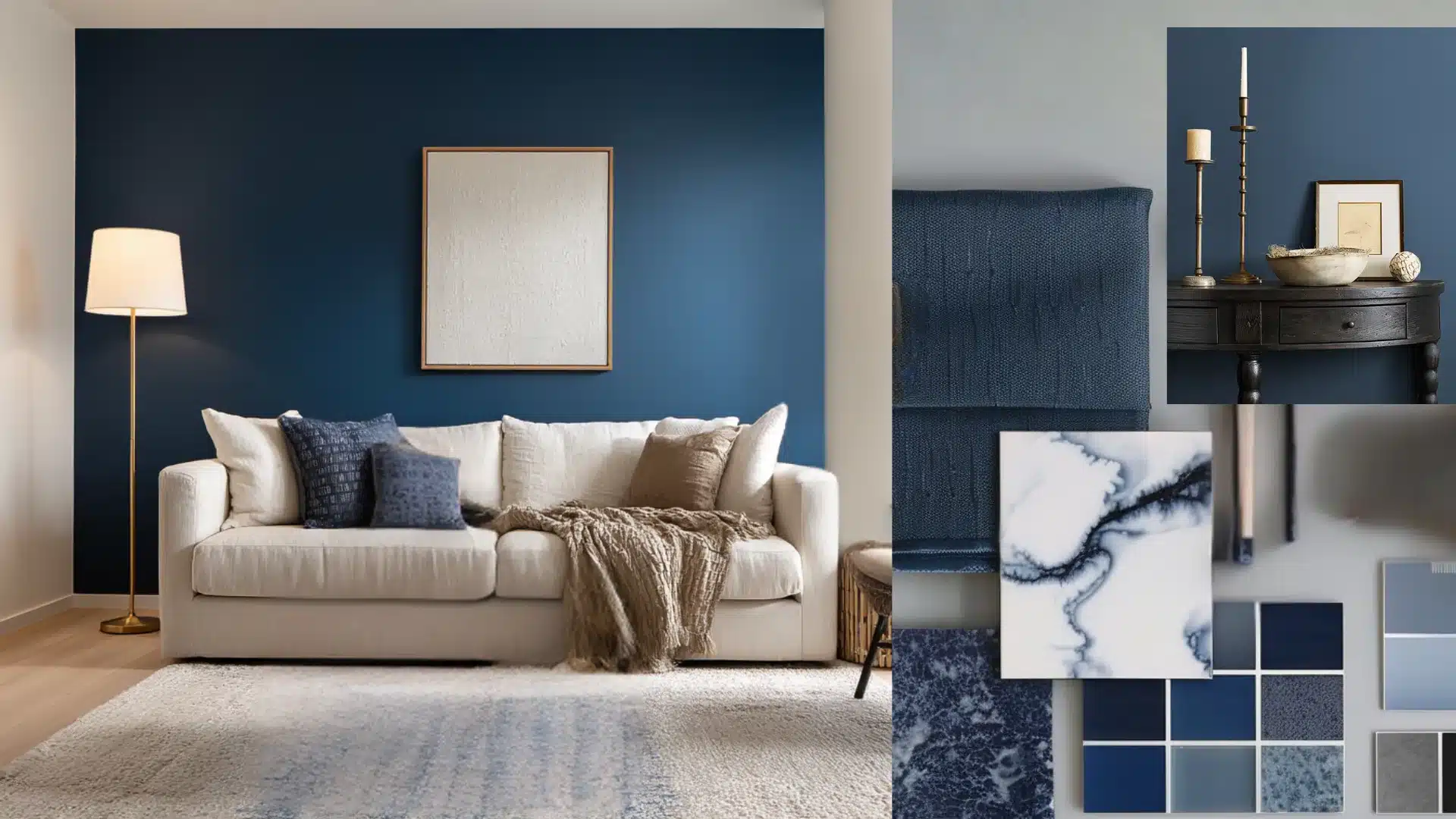
- Dusty blues and slates: Cool-toned accents that sit comfortably alongside without competing.
Sherwin-Williams Greenblack Cabinets Ideas for Your Kitchen
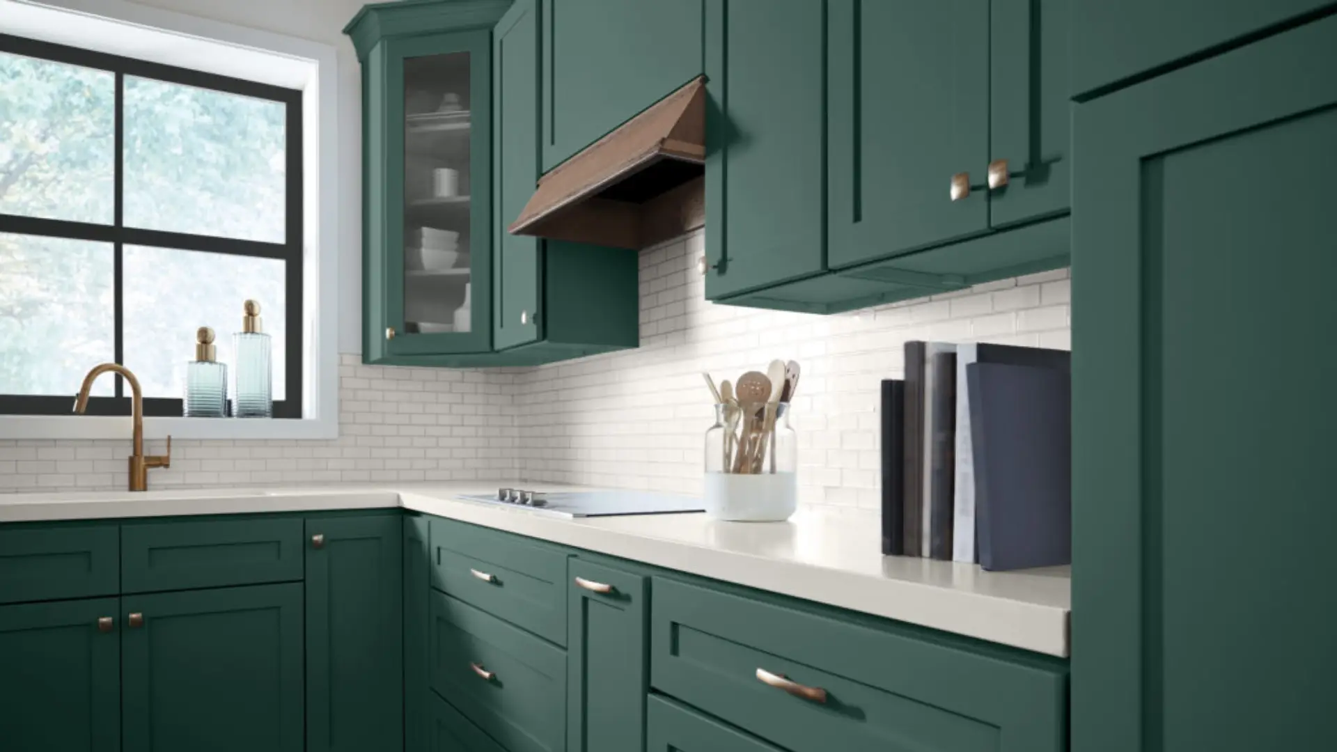
Greenblack cabinets work on walls, islands, and full kitchen treatments when balanced correctly.
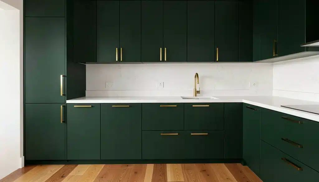
White quartz countertops are the most reliable pairing.
1. Kitchen Cabinets that Look Attractive in Greenblack
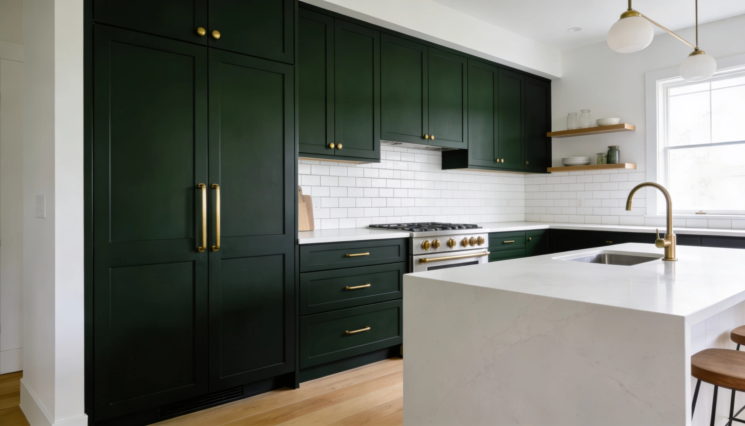
Shaker and flat-front styles create a look that is intense, grounded, and hard to walk past without noticing.
Shaker cabinets work because the clean lines and simple profile let the color do all the talking.
Two-tone kitchens with this color on the lower cabinets and white uppers are another strong option for those who want the impact without going all in.
2. Best Hardware for Greenblack Cabinets
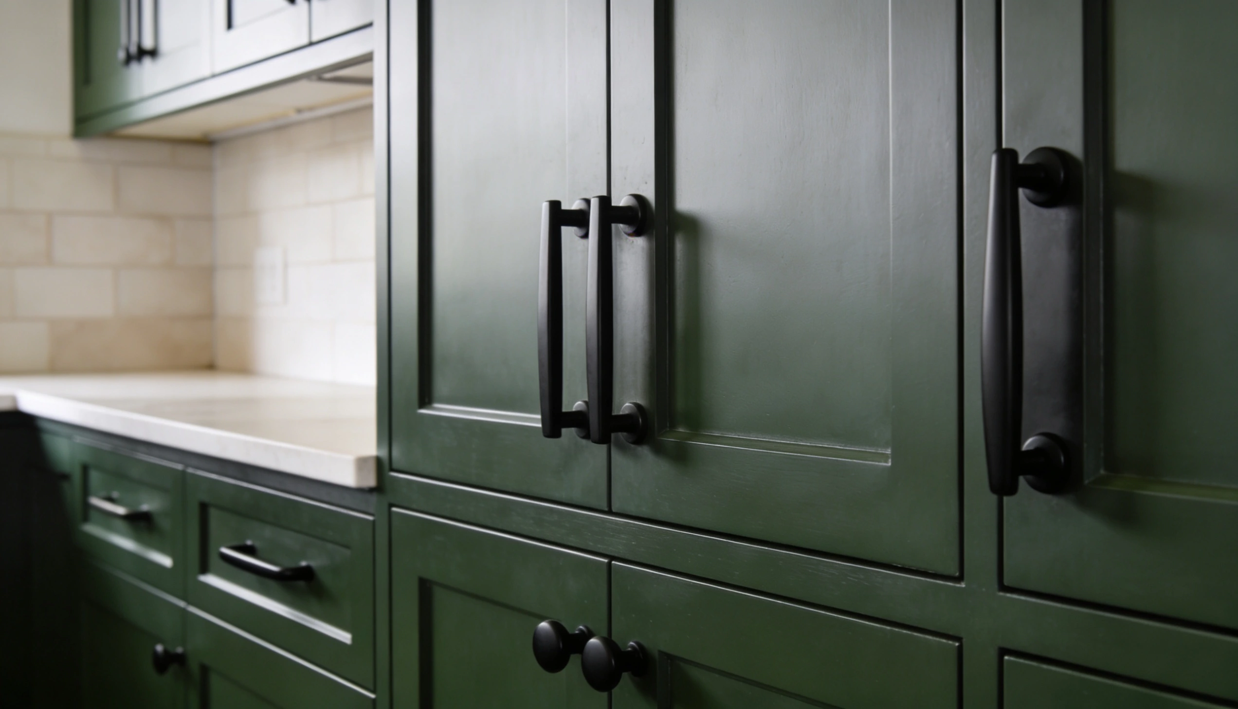
Warm metals consistently bring out the best in this color, but there are solid options across the board depending on the look the space needs.
Getting the hardware wrong is one of the easiest ways to undermine a cabinet color this strong, so it is worth taking that decision seriously.
- Unlacquered Brass: Develops a natural patina that only gets better against dark cabinets.
- Matte Black: Sharp, tonal, and seamless for a modern finish.
- Brushed Gold: Warm enough to add character without overpowering.
- Satin Nickel: A cooler option that works when the space leans neutral.
3. Countertops that go Well with Greenblack Cabinets