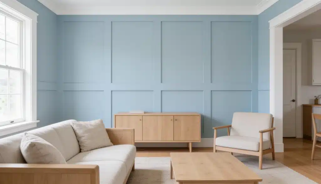
Sleepy Blue Sherwin-Williams (SW 6225) is calm and composed.
This soft, muted blue, with its subtle gray and green undertones, creates calm spaces without feeling flat.
This manual covers everything you need, like the color code, LRV specifications, where to purchase, and how it suits different rooms.
And further learn how to make the most of it once it’s on the walls.
Sleepy Blue Sherwin-Williams: Color Details
Everything you need to know about sleepy blue by Sherwin-Williams.
- Color Name: Sleepy Blue
- Brand: Sherwin-Williams
- Color Code: SW 6225
- Color Family: Blue
- LRV (Light Reflectance Value): 58
- HEX Code: #BCCBCE
- RGB Value: 188, 203, 206
- Undertones: Soft gray with subtle green influences
- Color Temperature: Cool leaning
Sleepy Blue Undertones: What You’re Actually Seeing on the Wall
Sleepy Blue has three undertone layers working together.
Understanding them tells you why the color can look different in the same house depending on which room you test it in.
The Primary Undertone: Gray
Gray is the anchor undertone in it.
This gray mass tone is what keeps the color from feeling babyish or overly bright. Instead of a pure, saturated blue, you get a softened, refined version.
The Secondary Undertone: Green
A subtle green undertone lurks beneath the surface, though it’s not immediately obvious.
In rooms with abundant natural light, especially north and east-facing windows, the green undertone becomes more visible.
The blue takes on a slight blue-green quality, almost like looking at calm ocean water or a peaceful lake.
If you’re testing Sleepy Blue in a north-facing room, sample it on a large board first. The green shift can be significant enough to change your pairing decisions.
The Tertiary Undertone: Blue
Obviously, blue is the dominant undertone. But it’s a cool blue, not a warm one.
This means it leans toward the cooler side of the color spectrum, which makes it ideal for relaxation spaces.
Cool tones psychologically trigger calm responses, while warm tones energize.
How Light Affects the Look of Sleepy Blue Color
Light is the wildcard with any paint color. The same shade can look drastically different depending on the time of day and room exposure.
Morning Light (East-Facing Rooms): Early sunlight brings out Sleepy Blue’s green undertones. The color appears fresher, almost coastal, with hints of blue-green.
Midday Light (South-Facing Rooms): Peak sunlight reveals Sleepy Blue’s true blue quality. The color appears most balanced at noon, neither too gray nor too green.
Afternoon/Evening Light (West-Facing Rooms): Warm, golden afternoon light intensifies Sleepy Blue’s gray undertones. The color softens & appears slightly warmer, cozier.
North-Facing Rooms (Limited Natural Light): Rooms with north-facing windows never get direct sunlight. Sleepy Blue here looks grayer and cooler. The color maintains a calm, collected feeling but lacks the brightness.
Warm White Bulbs (2700K): These mimic a sunset and create a cozy atmosphere. Sleepy Blue’s gray undertones come forward under warm light, making the color feel intimate and inviting.
Neutral White Bulbs (4000K): Mid-range lighting keeps Sleepy Blue balanced. The color reads close to its swatch appearance without cool harshness or excessive warmth.
Cool White/Daylight Bulbs (5000K+): Harsh, bright bulbs make Sleepy Blue feel cooler and crisper. The blue becomes more pronounced and gray undertones recede.
Sleepy Blue Sherwin-Williams Color Palette Ideas
Choose the color palettes that complement your space and style.
Monochromatic Palettes (Blue-Toned Harmony)
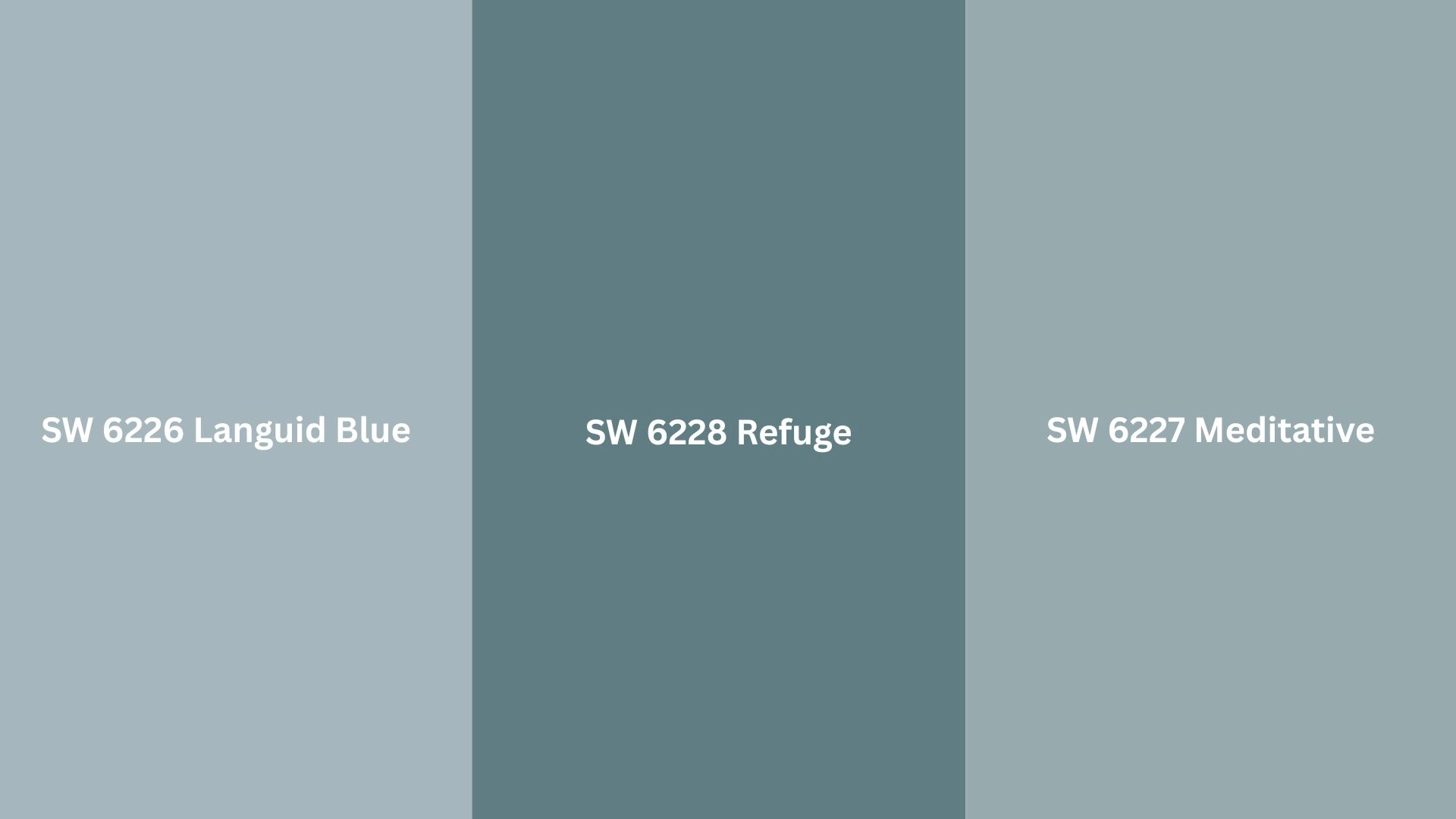
These shades layer seamlessly with Sleepy Blue for a unified, tranquil look. And they are best for bedrooms, bathrooms, and spa-inspired spaces where cohesion is required.
- SW 6226 Languid Blue: Slightly deeper blue for accent walls or trim depth.
- SW 6227 Meditative: Close cousin to it for a subtle variation on adjacent walls.
- SW 6228 Refuge: Richer blue for grounding and creating visual interest.
Contrasting Palettes (Bold And Defined)
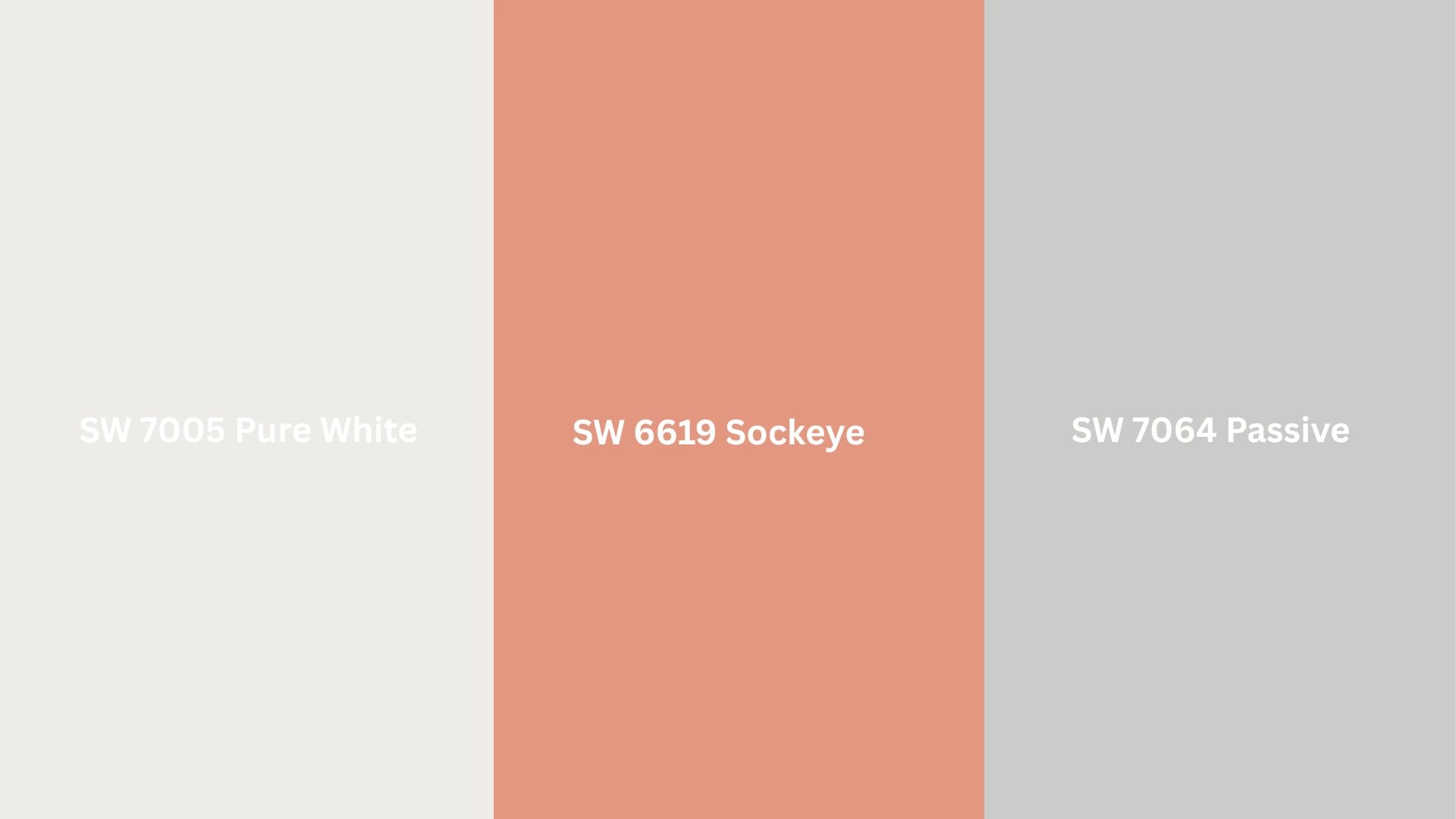
These colors pop against Sleepy Blue for dramatic effect. And it is best suited for living rooms, kitchens, and feature walls where contrast adds character.
- SW 7005 Pure White: Crisp contrast for trim, ceilings, and definition.
- SW 6619 Sockeye: Deep red-orange for unexpected warmth and personality.
- SW 7064 Passive: Warm gray that grounds while letting it shine.
Sleepy Blue Sherwin-Williams Interiors
It is an amazing choice as an interior paint color, as it feels calm, comforting, and really very peaceful. Learn how it changes spaces into calm, intentional rooms.
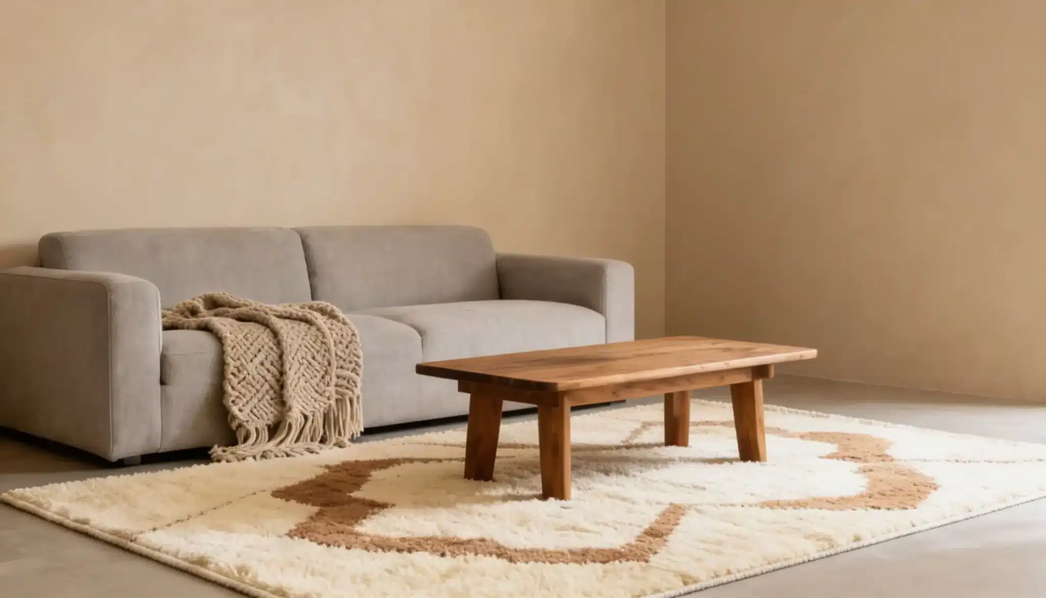
Bedrooms
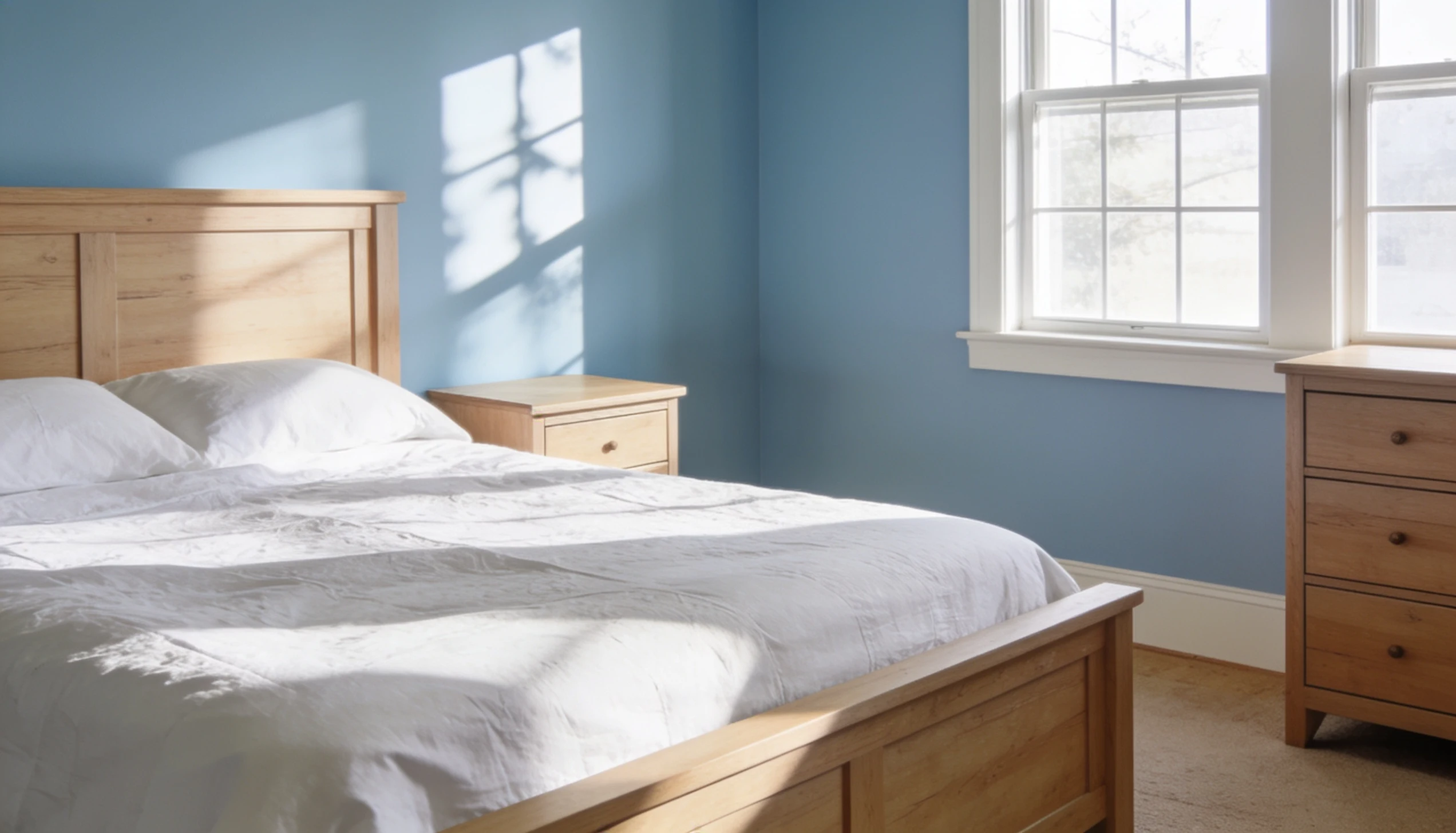
This is where Sleepy Blue performs best. The gray undertone keeps it from feeling juvenile, and the cool temperature supports sleep environments.
Pair it with crisp white trim, warm wood furniture, and soft gray textiles.
It works in master bedrooms, guest rooms, and even kids’ spaces that’ll grow with them.
Paint all four walls in Sleepy Blue, or use it as a feature wall behind the bed.
Kitchen Cabinets
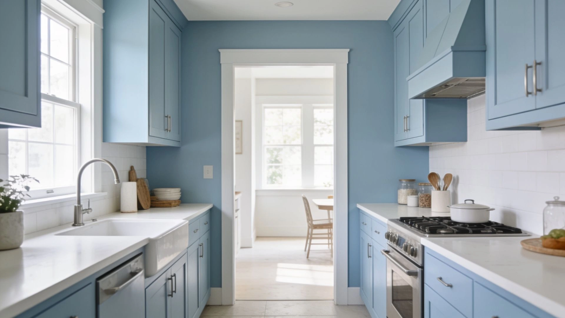
Kitchen cabinets in this color work beautifully when done right.
Lower cabinets in Sleepy Blue paired with white uppers create visual interest. Or go bold with all-Sleepy-Blue cabinetry for a cohesive, spa-like kitchen.
This application works best in contemporary, modern farmhouse and coastal kitchens.
Pair with white or soft neutral backsplash & countertops for breathing room
Bathrooms
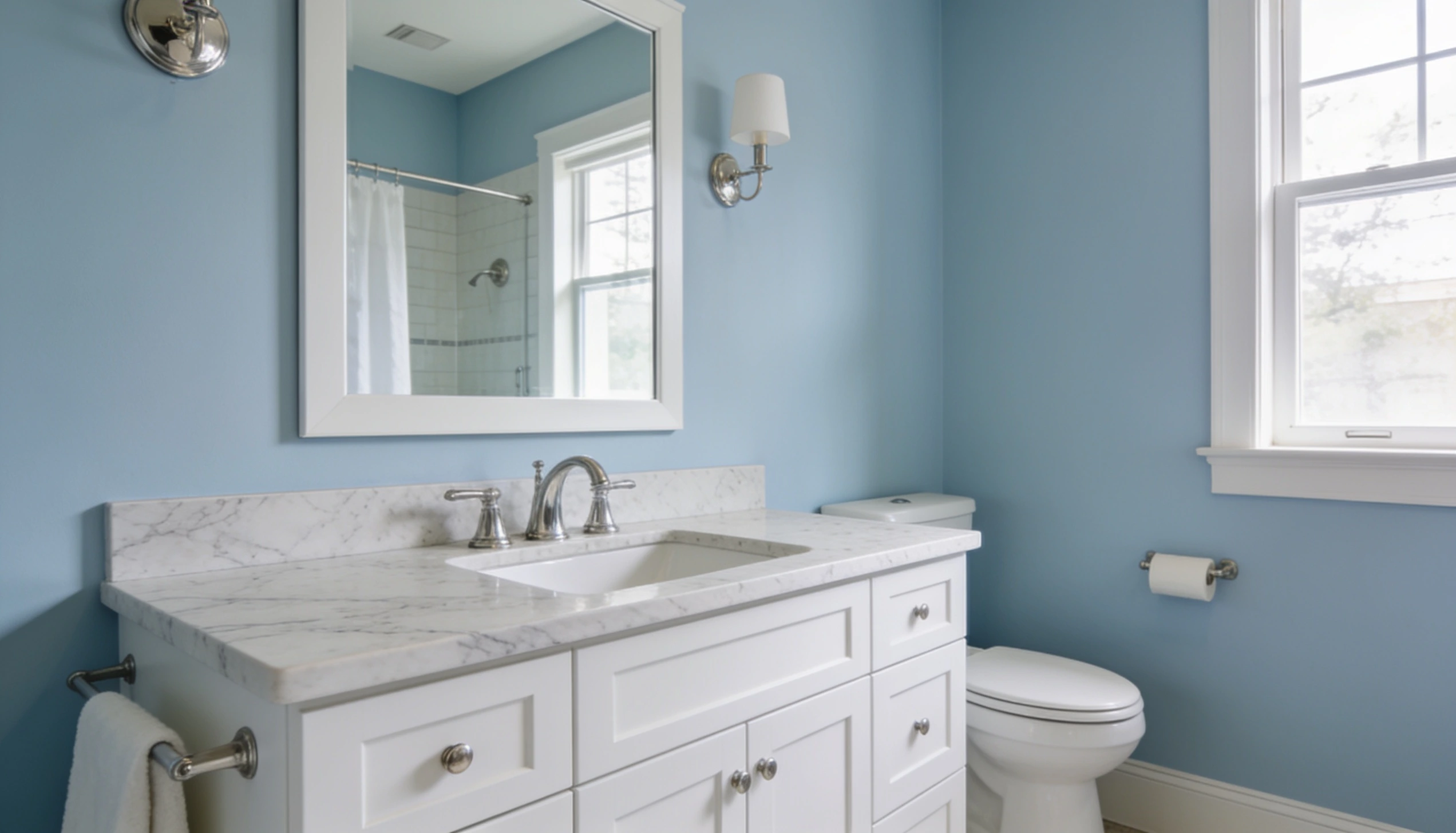
It changes bathrooms into spa retreats.
Pair with white subway tile, soft gray grout, and white towels. The color feels calming without the intimacy of a bedroom.
These walls create serenity, but moisture and humidity shift how the color reads.
Dark tile with Sleepy Blue can feel cave-like, so use white subway tile, light gray floor tile, or soft neutral stone.
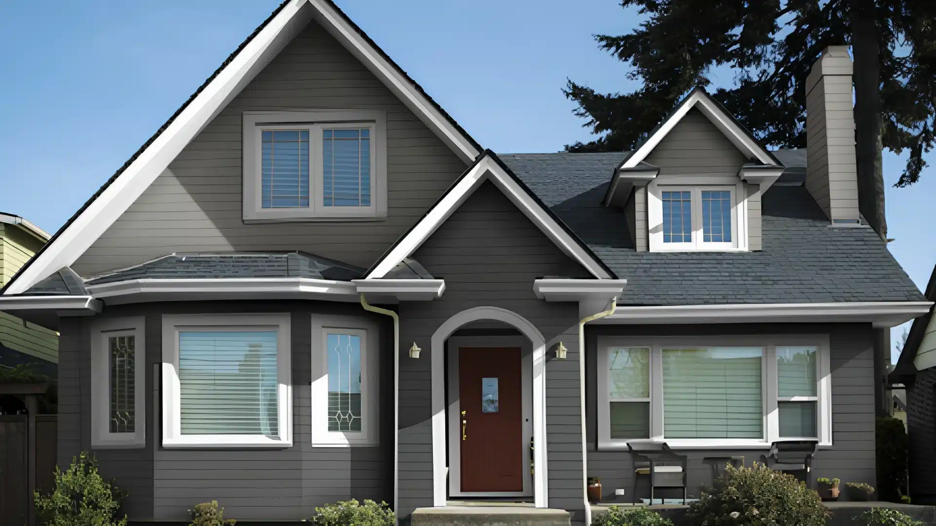
Is Sleepy Blue Sherwin-Williams a Good Exterior Paint Color?
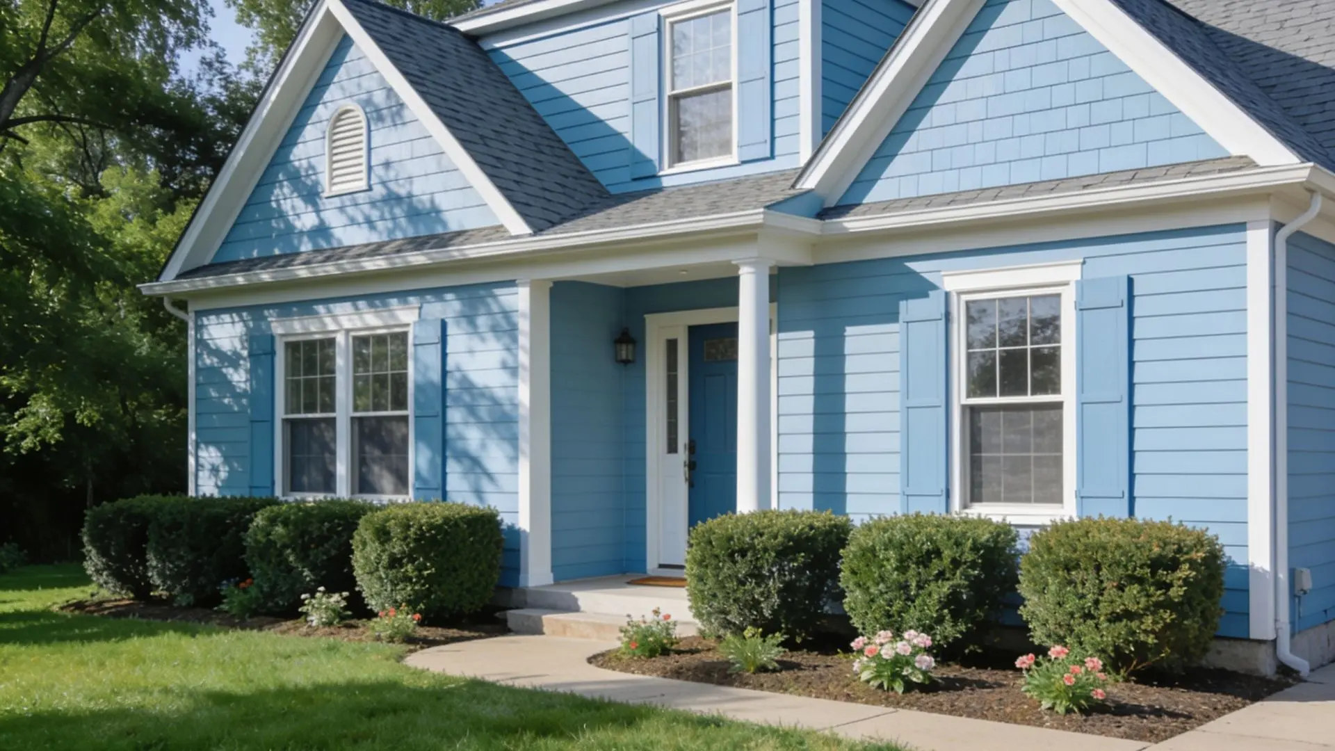
It can work well as an exterior color.
Its flexibility allows it to complement a wide range of architectural styles, including coastal homes, farmhouses, modern designs, and traditional builds.
With a beautiful appeal, it avoids the fleeting nature of trendy colors, remaining calming and relevant for years.
Thanks to Sherwin-Williams’ durable exterior formulations, it holds up well against sunlight with minimal fading.
Additionally, it goes well with natural materials such as wooden shutters, stone trim, and wood siding, increasing the home’s overall character.
Sleepy Blue Vs Tradewind Vs Upward
| Comparison Point | Sleepy Blue (SW 6225) | Tradewind (SW 6218) | Upward (SW 6239) |
|---|---|---|---|
| LRV | 57–58 (light-to-medium) | 60.69 (lighter) | 57.4 (light-to-medium) |
| Undertones | Blue + gray + hint of green | Blue + gray + green | Blue + gray + violet |
| Temperature | Cool blue | Cool blue | Cool blue-gray, balanced |
| Design Styles | Farmhouse, modern, traditional, spa visual | Coastal, beachy, contemporary | Coastal, modern farmhouse, casual contemporary |
| Room It Suits | Bedrooms, bathrooms, kitchens, and home offices. | Ideal for bedrooms and bathrooms. | Bedrooms, living rooms, kitchens, bathrooms. |
| Lighting Impact | Gray undertones become pronounced in cool/artificial light. | High reflectivity makes it appear lighter in bright rooms. | Stable across lighting conditions. |
Conclusion
Sleepy Blue (SW 6225) stands out as a serene paint color.
With its soft gray undertones, it adapts easily from interiors to exteriors, complementing a wide range of architectural styles and natural materials.
For the best results, always test large samples in your own lighting and pair them with crisp whites or soft neutrals for trim.
If you’re looking for a peaceful, comforting atmosphere, it is an outstanding option.
Frequently Asked Questions (FAQs)
1. Does the Light Affect the Color?
Absolutely, natural light brings out green undertones, while warm artificial light makes Sleepy Blue appear grayer and warmer.
2. Is Sleepy Blue More Blue or Gray?
It’s primarily blue, but the gray undertone is strong enough to keep it muted and advanced rather than bright or pastel.
3. Which is the Prettiest Shade of Sleepy Blue Sherwin-Williams?
Sleepy Blue itself (SW 6225) is the official shade; there’s only one, though its appearance shifts based on your room’s lighting and surrounding colors.