Ever mixed colors and ended up with mud?
Most people know red, blue, and yellow exist. But actually creating the colors you want? That’s where it gets messy. You’re trying to make purple and somehow get brown instead.
Understanding primary colors and secondary colors changes everything. Once you know how these six basic colors work, you’ll mix any shade you need.
What are Primary and Secondary Colors?
Primary colors and secondary colors form the base of the entire color system.
Primary colors are the foundation of all other colors. You can’t make them by mixing other colors together.
The three primary colors are:
- Red
- Blue
- Yellow
Secondary colors come from mixing two primary colors together.
The three secondary colors are:
- Orange (red + yellow)
- Green (blue + yellow)
- Purple (red + blue)
The key difference between primary colors and secondary colors is simple: primary colors can’t be broken down further, while secondary colors are created by blending two primaries.
This system forms the basis of the color wheel. Artists, designers, and anyone working with color use this knowledge every day.
Understanding this relationship helps you mix paints, choose color schemes, and know why certain colors work well together.
Understanding Tertiary Colors
Tertiary colors are the next step in the color wheel. You create them by mixing one primary color with one secondary color that sits next to it.
There are six tertiary colors: red-orange, yellow-orange, yellow-green, blue-green, blue-purple, and red-purple.
Mix red (primary) with orange (secondary), and you get red-orange.
Mix yellow (primary) with green (secondary), and you create yellow-green.
These colors fill the gaps between primary colors and secondary colors. They give you more options and help create smoother color transitions.
Tertiary colors appear everywhere in nature and design. The burnt orange of autumn leaves is a tertiary color. So is the teal blue of tropical waters.
The Science Behind Colors
Colors behave differently depending on whether they come from light or pigment.
Additive Mixing (RGB – Light):
Used in screens and digital displays. Red, Green, and Blue light combine to create new colors — when all three overlap, they make white light.
Subtractive Mixing (RYB/CMYK – Pigment):
Used in paints and printing. Red, Yellow, and Blue (or Cyan, Magenta, Yellow, and Black) mix by absorbing light.
Combining pigments results in darker colors; mix them all, and you get brown or black.
Light adds color; pigment subtracts it. That’s why red and green light make yellow, but red and green paint make brown.
Color is the result of how light interacts with materials; what your eyes see depends on the medium, whether it’s glowing pixels or painted pigments.
The Color Wheel
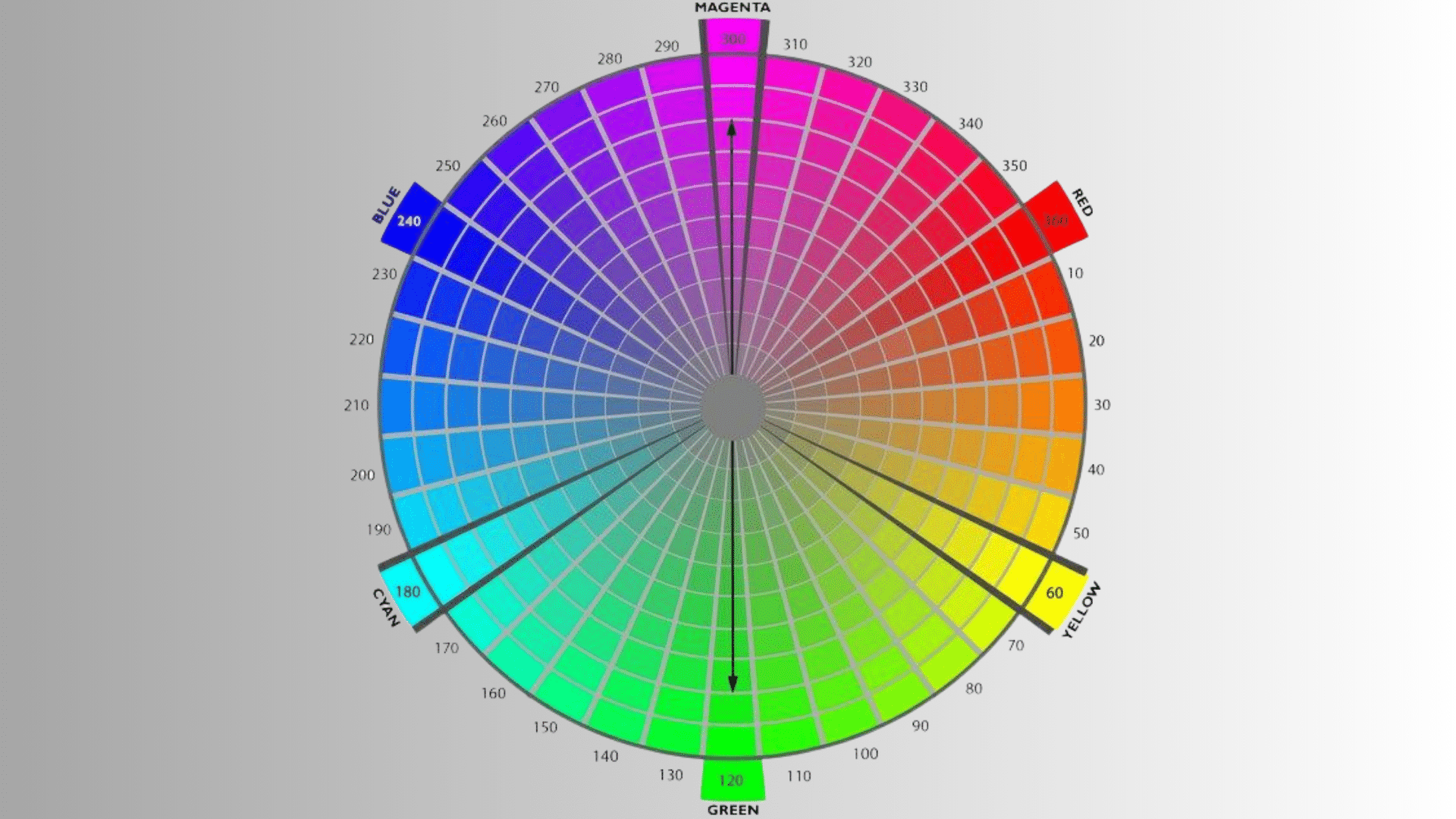
The color wheel is a simple tool that shows how colors relate to each other. It’s divided into primary, secondary, and tertiary colors, arranged in a circular layout.
The wheel helps artists and designers create color harmony: choosing combinations that look pleasing together.
Common relationships include:
- Complementary colors: Opposites on the wheel (like red and green): create strong contrast.
- Analogous colors: Next to each other (like blue, blue-green, and green): feel calm and natural.
- Triadic colors: Evenly spaced (like red, yellow, and blue): bright and balanced.
The color wheel is your roadmap for mixing, matching, and balancing colors: whether you’re painting, decorating, or designing a brand.
How Primary and Secondary Colors Are Used in Art and Design
Primary and secondary colors form the foundation of visual creativity.
Artists, designers, and decorators use these six colors to create everything from paintings to room designs.
In Painting and Fine Art
Painters start with the three primary colors plus white and black. From these five basic paints, they mix every other color they need.
This method saves money and gives artists full control. When they need orange, they simply blend red and yellow on their palette.
In Interior Design
Interior designers use secondary colors to set the mood in spaces. Green creates calm in bedrooms and bathrooms.
Orange adds warmth and energy to kitchens and living rooms. Purple brings a sense of luxury to boutique spaces.
Each secondary color triggers specific feelings that shape how people experience a room.
In Graphic Design and Branding
Major brands rely on primary colors for instant recognition.
McDonald’s uses red and yellow. Facebook picked blue. Coca-Cola chose red.
These bold, pure colors grab attention and stick in memory. Secondary colors work better when designs need a softer, more balanced appeal.
Creating Visual Contrast
Designers pair primary colors with their opposite secondary colors for maximum impact. Red against green creates a strong contrast. So do blue and orange, or yellow and purple.
This technique makes important elements like buttons and headlines stand out immediately.
Color Psychology and Meaning
Colors trigger emotions and influence decisions without words.
Each color sends a specific message that affects how people feel and respond.
1. Red: Energy and Passion
Red grabs attention and creates urgency. It signals passion and excitement. Sale signs and stop signs use red for maximum impact.
2. Blue: Trust and Calm
Blue represents trust and professionalism. Banks and tech companies favor it. It’s the most universally liked color and creates a calming effect.
3. Yellow: Happiness and Optimism
Yellow lifts mood and signals cheerfulness. Brands use it to appear friendly and approachable. Softer shades feel warm and welcoming.
4. Green: Nature and Growth
Green connects us to nature and signals health. It creates balance and represents growth. Organic brands choose green for environmental messaging.
5. Orange: Enthusiasm and Creativity
Orange combines energy with happiness. It feels playful and adventurous. Children’s products and sports teams commonly use orange.
6. Purple: Luxury and Wisdom
Purple suggests royalty and luxury. Beauty brands and premium products favor it. Deep purple conveys sophistication and wealth.
The Bottom Line
So there you have it. Primary colors are red, blue, and yellow.
Mix any two and you get secondary colors: orange, green, and purple.
Now you can mix colors confidently without ending up with muddy mistakes. You know how the basics work together.
Ready to try it out? Grab some paints and start experimenting. The best way to understand color mixing is to actually do it yourself.