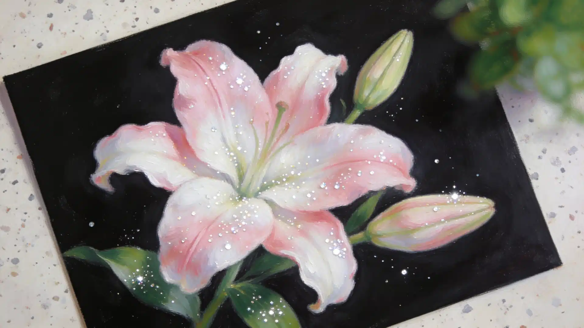
Blue cancels out orange.
That’s true whether you are fixing a stain job that went too warm, or trying to pick a wall color that won’t fight with an orange looking wood floor.
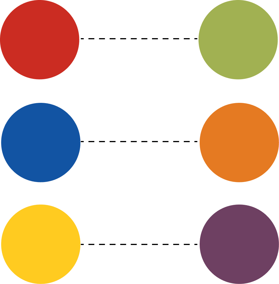
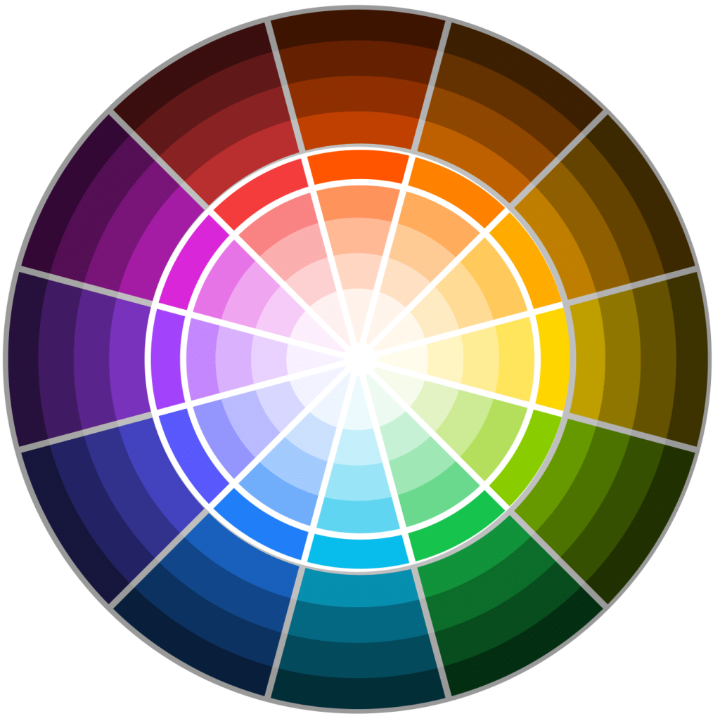
Blue sits directly opposite orange on the color wheel. And colors that sit opposite each other neutralize when mixed — the orange mutes, the blue mutes, and what’s left is a grayish, calmed-down version of whichever one you started with.
Just like purple, orange has exactly one true opposite. Let’s read more about it.
Understanding the Color Wheel and Complementary Colors
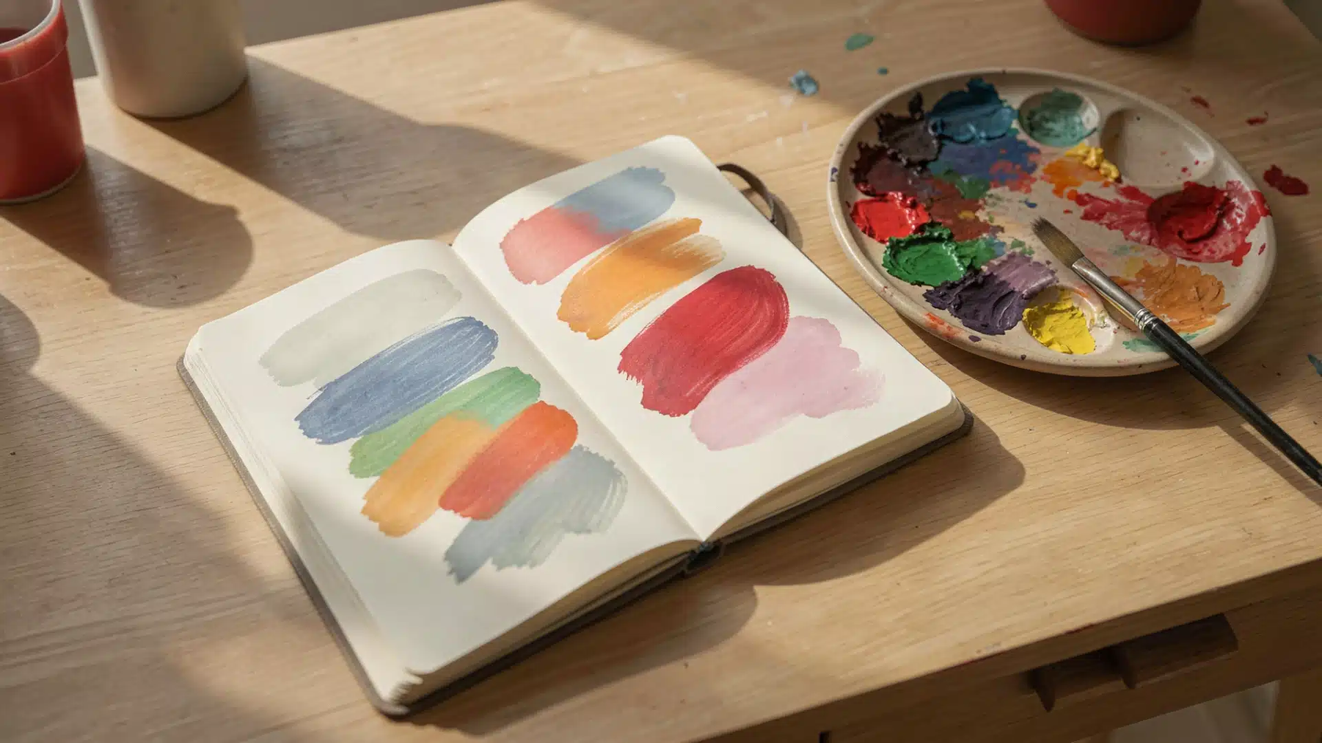
The color wheel is a circular diagram that shows how colors relate to each other. It helps you understand which colors work well together.

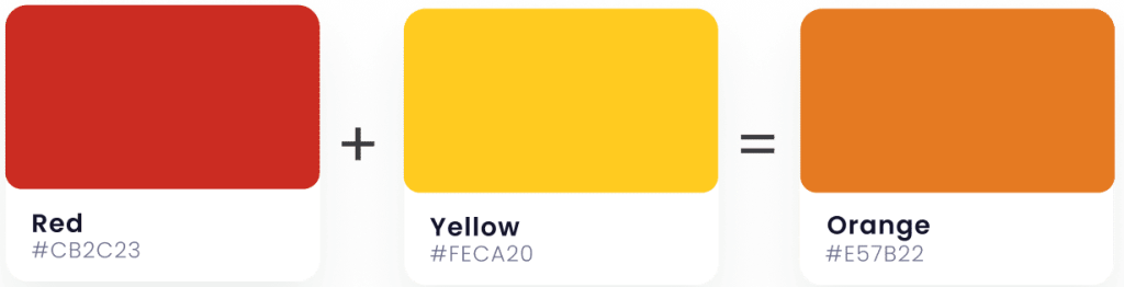
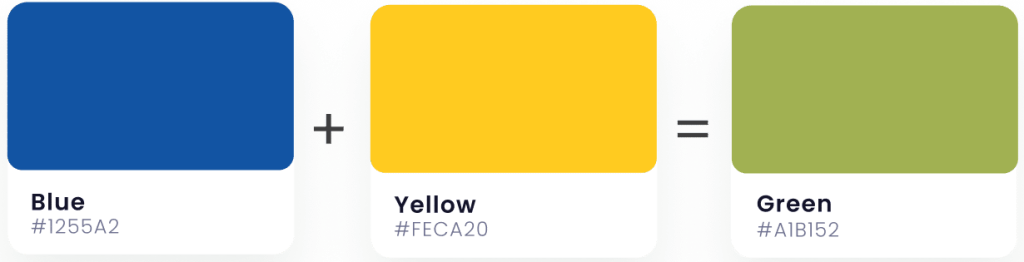
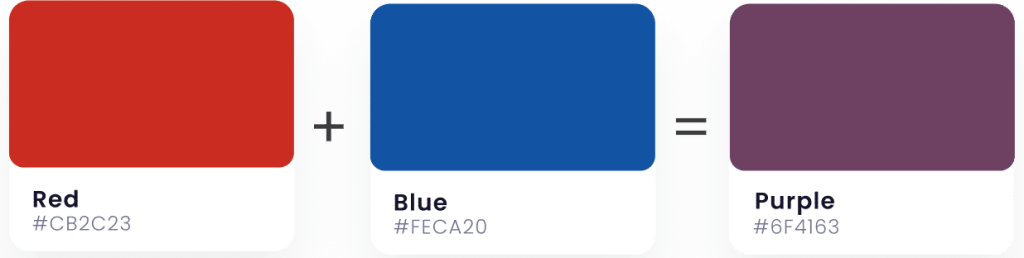
Opposite of Orange – Blue.

Orange is a warm color that falls between red and yellow. Blue, being a cool color, sits on the opposite side of the wheel. This creates a natural contrast that makes both colors pop when used together.
You don’t need to use bright, pure shades.
A muted terracotta looks completely different against a saturated cobalt than it does against a chalky powder blue.
The darker and more saturated the blue, the more the orange gets to stay warm and rich instead of looking washed out.
Navy and burnt orange work beautifully together. Turquoise pairs well with terracotta.
Sky blue complements peach tones. Any variation of blue and orange will create that complementary effect.
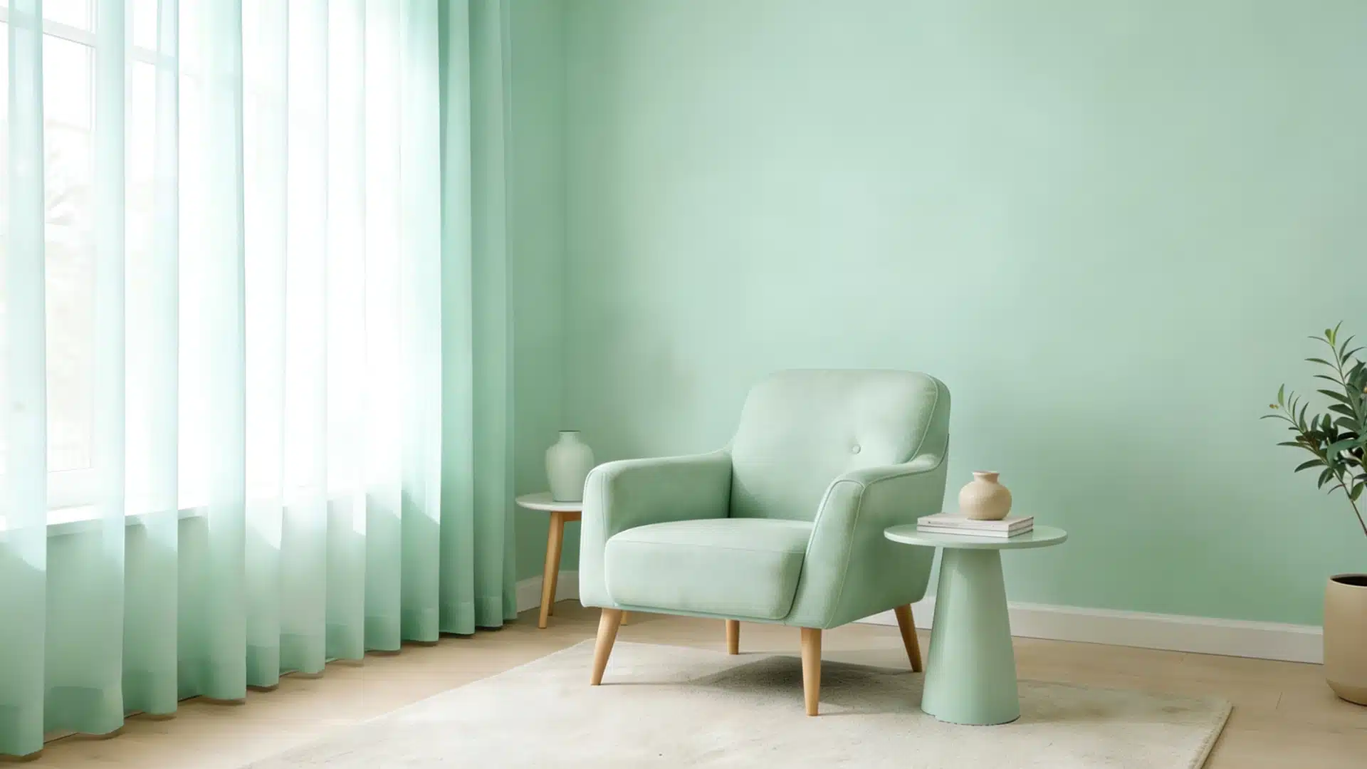
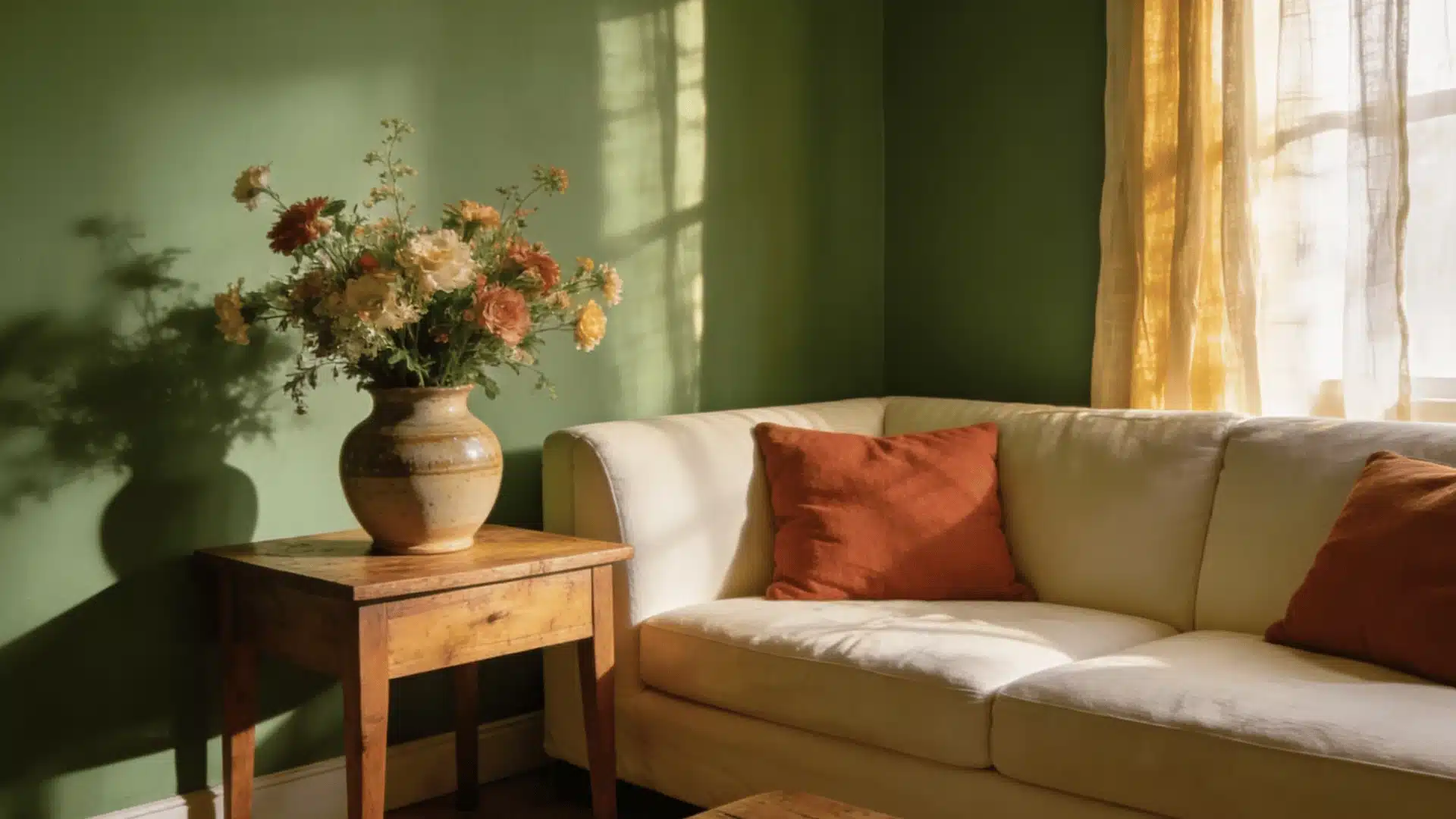
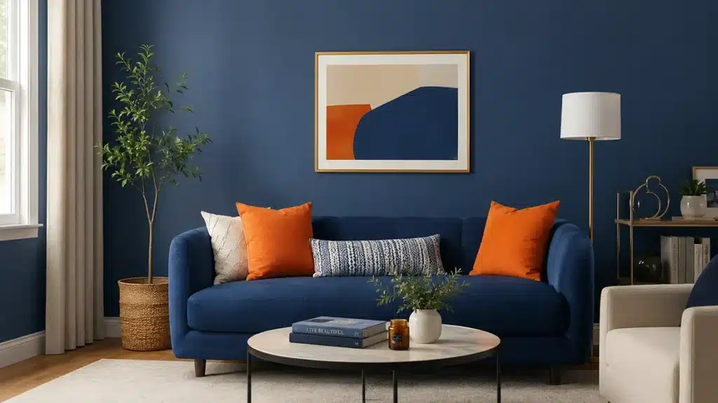
In your home, try pairing blue walls with orange pillows or an orange chair against blue-gray paint.
Inkwell by Sherwin Williams paired with a burnt-orange or rust-colored accent chair is a combination that shows up in a lot of living rooms for a reason — the near-black depth of this color keeps a bright orange from feeling like a Halloween decoration. For something softer, Sherwin-Williams Indigo Batik against a warm terracotta throw does the same job with less contrast.
The contrast adds visual interest and energy to any room.
Why is Blue Opposite of Orange?
Blue sits opposite orange because of how your eyes process color.
Okay so your eyes have cone cells that detect red, green, and blue light. And orange activates your red and green cones together. Blue only activates blue cones.
This whole thing creates maximum contrast in your visual system.
The Afterimage Test
Stare at something orange for 30 seconds, then look at a white surface. You’ll see a blue afterimage.
This happens because your orange-detecting cones get tired, and your blue cones respond strongly. This proves they’re true opposites.
Warm Meets Cool
Orange is warm (made from red and yellow). Blue is cool. This temperature difference creates a natural balance that your brain finds pleasing.
Real-World Uses of Orange and Its Opposite Color
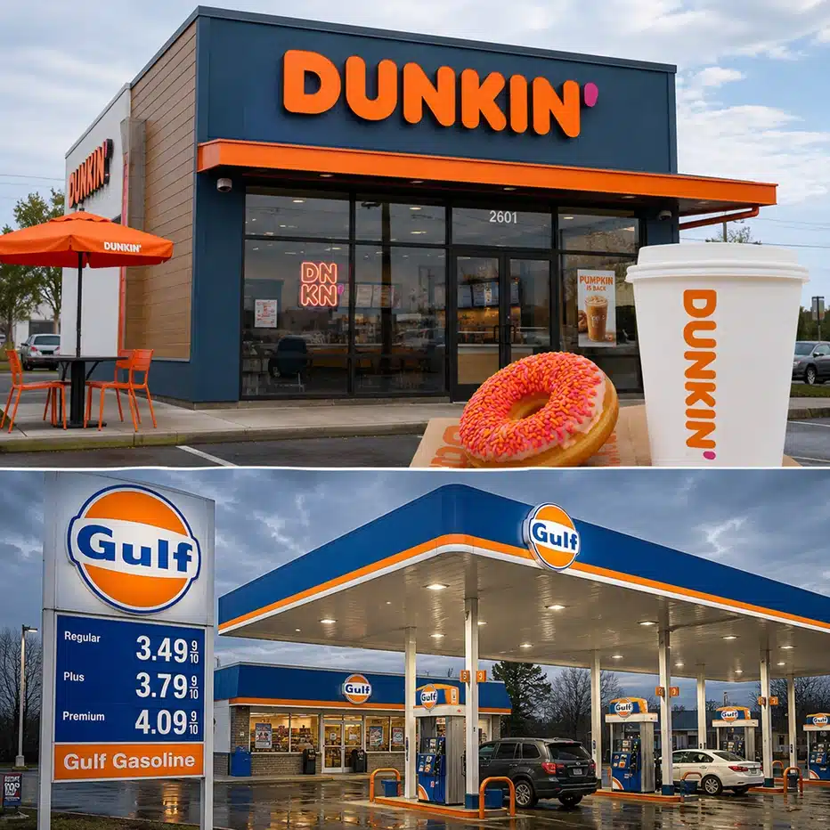
Blue and orange show up together everywhere once you start noticing them. This complementary pair creates impact in design, branding, and everyday spaces.



The Psychology of the Color Orange
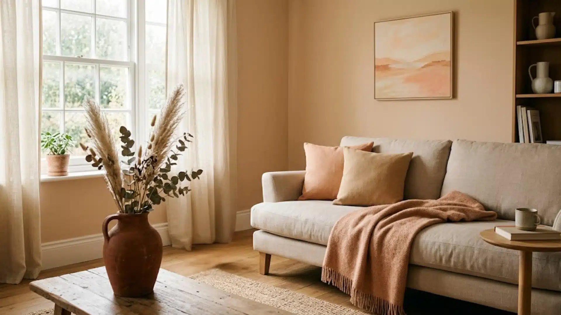
Orange color is often linked with energy, warmth, and confidence.
It combines the intensity of red with the cheerful quality of yellow, which gives it a lively and friendly feel.
Bright orange grabs attention quickly and that is why it appears in warning signs, sports uniforms, sale banners, and action buttons.
Softer shades, such as peach, coral, and terracotta, feel calmer to humans.
Orange is also commonly used in kitchens, restaurants, and food packaging because it can create a social and active mood. However, too much bright orange may feel overwhelming, especially in small rooms.
The meaning of orange changes with its shade:
- Bright orange: Energy and enthusiasm
- Burnt orange: Warmth, comfort, and stability
- Peach: Softness and calm
- Neon orange: Urgency and visibility
Pairing orange with blue helps balance its warmth and reduces its visual intensity.
Where You’ll Actually See Blue and Orange Working Together
Many sports teams use blue and orange as their colors.
The New York Mets, Denver Broncos, and Oklahoma City Thunder all feature this combination.
Alos, in film color grading, where cinematographers push skin tones warm against cool blue backgrounds to make actors pop, and in plenty of orange call-to-action buttons sitting on blue interfaces.
None of that is an accident — it’s the same optical mechanism at work everywhere else. But the version that actually matters for a home is the room version.
Interior Design Applications
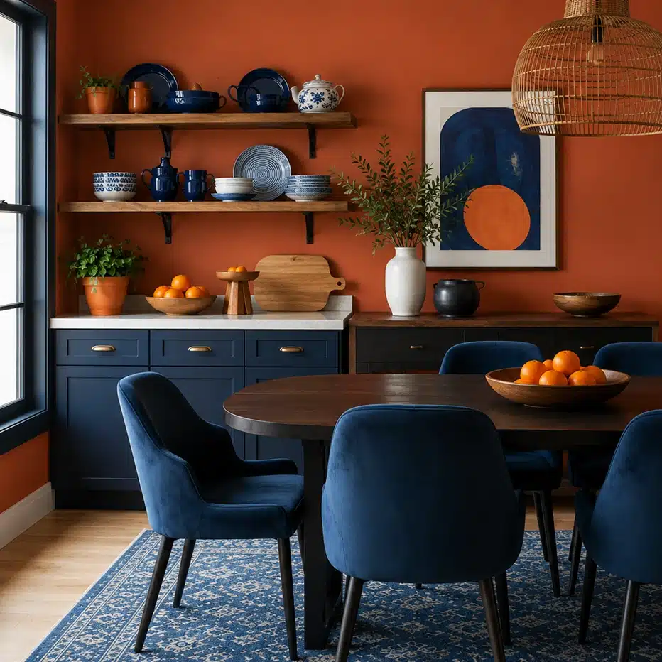
In homes, this pairing works in many styles. Coastal rooms use navy blue with coral or peach accents. Modern spaces pair burnt-orange furniture with slate-blue walls.
Even small touches work, like blue dishes on open shelving painted warm terracotta.
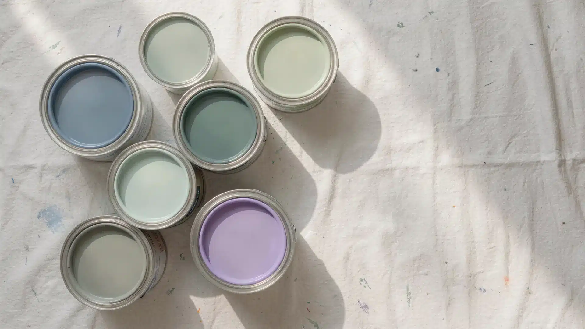
If you’re working with an existing orange-toned wood floor or cabinet, a muted blue-gray like Sherwin-Williams’ Sea Salt or Benjamin Moore’s Boothbay Gray work close enough to neutral. This way, it won’t read as a bold design statement and will give a soft look instead.
Complementary colors only neutralize cleanly in small doses. You cannot expect to get muted and soft orange if you mix a lot of blue with it. If you're toning down a color, always add the opposite color in small amounts to get the right and wanted shade. You can just stop whenever it looks right to you.
Other Complementary Color Pairs You Should Know
| Complementary Pair | Best Uses | Example Combinations |
|---|---|---|
| Red & Green | Living rooms, dining spaces | Olive walls with burgundy accents; sage with dusty rose |
| Yellow & Purple | Bedrooms, living spaces | Lavender with gold; eggplant with butter yellow |
| Red-Orange & Blue-Green | Bathrooms, coastal rooms | Coral and teal; rust with turquoise |
| Yellow-Orange & Blue-Purple | Nurseries, calm spaces | Peach with periwinkle; apricot with lavender |
Use one color as your main shade and the other as an accent. Choose muted versions instead of bright, pure colors. Add neutrals like white or gray to balance the look.
Common Misconceptions About Opposite Colors
1. Not Every Color Has a Single Opposite
The opposite color depends on the model you use.
- On the RYB wheel (paints) → orange’s opposite is blue.
- On the RGB wheel (light/screens) → it’s cyan-blue.
2. Opposite Colors Don’t Clash
They actually complement each other, creating contrast and balance, which is why orange and blue look great together.
3. Not All Blues Cancel Orange
Different shades matter: bright orange is neutralized by true blue, while brassy orange needs blue-green or teal.
4. Mixing Opposites Doesn’t Make Bright Colors
It makes neutral tones like brown or gray, perfect for toning down brightness.
5. The Fruit “Orange” Has No Opposite
Only colors have opposites, not objects.


Conclusion
Blue cancels out orange because it sits exactly opposite it on the color wheel, and that single fact covers most of the situations you’ll actually run into, whether it’s a paint sample gone wrong or a room that needs one more accent color to feel finished.
The next time an orange stain, tile, or paint sample throws you off, you’ll know exactly which direction on the wheel to reach for, and how much of it to actually use.
Frequently Asked Questions (FAQ’s)
1. Does Purple Cancel out Orange?
No, purple neutralizes yellow-green shades, not orange. Blue sits opposite orange on the color wheel, making it the true match.
2. What Color Cancels Orange in Hair?
Blue-based toners cancel brassy orange tones in hair. Ash or blue shampoos work best for lightened or bleached hair color.
3. Can Mixing Orange and Blue Paint Make Brown?
Yes, mixing orange and blue paint creates brown or gray tones, since complementary colors cancel each other’s brightness.