Today, I’m sharing everything you need to know about Sherwin-Williams Rain SW 6219, including real room photos and my honest review.
I’ve tested this color in three different rooms with various lighting conditions, and I’ve gathered photos from homeowners who actually use this paint in their spaces.
After reviewing many shades with grey undertones like Thunderous SW, I can confidently compare how Rain performs against others.
Let’s take a close look at how Rain performs in real homes.
What Makes Sherwin-Williams Rain Unique?
Rain is a beautifully balanced blend of soft gray with subtle blue and green undertones, which sets it apart from ordinary grays or blues.
With a Light Reflectance Value (LRV) of 49, it reflects enough light to keep rooms from feeling dark but still provides a cozy, calming effect.
This makes Rain a versatile choice for different interiors; it can make a bedroom feel serene or a living room look sophisticated without overwhelming the space.
Its understated yet rich tone offers a unique way to bring tranquility and style to a variety of home settings.
Real Room Photos Showcasing Sherwin-Williams Rain
Real-life rooms painted with Rain show how this versatile color adapts beautifully to different lighting and décor styles.
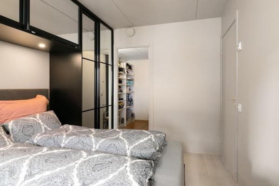
1. Bedroom
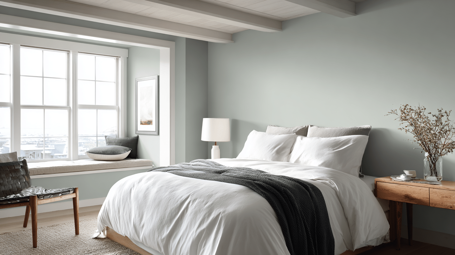
In bedrooms with soft lighting, Rain gently envelops the space in soothing blue-gray tones that create a peaceful and cozy environment.
This calming color helps establish a serene retreat that promotes relaxation and restful sleep, making it ideal for unwinding after a long day.
2. Bathrooms
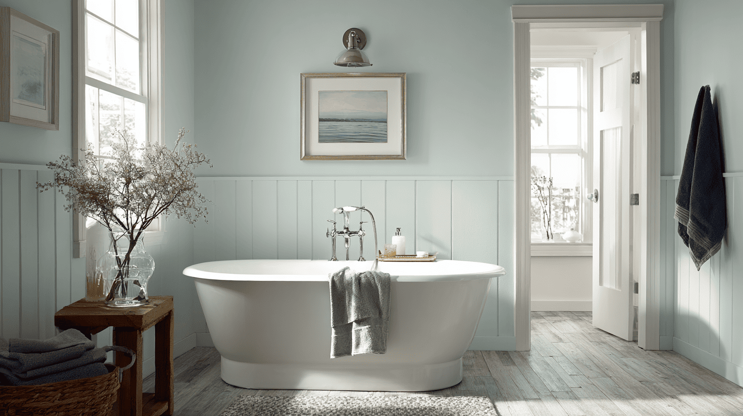
Rain’s crisp, fresh qualities shine brightest in bathrooms flooded with natural light. It enhances cleanliness and openness while complementing white fixtures and chrome accents beautifully.
This combination creates a spa-like atmosphere that feels both refreshing and tasteful, perfect for starting or ending your day on a calm note.
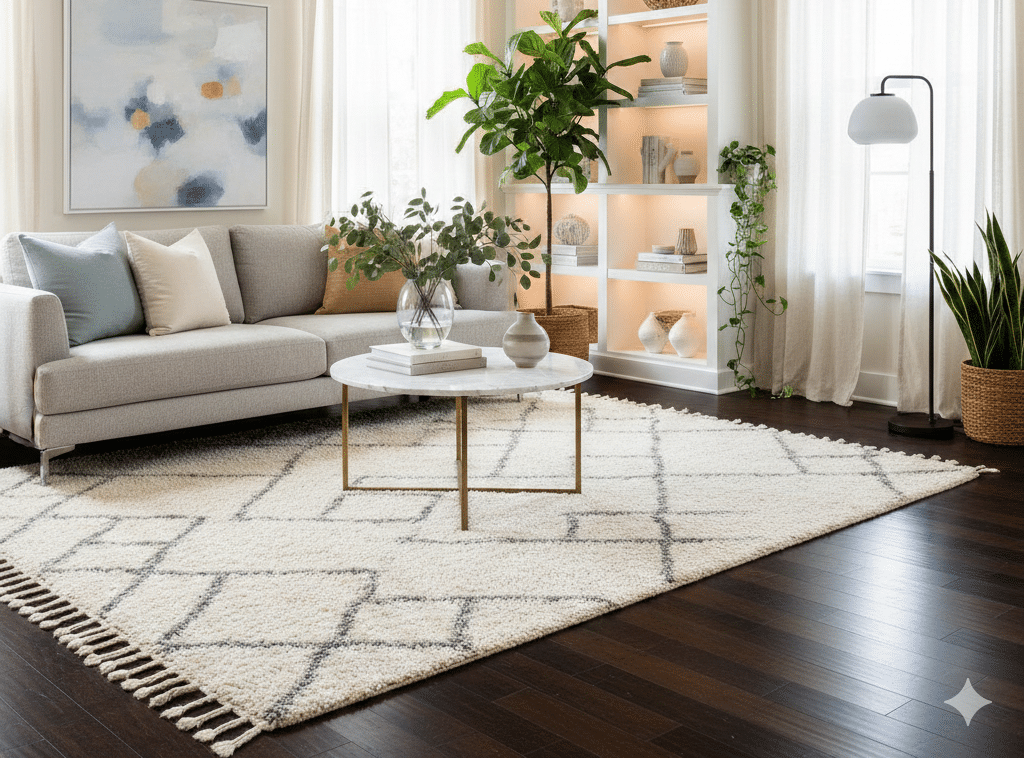
3. Kitchens
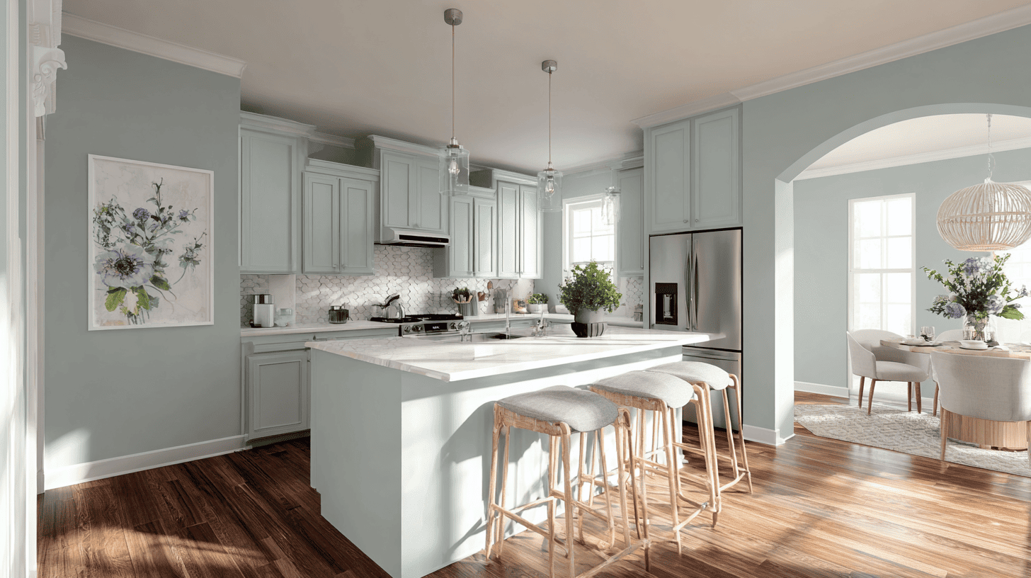
On kitchen walls, Rain serves as a refined, neutral backdrop that balances cool blue and gray undertones with warm wood cabinetry and white accents.
This harmonious blend adds sophistication and depth, creating an inviting and stylish heart of the home where family and guests can gather comfortably.
Best Color Pairings and Trim Options with Rain
Pairing the right colors with Sherwin-Williams Rain can elevate its calming blend and add depth to your space.
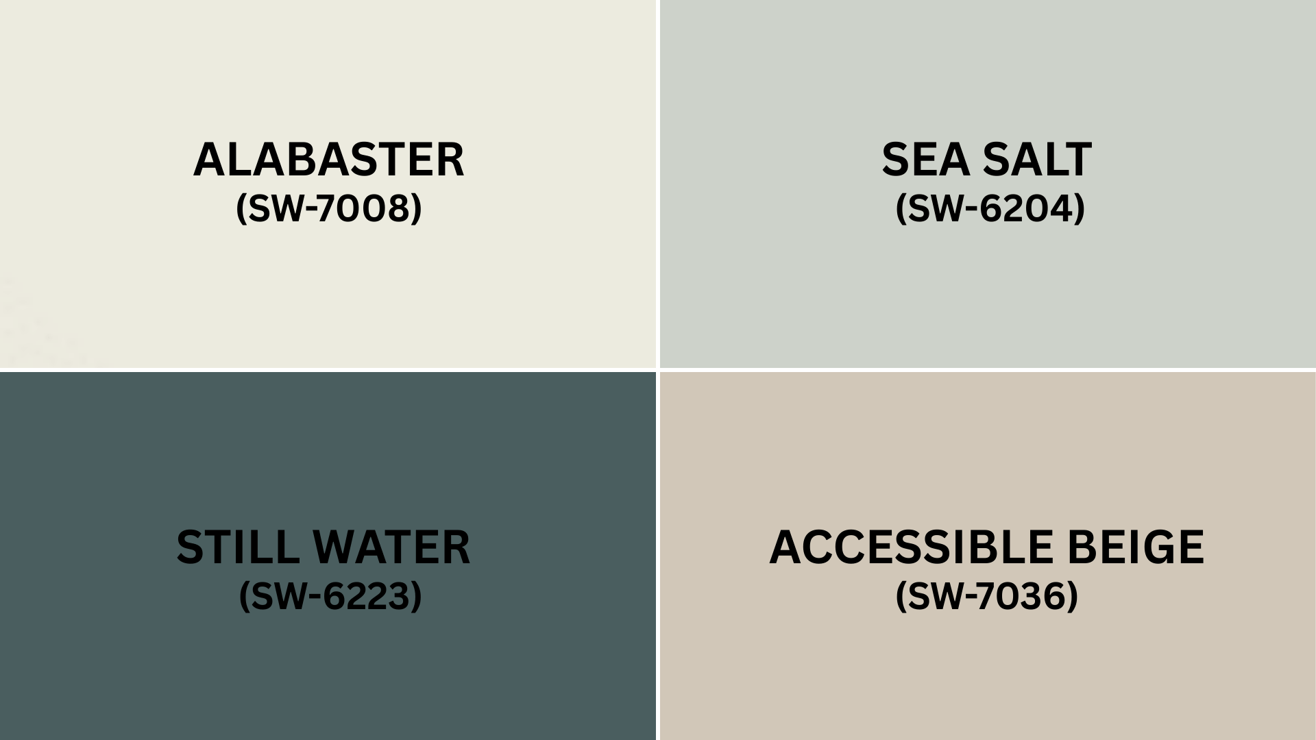
1. Alabaster (SW 7008)
This soft white creates a clean, crisp trim or ceiling color that brightens Rain’s subtle blue-green undertones without harsh contrast. Use it along moldings or ceilings to keep rooms feeling fresh and open.
2. Accessible Beige (SW 7036)
A warm beige that complements Rain’s cool undertones by adding cozy warmth. It works well on larger furniture pieces or accent walls to balance the calmness with inviting earthiness.
3. Sea Salt (SW 6204)
A gentle, muted green that echoes Rain’s hints of blue and green undertones for a harmonious layered look. This pairing suits bathrooms and coastal-inspired spaces perfectly.
4. Still Water (SW 6223)
A deeper blue-green accent that enhances the tranquil, refreshing vibe of Rain, ideal for feature walls, cabinetry, or accents in living spaces.
Each of these color options complements a different aspect of Sherwin-Williams Rain, making it easy to create a stylish, cohesive palette tailored to your décor preferences.
Tips for Painting and Finishing with Rain
Choosing the right finish and preparation can make all the difference when painting with Rain. Here are some tips to help you get the best results:
- Use matte or eggshell finishes in bedrooms and living areas for a soft, sleek look.
- Opt for semi-gloss finishes in kitchens and bathrooms to handle moisture and allow easy cleaning.
- Always test paint samples on your walls to observe how Rain changes with different lighting throughout the day.
- Properly clean and prime surfaces before painting to ensure smooth application and long-lasting color.
- Consider multiple coats for an even, rich finish, especially on darker or textured walls.
Following these tips will help your paint job look professional and beautiful for years to come.
Wrapping it Up
Sherwin-Williams Rain is a calm, flexible color that can make any room feel fresh and inviting.
Paired with shades like Thunder Gray and Storm Cloud, it creates a palette that balances soft cool tones with a touch of depth and warmth.
Testing Rain on your walls, along with trim and décor, helps you see how it looks in your own light.
Frequently Asked Questions
What Rooms Are Best Suited for Sherwin-Williams Rain?
Rain works well in bedrooms, bathrooms, and kitchens where its calming blue-green tones create cozy, sophisticated, and fresh atmospheres tailored to each space’s lighting and use.
Which Paint Finish Is Best for Using Rain in Different Rooms?
Matte or eggshell finishes suit living areas for a soft look, while semi-gloss works best in kitchens and bathrooms for moisture resistance and easy cleaning.
How Does Lighting Affect the Appearance of Sherwin-Williams Rain?
Rain changes subtly with natural and artificial light, so testing samples in your space at different times helps ensure the color meets your expectations.
What Colors Complement Sherwin-Williams Rain for Trim and Accents?
Soft whites like Alabaster, warm beiges like Accessible Beige, muted greens like Sea Salt, or bold yellows like Mustard Seed create balanced, stylish combinations with Rain.