

Paint color questions keep my inbox full.
But one shade gets asked about more than others: “What exactly is that color on your wall?” It’s Sherwin Williams Thunderous SW 6201, and people can’t quite figure it out.
What makes this paint special is how it sits between gray, green, and brown.
It’s not just another neutral; it’s a color that changes with the light and makes guests take notice.
Now I’ll share how this unique shade works in real homes, what colors pair well with it, and why it might be perfect for your next project.
Let’s look at what makes this hard-to-define color worth your attention.
What Makes Sherwin Williams Thunderous a Top Choice?
Sherwin Williams Thunderous SW 6201 is a deep, earthy green-gray with an LRV of 15, placing it on the darker end of the spectrum.
Its chameleon-like nature allows it to shift between gray, green, and brown tones depending on the lighting, creating a cozy ambiance without making spaces feel confined.
This color evokes a sense of tranquility and connection to nature, often making occupants feel at ease.
Its versatility shines across various rooms, serving as a cozy backdrop in living areas, fostering focus in home offices, and offering enduring appeal on kitchen cabinets.
When paired with wood tones, Thunderous accentuates the natural grain; brass fixtures provide a rich contrast, and matte black hardware introduces a modern yet warm touch.
How Thunderous SW 6201 Shifts Under Natural, Artificial, and Low Lighting
Rooms with limited natural light need extra care. Thunderous can appear much deeper in north-facing rooms and may look almost black after sunset.
Test the color during the morning, afternoon, and evening before painting the whole room.
Let me share what I’ve noticed about this color under different lighting conditions.
- In morning sunlight, Thunderous shows its green side. The cool undertones come forward, making it look fresh and less brown.
- Afternoon sun brings out the warmth. The yellow base becomes more clear, and the color feels cozier with a hint of olive.
- Under lamps at night, the gray tones take over. The color deepens and creates a calm, den-like feel that helps me wind down.
- On cloudy days, Thunderous looks most true to its paint chip – that perfect mix of gray, green, and brown that’s so hard to name.
Stunning Before and After Projects Featuring Sherwin Williams Thunderous
I’ve used this color in many homes, and the results always impress both me and my clients. Here are some real projects that show what Thunderous can do for different spaces.
Living Room Makeover
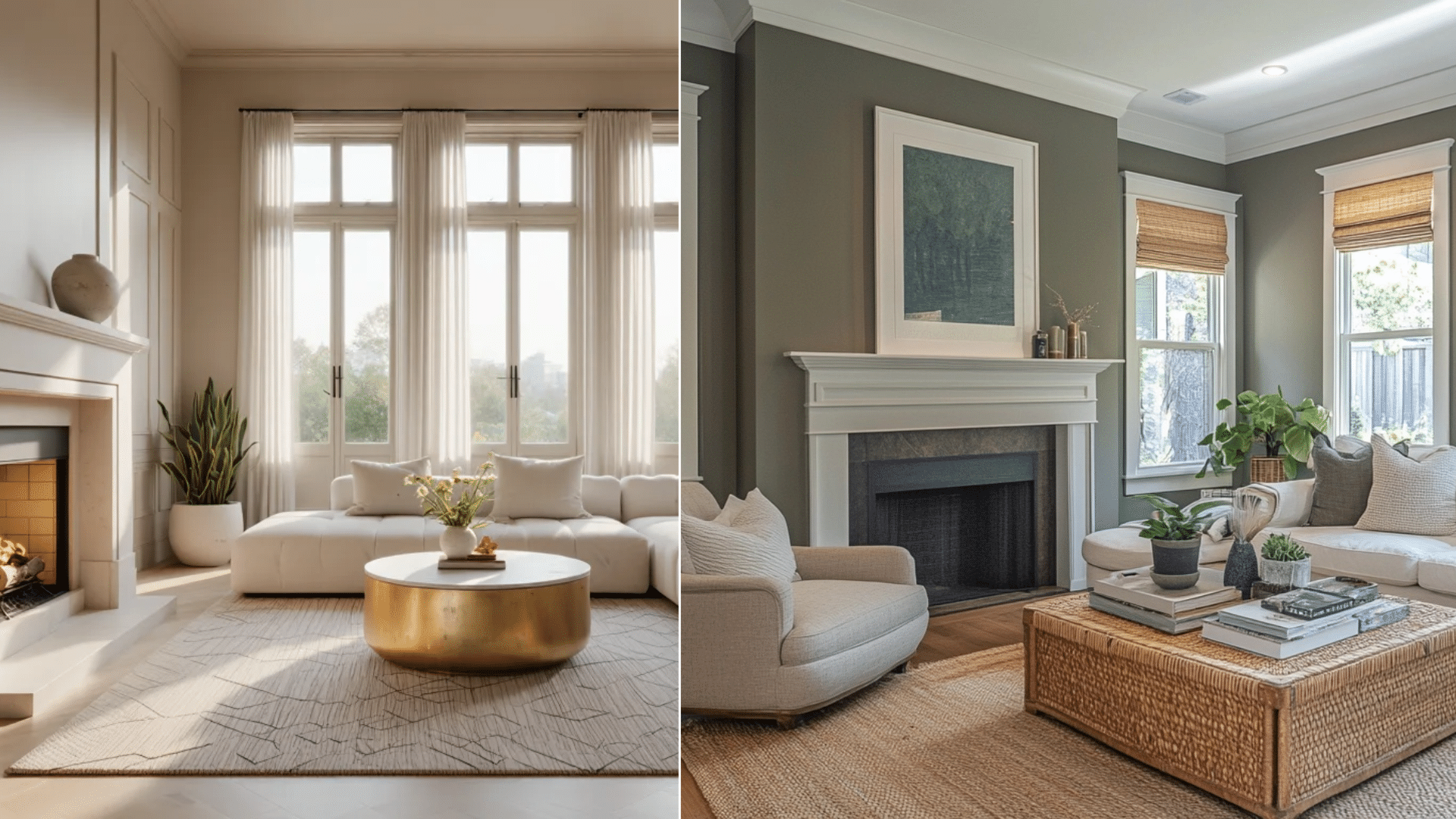
Before:
My client’s living room had light beige walls that seemed to vanish into the background. The space felt flat and washed out, especially in the afternoon sun.
The furniture looked disconnected from the room, almost floating without context.
After:
With Thunderous on the walls, the room gained structure and purpose. The white sofa now stands out with clear definition. Family photos pop against the richer background. The light oak coffee table looks more grounded and intentional.
Most notably, the room feels complete rather than like a work in progress.
Bedroom
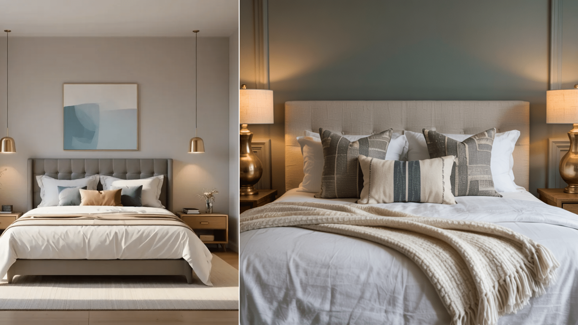
Before:
My bedroom felt uninspired and lacked character. The walls were painted in a generic off-white shade that did little to reflect my personal style.
The space felt cold and impersonal, with furniture and decor blending into the bland background.
Despite my efforts to add warmth through textiles and accessories, the room never achieved the cozy ambiance I desired.
After:
Finding Sherwin Williams Thunderous SW 6201 was a game-changer. This deep, moody green-gray hue brought a sense of depth and richness to the room.
The color’s earthy undertones created a serene and grounded atmosphere, making the bedroom feel like a true retreat.
I complemented the rich walls with warm wood furniture, soft linen bedding, and brass accents, which enhanced the overall warmth and elegance of the space.
Home Office Update
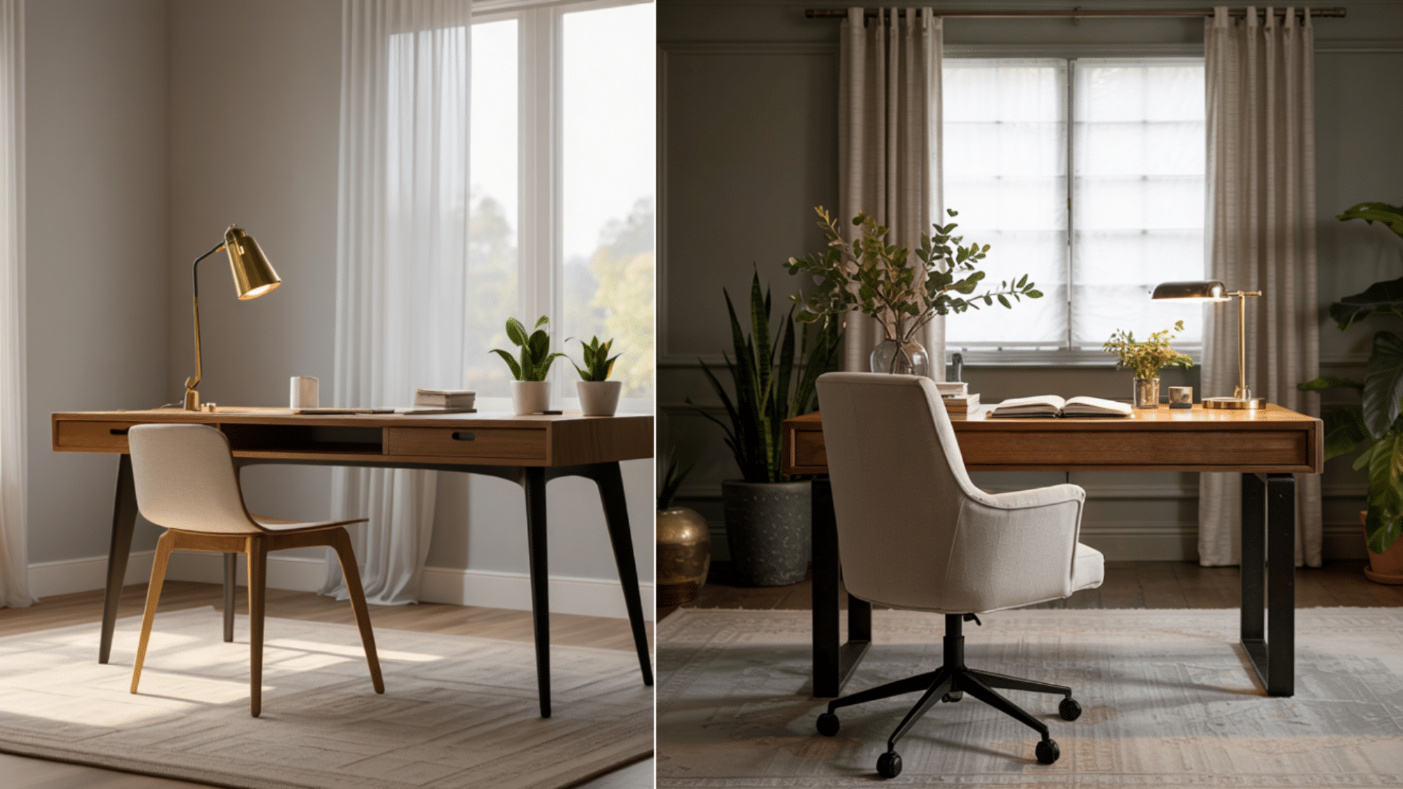
Before:
My home office had white walls and white built-in shelves. Everything looked clean but bland. Books and objects on the shelves faded into the background.
During video calls, the space behind me looked flat and uninteresting.
After:
I painted only the built-in shelves with Thunderous while keeping the walls light.
The contrast created instant focal points. Books and decorative items now stand out against the darker background.
My video calls have a professional backdrop that gets compliments. The color difference helps me feel more focused without making the room feel dark.
Key Takeaways from Each Makeover
- Color Perception: In the living room, Thunderous looked greener during the day and grayer at night. This dual nature meant the room felt fresh yet cozy, depending on the time.
- Ambiance: The reading nook felt much more intimate with Thunderous. The color seems to hug the space, making it feel set apart from the rest of the home in a good way.
- Focus: In the office, the shelves in Thunderous drew the eye but didn’t distract. My client said she felt more productive with the new color scheme.
Is Thunderous the Right Choice for Exteriors?
Yes, but only in small doses. Thunderous works well on a door or trim. It’s riskier on full siding, since bright sun can wash out its detail on large surfaces.
Thunderous on Trim
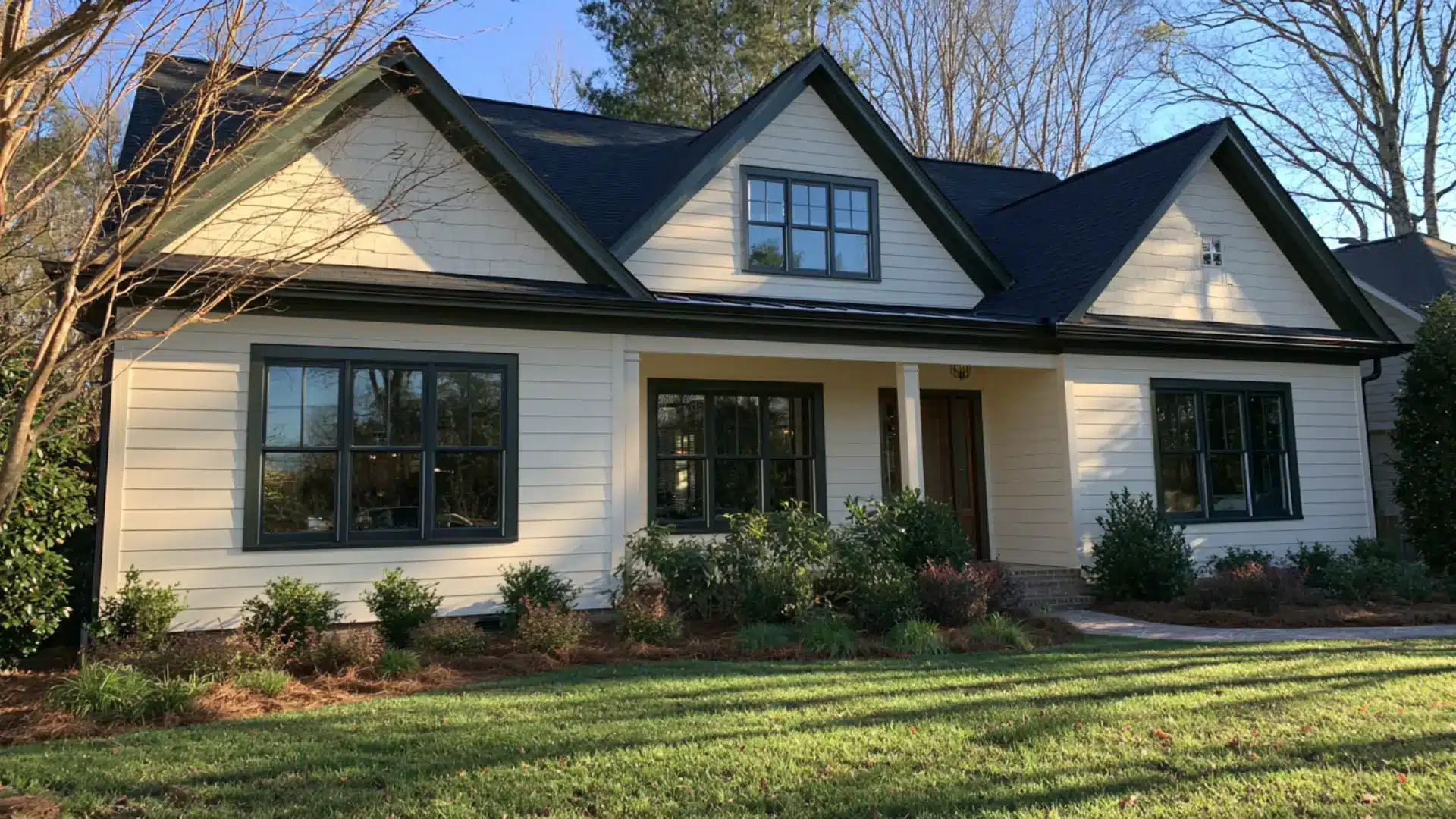
Trim is one of the safest ways to use Thunderous outside. It goes around windows, doors, and rooflines.
It does not cover big areas, so the color stays rich instead of fading in the sun. With white or cream siding, it adds nice contrast.
Always test a sample next to your real siding and roof first. Nearby colors change how green or brown it looks.
Thunderous on a Front Door
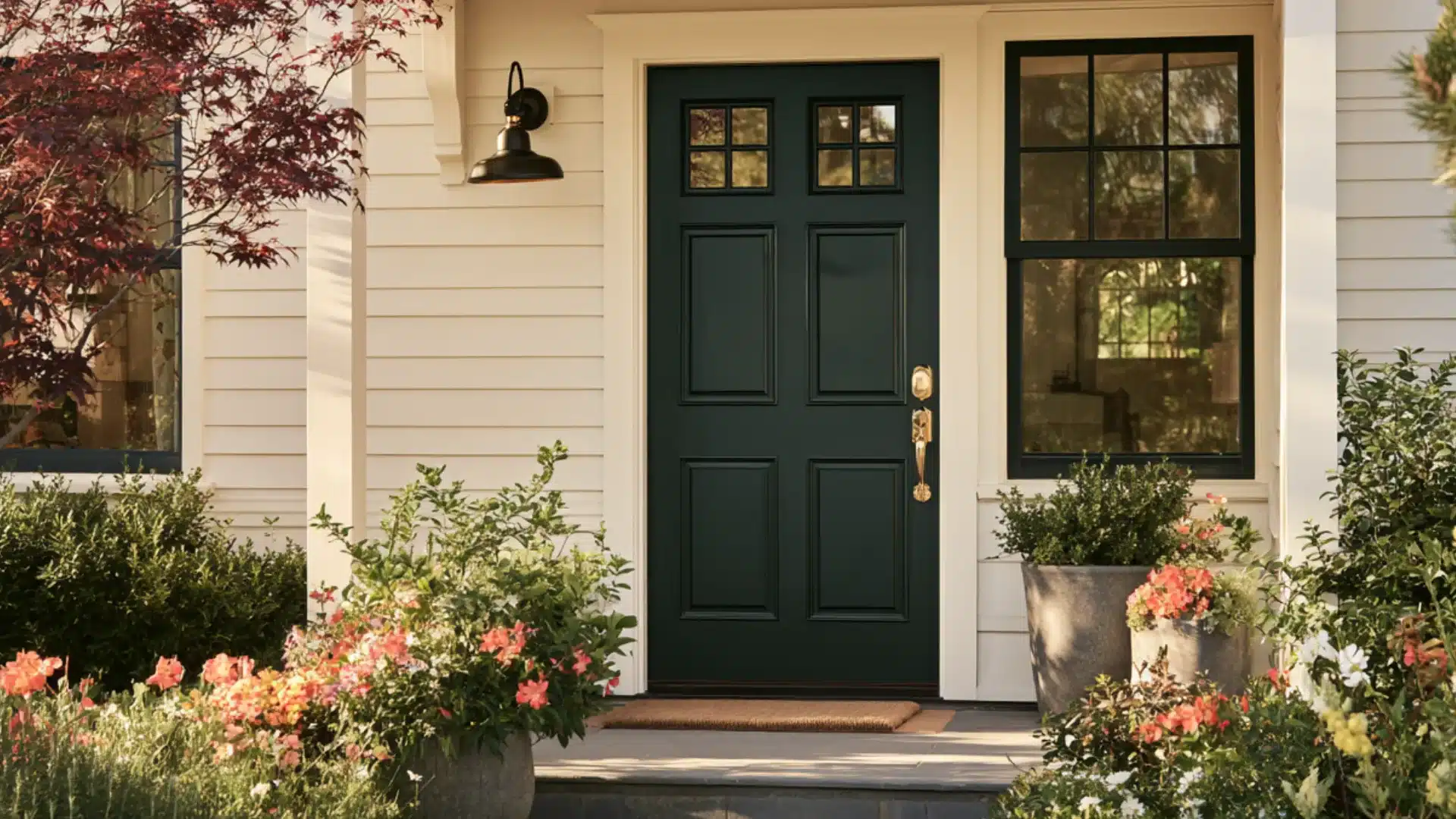
A front door is the easiest place to try Thunderous. It’s a small spot, and it often sits in shade.
Sun makes the color look deep and rich, not flat. It looks great with brass or black hardware and light-colored siding.
Before you paint, hold a sample next to your door frame and porch light. These nearby colors can change how Thunderous looks up close.
Sherwin Williams Thunderous SW 6201 Compared to Similar Shades
When choosing paint colors, I like to see options side by side. Here’s how Thunderous stacks up against colors that might seem similar at first glance.
With its LRV of 15, it sits in the sweet spot – dark enough to create impact but not so dark that it feels heavy like Urbane Bronze or Iron Ore.
| Color | LRV | Primary Tone | Undertones | Best For | How It Compares to Thunderous |
|---|---|---|---|---|---|
| SW Thunderous | 15 | Dark greige | Green, brown | Accent walls, cabinetry | Baseline – unique mix of gray, green, and brown |
| SW Retreat | 17 | Gray | Slight green | Modern spaces | More gray, less green, more stable in light changes |
| SW Evergreen Fog | 26 | Green | Gray | Feature walls | Lighter, more clearly green, less complex than Thunderous |
| BM Chelsea Gray | 22 | Warm gray | Brown | Traditional spaces | No green undertones, more formal look, higher LRV |
| SW Urbane Bronze | 8 | Dark brown | Gray | Exterior trim, doors | Much darker, more brown than green, less versatile indoors |
| SW Iron Ore | 6 | Charcoal | Minimal | Modern statements | Near-black, true neutral with minimal undertones, more dramatic |
The Best Color Pairings with Sherwin Williams Thunderous
I’ve experimented with many combinations alongside Thunderous in my projects. The right pairings can truly bring out the best in this unique color.
Here are my tested favorites that work time and again.
Complementary Neutrals (Whites, Creams)
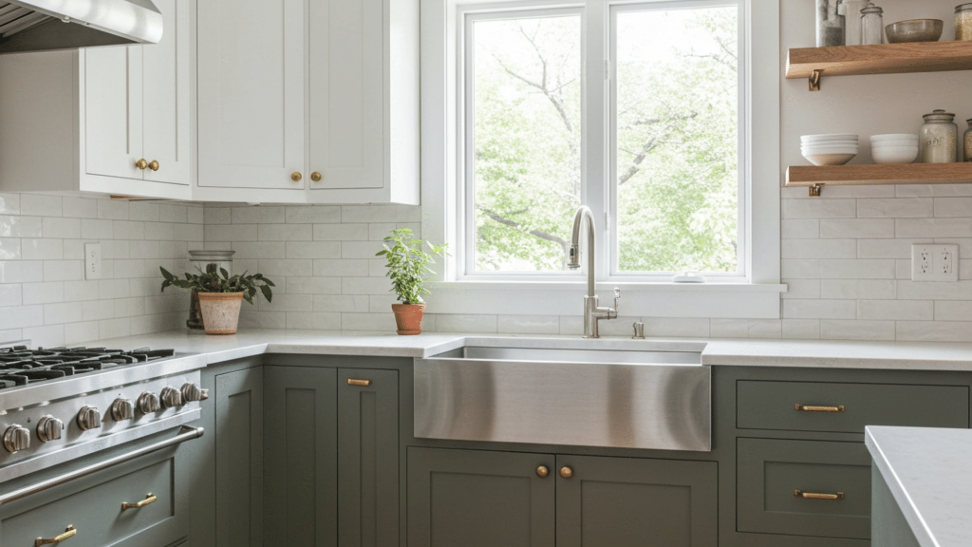
Sherwin-Williams Pure White creates a clean contrast with Thunderous without looking harsh. This pairing works in kitchens with Thunderous cabinets and Pure White walls.
Benjamin Moore Chantilly Lace pairs beautifully for trim and ceilings. Its green undertones speak to the green in Thunderous without being obvious.
For a softer look, I love Sherwin-Williams Eider White. This off-white has hints of greige that connect with Thunderous while keeping spaces light and airy.
Cream colors like SW Alabaster add warmth when Thunderous starts to feel too cool. This combo feels rich without being heavy.
Bold Accents (navy, rust, deep gold)
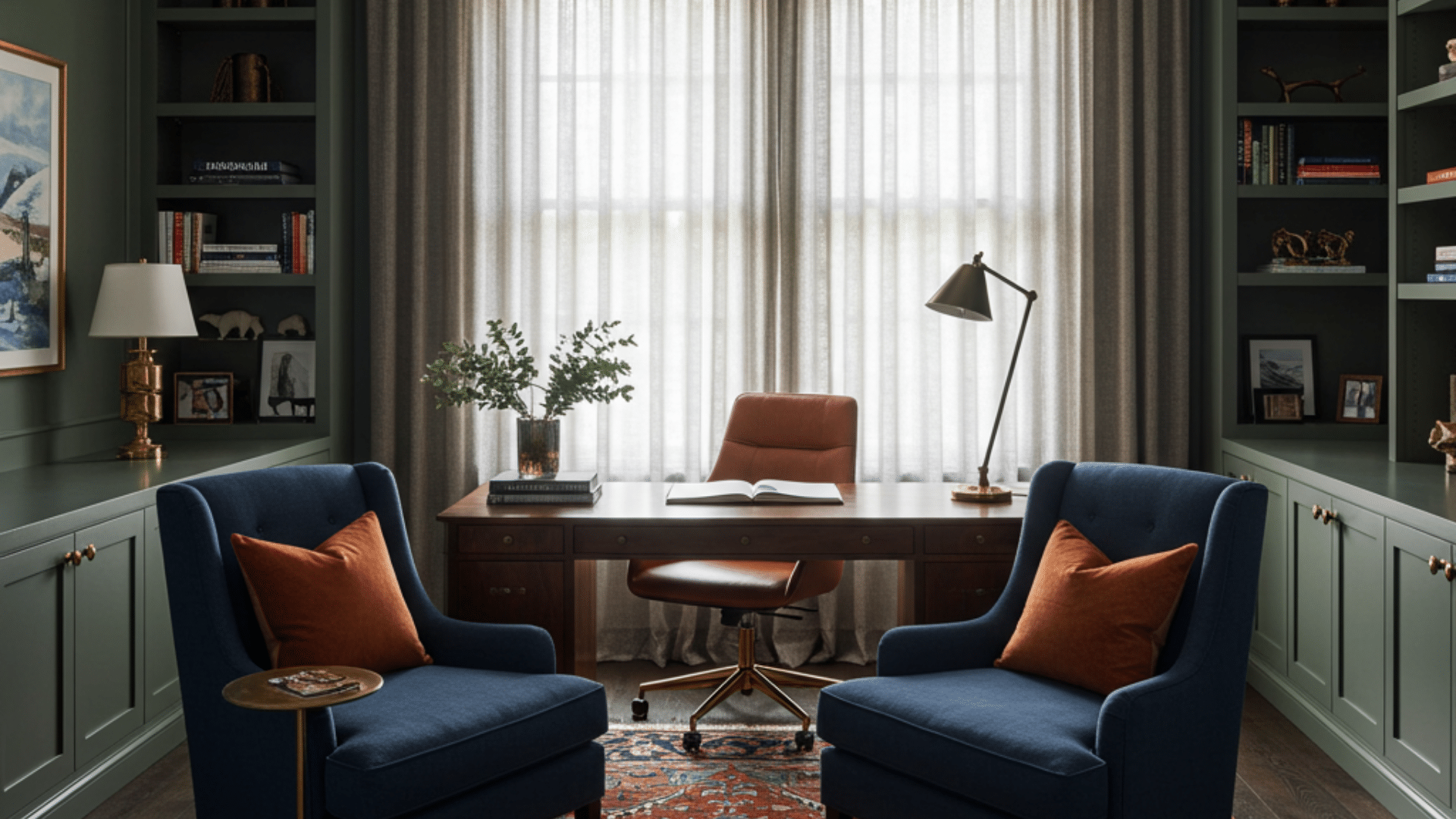
Navy blue, like SW Naval, creates a striking yet natural pairing.
I used this combo in a study with Thunderous walls and navy furniture; the colors felt like they belonged together.
Rust accents bring out Thunderous’s brown undertones. Terracotta pillows or artwork against Thunderous walls feel earthy and warm.
Deep gold elements, not bright yellow but amber-toned, add richness. Gold picture frames or lamps seem to glow against the thunderous background.
Materials and Textures (Wood, Linen, Rattan)
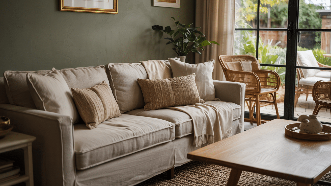
Natural wood tones, both light oak and dark walnut, complement Thunderous perfectly. The color seems made for highlighting wood grain.
Linen textiles in oatmeal or flax colors soften the strength of Thunderous. This mix feels both casual and classy.
Wood finishes also matter. Cherry and other red-toned woods can compete with the color, while oak, walnut, and neutral wood tones tend to sit more naturally beside it.
Always compare paint samples with existing flooring, cabinetry, trim, and furniture before making a final choice.
Ideal Design Styles for Thunderous
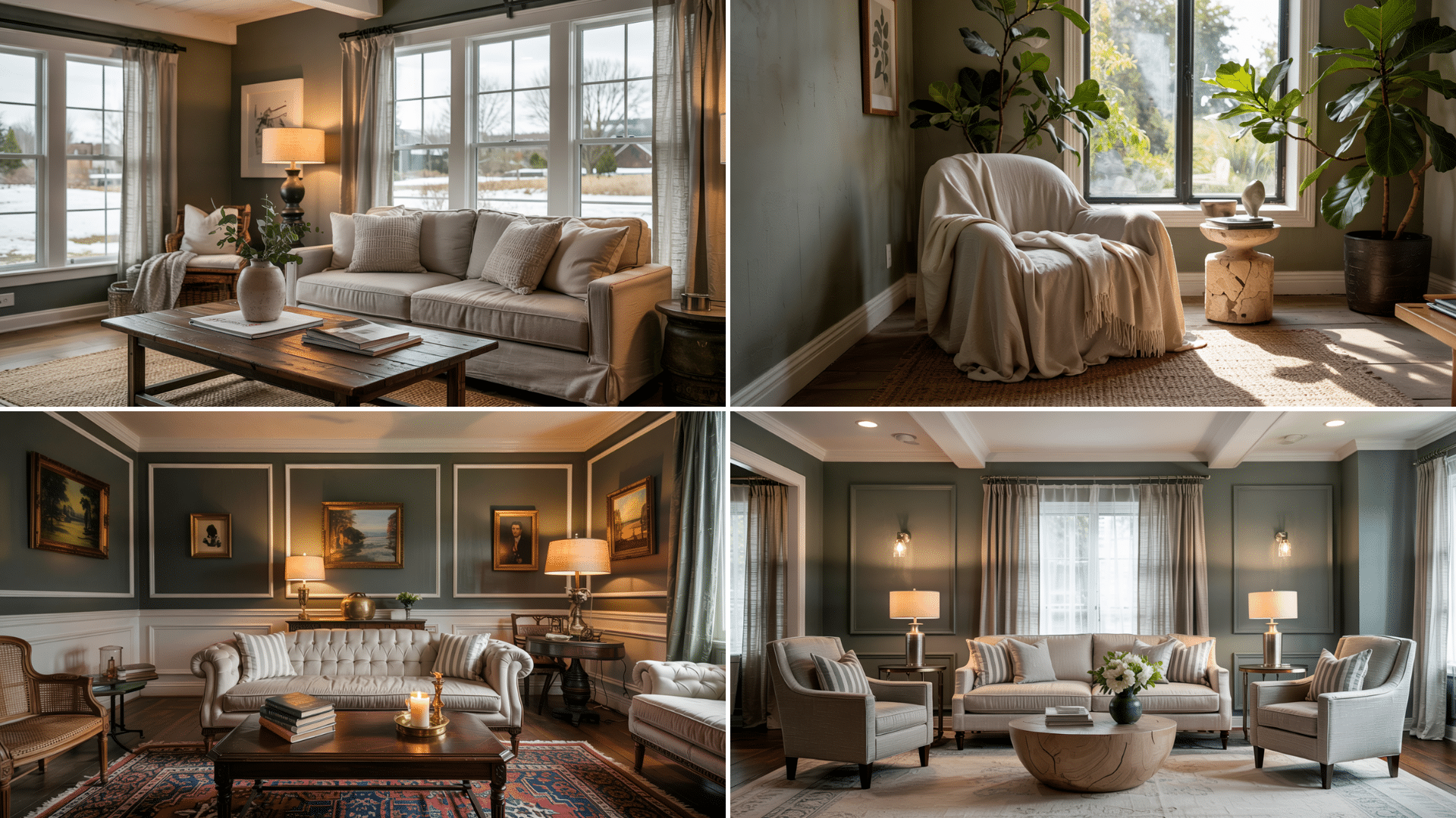
I’ve used this versatile color in many design schemes.
This complex color offers remarkable versatility in home design, adapting beautifully to various lighting conditions and complementary palettes.
It can feel too heavy when used on every wall in a very small room.
In compact spaces, it often works better on built-ins, cabinetry, doors, or a single feature wall.
Another option is to use it below a chair rail and keep the upper walls lighter. This gives the room depth without making it feel closed in.
Modern Farmhouse
Thunderous makes a perfect statement on kitchen cabinets in modern farmhouse homes. It brings depth without the heaviness of black.
The color pairs well with shiplap walls in white or cream, creating contrast that feels fresh yet cozy. For farmhouse style, I like to use Thunderous on interior doors with simple white trim for subtle impact.
Transitional
In transitional spaces, it shines on built-ins and wall paneling.
It bridges traditional forms with modern sensibility. I’ve found it works wonderfully in dining rooms with a mix of contemporary and classic furniture.
This color helps tie together different wood tones and metals often found in transitional design.
Organic Modern
Thunderous feels right at home in organic modern settings.
Its green undertones connect with plants and natural elements. The color creates a balanced backdrop for both light woods and concrete finishes common in this style.
I often recommend it for accent walls behind statement furniture pieces in organic modern living rooms.
Traditional Classic
For traditional spaces, Thunderous adds current appeal without looking trendy. It’s classic with a twist. The rich depth works beautifully in libraries and studies with traditional millwork.
I’ve used it on kitchen islands in otherwise white traditional kitchens for a focal point that still feels timeless.
Tips to Maximize Thunderous’s Impact
Do not choose this color from a small paint chip alone.
Its gray, green, and brown undertones become clearer across a larger surface.
Paint a sample area of at least 2 by 2 feet on more than one wall. Leave it for a few days and check it under natural light, lamps, and evening lighting before deciding.
Ideal Finish (Matte vs. Satin)
- For walls, I prefer a matte or eggshell finish with Thunderous. It shows the color’s depth without distracting sheen.
- On cabinets and furniture, satin brings out the richness while providing durability. The slight sheen helps details pop.
- Flat finish can make Thunderous look too flat and chalky. I avoid it except in very bright, sun-filled rooms.
Lighting Tricks
- Adding wall sconces or picture lights helps Thunderous show its true colors. Direct light brings out its complexity.
- Table lamps with warm bulbs (2700 K – 3000 K) make the room feel cozy without darkening the walls too much.
- Position lights to create pools of brightness against Thunderous walls for a dramatic yet welcoming effect.
Accent Wall Strategies
- Use Thunderous on the wall your eye sees first when entering a room for maximum impact.
- Painting built-ins or millwork in Thunderous while keeping walls light creates focus without darkness.
- Consider using it on a ceiling with light walls for an unexpected twist that draws the eye up.
To Conclude
After exploring this unique color, what’s the bottom line?
Thunderous offers something special: a neutral that’s not boring. If you’re tired of basic grays but not ready for bold color, Thunderous fills that gap perfectly. Its blend of gray, green, and brown creates depth that standard neutrals can’t match.
Remember to test it in your actual space before committing. This color shifts throughout the day, which most people love once they see it in action.
Not sure what to do next?
Try painting a large sample board and moving it around your room for a few days. Or start small with Thunderous on furniture or built-ins before tackling full walls.
Whatever you choose, trust your eye; the best color is always the one that makes you happy in your space.
Frequently Asked Questions (FAQs)
1. Can Sherwin Williams Thunderous Be Used Outdoors?
Yes, Thunderous can work outdoors on doors, shutters, or siding. Test it beside roofing, stone, and landscaping because sunlight makes it appear greener and lighter.
2. Can Thunderous Work as a Whole-House Color?
Thunderous works best as a repeated accent rather than a whole-house wall color. Use it on doors, cabinetry, islands, or built-ins for visual continuity throughout.
3. Is Sherwin Williams Thunderous Easy to Maintain?
Dust and fingerprints show more easily on dark paint. Choose washable eggshell for walls and durable satin or semi-gloss for frequently touched surfaces and cabinetry.





2 Responses
Colin, great article, this really helped me to narrow down the color and confirm my eyes were not deceiving me! I especially appreciate the “white” recommendations. I am thinking of doing Thunderous on my homes exterior to create a Colorado nature feel. What is your opinion on using this color on an exterior?
Thanks! Thunderous would look stunning on a Colorado exterior – those earthy green-gray tones will blend beautifully with the natural landscape. Just consider your home’s orientation since it can look darker on north-facing sides. I’d definitely recommend large samples first to see how it reads against your ambiance. Let me know how it goes:)