Sherwin Williams Rosemary keeps showing up on cabinet makeovers, accent walls, and front door refreshes for a reason.
This earthy, muted green pulls off depth and softness without leaning too dark or too trendy, which is harder than it sounds for a deep green.
It works on cabinets, bedrooms, and exteriors because its undertones stay balanced across different lighting conditions.
Still, sheen, surrounding colors, and natural light can all shift how this color reads in a room.
SW Rosemary Color Profile
LRV of 14 puts Rosemary firmly in the deep end. It is not a light green or a sage.
Rooms with limited windows will read this color as rich and moody. Spaces with good natural light will bring out its softer olive side.
The gray undertones keep it from feeling too warm or too cool, which is a big part of why the color works across so many different room styles and materials.
Quick Overview
| Aspect | Details |
|---|---|
| Color Code | SW 6187, Hex #5F6A4F |
| Undertones | Gray with subtle olive warmth |
| LRV | 14 out of 100 |
| Light Behavior | Darker and moodier in low light, softer olive green in natural daylight |
| Best Finish | Eggshell or satin for walls, semi-gloss for cabinets and doors |
| Best Rooms | Living rooms, cabinets, bedrooms, accent walls, exteriors |
| Pairs Well With | Warm whites, natural wood, brass, beige tones |
| Style Match | Modern organic, farmhouse, traditional, moody interiors |
| Recommended Primer | Gray tinted primer |
| Coats Needed | 2 coats for full, even coverage |
What LRV OF 14 Means
LRV stands for Light Reflectance Value, scored from 0 (pure black) to 100 (pure white).
At 14, Rosemary absorbs more light than it reflects. That is what gives it the rich, deep quality most people are drawn to.
In a well-lit space, it feels grounded and settled. In a small room with limited windows, that same depth can make things feel darker than expected.
Undertones Explained
Rosemary carries two undertones: gray and olive.
Gray is the dominant one. It keeps the color muted and grounded without pulling too warm or too cool.
The olive sits underneath and shows up more in natural daylight or warm bulb lighting. It is what keeps Rosemary from feeling flat or cold, like a purely gray-green.
Together, they make Rosemary one of the more forgiving deep greens to pair with a range of materials, wood tones, and whites.
Before we go any further…is it the right color for you?
Rosemary is a good fit if you want a deep green that feels natural and grounded without going too dark.
It works best on cabinets, accent walls, and front doors in rooms that get decent natural light. If you like earthy, organic spaces, it will likely feel right at home.
Skip it if your room is already dark, you want something lighter and easier to work with, or you lean toward cool, blue-toned greens.
Still not sure? Grab a sample pot first. That always helps.
Where to Use Sherwin Williams Rosemary in Your Home
Rosemary works best in spaces where depth and grounding are actually wanted.
It is rich enough to make a statement but balanced enough to avoid feeling oppressive.
Get the lighting and placement right, and it feels grounded and calm. Ignore those two things, and the same color can make a room feel closed in fast.
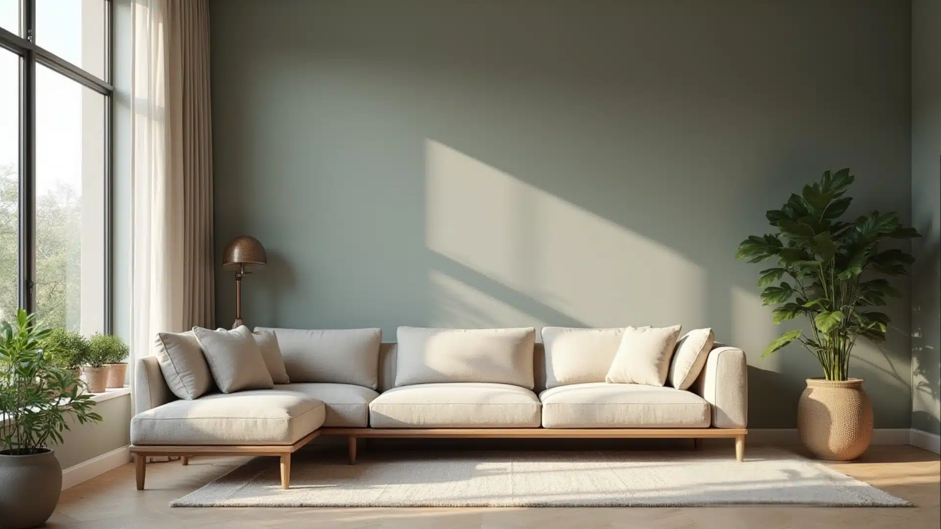
1. Living Rooms and Accent Walls
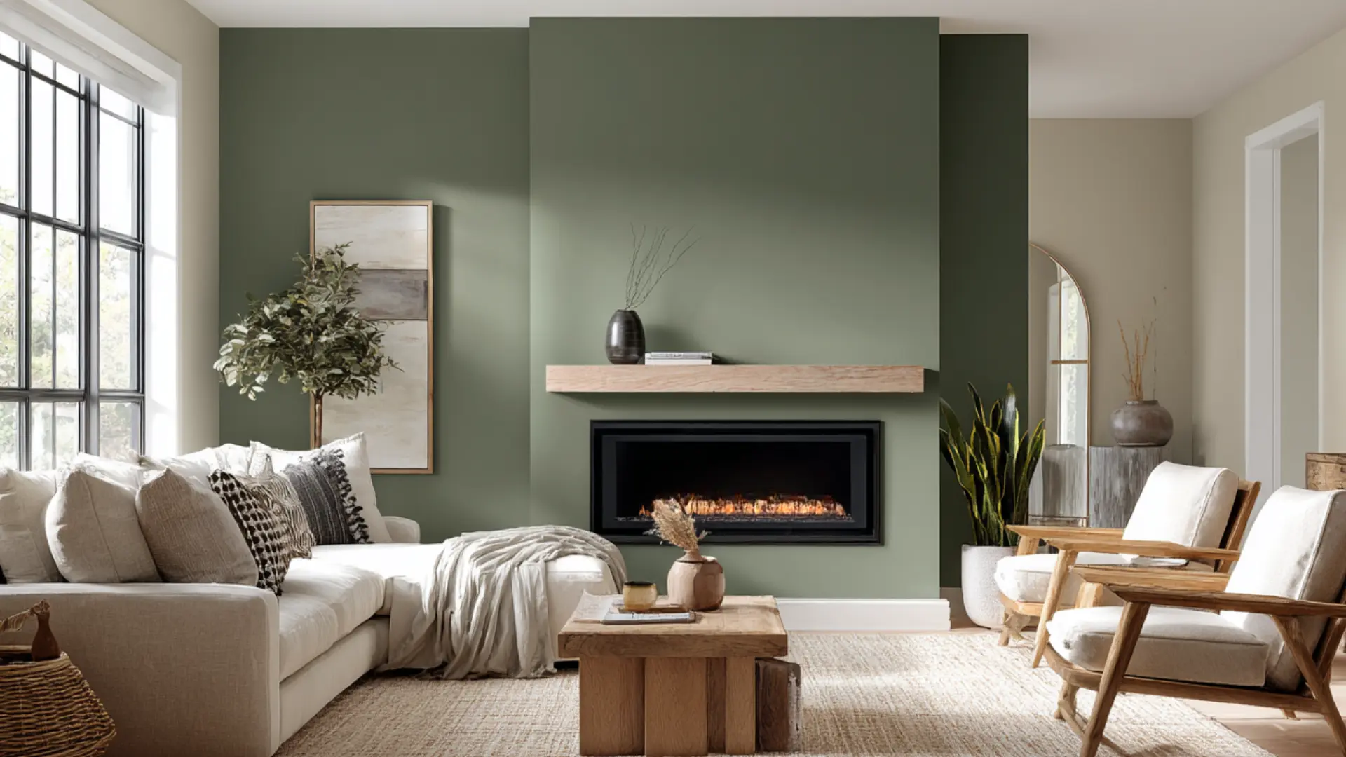
One wall is enough. Rosemary behind a sofa or fireplace adds real depth without pulling the entire room into a dark palette.
Surrounding walls stay light, and that contrast is what lets the color land correctly.
Warm white walls, natural wood furniture, brass fixtures, and linen or leather textiles all sit comfortably against it without competing.
Painting all four walls with an LRV of 14 in a room with limited natural light will make the space feel noticeably smaller and darker after sunset.
2. Bedrooms for a Relaxed Yet Rich Look
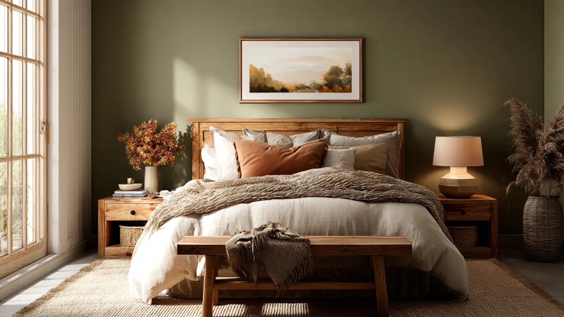
Most people hesitate to use deep greens in bedrooms.
Rosemary’s gray undertones soften it enough that the color reads calm rather than bold.
Use it on the wall behind the bed and keep everything else lighter:
- Warm white or oat linen bedding
- A woven throw at the foot of the bed
- Natural wood nightstands
- Soft terracotta or rust accents
Avoid cool gray textiles. They strip the warmth out fast and leave the color feeling flat.
Warm bulb lighting between 2700K and 3000K works best here. Cool white bulbs push the gray undertones forward, making the room feel less settled.
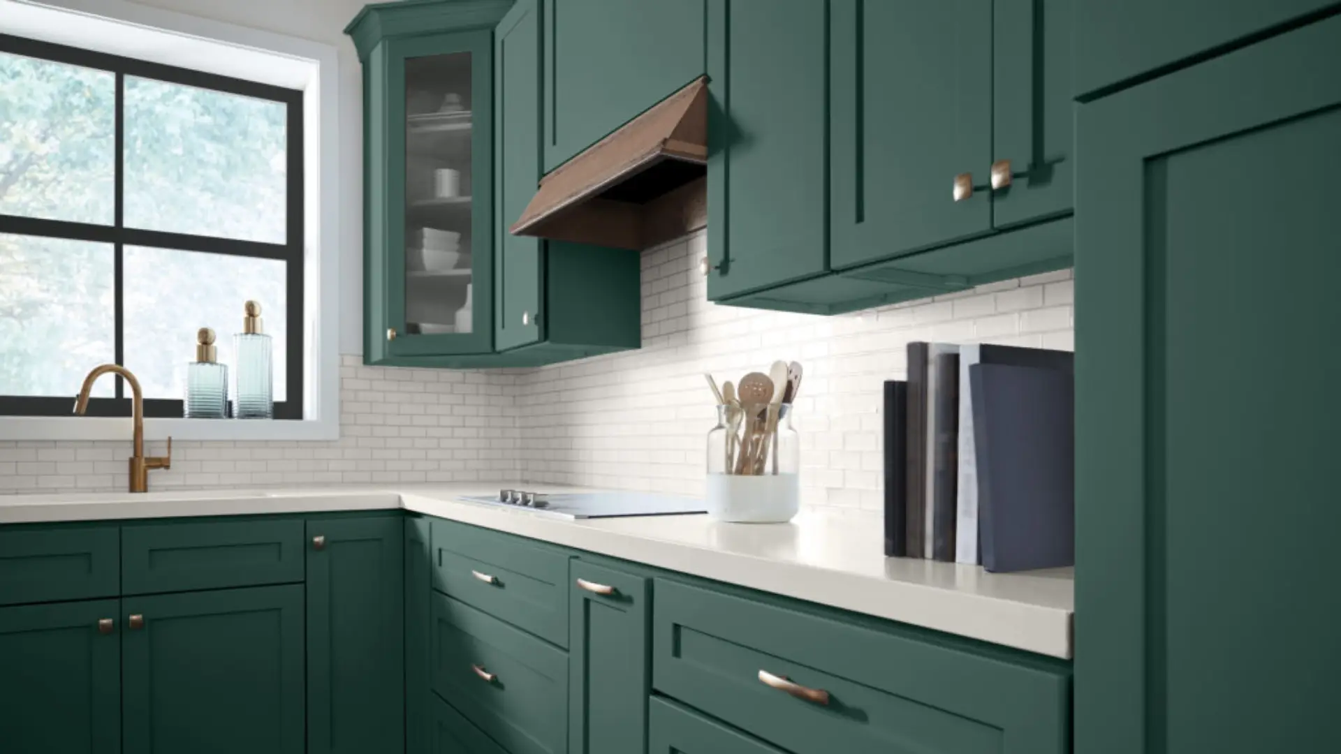
3. Kitchen Cabinets and Islands
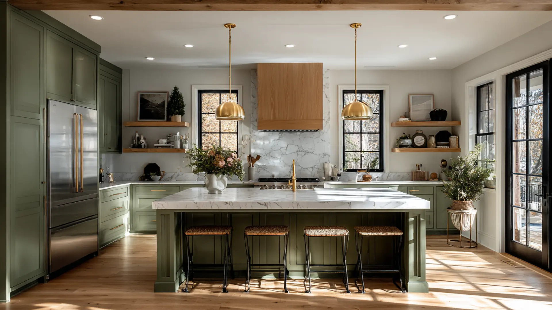
Rosemary on cabinets or an island creates grounded contrast without overwhelming the space.
White uppers, light countertops, and open wood shelving give the darker base cabinets room to breathe.
Hardware matters more here than anywhere else.
Brass and brushed gold pull the warmth from Rosemary’s olive undertones, keeping the kitchen feeling cohesive.
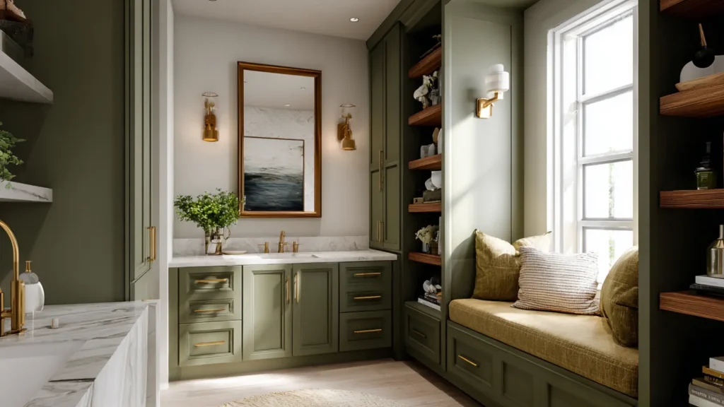
4. Bathroom Vanities and Built Ins
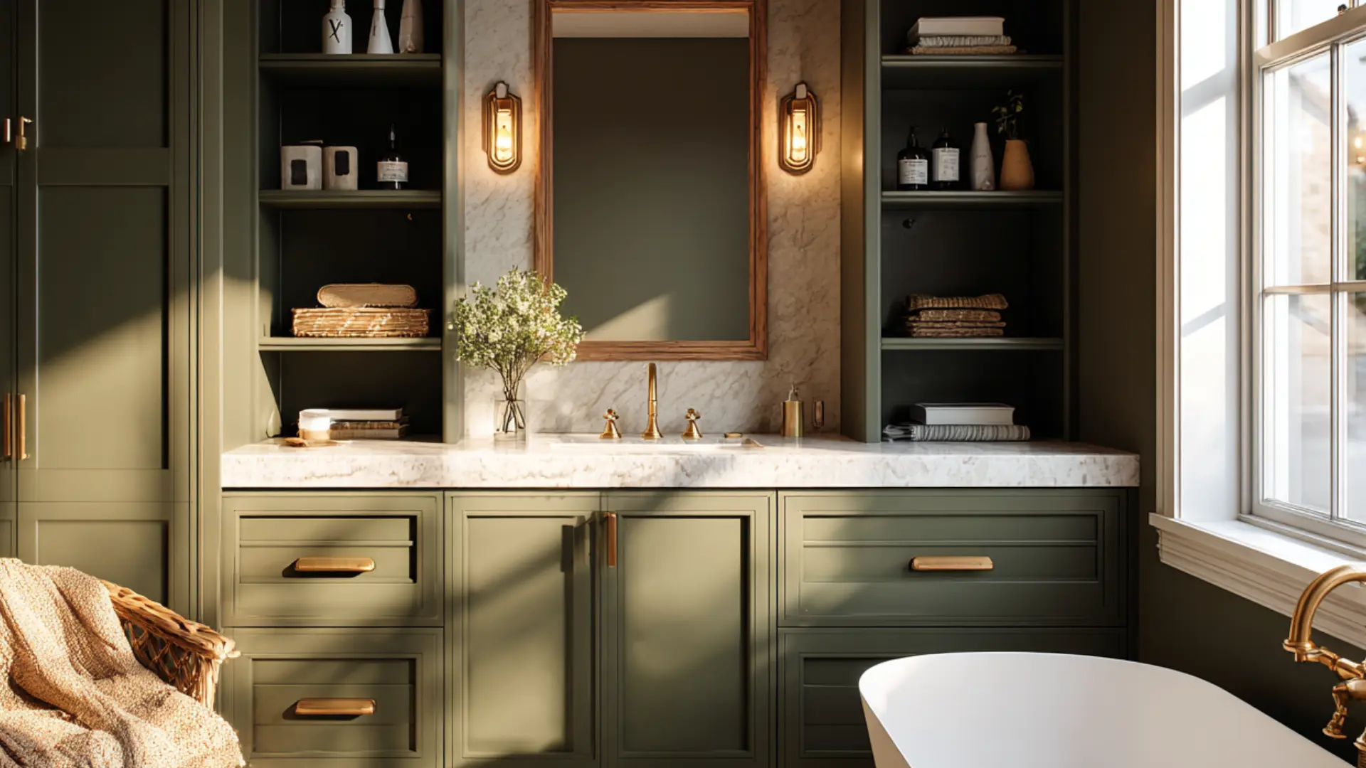
Rosemary on a vanity works well in bathrooms that already have natural stone, warm wood mirrors, or brass fixtures. It adds presence without needing a full renovation.
Built-ins in a home office or reading nook also work well.
The deep green gives shelving a purposeful feel rather than a purely functional one. Keep shelf interiors warm white to avoid closing the space in.
Use semi gloss on bathroom vanities. Steam and moisture wear down softer finishes over time and touch ups on deep colors rarely blend cleanly.
Sherwin Williams Rosemary Exterior Applications
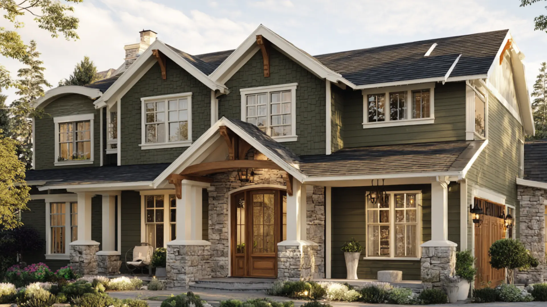
Most people assume that a deep green this rich will look too dark outside. Natural light does the opposite.
Direct sunlight pulls out the olive warmth. Shade deepens it toward a richer forest green.
The trim is what holds it all together. Rosemary needs clean contrast around windows, doors, and rooflines to look intentional rather than heavy.
Pairings that work well outside:
- Crisp white or warm off white trim for a clean boundary
- Natural stone or brick accents for added texture
- Warm wood garage doors or shutters to bring out the olive undertones
- Black or brass hardware on windows and doors
Not ready for a full repaint? A front door in this shade on a white or cream sided home works well as a standalone statement.
Darker exterior colors absorb more heat than lighter ones, so factor that in if your home gets direct sun for most of the day.
Use a satin finish outside. For front doors, semi gloss is the better call since doors take more contact and clean up easier with a harder finish.
Rosemary vs Pewter Green vs Retreat
Rosemary is balanced and earthy. Pewter Green runs darker and heavier. Retreat SW 6207 is lighter and cooler, better suited for whole-room use.
| Aspect | Rosemary SW 6187 | Pewter Green SW 6208 | Retreat SW 6207 |
|---|---|---|---|
| Undertones | Gray with soft olive warmth | Strong gray | Cool gray with subtle blue |
| LRV | 14 | 12 | 21 |
| Depth | Rich and grounded | Dark and moody | Softer and lighter |
| Lighting Behavior | Olive in daylight, moodier at night | Can read charcoal in low light | Airier and more muted |
| Best Use | Cabinets, accent walls, exteriors | Moody rooms, dramatic cabinetry | Bedrooms, living rooms, whole house |
| Best Pairings | Warm whites, brass, wood tones | Crisp whites, black accents | Creams, taupe, soft wood finishes |
| Overall Feel | Balanced and timeless | Bold and heavy | Calm and subtle |
Test all three as 12 by 12 inch swatches on your actual wall. They look very different on a small chip versus a real surface in your lighting.
So, which to choose?
Choose Rosemary: ifyou want a green that feels rich and grounded but not too dark or too bold. It is the most versatile of the three and works on almost anything.
Choose Pewter Green: if you want your room to feel dramatic and moody. This one is darker and heavier, so it needs good lighting to avoid feeling like a cave.
Choose Retreat: if you are not ready to commit to a deep green. It is softer, lighter, and the easiest to pull off without overthinking the rest of the room.
Coordinating Colors: What Works?
Rosemary works with many colors, but the wrong pairing can make it feel muddy or flat fast.
Trim, wood tones, metals, and surrounding wall shades all matter more here than most people expect.
1. Crisp Whites
White creates a separation around Rosemary, keeping it from feeling too heavy. On trim and ceilings, it sharpens the edges and makes the green feel more intentional.
Sherwin Williams Pure White SW 7005 works well here.
It carries just enough warmth to sit comfortably against Rosemary’s olive undertones without looking stark.
Best for: trim, ceilings, and cabinetry contrast
2. Warm Neutrals
Warm neutrals stop Rosemary from leaning too dark or gray.
Beige, greige, and creamy taupe tones help the green feel softer and more natural in connected spaces. Cool grays pull the warmth out of Rosemary fast. Warm neutrals keep the palette balanced.
Best for: surrounding walls, hallways, and adjoining living spaces
3. Natural Wood Tones
Medium oak, walnut, and warm-stained woods like SW Iron Ore (7069) bring out the organic side of Rosemary and keep the room from feeling cold.
Woods with strong orange or red undertones, like pine or cherry, tend to clash rather than complement.
Stick to walnut or medium oak for the most natural pairing.
Best for: flooring, shelving, furniture, and exposed beams
4. Muted Earthy Greens
Muted sage or dusty olive shades layer well with Rosemary because they stay in the same earthy family without matching too closely.
Bright yellow greens and saturated emerald tones quickly overpower it.
Benjamin Moore’s Saybrook Sage is a strong option for a softer layered palette.
Best for: accent walls, textiles, and layered decor
Bottom Line!
Sherwin Williams Rosemary is one of those colors that rewards a little planning.
Get the lighting, finish, and surrounding colors right, and it works beautifully across cabinets, accent walls, bedrooms, and exteriors.
Rush the decision, and it can easily feel heavier than expected.
Test a sample pot first, check it at different times of day, and pair it with warm whites and natural wood tones.
It almost always looks richer and more intentional in person than any photo suggests.
Frequently Asked Questions
1. Is Rosemary a Good Color for Small Rooms?
Rosemary can work in small rooms but is best kept to one accent wall rather than all four sides to avoid the space feeling closed in.
2. Does This Shade Work well With Gray Flooring?
Warm gray flooring can work, but cool-toned gray floors tend to flatten the color, so a warmer wood or stone floor is a safer choice.
3. Is Rosemary Similar to Hunter’s Green?
Rosemary is softer and more muted than hunter green, with gray undertones that keep it from reading as bold or traditional as classic hunter green shades.
4. Can you use Sherwin-Williams Rosemary in a north-facing room?
North-facing rooms receive cooler, indirect light, which can make Rosemary appear darker and grayer, so testing a swatch first is especially important in these spaces.
5. What Metals Pair Best with Rosemary?
Brass and brushed gold are the strongest metal pairings because they bring out the warm olive undertones and keep the overall palette from feeling cold.