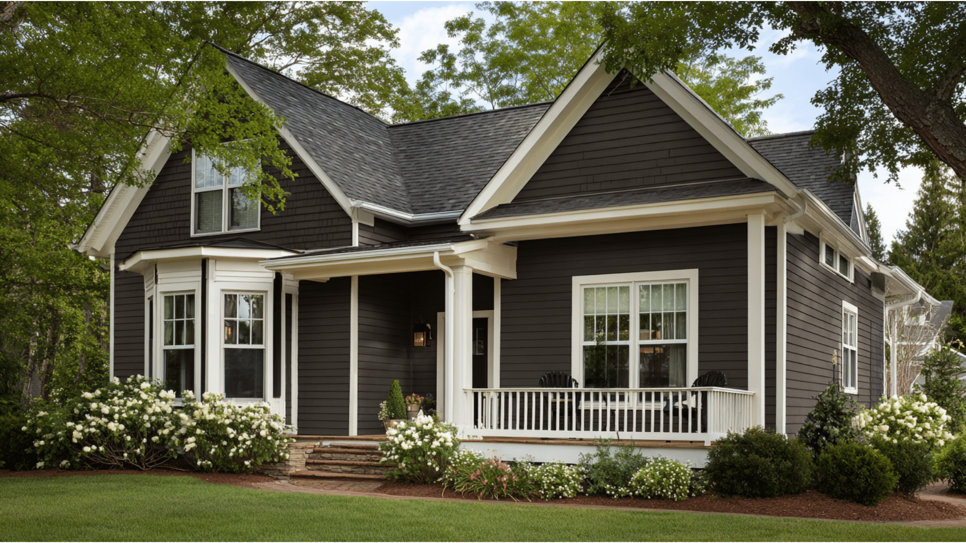
This color nails something most paints don’t. It’s dark enough to stand out, but doesn’t feel as heavy as black.
The shade shifts throughout the day. Morning sun brings out warm tones, while afternoon light shows its gray side.
Ranch homes look modern with it. Craftsman houses feel updated. Basic suburban builds get instant personality. People see it in person and immediately want it.
The technical details behind this color explain why it works so well.
Want to know what makes an urbane bronze exterior color choice so different?
Urban Bronze: Color Description, Undertones, LRV
Color Profile
Here’s what you actually get:
- Deep, rich brown that reads almost charcoal in dim light
- Neutral family member with way more personality than standard grays
- Slightly warm temperature that prevents a cold, industrial feel
- Shifts between brown and gray depending on conditions
Undertones
Brown is the star here, with strong gray notes backing it up. Some people catch purple or plum hints depending on the light.
The undertones shift constantly. North-facing walls pull more gray.
Morning shows warmer browns. Evening gets cooler. What you pair it with also changes what you see.
LRV
Urbane Bronze (SW 7048) has an LRV of 8 on a scale of 0 to 100. This means the paint absorbs most light instead of bouncing it back.
Think of it as a light-eating color. That low number explains the rich, deep appearance of the walls.
Tip: Darker,low-LRV paints hide imperfections but can show dust and pollen more easily.
Style Your Home’s Exterior with Urbane Bronze
This color works in more ways than you’d expect. Here are seven proven applications that deliver real impact.
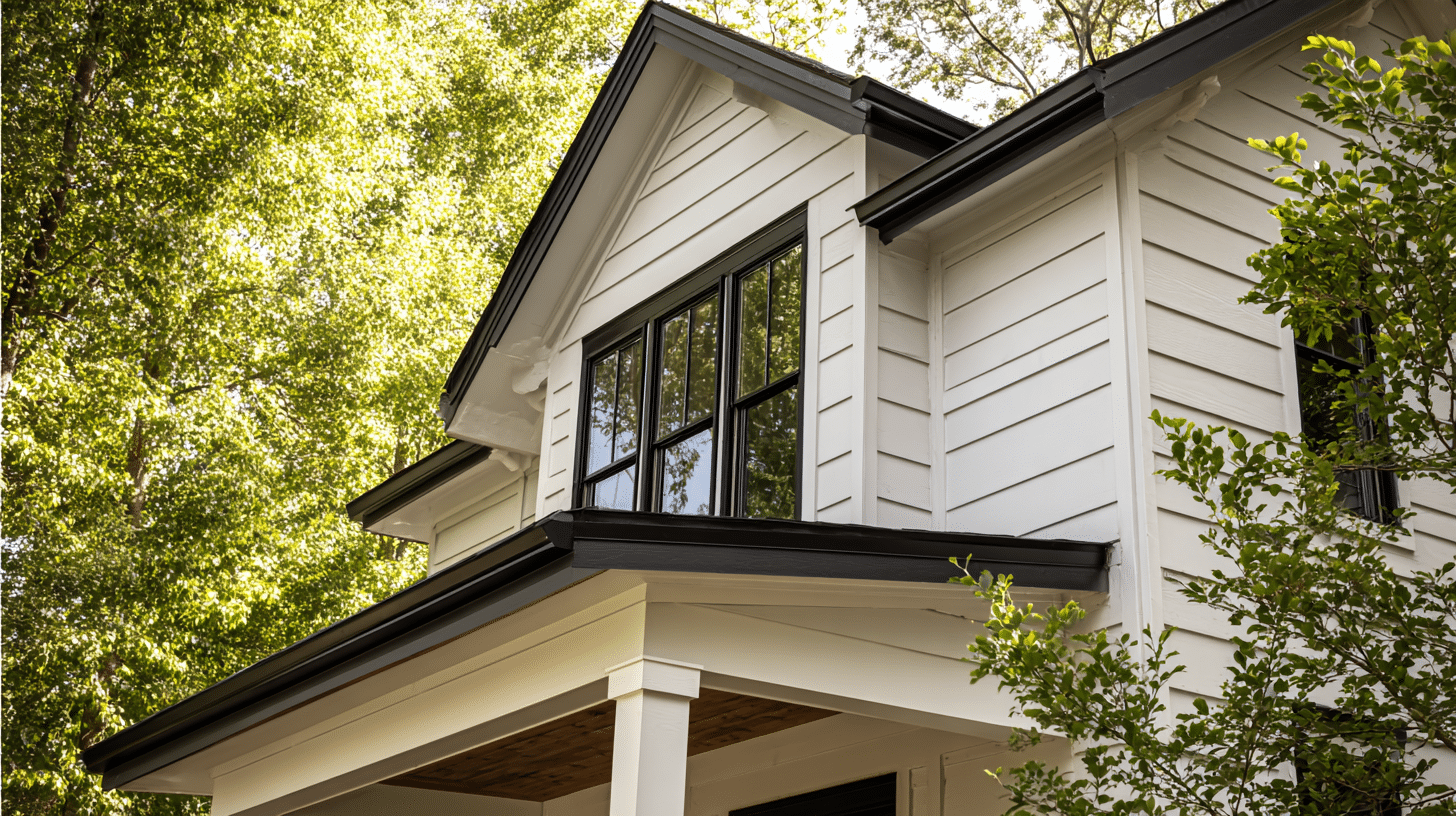
1. Siding With Light Trim
Paint your siding in this rich shade and pair it with white or cream trim.
The contrast makes architectural details pop while the dark body color grounds everything. It’s the most popular way to use this paint.
2. Front Door
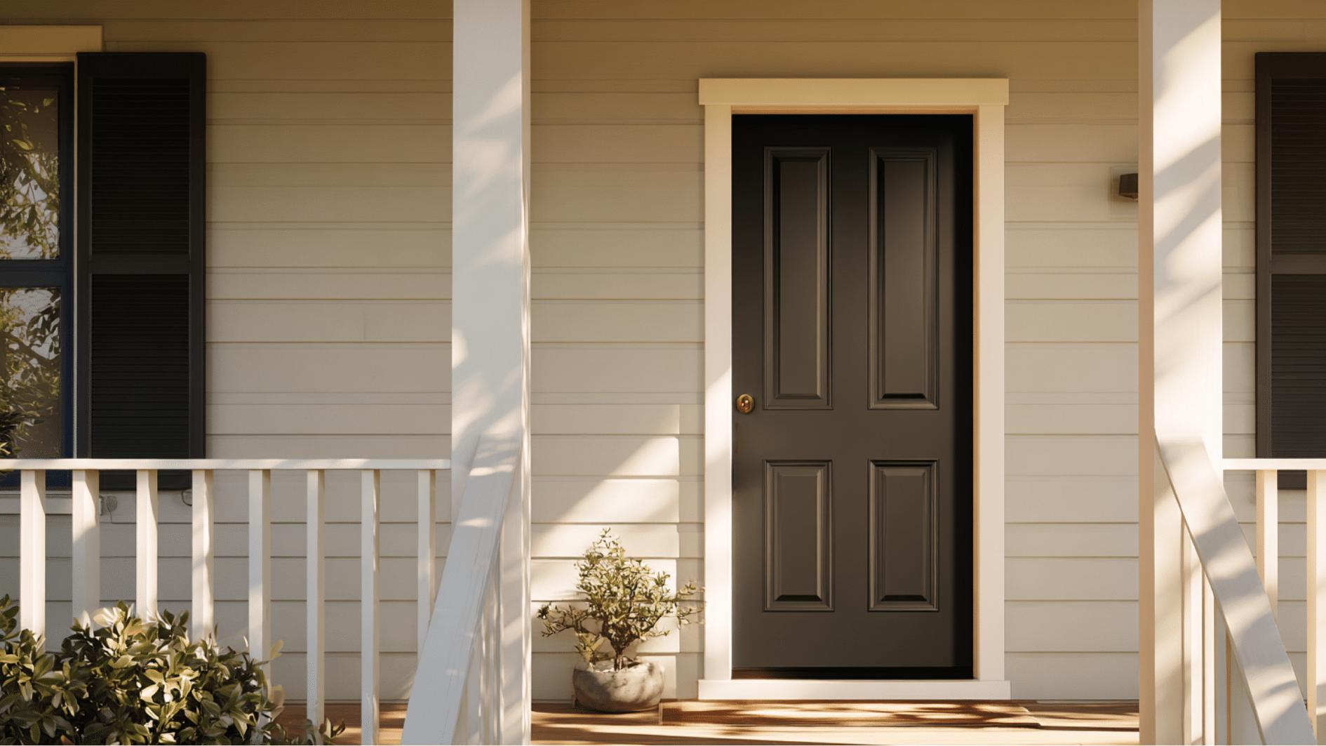
A front door in this color adds instant personality without overwhelming your home. It works on white houses, gray houses, and even beige ones.
Plus, you only need one quart of paint to test this look.
3. Garage Doors
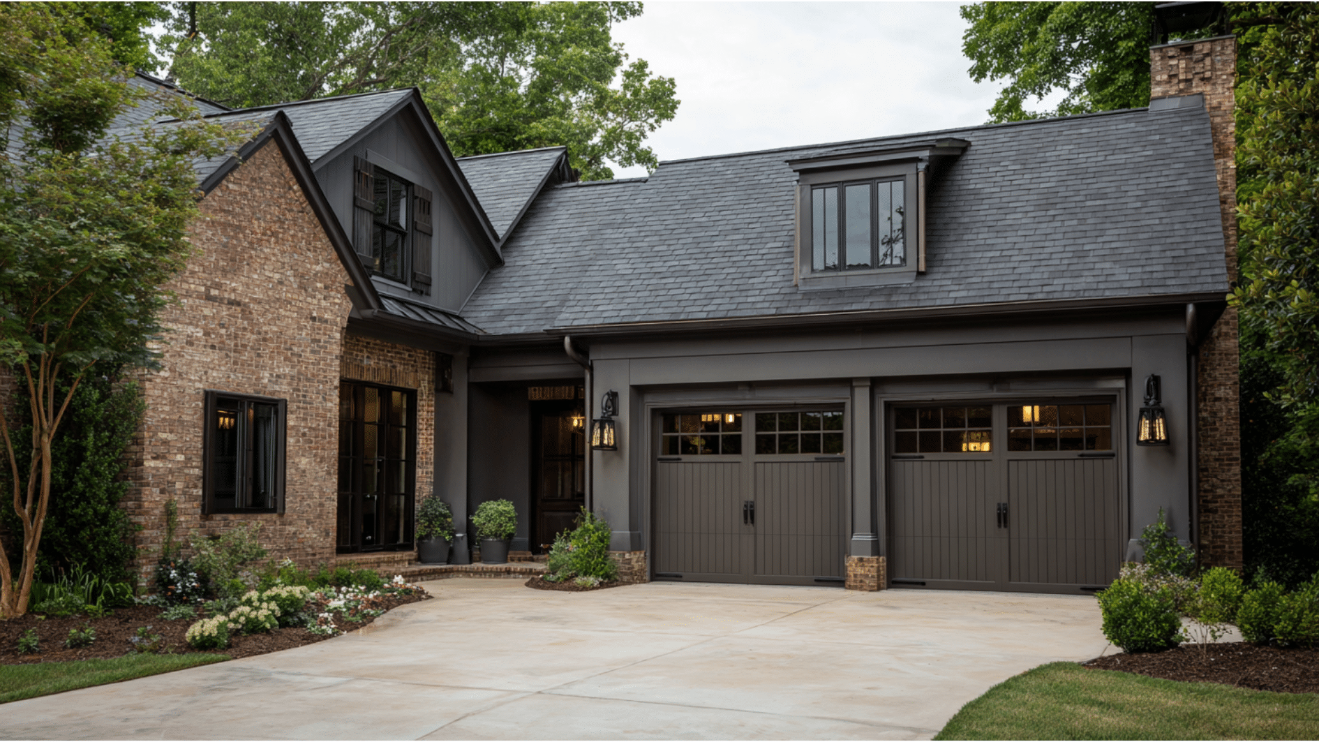
Garage doors take up massive visual space on most homes.
Painting them this color makes them recede instead of dominate. Your eye focuses on other details instead of the two giant rectangles.
4. Trim or Fascia
Flip the script and use this as trim against lighter siding. The dark framing creates a modern edge that standard white trim can’t match.
Fascia boards especially look sharp in this shade.
5. Pair With Warm Wood Elements
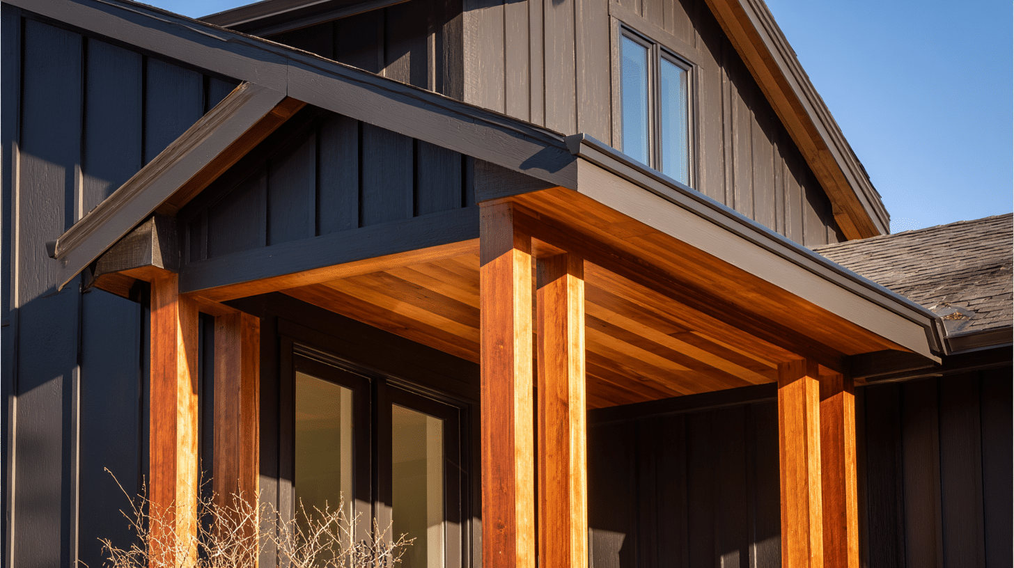
Natural wood tones and this color are best friends. Cedar shakes, wood beams, or even a wooden front porch play beautifully against the brown-gray base.
The combination feels grounded and natural.
6. Use With Stone or Brick
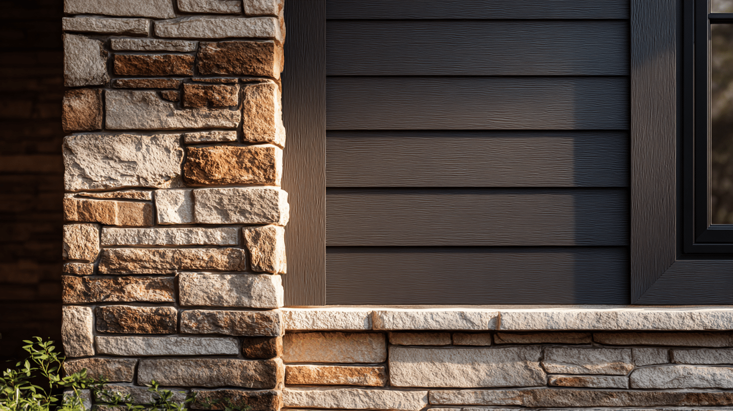
This paint loves textured materials. Stone facades and brick walls get a modern partner that doesn’t compete with their natural beauty.
The color pulls out warm tones in both materials.
7. Window Frames
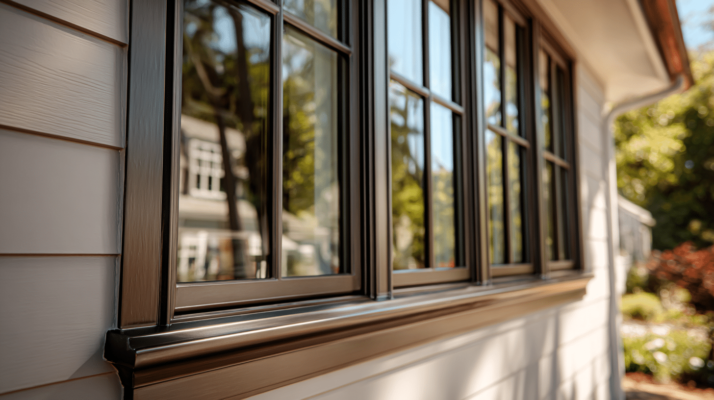
Dark window frames create a striking look that’s trending hard right now.
They make windows look bigger and add definition to plain facades. Black gets all the attention, but this shade offers more depth.
The right color pairings take these looks from good to great.
Pairing that Work Best with SW Urbane Bronze
The right color pairings make or break your exterior design. Here are the combinations that actually work in real life.
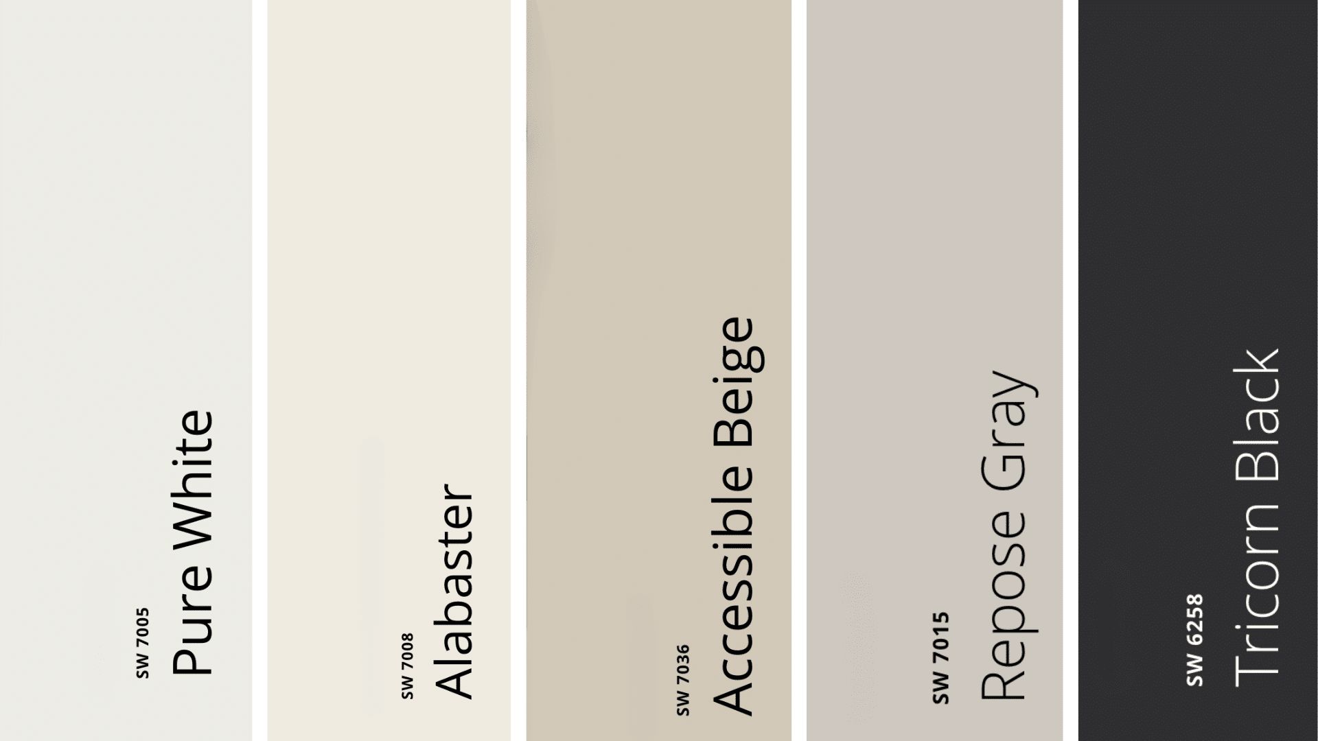
1. Pure White (SW 7005)
This is the classic combo for a reason. Crisp white trim against the deep brown creates maximum contrast that makes architectural details pop.
2. Alabaster (SW 7008)
A softer white option that doesn’t scream at you. Alabaster brings warmth that complements the brown undertones, making it perfect if stark white feels too harsh for your taste.
The slightly creamy base keeps everything feeling connected instead of choppy.
3. Accessible Beige (SW 7036)
Want less contrast? This warm beige trim keeps things tonal and sophisticated without any drama.
Need a detailed look at this color? Click here.
4. Repose Gray (SW 7015)
A light gray trim offers a modern twist on the classic white combination. The cool gray plays off the warm brown beautifully, especially on contemporary builds.
It’s subtle but makes a real difference in how modern your home reads.
5. Black (SW 6258 Tricorn Black)
Going full dramatic? Black accents with Urbane Bronze siding create a moody, high-end look that photographs incredibly well.
6. Natural Wood Tones
Cedar, oak, or walnut stains don’t fight with this color.
The brown undertones in the paint echo natural wood grains. Stained doors, beams, or shutters feel right at home against this backdrop.
7. Warm Metal Finishes
Brass, copper, and oil-rubbed bronze hardware look incredible here. Skip chrome and stick with warmer metal tones that catch light and add dimension.
Not every space works well with this color, though. Here’s what to know now.
Pros and Cons
Every paint color has strengths and weaknesses. Here’s what you need to know before making your decision.
Pros
- Hides dirt and imperfections: The dark tone masks dust, pollen, and minor dings that would show up immediately on lighter colors
- Makes cheap materials look expensive: Basic vinyl siding or builder-grade trim suddenly appears high-end with this rich shade
- Works across multiple styles: Ranch, craftsman, modern, or traditional homes all pull it off successfully
- Increases curb appeal: Real estate agents report that homes with this color photograph better and attract more interest
- Versatile pairing options: Pairs well with whites, beiges, grays, natural wood, and metal finishes
Cons
- Shows dust inside: That low LRV means every speck of dust, pet hair, and fingerprint becomes visible on interior walls
- Needs good lighting: Rooms painted in this shade require adequate light sources, or they feel dark and cramped
- Can fade over time: Direct sunlight exposure may cause the color to lighten, especially on south-facing exteriors
- Not for small spaces: Tiny rooms feel even smaller when painted in such a dark color
- Requires quality paint: Cheap paint in this shade looks muddy and flat instead of rich and sophisticated
Knowing when this color works best helps you avoid these downsides.
Urbane Bronze Alternatives
Sometimes this color isn’t quite right for your project. Here are solid alternatives that deliver similar vibes with slight differences.
| Color | LRV | What Makes It Different |
|---|---|---|
| Iron Ore (SW 7069) | 6 | Darker and leans more toward true charcoal. Reads cooler with stronger gray undertones and less brown warmth. |
| Black Fox (SW 7020) | 10 | Lighter option that’s still moody. Has similar brown-gray qualities but won’t feel as heavy on your home. |
| Intellectual Gray (SW 7045) | 7 | More gray, less brown. Keeps the dark appeal but dials back the warmth significantly. |
| Chelsea Gray (Benjamin Moore HC-168) | 8 | Different brand but competes directly in popularity. Undertones shift between gray and brown depending on the light. |
| Gauntlet Gray (SW 7019) | 11 | Warmer and slightly lighter. Good middle ground if you want drama without going too dark. |
| Sealskin (SW 7675) | 5 | Deeper with stronger brown notes. More dramatic than Urbane Bronze. |
| Peppercorn (SW 7674) | 5 | Classic dark gray-brown that’s been popular for years. Reliable and versatile choice. |
Applying any of these colors correctly matters just as much as choosing the right one.
Urbane Bronze Exterior Application Tips
Getting this color to look its best requires some smart prep work and application techniques.
- Clean surfaces thoroughly: Dirt and mildew show through dark paint. Use a pressure washer and let everything dry for 48 hours.
- Prime when covering lighter colors: Gray-tinted primer prevents the old color from bleeding through. Skip this, and you’ll need three coats.
- Paint between 50 and 85 degrees: Avoid direct sunlight since hot surfaces cause uneven drying. Early morning or late afternoon works best.
- Apply two coats minimum: Dark colors need at least two applications to look rich instead of streaky.
- Invest in quality tools: Cheap brushes leave marks that show badly on dark surfaces. The difference is worth the extra cost.
- Back-roll sprayed paint: This pushes paint into textured surfaces and prevents thin spots. Takes longer but keeps coverage consistent.
- Watch for lap marks: Work in sections and maintain a wet edge to avoid visible lines.
Test samples of these alongside your top choice. Small differences in undertones make big impacts on your final look.
Easiest Way to Sample SW Urbane Bronze
Testing this color before committing saves you from expensive mistakes.
Here’s the smartest way to do it.
Step 1: Get a Peel-and-Stick Sample
Order a 12×12-inch sample from Samplize for around $7. These stick right to your wall without paint, and you can move them around easily.
Step 2: Test Multiple Locations
Stick your sample on different exterior walls. Try morning sun areas, afternoon shade spots, and north-facing sections. The color looks completely different in each location.
Step 3: Watch It for Three Days
Check the sample at different times throughout the day. Take photos with your phone so you can compare how it shifts from morning to evening.
Step 4: Compare Against Your Roof and Foundation
Hold the sample next to your existing roof shingles, brick, or stone. This step catches clashes before you buy gallons of paint.
Step 5: Get a Small Paint Sample If You’re Still Unsure
Sherwin-Williams sells 8-ounce samples for about $6. Paint a foam board and prop it against your house for a bigger view.
In Case You’re Thinking of Using Urban Bronze in Your Interior
This color isn’t just for exteriors. Bringing it inside creates drama and depth in all the right ways.
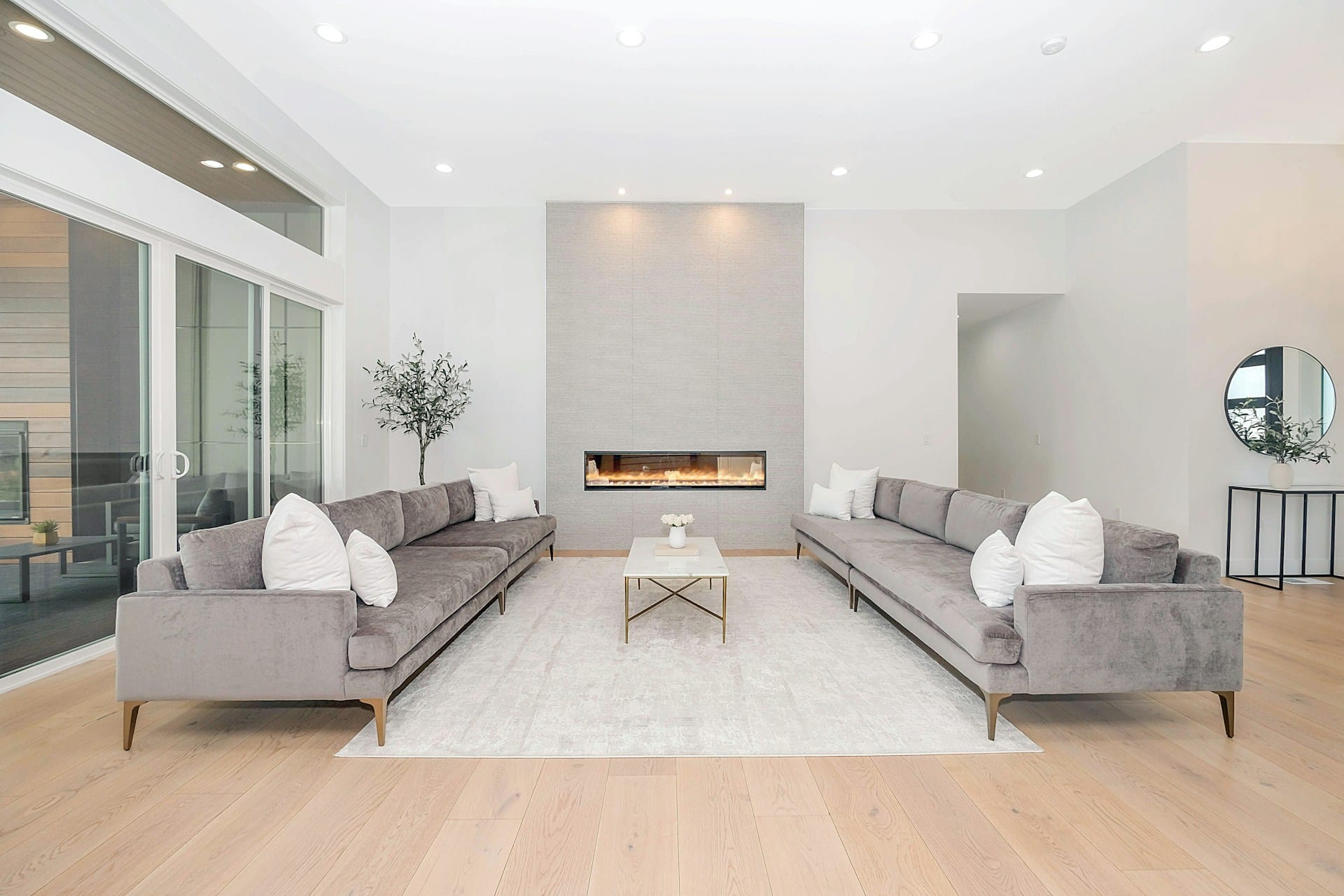
1. Accent Wall in Living Rooms
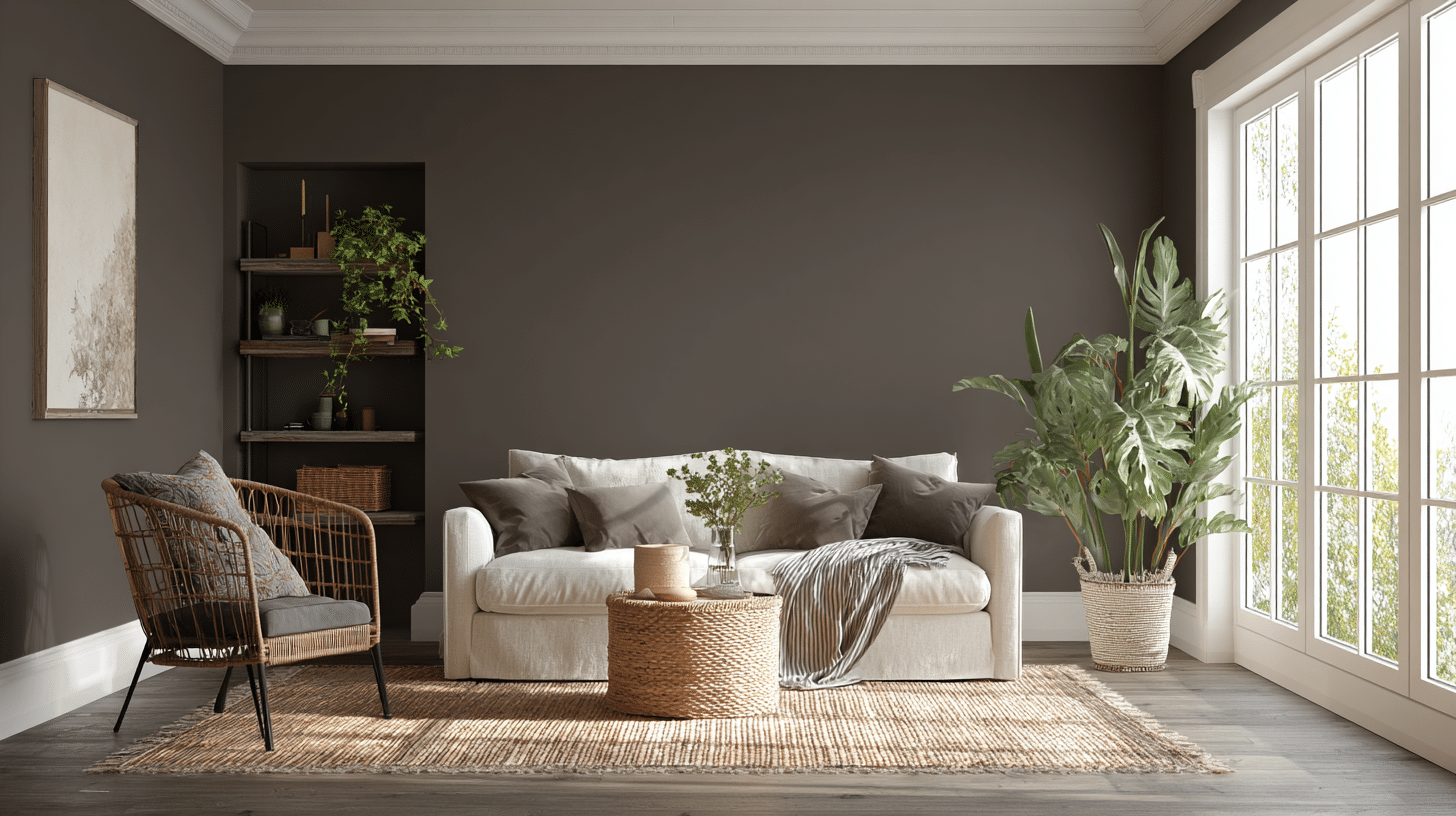
One wall in this shade transforms a boring living room into something special.
The dark color adds weight and makes the space feel more intimate.
Pair it with lighter furniture so the room doesn’t feel like a cave, and you’ve got yourself a focal point that guests always comment on.
2. Lower Cabinets on Kitchen Islands
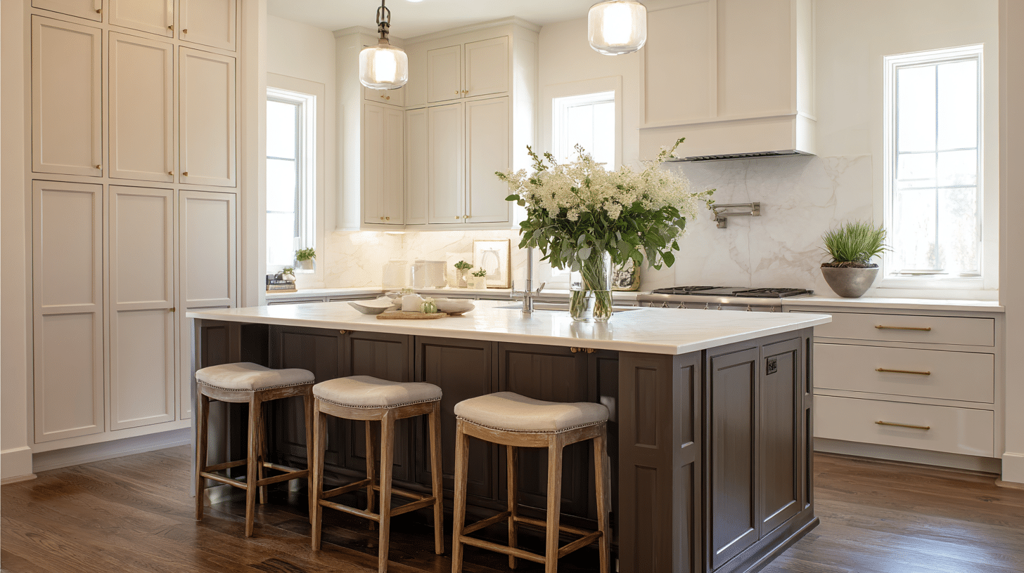
Painting your island or lower cabinets in this color while keeping upper cabinets light creates visual interest without closing in the space.
The dark base grounds the kitchen and hides scuffs way better than white.
It works in both traditional and modern kitchens, which is pretty rare for such a bold choice.
3. Entryway
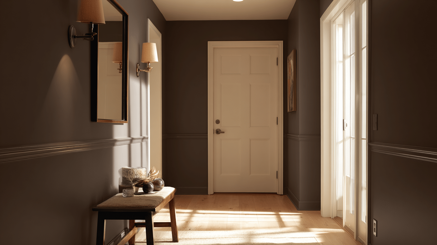
An entryway painted in this shade sets the tone the moment someone walks in. The bold color makes a strong first impression and defines the space as intentional.
Add a mirror and good lighting to keep it from feeling like a tunnel.
Is it the Right Color for Your Exterior?
You’ve got the details, the pairings, and the application tips.
Now comes the fun part: deciding if an urbane bronze exterior fits your home. This color rewards the bold but demands proper testing first.
Order those samples, watch how light plays across your walls, and trust what you see.
When are you trying SW Urban Bronze then?