You’ve seen alabaster pop up everywhere. Paint swatches, design blogs, home makeover shows.
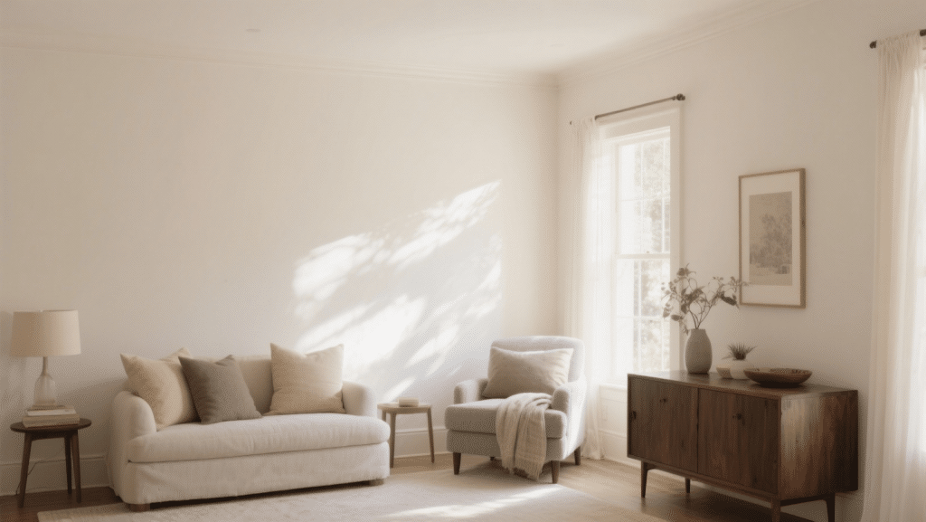
But what color is Alabaster, really? Most people think it’s just white. They’re wrong. It’s softer than that. It has a gentle, creamy undertone. And that’s exactly why it works in so many spaces.
I’m going to show you exactly what makes Alabaster different from plain white.
You’ll get to know the reason why designers can’t stop recommending it. And more importantly, you’ll see if it’s right for your space.
In this blog, you’ll learn what Alabaster actually looks like, how it compares to other popular whites, and where it works best in your home.
Color Specifics
Alabaster isn’t just another white paint. It has specific qualities that set it apart. Here’s everything you need to know about this color in one quick reference.
| Property | Details |
|---|---|
| Paint Brand | Sherwin-Williams |
| Color Code | SW 7008 |
| Hex Code | #EDEAE0 |
| RGB Values | R: 237, G: 234, B: 224 |
| LRV (Light Reflectance Value) | 82 |
| Color Family | Off-White / Cream |
| Undertones | Soft beige and greige |
| Finish Options | Flat, Eggshell, Satin, Semi-Gloss, Gloss |
| Special Recognition | Sherwin-Williams Color of the Year 2016 |
| Best For | Interior walls, trim, and cabinets |
What Color is Alabaster?
Alabaster looks different depending on who you ask. Some call it white. Others say it’s cream.
Here’s what it actually is.
Alabaster sits right between true white and beige. It’s an off-white with a creamy base. You’ll notice a slight greige undertone, which means it has hints of both gray and beige.
In bright sunlight, it reads almost white. But it never looks stark or cold. In softer light, those creamy undertones come through more. That’s what makes it so versatile.
Think of it this way: if plain white is too bright and beige is too dark, Alabaster is the middle ground. It gives you that clean, fresh look without the harshness. And it plays well with both cool and cozy tones in your decor.
Alabaster Style Ideas for Every Corner of Your Home
Alabaster works in almost any room you can think of. But some spaces really let this color shine. Here are seven proven ways to use Alabaster throughout your home.
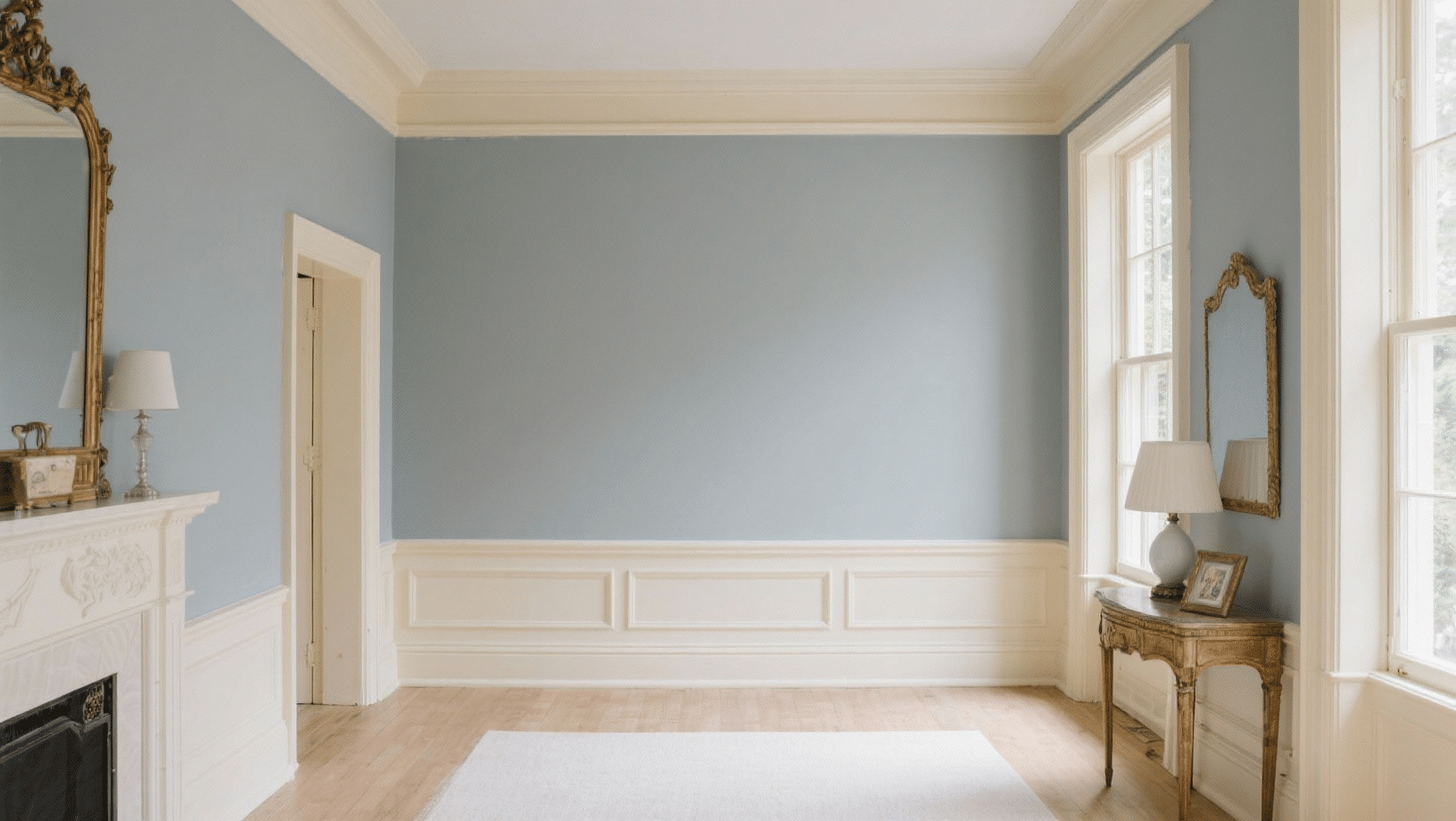
1. Living Room Walls
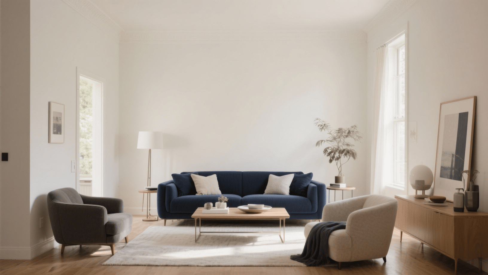
Your living room gets a lot of light changes throughout the day.
Alabaster walls with pure white trim handles that beautifully. Paint all four walls and watch how the color shifts from morning to evening.
It stays neutral enough to work with any furniture style. Pair it with darker accents like navy or charcoal for contrast.
Or keep things light with soft grays and tans. Either way, you get a space that feels clean but lived-in.
2. Kitchen Cabinets
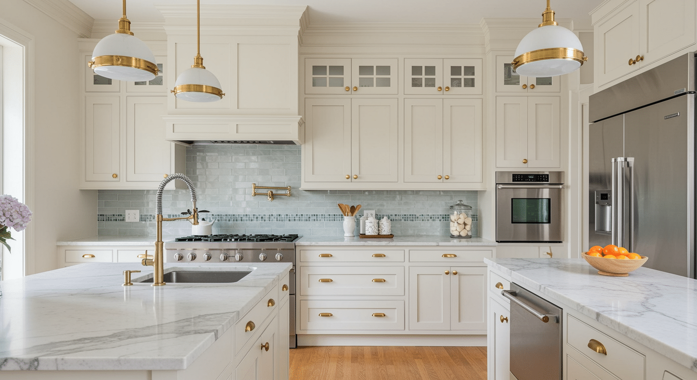
White kitchens are everywhere, but alabaster cabinets feel different. They have more depth than stark white. The creamy undertone makes your kitchen feel inviting instead of sterile.
This works especially well with stainless steel appliances.
The slight color keeps things from looking too cold. Add brass or bronze hardware for extra richness. Your cabinets will look expensive without trying too hard.
3. Bedroom With Soft, Calming Vibes
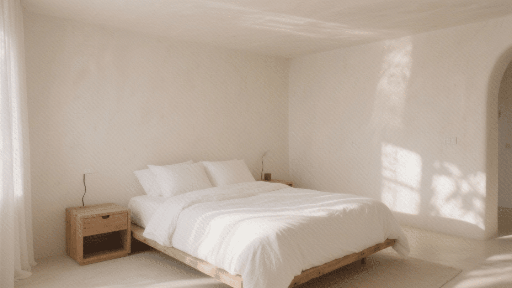
Bedrooms need to feel restful. Alabaster delivers that without being boring. Paint the walls and ceiling in this shade for a cocooning effect.
The gentle tones help you wind down at night. It also reflects enough light to keep the room bright during the day.
Match it with white bedding and natural wood furniture. You’ll have a space that feels peaceful, not plain.
4. Bathroom
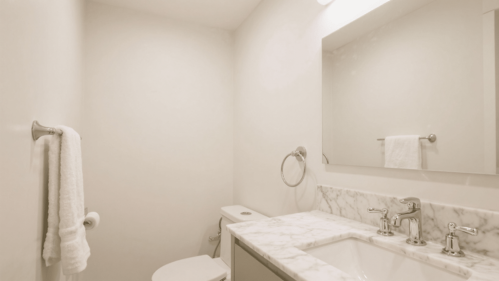
Small bathrooms need all the help they can get, and Alabaster makes them feel bigger and brighter. The color bounces light around without the glare of pure white.
Use it on walls, and consider it for vanity cabinets too. It pairs perfectly with marble, tile, and chrome fixtures. Even a windowless bathroom feels more open. You get that spa-like quality everyone wants.
5. Trim and Molding
Here’s a trick many people miss: use Alabaster on your trim.
If your walls are a different color, alabaster trim creates clean lines without harsh contrast.
This works with gray, blue, or even darker-toned walls. The trim stands out just enough. And it ties everything together beautifully.
6. Home Office
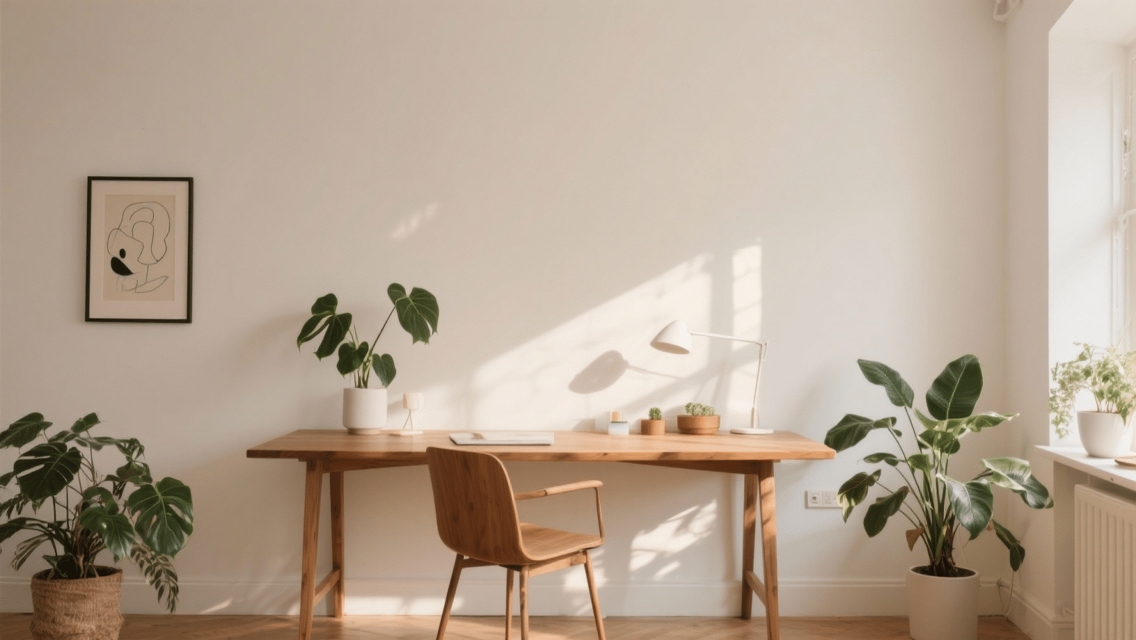
You need a calm background when you’re working. Alabaster gives you that.
It’s not distracting like bold colors can be. But it’s not dull like flat white either.
Paint the walls and you’ll notice less eye strain during long work sessions.
The color also looks professional on video calls. Add pops of color through art or accessories. Your office feels put-together without effort.
7. Entryway
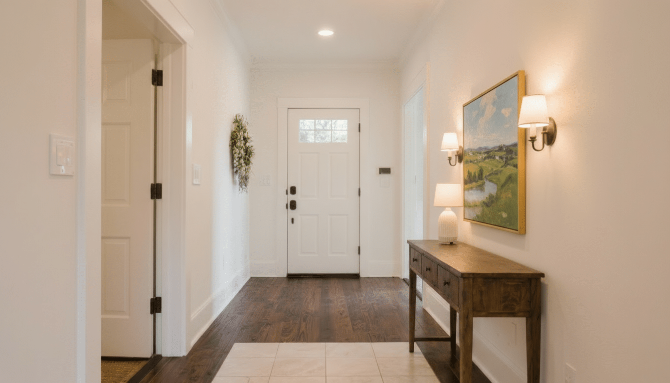
First impressions matter, even at home. This color in your entryway sets a calm, collected tone. It makes the space feel open and clean. And it works with any flooring you have.
It doesn’t matter if you have dark hardwood or light tile; Alabaster complements both. The color also hides scuffs and marks better than pure white.
Your entryway stays looking fresh with less touch-up work.
Pros and Cons of Choosing Alabaster for Your Space
Every paint color has its strengths and weaknesses. Alabaster is no different.
Here’s an honest look at what works and what doesn’t when you choose this shade.
| Pros | Cons |
|---|---|
| Works with almost any decor style | It can look dingy in rooms with poor lighting |
| Hides imperfections better than pure white | The undertones might clash with cool grays |
| Makes small spaces feel larger | Needs the proper lighting to show its best side |
| Less stark than bright white paints | Not ideal if you want a crisp, modern white |
| Pairs well with wood tones and metals | May appear too yellow in north-facing rooms |
| Easy to touch up and maintain | Some people find it too subtle |
Head-To-Head Comparisons with Other Popular Shades
Alabaster often gets compared to other popular whites and neutrals. Let’s see how it stacks up against the competition.
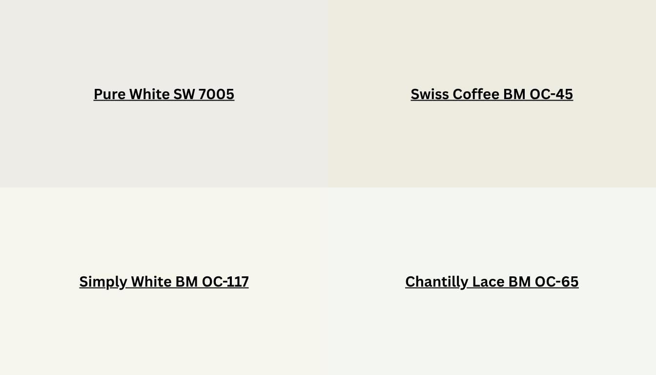
Pure white is stark and bright. Alabaster is softer with creamy undertones. Pure white can feel cold and sterile in some rooms. Alabaster adds subtle depth without losing that clean look.
Swiss Coffee leans more yellow. Alabaster has greige undertones that balance gray and beige. Swiss Coffee works best in traditional spaces. Alabaster fits more styles.
Simply white is crisper and cooler. Alabaster feels cozier with its beige base. If you want a modern, fresh look, go with Simply white. For something gentler, choose Alabaster.
Chantilly Lace is a true, bright white. Alabaster is muted by comparison. Lace creates a sharp contrast. Alabaster blends more smoothly with other tones.
Wrapping it Up
It’s that perfect in-between shade that gives you clean walls without the coldness of pure white.
You get the freshness you want with a subtle, creamy undertone that feels livable.
Also, you know how it compares to other whites, where it works best, and what to watch out for. The technical details are there if you need them.
Ready to try it in your space? Start with a sample board. Test it in different rooms and lighting.
You’ll see why so many people stick with this color once they try it.