

The Color Wheel
Let me start by explaining the color wheel to you in simple terms.
You’ve got three primary colors first – red, blue, and yellow. These are the building blocks.
Mix any two primaries together, and you’ll get secondary colors. Red plus blue makes purple. Blue plus yellow creates green. And yellow mixed with red gives you orange.
Then there are tertiary colors. These happen when you mix a primary with a secondary color next to it. Think blue-green or red-orange.
Now, here’s the interesting part about opposite colors. If you look at any color wheel, you’ll notice that complementary colors sit directly across from each other.
They’re positioned exactly 180 degrees apart.
When you put these opposites together, something magical happens. They make each other look brighter and more vibrant.
Artists and designers love this relationship. Why? Because complementary colors create natural balance in their work.
If the primary/secondary/tertiary breakdown here is new to you, our color theory basics guide covers the full wheel in more depth.
So, What Color is Opposite of Purple?
The answer is straightforward. Yellow is the opposite color of purple on the color wheel.
Here’s why this makes perfect sense. Purple is created by mixing red and blue, two of the three primary colors.
That leaves yellow standing alone as the remaining primary. Since purple contains no yellow whatsoever, these two colors are complete opposites. They’re as different as colors can get.
That’s the traditional artist’s wheel, though. Switch to screens or ink and the answer changes, but more on that below.
First, not all purples and yellows are equal partners.
Each shade of purple has its own perfect opposite partner. Let me show you how different purple tones match up with their yellow counterparts:
| Purple Shade | Opposite Color | Visual Effect |
|---|---|---|
| Lavender (light purple) | Pale yellow | Soft, gentle contrast that feels calming |
| Violet (deep purple) | Gold | Rich, dramatic combination with strong impact |
| Magenta (reddish purple) | Yellow-green | Fresh pairing with energy |
| Indigo (bluish purple) | Yellow-orange | Warm meets cool for balanced contrast |
| Plum (medium purple) | Chartreuse | Bold, unexpected match that catches the eye |
Hex Code / Numerical Opposite of Purple
If you want an exact answer instead of an artistic one, hex codes give you the math.
Purple in hex code is written as #800080. This code breaks down into three values for red, green, and blue light.
To find the exact opposite, you flip each value. Subtract each number from 255, which is the highest value possible in RGB.
Here is how that math works for purple:
Red: 128 becomes 127
Green: 0 becomes 255
Blue: 128 becomes 127
That gives you #7FFF7F, which is a bright, light green.
This number based method is useful for web design and digital tools, since it removes any guessing. If you plug a hex code into most design software, it can calculate this opposite for you instantly.
Opposite Color of Purple in RYB Color Model
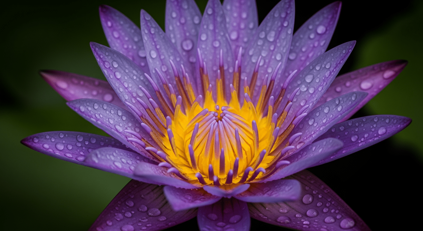
The RYB model (Red, Yellow, Blue) is what traditional artists have used for centuries. It’s the color system you learned in art class, and painters still swear by it today.
Isaac Newton mapped colors into this kind of circular wheel back in the late 1600s, and the complementary pairs he laid out are still the ones art teachers use today.
In this model, yellow sits directly opposite purple on the wheel. This isn’t just theory.
Nature shows us this pairing constantly. Look at pansies with their purple petals and bright yellow centers. Or irises that combine deep purple with yellow beards.
These combinations aren’t accidents; they catch our eye because the contrast works.
Interior decorators use this knowledge too. I’ve seen living rooms where purple throw pillows pop against yellow walls. The effect? Instant visual interest without trying too hard.
Opposite Color of Purple in RGB Color Model
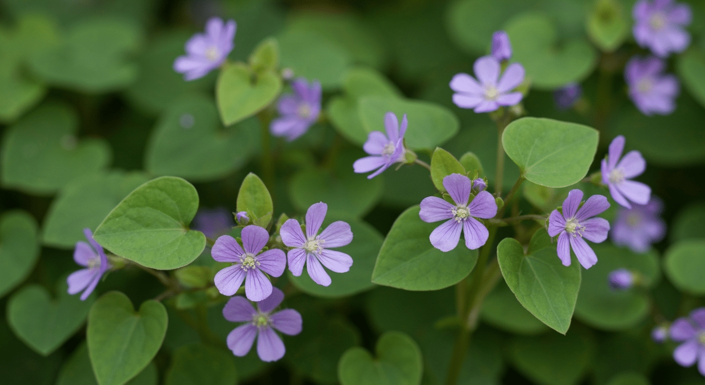
RGB (Red, Green, Blue) is how screens create color. Your phone, computer, and TV all use this system.
In RGB, purple (or violet) actually sits opposite green, not yellow. Surprised? I was too when I first learned this. The whole relationship shifts because we’re dealing with light, not paint.
Why the difference? RGB mixes colored light together. When you combine all three colors at full brightness, you get white light.
That’s completely different from mixing paints, where combining everything gives you muddy brown.
This changes how colors relate to each other on the wheel.
You see this green-purple pairing everywhere in digital spaces:
- Website designers use purple buttons on green backgrounds for maximum pop
- Digital artists create vibrant illustrations with violet and green light effects
- Stage lighting crews combine purple and green lights for dramatic scenes
- Video game designers use this contrast to guide players’ attention
What is the Opposite of Purple in the CMYK Color Model?
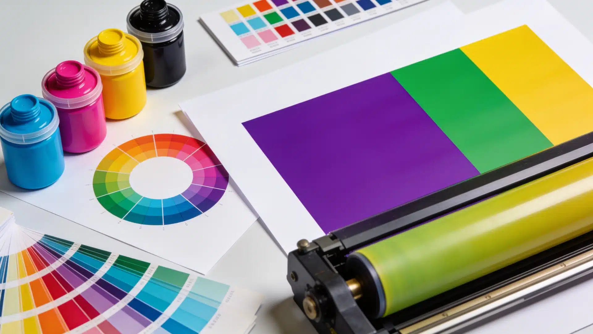
Now, let’s move from screens to printing.
CMYK stands for cyan, magenta, yellow, and black. It’s the color system used by printers to create images on paper.
In CMYK printing, the opposite of purple is generally green or yellow green. The exact answer depends on the type of purple being printed.
Purple is usually created by mixing cyan and magenta ink, with the amount of each ink changing the final shade.
Here is the clearest way to understand the relationship:
- A red leaning purple or magenta pairs with green.
- A balanced purple pairs with a fresh green.
- A blue leaning violet pairs with yellow green or yellow orange, depending on its exact hue.
CMYK does not have a separate color wheel that gives purple a completely new opposite. It is mainly a system for reproducing colors with ink.
The complementary color is based on the appearance of the purple, not simply on its CMYK percentages.
Black ink may make purple darker, but it does not determine its opposite color. The printed result can also change slightly based on the paper, printer, ink, and color profile being used.
So, the simple answer is:
In CMYK printing, purple is usually opposite green, while a bluer purple may be opposite yellow green.
This differs from the traditional RYB wheel, where purple is opposite yellow. It is closer to the RGB relationship, where magenta is opposite green.
Different Shades of Purple and Their Color Wheel Opposite
| Purple Shade | Opposite Color | Visual Effect |
|---|---|---|
| Lavender (light purple) | Pale yellow | Soft, gentle contrast that feels calming |
| Lilac (pale pinkish-purple) | Buttercream yellow | Delicate, almost pastel pairing |
| Orchid (bright pinkish-purple) | Chartreuse yellow-green | Playful, high-energy combination |
| Violet (deep blue-purple) | Gold | Rich and dramatic, reads expensive in small doses |
| Amethyst (jewel-toned purple) | Warm amber | Deep contrast that feels luxurious rather than loud |
| Magenta (reddish purple) | Yellow-green | Fresh, almost tropical energy |
| Indigo (bluish purple) | Yellow-orange | Warm meets cool, balanced rather than jarring |
| Plum (muted medium purple) | Chartreuse | Unexpected pairing that still feels grounded |
| Eggplant (near-black purple) | Pale gold | Moody base with a bright accent, works in small pops |
| Mauve (grayish dusty purple) | Soft ochre | Understated, works well in rooms that don’t want drama |
Not every purple wants the same intensity of yellow back.
A pale shade like lavender gets washed out next to a bold gold, it needs something equally soft, like a buttercream or pale straw yellow, or the contrast just looks unbalanced instead of complementary.
On the other end, something like eggplant color can handle a much richer, warmer yellow without the pairing feeling cartoonish.
What Does Purple Represent in Colour Psychology?
Colors do more than look nice. They shape how we feel about a brand, a room, a style or even a mood.
Purple often represents creativity, imagination, luxury, and individuality.
It sits between the energy of red and the coolness of blue, which is why it feels balanced rather than loud.
It has a strong connection to royalty because purple dye was once rare and expensive. For that reason, the color is still linked with wealth, status, and importance.
But purple can also feel calm and thoughtful. Lighter shades, such as lavender, are often associated with peace, softness, and relaxation.
Darker purples can create a deeper and more dramatic mood. They may suggest mystery, confidence, or power.
The meaning can also change depending on the shade:
- Lavender often feels gentle and calming
- Violet can feel creative and expressive
- Plum often feels rich and mature
- Deep purple can suggest luxury or mystery
So basically purple does not carry just one meaning. Its effect depends on the shade, the setting, and the colors used beside it.
How Complementary Colors Work
Complementary colors create the strongest visual contrast possible.
When you place purple and yellow side by side, each color makes the other appear more intense. It’s like they’re boosting each other’s energy.
Our eyes actually crave this balance.
Here’s what happens when we see purple and yellow together:
- The colors stimulate different cone cells in our eyes
- Our brain processes them as a complete visual experience
- Neither color overpowers the other — they share equal visual weight
- The contrast feels satisfying, almost like solving a puzzle
You’ll also spot this purple-yellow partnership everywhere once you start looking:
In art: Van Gogh used violet shadows with yellow highlights. Monet painted purple irises against golden backgrounds.
In photography: I’ve captured purple wildflowers in golden hour light. The warm yellow glow makes those purples sing.
In nature: Think about pansies with their purple and yellow faces. Or a sunset where violet clouds float across a yellow-orange sky. Nature knows this combination works.
Using Purple’s Opposite Colors in Design
The right color combination can make or break your design. Purple, with its opposite colors, creates feelings you can actually control.
Purple and Yellow Combinations
Purple and yellow together create instant energy.
This pairing feels cheerful, bold, and impossible to ignore. I see this combination work magic in children’s rooms, spring gardens, and sports team branding.
The Lakers knew what they were doing with this choice.
Want to use purple and yellow effectively? Here’s what works:
- Soft with soft: Lavender walls with buttery yellow curtains feel like a spring morning
- Bold with bold: Deep violet and bright gold make a statement in small doses
- One leads, one follows: Let purple dominate with yellow accents, or flip it around
- Add breathing room: White or gray spaces between these colors prevent visual overload
Purple and Green Combinations
Purple and green hits differently.
This combination feels natural yet unexpected, like finding violets growing in a forest. It’s the combo you see in peacock feathers and summer twilight skies.
These colors work together because they share a secret. Green contains blue, and so does purple. This common ground helps them play nicely together.
Here’s how to make them shine:
- Go tonal: Sage green with dusty purple creates calm, sophisticated spaces
- Create contrast: Bright lime with deep plum gives you drama without chaos
- Think nature: Purple blooms with green leaves never fails
- Consider the mood: Cool greens with cool purples feel serene. Warm versions feel exotic
Concluding Thoughts
Purple doesn’t have just one opposite. On the artist’s RYB wheel, yellow sits across from it.
On digital RGB screens, green takes that spot. In CMYK printing, the result usually leans green too, though the exact shade depends on the type of purple used.
Hex codes give you an exact numerical answer, while mixing complementary colors can either boost contrast or mute it completely.
Purple, violet, and magenta each bring their own personality to the mix as well. Whatever system you use, purple’s opposite adds balance, contrast, and visual interest to any project you create.
Frequently Asked Questions (FAQs)
1. Why Has Purple Long Been Linked to Royalty Throughout History?
Purple dye was once rare and costly to make, so only wealthy rulers could afford it, linking the color to royalty.
2. How Does Purple Usually Pair with Neutral Colors Like Black or White in Outfits?
Purple looks bold next to black and soft next to white. Both neutrals let purple stand out without clashing.
3. Does Purple Mean Something Different in Various Cultures Around the World?
Yes. Purple can signify mourning in some cultures, royalty in others, and spirituality elsewhere, showing how color meaning shifts across regions.
4. Can Colorblindness Affect How Someone Sees Purple and its Opposite?
Yes. Some forms of colorblindness make purple appear more blue or gray, which can change how strongly its opposite color stands out.





One Response
Thank you, I can sleep now.