Walk into a room where everything just clicks, same color, different depths, nothing fighting for attention.
That’s a monochromatic color scheme at work. Yet people either overdo it and end up with a flat, one-note space or avoid it altogether out of fear. Neither has to happen.
When you know how tints, tones, and shades of one color interact, the whole thing becomes clear.
This blog breaks it all down, from picking your base color to layering it without losing contrast.
What is a Monochromatic Color Scheme?
One color. Multiple shades. That’s the whole idea behind a monochromatic scheme.
It takes a single base color and works with its lighter tints, deeper shades, and mid-range tones.
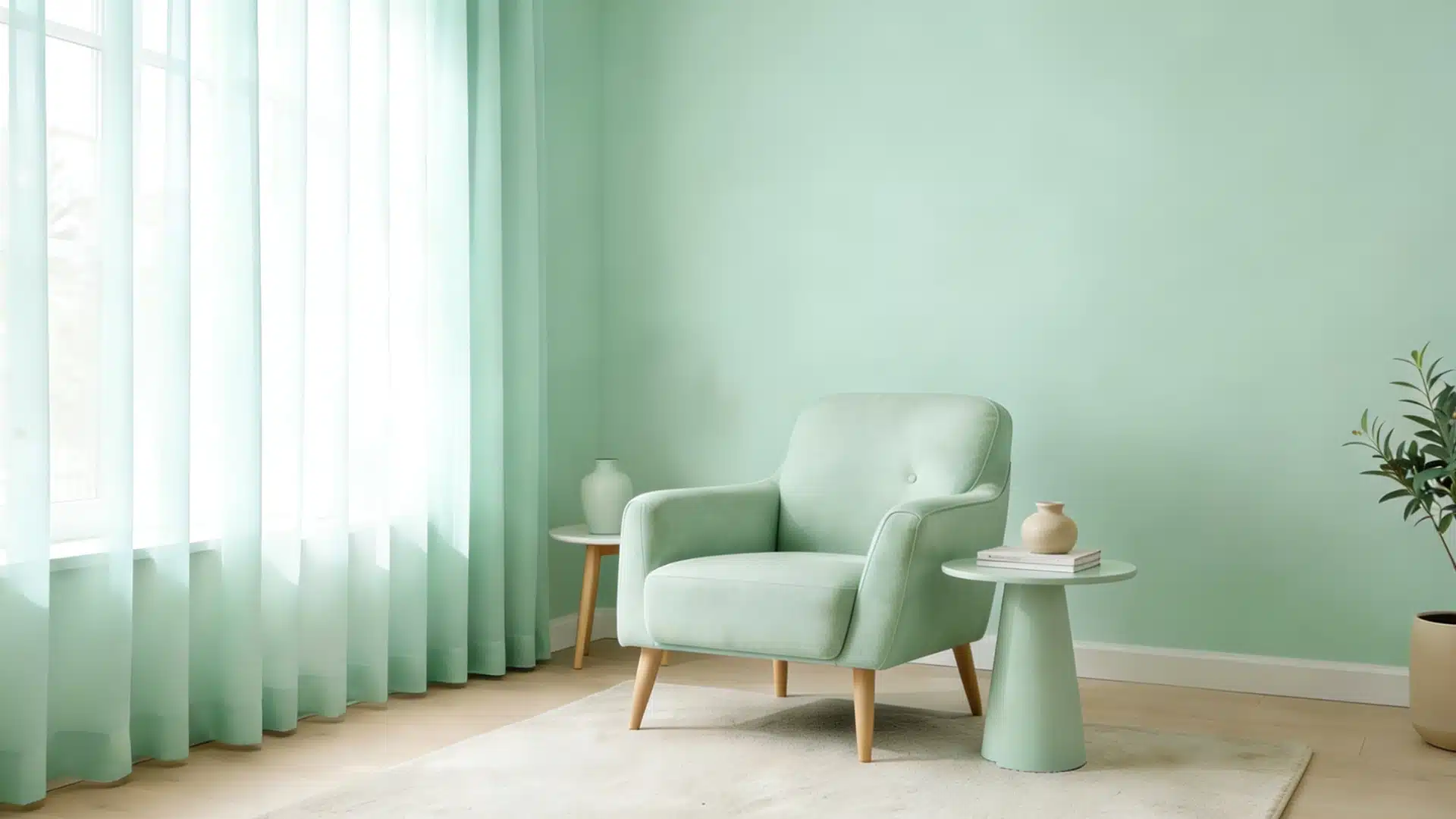
Think of navy, sky blue, and powder blue all living in the same room. Same color family, different depths. The result is a space that feels calm and put-together without looking overdone.
It works in interiors, outfits, and graphic design alike.
No clashing, no confusion, just one color carrying the whole look from top to bottom.
Understanding Monochromatic Colors
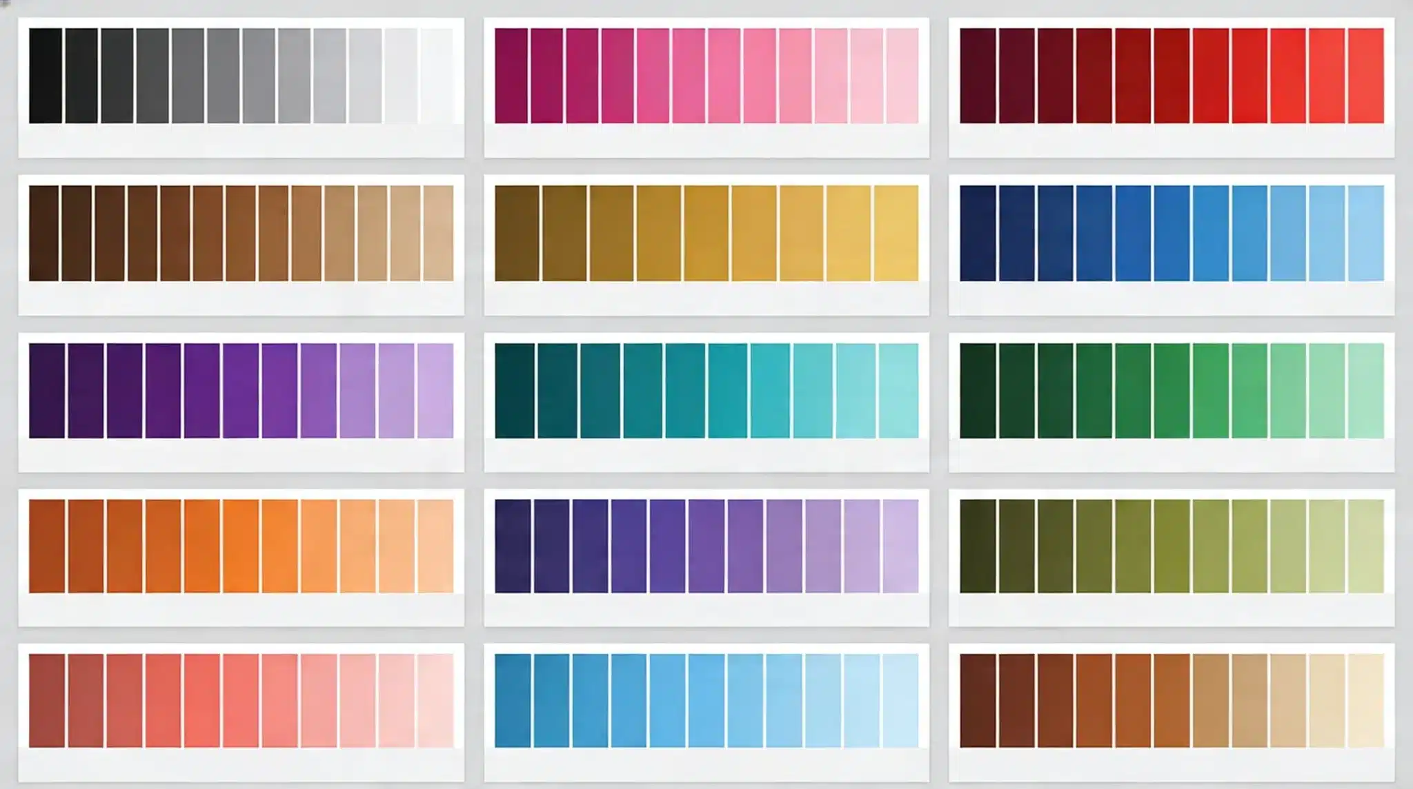
Monochromatic colors all derive from a single base color.
This color palette groups tints, shades, and tones of a single color.
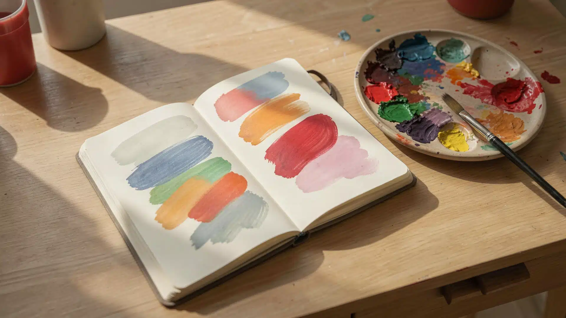
Light versions create space, darker ones add depth. Together, they achieve a balanced, complete look. Tints are made by adding white, shades by black, and tones by grey to a single color.
Each variation sits in the same color family but carries a different weight and feel.
A deep forest green and a pale mint can both trace back to the same green.
That’s what makes monochromatic design work: the colors don’t compete; they complement.
Why Monochromatic Design Works so Well in Homes
Using a single color throughout a space isn’t a limitation; it’s a design decision that delivers real, visible results.
Here’s why it works so well:
- Too many colors in a room create noise; a single color family keeps everything calm and pleasing.
- Lighter tints on walls and furniture blur hard edges, making a room feel more open and less boxed in.
- With one color as the base, every purchase has a clear reference point, so nothing feels out of place.
- Layering shades and tints adds visual interest without adding more objects or patterns to the room.
- In a small bedroom or a large living area, a monochromatic approach brings structure to spaces of all shapes.
- Built from a single base color, it uses tints, shades, and tones for variation within that color family.
- Every element shares a common color root, giving the space a natural sense of order and consistency.
- It relies on contrast through depth rather than difference, so the space feels considered and put-together.
How to Build a Monochromatic Color Scheme Step-by-Step
Building this color scheme doesn’t have to feel complex. Follow these steps, and the whole process becomes clear.
Step 1: Pick Your Base Color
Start with one color you genuinely like. This becomes the anchor for everything else in the space.
Step 2: Identify Your Tints, Shades, and Tones
From your base color, pull out lighter tints, deeper shades, and mid-tones. These give you a full range to work with.
Step 3: Assign Each Variation a Role
Use lighter tints on larger surfaces, such as walls. Save deeper shades for accents and smaller details.
Mid-tones work well for furniture and fabrics.
Step 4: Test Before Committing
Put samples on the wall. See how each shade looks in both natural and artificial light before making final decisions.
Step 5: Balance the Proportions
Don’t split your shades equally.
Let one variation dominate, use the second as a supporting tone, and keep the darkest or lightest as an accent.
Monochromatic Color Scheme for Every Room
One color can work anywhere in the home. These monochromatic example, shows how to apply it, room by room.
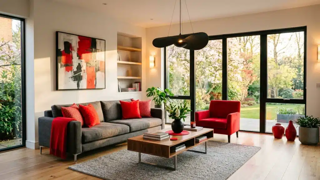
Living Room
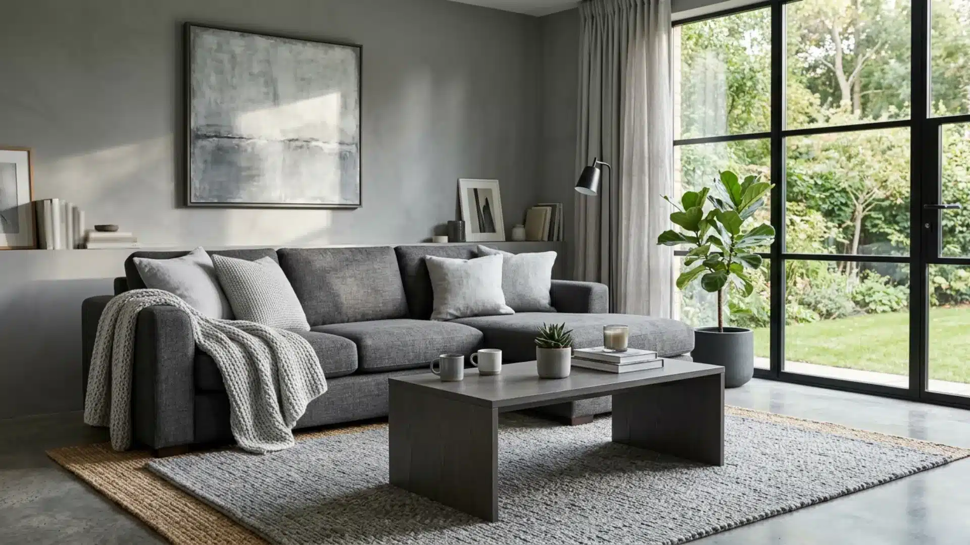
Warm beiges or soft neutrals work well here.
Use a mid-tone on the walls, a deeper shade on the sofa, and lighter tints on cushions and throws. The result feels put-together without looking overdone. Texture in fabrics and materials keeps it from feeling flat.
A single statement piece in the darkest shade ties the whole room together.
Bedroom
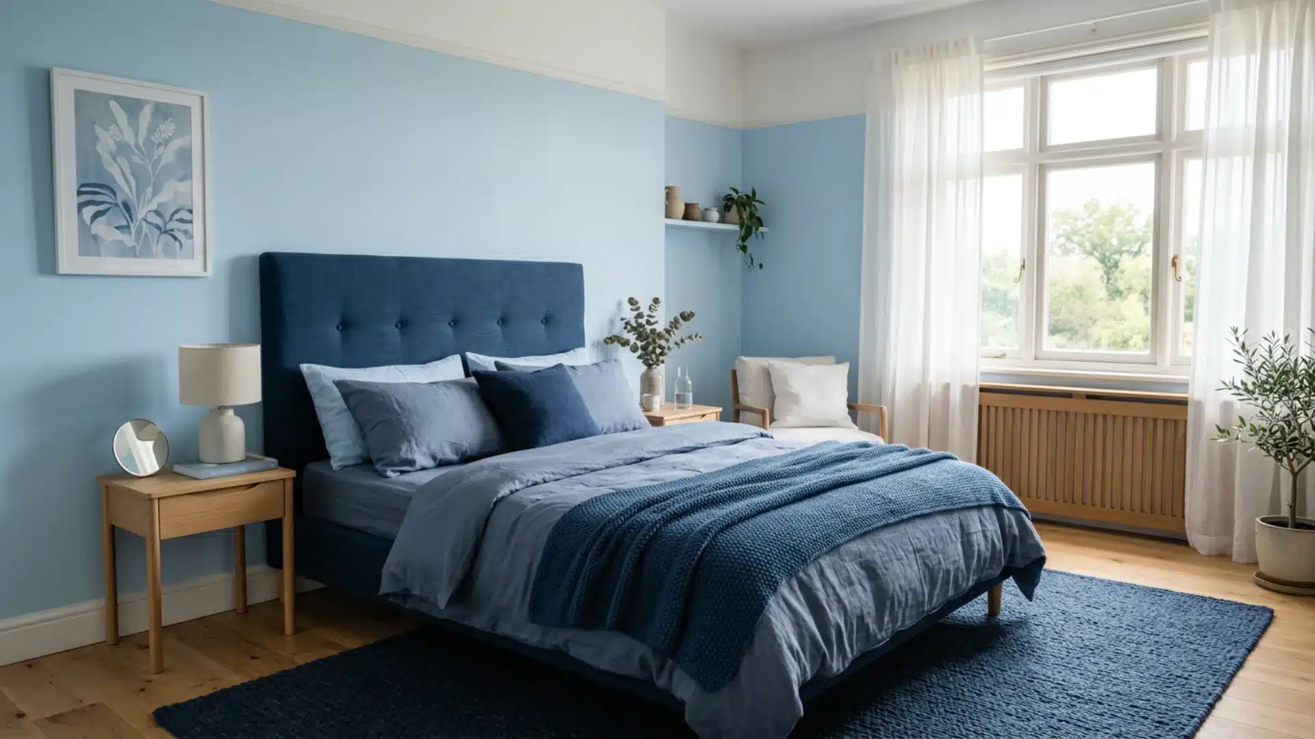
Soft blues or muted greens make bedrooms feel calm and restful.
Keep the walls light, go slightly deeper on bedding, and use the darkest shade on a headboard or rug.
It creates a cocoon-like feel that’s easy to sleep in. Adding varied textures, like linen, velvet, or cotton, prevents the space from looking too one-dimensional.
Recommended: Santorini Blue by Benjamin Moore
Kitchen
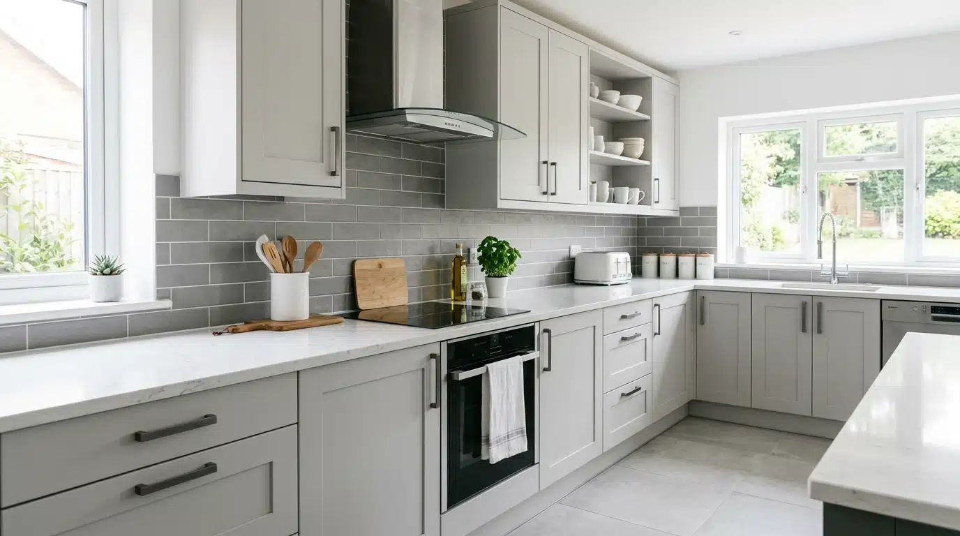
Crisp whites or cool greys suit kitchens well.
Lighter shades on cabinets, a mid-tone on the backsplash, and broader accents on handles or countertops. Clean, sharp, and visually easy to maintain.
Matte and gloss finishes within the same shade add subtle contrast without breaking the color flow.
Bathroom
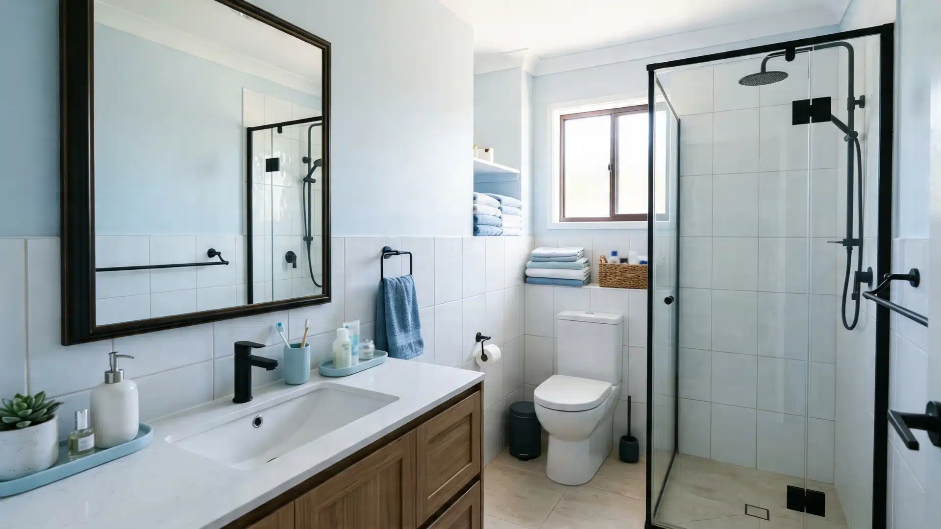
Soft whites or pale blues keep bathrooms feeling fresh. Tiles in a lighter tint, towels in a mid-tone, and darker accents on fixtures tie everything together neatly.
It avoids the overcrowded look that too many colors can bring.
Even small details like soap dispensers and mirrors can carry the shade through consistently.
Home Office
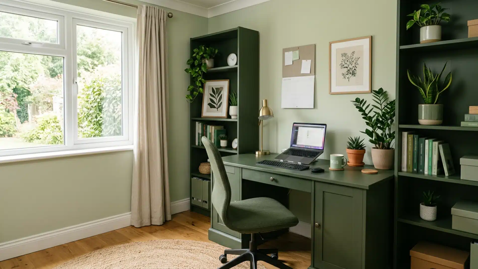
Muted greens or warm taupes work well here.
A lighter tone on walls keeps the space bright, while deeper shades on furniture and shelving add focus.
It feels productive without being distracting.
Keeping accessories within the same color family maintains a clean, clutter-free look throughout the day.
Children’s Room
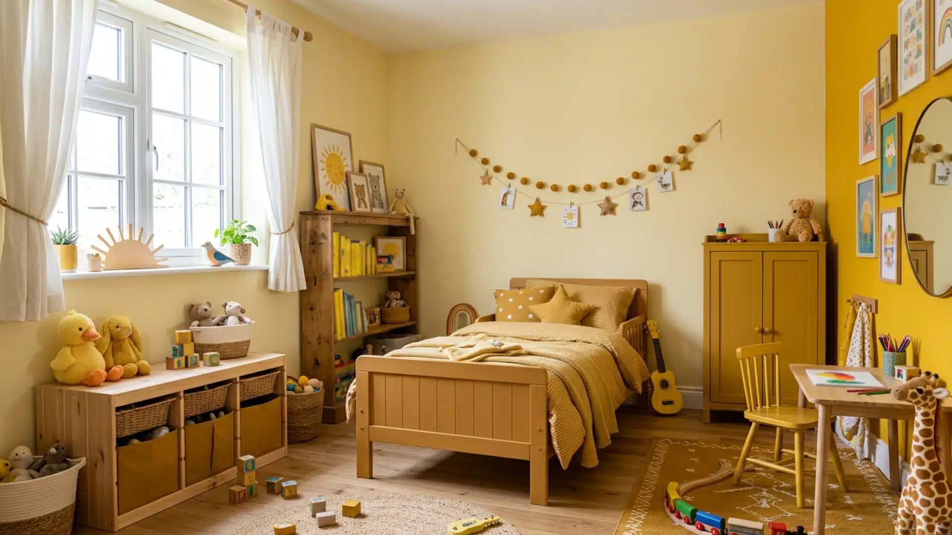
Soft yellows or light corals bring heat without being too loud.
Keep the base light, add mid-tones through bedding and storage, and use the deepest shade sparingly on a feature wall or furniture piece. This keeps the room feeling fun and cheerful.
Monochromatic Color Scheme Mistakes to Look Out for
Getting a monochromatic color scheme avoids key pitfalls.
Rooms often fail due to small choices that accumulate. Knowing what not to do is as helpful as knowing what to do.
- Using only one shade throughout makes the space look dull; always work with at least three variations.
- Ignoring texture is a common slip. Without varied surfaces, even a well-chosen color feels lifeless and flat.
- Overloading the darkest shade on large surfaces makes a room feel heavy and closed in.
- Skipping light tests before committing can cause colors to look very different after the room is finished.
- Forgetting a neutral anchor like white or off-white leaves the scheme with no breathing room.
- Matching everything too precisely removes contrast and makes the space look more like a showroom than a lived-in home.
Natural and artificial lighting can alter how a shade appears on a wall.
What seems soft in the store may look cold or dull in your home. Always test samples at different times of day before making a decision.
How Lighting Affects Monochromatic Color Scheme
Light shifts the way any color reads in a room. Here’s a quick breakdown of what to expect.
| Light Type | Effect on Color | Best Used For |
|---|---|---|
| Morning natural light | Warm, soft appearance | Testing true shade |
| Evening natural light | Cool, flat appearance | Checking shade shift |
| North-facing rooms | Colors read cooler | Warmer shade selection |
| South-facing rooms | Colors read warmer | Cooler shade selection |
| Warm bulbs | Push towards yellow/orange | Cozy, relaxed spaces |
| Cool bulbs | Pull towards blue/grey | Bright, focused spaces |
Always test shades under both natural and artificial light before committing.
What works in one light won’t always work in another.
Choosing the Right Paint Finish for Depth
Paint finish is often overlooked, but it plays a big part in how a monochromatic scheme comes together.
A matte finish absorbs light and works well on walls, giving a soft, understated look. Satin and eggshell finishes add a subtle sheen and suit areas with more activity, such as hallways and kitchens.
Gloss works best on trims, doors, and accents, adding contrast without changing the color.
Mixing finishes within the same shade creates depth and keeps the space from looking one-dimensional.
End Note!
A monochromatic color scheme works because it keeps things simple without being boring.
One base color, the right mix of shades, and a bit of attention to texture and light, that’s really all it takes.
Every room in the home can carry this approach well when the proportions are right.
Start small if needed.
Pick one room, choose a color you’re drawn to, and build from there. The results speak for themselves. Once you see how much one color can do, you’ll wonder why you ever needed more than that.
Frequently Asked Questions (FAQ’s)
1. What are the 7 Types of Color Schemes?
The seven types are monochromatic, analogous, complementary, split-complementary, triadic, tetradic, and square.
2. What are the Five Monochromatic shades?
The five shades are the base color, tint, tone, shade, and neutral.
3. What is the 70 20 10 Color Rule?
Use 70% of the dominant color, 20% of the secondary shade, and 10% of the accent color throughout the space.
4. What Two Colors Should Not Be Seen Together?
Red and green, or orange and purple, tend to clash and create visual discomfort in most spaces.
5. What are the Forbidden Colors?
Forbidden color combos include red-green and blue-yellow because the human eye can’t process them simultaneously.