Have you ever walked into a room painted in a perfect shade of blue that instantly made you feel calm? That’s what I felt when I first saw Santorini Blue 1634 by Benjamin Moore. This soft, cool blue with just a hint of gray caught my eye right away.
Everyone wants a color that brings peace to their home, but finding that perfect shade can be tough. Many blues are too bright or too dark for everyday living.
Santorini Blue solves this problem with its balanced tone that works in many spaces and lighting conditions. It creates a soothing feeling without being boring.
In this color breakdown, I’ll show you everything about Santorini Blue, its undertones, how light affects it, and the best ways to use it in your home.
What Makes Santorini Blue Benjamin Moore a Popular Choice?
Santorini Blue stands out because of its perfect balance. It’s not too dark or light, with just enough gray to keep it from feeling cold.
With an LRV of 44.67, it brightens spaces nicely without washing out. I’ve seen it work in many styles, coastal, modern, and traditional homes all look good with this blue.
What I like most is how it pairs with different colors. It looks clean with whites and grays, or warm next to wood tones.
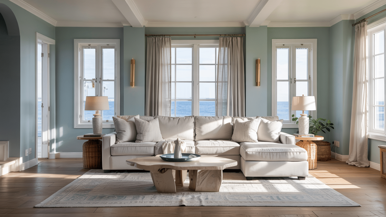
Unlike trendy colors that quickly date, Santorini Blue has staying power. It creates a calm mood that makes rooms feel like a retreat, bringing a touch of the Mediterranean into daily life without feeling forced.
Color Pairings with Santorini Blue Benjamin Moore
When I use Santorini Blue in my home, I find that choosing the right color companions makes all the difference. This soft blue shade plays well with several color families, each creating a different mood and style.
Minimalist Whites
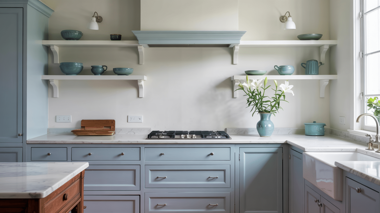
Crisp whites like Simply White (OC-117) and Cloud White (OC-130) make Santorini Blue pop. This combo creates a fresh, clean look that’s perfect for kitchens and bathrooms.
For decor elements, I like to add:
- White linen curtains that let in natural light.
- Ceramic vases or dishes in pure white.
- Cotton or wool rugs with simple patterns.
- Clear glass table lamps with white shades.
- White painted trim and crown molding.
Chic Gray Harmonies
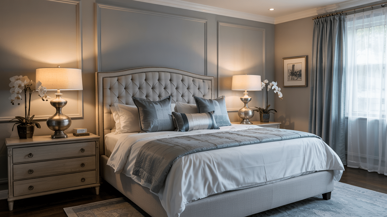
Wolf Gray (2127-40), Distant Gray (OC-68), and Nimbus Gray (2131-50) balance Santorini Blue with their cool undertones. This mix feels modern and calm, great for living rooms and bedrooms.
Decor elements that work well include:
- Gray stone or concrete table lamps
- Textured throw pillows in various gray shades
- Brushed nickel or chrome fixtures
- Gray velvet upholstery
- Slate tile or accessories
- Light gray area rugs with subtle patterns
Earthy Classics
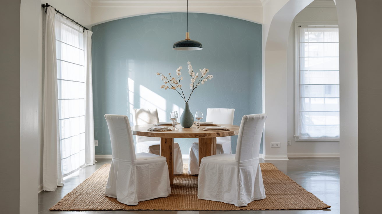
White Sand (OC-10), Linen White (OC-146), and soft beiges add warmth to Santorini Blue’s coolness. This combo feels cozy and welcoming in dining areas and family rooms.
I like to include these decor elements:
- Natural wood furniture with visible grain
- Woven baskets for storage
- Cream-colored upholstery or curtains
- Brass or gold metal accents
- Terracotta pots or decorative items
- Tan leather chairs or ottomans
- Jute or sisal natural fiber rugs
Tranquil Blues
Using colors from the same family, like Providence Blue (1636), Cape Blue (1642), or Water’s Edge (1635), creates a layered, rich look. This works well for accent walls or when you want a cohesive color scheme.
Decor elements to consider:
- Patterned rugs with various blue tones
- Blue glass vases or bowls
- Artwork featuring blue as the main color
- Textiles with blue patterns, such as ikat or block prints
- Driftwood or bleached wood accents
- Sea glass collections in jars
- Natural rope details on lamps or mirrors
Soothing Spa-Like Blends
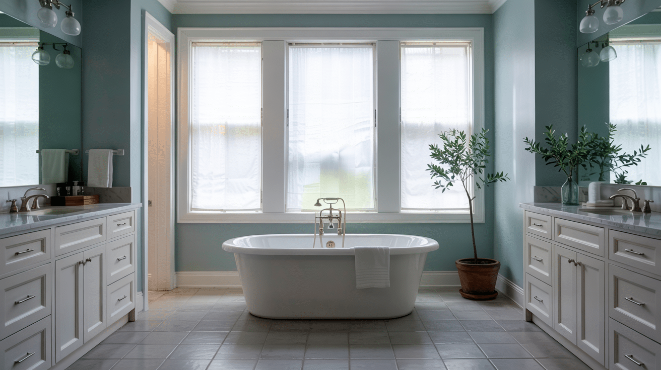
Pairing with soft greens like Pale Smoke or light aqua tones creates a calming, spa-like atmosphere perfect for bathrooms and bedrooms.
Decor elements for this scheme:
- Natural stone accessories in gray-green tones
- Glass containers in sea glass colors
- Fluffy white towels and linens
- Eucalyptus or soft greenery
- Light wood bath accessories
- Frosted glass light fixtures
- Water-inspired artwork or photography
When I’m putting together a room with Santorini Blue, I make sure to mix textures too. The soft paint color serves as a perfect backdrop for both smooth and rough surfaces, making the space feel complete and well thought out.
How Does Santorini Blue Benjamin Moore Compare to Other Blues?
When I look at Santorini Blue Benjamin Moore, I see a color that sits in a sweet spot among Benjamin Moore’s blue offerings. It has its own character that sets it apart from other blues.
Let me break down how this shade stacks up against some similar blues:
| Color Name | LRV | Undertones | Best For | How It Differs From Santorini Blue |
|---|---|---|---|---|
| Brittany Blue 1633 | 58.2 | Light, airy blue with minimal gray | Bright spaces, bathrooms, bedrooms | Lighter and less gray than Santorini Blue |
| Cape Blue 1642 | 46.8 | Soft blue with slight green hints | Living rooms, kitchens | Has more green undertones than Santorini Blue |
| Water’s Edge 1635 | 34.6 | Blue with gray and green notes | Accent walls, studies | Darker and more moody than Santorini Blue |
| Providence Blue 1636 | 29.7 | Rich blue with gray depth | Dining rooms, offices | Much deeper and more formal than Santorini Blue |
| Santorini Blue 1634 | 44.67 | Cool blue with gray hints | Versatile – works in most rooms | Balanced mid-tone with good depth |
What makes Santorini Blue stand out is its balance. With an LRV of 44.67, it’s not too light or too dark. This makes it work well in rooms with different light levels.
I find Santorini Blue to be more versatile than its cousins. While Cape Blue leans a bit green and Water’s Edge feels more moody, Santorini Blue stays true to a classic, clean blue that fits many styles.
Common Mistakes to Avoid with Santorini Blue
I’ve seen many people fall in love with Santorini Blue paint only to be disappointed with the results. This gorgeous shade can transform a room when used correctly, but there are several pitfalls that can turn your dream color into a decorating regret.
After helping friends fix their color mishaps, I’ve gathered the most common issues to watch for before you open that paint can.
- Using it in poorly lit rooms without balance – Santorini Blue becomes darker and flatter in rooms with limited natural light, especially north-facing spaces.
- Pairing with clashing warm tones – Some bright yellows and oranges create jarring contrasts with this cool-leaning blue.
- Ignoring the undertone shift under artificial light – The color appears differently under LED lighting (more gray) versus incandescent bulbs (more blue).
- Applying to all four walls in small spaces – This can make rooms feel smaller and more closed-in than they actually are.
- Forgetting to test on larger sample areas – Small paint chips don’t accurately show how the color will look on your walls.
- Missing the chance for perfect trims – White trim helps the blue pop, but choosing the wrong white can make it look dingy.
- Overlooking its effect on room temperature feel – This cool blue can make already cool rooms feel chilly without warming elements to balance it.
Tips for Painting Your Walls with Santorini Blue Benjamin Moore
I’ve painted many rooms with Santorini Blue, and these are some helpful tips to make your painting job go smoothly.
- Test the color first in your space. I always paint a small area and check how it looks throughout the day.
- Clean your walls with mild soap and water before starting. Let them dry completely.
- Fill any holes with spackle and sand until smooth for a perfect finish.
- Use high-quality tools. I find medium-nap rollers work best with this color.
- Choose a good angled brush for cutting in around edges and corners.
- Apply primer, especially if covering a darker color. This helps Santorini Blue show its true shade.
- Plan for two coats of paint. Let the first coat dry fully before adding the second.
- Use painter’s tape for clean lines along trim and ceilings. Pull it off while the paint is still slightly wet.
- Pick a day with low humidity for painting. This helps the paint dry more evenly.
- Keep a wet edge as you paint to avoid lap marks and streaks.
Final Verdict
I’ve tested and lived with many paint colors over the years. Santorini Blue Benjamin Moore is one I keep coming back to for its gentle presence and how it changes throughout the day. But is it right for you?
You should pick Santorini Blue if you want a color that feels soft and calm without being dull. This color works well for folks who want their space to feel open, bright, and peaceful. It’s perfect if you like coastal styles or if you want a color that makes a room feel bigger.
Santorini Blue really shines in bedrooms, bathrooms, and living rooms with good natural light.
I’ve seen it look stunning in spaces with white trim and natural wood elements. It also works well in home offices where you need focus but not distraction.