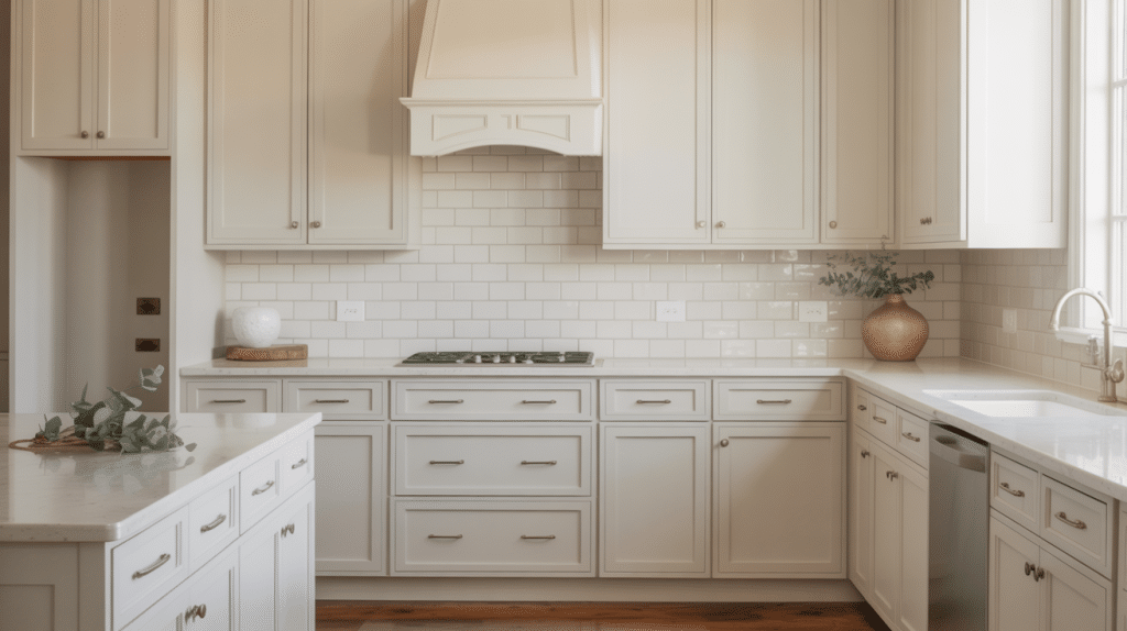
If you’re updating your kitchen cabinets with white paint, you’ve probably realized white isn’t just white! I’ve discovered this firsthand while helping clients transform their kitchens.
White is the most complex “simple” color, it can make spaces feel open, clean, and timeless. Yet choosing the wrong white might leave your kitchen feeling cold or dingy.
In my experience, Sherwin Williams offers fantastic white options that suit various lighting conditions and design styles. Whether you prefer warm and creamy or bright and crisp, there’s a perfect shade waiting for your cabinets.
I’ll walk you through my top picks, explain how lighting affects each shade, and share tips to help you pick the ideal white for your space.
What’s the Best White for Kitchen Cabinets Sherwin-Williams Offers?
In my years as a designer, I’ve found that the “best” white depends entirely on your kitchen’s lighting, flooring, and overall design vision.
That said, here are my top Sherwin Williams whites for kitchen cabinets that consistently deliver beautiful results.
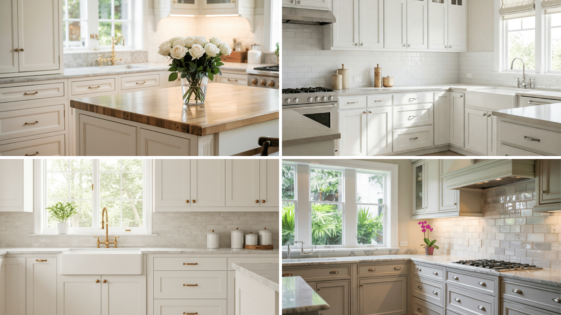
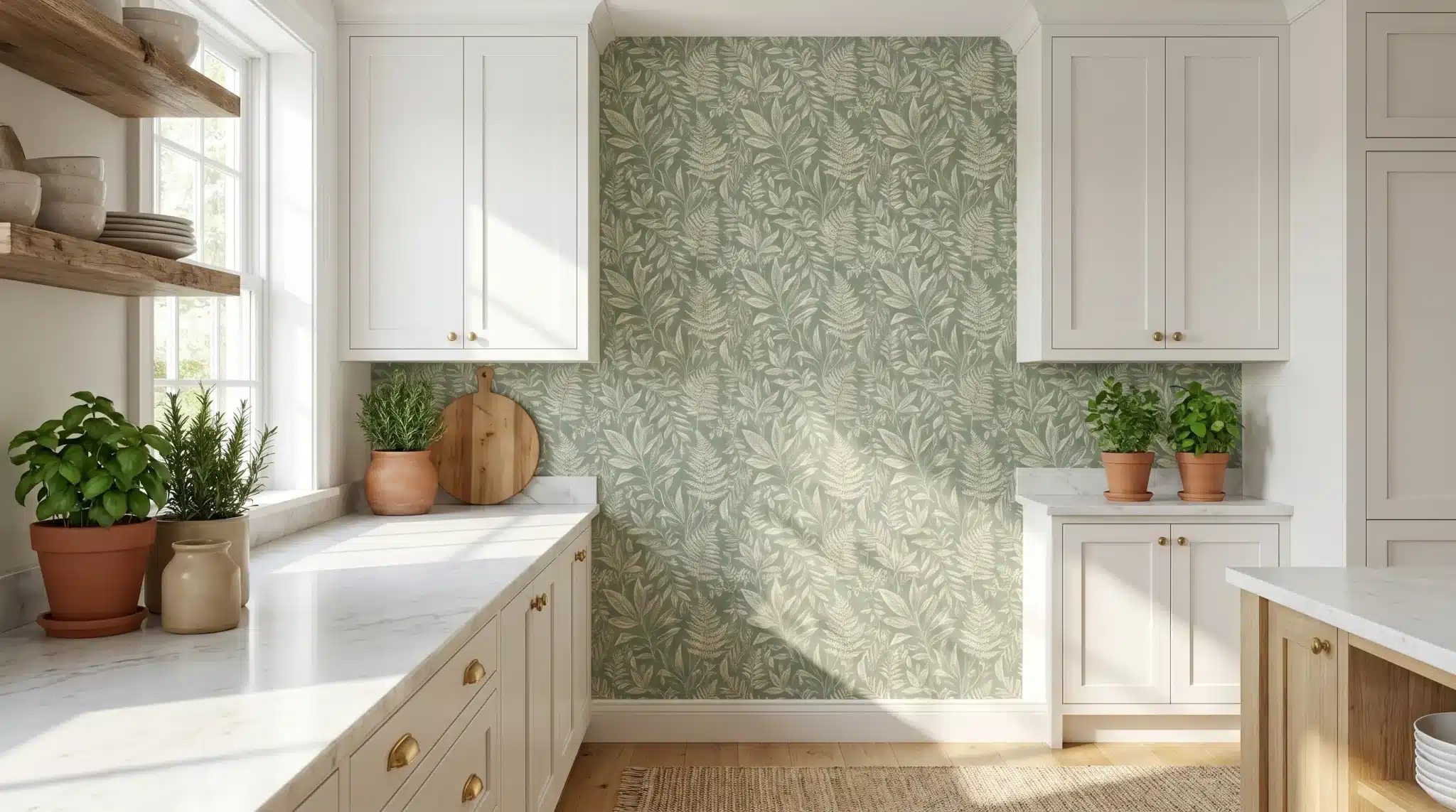
SW Alabaster (7008)
Alabaster creates a soft, welcoming feel with its warm undertones. I’ve used it in countless farmhouse and traditional kitchens where clients want cozy without feeling yellow. It pairs beautifully with wood elements and warm metals like brass or copper.
In north-facing kitchens, it maintains warmth; in south-facing rooms, it glows without becoming too yellow.
SW Pure White (7005)
When clients can’t decide between warm or cool, I recommend Pure White. This chameleon adapts to your space, appearing slightly warmer in cool light and maintaining its crispness in warm light. It’s my most recommended white because it works with virtually any countertop material and doesn’t lean too creamy or too stark.
SW Extra White (7006)
For modern, clean-lined kitchens, Extra White delivers that bright, gallery-like finish. It contains subtle blue undertones that give it a crisp appearance.
I particularly love it with concrete countertops or dark island cabinets for dramatic contrast. Just be careful in north-facing rooms where it can sometimes read a bit cold.
SW Snowbound (7004)
Snowbound offers sophistication with its subtle pink-gray undertones. I recently used it in a kitchen with marble countertops, and the client was amazed at how it complemented the veining perfectly.
It creates soft transitions rather than stark contrasts, making it ideal for spaces where you want a gentle, refined look.
SW Dover White (6385)
Dover White embraces its warmth with noticeable yellow undertones.
I recommend it for traditional spaces where bright whites would feel out of place. It pairs exceptionally well with terracotta tiles and warm woods, creating a timeless, European-inspired kitchen. In north-facing rooms, it maintains its warmth beautifully.
SW Greek Villa (7551)
Greek Villa offers an elegant middle ground between white and beige. I’ve used it in kitchens with limestone or travertine elements where pure whites would create too much contrast.
It appears sunlit and radiant, especially in kitchens that don’t get much natural light, helping to make the space feel warm and inviting.
SW High Reflective White (7757)
When clients ask for “the whitest white possible,” I show them High Reflective White. It’s as close to pure white as paint gets, reflecting maximum light. I’ve used it in ultra-modern kitchens with sleek black hardware for dramatic effect.
Be cautious, though—its brightness can be overwhelming in sun-drenched kitchens.
SW White Duck (7010)
White Duck is my secret weapon for sophisticated, understated kitchens. This greige-white hybrid creates a subtle, refined look that’s neither too white nor too beige.
It pairs beautifully with natural elements like soapstone countertops and works wonderfully in open-concept spaces where you want kitchen cabinets to harmonize with surrounding areas.
Styling White Cabinets with Other Colors
I’ve designed kitchens with every possible combination of white cabinets, and I’ve learned that pairing them correctly makes all the difference between a stunning kitchen and one that falls flat.
Pairing With Wood-Stained Islands
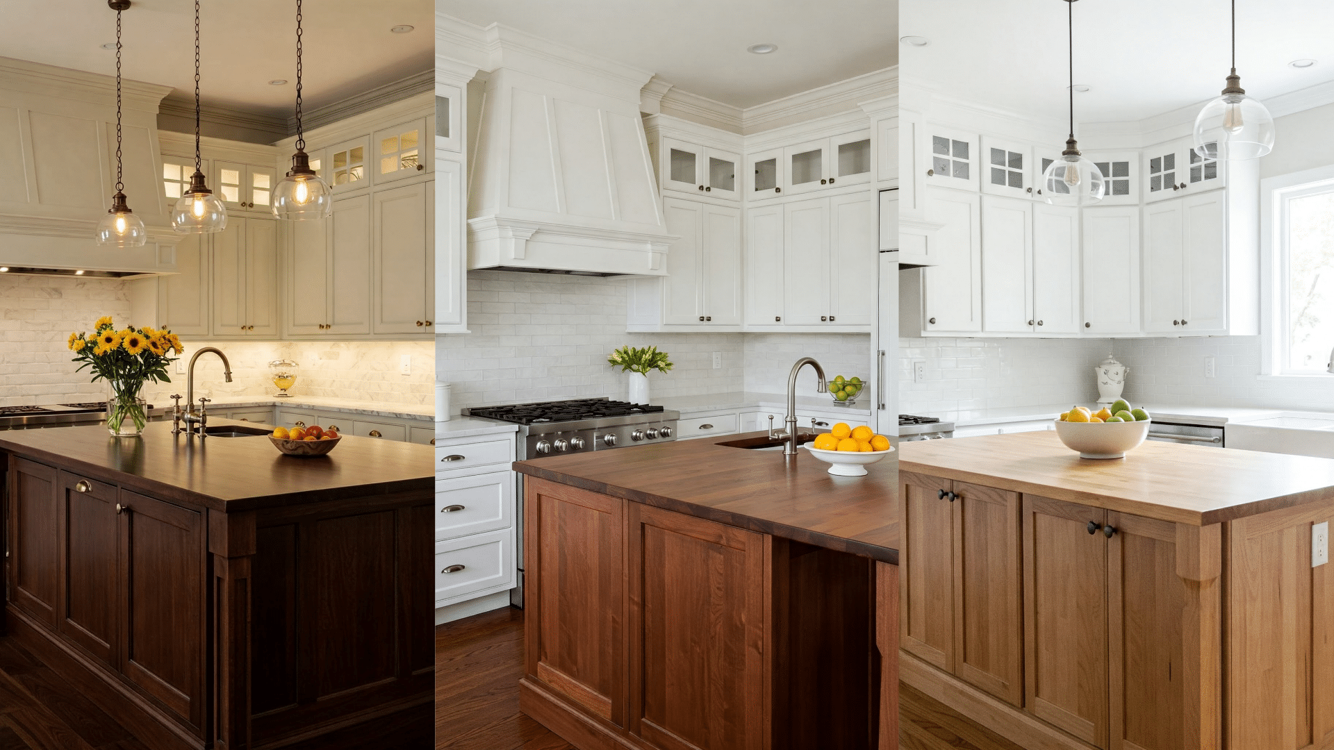
Warm whites create magic with wood tones. In my designs, I follow these guidelines:
For rich, dark woods (walnut, mahogany): Alabaster and Greek Villa complement these beautifully, enhancing the wood’s warmth without fighting it.
For medium woods (cherry, oak): Pure White creates a perfect balance clean yet not stark enough to make the wood look dated.
For light woods (maple, birch): Extra White or High Reflective White create a crisp contrast that makes both finishes pop.
Designing with Dark Countertops
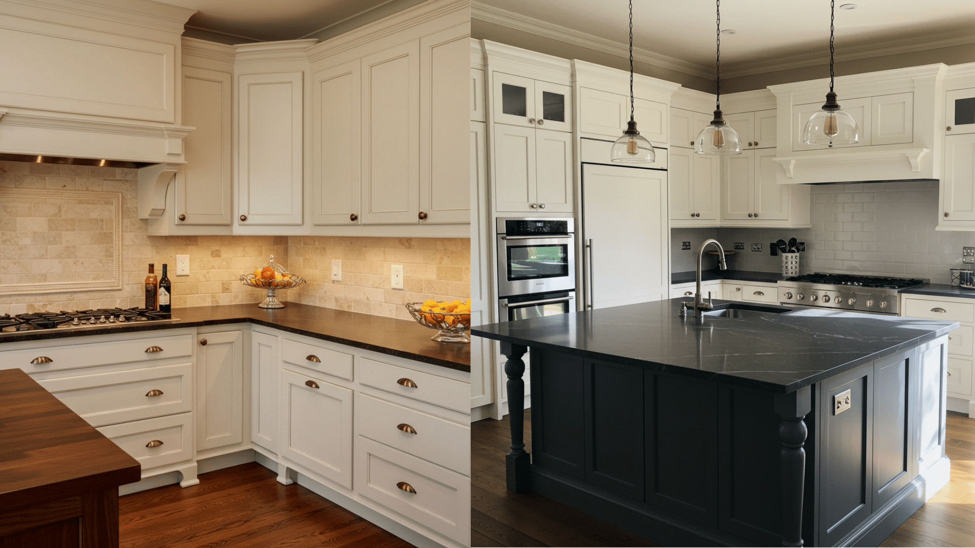
Dark countertops create dramatic contrast with white cabinets but choosing the right white is crucial.
With dark gray/black countertops (soapstone, granite): I recommend Pure White or Extra White cabinets for a classic, timeless look.
With dark brown countertops (walnut butcherblock, brown granite): Alabaster or Greek Villa complement these beautifully, picking up subtle undertones in the counter material.
One of my favorite recent projects featured Snowbound cabinets paired with rich black soapstone counters—the subtle warmth of Snowbound softened what could have been too stark a contrast.
Quick Palette Suggestions
These are some of my most successful white cabinet color palettes:
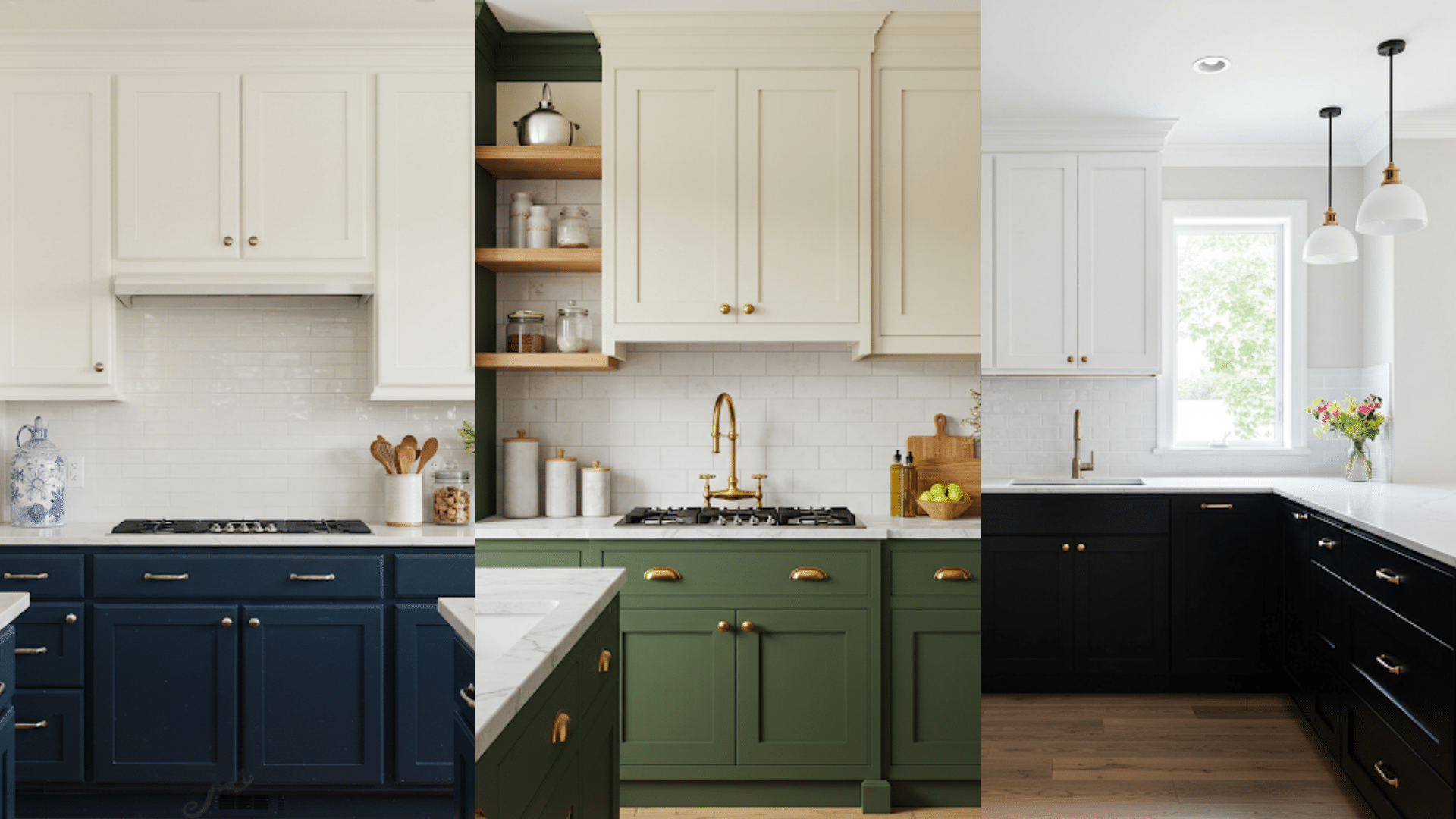
- Modern Farmhouse: Alabaster cabinets + medium wood island + matte black hardware + white subway tile backsplash.
- Contemporary Clean: Pure White cabinets + navy island + brass hardware + marble backsplash.
- Industrial Chic: Extra White cabinets + black lower cabinets + black metal hardware + concrete countertops.
- Warm Minimalist: Greek Villa cabinets + walnut floating shelves + bronzed hardware + cream zellige tile backsplash.
- Coastal Calm: Snowbound cabinets + sea glass green island + chrome hardware + white quartz countertops.
The Impact of Paint Sheen on Cabinets
Choosing the right white is only half the battle in creating your dream kitchen cabinets. I’ve learned through dozens of kitchen renovations that sheen level can dramatically change how a white color presents itself on cabinets.
Why Sheen Matters As Much As Color
The sheen you choose impacts three major aspects of your cabinets:
- Light reflection: Higher sheens bounce more light around your kitchen, which can make small spaces feel larger but also highlight imperfections.
- Color perception: The same white appears slightly different in various sheens – gloss finishes make whites look brighter and cleaner.
- Practical cleanability: Different sheens offer varying levels of scrub resistance and stain repellency.
Satin vs. Semi-gloss vs. Gloss
| Finish Type | Sheen Range | Recommended For | Benefits | Drawbacks | Personal Experience |
|---|---|---|---|---|---|
| Satin Finish | 25-35% sheen | Modern kitchens, understated elegance | Subtle, sophisticated glow; forgives minor imperfections; reasonably washable | Slightly less protection against moisture and stains | Painted cabinets in Snowbound for a client seeking elegance |
| Semi-Gloss Finish | 45-55% sheen | Most kitchens, easy maintenance | Excellent moisture resistance; easy to clean; enhances whites without excessive shine | May have a noticeable sheen but not too reflective | Personal cabinets painted in Pure White, perfect balance |
| Gloss Finish | 70%+ sheen | Dramatic modern style, pristine surfaces | Maximum durability; high moisture resistance; glossy, reflective look | Requires flawless prep work; magnifies imperfections | Painted High Reflective White for a statement kitchen |
Pros and Cons of Choosing White Cabinets
Pros
- I’ve never had a client regret choosing white cabinets – they’ve remained stylistically relevant for decades while colored cabinets come and go with trends
- Real estate agents consistently report white kitchens help homes sell faster and often for more money
My sister’s home with newly painted SW Alabaster cabinets received three above-asking offers within a week of listing. - They create the perfect versatile backdrop for changing decor, hardware, rugs and accessories seasonally. My own SW Snowbound cabinets let me refresh my kitchen’s look without major renovations
- White cabinets complement virtually any countertop material from butcher block to granite
Cons
- White cabinets show every fingerprint, food splatter, and coffee drip. Areas around handles and knobs darken over time from hand oils.
- Expect to wipe them down several times weekly and touch up paint about once yearly.
- Tomato sauce, coffee, wine, and even water can leave visible marks. Spills require immediate cleaning to prevent staining.
- A Thanksgiving cranberry sauce incident on a client’s Dover White cabinets required repainting that entire section.
Conclusion
Choosing the perfect white for your kitchen cabinets isn’t a one-size-fits-all decision.
Remember to test your chosen white in your specific lighting conditions before committing. What looks perfect on a paint chip might read differently under your kitchen’s unique light.
While white cabinets do require more maintenance than darker finishes, their timeless appeal and design flexibility make them worth the extra care for many homeowners.
The right Sherwin Williams white can transform your kitchen into a space that feels simultaneously fresh and timeless.
What white cabinet shade are you leaning toward? I’d love to hear about your kitchen transformation in the comments below.


2 Responses
Hello. I am between a light birch stained cabinet and a painted cabinet in shoji white? Not sure which would be best. I lean toward rustic farmhouse colors. Organic nature colors. I have a cape cod in the woods. Did my dining room in a floral bird pattern, bramble blue, by york coverings. Am using liveable green for my kitchen. A stone look vinyl floor, and a quartz countertop. thanks for help-Gen
While trying to decide which white to paint our kitchen cabinets I stumbled across this article from The Painted Hinge. So glad I did. So much great information. I was excited that one of my white shades from Sherwin Williams was included in the article. Thank you for this post and great information.